|
| Group |
Round |
C/R |
Comment |
Date |
Image |
| 29 |
Feb 26 |
Reply |
Glad you liked the article, Joel. I think your explanation of trial and error is very helpful for the group, and visionary on your part. Just for the joy of working on a great image, I opened the Main image in PS 2026 and used a color and vibrance adjustment layer to bring out the blue some more. Jpeg editing isn't ideal. I'm sure your original is stunning. Good luck with your show. |
Feb 16th |
 |
| 29 |
Feb 26 |
Reply |
Thank you, Joel. We are just starting another cold (for us) spell here in the Pacific Northwest, so I would be happy for a warm spring. |
Feb 16th |
| 29 |
Feb 26 |
Reply |
Thanks, Tim. Very similar to what I am ending up with. |
Feb 9th |
| 29 |
Feb 26 |
Reply |
Thanks, Karen. I believe you and Kathy are correct. I need to burn the head a bit more, especially the top. The greens and yellows' were problematic for me. |
Feb 9th |
| 29 |
Feb 26 |
Reply |
Thanks, Judy. Your version definitely makes the rock stand out more. I've redone it based on the many suggestions, although depending on Tim, I may yet revisit it. |
Feb 9th |
 |
| 29 |
Feb 26 |
Reply |
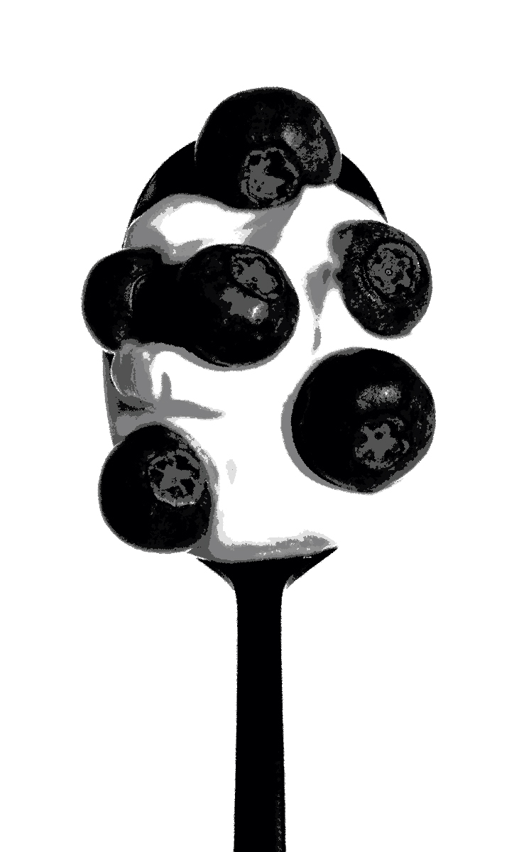
I didn't see the face before, Judy, but I see it better now. This isn't really a version, just a Tone Evaluation action from Blake Rudis' Visionary Panel. Maybe Joel saw it too, and that was a selling point for him. I usually use the TE action along with the Histogram to make sure I have placed elements correctly to guide the viewer to see what I saw. High-Key is somewhat different. |
Feb 9th |
| 29 |
Feb 26 |
Comment |
Hi Kathy,
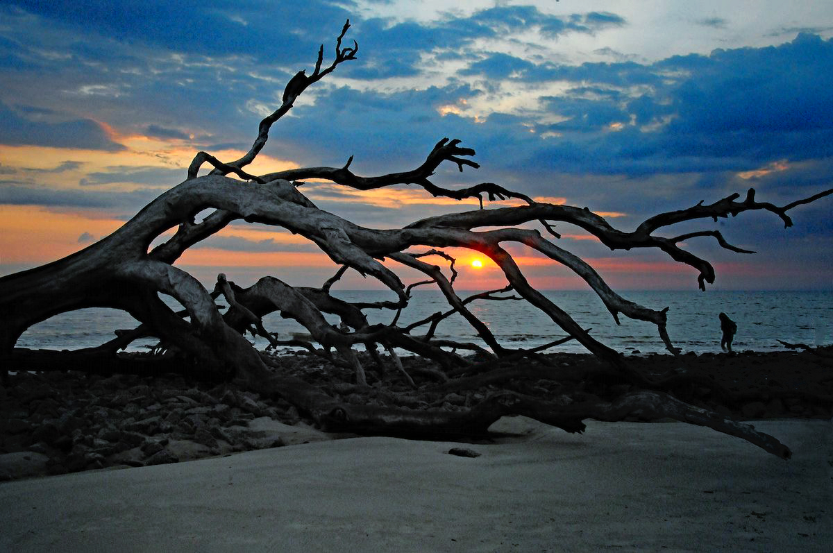
You have captured an ideal shot of Jekyll's Island. I think the original image color and is terrific, if a little less dramatic than it felt to you. It is sharp and the sun is in an ideal place. I'm not familiar any more with Luminar Neo, but I think it muddied the colors a bit, especially the driftwood. Maybe the dehaze combo did it. Nevertheless it is a great shot.
I moved and increased the size of the person in PS, as Tim suggested to see if you like it. Timing is critical on sunrise shots, and you didn't mention using a ND filter, which helps in those situations, so waiting was not an option. I removed a couple water reflections I found distracting too. |
Feb 8th |
 |
| 29 |
Feb 26 |
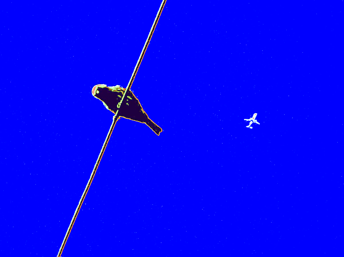
Comment |
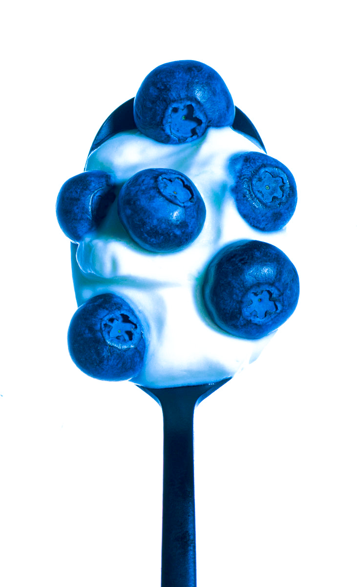
Hi Joel. I like the creative aspect and the high-key is very effective. I like your project, and hope to see more projects from you. I wonder though about blowing out the highlights. I think exposure is critical for high-key.
Your image is sharp, and I think you probably hit your goal of making the blueberries pop. To me the highlights should not be blown out, and I am attaching a tonal evaluation. The shadows are pretty harsh, IMO. I thought this website is a good reference for what I see. Just my thoughts.
https://photofocus.com/photography/shooting-photography/mastering-the-art-of-high-key-photography/ |
Feb 8th |
 |
| 29 |
Feb 26 |
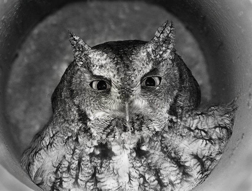
Comment |
Hi Karen, Very sharp eyes, and a terrific story. I assume the colors were affected by the lack of light. I'll take your word for it that the owl was sunning himself, since they usually sleep during the day....
I added a radial spot to augment your flash, and cleaned up some of the mailbox spots. Super cool shot. |
Feb 8th |
 |
| 29 |
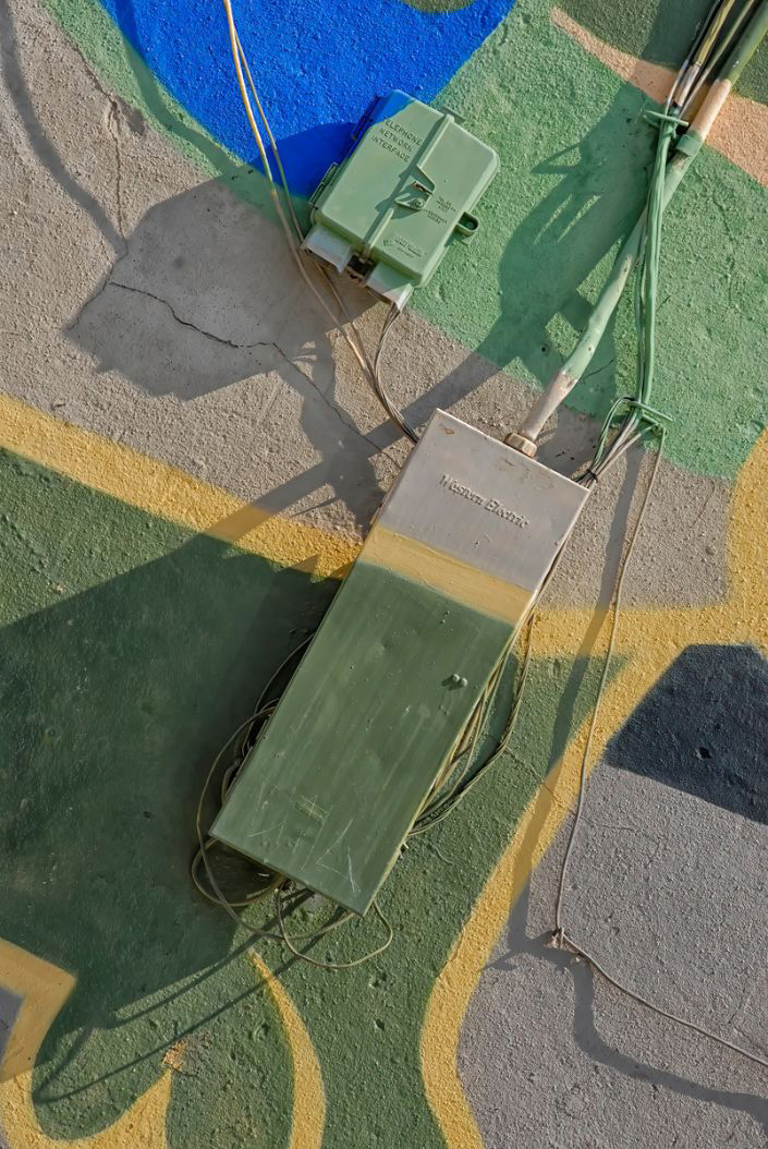
Feb 26 |
Comment |
Hi Judy, Very sharp and the colors are great. I love the diagonal lines. I wish the painter had done a better job taping off the Telephone Interface box. Great work.
I just lightened the background slightly to try to bring the boxes forward. |
Feb 8th |
 |
| 29 |
Feb 26 |
Comment |
Hi Tim, I love the story I see even more than the great nature shot. The compelling eye is looking right at me as the caped crusader peers over his arm. Too cool for words. I know Kathy is on the right track with her suggestions, but the story I see makes it a winner for me. |
Feb 8th |
| 29 |
Feb 26 |
Reply |
Thanks, Kathy. I believe you are correct. I need to burn the head a bit more, especially the top. The greens and yellows' were problematic for me. |
Feb 7th |
5 comments - 7 replies for Group 29
|
| 34 |
Feb 26 |
Reply |
Thank you, Frans. I appreciate your comments. It is especially gratifying to me that you can feel the intensity and story I wanted to tell. Abstracts, like this are hard to know when to quit, but to me war is all about wrongness and I didn't want the clarity of a photo. Thanks, again. |
Feb 25th |
| 34 |
Feb 26 |
Reply |
Thanks, Steve. That is a good reminder. I try to do that too, but I forget sometimes. Depends when I am editing from LR, and am concentrating on saving the work there too and didn't know save as keeps me from having to import again as a "save a copy" does. Live and learn.
|
Feb 22nd |
| 34 |
Feb 26 |
Reply |
Thanks, Steve. I'll try the different layer modes in PS on each element as you suggest. I also should probably try more randomize Noise color combos, and mask the red coated soldier to keep the color there. Your comment, along with Jan's and Judi's help a lot. I'm glad the composition worked. It is always nice to get something right.
I made the mistake of not saving a copy of the layered image, so I will have to rebuild this one from scratch. Another lesson learned. |
Feb 22nd |
| 34 |
Feb 26 |
Reply |
Thanks for the clarification, Steve. Sometimes people say "interesting" to be a polite way to say boring. From your bio, abstract art is highly important to you, and now I understand more the "why the the image," I don't think I would do anything differently for your contrasting nature/manmade image. I might clean up the white spots, but that might not hit your goal either. I also increased the contrast a bit, but that makes it a bit more like Warhol, so that might not be in line with your independent thinking. Thanks for adding your replies, Steve. |
Feb 22nd |
 |
| 34 |
Feb 26 |
Reply |
Thanks, Jan. I wasn't aware of those techniques. I sometimes have a couple of non-pixel layers between pixel layers, so I have to use Ctrl+Shift+Alt+E to make a stamped pixel layer. I'll have to try copying that layer prior to adding a filter and see if that works. Thanks for the details. |
Feb 7th |
| 34 |
Feb 26 |
Reply |
Thanks, Jan. I'm definitely going to work on the color. You and Judi, agree I've made the image too flat and too stylized. |
Feb 7th |
| 34 |
Feb 26 |
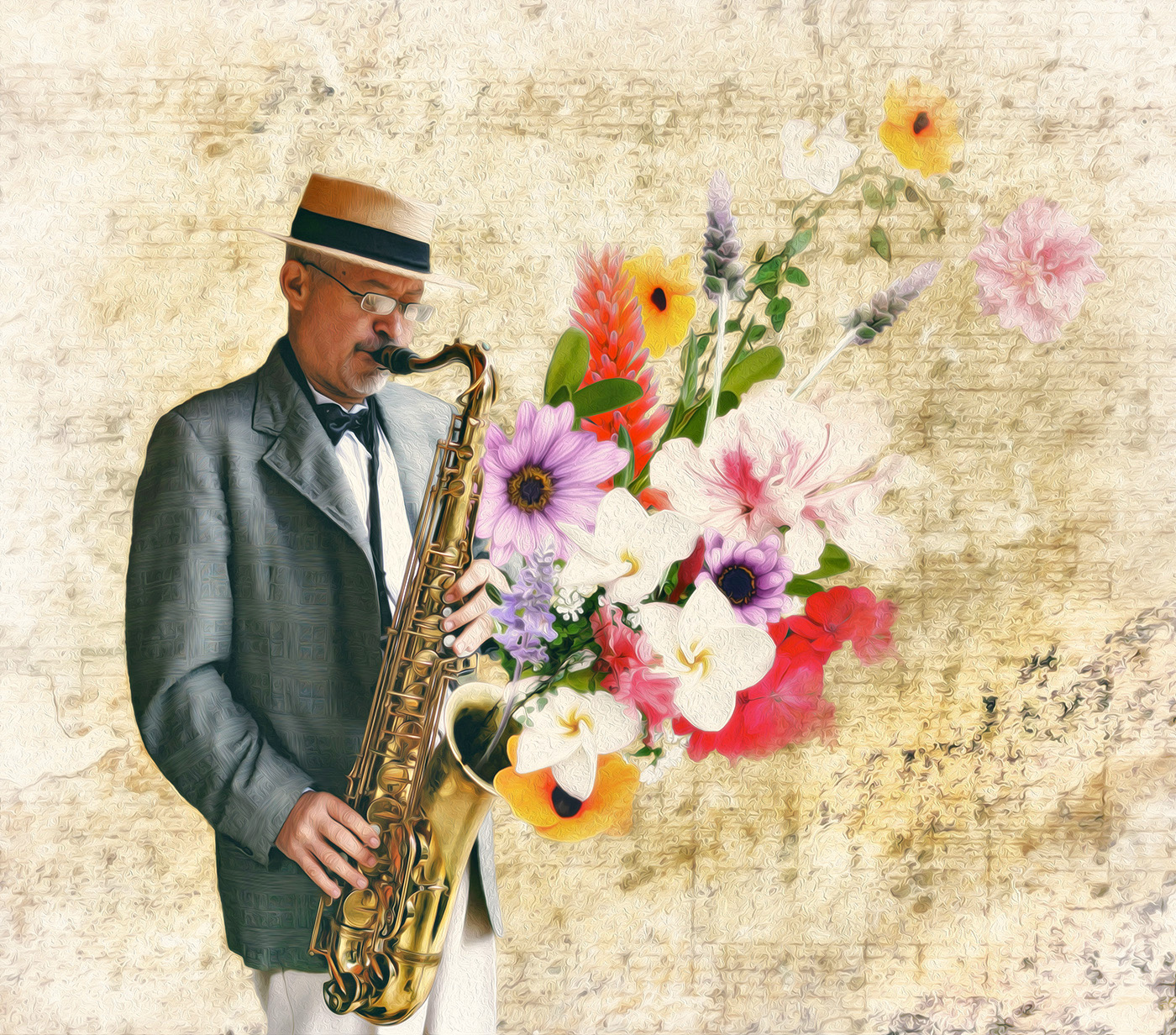
Comment |
Hi Jan, You do such a great job of storytelling. Your photography is sterling, and all the elements are interesting. I am envious. Thanks for the reference to https://unsplash.com/. I have so many photos that I've never culled, I will probably never use it, but...
I agree with Judi that the coat seems just a bit out of place with all the pastels. so I tried a little gradient and mask to increase the flower saturation, and bring them forward. Wonderful work. |
Feb 6th |
 |
| 34 |
Feb 26 |
Comment |
Hi Steve, I like the idea of a compare/contrast you started. I'm unsure what you want us to see. I think it might be worth looking through your files to see if you have some sharper images that you could composite. If you had a plane with a contrail, or a sky with a contrail you could have a more polished image, IMO. |
Feb 5th |
 |
| 34 |
Feb 26 |
Comment |
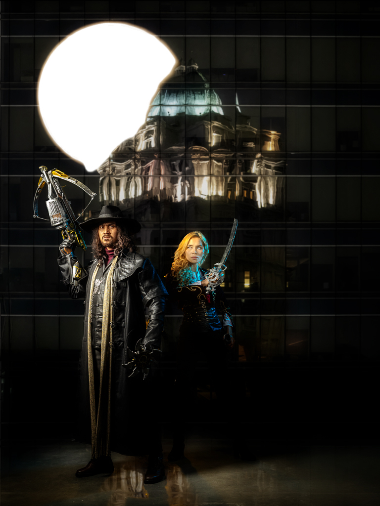
Hi Frans, I love the imagery. I've never seen the movie, but I would guess the story is dark as your caption explains. Your photography is terrific. The colors are great, and the images sharp. I wonder about the crop that includes the left edge of O2. It is distracting to me. I imagine you used a supermoon to match the model's hair. but I always think of horror films with a white moon. Just a thought or nitpick.
I loved the object coming from her sword until I finally figured out it was your lighting. Great work on the composite. |
Feb 5th |
 |
| 34 |
Feb 26 |
Comment |
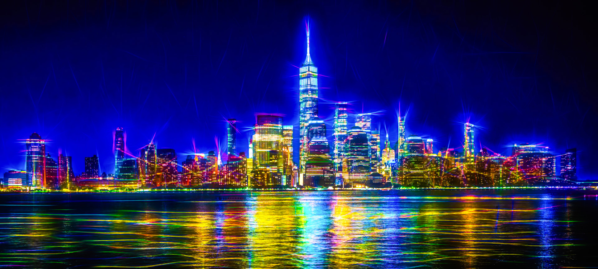
Hi Judy, Magnificent first image. Is this a shot from Liberty State Park? The color is dazzling, the effects are applied perfectly. I don't have this version of Topaz any longer and Photoshop filters can't duplicate your success. Your crop is perfect and the pano is a great choice. My only suggestion would be to remove the pilings from the water.
I tried replacing the sky also with one of my Milky Way images, but without Topaz, I couldn't make it work. You might consider adding a different sky and see if you like it. |
Feb 3rd |
 |
| 34 |
Feb 26 |
Reply |
Thanks, Judi. It's funny though, the more I see it the less I like all the yellow. It is the color I like least. I also have a hard time knowing when to stop adding effects though. Maybe I'll change the coat color of the gunner. If I change the tone/color of the fort, that also might push it back so the cannon image is more prominent. It is all kind of flat. Good suggestion and makes me think.
Welcome to the group! |
Feb 2nd |
4 comments - 7 replies for Group 34
|
| 84 |
Feb 26 |
Reply |
Thank you for explaining the story, Boskee. Ramadan Mubarak. |
Feb 16th |
| 84 |
Feb 26 |
Comment |
Hi Boskee, I am visiting at Dick's request. I know nothing about video editing, but I liked your story and video. The music was appropriate to me. Keep up the good work and know that Dick is doing his best for the group. |
Feb 14th |
| 84 |
Feb 26 |
Comment |
Hi Peter, I enjoyed most of your video. It is very well done as others have mentioned. The story telling is top notch IMO. I do not create videos and know nothing of the work involved. I have two considerations nonetheless, as Dick has asked me to comment.
The blend of still images and video's is a positive, but panning the still shots isn't appealing to me.
Your text is good, but I don't find it helpful during the video segments. If I try reading it detracts from seeing the video action. Text during the still shots makes sense to me. Keep up the good work.
Dick is trying hard to make sure your group gets the benefits available from your study group. |
Feb 14th |
| 84 |
Feb 26 |
Reply |
Thank you, Dick. I did look at all of the video's, but I'm not sure I would be of any help. I am not a videographer. |
Feb 14th |
| 84 |
Feb 26 |
Comment |
Hi Dick, I thought I'd review your groups images this month to see if the comments are current. I'll comment again in February to see if I can add a comment to Peter's image for January. |
Jan 30th |
3 comments - 2 replies for Group 84
|
12 comments - 16 replies Total
|


