|
| Group |
Round |
C/R |
Comment |
Date |
Image |
| 29 |
Jan 26 |
Reply |
No apology needed, Joel. Thanks for the suggestions. My ultimate crop will depend more on what I composite with it. This will probably be a background image. |
Jan 23rd |
| 29 |
Jan 26 |
Reply |
Thanks, Judy. I'm trying to use this group for help in deciding images to use in my composites for DD34. https://psadigital.org/group34/
I'm not sure about using too many composites here too. This months images give me hope though, that we can be creative too in a General category. |
Jan 20th |
| 29 |
Jan 26 |
Reply |
Thanks, again, Tim. |
Jan 18th |
| 29 |
Jan 26 |
Reply |
I don't mean to change the feeling that your image generates in the viewer.
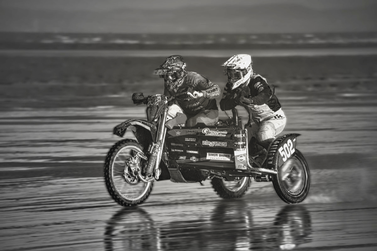
What threw me off a bit, was I didn't understand that this was just one bike with a sidecar. The driver is darker than the passenger, so I missed that. I was trying to equalize them and the bike to make it noticeable that it is only one vehicle. After looking it up online, the Weston Beach Race seems to be quite a massive event. |
Jan 14th |
| 29 |
Jan 26 |
Reply |
Thanks, Tim. I'll probably add something like this from my Alberta trip. |
Jan 14th |
 |
| 29 |
Jan 26 |
Reply |
My wife was so impressed with Maine's beauty and friendly people that she wanted to try living there. Of course, I reminded her that winter is a much harsher climate than Seattle. I hope you can return again. |
Jan 13th |
| 29 |
Jan 26 |
Reply |
Just an opinion on a once historically beautiful country, and especially Havana. I spent some weeks in Guantanamo Bay. I lived in Florida with the US Navy, and my parents who are buried in Sarasota. This site shows a lot of the architecture in Havana, and can also be found throughout most of older cities in Florida.
https://thirdeyemom.com/2014/04/13/a-brief-look-at-old-havanas-glorious-architecture/ |
Jan 13th |
| 29 |
Jan 26 |
Reply |
Thanks, Elaine. I tend to shoot more with the thought of using my photos later in a composite. That seems to be my incentive now. It was pretty sunny and warm when I took the original. |
Jan 12th |
| 29 |
Jan 26 |
Reply |
I like both art forms also. |
Jan 12th |
| 29 |
Jan 26 |
Comment |
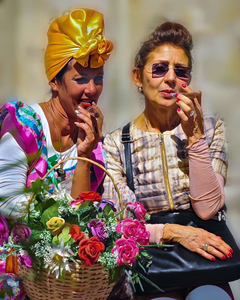
Hi Kathy, I think this is an exciting and memorable street scene. Your title, focus and color are all great. I too found the background distracting and maybe I might have opened up the lens to blur the background. I added a gaussian blur to simulate what it could look like. I also removed the artifact on the lower right, and I'm not sure if there is another lower left, but it isn't distracting to me and I couldn't change it with the remove tool anyway. The only other suggestion might be to composite this with some cigar smoke from the cigar on the right. Well done. |
Jan 12th |
 |
| 29 |
Jan 26 |
Comment |
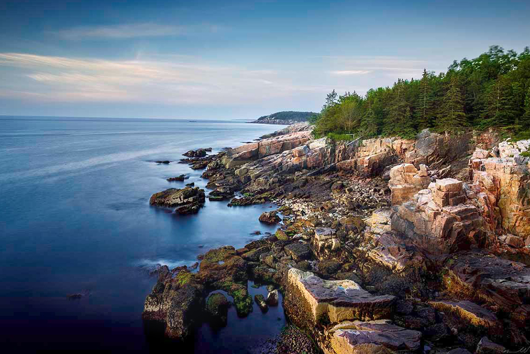
Hi Joel, Even converted to a jpeg, this coastline image has amazing dynamic range, Dof, clarity and color. Beautiful work, and I am in awe at the print size that you must have available from the original. As mentioned before I think the vignette probably wasn't really necessary, especially in the sky. I kept your original ratio, but cropped in from the top left. Acadia might be the most beautiful park in the east for me. |
Jan 12th |
 |
| 29 |
Jan 26 |
Comment |
Nicely done, Karen. I like the creativity. Thanks for the wish, too. Great work.
I had to play a bit since it is a creative image. I cropped and rotated a bit, then added an Artistic Filter (Neon Glow) to make it pop some. |
Jan 10th |
 |
| 29 |
Jan 26 |
Comment |
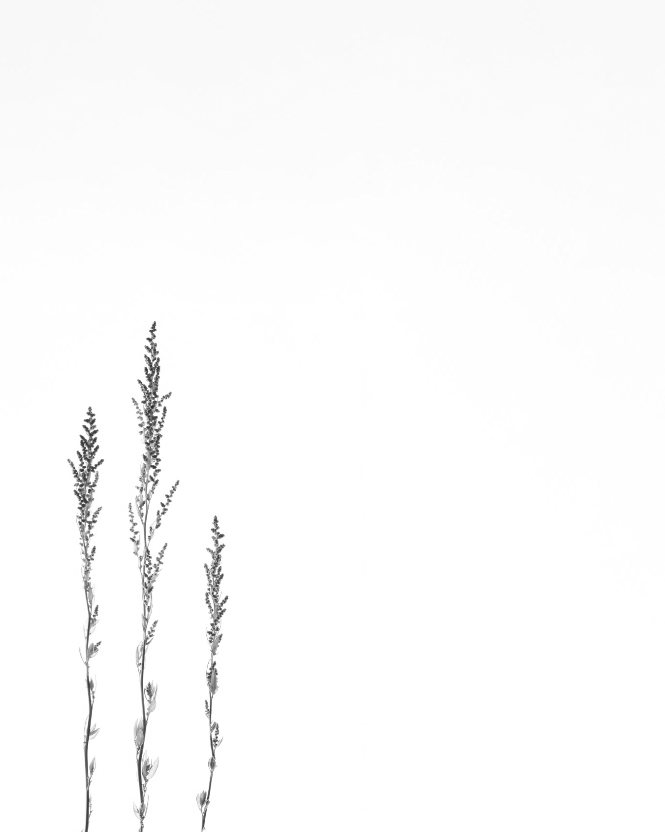
Hi Elaine, I think I'd classify this as a High Key more than a Minimalist image. No matter though, I agree with Joel, that I would want more background, and I might also consider a B&W too. This is a 5x4 crop, maintaining your offset. The image is sharp and a creative image. Well done. |
Jan 10th |
 |
| 29 |
Jan 26 |
Comment |
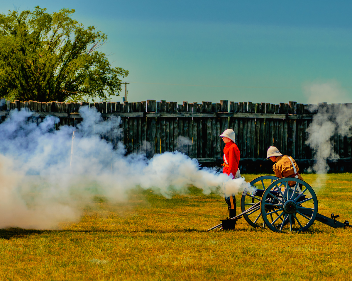
Hi Tim, Really well done sports image. The pan is great. All the words are clear and the motion is shown in the spokes and background. The only suggestion I would have is only for a print, in case this is too dark overall. There is a lot of close to black tones. I added a curve to the darks and midtones to brighten them up a tad, and added a radial gradient to the riders. As a digital image on my screen it looks great. Excellent work. |
Jan 10th |
 |
| 29 |
Jan 26 |
Reply |
Thank you, Karen. Any particular reason that the original is more appealing? I did consider the thirds crop, but it didn't work for me on this image. |
Jan 7th |
| 29 |
Jan 26 |
Reply |
Thank you. Kathy. |
Jan 7th |
5 comments - 11 replies for Group 29
|
| 34 |
Jan 26 |
Reply |
Thank you, Frans. I'm inspired by your comment. |
Jan 21st |
| 34 |
Jan 26 |
Reply |
Yellow is my most unfavorite color, so I'm not sure why I didn't see it in my versions. Oh well, I'll keep trying, but it does look better more orangey(?) and muted. Thanks for the nit-pick. |
Jan 15th |
| 34 |
Jan 26 |
Reply |
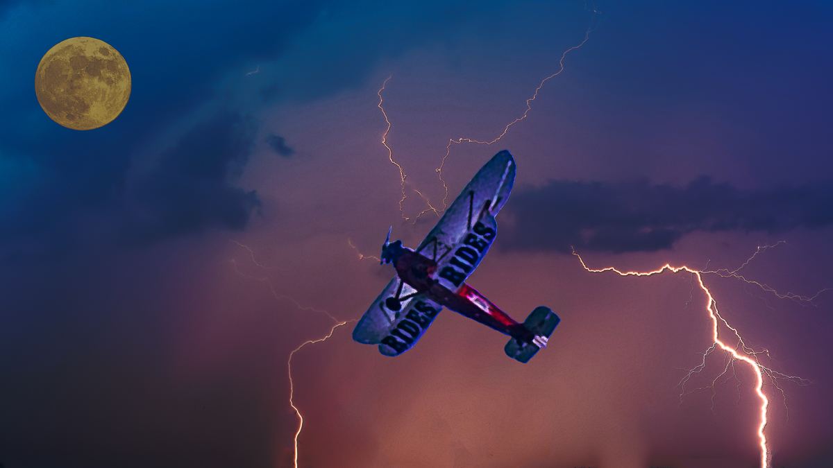
Thank you, Joan. Great pun! It was a struggle for me to place the plane at a new angle and where the lightning was most effective (in my opinion.) The image was brightened too much by Poster Edges, especially the supermoon, and I should have was brightened just the plane and rear lightning to create three objects. I re-cropped to 16x9 and lowered the opacity of the PE layer. Does this look more appealing? |
Jan 15th |
 |
| 34 |
Jan 26 |
Reply |
I meant that the text IS in balance. |
Jan 14th |
| 34 |
Jan 26 |
Reply |
Thanks, Frans. I don't think the text is balanced and doesn't overwhelm the beautiful image. I guess I was wondering if you wanted to sell it as a postcard or something. Idle curiosity. |
Jan 12th |
| 34 |
Jan 26 |
Comment |
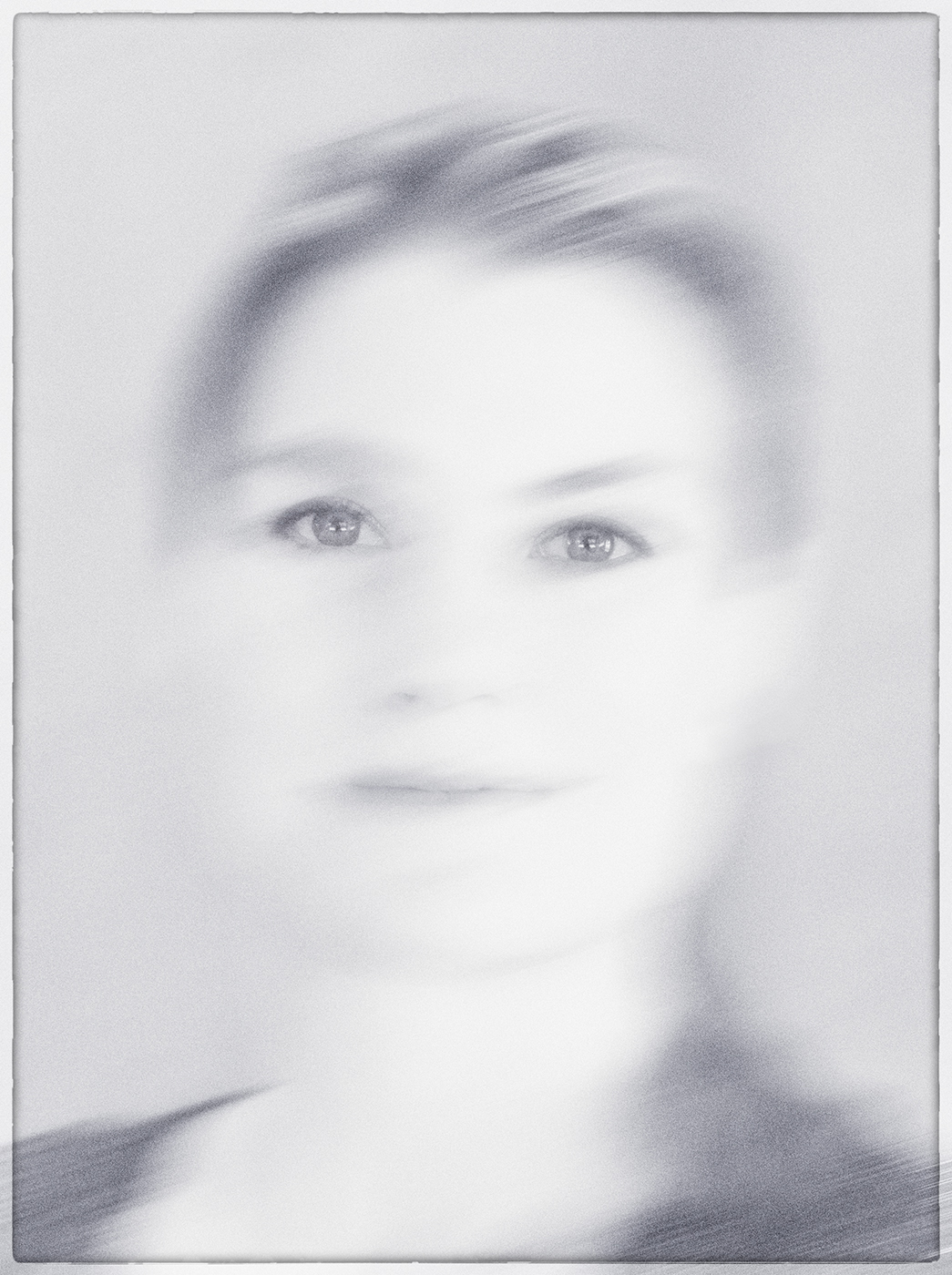
Hi Jan, I like the effects, the minimalist change to B&W, and the border. I'm distracted a little by her lighter left eye. IMO I would make them closer to equal. I went overboard by burning some of the left shoulder to, for balance. Excellent work. |
Jan 5th |
 |
| 34 |
Jan 26 |
Comment |
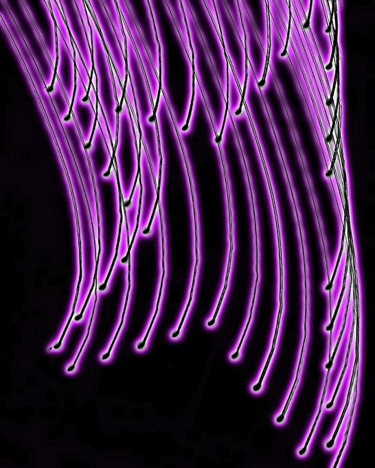
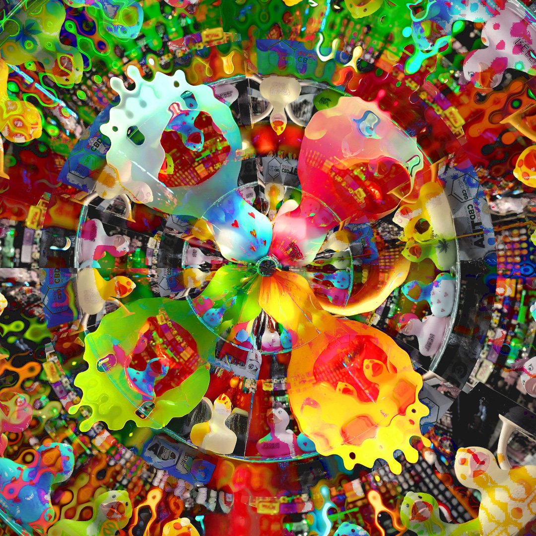
Hi Steve, I enjoy the resulting Kaleidoscope image you've created. I wonder about the blown out white tubes being included. I don't have a knowledge of the apps used, but I can remove the results using the remove tool in PSCC 2026. Just an idea if you wish to consider any changes. Nicely done. |
Jan 5th |
 |
| 34 |
Jan 26 |
Comment |
Hi Frans, I too think that this is an exceptional work. I'm not sure about the text though. What was the purpose of adding the location? |
Jan 5th |
 |
| 34 |
Jan 26 |
Reply |
Thank you, Steve. In this version I had tried creating drama using more contrasting lighting, darker blues and lighter red sky, but what would you want to see to feel more drama? I made the plane larger to make sure it was the subject being threatened by lightning. I also tried a white version of the supermoon, but wasn't thrilled. My wife liked that version better though. |
Jan 5th |
3 comments - 6 replies for Group 34
|
8 comments - 17 replies Total
|


