|
| Group |
Round |
C/R |
Comment |
Date |
Image |
| 34 |
Dec 25 |
Reply |
Thank you, Frans. |
Dec 28th |
| 34 |
Dec 25 |
Reply |
Thanks for viewing the video Frans, and your rendition is powerful. |
Dec 28th |
| 34 |
Dec 25 |
Reply |
Thanks, Steve. It is a simple composite and hopefully effective. I'll have to look and see what gradient was used. My Vision Panel from Blake Rudis, just calls it Atmosphere, and I must have been half asleep to think it looked better. It is clear that I am the only one who thinks so.
I wonder what the comments would be if you all didn't have the bright originals. I think the Atmosphere adds more than it subtracts. I also want to try to create some altered reality in my DD images, but sometimes we can go too far. That is why I like DD comments and not "Likes." |
Dec 20th |
| 34 |
Dec 25 |
Reply |
Yes, it does get better with each update to Adobe. If I can just get my new desktop to finish backing up on my NAS, I will try using more AI. |
Dec 20th |
| 34 |
Dec 25 |
Reply |
Whew! I seem to be having a hard time these days with communications. I'm clear in my mind, but what comes out of my mouth or written words is a different matter. Anyway, I still love the stories you tell with your images. |
Dec 20th |
| 34 |
Dec 25 |
Reply |
I'm sorry I wasn't clear. I'll try to clarify how I evaluate images. These are just my opinions and I seldom do well in competition. I use tools for tonal and color evaluation designed by Blake Rudis, f64 Academy. The tone evaluation of your image isn't actually a B&W version, but an evaluation of the brightest and darkest areas of your image. Gray areas are midtones. I used this to support my comment that your brightest areas include your subjects and therefore draw the viewers eye. IMO the silhouette is distracting by being too large and grainy. I made a mess of the vignette.
My eye is drawn to the snail by his clarity, but not until I've finished the bright areas which include the castle and some of the clouds. When I try selecting the subject in LR or PS the brightest part of the castle is included. That may be too technical, but me eye seems to see part of the castle before I see the Snail, even though it is sharper. I still think it is representative of your style, which is lovely.
|
Dec 15th |
 |
| 34 |
Dec 25 |
Comment |
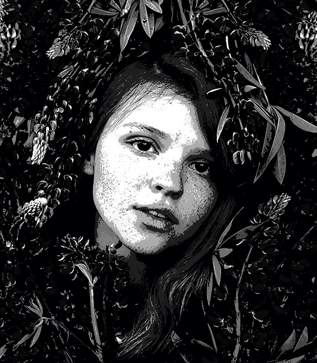
Hi Steve, I see "Scream" in the original stump, just without the hands. Your creation is interesting but somewhat busy and flat. I don't have Mirror Image, but may be there are options that allow more creative control. |
Dec 15th |
 |
| 34 |
Dec 25 |
Reply |
Thanks Peter. The gradient was used to add depth, but I failed to add a proper mask, which would have preserved the elements I wanted to bring forward. I am sure I had a polarizer. I'm also trying to make composites that couldn't just be taken with a camera-Altered Reality. I haven't been able to develop a creative style yet. I'll keep trying. |
Dec 15th |
| 34 |
Dec 25 |
Reply |
Thanks, Jan. Helpful comments. I should have masked out the tree and Balloons. The atmosphere was supposed to push the mountains and sky to add some depth. The crop is too tight. Never sure about PSA rules on AI, but I could have CA Moved the top balloon. I never seem to be able to completely finish an image. I need to start earlier and not be rushed. |
Dec 15th |
| 34 |
Dec 25 |
Reply |
I use the Tone and Color Evaluation tools developed by Blake Rudis. https://youtu.be/nTIlBJ4QkCc?t=15. Along with focus evaluation to help guide the viewers eye. Those tools help the technical artistry but not the story-telling and impact. That is more of the struggle for me.
The attached file is from the PSA website. © Tatsiana Rusetskaya
https://psaphotoworldwide.org/?
|
Dec 15th |
 |
| 34 |
Dec 25 |
Comment |
Hi Jan, I think that the image is reminiscent of the Mad Hatter, so I think your description of what captured your fancy is what the viewer will see. Your image tone evaluation matches what I was trying to say to Frans this month. The creator of art should lead the viewers eye to where the important elements reside. My wish would be for a lighter vignette and maybe dodge the hat, but otherwise a recognizable Jan Handman image for sure. |
Dec 7th |
 |
| 34 |
Dec 25 |
Comment |
Hi Frans, this is an amazing amount of work, and I think a spectacular result. Some of the left traffic flow needs a little clean up to match the right, but it is a beautiful composite and interesting to look about. Well done. |
Dec 7th |
| 34 |
Dec 25 |
Reply |
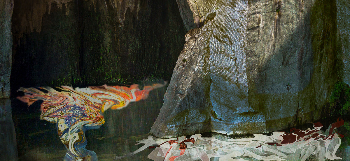
I am including an image that puts more emphasis on the suffering, which is what I think your emotions might have been. Just an idea. |
Dec 6th |
 |
| 34 |
Dec 25 |
Comment |
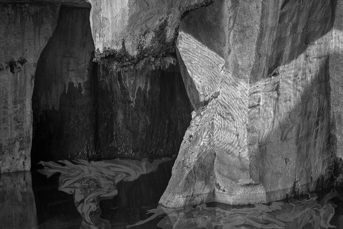
Hi Franz, I think the selection of your images could make the story you wish to tell. The composite though doesn't give me the same strong emotional feeling. My eye is drawn to the lightest and most detailed. The left side and bottom of the image is dark and not as detailed. Your two underwater images of pain and suffering are lost in darkness and O2's odd angle makes it less impactful. I might consider looking at the image in B&W to evaluate where the brightest areas of your image are. |
Dec 6th |
 |
4 comments - 10 replies for Group 34
|
| 41 |
Dec 25 |
Reply |
Thanks, Ian. I'll look it up. The background change does make the Triangle stand out more. |
Dec 26th |
| 41 |
Dec 25 |
Comment |
Hi Ian, I wondered where you had gone. Congratulations on your image in the new Members Showcase this month https://psadigital.org/.
I couldn't find the Journal entry. What month was it in?
This is a good example of your current work, IMO. What is it that captured your interest? What made you decide to remove the beautiful background in the original? Have fun in your new group. |
Dec 16th |
| 41 |
Dec 25 |
Comment |
Hi Brad, I'm visiting from DD34, via Current Images. Nomads caught my eye, as did your explanation. How did you use generative fill(in PS?) to adjust the neckline?
Did it meet the PSA standard "Other generative AI tools that generate new synthetic visual content based on external image data not originally present in the author's photograph are prohibited, regardless of how small the edited area."
Are you planning to use it in competition?
It most certainly is a creative composite. The images you used are well done and strong on their own. The color palette you ended up with seems a little too busy though. I'm not sure about the diagonal gradient across the torso either. The halo effect to me is distracting.
I am still trying to improve my storytelling and composite work, so my observations are to be taken with a grain of salt.
I added a randomized reflected Gradient (Noise, HSB, at 20%) until I picked a color that was just a subtle variation of your colors. I don't have a clue how to get rid of the halo-ish gradient. |
Dec 4th |
 |
2 comments - 1 reply for Group 41
|
6 comments - 11 replies Total
|


