|
| Group |
Round |
C/R |
Comment |
Date |
Image |
| 5 |
Oct 25 |
Comment |
Hi Pete, We are so happy we got to spend time with you and Cyndy. I do like the image color, and I imagine it looks even better in HDR. Great Dof, clarity and detail. We don't have much haze on the coast, Natalia, mostly forest fire smoke. |
Oct 16th |
1 comment - 0 replies for Group 5
|
| 29 |
Oct 25 |
Reply |
Just a hint aimed more at the group. This image works. |
Oct 25th |
| 29 |
Oct 25 |
Reply |
Thanks, Judy. I find I can use it more now than ever. As we are unfortunately learning, some bodies age better than others. Mine is in the others category. Say hi to Ed. |
Oct 25th |
| 29 |
Oct 25 |
Reply |
I try not to overdo myself, but if you work outside the box, it happens. I didn't add any texture, just a blue layer. I just use PS and LR for editing and the new Topaz Studio/Gigapixel for my own images. I keep them all updated. |
Oct 25th |
| 29 |
Oct 25 |
Reply |
The Perspective Warp or Perspective Transform tools will straighten most anything. |
Oct 23rd |
| 29 |
Oct 25 |
Reply |
Thanks, Elaine. It IS possible to get all the lines straight in an image. The Perspective crop tool in PS works well, usually. https://www.youtube.com/watch?v=ZuEJWNitu8Q |
Oct 21st |
| 29 |
Oct 25 |
Reply |
We did enjoy the trip with our family. Thanks, Bob. |
Oct 19th |
| 29 |
Oct 25 |
Reply |
Thank you, Kathy. I duplicated the layer, then used select object twice to get the birds, inverted the selection and added a Gaussian Blur. |
Oct 14th |
| 29 |
Oct 25 |
Reply |
Thanks, Tim. It was an interesting mansion and the grounds were beautiful.
|
Oct 14th |
| 29 |
Oct 25 |
Reply |
I had cropped out the left curtains. I'll try to find out what happened next week when I get home. I was in a hurry to get to my brother's home. |
Oct 12th |
| 29 |
Oct 25 |
Reply |
Correct. I do not have access to my images as they are on a NAS in WA and I am in MN. Your liquid zoom reference isn't known to me. |
Oct 12th |
| 29 |
Oct 25 |
Comment |
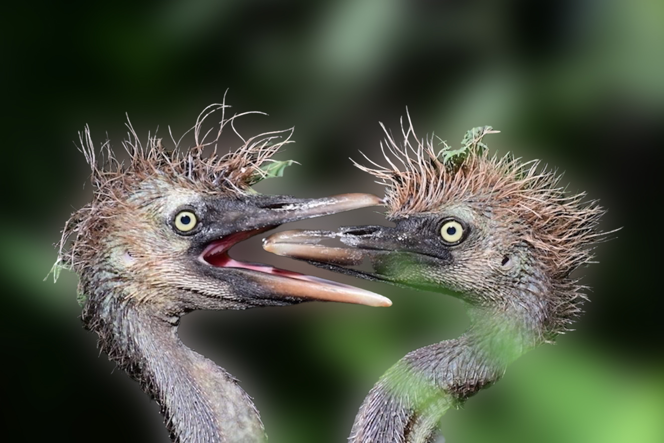
Thanks, Kathy. Great capture of two very homely herons. Eyes are really sharp, which is a prerequisite quality. Hard to compete with this lens, though. If you cannot enter it into a nature or wildlife competition, maybe you can simulate a blurred background. Obviously I'm not a nature photog. Gear costs too much, and is way too heavy. |
Oct 12th |
 |
| 29 |
Oct 25 |
Comment |
Thanks, Bob. Sharp, creative and worthy of our time. I enjoy looking at it and added a blue layer for another version, with more color in the sky. |
Oct 12th |
 |
| 29 |
Oct 25 |
Comment |
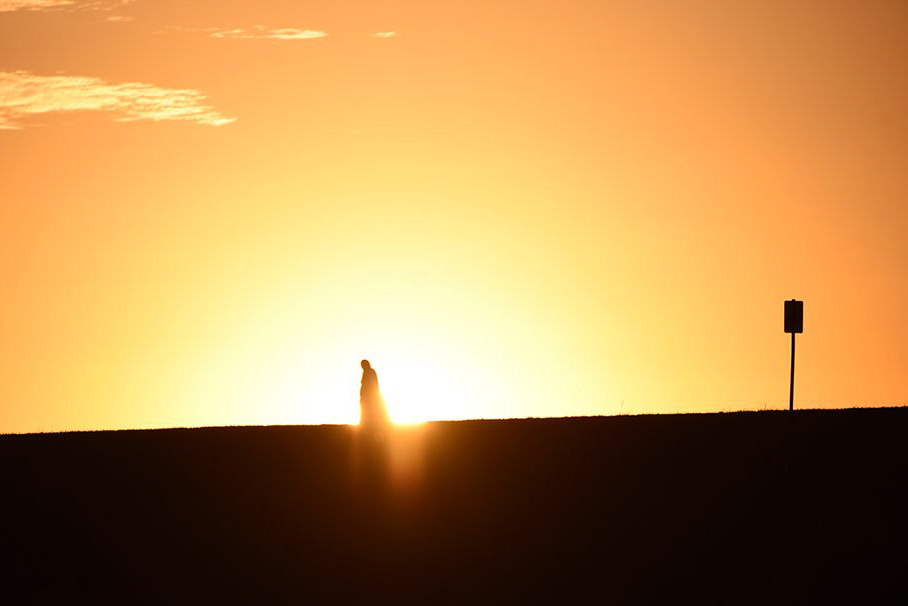
Thanks, for sharing, Karen. I also like the story of a man walking downhill away from modern life as portrayed by the sign. My eyes hurt looking at the main image. Not your fault, just my eyes. |
Oct 12th |
 |
| 29 |
Oct 25 |
Comment |
Thanks, Judy. I'm reading Art & Fear: Observations On the Perils (and Rewards) of Artmaking By David Bayles and Ted Orland. It was suggested reading by Brooks Jenson at the PSA Portland Festival, and I think this image matches their philosophy perfectly. As we get to a stage where we can take our art in a new direction, and it is fun, then do it. The more fun and errors we learn from, the better the creation. If I enjoy your work too, it is just a bonus.
I enjoy your work. Thanks for sharing. |
Oct 12th |
| 29 |
Oct 25 |
Comment |
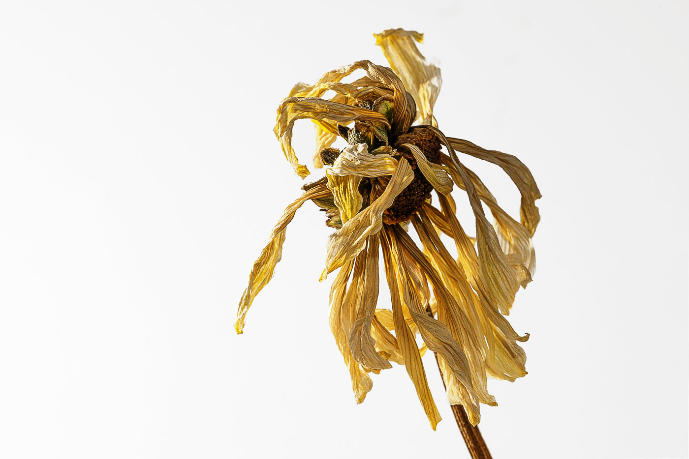
Hi Elaine. I can't say I share your enthusiasm for dying flowers, but your image is sharp and the muted yellow seems a proper choice for a life in its last spiral downwards. I think the slight diagonal helps add some interest for me. I changed the background color to more of a white, and added some warmth, but don't think it really adds anything. |
Oct 12th |
 |
| 29 |
Oct 25 |
Comment |
Hi Tim, your artistry is on display in every subtle facet of this image. You have taken a photo of two lovers gazing on two lovers. Not only does the light play into highlighting the three elements, but it also causes the female's legs and arms skin color to mimic the skin color of the two people in the painting. You also positioned yourself perfectly so that her left arm is highlighted by the greenish edge of the painting. The tats and elbow on her left arm also can be seen as a tearful face on close inspection.
There is some chromatic aberration on the man's clothing, but that may be just from being a jpeg, but should be looked at in ACR or your raw processor. The only other suggestion I have is to look at perspective warp as a tool to ensure all the lines are correct. https://www.youtube.com/watch?v=STCI_sgjVOo and also vanishing point. https://www.youtube.com/watch?v=OoHfZFl65fo
I am awed and inspired by your vision on this one. There may be no such thing as perfection in art, but this seems close to me. |
Oct 12th |
6 comments - 10 replies for Group 29
|
| 30 |
Oct 25 |
Reply |
Using my husband's laptop.....Dorinda :-) |
Oct 15th |
| 30 |
Oct 25 |
Reply |
I like both versions. Cannon Beach is such a beautiful place. |
Oct 13th |
| 30 |
Oct 25 |
Reply |
Jody, Good idea about the green bit. I will try it. Thanks for the comment. |
Oct 13th |
0 comments - 3 replies for Group 30
|
| 34 |
Oct 25 |
Reply |
Thank you, Steve. I took pains to use the ruler tool to get everything as close to symmetrical as I could. I've found the tool is very critical for architectural images. The high contrast worked here I thought. Most painters shy away from pure black. |
Oct 30th |
| 34 |
Oct 25 |
Reply |
Thank you, Peter. I enjoy making art, and the wrought iron is definitely what caught mt eye. I probably thought I'd remove the plant later. It was probably on its way to the plant repair shop. |
Oct 30th |
| 34 |
Oct 25 |
Reply |
Yes, thank you Frans. As far as telling a story, it is a pretty good attempt. I am more familiar with Medusa turning anyone who looks upon her to stone. Your story is expanded to allow her to place a curse. Still, a nice job of adding the skin to the maiden from the mirror. I don't know if the snake needs to be lower or not. I've always thought of Medusa as a victim herself(raped by Poseidon.)
I wondered if these were representing her two immortal Gorgon Sisters, who were also punished and turned into hideous women. |
Oct 21st |
| 34 |
Oct 25 |
Comment |
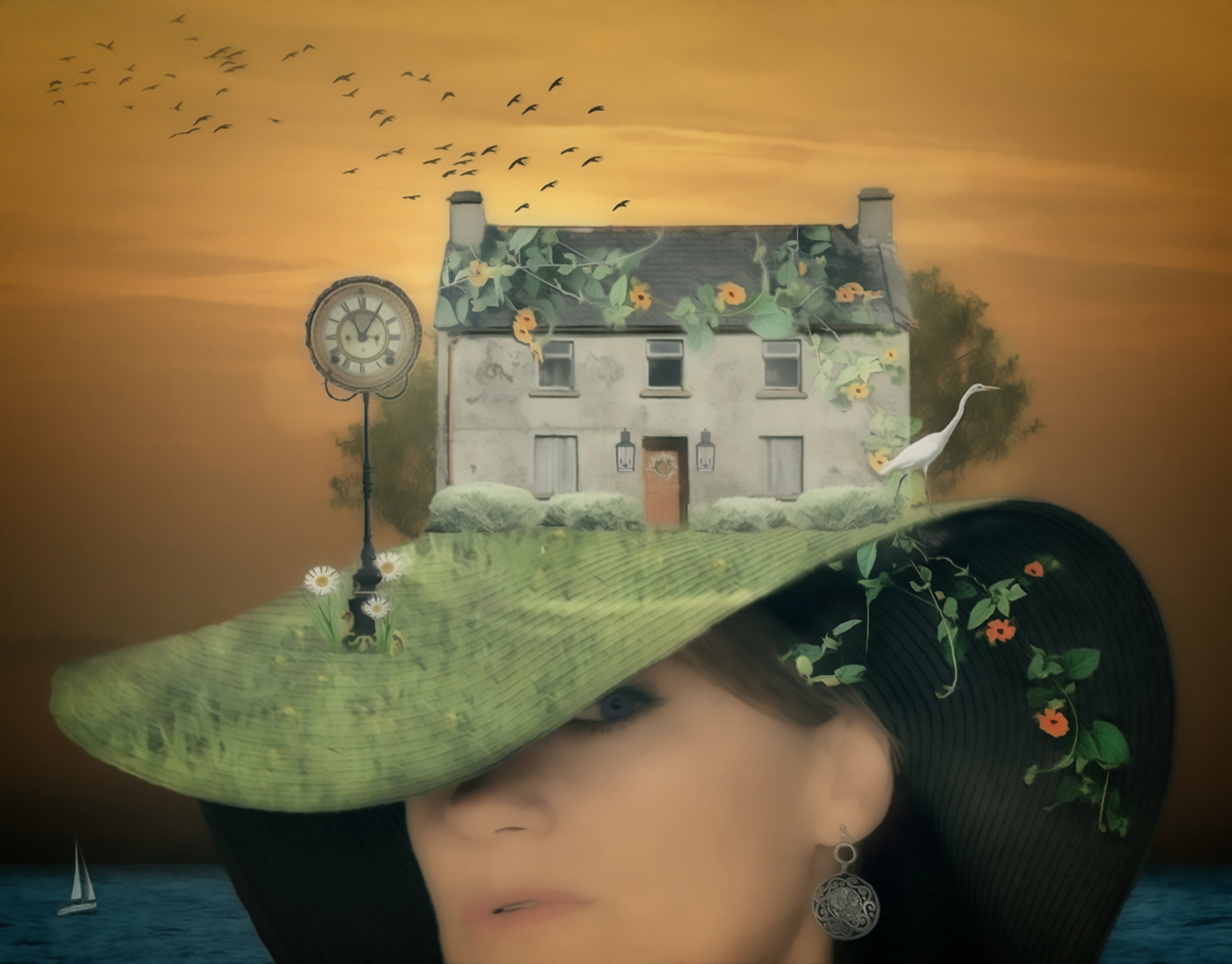
Hi Jan, Very creative image. I don't know what "other worldly" means to you, but I'm not sure it needed more glow. It has a lot of elements, and when I look at the tone map (or squint) the upper half of the image draws our attention. The face below the house has some glare that makes me linger there against my will. I burned my version with the colors close to the areas that I felt were either too bright on the face, grass, and bushes. I then dodged the house, sky, and clock to draw the eye more to them as the subject. Hopefully a subtle change. Your sense of color and light are amazing to me. I think the image could have been busy, but the color ties things together. Much to explore, even in the water. |
Oct 15th |
 |
| 34 |
Oct 25 |
Comment |
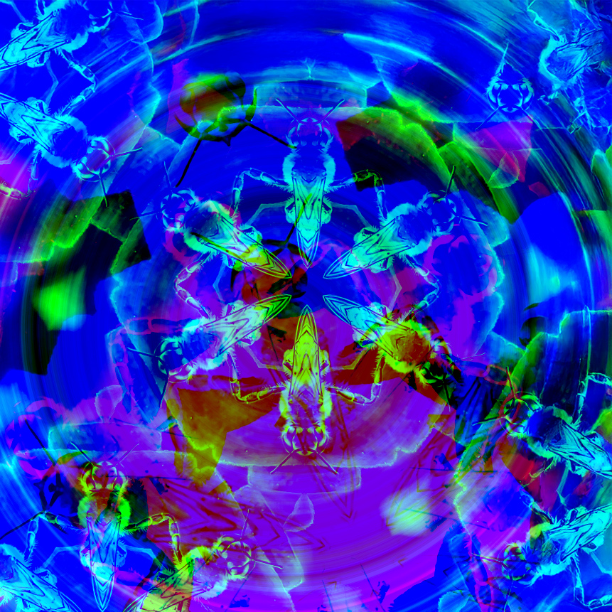
Hi Steve, I think it is amazing that you thought to use half a 3D image for our group. I'm not familiar with the Mirrorlab app, but it creates a bright and shiny effect. I took the liberty of playing with your image a little as the K" effect is a bit too bright for my eye. I added a radial gradient in photoshop. Just a different perspective. |
Oct 15th |
 |
| 34 |
Oct 25 |
Comment |
Hi Frans, I think the composite is nicely put together. I'm not sure that it is a photo story, unless this is that you learned. My knowledge of a photo story is a visual narrative that uses a series of photographs to communicate a story. Unlike a simple collection of pictures, a photo story arranges images in a specific sequence to create a cohesive flow, often with a beginning, middle, and end.
I like Jan's interpretation, except I would have liked a smile in the mirrored woman, or upon her release from the mirror and a fourth image of her with her eyes looking up at the snake. I would also like the collection progressing either right to left, or left to right. As presented, I think it goes from the middle, but maybe the right. The sequence is unclear to me. The processing is well done though. |
Oct 15th |
| 34 |
Oct 25 |
Reply |
Thanks, Jan. I hate to admit it, but I just took the image because I was getting bored sitting and waiting for my wife to finish her shooting. Your glow does improve the eyes and adds more balance. I'll have to get used to using outlines, borders and frames. I don't like them on initial submissions to the group. It doesn't mean that I don't like borders and frames, just that I want to make it easy for the group to add an adjusted image with their comments. |
Oct 14th |
| 34 |
Oct 25 |
Reply |
Thanks, Frans. D&B stands for Dodge and Burn. I usuall use one layer for each. Many ways in Photoshop to accomplish that same thing. |
Oct 11th |
3 comments - 5 replies for Group 34
|
10 comments - 18 replies Total
|


