|
| Group |
Round |
C/R |
Comment |
Date |
Image |
| 18 |
Jul 25 |
Reply |
Thanks Jan. Her beauty takes a hit for me from the dark streak across her eyes. Flipping both images for me was to try to visualize Robin's comment. Good image worthy of more work and maybe a new title. I had to look up the title.
Anorchid refers to the congenital absence of both testicles. I assume it is a typo, but I had to laugh when I found out what it means. Just goes to show why I always spell check my group DD29 posts, and of course my comments and replies here after they post. Tom gave us the ability to edit and I find it is a useful tool. |
Jul 31st |
| 18 |
Jul 25 |
Reply |
No need to be sorry, Jan. Loud and disturbing is how I see it, too. I failed to mask my face properly, causing myriad problems for myself. Positive comments are not my goal. |
Jul 30th |
| 18 |
Jul 25 |
Reply |
Barbara doesn't want to rename the "Creative" groups, so we are constantly trying to get new people to adhere to the main point of building Creative images in PS. If ever you wish to expand the use of PS on your images let Barbara know. |
Jul 23rd |
| 18 |
Jul 25 |
Reply |
Hi Karen, I wouldn't suspend them in space either. As I said, they were just quick edits. Creative images should take more time than filter images. Just depends on what you want from joining this group. |
Jul 23rd |
| 18 |
Jul 25 |
Comment |
Hi Joan, Excellent work. Wonderful image and pretty good placement for a gal with eyesight limitations!
Some artifacts came into the lower square, and the needles above the square were cropped off. (They are also cropped above, so maybe that was a choice.)The arcs in the top square are missing in the bottom square.
I fixed the artifacts, but didn't try restoring the needles or arcs. Should be fairly easy to do if you saved the layers as a copy. |
Jul 14th |
 |
| 18 |
Jul 25 |
Reply |
Thanks, Ian. The Original above is my "The Scream" image on a background. I'll include the original artwork saved from an online source, so you can see why I posed as I did.
It will continue to be a work in progress.
As I said before, there are at least four different paintings with this title from Munch. |
Jul 14th |
 |
| 18 |
Jul 25 |
Comment |
Hi Robin. Perfection is in the eye of the beholder.
Behold-Perfection!
Nothing better than a story told well. |
Jul 14th |
| 18 |
Jul 25 |
Comment |
Welcome Jan. I wish you had included both images. I like to show my ideas, as I cannot type, and struggle sometimes to explain things. I also wonder what your intent for the image was. What would you like in our comments?
I enjoy the concept of a face within the flower. It would be of interest to know your processing methods, too. I think Robin has the right idea about more blending. I might consider flipping the image vertically so that her severed neck would sit atop the red (blood.)
I might also use a gradient to add more mood, depending on what your goal was. |
Jul 14th |
| 18 |
Jul 25 |
Comment |
Hi Karen, I hope you see where we are going with our comments. Last month I gave you a couple of resources to look at for creative images. This month I just did a couple of quick edits to your image in PS. I removed the background. Then I used Place Embedded (FILE menu) to add a new background from my own background files. Then I changed the blend mode to Linear Light and the Fill to 25%. Finally I added a Linar Gradient Layer from the Purple group to blend it all together. Flying Flowers! Going forward, I hope to see you try to use more than filters.
Your image is sharp and while I wouldn't say I like the 50/50 split of the table/wall, the flowers are nicely muted to match the table cloth. |
Jul 14th |
 |
| 18 |
Jul 25 |
Comment |
Hi Ian, I like the pencil drawing, but I also like the arrow shape created by the landscape and reflection in the original. I might consider using it also for your filter. I am including a Poster Filter version from PS, a nice filter IMHO. |
Jul 14th |
 |
| 18 |
Jul 25 |
Reply |
You're welcome. I follow Blake Rudis (f64 Academy) who is a PS expert, unsuccessful painter, and not much better photographer but his recommendations are astute. |
Jul 6th |
| 18 |
Jul 25 |
Reply |
Thank you, Karen. I think I can learn about composition, tone and color by studying what grabs my attention in paintings. Putting that study into a project becomes more difficult. Some of my use of PS filters has reduced the effect of my man screaming in the image. I need to get that back. Munch's work, including The Scream, had a formative influence on the Expressionist movement. He described the work as only being able to be painted by a madman. He spoke literally of seeing a blood red sky. |
Jul 6th |
| 18 |
Jul 25 |
Reply |
Thank you, Joan. You can get a feeling how hard this has been for me. I've renamed and subsequently lost both files and layers. I will need to start afresh, probably, but I'm hoping for a lot of suggestions like you have done. Very helpful comment. |
Jul 6th |
5 comments - 8 replies for Group 18
|
| 20 |
Jul 25 |
Reply |
Hi Deborah, I like to see what other Creative groups are doing. The piece of cord is probably a chin strap. Gets windy in them thar hills. He looks more like a gaucho to me. I might try to composite him with a horse, if you have any. |
Jul 28th |
0 comments - 1 reply for Group 20
|
| 29 |
Jul 25 |
Reply |
Judy always make a mono copy too, so I think it is a good idea. |
Jul 18th |
| 29 |
Jul 25 |
Reply |
You couldn't offend me. Tom will fix it again, I hope. |
Jul 18th |
| 29 |
Jul 25 |
Comment |
Hi Bob. I'll comment (again) on your now properly displayed image. I still enjoy the symmetry created by duplicating and flipping the mirror imaging. There is so much to explore, as you said. Great job building this.
How many layers did you end up using? |
Jul 11th |
| 29 |
Jul 25 |
Reply |
Thank you for the proper admonishment, Bob. My apologies. I write as poorly as I make images.
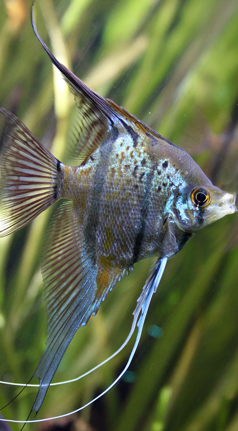
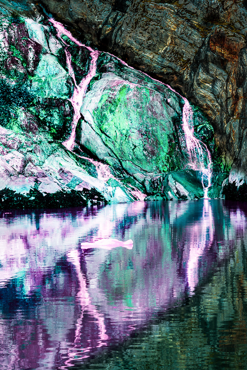
I cropped from the left to start the fish to help define it. Had I just used the image as is, I see a freshwater Angel fish defined by the waterfall rivulets. If left alone the rivulets would make it a fancy Angel. It seems that either my seizures or medicines now cause me to see things inside other things. You can call me Mad Bob!
The fish is half in green above the water and reflected in purple in the water. I just tried a linear gradient to highlight the fish I see, along with sharpening and some clarity. The colors weren't meant to do anything but add definition to the fish. I darkened and blurred the rest of the stone and its reflection
The fish starts on the entire left frame, decreasing diagonally to a small white toothy mouth. The eye in green above and just behind the mouth. The dark stone and reflection become the opposing triangles. The whites are too bright for my taste and probably detract from a decent fish image, but I don't mean to create a finished product.
Hopefully this is a better description of my comment. I guess dialogue is a better way of commenting than one and done. I struggle to not read things into written words using my own developed bias, education and experiences. Talking is my preferred communication method, as I am able to clarify my thoughts easier. |
Jul 11th |
 |
| 29 |
Jul 25 |
Comment |
Hi Elaine,
The cityscape is terrific, the sky adds interest and technically the phones now take great images. There are a lot of things in the water that appear to me to be artifacts, but could just be things in the air above the water. I might consider cropping the water to where you like the reflections.
I would like to see more info in your descriptions. The group would be happier to respond if you add a description of the subject matter, the effect you're trying to achieve or why you took the picture.
|
Jul 10th |
 |
| 29 |
Jul 25 |
Comment |
Hi Kathy, I really like your action shot. I've never been to Naples, but I'm sure it was a fun trip. The diagonal adds to the action, and I think it is sharp and well exposed. I like Tim's version also, so I'll give you some more choices. I created a copy in LR, changed the WB and Profile to Auto, used a Lens Blur, and finally a light vignette. I also like it more contrasty like this too. I assume most of the LR features are available in Elements. Great start in DD29. |
Jul 10th |
 |
| 29 |
Jul 25 |
Comment |
Hi Bob, I really enjoy the symmetry you captured or created in your original image. I also appreciate the diagonals in your Original 2 image, and with some D&B and maybe some blur, could bring out a fish creature I see. The same could be done with the final image, should you also like the fish. I don't think it is as much oversaturated as it is busy and flat. It is fun to play with images and you have created a very interesting abstract from a natural landscape. |
Jul 10th |
 |
| 29 |
Jul 25 |
Reply |
Thanks, Judy. I had given up hope of ever shooting again after my tremors started. But since I was diagnosed and treated for PD, I bought gear again. Living here and having pool therapy has made me active again. I still don't have as much energy, but am doing so much better. Just can't figure out why my LRC is balking. |
Jul 10th |
| 29 |
Jul 25 |
Comment |
Hi Karen. I haven't been to Florida since my dad died, but I looked at all of my gator shots, and I have none this good. I agree some crop from the bottom would make it appear bigger and more manacing if possible, but I know their eyes are always a deadly black. Probably why they are prehistoric. It looks like a croc to me, but it is hard to tell how pointed the nose is. Great image. |
Jul 8th |
| 29 |
Jul 25 |
Comment |
Hi Judy, I'm suffering from Burr-itis and am having laptop problems. This is a classic Judy Travel image and I appreciate them all. Did you make a B&W too? It might bring out the window people to your advantage. |
Jul 8th |
| 29 |
Jul 25 |
Reply |
You did indeed let me know. It is hard to believe I remember anything these days, but I rememberr this discussion from years past. |
Jul 8th |
| 29 |
Jul 25 |
Comment |
Hi Tom, Sorry I'm late making comments, but my new lightweight laptop doesn't like me. I'm not a PJ image maker, but I love your subtle use of a diagonal to promote the action. Your use of a diagonal level between cars adds a level of sophistication and creativity the image, making it more engaging and captivating. I'm also not a racing fan, but the cyan(ish) cast to the smoke bothers me. It may be from the gasoline fuel, but, it may be realistic but seems a lot on the cyan side of blue/green color. I used the LR Color Picker to add more blue. The crowd is a plus in my opinion, and gives good balance/depth. |
Jul 8th |
 |
| 29 |
Jul 25 |
Reply |
Thanks, Tim. Time to go back to shooting real images. |
Jul 7th |
| 29 |
Jul 25 |
Reply |
Thanks Karen. As I said this image was more for practice, seeing what this lens could do, and then I just decided to put it up as a background test too. Your idea is a good one. |
Jul 7th |
| 29 |
Jul 25 |
Reply |
Thanks, Elaine. |
Jul 7th |
| 29 |
Jul 25 |
Reply |
Thank you, Bob. I sometime use my Backgrounds images as middle grounds too. I try not to limit myself too much and hunt folders when I am compositing. This will probably end up in DD18 some day. Kathy gave me a good suggestion about a composite. It is a fun lens to use and will require much more practice for me. |
Jul 6th |
| 29 |
Jul 25 |
Reply |
me too. |
Jul 6th |
| 29 |
Jul 25 |
Reply |
Thank you, Kathy. Ultimately it is destined for my Backgrounds folder. I left in the red/yellow you took out because I thought it might be balanced from the tringle made by the red/yellow combos on the left edge. Since they are sharp and the area you removed is blurred, I think I was wrong. |
Jul 4th |
7 comments - 11 replies for Group 29
|
12 comments - 20 replies Total
|


