|
| Group |
Round |
C/R |
Comment |
Date |
Image |
| 18 |
Jun 25 |
Reply |
Hi Jan, Thanks for the comment, and welcome to DD18. |
Jun 16th |
| 18 |
Jun 25 |
Reply |
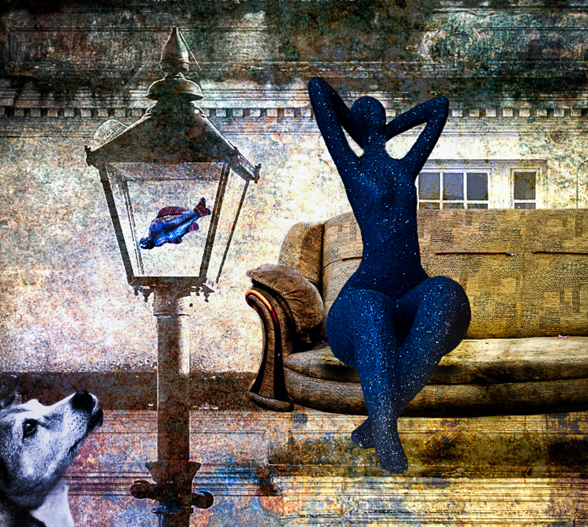
Thanks Robin,even though you want us to make our own story up, that could be stated in your description. That would give me a starting point for my comment. My understanding of juxtaposition in photography is using color, texture or motion as a contrast or comparison between several, usually two elements to invoke an emotion or reaction. I presume you may have been using some contrasting warm and cool colors, and some contrasting images to compare live and inanimate objects, and there may even be more. That makes the image way too busy for me to grasp a story. I cooled the fish in the lamp post, which was a mistake on my part. It is more of a contrast to the dog as you used the red v B&W dog.
I don't see any gestalt objects, but that doesn't mean there aren't any.
My suggestion would be to limit the colors or objects to a single comparison or contrast. It is an interesting and well done composite nontheless, just over my head. |
Jun 12th |
| 18 |
Jun 25 |
Reply |
Thanks, Ian. I didn't try to match anything with the new canvas extention. Maybe I'll make him a space cowboy like Clint Eastwood. |
Jun 11th |
| 18 |
Jun 25 |
Reply |
I don't mind borders for finished images, but for our DD study groups other than creative, it makes it difficult to remove the border to create an image showing what you are talking about in your comment. For creative groups I don't feel the need very often to attach an image. |
Jun 11th |
| 18 |
Jun 25 |
Comment |
Hi Robin, I think the image is well composited technically. It is interesting and the colors work well together.
I wish you had given us a bit more in the description as to what you were trying to convey. As far as the elements you've chosen, do they have any symbolism or connection?
I wish the image were more balanced. I think cropping it might also make it fit the definition better of looking unexpected.I'm adding an optional image. I added some unifying color to the elements and a radial gradient across them all.
|
Jun 11th |
 |
| 18 |
Jun 25 |
Comment |
Hi Karen. Thank you for joining the group. I enjoy your use of filters in this image. I like the balance and harmony of the image, especially after expanding the canvas.
Adding borders can be problematic and looks to have been a contributing factor to cutting off the stem. Assuming PS works the same on a Mac as a PC, I would increase the canvas first then add the border to the new canvas.
If you wish to see what other creative artists are doing in DD, I would look at the Current Images (top menu row) https://psadigital.org/groups/images.php
and sort them by theme. Jan Handman, DD34 is especially good with composites, and her webpage is spectacular IMO. https://jhandman61.wixsite.com/jhandmanphotography
Really nice first group18 image. |
Jun 11th |
| 18 |
Jun 25 |
Comment |
Hi Ian, I really like impressionism, and this looks very much like a modern abstract impressionist painting. I'm probably creating a non-painting category, but that is how the image makes me feel. The colors are soft and mostly soothing, even the red.
If it were printed and hung on a wall, I probably would not want any borders but approprite mat(s)and frame. For PID I think borders are okay but distracting IMO. |
Jun 11th |
| 18 |
Jun 25 |
Reply |
Thank you, Karen. Welcome to the group. I assume your opinions will be shared by most. I want the image to work better and probably just replacing the background altogether would have been the wiser choice. Creative groups are not used for making images appear more "realistic" so that part isn't important to me. The far background was the brightest part of the original and I was hoping to redirect the eye to the cowboy. Definitely a work in progress. |
Jun 9th |
3 comments - 5 replies for Group 18
|
| 29 |
Jun 25 |
Reply |
I hate to say this, but I have never competed in PJ, so I never knew the rules. I even had a Fuji X100V which is primo for street photography. |
Jun 21st |
| 29 |
Jun 25 |
Reply |
You have to grab what you can when available. Good job. |
Jun 21st |
| 29 |
Jun 25 |
Reply |
Thanks, Bob. The remove tool does an excellent job if there is a clear area, but sometimes I have artifacts show up if it is a busy area. I'm not sure if I am explaining it correctly. but I must carefully inspect removals for unintended additions from nearby objects. AI allows some unwanted and strange artifacts occasionally. |
Jun 21st |
| 29 |
Jun 25 |
Comment |
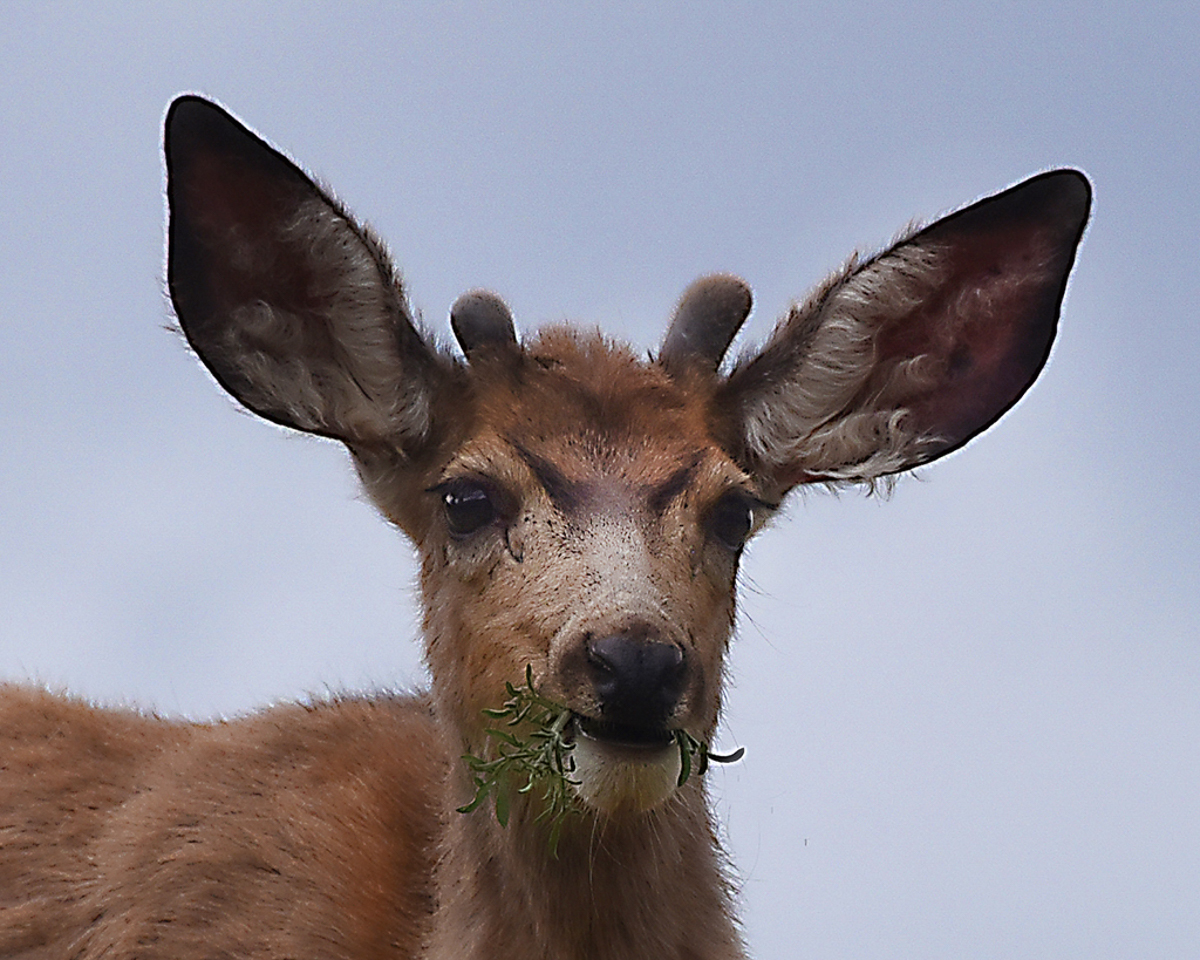
I hope after you caught the young buck, you let him go. I agree that global sharpening isn't always effective, and I did some reverse engineering with clarity and texture on the buck and increased the eye highlights as best as I could. If I took my time, I could add some white irises to make him more animated. Great "capture!" |
Jun 19th |
 |
| 29 |
Jun 25 |
Comment |
While I replied to Karen's comment a lot, I want to add a comment myself.
I like what you created. The innovative design works for me. It is colorful and creative. My version is just a copy with LRCC Auto color balance and a different crop. Just playing with your image. Thanks for all the dialogue. |
Jun 19th |
 |
| 29 |
Jun 25 |
Comment |
Beautifully captured, Elaine. Not much I could offer, but maybe a little warmer if some judges don't like the cold version. |
Jun 19th |
 |
| 29 |
Jun 25 |
Reply |
Thanks, Tim. I would have to do some cleanup of the flowers if this were a candidate for competition. It was indeed glitter. D&B too needs to be done to get some depth. |
Jun 19th |
| 29 |
Jun 25 |
Reply |
What is it that you disagree with about the sky as a reflective surface?
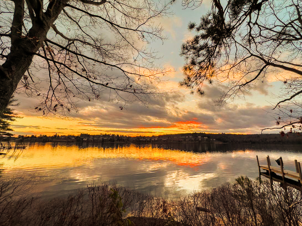
The composition as presented has a land mass and trees from the Original, then the area above the land mass composited with a version of Original2. Therefore, it becomes a recognizable sky area and keeps the image out of the abstract category for me. I think your Original has enough color for the composition, but I'm adding a warmer version for an option and your Original 2 is worth keeping as a background for another abstract. |
Jun 17th |
 |
| 29 |
Jun 25 |
Reply |
Thanks, Judy. They're good at keeping the dining room looking nice here. We've been here seven months now and are getting more acclimated to community living. A little over two hundred people are here and we are among the younger ones. I'll consider removing the spectral white glass spots. They bother me more on cars than bowls. |
Jun 17th |
| 29 |
Jun 25 |
Reply |
Thanks, Elaine. I usually stop down two stops for red with my Z8 but wouldn't have a clue how to do that with a phone, so I did it in LRCCC. No, the lilies weren't white, or didn't appear to be under our dome ceiling light bulbs.
Another week to go with my ear. |
Jun 17th |
| 29 |
Jun 25 |
Reply |
Thanks, Judy. The AI part of my rant wasn't aimed at your image in particular. What we don't always know when using editing apps, even Adobe uses it extensively, is the extent the app is using AI in their programming. AI is here to stay, for good or ill to photography. |
Jun 17th |
| 29 |
Jun 25 |
Reply |
I am a firm believer that this is where digital photography was always headed. Once film photographers (Ansel Adams) found ways to advance their images to an artistic level, photography became an art medium, rather than just documentation.
AI will take that even further by making perfect documentary images, a possibility that camera makers can't duplicate. I would still prefer to have control over images as opposed to having just an interpretation based on a database of images.
I'm showing my age, but I no longer think our generation will make the final decisions. |
Jun 14th |
| 29 |
Jun 25 |
Comment |
Hi Bob, I think that even in an abstract I have a tough time imagining the sky as a reflective surface, or a surface at all. Each image looks to be stand alone as they are, although I'd keep looking for a composite that works for the reflections as a background. Even then, I might try to increase the shadows until the trees aren't a stopper. Just a thought. I'll try to add an image later. |
Jun 14th |
| 29 |
Jun 25 |
Reply |
Thanks, Karen. A tighter crop is a better idea for me also. |
Jun 14th |
| 29 |
Jun 25 |
Comment |
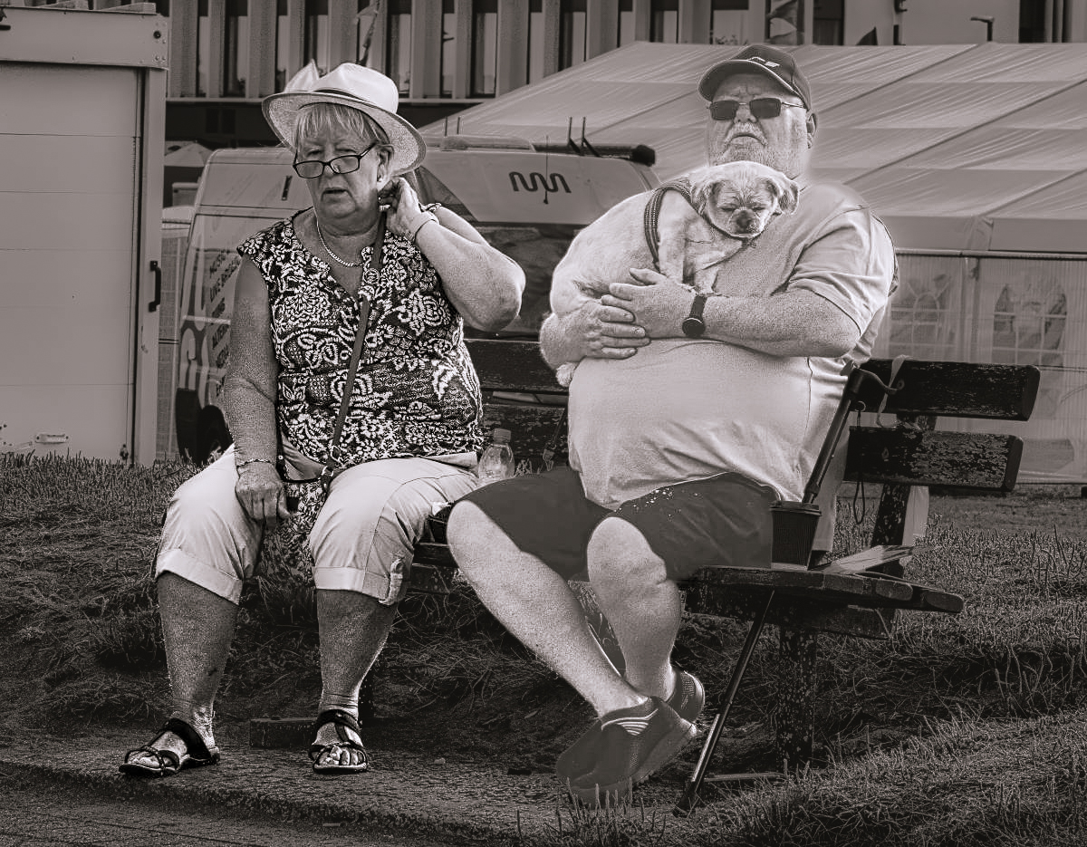
Hi Tim, I like the subjects, and their expressions are great. They look beat. My story is that he is retired from the military, USAF, but his hat is tilted back so I get to make my own guess. The spoiled little pooch gets a nice soft seat, while the wife fends for herself and her camera.
As for your settings, I would suggest a much wider aperture to blur the busy background. If the bench had been in front of a solid color, such as a building it wouldn't matter. The harsh light actually helps explain their expressions as it shows how hot they must be. Good capture. |
Jun 13th |
 |
| 29 |
Jun 25 |
Reply |
Thanks, Bob. Hmm. Good catch on the adjoining table. I didn't see it. That will pose some work to remove as it doesn't appear to me as a simple crop would do the trick. |
Jun 9th |
5 comments - 11 replies for Group 29
|
8 comments - 16 replies Total
|


