|
| Group |
Round |
C/R |
Comment |
Date |
Image |
| 18 |
Apr 25 |
Reply |
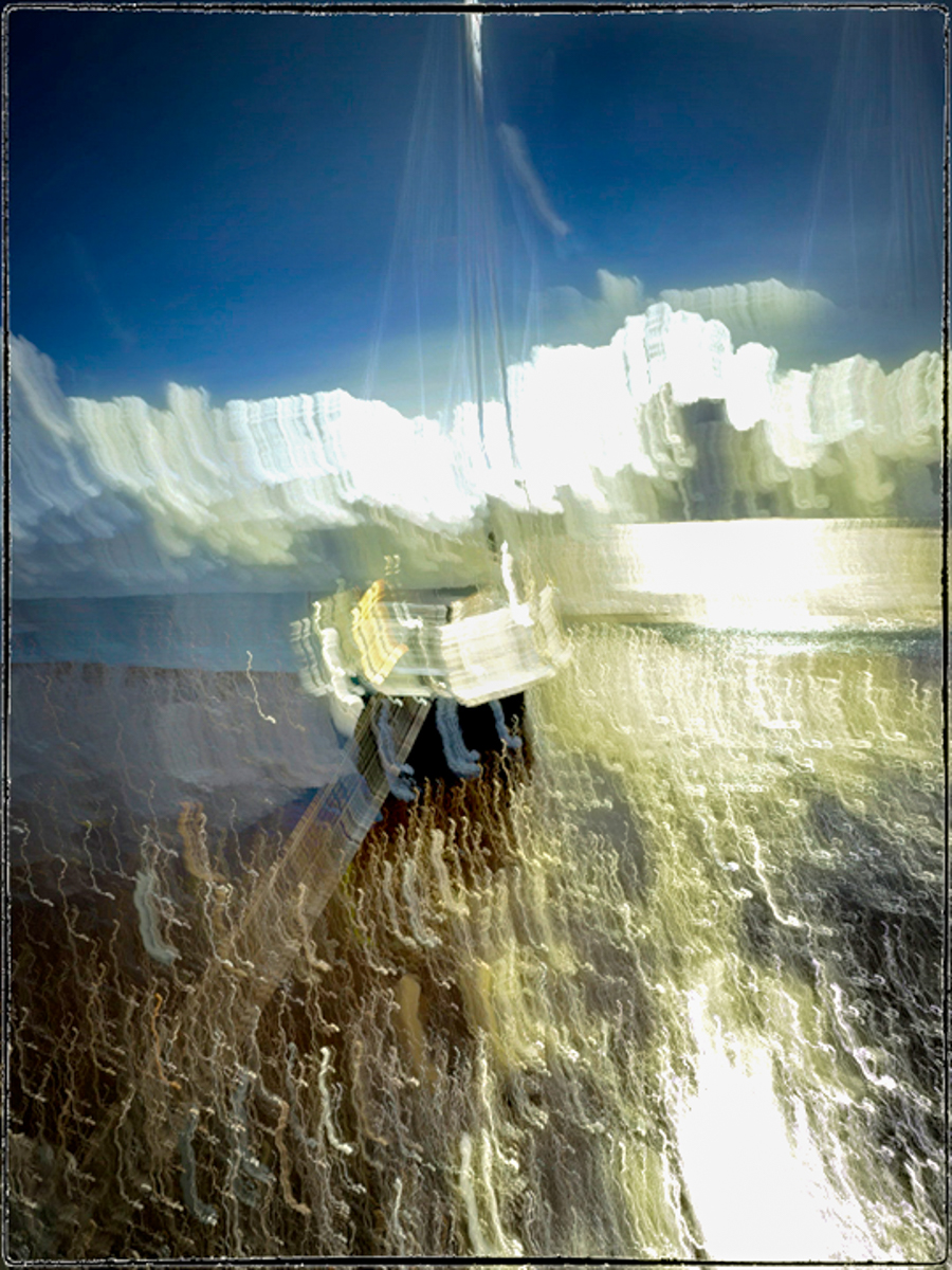
Thank you so much. If I were viewing this at a gallery, I would agree that I should feel what I feel.
But since this is a "study group" we need to expand our "dialogue" to help each other grow. It takes more time of course, but we signed up to learn and share. Your answer is just what I wanted. I would have guessed your motion to be down, but now I see why the sails extend upward. A longer exposure than I've tried for ICM too. Great explanation for a goal well met. |
Apr 22nd |
| 18 |
Apr 25 |
Reply |
Thanks, Robin. They are indeed great animals, and dangerously wild, although you wouldn't know it from the way people get too close just to get a selfie. Charging is the right word too. |
Apr 22nd |
| 18 |
Apr 25 |
Reply |
Thanks, Ian. |
Apr 22nd |
| 18 |
Apr 25 |
Reply |
I'm replying to your reply via Ian's comment.
I still wonder why you took this image using ICM. What was your goal? Did this meet your goal?
I just played with it some. I'm not sure about the white at the top, though.
|
Apr 22nd |
 |
| 18 |
Apr 25 |
Reply |
I agree with you, Ian, and Barbara has no interest in changing her definition, which I just copied and pasted from the guidelines. Since Gunter has left, I won't mention this again. |
Apr 22nd |
| 18 |
Apr 25 |
Reply |
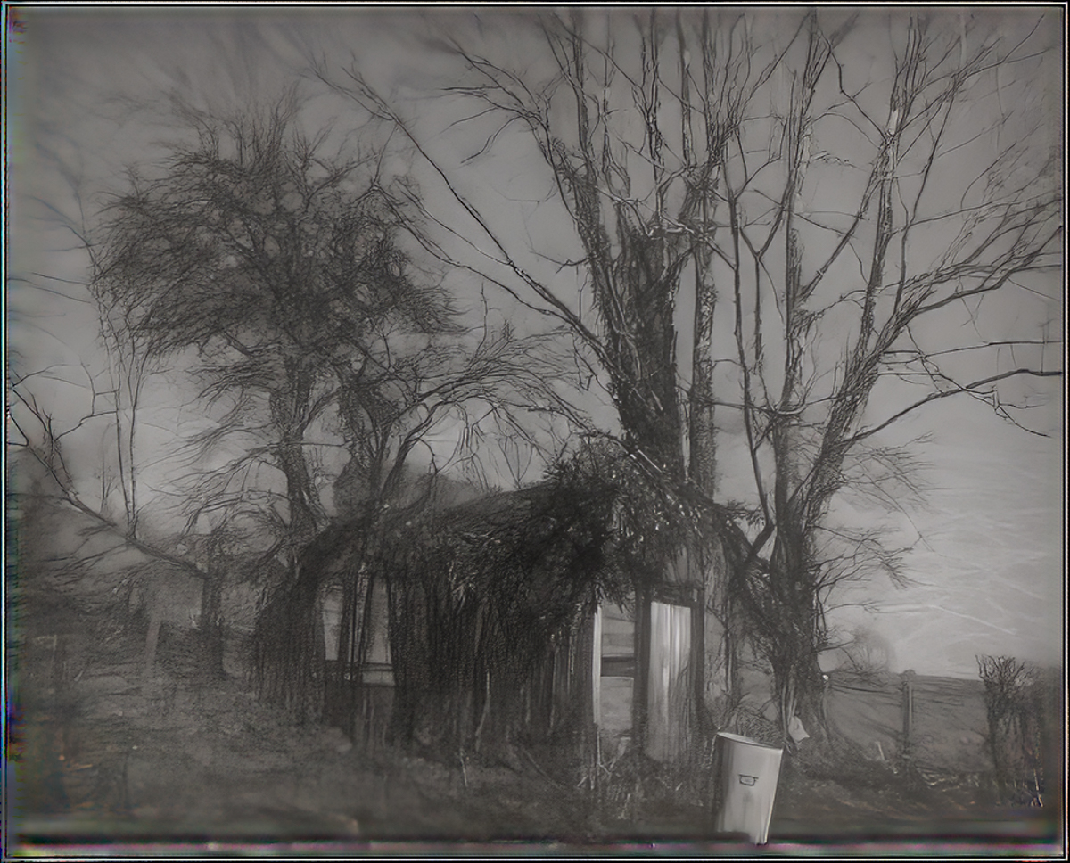
Not a problem. I like the light on the doors and dustbin (trash can in American English.) I did a little cropping on this version to increase the size of the shed and dustbin since they are your subjects. The light is still terrific. |
Apr 22nd |
 |
| 18 |
Apr 25 |
Reply |
No problem! |
Apr 17th |
| 18 |
Apr 25 |
Comment |
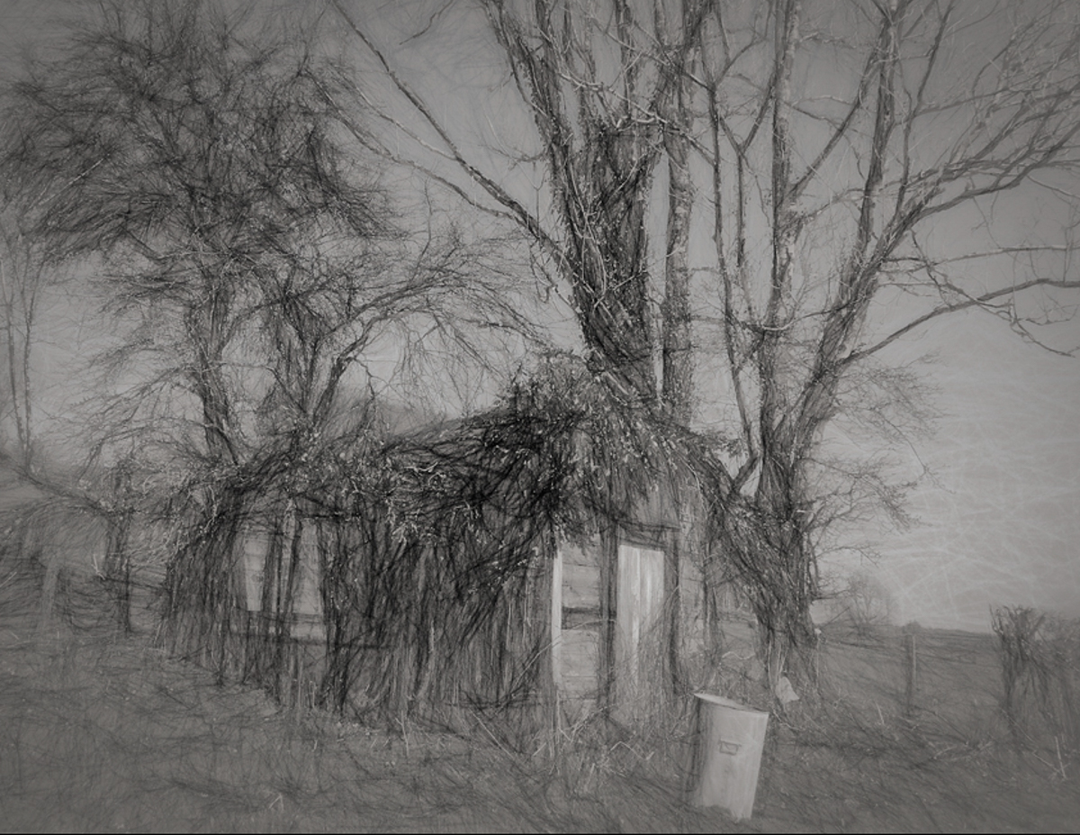
Hi Joan, it is a beautiful image for us to enjoy. |
Apr 16th |
| 18 |
Apr 25 |
Reply |
Thank you, Joan. I must admit I have no idea what a bubisdon is. I take it that the scale ruins the image for you. Original #2 is from one of the hot springs, which I used for the color and texture. |
Apr 16th |
| 18 |
Apr 25 |
Comment |
Hi Robin. I applaud trying ICM, and it is a great technique to get Impressionist photographs. Eva Polak is another major source. https://www.youtube.com/channel/UCmhmYOlVr7bktdq6Yt7OQSA/videos
I would also wonder why you took the image. What was your goal? Did this meet your goal? What would you like from the group?
I hate to go back to the discussion of whether this is an image "created" for the group. In the definition of the Creative category "A camera or other light gathering device could never solely capture such images as they appear in the altered image."
|
Apr 16th |
| 18 |
Apr 25 |
Comment |
Hi Ian, it would be interesting to know what you saw here that made you take the original image. I don't see a story unless someone was living here. I'm unfamiliar with the can too. The processing is terrific though. It is a bit flat for me and so I took it into PS, playing with contrast, adding some atmosphere to the foreground to lighten it back up. No longer a pencil drawing, but I don't know if you were married to that part. I left the can alone, although I was tempted to remove it. |
Apr 16th |
 |
3 comments - 8 replies for Group 18
|
| 29 |
Apr 25 |
Reply |
Thank you, Elaine. I mostly turn my images into abstracts, although I have used many straight up (after processing in Adobe and sometimes Topaz, of course) for our walls and our family likes our images too. Dorinda (DD30) is a much better photog than I am, so more wall space is hers. I've kept the colors as is to enter local competition this year. |
Apr 28th |
| 29 |
Apr 25 |
Reply |
Thank you, Judy. Colin Smith approaches several remedies for anyone wanting to remove glare or spectral highlights.
https://www.youtube.com/watch?v=ojfoGBT1YIM |
Apr 21st |
| 29 |
Apr 25 |
Reply |
I used LR and PS to select objects and foreground and then darkened them that way. I assume you can also use PS Express in the same way. As you say, you are a more realistic photographer and less of a creator. The red building is even more distracting IMO. Green might work if you can't remove it in your divisions.
I try to explain my reason for processing as I do that when I stare at a subject, concentrate, then I don't see the rest of the view in sharp focus, so everything being sharp as realistic isn't true in normal vision. Maybe only my eyes work that way. |
Apr 21st |
| 29 |
Apr 25 |
Reply |
Me too. Increases the depth. |
Apr 17th |
| 29 |
Apr 25 |
Reply |
Thank you, Tim. I had to look up pareidolia, and found out not only the meaning, but that Leonardo Da Vinci even wrote about the concept during the Renaissance. Not bad for a word coined from the German "Pareidolie" in 1962. |
Apr 15th |
| 29 |
Apr 25 |
Reply |
It's a thought. Bob. |
Apr 15th |
| 29 |
Apr 25 |
Comment |
Hi Ron, highly creative image of your Pookie. I am impressed by the colors and the ICM. It might be interesting if you have a good shot of the face to composite to bring back a clear nose. The eyes are perfect. I've taken a different tack than Karen, by cropping and warming. I don't really like the blue around his neck. Dealer's choice though. A gem for your portfolio. |
Apr 15th |
 |
| 29 |
Apr 25 |
Comment |
Hi Bob, I spend a lot of my time now going through old images. So much has evolved in editing, it is possible to do some nice things even to film prints. The color is beautiful. and the image is sharp. I did some cropping and removed some white spots. There are still some spectral highlights, but not too bad for what I think is a midday shot. Excellent job finding the image.
|
Apr 15th |
 |
| 29 |
Apr 25 |
Reply |
Thank you for posting this, Karen, even though you didn't want it. I couldn't post it as an Original since there were already comments. |
Apr 15th |
| 29 |
Apr 25 |
Comment |
Hi Karen, I can't even imagine how a zoom at 300mm could have been so sharp, but I agree. The eyes are supersharp which is terrific for wildlife. The rocks and ledge, not so much. I know Tim is correct, but with the sharpness fixed in the kit and rock, the pine no longer seems distracting to me and gives it a more environmental feel. The fox is still a little oversharp in my image. |
Apr 15th |
 |
| 29 |
Apr 25 |
Comment |
Hi Judy, June in the Palouse is about as good as farmland gets. I agree with others that the house is distracting, so I took it out using the Remove tool. Your forte has always been focused documentary photography, and this is no exception. A well-done image. The sky and canola are very bright, and the wheels and grass are darker.
I played around with it to add more contrast and cropped it some to make the wheels fill more of the frame. I wish we were younger and more mobile. I have a feeling a wide-angle lens shot from the canola side could have produced a spectacular image. |
Apr 15th |
 |
| 29 |
Apr 25 |
Comment |
Hi Tim, I too, think the pan adds needed action to the shot. The road looks slightly elevated, but the car is level. The driver is sharp, and the blur is pleasing. Wonderful job.
I like that the road around the curve is bright enough to catch our eye yet not distracting. Even though the hood and helmet are in bright light I wouldn't mess with that.
I find there to be a blue color cast to the midtones, which can be removed, should you choose. I added some warmth in Photoshop. |
Apr 15th |
 |
| 29 |
Apr 25 |
Reply |
I have uploaded the new image. Please note for future reference that I can upload a new image if you have made an error in sending me the wrong image.
It isn't necessary in our study group to send what you consider perfect images anyway. Submitting an image that you may be struggling with is an effective use of DDG. Doing so may lead to an award-winning image. |
Apr 11th |
| 29 |
Apr 25 |
Reply |
Thanks, Karen. You are right! I thought of it as an alien. |
Apr 10th |
 |
| 29 |
Apr 25 |
Reply |
Thank you, Bob. I see two eyes and a nose as is, which is a better description than a face, but your point is well taken. A mask is a better description of what I saw when making the crop and rotating the image. |
Apr 8th |
5 comments - 10 replies for Group 29
|
8 comments - 18 replies Total
|


