|
| Group |
Round |
C/R |
Comment |
Date |
Image |
| 18 |
Mar 25 |
Reply |
Testing back at you. I did not get a comment notification though. |
Mar 26th |
| 18 |
Mar 25 |
Reply |
Thank you, Joan. I do apologize for my lack of creative juices. I'm afraid I did not properly prepare a creative image again this month. I'm taking over DD29 again as admin. It was my original group with DD. I hope to have a proper image in April. I am a VIP member of the Photoshop Creativity Virtual Summit 2025 starting tomorrow and hope that will provide enough training and inspiration to get me on track. There is a free version also. https://www.pscreativitysummit.com/ |
Mar 22nd |
| 18 |
Mar 25 |
Reply |
Your comments this month are immensely helpful and inspire me to take more time with my images for this group. I hope your eyesight has been accurately diagnosed and treatment is available to slow the progression. Good luck. |
Mar 22nd |
| 18 |
Mar 25 |
Reply |
Thank you, Suzy. I agree that I need to reduce the brightness/luminosity of the log. The whole composition is probably weak. |
Mar 20th |
| 18 |
Mar 25 |
Reply |
Cropped version. I know I'm being weird, but I'm trying to connect. |
Mar 20th |
 |
| 18 |
Mar 25 |
Comment |
Hi Ian, I thought I had already posted a comment, but I guess not. The additions you have made give the image pop. I had a hard time finding a line to align to, but finally just decided it may not need levelling, yet I did anyway. I think a more symmetrical shot might hold interest better. It just feels slightly tilted. Maybe cropping the sky out would solve my dilemma. Maybe if you had a wide angle shot, from a low point I could feel more connected to the image. I just don't have a warm & fuzzy about the image as presented. |
Mar 20th |
 |
| 18 |
Mar 25 |
Comment |
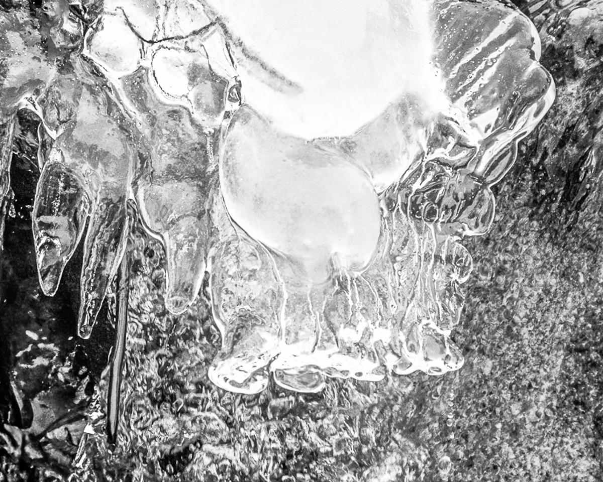
I prefer this bubble image to last month's landscape. I tried Ian's idea, and it changes the mood, but I don't know if I feel that it makes it better, simply different. There do appear to be artifacts along the top edge that should be cleaned up. I didn't clean mine either. |
Mar 14th |
 |
| 18 |
Mar 25 |
Comment |
I like the composition, Robin, except for the merger between the Man's hat and tree. I prefer that the man be a full silhouette too. Just fussy unimportant things for me. Good idea. |
Mar 14th |
 |
| 18 |
Mar 25 |
Reply |
Hi Ian, This O 3 image looks the same to me as Suzy's O 2 image. Did they get mixed together somehow? |
Mar 14th |
| 18 |
Mar 25 |
Comment |
Hi Suzy, highly creative abstract. I would not have guessed what the boiling water was. I'm not sure what color was added from the O2 image, but I would only consider adding a gradient to unify the colors and tones. I made this a bit more vivid, but Ian's B&W also unifies the whole. |
Mar 14th |
 |
| 18 |
Mar 25 |
Reply |
Thanks, Ian. I should have masked the log from the painting, but that is why I am in DD, to get good advice. I was looking to add a third element. |
Mar 11th |
4 comments - 7 replies for Group 18
|
| 29 |
Mar 25 |
Comment |
Hunter, testing for Tom. |
Mar 26th |
| 29 |
Mar 25 |
Reply |
We all show our age at times.
I have confidence our grandkids (and my great grandkids) will create their own world, as all generations do. Even the so-called Greatest Generation didn't leave us much to work with. I personally don't think of PSA-Worldwide as a US business, only as a non-profit social and art club. I will miss your images and comments. Take care. |
Mar 20th |
| 29 |
Mar 25 |
Reply |
Thanks, Judy. It isn't sharp as I am working from the 1200 mp jpeg, not a raw file. It does create a different image, and not one that you would particularly like.
I made you a tone evaluation image copy. White draws the eye, black blocks the eye and gray are the midtones. I was wrong that it is mostly midtones, as there are mostly highlights. The alley does allow the eye to travel around to the bright dancing scene on the left. |
Mar 20th |
 |
| 29 |
Mar 25 |
Reply |
If you put it into competition, rename it to Tilly's Setter/Retriever or something similar. Good work. |
Mar 14th |
| 29 |
Mar 25 |
Comment |
Hi Bob, back for more!
Your image makes me cold, which is a tribute. It is sharp and well exposed. I do agree with Karen that it is busy, and I think a B&W conversion helps. The brown doesn't add anything to the subject. I converted it in LR and added some High Key radial gradients to areas that I thought were interesting to me. I didn't leave the black twig(?) black, but that was just my choice. Fun image to play with. |
Mar 13th |
 |
| 29 |
Mar 25 |
Comment |
Hi Karen, I am excited to be back. I hope I can bring some new perspectives to the group. I like the creative composition of your fruity moon. The image is sharp and colorful. The black background makes the color pop. I feel that the light on the top edge is beautiful, but that the spectral light on the bottom is distracting. That could have been dealt with during setup but is much more difficult in post due to the multiple layers. I might consider brightening the color even more. |
Mar 13th |
 |
| 29 |
Mar 25 |
Comment |
I am happy to be back Judy.
As always, your images are sharp and edited properly. The color, exposure and White Balance are all good and the color vibrant as Bob Legg stated. The composition is for a proper travel image, but I find it too busy for my taste. There are just too many elements for me to look at and the overall tone is flat, being mostly midtones with no color separation.
I am, increasingly, becoming an advocate of adding depth to images using more blur and tonal range (Dodging and Burning.) |
Mar 13th |
 |
| 29 |
Mar 25 |
Comment |
Hi Tim, I admire your image very much. The lighting is good, the action is excellent, and I am unfamiliar with Luminar after giving it a go years ago. I agree with Hunter in that I would flip it to make Tilling leap into the future, as opposed to the past. Karens suggestion is also good to brighten him up. I have added a little more contrast and color, plus cleaned up the water in case it ends up on a wall. I work in Topaz Photo AI, Adobe LRCC and PSCC exclusively. I'm extremely excited to be back in my original group. |
Mar 13th |
 |
| 29 |
Mar 25 |
Reply |
Thanks, Gunter. If you can harness your political beliefs, you are an asset to PSA (International for quite some time) and hope you would reconsider and stay active.
I won't get any better as all my illnesses are lifetime now, but are controlled better with many, many drugs and PT. Thank you for all you have done with the group. |
Mar 11th |
| 29 |
Mar 25 |
Comment |
Hi Gunter, I'm so sorry that you are leaving the group. You created a strange abstract this month as your grand finale. I want to say I can change the image so that the larger images tunnel down into the smallest, but I'll need to play with this a while. I'm not familiar with Mirrorlab for composition, or Nik Solar Filter, but PS has a solarize filter. I also added another filter from the filter gallery. Abstracts are fun to create. Good work. |
Mar 9th |
 |
6 comments - 4 replies for Group 29
|
| 75 |
Mar 25 |
Reply |
I usually look each month at the Current Images https://psadigital.org/groups/images.php and see if I enjoy any image enough to offer praise or my opinions. My work is average at best. It helps study group members to add original images so we can produce examples of our suggestions. I realize as a professional you are presenting finished work, rather than asking for suggestions, but it is still fun for some of us to see what we can create from the original. I'm glad as an admin to have pros in DDG. |
Mar 27th |
| 75 |
Mar 25 |
Comment |
Hi Mo, just visiting from DD29 and DD18, after looking at this month's DD Members Showcase https://psadigital.org/. "Siren" is a gorgeous image. After reading your carefully crafted bio then visiting your website, I see that you are an accomplished professional with much to teach us mere amateurs. I'll look in from time to time and see if your descriptions give me any much needed help. Even though I'm retired Navy, I can see you learned much in the Army. Have a good day. |
Mar 26th |
1 comment - 1 reply for Group 75
|
11 comments - 12 replies Total
|


