|
| Group |
Round |
C/R |
Comment |
Date |
Image |
| 18 |
Feb 25 |
Reply |
Thank you, Joan. Out of the box is a good start for me. |
Feb 22nd |
| 18 |
Feb 25 |
Reply |
Thank you, Robin. I think I also may need to change the blur/glow I added. The color is also beginning to be off-putting, if that is a word. |
Feb 19th |
| 18 |
Feb 25 |
Reply |
Thanks, Gunter. Not sure about his size making your image unshootable, but the crop gives me an idea about moving him inside the window looking out or moving/removing her and placing him inside the doorway. |
Feb 14th |
| 18 |
Feb 25 |
Reply |
Thank you, Ian. I might keep it going. I used the doorway as a dark backdrop for his head, but I am not married to anything at all yet. Looking for more good suggestions from our group. |
Feb 12th |
| 18 |
Feb 25 |
Reply |
I agree with you, Ian, that the girl is a misfit. Botticelli's work is perfect in his use of light by drawing the eye around the image of Venus. I also get that there could be more "tongue in cheek" humor than honor in this version of The Birth of Venus. |
Feb 12th |
 |
| 18 |
Feb 25 |
Reply |
Just to clarify why I included the B&W, my mono image is only meant to highlight the face I see, not to create another version. |
Feb 12th |
| 18 |
Feb 25 |
Comment |
Hi Suzy, Terrific job in creating an image that I can't stop finding places to look. There are endless areas that create interest for me. The color, balance and symmetry are perfect, in my opinion. It is a bit dark, but with feeling. I added a slight bit more color contrast, just for fun. You have created a memorable image. |
Feb 12th |
 |
| 18 |
Feb 25 |
Comment |
Hi Joan, I'm not a n Apple user, but I see you use Adobe in your bio, so https://community.adobe.com/t5/photoshop-ecosystem-discussions/make-a-sphere-on-an-old-mac/m-p/9447222
might help if you have an older Mac. I like the concept of using spheres. If you do get some help making them, I might transform the size and move them to match more to the areas they represent. Beautiful landscape with or without the spheres. |
Feb 9th |
| 18 |
Feb 25 |
Comment |
I really like the female face created in the center. Makes me think of a femme fatale. Spectacularly put together, Gunter. If the face is meant to be seen, you could use it for a title. |
Feb 7th |
 |
| 18 |
Feb 25 |
Comment |
Hi Ian, the creation is a winner. I like Angela's idea of flipping the image too. Just a matter of taste always in abstracts. |
Feb 7th |
 |
| 18 |
Feb 25 |
Comment |
Hi Robin, I like the idea of trying to recreate a famous painting. I think that there needs to be more work that could be done to try to match at least some of the "meaning and allegorical references to antiquity" displayed in the painting.
I am wondering about the tan-ish area on the eggshell where her feet would be. It makes me think there is a strange translucence quality in the shell. I see it is on the original but I think it is distracting. |
Feb 7th |
5 comments - 6 replies for Group 18
|
| 27 |
Feb 25 |
Reply |
Thanks, again. |
Feb 27th |
| 27 |
Feb 25 |
Reply |
My wife and I took the Gondola ride in Banff, but not at night and the images we got were more of the snapshot variety. Is the orange snacks Jalebi? We watched Anuja last night and saw them frying. |
Feb 26th |
| 27 |
Feb 25 |
Comment |
Hi Rizwan, I just saw your Member's Showcase image this month and it is beautiful. Was it a drone shot?
As far as this image, his eyes are sharp, and the depth of field (Dof) is helpful. I might consider what supporting elements are important to your vendor and remove the rest. Whatever is left I would crop it to make the vendor stand out. I can't create a good file, as the foreground is a composite or added to hide unwanted elements and needs to be blended better. |
Feb 25th |
1 comment - 2 replies for Group 27
|
| 54 |
Feb 25 |
Reply |
Thanks, Peggy. Being a PC user, I'd never heard of the Notanizer app, but the 3-level set-up is the same as what I use in PS. I wonder what the Renoir painting would return on Notanizer.
Dorinda and I have mistaken you for another Peggy. |
Feb 26th |
| 54 |
Feb 25 |
Reply |
https://psadigital.org/
https://psadigital.org/groups/images.php
https://psadigital.org/resources/guidelines.php
Home on the main menu line opens the current member showcase. Current Images opens all the DD images each month and can be sorted by either group or category.
Barbara added Current Images so we can all learn from any group. The first paragraph in Guidelines explains the immense popularity of DD.
I don't need to contact Peggy, but I have commented on other images in your group this month. I am sorry if you haven't understood the goals and guidelines of DD. DD was set up to enjoy and learn from all members, and we encourage exploring and "tinkering" with all DD images.
Your competitive image shouldn't be displayed here as they don't need help or suggestions for improvement.
I too construct and create and hope I can learn from other creators. My request to Alan was within the guidelines of DD. Your image this month is extremely well done, and I hope you can learn something from my comments. |
Feb 24th |
| 54 |
Feb 25 |
Reply |
Good luck in all your competitions. |
Feb 22nd |
| 54 |
Feb 25 |
Comment |
I too love the concept, Bruce. I wonder though about the harsh light source applied to the balloon and upper left. I'm not sure if the caravan plays a role in leading to the balloon, but it needs to become a better element if so. This could be a terrific wall art if some of the files were cleaned up. The blemishes appear especially on the outer sides of the final image. I might consider undoing some of the texture and clarity in the originals or place the elements on their own layers if that wasn't done. It has the potential to be astonishing. |
Feb 20th |
 |
| 54 |
Feb 25 |
Reply |
Bruce, could you upload a larger image? This is 77x43 and too small to be able to see what you did to it while you tinkered. |
Feb 20th |
| 54 |
Feb 25 |
Comment |
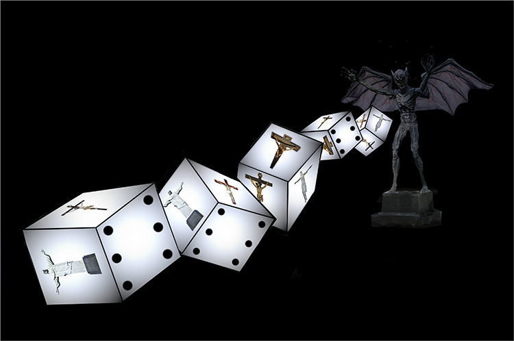
Hi Alan, I'm invading your group this month as I am trying my best to learn how to improve my compositing for DD18. You have mastered, not perfected as we all know, your work. I love everything about the image, and I'm learning new ways to think about tone and color. Black and white can benefit sometimes from adding warm or cool color. Since some people wanted more light on the "devil," I added a cool blue/magenta radial placed along the diagonal. Changed the blend mode to Vivid Light and fill level to 20%. Surely it doesn't make it any better, but just a technique you might like. |
Feb 19th |
 |
| 54 |
Feb 25 |
Comment |
Hi Peggy, I love the composite you have created. Tells a story with the addition of the bike. Is he deciding to steal it? Does he wonder how anyone could ride it with the seat so high and the handlebars so low?
I include a tone evaluation for your use if you wish to D&B some of the light areas that overwhelm the subject. The original-2, which I would suggest darkening prior to adding to the composite.
We enjoyed touring with you during some of the old PSA conferences. |
Feb 19th |
 |
| 54 |
Feb 25 |
Reply |
Hi Alan, I am so happy that you included Renoir's painting in your comments. I commented on Brad's image this month too. I am also going to comment on Peggy's image too. I am including a tone evaluation of the image. It shows that all masters do in fact paint with light to display their subject. Also is how he uses a sharp focus to bring her face forward, and blurs the background. |
Feb 19th |
 |
| 54 |
Feb 25 |
Comment |
Hi Brad, I am just looking through the Current Images and saw yours. It has a lot of interest with the lovely sky and waterfall. https://psadigital.org/groups/images.php
I am trying to make my own images better and saw a familiar problem in this image that inhibits my own. There isn't a way for the viewer to navigate from the sky to the waterfalls. All the black is a barrier. A frame makes it even harder to navigate.
Blake Rudis is a valuable resource for me in evaluating images. He is a former (bad) painter but is a good PS instructor. He uses f.64 and YouTube. I am including a tone evaluation that shows what the tones are in your image. Our eye is drawn to the lightest areas first and in-focus second. White in the evaluation are the light areas, gray the midtones.
I am in DD18 now but have been around a long time. |
Feb 16th |
 |
4 comments - 5 replies for Group 54
|
10 comments - 13 replies Total
|


