|
| Group |
Round |
C/R |
Comment |
Date |
Image |
| 18 |
Sep 24 |
Reply |
Ian and Chan,
I'm just reading comments again, before the EOM, and now I understand what "presets" mean. I've never loaded any presets into PSCC, and without researching {(Cmd/Ctl+F,) then typing Presets Panel,} I found PS does have presets, but unlike the Swirly Strokes you used in Topaz, which I don't have. I sometimes use Topaz for Noise reduction, but that's about it.
https://www.adobe.com/products/photoshop/presets.html
I learn from the group and look forward to many more months. |
Sep 24th |
| 18 |
Sep 24 |
Reply |
Good advice, Hunter. Thanks for the image. |
Sep 17th |
| 18 |
Sep 24 |
Reply |
Thanks, Gunter. The image didn't load, but I understand, I hope. I'll need to expand my background, textures, and skies folders. |
Sep 17th |
| 18 |
Sep 24 |
Reply |
Before I dropped out of DD, Barbara Miller had sent us a message that only using filters wasn't "creative" enough, so I am still working out the meaning of altered reality. "A camera or other light gathering device could never solely capture such images as they appear in the altered image" helps, but I could use your suggestions in your comments about what you might have done. If I remove the sign and figure in this image, I assume I will need to use an AI tool to repair the missing areas of the car. Does the group care if AI tools (generative fill) are used? Does PSA? My club won't allow it. |
Sep 16th |
| 18 |
Sep 24 |
Reply |
Thank you, Gunter. I'll work more on the background as you suggest, and as for what you and Chan have pointed out, I need to add more creative work going forward. |
Sep 16th |
| 18 |
Sep 24 |
Comment |
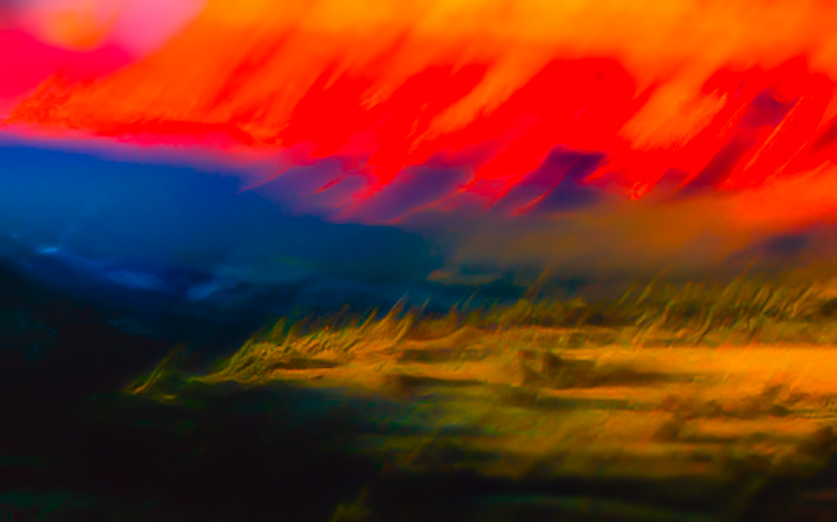
The slow right to left downward motion of the camera at a stopped down lens opening creates sharp lines that to me are not harmonious. I might try re-shooting and opening up the lens to make a blurrier abstract color image. My attempt at showing you my thoughts are rather bold and may not be as you intend. |
Sep 15th |
 |
| 18 |
Sep 24 |
Reply |
So sorry, Chan. Thanks for the reply.
I hate some of the Save/SaveAs features in Adobe. When I've renamed files for competitions, outside Adobe, I've lost the link to the original image. Now I try to add titles in LRCC to any images for competition or DD. |
Sep 10th |
| 18 |
Sep 24 |
Reply |
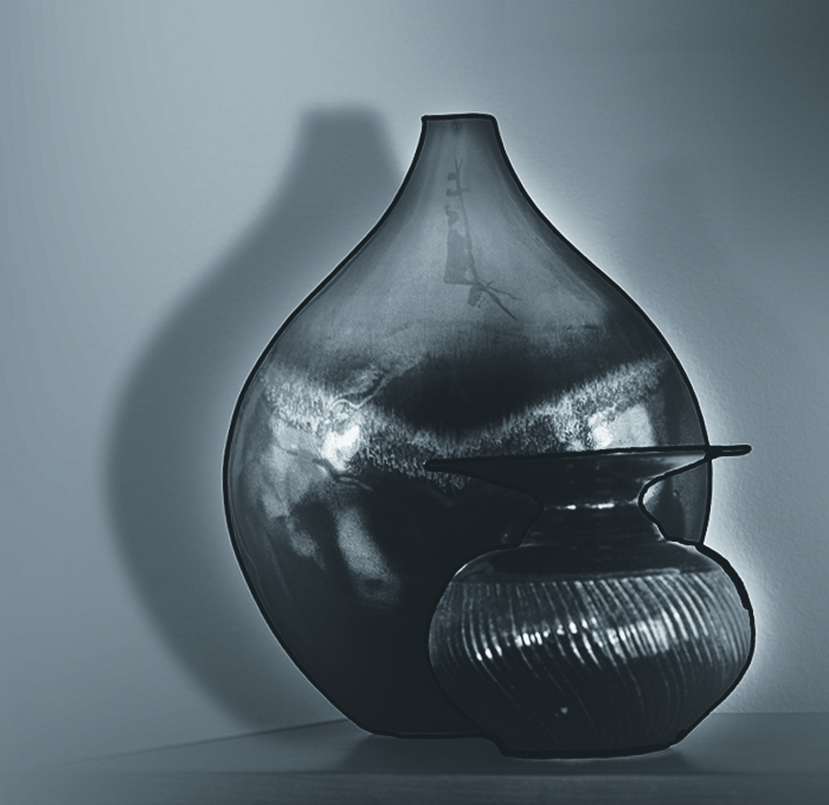
Thank you, Chan. I also like the DD87 image, but the white(?) vignette on both images leech into the jars, lowering the original contrast. Masking the jars on the vignette layer would restore the contrast and make the jars appear sharper to me. Good luck with your image. |
Sep 9th |
| 18 |
Sep 24 |
Reply |
I wouldn't remove a technique from your toolbox if you like it. My big issue with the line isn't thickness, but that there are points along the way around the small jar that stray away from the outline. I surely couldn't do this work as I have essential tremors, and as of this time have been unable to use a pen tablet. If the small jar outline were cleaned up, and the original contrast restored, I would consider the image competition ready. |
Sep 9th |
| 18 |
Sep 24 |
Reply |
Thank you, Chan. I didn't even consider trying to remove the sign, as this was a sponsored car show, but I see what you mean. |
Sep 8th |
| 18 |
Sep 24 |
Reply |
I agree that there are many reasons now to re-visit old images, not the least being the major advances in digital image processing. This image would look great in print hanging on a wall. |
Sep 7th |
| 18 |
Sep 24 |
Reply |
Thank you, Ian. I could recover details but chose not to at this time. I want the lime color to pop. I have tried to fix some of the errors you pointed out and removed some distracting noise. |
Sep 7th |
 |
| 18 |
Sep 24 |
Comment |
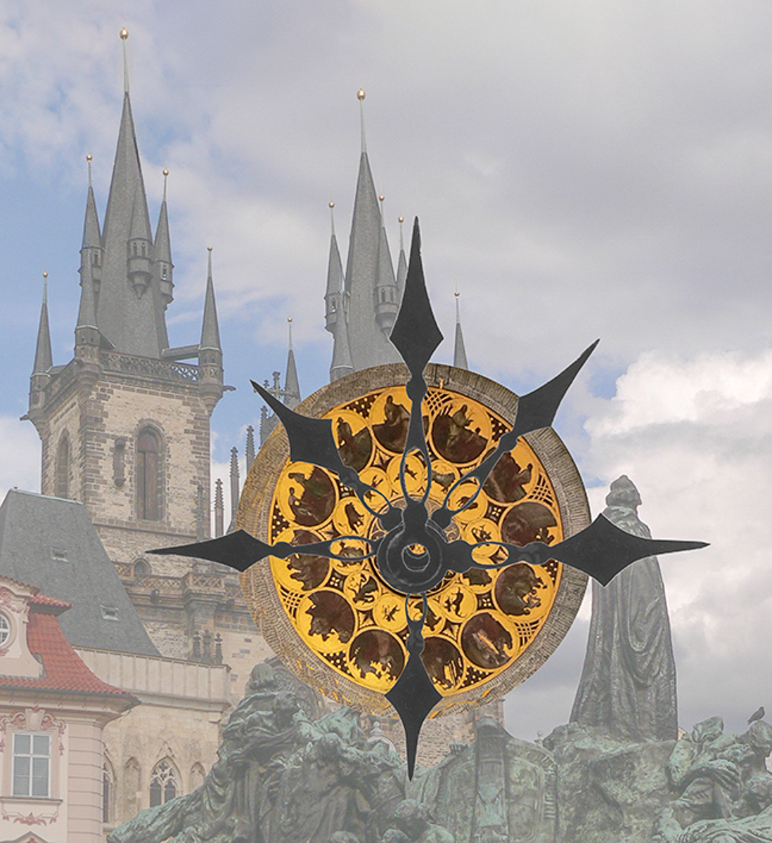
Hi Joan, I really enjoy this image. Thanks for owning up to using stock hands. I have two suggestions.
Expand the canvas at the top and clone the rest of the golden finial thingy.
Move the hands up a tad so that the centers are aligned with the clock face, and ensure they are level vertically. I couldn't do that without the original layers.
Way to stick with your concept.
|
Sep 5th |
 |
| 18 |
Sep 24 |
Comment |
Hi Chan, I wonder from the comment above if you submitted the wrong image to each group. There is more creativity involved in the DD87 image than this one.
In any case, I'll comment on the image here. The original image is soft, and the colors are also desaturated by the harsh light coming through the windows. Diffusers would have helped soften the lights.
The drop shadow is a nice thought, but from the window reflections I don't see this as realistic. The black outlines don't add anything for me but might if this could be converted to a black and white image. I tried it in LRCC. I also leveled the image along the tabletop and re cropped it.
I may be being too harsh, but since you have the option of re-shooting this image it could be improved by taking time for a good setup.
|
Sep 5th |
 |
| 18 |
Sep 24 |
Comment |
Thank you for posting the original, Gunter. I agree that it is also a great color image, once cleaned up. Your mirror image and conversion are very well done. The diagonal placement adds a ton of interest. Your crop is spot on, giving the image balance and symmetry. Excellent image. |
Sep 5th |
| 18 |
Sep 24 |
Comment |
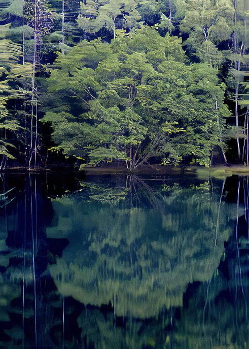
Hi Ian,
The image is as you've described it. A snapshot taken while on a walk. I'm unable to see what drew your eye to the image, nor why you returned to this image after four years. The filter you applied makes it more interesting, and the color palette is fine. If you have specific questions regarding this image let us know.
|
Sep 5th |
| 18 |
Sep 24 |
Comment |
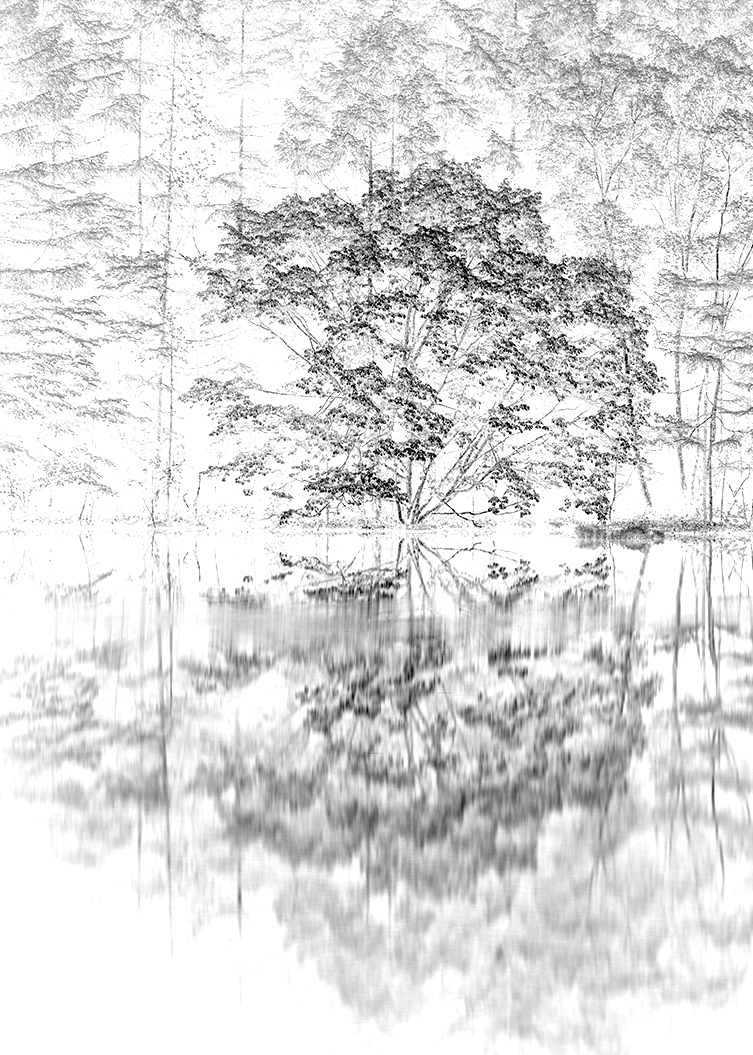
Hi Yolandi, it would be of interest if you could include the original image. I usually base my comments on what I see has been done and what I believe might be done differently. |
Sep 2nd |
| 18 |
Sep 24 |
Comment |
Hi Gunter, it would be of interest if you could include the original image, and since you mentioned it in your description, the color version. I am new to the group, but not DDG. I'm not familiar with MirrorLab software. |
Sep 2nd |
7 comments - 11 replies for Group 18
|
| 29 |
Sep 24 |
Reply |
You can still get them on Amazon! Of course they are imported
from China. You guys take care. |
Sep 18th |
| 29 |
Sep 24 |
Comment |
Ed in Red? |
Sep 18th |
1 comment - 1 reply for Group 29
|
| 34 |
Sep 24 |
Comment |
Hi Frans, I am fairly new to DD Creative groups and wonder what you did to your images to make them creative, or what you want us to address in a comment. Your description doesn't help your study group do anything except admire your images and go to your YouTube video. I am confused. Excellent photography, but you already know that. |
Sep 22nd |
1 comment - 0 replies for Group 34
|
| 74 |
Sep 24 |
Reply |
Even if you want to process the original, I would still crop to a single subject, and after selecting that subject, push the background back. I used a mask and the Selective Color adjustment.
I know you like subtle, so it is just for consideration. Excellent work as always, Haru. |
Sep 18th |
 |
| 74 |
Sep 24 |
Comment |
Hi Haru, I saw this image while browsing "Current Images" and had to comment. It is a striking image and has the WOW factor for me.
It would be interesting if you expanded the "I tweaked a bit." How did you do this conversion?
I agree that there are two subjects, so I would consider which to use to simplify your viewer's choice of what you want us to see. Because you have included reflections, it is even more important to crop the image.
|
Sep 18th |
 |
1 comment - 1 reply for Group 74
|
| 83 |
Sep 24 |
Reply |
Thanks again. Sounds very un-PSA like, but your mentoring makes some sense to me. |
Sep 19th |
| 83 |
Sep 24 |
Reply |
Thank you, Lance. I joined DDG to learn from others. It is competition based however, and so comments are generally offered based on making an image "competitive" in PSA. I've found over the years that my images are less fulfilling to me when I make them competitive. I wonder what you would think of the images posted this month on the showcase. https://psadigital.org/ |
Sep 19th |
| 83 |
Sep 24 |
Reply |
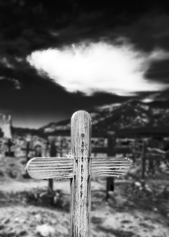
Another possibility but mergers are nearly impossible to control, if you like this cross better. |
Sep 19th |
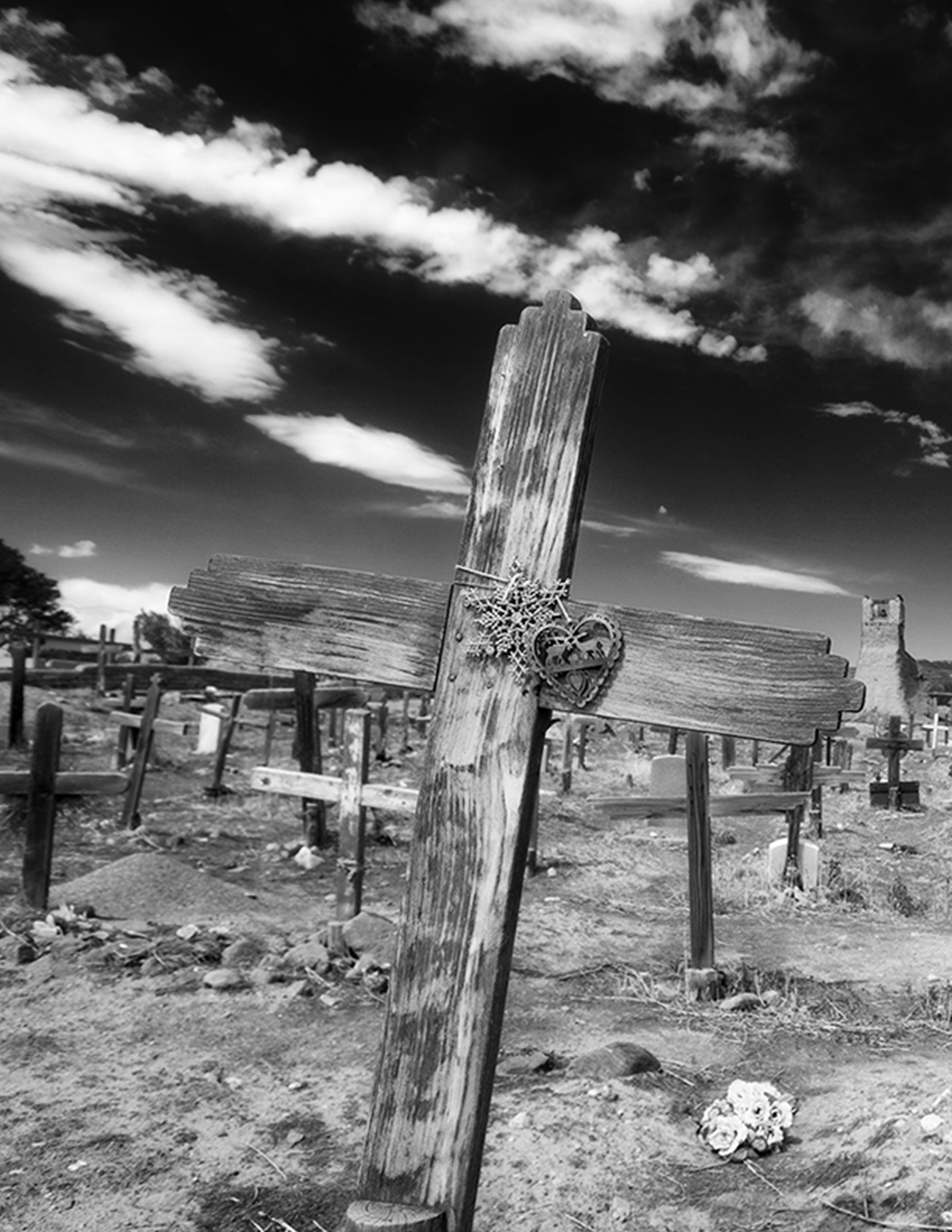 |
| 83 |
Sep 24 |
Comment |
Hi, I am visiting from Group 18, where you have visited this month. I like the perspective; the focus and exposure are spot on. There is no subject or processing that leads my eye around the image. Your title indicates it might be an image for a lecture or travelogue.
For a competitive image I'd suggest a crop and a defined subject and using D&B and/or Gaussian blur to help with the clutter in the cemetery. |
Sep 19th |
 |
| 83 |
Sep 24 |
Reply |
Hi Lance, I don't see the difference between this image and the posted one. Did you mean to attach the original? |
Sep 19th |
1 comment - 4 replies for Group 83
|
11 comments - 17 replies Total
|


