|
| Group |
Round |
C/R |
Comment |
Date |
Image |
| 18 |
Aug 24 |
Reply |
Very Cool. I am up for the challenge. |
Aug 19th |
| 18 |
Aug 24 |
Reply |
Thank you, so much, Chan. I went back to find the other images in the series. The Man in the Window I found but in bringing up other images from prior months, the DD database seems corrupted to me. Your image and an identical one from Jim Hagan (DD11) are posted in July. Weird. I'll check with Dorinda and Tom P.
Do you use a pen tablet or mouse?
PC or Apple?
I have Parkinson's so the tremors when selecting sometimes are frustrating, but I really enjoy processing images. |
Aug 19th |
| 18 |
Aug 24 |
Reply |
Thanks, Gunter. I'll see how my use of vignetting works as I start submitting images. I do agree they can be easily overdone. |
Aug 18th |
| 18 |
Aug 24 |
Comment |
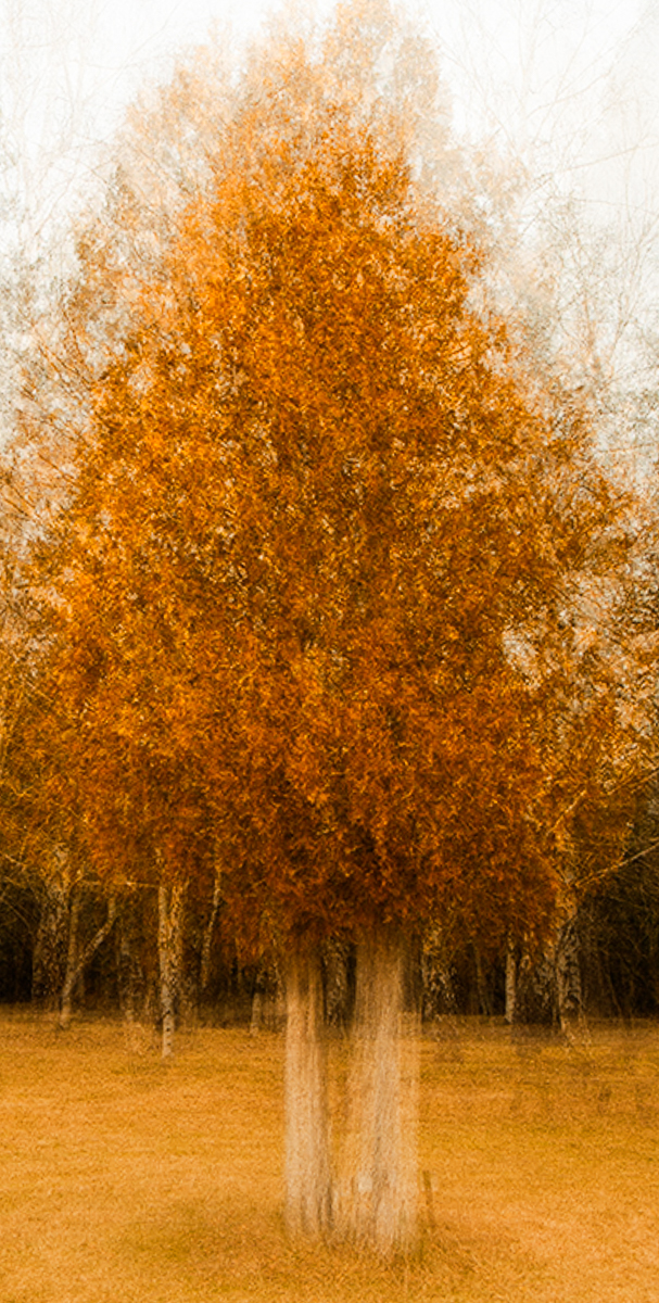
Hi Yolandi, Excellent job of recreating this effect. I especially like the foggy sky the process creates from a boring gray sky. I prefer it even more golden. but I usually like more contrasty images. Judges seldom agree with me, so I'd take my suggestions with a grain of salt. Great project selection.
|
Aug 18th |
 |
| 18 |
Aug 24 |
Comment |
Hi Chan, Your image is a technical marvel to me. This represents my goal for my own creativity. I don't have the skills necessary yet to produce anything this good. Inspired work, for sure. Any processing hints when you write your description would go far in helping me to learn. |
Aug 18th |
| 18 |
Aug 24 |
Comment |
Hi Ian, I'm excited to be back in DDG, and hope to learn much from the group. I have a rather sharp sense of humor, so I hope I will fit in okay. I'm commenting this month just to get my feet wet again after a long layoff from photography.
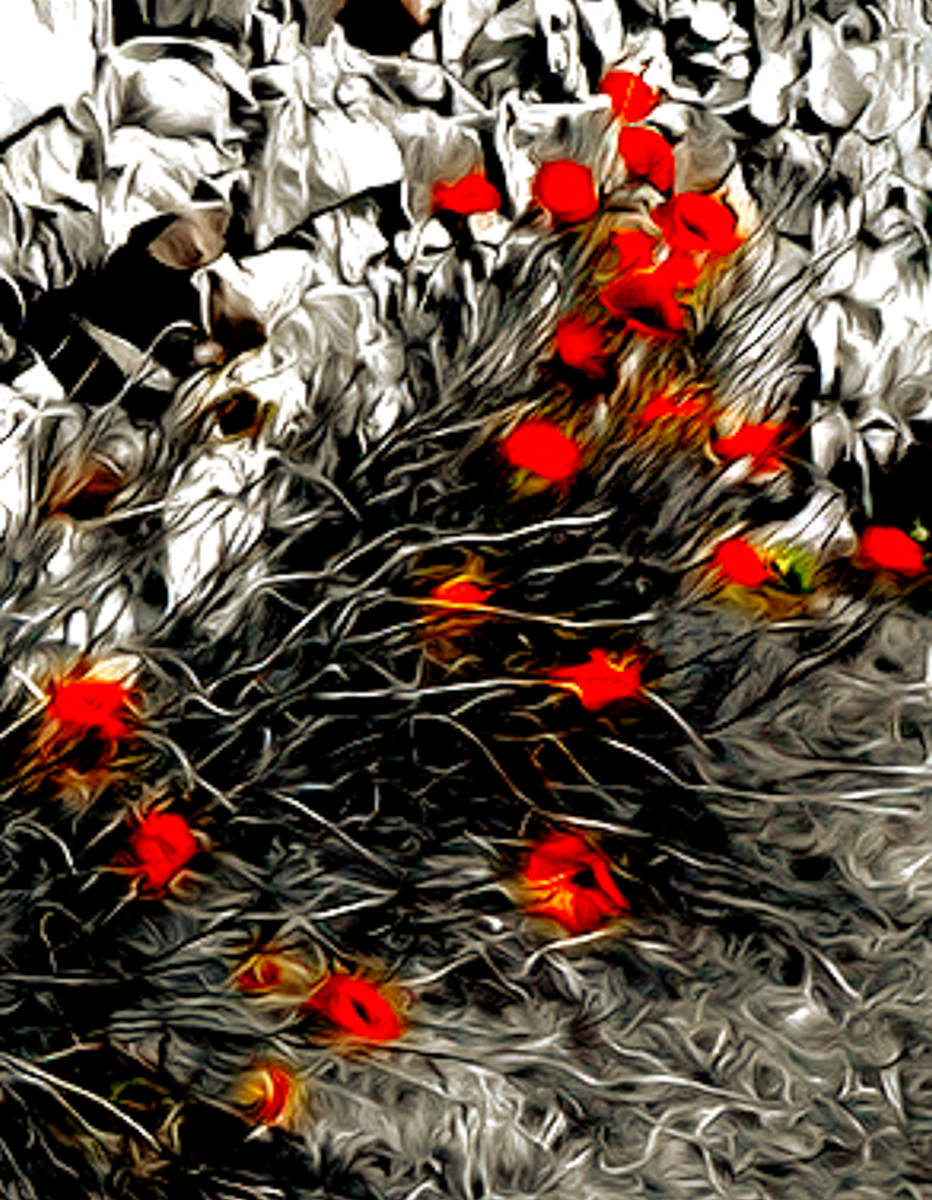
Your original image is a bit OOF, so using the Oil Paint filter is a good choice. Midday images in harsh light can also be helped by conversion to B&W. In this case I might consider the dreaded color splash. |
Aug 18th |
 |
| 18 |
Aug 24 |
Comment |
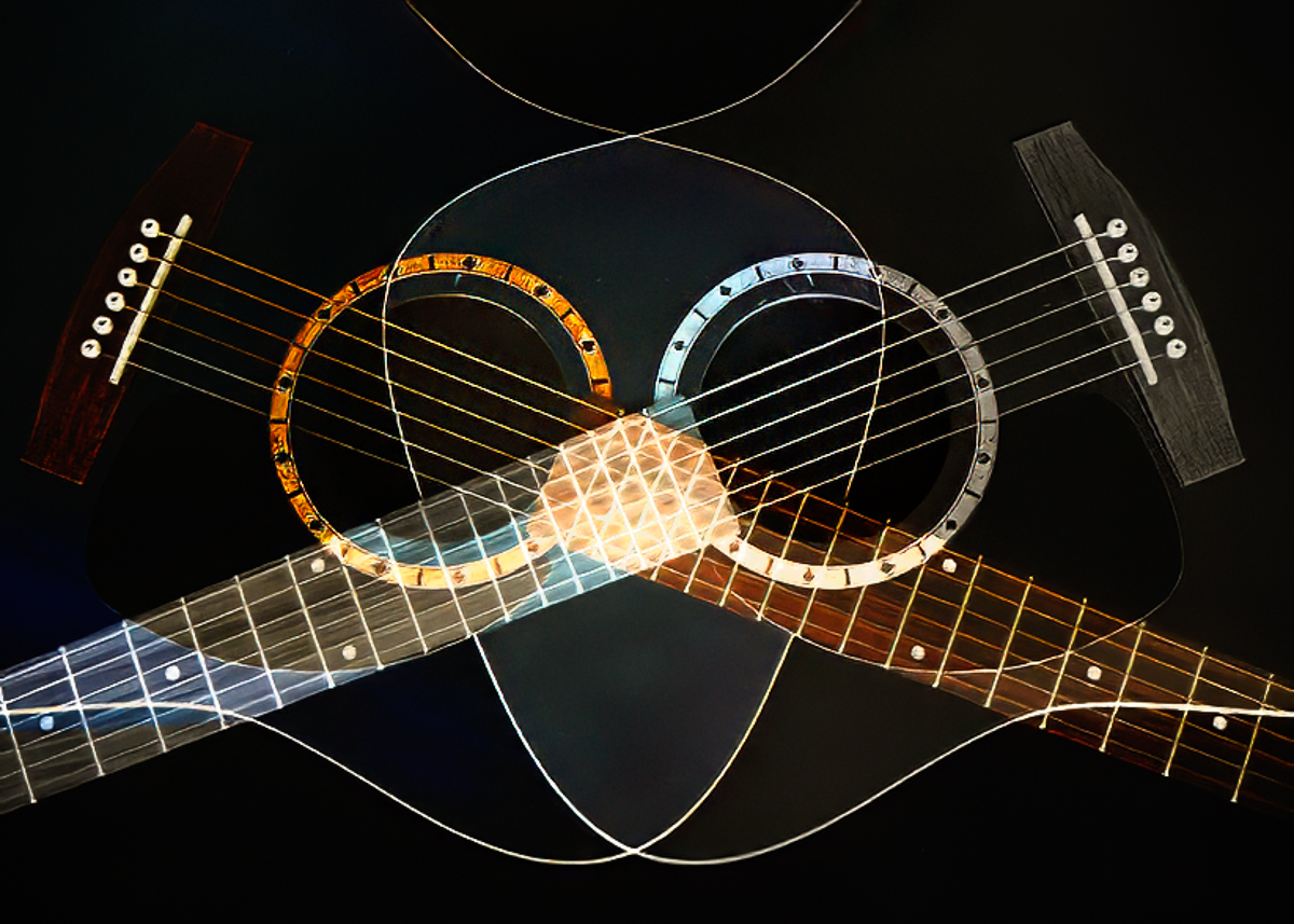
Hi Gunter, I think your composite is exceedingly imaginative and well processed. It is a fun image to play with.
It would be helpful to me to know why you decided to use a B&W for the composite.
I might consider a vignette and/or radial spot to keep your viewers eye in the image. The strong lines created by the strings lead my eye out of the frame.
I'm including my image only as an example of how much fun I had re-imagining your beautiful work as a face.
|
Aug 18th |
 |
4 comments - 3 replies for Group 18
|
4 comments - 3 replies Total
|