|
| Group |
Round |
C/R |
Comment |
Date |
Image |
| 18 |
Sep 23 |
Comment |
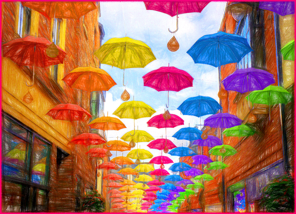
Hi Ian,
I was browsing this month's images (https://psadigital.org/groups/images.php) and yours captured my eye. It is sharp and the colors pop. I might consider bringing forward the brollies (bumbershoots in Seattle) and pushing the buildings back a little. I just selected and masked the umbrella's in PSCC and then darkened and blurred the buildings, I changed the blend mode to lighten on the selection layer. |
Sep 16th |
 |
1 comment - 0 replies for Group 18
|
| 20 |
Sep 23 |
Comment |
Hi Deborah. Great composite idea. Last October https://psadigital.org/group20/image.php?iid=77118 I had the exact same problem.
https://www.youtube.com/watch?v=9v5YV6xzFsA is a good fix.
I wonder if switching the left and center cowboy would help with the dark building hiding his hat. or just leave the dark building without a Lash Larue. Might it work better in color?
|
Sep 13th |
| 20 |
Sep 23 |
Comment |
Hi Angela, I love the use of complimentary colors on the vase. The reflection spilling over your frame/border is a nice touch. The hint of blue inside the vase is also appealing to me. I might consider centering the vase from the sides. Well done.
I am learning about what all the new PSCC AI tools are doing, so I took the liberty to add a gradient map to your image. Makes it more abstract, I know. |
Sep 13th |
 |
| 20 |
Sep 23 |
Comment |
Hi Fred, Great image. I agree with Angela about the girl needs more exposure. I added a quick selection and mask, then a skin tone gradient with Soft Light Blend mode to lighten her up. Beautiful background change and dress blending. |
Sep 13th |
 |
| 20 |
Sep 23 |
Comment |
Hi Sam, terrific still life image. I can feel your passion by the light, so that is successful. I might consider using the oil paint filter in PS rather than noise to get a better painterly effect. Great work. |
Sep 13th |
| 20 |
Sep 23 |
Comment |
Hi Peter, Good creativity. The image is a little flat for my taste I am including a slightly more contrasty version. Not sure what is behind yours truly, but I might consider removing it. I am also distracted by the space between the curves at the bottom. I want to be able to read the words when I see letters, but I cannot. If this just a straight camera shot, it is amazing to try to figure out. If a composite, it could just use a little work as it is too asynchronous (assymetrical?) for me. |
Sep 13th |
 |
5 comments - 0 replies for Group 20
|
| 96 |
Sep 23 |
Reply |
Good question, Haru.
When I look at your image, I see the pervading color blue first, which makes me calm, and feel the morning dawn with you.
Then the subject (landscape) becomes my next view, and then I get the disjointed elements. The upper half is a majestic mountain view, and then dead trees and calm water/ice reflections on the bottom half. Poof, my calm vanishes, and I lose interest.
My image didn't have any real mood, but the mergers of dead and live trees on the mountain reflections could be fixed in PS or by reshooting, standing more to the right if that were possible.
I hope that clarifies what I meant.
I tried a content aware move to mimic shooting more from the right, but with a jpeg, artifacts make it too hard. |
Sep 21st |
 |
| 96 |
Sep 23 |
Comment |
Hi Viren, I agree with most of Robert's comments. I'm not sure the cars add anything to me. I do have a couple of technical considerations that might make this stark image stand out more. I used the masks in LRCC to isolate the sky (Dehaze) center of the building which I wanted to be the subject(?) (Contrast) and background, which is the remainder and (Lighten.) Just thoughts to try to add some pop. |
Sep 18th |
 |
| 96 |
Sep 23 |
Reply |
Many thanks to you. I wish you well in your future endeavors and photography. We will miss your sometimes philosophical and thought-provoking comments. I am sure you are a wonderful and creative mentor. |
Sep 14th |
| 96 |
Sep 23 |
Reply |
In Properties on the gradient or gradient map (Which I now use more) There are 4 icons to change the type of gradient. The angle gradient must be for Design, as I haven't found a use for it in photographs unless you are Picasso. Linear, Radial and Diamond have all been simplified in 2023 and 2024. Once you have the layer you can just click on different gradients or click Randomize. Ctrl + F will bring up Adobe tutorials and explanations right in the image! |
Sep 14th |
| 96 |
Sep 23 |
Comment |
Hi Gloria, very minimalist kind of image that works well. Since the boat is anchored, I don't worry about the space or direction all that much. If you have more, it might be useful. I might consider a little more pop. LR will mask the subject for you, and you can make the colors and light pop a little and increase the conversation between lighthouse and boat. Great capture. |
Sep 12th |
 |
| 96 |
Sep 23 |
Comment |
Hi Dan. Outstanding seascape. Gorgeous light, beautiful color, flowing curves, leading lines, (dang) seagulls, you got it all! Print it, hang it on a wall, post it on social media, enter in a contest and sell it. A work to be proud of. |
Sep 12th |
| 96 |
Sep 23 |
Comment |
Hi Robert. I don't know the Narnia stories, but I can see the frame well enough. The sharpness and color are terrific. I think there may be a green color cast, but that is our Pacific NW forests! I tried a new Diamond gradient in PS to darken the frame and spotlight the view. Just technical stuff from me as usual. Well-made image.
(Cont.) your image has the whimsical and adolescent mood you were trying to convey. (For some reason, my comment disappeared before posting and I had to rewrite it and my memory ain't what it used to be!) |
Sep 12th |
 |
| 96 |
Sep 23 |
Comment |
Hi Ye,
Excellent subject. You didn't mention any processing, so I don't know if you do any. I'll make my suggestions in Adobe CC. I use both LR and PS.
I would just consider adding a little clarity and contrast. |
Sep 12th |
 |
| 96 |
Sep 23 |
Comment |
Hi Haru, I'm not sure if your image is a color/mood image or a landscape. It is heavily toned on darks, which blocks eye movement for me.
The landscape image is a dual subject for me. The layers in the mountains and sky are interesting and nicely processed. The tree shapes are sharp and interesting to me. My eye is drawn first to the bright ice, the jumps to the sky and snow. Nothing connects me between these areas. Lastly, I see the reflection in the water. I must admit it is complicated for me to move around, but I think busy isn't the right word. More disjointed than a smooth viewing experience.
I don't usually use histograms during edits, but this image screamed at me to try to push the mountains to the background and pull the tree shapes (and color) forward. The new gradient tool in PSCC would accomplish this better, but for a quick look I just moved the entire histogram to the right.
|
Sep 12th |
 |
| 96 |
Sep 23 |
Reply |
Thank you, Gloria. I'm reading Zane Grey novels, and he is remarkably intelligent and ahead of his time in treatment of women for a dime novelist. |
Sep 9th |
 |
| 96 |
Sep 23 |
Reply |
I have taken down your valuable image as requested, Haru. Please remember that this is a study group, not social media. We comment and show a remade version that we think shows a different vision and technique. That is an aid to the creator and our purpose. Nothing to be ashamed of or think the artist will be offended. Please continue to post commented images as we can all learn even when not our own images.
You can repost your edited image if you feel I have made sense. If the EDIT comment box is gone for you, send me the jpeg and I'll add it back. |
Sep 8th |
| 96 |
Sep 23 |
Reply |
Thanks, Dan. (I am going to continue this answer in a critique of Roberts image this month. ) I finished reading Zane Grey's "Riders of the Purple Sage" and "Fighting Caravans." that took me away from looking at my lighthouse images and back into my Western images. His writing is speaking to me and you and Robert each referenced Guy Tal this month. I read him a lot in Lenswork, and vision is important but hard to grasp. At 77 and with Parkinson's my balance is betraying me, so vertigo is a good insight. |
Sep 7th |
| 96 |
Sep 23 |
Reply |
Thank you, Haru. I have discovered some useful gradient tool changes in the new PSCC that can help me isolate areas of the image to guide the viewer's eye. As usual I have struggled with selecting a proper subject. |
Sep 7th |
| 96 |
Sep 23 |
Reply |
Thanks, Robert. Good suggestions as always. |
Sep 5th |
6 comments - 8 replies for Group 96
|
12 comments - 8 replies Total
|


