|
| Group |
Round |
C/R |
Comment |
Date |
Image |
| 20 |
Aug 23 |
Reply |
Thank you, Peter. |
Aug 29th |
| 20 |
Aug 23 |
Reply |
Thank you, Peter. I don't understand your reply to comments I made on Sam's work.
Does reading direction have anything to do with walking direction? If it does, and I were entering the image I would use the correct direction for the country in which I was competing. Sam has the monk walking in both directions, so that would be appropriate.
What is the significance to you about PSA now being labeled International and why would you mention that to me? |
Aug 28th |
| 20 |
Aug 23 |
Reply |
Thanks Fred. I have reached a stage in my life where I sit more than walk. I was sitting near the entrance, waiting for Dorinda to finish her shots and I took what I considered a snapshot at the time. My body is giving up, but the brain still works. |
Aug 28th |
| 20 |
Aug 23 |
Comment |
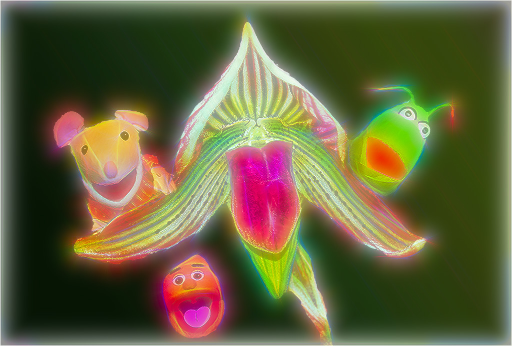
Hi Peter, I like the group Muppets and plant. They are technically well done shots. It has a feeling of joy for me, especially the flower "tongue.). I'm not sure I would be able to make a jump to believe this is a group singing without another image added like a sheet of music. I would consider replacing the black background and adding canvas to the bottom. Since I don't have a music stock image in my files, I just used the gradient tool to blend the image into a more cohesive whole and added a neon glow from Topaz. A nicely done creative cartoon image. |
Aug 14th |
 |
| 20 |
Aug 23 |
Reply |
A ray could work. I don't know what a Buddhist monk seeks for achieving solace. or what that symbol might be. Your imagination is keen, and I am positive you'll find an answer that works for you. |
Aug 8th |
| 20 |
Aug 23 |
Comment |
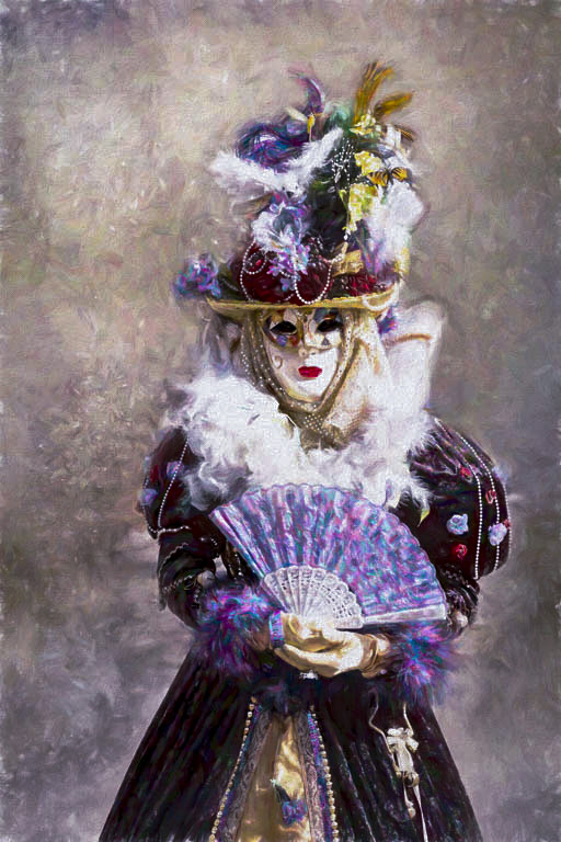
Hi Deborah, Just as a consideration, I ran the Gradient Map action available in PSCC and just chose a gradient I liked to tone the highlights a bit. Many gradient selections can really help add some pop. I'm glad you got rid of the merger between the background spire and her hat. |
Aug 7th |
 |
| 20 |
Aug 23 |
Comment |
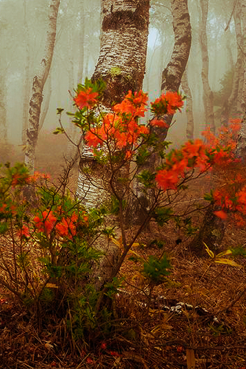
Hi Angela. Excellent image and I especially enjoy the curves in the stems all adding to the excitement and joy of lilies, even if on fire! |
Aug 7th |
| 20 |
Aug 23 |
Comment |
Hi Fred, looks like my wife's allergy coughs! Excellent imagination. |
Aug 7th |
| 20 |
Aug 23 |
Comment |
Hi Sam, A lot of splendid editing work in this composite.
The main difference for me between this version and the first, is the monk is now walking back in time, whereas in the original he is walking forward (signifying searching for Hope, to me) through the frame. In both images he is walking away from the impermanent buildings. I'm not sure if the image portrays what he seeks. I might consider adding another image that represents what he seeks-Solace.
I prefer the original (hope) but wonder if the darker entryways will make this version more acceptable in competition.
Wonderous image. |
Aug 7th |
| 20 |
Aug 23 |
Reply |
Thanks, Deborah. B&W escapes me sometimes. |
Aug 7th |
| 20 |
Aug 23 |
Reply |
Thanks, Angela. Bob is strange! |
Aug 2nd |
5 comments - 6 replies for Group 20
|
| 30 |
Aug 23 |
Comment |
Lines, shapes, and colors. Wonderful abstract, color palette and sharpness. |
Aug 18th |
 |
1 comment - 0 replies for Group 30
|
| 96 |
Aug 23 |
Reply |
Thank you, Haru. It IS cropped too tight on the right, but for this shot I didn't want the lightkeeper's house shown, which is the normal shot. If I had added more negative space those people who know wouldn't believe the image. Same for shooting wider for more foreground. We must compromise on most shots to show what we think is necessary. Clean-up tools though must be used, and I didn't. That I can fix. |
Aug 15th |
| 96 |
Aug 23 |
Reply |
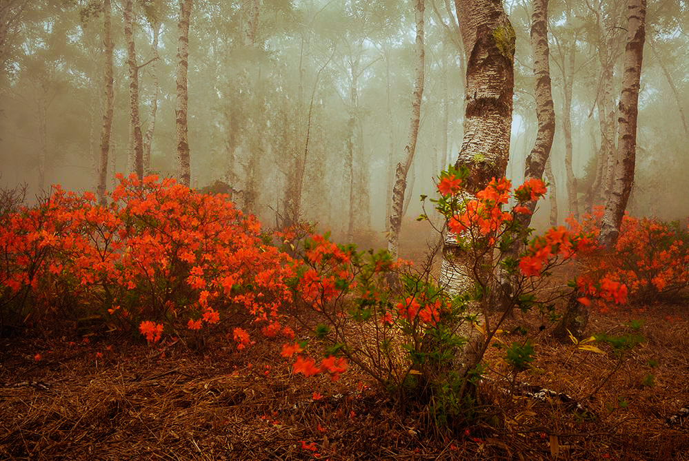
Thanks for the question, Haru. Yes, it does seem unbalanced without the trees (I also eliminated the right evergreens.) My thought was that if it were my image, I would simplify it to just show the reds, but it loses the feeling I know that you hold dear in your images. We all follow our own visions, and you like more supporting elements in your landscapes, and subtle tonality. I also learn much from you and Dan about expressing your feelings, but I don't seem to be able to do the same. I lean more towards the technical side when I process an image. I appreciate your moody images a lot. The other option for me would be a Pano crop, taking the top off to make the flowers two thirds of the scene, rather than a fifty-fifty split. |
Aug 15th |
 |
| 96 |
Aug 23 |
Comment |
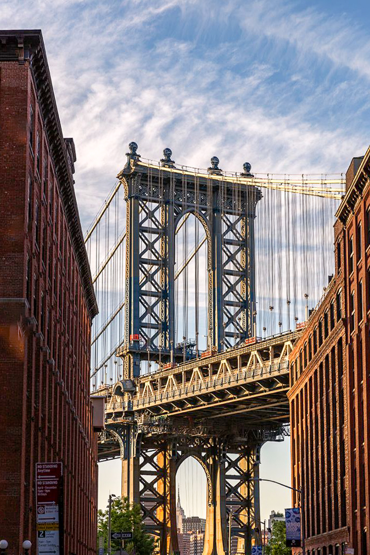
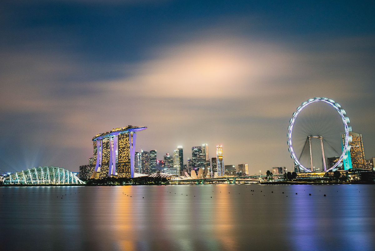
Hi Viren, I love this image. Beautiful evening light, and it makes the city look more inviting than it really is. People and cars wouldn't keep that feeling for me. I was stationed in the Brooklyn Naval Yard for 2 years, and don't miss any of it. I might consider a little lens perspective transform, and I might brighten it up a bit, but it is well composed and sharp. Great image. |
Aug 13th |
 |
| 96 |
Aug 23 |
Reply |
I have no influence either, although I think PSA-PID changed their mind about calling it AI and accepted my recommendation to call it computer generated, since no photographic equipment is used. Nvidia and all the other chip users are relieved though as the demand for speed will be immense. |
Aug 13th |
| 96 |
Aug 23 |
Comment |
Hi Haru,
My eye is seldom drawn to particulars in your images. Your images to me are more about subtle feelings and moods presented with little contrast, augmented by the midtone colors. The reds look more like a soft orange, so there is still a safe feeling to this landscape. I agree with Dan that the evergreen is distracting, and depth is already available from the foggy background trees. The sharpness of the foreground adds to depth, and the image isn't as busy, and more focused on the nearest tree. |
Aug 13th |
 |
| 96 |
Aug 23 |
Reply |
Singapore International Chamber of Commerce. I fixed my comment. Old age strikes now and then.
https://sicc.com.sg/ |
Aug 9th |
| 96 |
Aug 23 |
Reply |
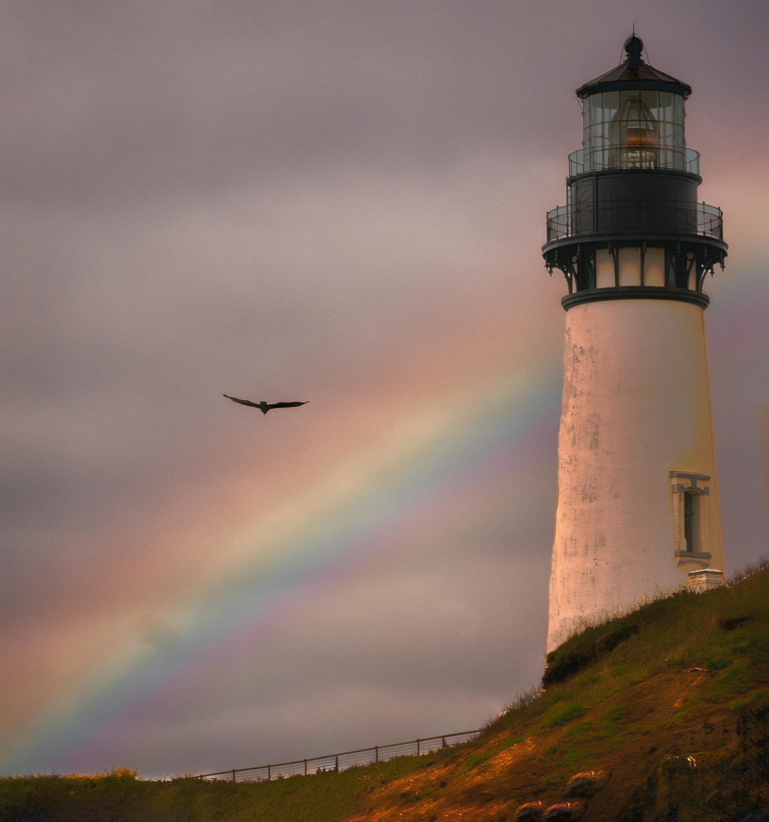
Hi,
I decided to try fixing the lighthouse and other issues. The chipping lighthouse paint is hard to fix, but this is my first attempt. I also extended the canvas top and right and brightened the rainbow per Viren's suggestion. |
Aug 6th |
 |
| 96 |
Aug 23 |
Comment |
Hi Dan, I wonder where the birds are in the original.
The processing improves the image, and any more wouldn't be better for me.
I can pledge for now not to provide computer generated images, but I believe PSA plans to add that as a separate category. Like college football, money drives organizations.
Scott Kelby Training on Adobe PS before LR was ever started showed me how to flip images as a reflection, so that has been around an exceedingly long time. I don't think I've ever actually used it though. Excellent work here. Hope the trip is going well.
The sky alteration and birds add a mood to a dead or winter tree scene. Nice and haunting image. |
Aug 6th |
| 96 |
Aug 23 |
Comment |
Hi Ye, Beautiful image. Sharp cityscape balanced by the long exposure blur of the water and sky. The scene gives me a sense of calm in the sky and water, but there is also anxiety from the bright unbalanced landmarks. The tilted building at the edge adds to that anxiety.
I might consider cropping the left and bottom and reducing the brightness in the landmarks level.
It would look good in the SICC. |
Aug 6th |
 |
| 96 |
Aug 23 |
Reply |
Thanks, Dan. I thought about fixing the lighthouse, and for a fine art print and competition image that would be best. For those who like realistic images best, maybe not. I thought about removing the box under the window too. I will think more as comments come in. |
Aug 5th |
| 96 |
Aug 23 |
Reply |
Thank you, Viren. Good comments. |
Aug 2nd |
4 comments - 7 replies for Group 96
|
10 comments - 13 replies Total
|


