|
| Group |
Round |
C/R |
Comment |
Date |
Image |
| 5 |
Jun 23 |
Reply |
https://www.youtube.com/watch?v=hgcHDHzfr2Q
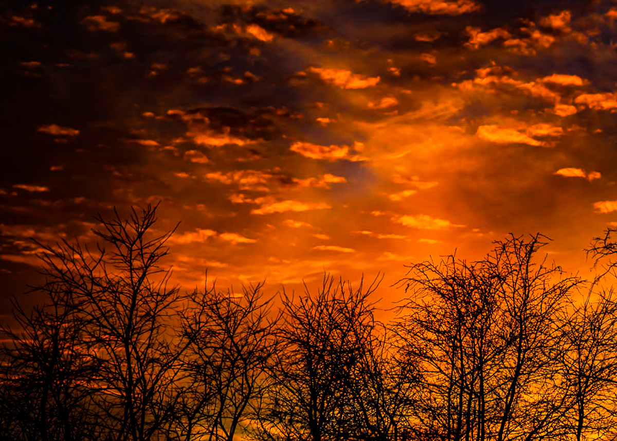
Orton Effect adds a glow to landscapes. Lots of ways to do it. |
Jun 30th |
| 5 |
Jun 23 |
Comment |
Hi Richard, I was looking at "Current Images" and your June image stood out for me. The furthest north I got was Hue in 1966, but your image is inspiring. I think Pete is correct that balance is added by your crop, but it is slightly tilted right from the horizon. I would consider removing the front boat and some of the smaller ones, just for simplicity. Beautiful image. (I added an Orton Effect too.) |
Jun 30th |
 |
1 comment - 1 reply for Group 5
|
| 6 |
Jun 23 |
Comment |
Hi Charissa, I was scrolling (Current Images) for June and your image stands out. Beautifully done. Backgrounds are important, and your color palette and crop are perfect IMHO. Sharp enough with a nostalgic glow. |
Jun 30th |
1 comment - 0 replies for Group 6
|
| 20 |
Jun 23 |
Comment |
I'm not normally a major fan of white vignettes, but as a high key B&W portrait, this image works well for me. Sam's idea of removing the plastic bag handle from her shirt is a good consideration, and should be done prior to converting to B&W. It might change your subject selection. I do think the left side could be cropped or filled in with more of her. Well done. |
Jun 8th |
| 20 |
Jun 23 |
Comment |
I agree that the images are well done technically, but with them framed individually, and the background unrecognizable, other than a photo club trip, what is it that the viewer will see? I don't really get the image, I guess. The individual images don't go together for me. I don't always get my own either. |
Jun 8th |
| 20 |
Jun 23 |
Comment |
Hmmm, his balls aren't just red, and no longer balls. Fun image. |
Jun 8th |
| 20 |
Jun 23 |
Comment |
Hi Fred, I like the title, but am confused by the size of the mansion compared to the pathway. I would consider adding someone on the path looking at the mansion. All the color toning unifies well, but keeps it pretty flat, except for the wings. They draw the eye to the edge of the frame. I tone mapped your image so that you can see where the eyes are drawn. |
Jun 8th |
 |
| 20 |
Jun 23 |
Comment |
Highly creative, Sam. The idea of adding chains would work for me, or just keep the chains already there. I visited Perth twice in the 80's and did not see the prison. Very creepy and reminds me of how the prisoners at Changi must have seen their guards. Well done. |
Jun 8th |
| 20 |
Jun 23 |
Reply |
Thanks, Angela. To my poor old eyes, I thought I had his paws wrapped around a peak, but it may not be. I moved everything a lot, but to no avail. I think his tush is a problem. |
Jun 4th |
| 20 |
Jun 23 |
Reply |
Thanks again, Fred. I encourage members to work on my images. I "see" better than I read about changes. I would guess that this might be more appealing to many. |
Jun 4th |
| 20 |
Jun 23 |
Reply |
Thanks Sam. They worked for me, but not everyone, I guess. I'll not put this image on the front burner. |
Jun 4th |
| 20 |
Jun 23 |
Reply |
Thanks, Deborah. I added the sign and a photographic subject for us to shoot. All were in my Badlands folder and so matched a criterion for me. Not meant to be a work of art. I did enjoy the movie "Harvey" when I was young. |
Jun 4th |
| 20 |
Jun 23 |
Reply |
Thanks, Fred. Needs work, for sure. Helpful suggestions. |
Jun 3rd |
5 comments - 5 replies for Group 20
|
| 29 |
Jun 23 |
Comment |
Hi Bob, I was scrolling through "Current Images" and yours grabbed my attention. Both images are terrific. Blue and Orange are a perfect combo, and the swirl is exactly right. I cropped the original to my taste, but as you remember my taste seldom works. Hi all. |
Jun 11th |
 |
1 comment - 0 replies for Group 29
|
| 30 |
Jun 23 |
Comment |
I took images of the ship too while she was there. Without the current "remove tool" in PSCC, there was no chance to get a shot of the entire ship while she lay in port at the Tacoma Boat Museum. Your capture exceeds anything I got by leaps and bounds. Well done! |
Jun 11th |
| 30 |
Jun 23 |
Reply |
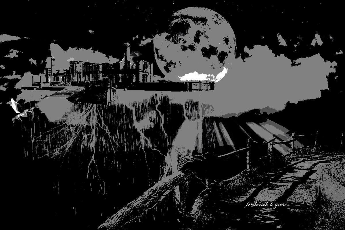
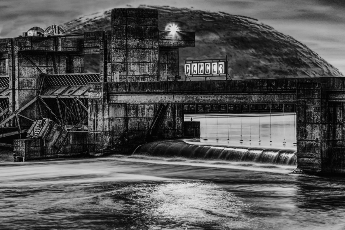
DamMoon works for me. I'd still consider getting rid of the flare and any other distracting elements. |
Jun 1st |
| 30 |
Jun 23 |
Comment |
Hi Jody, I was just browsing current images http://psadigital.org/groups/images.php
when I saw yours. which has a high impact. Other than being a Mac user product I don't know anything about Affinity photo software (or Apple) for that matter.
It would be nice to see the original images too, to see what came out of the camera before the compositing. How much control and input does the editor have or is this mostly an AI image?
The grunge look works for the subject, the title escapes me, and the lens flare placement seems random and distracting to me. Too many supporting elements to take in, but well done lunar composite overall.
Have you looked at it as a B&W? The bright areas attract the eye and B&W gives you feedback on tonal values overall. |
Jun 1st |
 |
2 comments - 1 reply for Group 30
|
| 96 |
Jun 23 |
Reply |
Hi Paul, thanks for visiting. I am assuming that you think Haru's B&W is excellent. I agree. |
Jun 28th |
| 96 |
Jun 23 |
Reply |
Thank you, Bob. I spend too much time with my head in the clouds! I am stuck with trying to process my older images now. As often happens, I am unable to define my image subject and more often am trying to convey a mood. My artistic talents are seldom adequate to create the mood I was in at the time. Your abstract is better, and I'm afraid all the lines lead me out of, not into the image. Poor choice of an image, but all comments help my thinking. |
Jun 24th |
| 96 |
Jun 23 |
Comment |
This is the B&W version. |
Jun 18th |
 |
| 96 |
Jun 23 |
Comment |
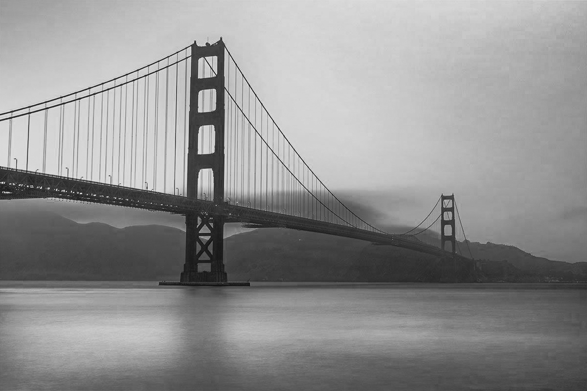
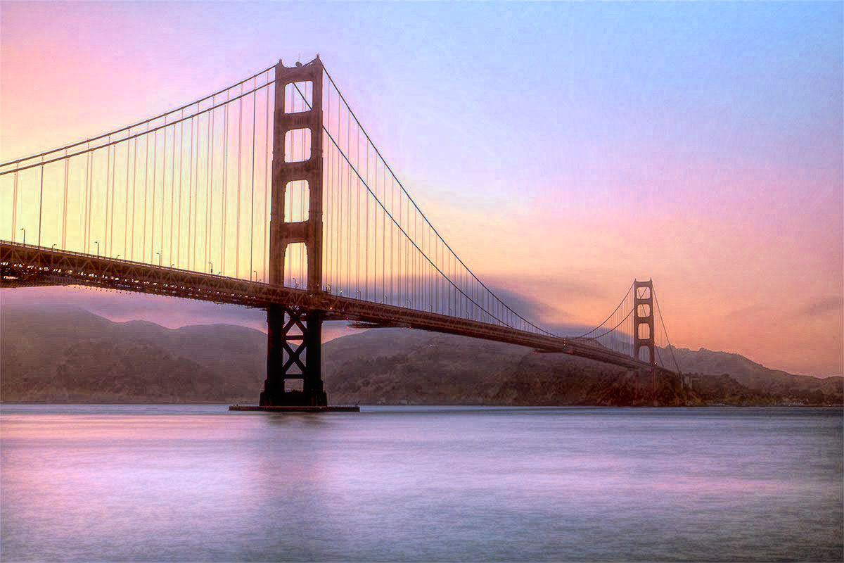
Hi Viren, Welcome to the group. This looks like the Golden Gate Bridge, from Fort Point. I don't know of a way to add light to the bridge at sunset and make it look realistic.
The bridge looks sharp to me, and the composition is good.
The best I can suggest is to try a B&W and see if that appeals to you. The red and yellow of this image gives me an unsettled feeling and you could consider a new color grading. I tried both to see if it helps. |
Jun 18th |
 |
| 96 |
Jun 23 |
Reply |
Okay, Dan. I won't comment on your titles, in the future. I should have replied to Haru's comment, rather than made a new comment. No offense meant. I also research other interesting titles as well. Part of my experiences, I guess. I usually struggle with titles for my own images but find one now and then that sparks interest, unfortunately more often than my images. |
Jun 17th |
| 96 |
Jun 23 |
Comment |
I usually look up Dan's titles because I think his titles show a lot of thought, and I usually find a musical reference.
"In the Fishtank", according to Wikipedia, is an ongoing project of Konkurrent, an independent music distributor in the Netherlands. In this project, Konkurrent invites one or two bands to record and gives them two days studio time.
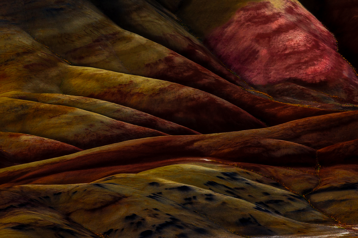
In case anyone else wants to see the "man" in the hills, I have isolated him, in red, which has absolutely nothing to do with anything about Dan's image.
I also saw Haru's "stomach."
|
Jun 15th |
 |
| 96 |
Jun 23 |
Comment |
I am a huge fan of this image, Bob. The crop is well done, and the layers are perfect. The birds' positioning is terrific, and Mt Adams is well framed by all the elements. Your composition is well done and sharp. Excellent work, and you made outstanding choices in converting the image. I would love this image in my portfolio. |
Jun 11th |
| 96 |
Jun 23 |
Comment |
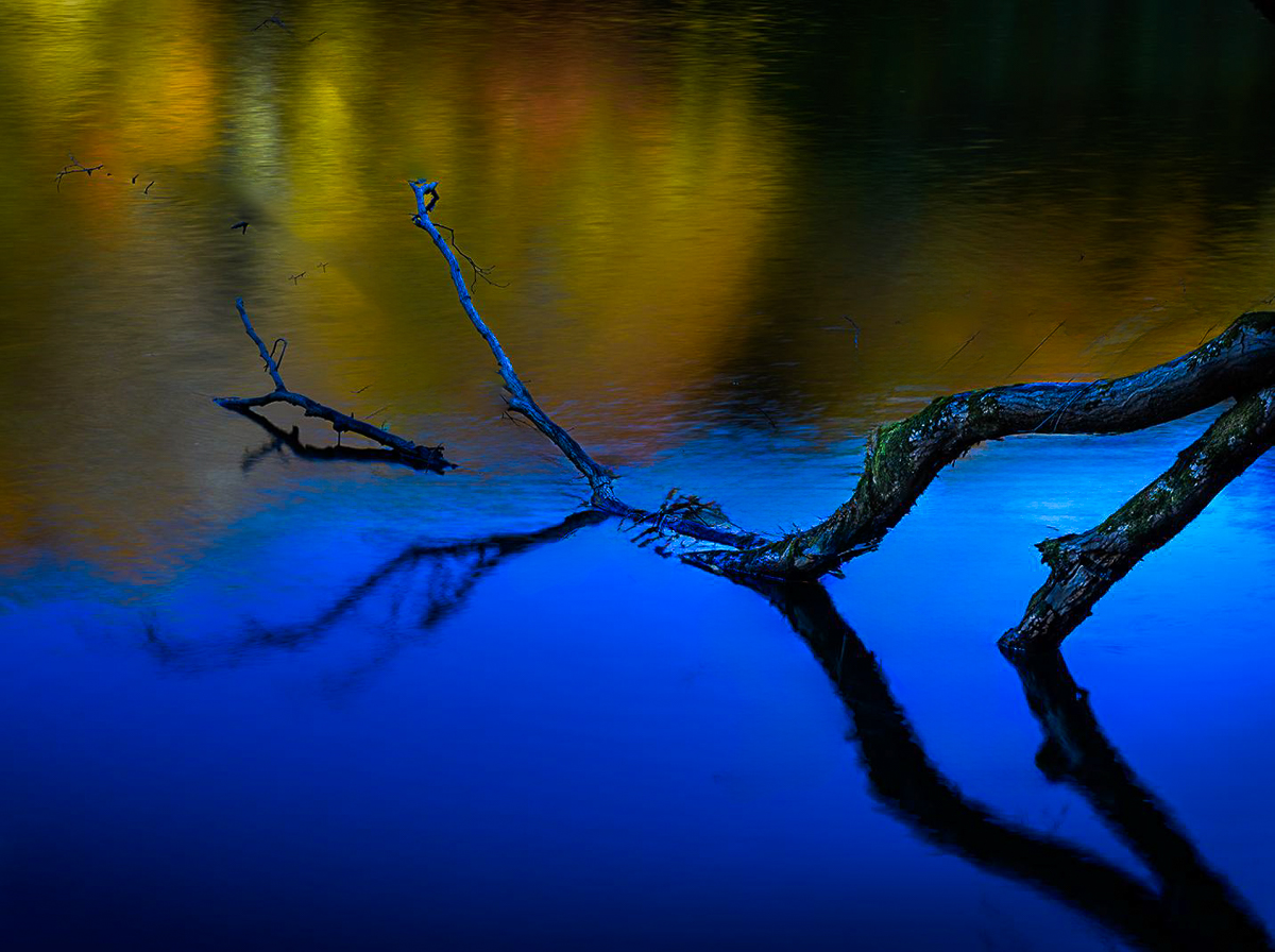
Hi Haru, I agree that the cropped image appeals to me more. I don't like the tree branch and reflected branch centered. It seems static to me. I regret the loss of vibrance in the fall reflections, but it may be a distraction from the branches. Your blues carry the day, and it is a beautiful photographic image.
I'm crawling out onto a limb (pun intended) and looking at the new remove tool in PSCC. I cleaned up the twigs from the branches just to see what impact AI might have on your image. Cropped from the left too. It only took about five minutes to simplify the image. We are in a new editing world, and I am in a quandary about what it will mean.
If I were a painter sitting on this site, would I paint the twigs in, or leave them out? I'd leave them out, myself.
|
Jun 11th |
 |
| 96 |
Jun 23 |
Reply |
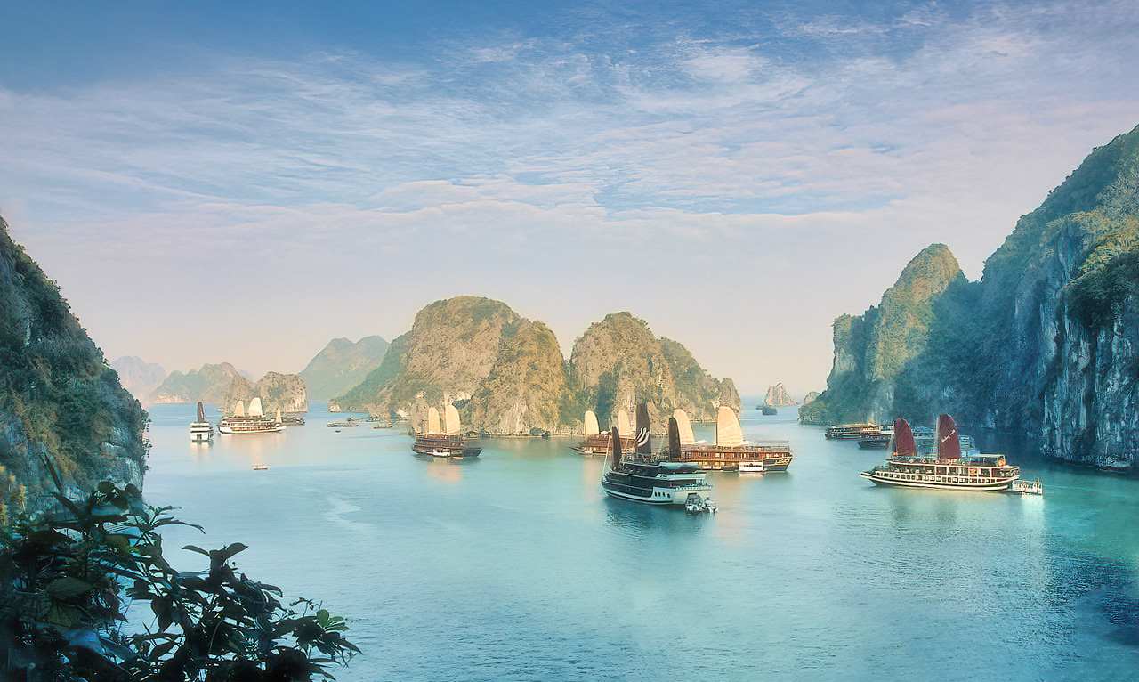
I'm sorry if you thought I meant it wasn't a Cityscape. It is a Cityscape, but it could be competitive in a Travel competition. The brightly colored boats just stand out to me and cover half the image frame as a triagonal. The buildings are a supporting element along with the riverwalk. I used the radial spot to try to accent the building, albeit harshly. |
Jun 11th |
| 96 |
Jun 23 |
Reply |
Thank you, Gloria. The peaks are not sharpened, on purpose in this instance. See Haru's version, which is more stark. |
Jun 11th |
| 96 |
Jun 23 |
Reply |
Thank you, Haru. Your image definitely has a stronger mood. I think I was in a mellow place at the time of this edit, so I saw a different scene. I am seldom mellow anymore, and I like the dark-light diagonals you made, fanning into the horizontal sky. Great work. |
Jun 11th |
| 96 |
Jun 23 |
Comment |
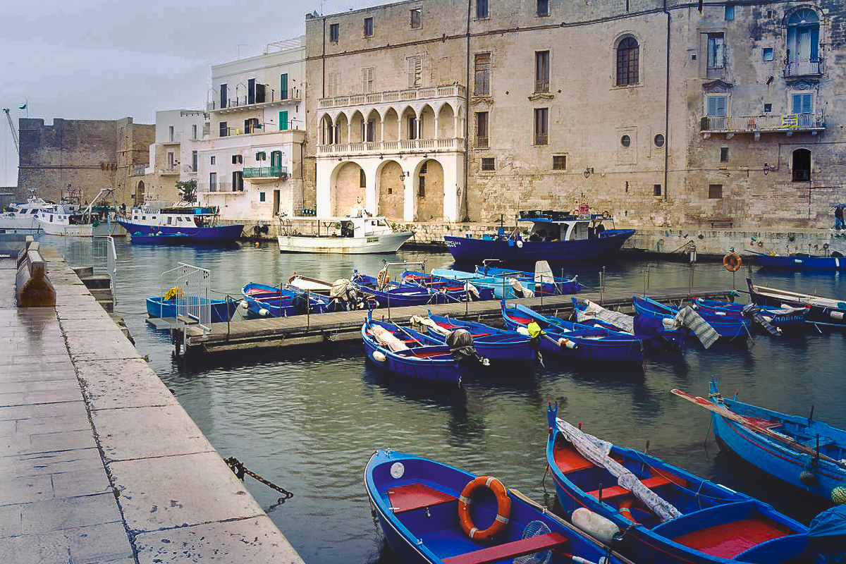
Hi Gloria, I'll comment as a travel photo. My ideas, which aren't always good, are that it works as a high key for me. Your image is sharp, and the blues and reds well done. I might consider underexposing a stop or two to bring out the texture of old Italy and the sky. A little warming reminds me of the ports I've stayed in. I may have added too much blue to the sky in my version, but just stuff to consider. Masking for the sky and foreground is easy (moderately) in LR or PS and allows adjustments locally. Nice image. |
Jun 6th |
 |
| 96 |
Jun 23 |
Comment |
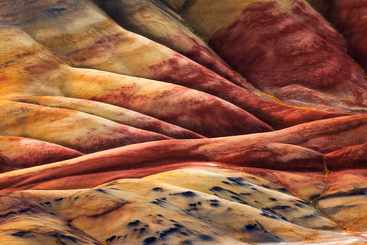
Hi Dan, I've never made the trip to the Painted Hills, but if I could, I may yet. Your composition is beautifully done. The leading diagonals are wonderful. The colors are too muted for my old eyes, so I am adding a more contrasty version. I've seen the neanderthal man in the upper right (red) hill in other images from this area, which is a popular area for my club. Gorgeous shot. |
Jun 6th |
 |
| 96 |
Jun 23 |
Comment |
This is your tonal map. I usually do a high contrast B&W mapping to see where I am leading the viewer. Sharpness also leads the viewer, which is also Dan's point. |
Jun 6th |
 |
| 96 |
Jun 23 |
Comment |
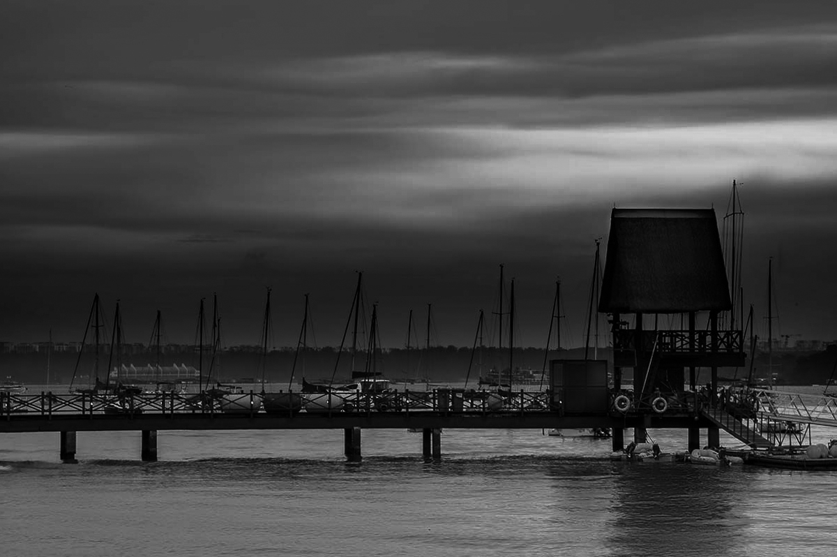
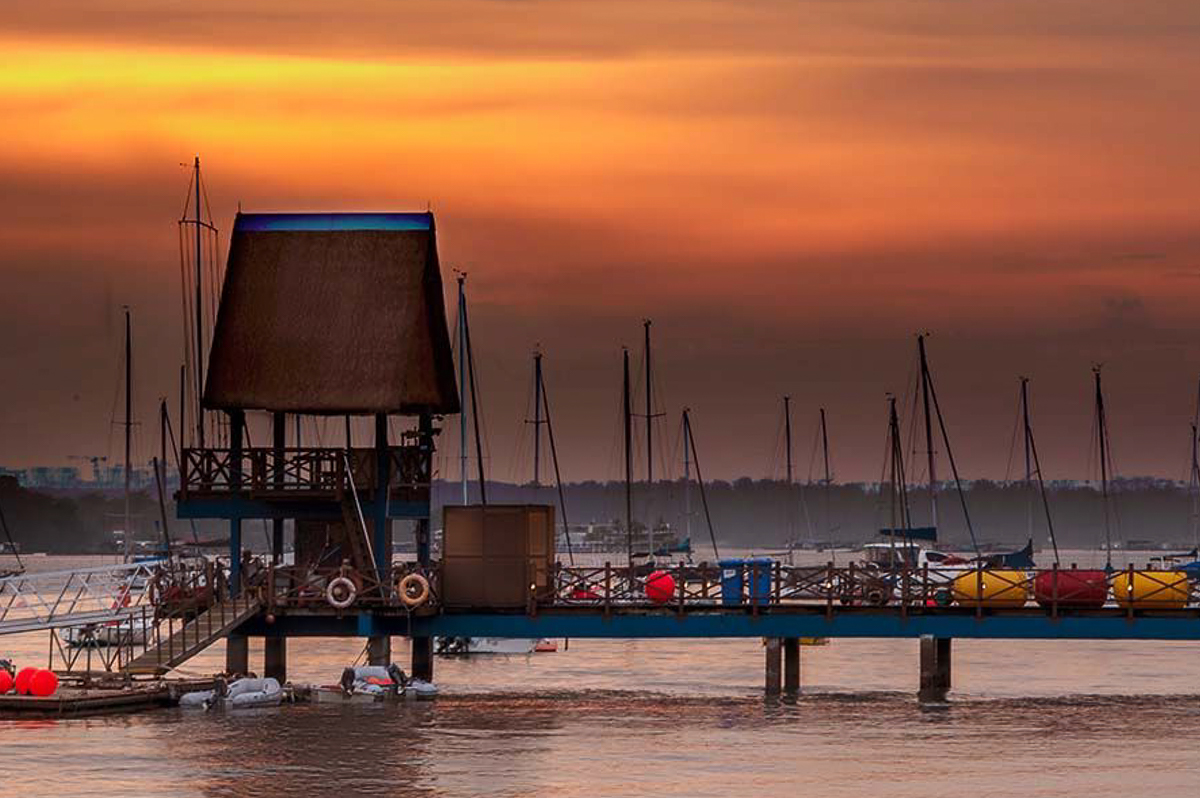
Hi Ye, I can feel the mood of your twilight. The colors are well done, and except for the five bright red/yellow/blue objects pretty much earth tones. The image is sharp front to back, and the image is well exposed. The composition is busy to me. After looking at the twilight, I am led right to left out of the image, come back in at the water and am led out again, left to right. Tonally the image is layered from top to bottom horizontally. The bright red attracts my eye after the initial view, but the subject isn't clear, except for your title.
I think this image could work better in western competitions, if flipped horizontally, as we tend to read right to left. I also feel a tighter crop would define the view better. There is a wave in your lower left I would consider cloning or cropping out. |
Jun 6th |
 |
| 96 |
Jun 23 |
Reply |
Thanks, Dan. Useful comment as always. The mountains are definitely too flat. I need a true black. I may end up with a sky replacement image for my sky folder. |
Jun 3rd |
| 96 |
Jun 23 |
Reply |
Thanks, Ye. I'll take nice, but I get your ambivalence. Growing up in a B&W analog world does make a difference to my generation. As Dan mentions below, I should have dodged and burned the mountains and increased their size. |
Jun 3rd |
9 comments - 8 replies for Group 96
|
19 comments - 15 replies Total
|


