|
| Group |
Round |
C/R |
Comment |
Date |
Image |
| 20 |
May 23 |
Reply |
You're welcome. Do you prefer Sam or Bob as a greeting within the goup? Or anything else? |
May 18th |
| 20 |
May 23 |
Reply |
You're welcome. Justs adds a little depth to a well done composite. |
May 16th |
| 20 |
May 23 |
Reply |
Linen's shopping on the mind?? |
May 16th |
| 20 |
May 23 |
Comment |
Excellent compositing, excellent story and I just have one suggestion. I would consider pulling the statue forward (lighten) and pushing the background back (darken.) I just used the LR masks. |
May 16th |
 |
| 20 |
May 23 |
Comment |
Well done and creative photography. |
May 16th |
| 20 |
May 23 |
Comment |
Good filter selection. |
May 16th |
| 20 |
May 23 |
Comment |
Hi Fred, I'm not sure I quite understand the idea, but that says more about me and my head cold. Anyway, I did a little work on it. I added a sunspot to the windows (radial gradient of RYW) and also selected the blue windows and added a curves adjustment to change the color a bit. Your compositing work is terrific. |
May 16th |
 |
| 20 |
May 23 |
Comment |
Hi Sam, I am motivated by your creativity. The first PiP was seen on the televised coverage of the 1976 Montreal Summer Olympics. Your image has enough interest to make it hold up as a PiP. I also think your color changes in the background work perfectly. Great idea, and processing. |
May 16th |
| 20 |
May 23 |
Reply |
Thanks, Shirley. Do you have any recommendations? |
May 15th |
| 20 |
May 23 |
Reply |
Thanks, Deborah. Me too! Study groups are really great learning tools. |
May 12th |
| 20 |
May 23 |
Reply |
Thanks, Bob, I'll try it. Sounds promising. |
May 12th |
| 20 |
May 23 |
Reply |
Thanks, Fred. Great suggestions. 1. The white Falls could have been adjusted but I've lost them as a background mostly anyway. 2. I'm going to try using a transform tool to add some angling, but if that doesn't work, I'll have to try shooting the ship again. 3. I haven't figured out how to fully brighten the bow water, as the swirl filter affected how the colors interact, I tried dodging, but it doesn't seem to lighten where I want/need. I don't like the muddy color there, but the filter limits what I can do about dodging the swirl, but I liked the filter's effect.
I may well need to learn how to use Smart objects for better effects in compositing, especially in creating this image. |
May 9th |
5 comments - 7 replies for Group 20
|
| 96 |
May 23 |
Reply |
Robert Atkins image above. Sorry. |
May 23rd |
| 96 |
May 23 |
Reply |
I think you have a consistent style and bring moodiness to your images. It would seem to me that after 77 years of seeing the world, I would have developed a consistent style too, but age has not seemed to help. Thanks for the health concern. |
May 18th |
| 96 |
May 23 |
Comment |
Hi Gloria, your image is a good fit for PSA Travel division, and RA's transform work would provide some cleanup to make it a winner. I hope you consider the suggestions. Good work. |
May 16th |
| 96 |
May 23 |
Comment |
I'm not sure there is much I can add, just gorgeous sunrise. I cropped some just because I need to try to be knowledgeable, and a little dodging. You did all the hard lifting. |
May 14th |
 |
| 96 |
May 23 |
Comment |
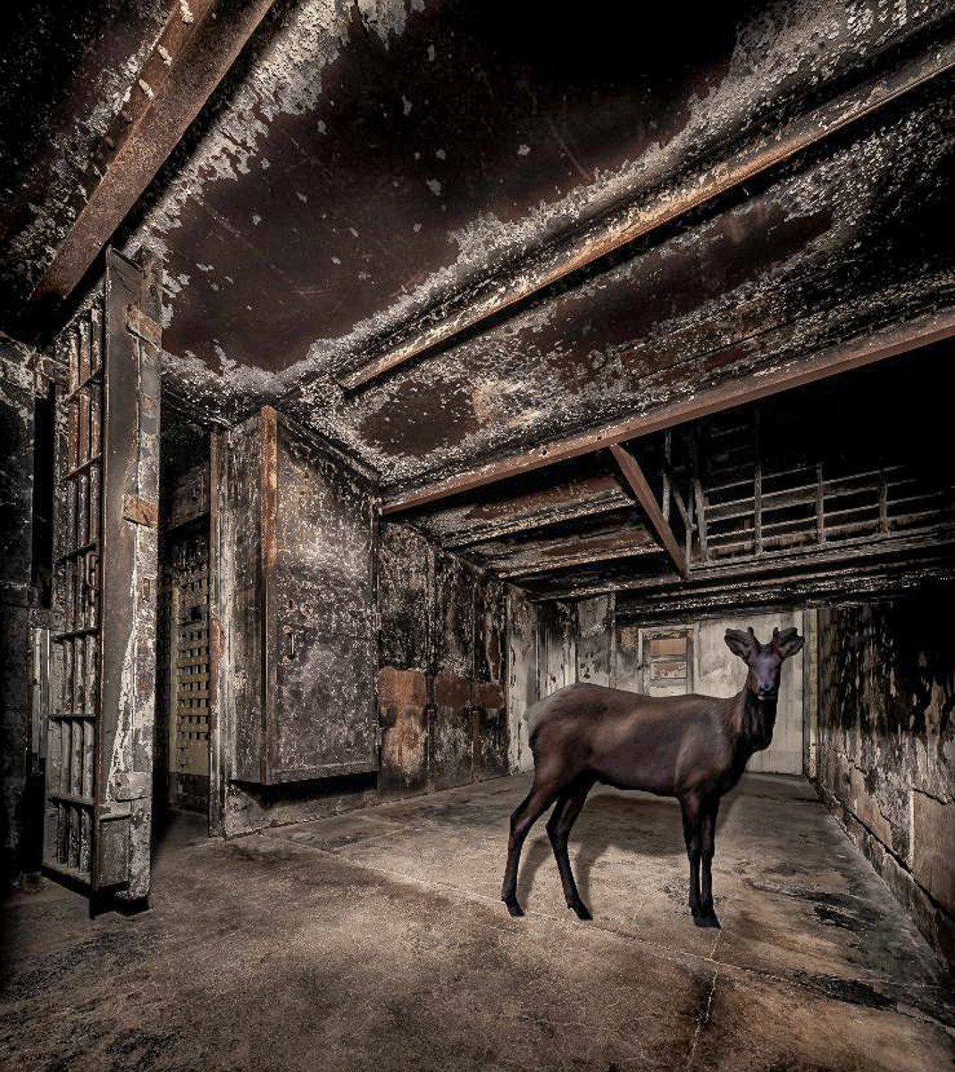
Hi Dan. A dark image. I like composites, which is why I joined DD20. I went to Alcatraz in the eighties when stationed at Treasure Island. Not a big fan of prisons (or crime.) There are a lot of interesting features to look at in your image. The bottom of the image is too dark for me to enjoy and could be cropped. The elk is also dark. I might consider moving the elk to the left a bit or a horizontal flip. Excellent shadow work.
The elk would also be a good image to include as an original for us to see. |
May 14th |
 |
| 96 |
May 23 |
Comment |
Hi Bob, you beat me to the punch on your crop. As always, your image is sharp and well exposed I kept your original ratio and just cropped up from the lower left. I masked the sky in LR to add a little extra contrast to Mt Adams. I tried to make the ridge angles flow R-L.
When I looked at your image in B&W to assess the tonal values all the light areas are on the top, I might consider dodging the line of rocks and trees to give the lower half some interest. I just increased the shadows.
Great image. |
May 14th |
 |
| 96 |
May 23 |
Comment |
Hi Ye, Welcome. Strong image to start. excellent color, sharpness, and composition. I can see some wide-angle lens distortion when I zoom into the port area. I agree with Dan that the sky has some issues. One suggestion would be a crop from the upper right. Most of the interest to me is the left sunset and rocks. Using the original crop ratio but eliminating the sky to one-third of the image changes the feel, so it may be an undesirable change. Beautiful work.
In response to your comment to Dan, I would suggest that while you are learning Photoshop that you use Cmd/Ctrl + F (ind) while working in PS. It is a shortcut for PS help without leaving your image. For example, if you type "lens distortion" in the pop-up box, a filter will open and allow you to put in the camera info to remove the distortion.
|
May 14th |
 |
| 96 |
May 23 |
Comment |
Hi Haru, I am just starting to feel better from two weeks of a head cold. My comments may be affected by that, so please take them only for what you need. This image is calm and peaceful, and has some fall color, but not a lot. The light on the landscape view to me makes it appear like a full-on B&W gradient filter has been added. That may be why you like the portrait version better. The reds are lost in the darkness, but if a subtle hint were your goal, I would leave it in the dark. Robert's version lightens the reds but does get rid of the gradient feel. I'm not positive that I could improve anyone's image except for pointing out obvious technical flaws. You never have technical flaws. So, that sums up what I see. Good images.
I'm just adding a sample of what I could see as a simplified version of your image. Not better, simply different. |
May 14th |
 |
| 96 |
May 23 |
Reply |
Au contraire Cheryl. You most certainly did add something. When multiple members agree with suggested changes, it helps me focus my re-edits. Thank you. |
May 11th |
| 96 |
May 23 |
Reply |
Thanks, Gloria. I don't always compensate for wide angle lenses. I should. |
May 10th |
| 96 |
May 23 |
Reply |
Thank you, Haru. I tried keeping the balcony wood close to what the color appeared to me. That color is what attracted me in the first place, not the balcony itself. The entire cathedral interior is given a "holy" color cast and glow from all the many stained-glass windows. Not an accident by the church, I would guess. To me this image is more a study of color than actual "things".
I do like your interpretation of my image a lot. |
May 10th |
| 96 |
May 23 |
Reply |
Thanks, Dan. Your comments are a tremendous help. I need to crop the bottom off the window, as it isn't my intended subject but a supporting element and frame for the balcony. The balcony, also being someone else's artwork, makes me reconsider this image, but I believe it will pass the ethics test. I always try to look up too during a shoot to see if there is interest (to me.) |
May 8th |
| 96 |
May 23 |
Reply |
Thanks, Robert. My old cabinetmaking passion (prior to tremors) is why I shot this image. I have many images of stained glass, so I hoped to frame the woodwork. Time for me to get the Rulers and Transform tools in PS active to get this image displayed properly, but not make it static. Your suggestions are great. I didn't notice the dark spots as I was concentrating on the balcony wood too much. I didn't use a vignette, but the lens may have caused it. I'll look closer at the RAW file. |
May 8th |
6 comments - 7 replies for Group 96
|
11 comments - 14 replies Total
|


