|
| Group |
Round |
C/R |
Comment |
Date |
Image |
| 20 |
Dec 22 |
Reply |
I just read the DD41 comments for December and I think you will get all the great dialogue you deserve, Hazel.
I know from being on Barbara's management team prior to my brain surgery that she doesn't support the idea of local club members being in the same DDG. Dorinda (30), Bruce Benson (59 and 72) and I are also spread out. Have fun and keep creating great images. |
Dec 19th |
| 20 |
Dec 22 |
Reply |
It is unique, and a good eye to spot it. Well done and Happy Holidays! |
Dec 19th |
| 20 |
Dec 22 |
Reply |
Thank you, Shirley. |
Dec 19th |
| 20 |
Dec 22 |
Comment |
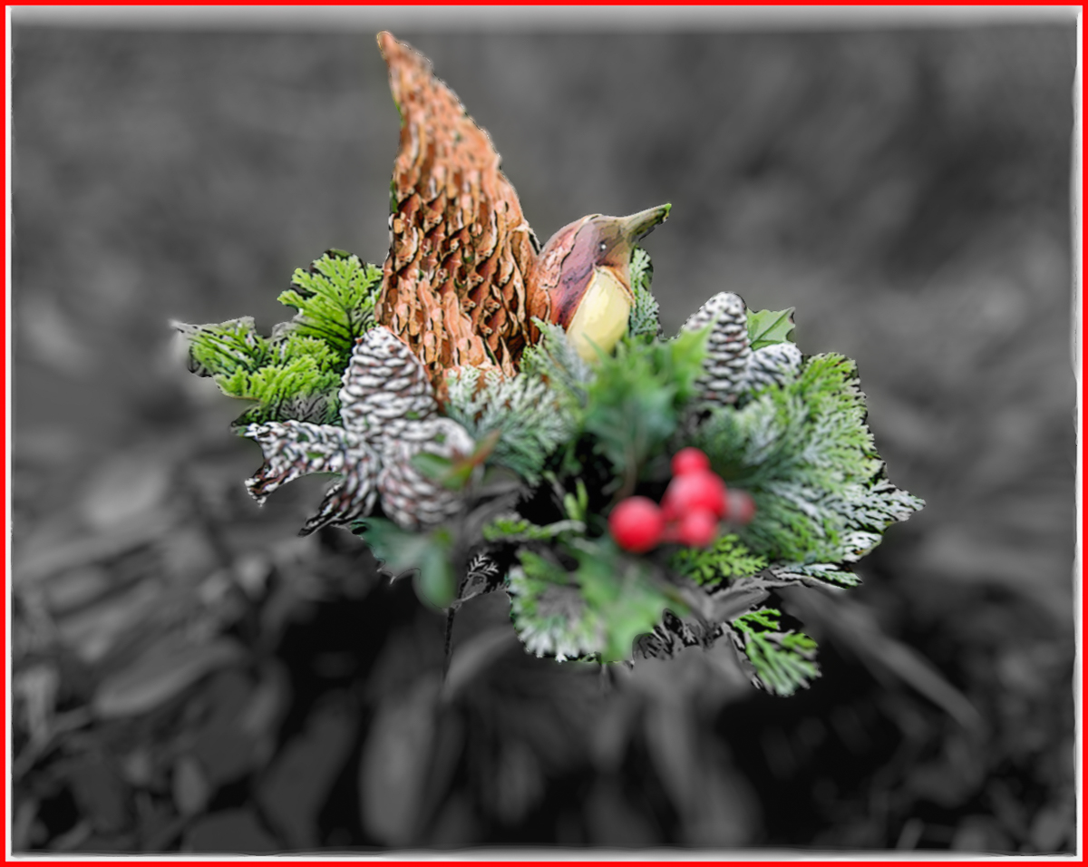
Welcome Hazel. I love many things about your image. The cats' eyes are sharp and alive. Everything else adds depth. Best animal portrait I have ever seen. Bravo, and I hope you supply me (us) with a future image I (we) can provide more help with! |
Dec 17th |
| 20 |
Dec 22 |
Reply |
I'll let Dorinda know now. |
Dec 17th |
| 20 |
Dec 22 |
Comment |
Too cool, Angela! I agree it would be even better larger. I must admit my old eyes thought you alien was eating a fish. Who knows what aliens eat, not me. Wonderful work, and a beautiful image to boot. |
Dec 17th |
| 20 |
Dec 22 |
Comment |
Hi Shirley,
Kind of a strange image, but that's part of being creative. I think that the texture is a little off-putting. I used a beta Neural filter in PSCC, and I might consider a blur to the black/gray areas. Was one of the originals in color? There may be better selection tools available now than what you are currently using. Good ideas. |
Dec 17th |
 |
| 20 |
Dec 22 |
Comment |
Merry Christmas to you, too. Wonderful composition with appropriate feeling. |
Dec 17th |
| 20 |
Dec 22 |
Comment |
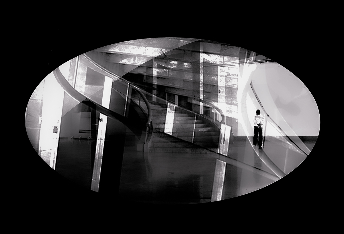
Hi Bob. The composition works for me, but the title does not. I don't see the balance of equal and opposite forces/objects or lives. I think this image is better in B&W, sharp and your minimal just works. Transforming the oval into a circle and a lot of burning might give you a yin-yang for real. Maybe a layer of a real circle.....I don't know if it would make a good composition though. Well done on the image. I'm just being too literal with your title. |
Dec 17th |
 |
| 20 |
Dec 22 |
Reply |
Thank you, Hazel. |
Dec 5th |
| 20 |
Dec 22 |
Reply |
Thank you, Angela. Dorinda feels the same. Sue is her best friend, and we are going to send her a print. One of the best images I have, I took of my friend Marty also staring off into space, on a trip to 29 Palms, CA, and it's been hanging in their bedroom for twenty years. Life is not always fair, but they have been together since high school, and have lots of family to see them through. I can only hope that when this disease strikes that the memories left to those afflicted are their shared happy times. |
Dec 5th |
| 20 |
Dec 22 |
Reply |
Thank you, Fred. Our hearts are particularly heavy with Dorinda's sister also suffering from this terrible disease.
I had a challenging time deciding where to level this image. I ended up using a vertical through Sue. Maybe it needs to be left "out of whack'" |
Dec 3rd |
5 comments - 7 replies for Group 20
|
| 96 |
Dec 22 |
Reply |
Merry Christmas! |
Dec 22nd |
| 96 |
Dec 22 |
Reply |
Excellent results, Bob. I would prefer more canvas for the horses to jump onto, but I do get a feeling of anxiety for the horses with less room. |
Dec 22nd |
| 96 |
Dec 22 |
Reply |
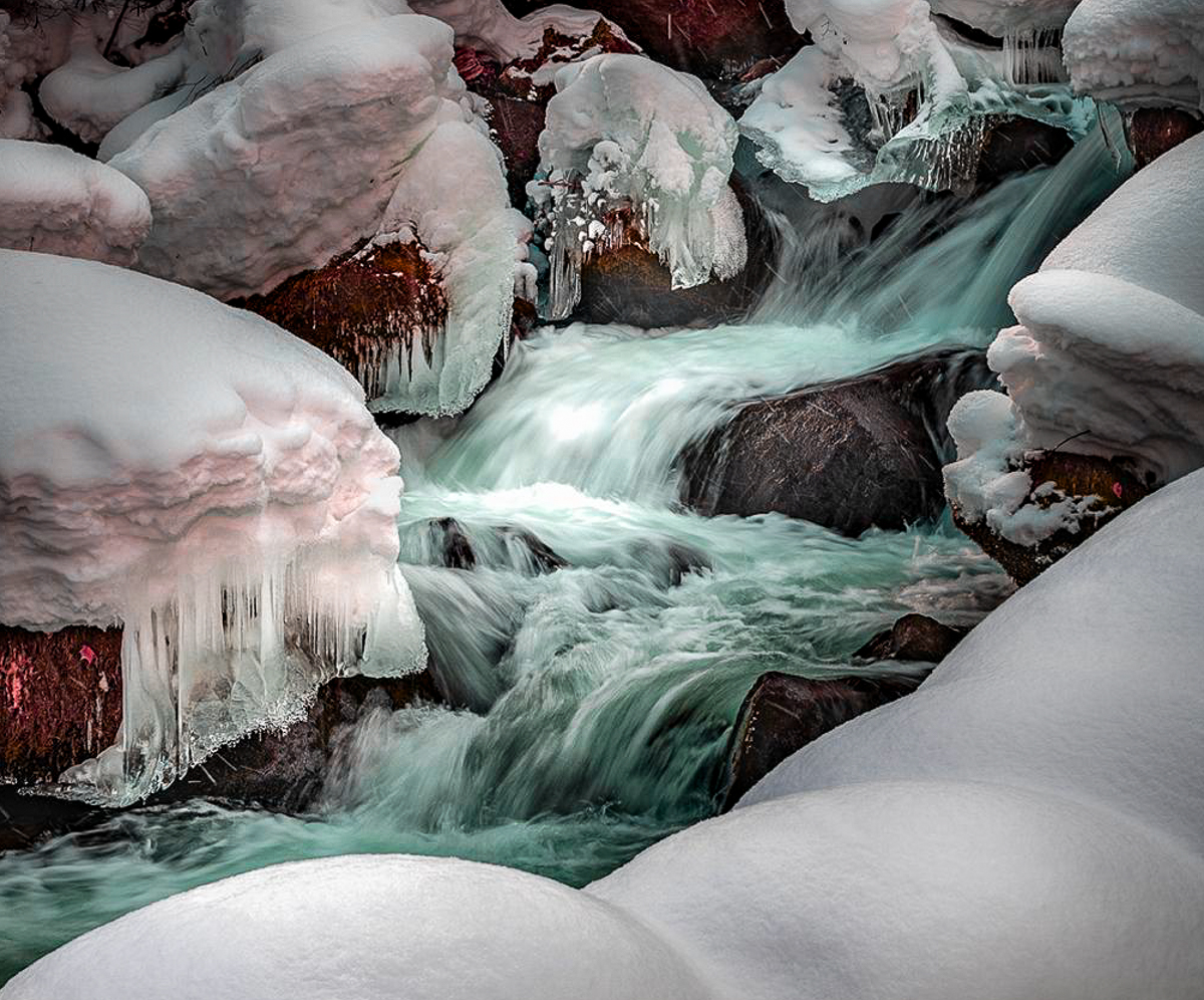
Hi Haru, I couldn't find a landscape image that really made me FEEL cold. Most images that conveyed cold as a feeling contained a live element. If your subject isn't the water, but a feeling of COLD! You might have to add another element. Even images of icicles were more of beauty than a temperature. We can't remember what pain feels like either, just that we had it.
And yes, I am aware that you don't like odd unnatural colors. |
Dec 22nd |
| 96 |
Dec 22 |
Reply |
Thanks much, Robert. All good thoughts as ever. The road curves to the right and definitely out of the frame. |
Dec 19th |
| 96 |
Dec 22 |
Reply |
Thank you, Cheryl. I return to this image often. I'm trying my best to get it good enough to hang on a wall. |
Dec 18th |
| 96 |
Dec 22 |
Reply |
Thank you, Dan. Thanks for the suggestion. I was hoping the light wall brought you INTO the image, not out, and especially the window, but I will rethink that now. |
Dec 16th |
| 96 |
Dec 22 |
Comment |
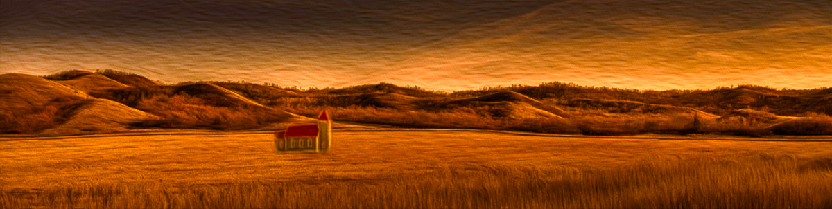
Hi Cheryl, I love this Pano, even if there aren't a lot of places where you could find enough wood to frame it. So, my suggestion would be to have the city council have someone convert it into a mural. It is too beautiful for loneliness for me, but I found it fun to work with. I moved the church and added oil painting filter. You really have a great style. |
Dec 13th |
 |
| 96 |
Dec 22 |
Comment |
Hi Dan, I always appreciate your images and especially titles. I think of calico in terms of orange and black with white in various configurations. In my opinion this abstraction is better photographed than named! There are too many blues and yellows for the title. The delicate lines are truly artistic, excellent image. I might consider a crop. |
Dec 13th |
 |
| 96 |
Dec 22 |
Comment |
Hi Robert, I never tire of Mount Rainier, or your images. You have cropped it to add a needed dynamic of repeating diagonal lines and the colors are great.
I always get comments about "too saturated greens" in my Washington images. That is just the product of sufficient rainfall, clear air, and moderate temperatures. We are a green state in all senses of the word.
I'll have to buy a print when it becomes available! |
Dec 13th |
| 96 |
Dec 22 |
Comment |
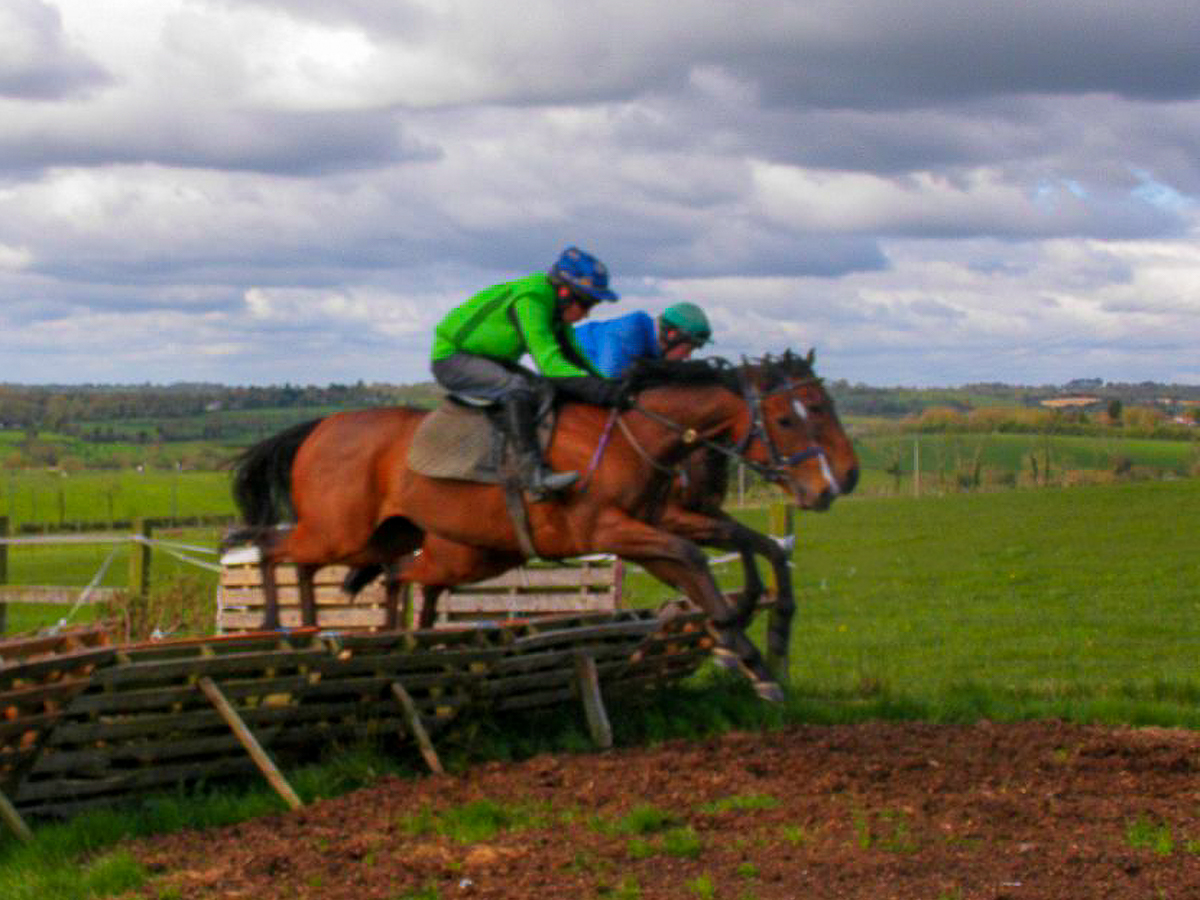
Hi Kate, it sounds like you had a lovely stay in Ireland. Your image shows the action quite well. As stated, it is a little soft, but that isn't a big problem with motion images. I would consider a crop, and then some cleanup of bright areas and a black area below the saddle that distracts my eye. I don't know how to remove it on the jpeg, or what it might be. Beautiful little island that Ireland. Good image. |
Dec 13th |
 |
| 96 |
Dec 22 |
Comment |
Hi Haru,
I see an image this lacks color yet is not black and white. The texture is brought out, by the sharpness, yet little texture in the top of the snow. It is probably just pristine. I let LRCC AI select a subject and it saw the foreground snow covered rocks. The rest was selected by AI as the background. Interesting, huh? It doesn't really feel cold to me, and that may be all is sharp, and the icicles are not featured. More burning or vignette that I would like, but that is your consistent style. I would consider a crop like my candy-colored stream. It just depends on what besides the coldness is your subject. |
Dec 13th |
 |
| 96 |
Dec 22 |
Reply |
Thank you, Haru. I did use a combination of different filters in Photoshop, until I arrived at a color palette that matched my mood here. I used Topaz, and I've dropped Luminar as a plugin filter. I may start working with On1 again, but Adobe is developing a set of AI filters too. called Neural for some reason. Hope they change the name. Most are still in BETA stage. |
Dec 13th |
| 96 |
Dec 22 |
Reply |
Thank you, Kate. Like most things, in Photoshop the more practice you put in, the more your skills grow. If you can't remember a process, control/command(mac) + F gets you to the solutions. Then just type in the process you can't remember. |
Dec 7th |
5 comments - 8 replies for Group 96
|
10 comments - 15 replies Total
|


