|
| Group |
Round |
C/R |
Comment |
Date |
Image |
| 20 |
Nov 22 |
Reply |
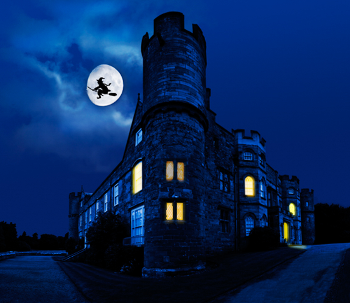
Thanks Shirley. I've changed to a masted ship and lit the back ground with more blues. |
Nov 25th |
 |
| 20 |
Nov 22 |
Reply |
Thanks Shirley. I've changed to a masted ship and lit the back ground with more blues. |
Nov 25th |
| 20 |
Nov 22 |
Reply |
I should have said "under the tower" as it isn't totally clear that the tower starts at ground level. |
Nov 16th |
| 20 |
Nov 22 |
Reply |
Duh! EAP= Edgar Allen Poe! How dumb am I getting. Just old. |
Nov 15th |
| 20 |
Nov 22 |
Reply |
Thank you, Bob. I agree with your suggestion and will move the boat as I keep working on it. I looked at more dynamic color and more contrast, but it didn't appeal to me either. |
Nov 9th |
| 20 |
Nov 22 |
Reply |
Like most days, I forget what I said or what it means. I used EAP as my fingers were tired, so you get to make up any words that sound good to you. How about expert/extraordinary artistic processor! I am such a goof.
Graveyards are meant to be dark, methinks. It was tough to find a good way to edit on a jpeg. Never stops me though. |
Nov 8th |
| 20 |
Nov 22 |
Comment |
Hi Angela, you have created a very spooky image. I played with it since I am inspired by your work on this. I wanted it darker, but I added a second window to the tower and got lost! Great image. |
Nov 7th |
 |
| 20 |
Nov 22 |
Comment |
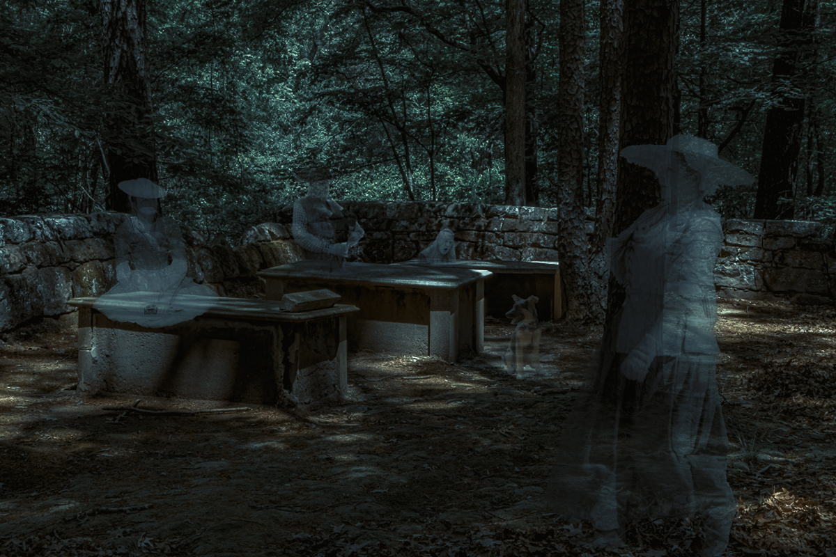
Hi Shirley, Looks like a paint ball battle. |
Nov 7th |
| 20 |
Nov 22 |
Comment |
You are EAP for sure! I like the work you did putting this together. I thought it word be spookier in B&W, but when I tried it wasn't, in my opinion. The composition is great no matter. I color graded it differently in LR to try to give it more of a haunting look. Not sure I succeeded though. |
Nov 7th |
 |
| 20 |
Nov 22 |
Comment |
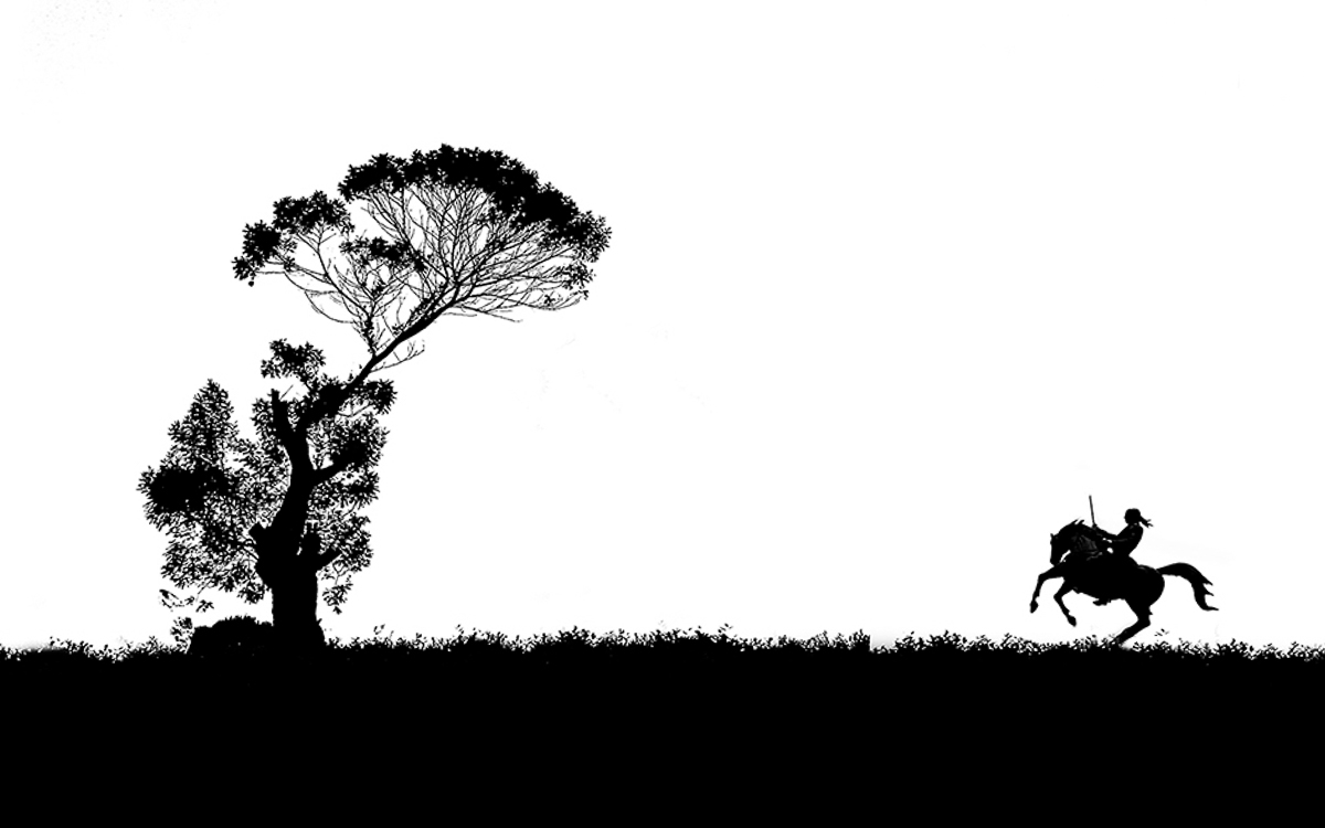
Hi Bob, I really like the starkness created using B&W, but not sure I want the birds as it keeps the warrior from being lonely. The warrior being flipped adds to his loneliness by having him facing the past. If you see the tree as the tree of life, he is also returning to it, if that makes sense. I enjoy the story.
I straightened it from the base of the tree to the bottom hoof and used the content aware brush in LRCC to further remove the remaining pedestal. Very dark and sad tale I see as an indigenous American, very distant from Sri Lanka. |
Nov 7th |
 |
| 20 |
Nov 22 |
Reply |
Thank you, Angela. I ended up using the Hard Mix blend mode (Fill slider works with Hard Mix and Linear Light modes) at 76% where my wife liked it, but I agree more with you. I'll likely move it closer to 40-50%. |
Nov 4th |
| 20 |
Nov 22 |
Reply |
Thank you, Fred. I did leave some stand artifacts but will get them removed. It looks much easier on YouTube to remove objects and on Adobe's new image help/Tutorials (Command/Control F) than I have success with. I hope to improve with all the suggestions from the group. |
Nov 4th |
4 comments - 8 replies for Group 20
|
| 96 |
Nov 22 |
Reply |
Thanks, Dan. I hope to meet up with your vision of me. I like the man you describe, and I do love some hard rock ((when my wife isn't around.)
My work does tend to be harsh, but I am trying to soften my approach. I joined DD20 in an effort to see what I would do by combining my images. Compositing takes a lot of time, but I hope to expand my options. |
Nov 22nd |
| 96 |
Nov 22 |
Reply |
I see your points on this crop and like the light spot removed in the foreground ice plants. |
Nov 21st |
| 96 |
Nov 22 |
Comment |
Could be this one too, flipped horizontally. |
Nov 21st |
 |
| 96 |
Nov 22 |
Reply |
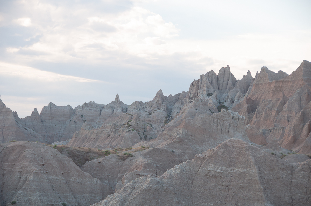
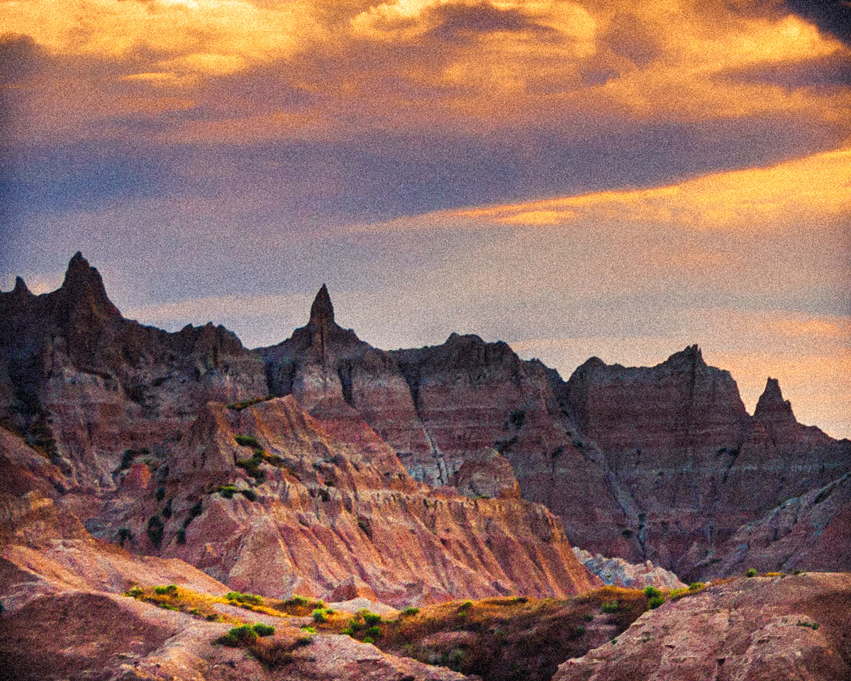
Thanks, Bob. I hope you someday make an opportunity to go, South Dakota has so many differing landscapes that it would take your breath away. Badlands, Black Hills, Custer State Park.
I do sometimes see the dark side, and that is an interesting observation. Unsettling to me now, too. I've included the original so have at it. I have seven different crops and variations of this one. |
Nov 21st |
 |
| 96 |
Nov 22 |
Reply |
Thank you, Gloria. It very well may be. I think I should start taking a recorder with me when I shoot so I can describe what colors I saw, what I was feeling, etc. That would give me access to a true representation, but I'm never sure if that is what I really want. I get involved in post creating new feelings for old shots. |
Nov 21st |
| 96 |
Nov 22 |
Reply |
I am such a dufus. I failed to understand the difference between the mediocre quality of a 4x5 medium format sensor and a 4x5 large format film field camera. In reading your Bio again (or had I forgotten to read it at all,) I now wish so much that I could see your work full sized. Your reference to Charles Cramer, David Muench, Michael Fatali, and Ben Horne led me to look up their work, and while the Muench family was one of my early inspirations, I lost track of the beauty of film, thinking that digitally invoked film simulations available in post processing can match real world large format captures. I really do not know how to actually comment on your work now. The depth, color and nuance can only be guessed at by your study mates. Such a wonderfully written bio too, Bob. Now I'm too disabled to ever reach such heights as you in your work. Thank you for being in our group. |
Nov 21st |
| 96 |
Nov 22 |
Reply |
Thank you again for this idea. |
Nov 12th |
| 96 |
Nov 22 |
Reply |
I'm sorry for the poor communication, Kate. I am suggesting that the clouds and their reflection are the SUBJECT, and that the crop should be the foreground bush. |
Nov 11th |
| 96 |
Nov 22 |
Comment |
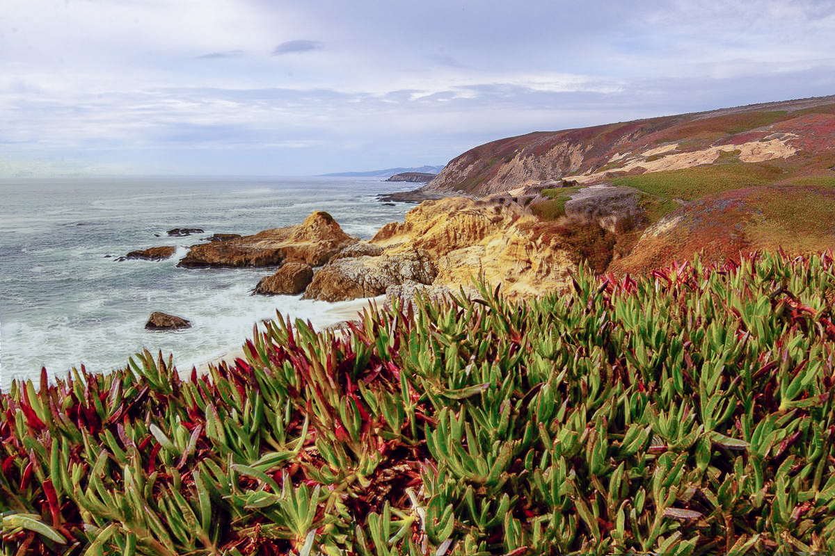
PNW Rocks! Hi Gloria. I think your work on this is excellent. The composition works, although ice plants can get to be tedious. I lived in Novato, CA and worked on Mare Island, for years. You have a technically and emotionally well-done image that speaks to me. The sky looks okay to me, and a little smokey which would be appropriate these days in California. Couldn't help editing it. |
Nov 11th |
 |
| 96 |
Nov 22 |
Comment |
Hi Dan, Beautiful composition, detail, and colors. My poor old eyes could not find your tree. I love the abstraction in this area. Your color choices are spot on for my taste. Navy Blue and Gold is best, but your choices work better on your image.
Since I couldn't find the tree, I cropped and inverted the image to have a bare tree made up in the shadows. |
Nov 11th |
 |
| 96 |
Nov 22 |
Comment |
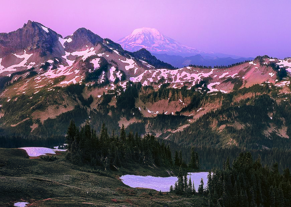
Hi Robert, I always struggle to comment on your images, especially your medium format, which I have never shot with either film or digital media. The composition is well thought out. I'm not sure if the tree line leads me all the way to Mt Adams (if that was the goal) since the trees are so dark. I wonder about the lack of detail or if you purposely removed it in post. I must say that Dorinda is not a morning person, so I have never seen morning light at Paradise. Kind of a painterly image. Forgive me for cropping, but I was looking for detail in the foreground snow. |
Nov 11th |
 |
| 96 |
Nov 22 |
Comment |
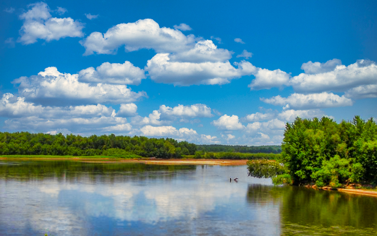
Hi Kate, I just returned from visiting my brother in Mankato MN, and I couldn't believe how low the water level had gotten in the Minnesota River. Down fifteen feet.
Your image is a beautiful, calm scenic landscape. Not a view of the Big Muddy that would be common to most people. Sharp and well exposed. I would consider a landscape crop and boost the colors a bit. The clouds are the star of the show, especially Big Fluffy! The reflection also contributes to the story. I don't think the foreground bush is interesting enough to make this a vertical image.
I'm sure the dry Midwest will be happy when rivers return to their normal levels. |
Nov 11th |
 |
| 96 |
Nov 22 |
Reply |
Thank you Haru. Your version is quite different and has an anime scenery feel to it, if I burn some of the ridgeline. A welcome idea for this image. |
Nov 11th |
| 96 |
Nov 22 |
Reply |
Yes, I think it might be better than the original. Portrait orientation is always debatable for landscapes, but since there is a large rock, it works for me. What doesn't work for me is the vignette. I get a bad feeling about a dark coastal image with no sunset to enjoy, or a human/animal supporting element. As Dan states, the sky reflection is a needed supporting element. |
Nov 11th |
| 96 |
Nov 22 |
Reply |
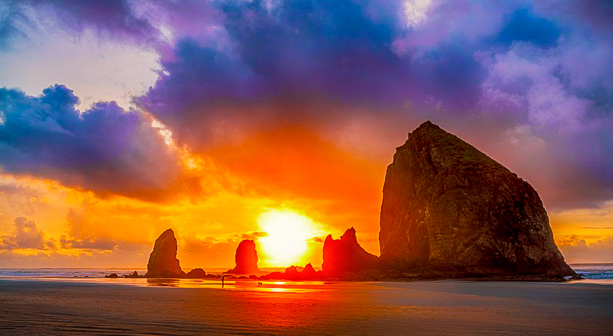
Excellent work, Cheryl. The halo is gone, and the blow-out done very well. I always expect the sun to blow out, being the largest and brightest light source, we have, but your version is remarkable. I hate it when the sun is desaturated to a gray blob. Beautiful image. |
Nov 10th |
| 96 |
Nov 22 |
Comment |
Hi Haru, I love all rocky coastal areas, and you picked a great spot and time of day. Your images are always sharp and correctly exposed. Overlapping isn't always bad, although Dan may disagree. I cropped it using the two center lines in LRCC and centered the highest rock for simplification, while trying to maintain the sky and reflection quality. I also warmed it a bit, which may not be to your taste. A nicely done coastal image. |
Nov 9th |
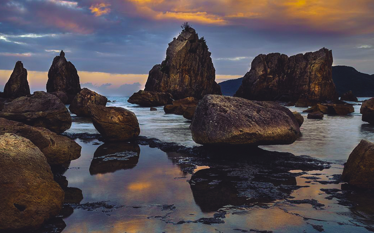 |
| 96 |
Nov 22 |
Comment |
Hi Cheryl, the story and composition are terrific. I am going to suggest a couple of changes to consider. Using the auto level in LRCC I found it to be slightly off the horizon. I like that you embraced the blowout, but the color is a little muted around it, It could be more orange so I added a little color. If you did a global sharpening it has added a halo on the haystacks, which could be removed by using a mask and sharpening locally. I really do enjoy the image, and my suggestions may be too strong. |
Nov 9th |
 |
| 96 |
Nov 22 |
Reply |
Thanks, Cheryl. It sometimes appears that way, especially to me. I couldn't fix the "halo" around the higher peak, so I think it was a lens flare. Any suggestions from the group on fixing flares? |
Nov 5th |
| 96 |
Nov 22 |
Reply |
Thank you, Kate. I've shot this scene many times and each time in a different light. If the seasons weren't so harsh, I'd live here. |
Nov 5th |
7 comments - 12 replies for Group 96
|
11 comments - 20 replies Total
|


