|
| Group |
Round |
C/R |
Comment |
Date |
Image |
| 20 |
Sep 22 |
Comment |
Hi Shirley. Good veggie shot and use of filters. I hate chokes, though. I guess I like the Arti's in salads. |
Sep 15th |
| 20 |
Sep 22 |
Comment |
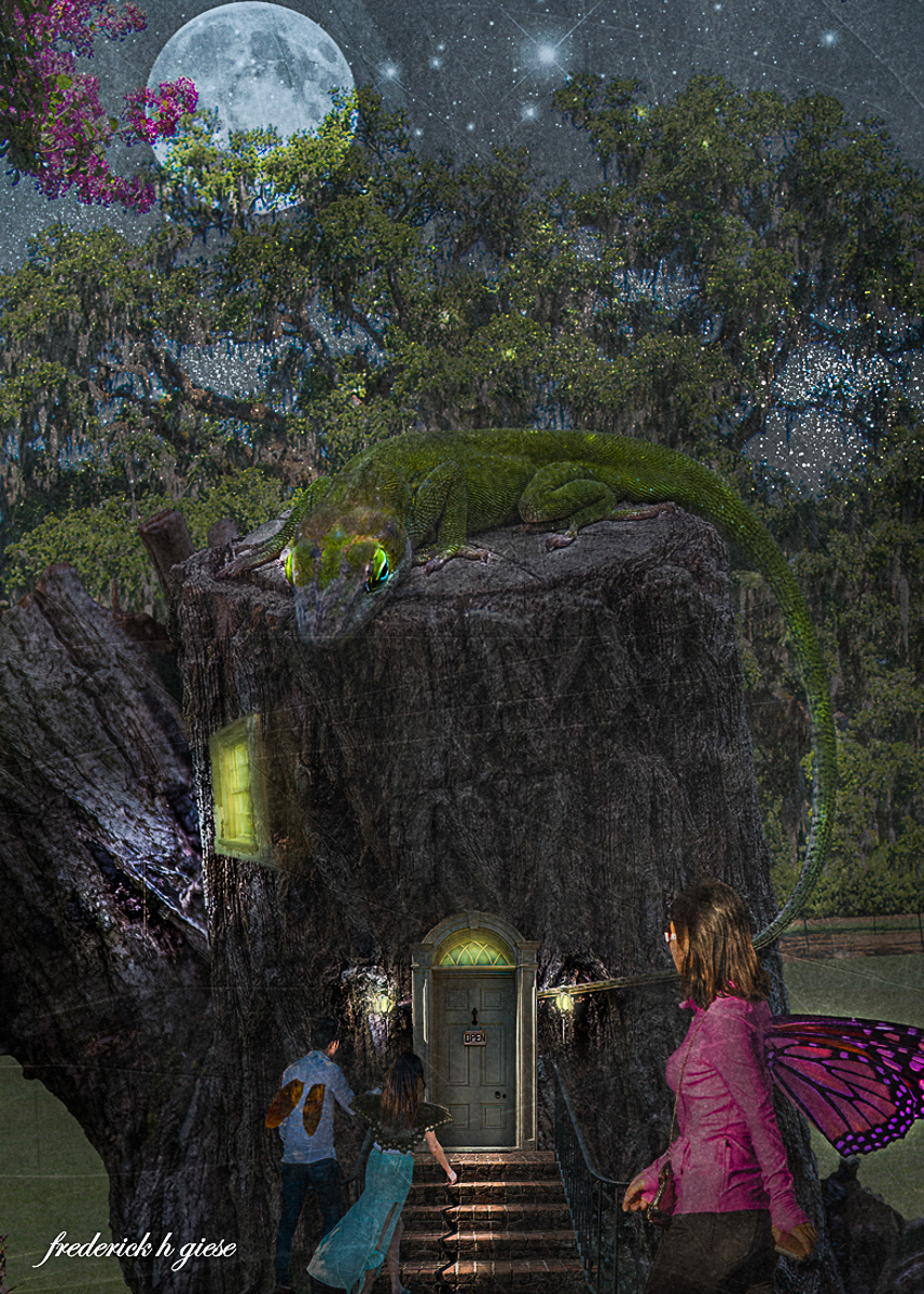
Hi Fred. Another highly creative image. I really like that sneaky little dragon. I, too, feel it is a little too dark, and it makes it hard to see all the delicious menu items. I just went to the AUTO tone button, then increased the contrast a tad, trying to keep it somewhat dark. Wonderfully creative work. |
Sep 15th |
 |
| 20 |
Sep 22 |
Comment |
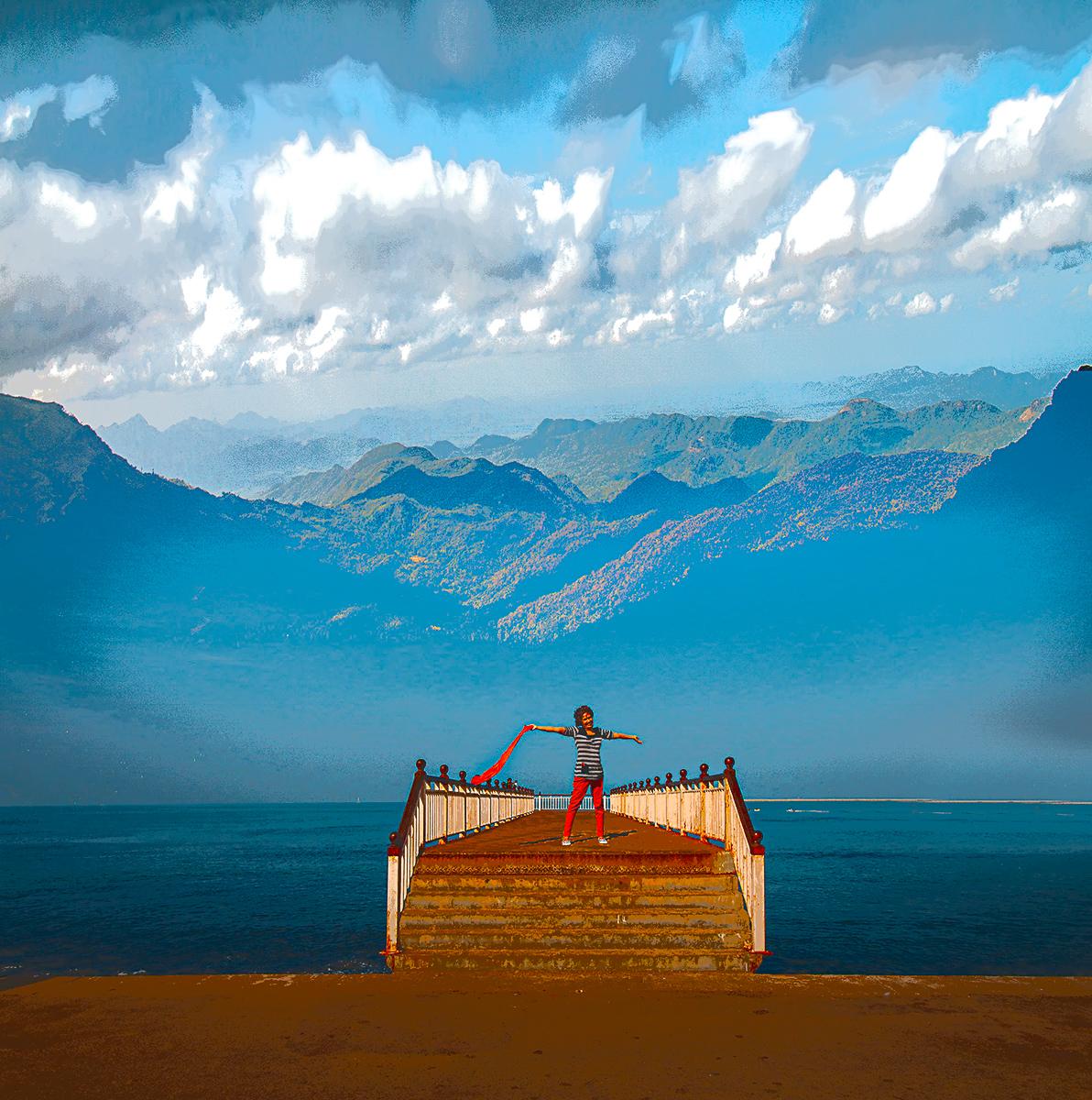
Hi Bob, I like the image you have created. I'm barely starting on my journey to creative images, but I do have a suggestion for this image. The foreground is bright and sharp, and the background is matte and hazy and needs something transitional. There are many ways you could do that. I think because your wife is in a happy mood, you could make the whole image cartoonish, and it might work. Good work and imagination. |
Sep 15th |
 |
| 20 |
Sep 22 |
Comment |
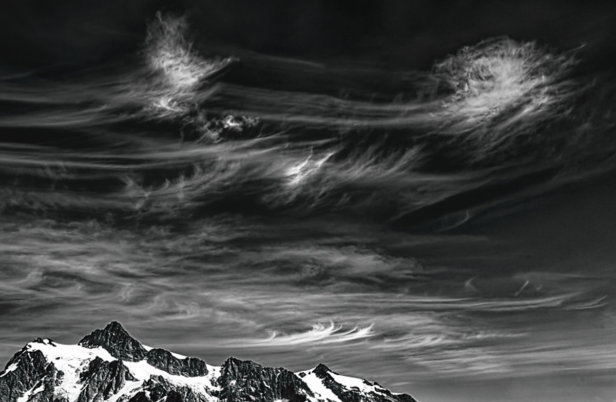
Hi Ham. Wow, wow, wow! The clouds are the story I can wrap my little brain around. I see a elvish image in the far right, reaching towards another human-ish form. I must admit I didn't even see or care much about the mountains. The story is in these beautiful clouds. Excellent choice for B&W too. Wow!!!!! |
Sep 15th |
 |
| 20 |
Sep 22 |
Comment |
Hi Angela. The image matches the story you wrote. The flower petals are underwhelming to me, as they are on their last legs! Nice delicate image as everyone states. |
Sep 15th |
| 20 |
Sep 22 |
Reply |
Thanks, Fred. I must quit listening to 60's rock! I will try to meet the criteria next month. Not sure about being the crème de la crème though. |
Sep 11th |
| 20 |
Sep 22 |
Reply |
Thank you, Ham. Green is the color of the Pacific NW (when it isn't aflame.) |
Sep 10th |
| 20 |
Sep 22 |
Reply |
Thank you, Sam. Me too! |
Sep 9th |
| 20 |
Sep 22 |
Reply |
Thank you, Angela. I think you are correct about the green leaves. Easily replaced with the patch tool. |
Sep 9th |
5 comments - 4 replies for Group 20
|
| 96 |
Sep 22 |
Reply |
Thanks, Bob. The roof of the glass museum is made like a huge diffuser and doesn't reflect anything. Made for art display inside. Sometimes I just learn more from my failures than my successes! Union Station in the background is another local iconic/historical Tacoma building. Darn those housing developers. |
Sep 28th |
| 96 |
Sep 22 |
Comment |
I just took another look at your image, Gloria, after reading Bob A's comments. It is hard to see, but on top of the sailboat there is a wooden flagstaff. When moored a vessel raises the ensign on top of the flagstaff from 8am to sunset. Once underway, the ensign then "shifts colors" to the gaff. The flagstaff and ensign need to be removed. At best it may be a merger, but also it could have been an artifact from cloning the sky in that area.
|
Sep 26th |
| 96 |
Sep 22 |
Comment |
Hi Cheryl, I liked the drama in your original image, especially the tilt. I enjoy the sky better in the updated version as it makes sense. I don't like that the sky has dwarfed the building in importance. Possibly burning the darker parts of the sky would re-capture the original drama I felt. |
Sep 22nd |
| 96 |
Sep 22 |
Reply |
Thanks, Dan. Lots of humor in this, heh? |
Sep 21st |
| 96 |
Sep 22 |
Reply |
Thanks for the suggestion, Gloria. I thought it added vertical balance to the left uprights. My thoughts aren't always right. |
Sep 16th |
| 96 |
Sep 22 |
Reply |
Thank you, Cheryl. I do get the idea. It is sometimes exceedingly difficult to "play" and get away with it when shooting (even local) iconic structures. |
Sep 16th |
| 96 |
Sep 22 |
Reply |
Hi Haru,
I am also replying to your observation to Cheryl. The balance issue can be resolved in PS, if you are willing to alter reality. Somethings cannot be changed, but if we're giving ourselves permission to "create" art, it allows for freedom.
I had cloned the left edge to give a little space, but in this image, I've selectively lassoed the entire mass and content-aware moved the selection (too far?) to give some balance to the right side. As a side benefit it also gives some separation from the mass above. Just an idea. |
Sep 16th |
 |
| 96 |
Sep 22 |
Reply |
I watch TV/movie cinematography differently now, paying more attention to lighting and how they dramatize images for effect. Especially when re-watching a show. I find it to be inspirational. |
Sep 16th |
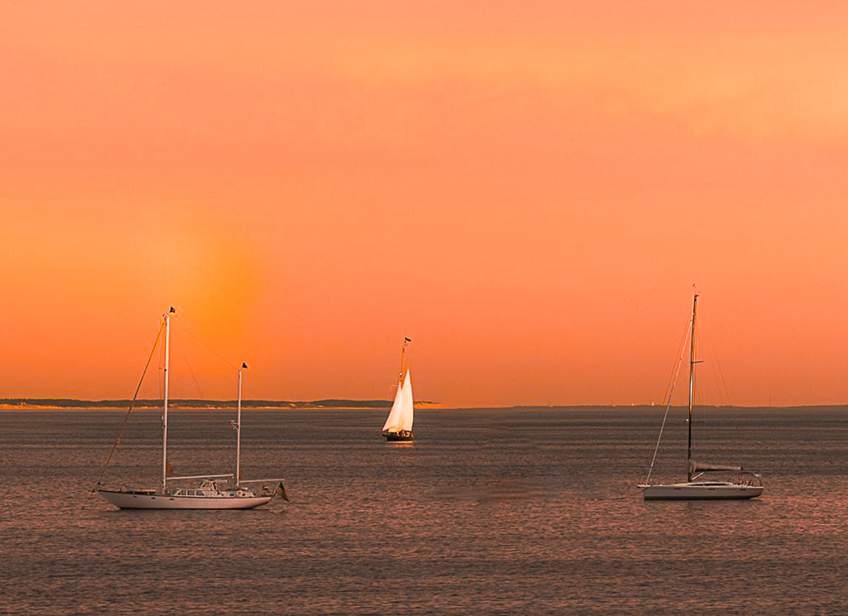
| 96 |
Sep 22 |
Comment |
Hi Gloria, I am afraid I only see a sunspot, and not a rainbow, but there seem to be some extreme colors that were available to you. I agree with Dan that three boats would strengthen the image, so I selected the center one in PSCC with a lasso, the used content aware fill, to remove it. I also straightened the horizon. I lost a little of the color and couldn't get it back. Might be a white balance issue for me. |
Sep 15th |
 |
| 96 |
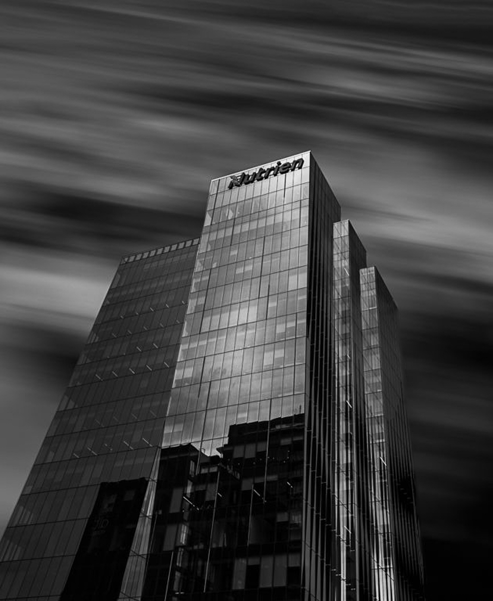
Sep 22 |
Comment |
Hi Cheryl, I love the B&W image from an angle. In Citizen Kane. Zanadu (Hearst Castle) was shot much the same and it is a classic image. Movies can give us vision in still photography. Well done. The image is sharp, all text is readable, and the reflections are perfect. The only suggestion, and it is a nitpick, is a white line on the back of the second stairway. I removed it in PSCC.
|
Sep 15th |
 |
| 96 |
Sep 22 |
Comment |
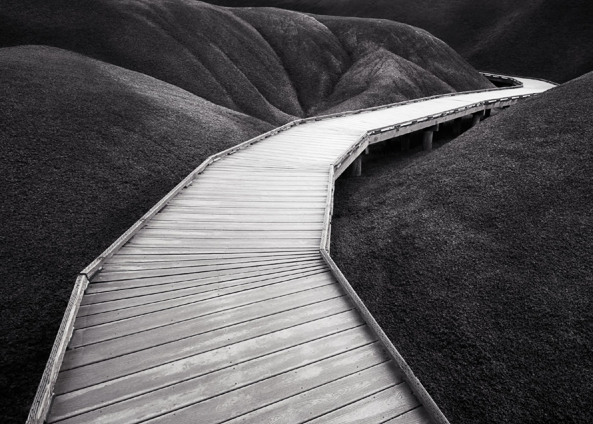
Hi Dan, your vision of a path to nowhere was met with this image. You picked a perfect spot to shoot from as the curve is highlighted (pointed to) by the dodging and burning on the left. I'm not a fan of the Pano crop, but I think there is some space on the right that isn't necessary, although you did dodge the hill to balance white areas. I added a radial spot in LRCC to keep your balance, I hope. It is important to follow your vision.
|
Sep 15th |
 |
| 96 |
Sep 22 |
Comment |
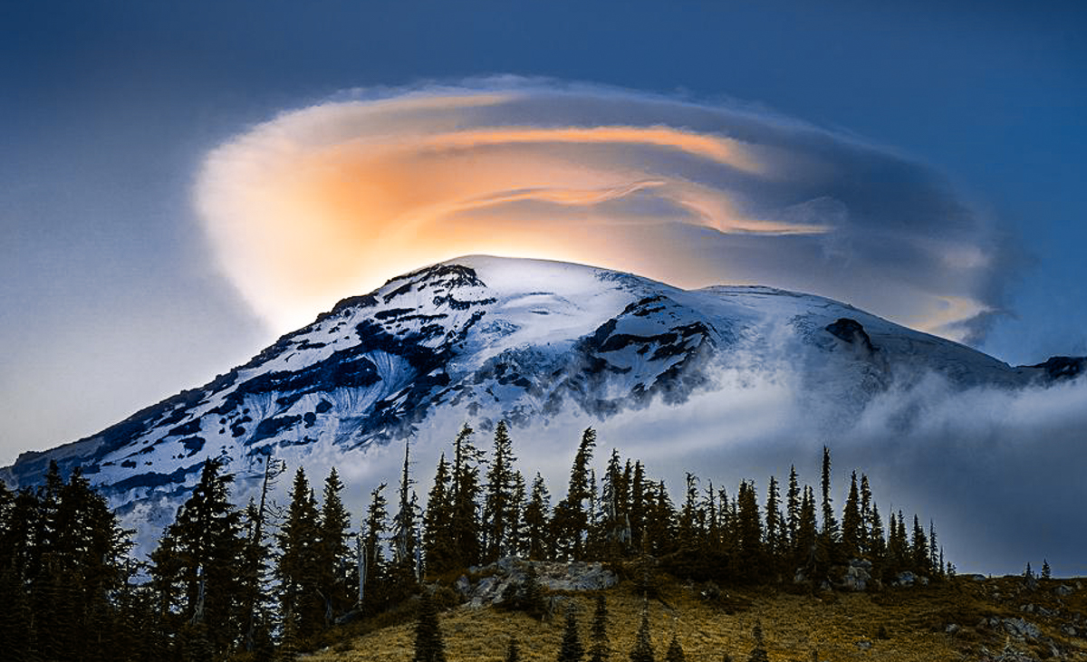
Hi Bob, nothing in nature makes a greater impact on Dorinda and me than seeing Mt Rainier every (clear) day. It dominates our world. When we get lenticular clouds, it makes it even better. You have captured our soul with this image. Thank you. Even having said that, I have a couple of suggestions that I think will make the image pop a little better for me. I want the largest active volcanic mountain in WA to stand out more, so I've cropped it. I also thought the saturation was a bit heavy, so I toned it down a bit.
Just for a little PC, we sometimes refer to our magic mountain as Tahoma, Tacoma, or Tacobet. It is becoming sad to watch the glaciers recede. Beautiful capture Bob. |
Sep 15th |
 |
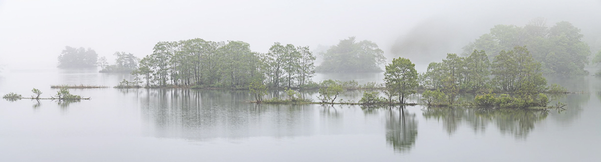
| 96 |
Sep 22 |
Comment |
Hi Haru, I enjoy your image this month, and I envy your being able to capture a meaningful Pano. I never have. Both images work for me, but the subtle green in the color image makes me feel more attached to the image.
I agree with Bob A that the left edge leads me out of the image, and I also straightened an extremely hard to straighten image from a tree, as I thought it had a very slight right lean. Fantastic image, Haru. |
Sep 15th |
 |
| 96 |
Sep 22 |
Comment |
Thank you, Haru. We sometimes get a rosy glow, which I think causes the pinkish hue. These sunsets make Mount Rainier positively glow. |
Sep 10th |
8 comments - 6 replies for Group 96
|
13 comments - 10 replies Total
|


