|
| Group |
Round |
C/R |
Comment |
Date |
Image |
| 20 |
Jun 22 |
Reply |
Thank you, Ham.
Rust it will be. My main image was cropped so the trees are more prominent, so I can rework that. |
Jun 21st |
| 20 |
Jun 22 |
Reply |
Thank you, Fred. I'll keep at it, then. |
Jun 15th |
| 20 |
Jun 22 |
Reply |
Thank you, Sam. Turning the live trees from green to rust is a promising idea, and something I will consider. It may be a stretch for me to use this small sample of dead trees to tell a story. |
Jun 13th |
| 20 |
Jun 22 |
Comment |
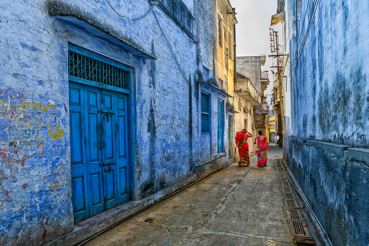
Hi Shirley,
Even though I was transferred from DD23 sooner than expected, here we are again in the same group. I like your composition and the filter you have added. The colors are a good combination, but the filter has flattened most of the tones to a create a dark image except for the stems.
I would consider adding a radial spot or as I have, a reflected spot. I made the reflection just 1 pixel, then turned it horizontally across the apples where I wanted it, then increased it back again.
Wonderful image as always. |
Jun 12th |
 |
| 20 |
Jun 22 |
Comment |
Hi Fred,
Your image is my goal for joining this group. I want to create enjoyable, or at least more powerful images than my camera can do. Macro, composites and establishing a vision. You checked all these boxes for me with your image. It belongs on a wall!!
The only suggestion I have is to add the missing end of the stamen, only because it sticks out. I guess it could also be cloned out, but I think it belongs. Wonderful image, sharp, soft color palette. |
Jun 12th |
 |
| 20 |
Jun 22 |
Comment |
Hi Sam,
This image is a winner. The composition is fantastic. The colors (RBY) are terrific. It is sharp and the leading lines are wonderful. I have a couple of suggestions to consider.
1. Replace the sky with a lighter shade of a blue sky. Eliminate the wires, at least in the sky.
2. Level the image (I used the two humans along their feet.)
Beautiful image. |
Jun 12th |
 |
| 20 |
Jun 22 |
Comment |
This is a more contrasty version for your consideration. |
Jun 12th |
 |
| 20 |
Jun 22 |
Comment |
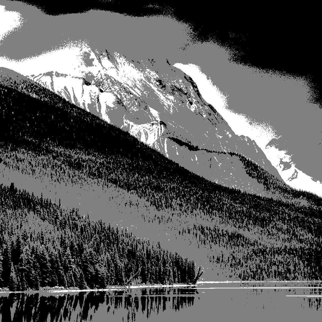
Hi Ham,
I'm not sure I should be the first to comment, as I too am new to this group. Lake Malign and Jaspar are a terrific location (except for the mosquitoes.)
I enjoy the original image composition more than the cropped version. You may have lost the appearance of a level image, but that is just my feeling. I like the distinct layers in both images, but the detail in the B&W forests compete for my attention. The triangles are more pronounced in the original, and though the waterline is centered, for me it works better. I think that the HDR tone compression makes the B&W image flatter, and I would consider D&B back most of the layers.
You have a good image that I think could be made better. It is your vision though. I am attaching a tone mapping image of what you have. Our eyes are drawn first to the lightest areas, and then to the sharpest areas.
|
Jun 12th |
 |
| 20 |
Jun 22 |
Comment |
I have been working on this image, as I wasn't really satisfied that I had created the story I wanted to tell. I was also feeling a need to give Fred an image. I added a texture from my files, and then a reflected gradient to give the image a more ominous look. Same original image, just recropped and added the layers I mentioned in PSCC. |
Jun 8th |
 |
6 comments - 3 replies for Group 20
|
| 96 |
Jun 22 |
Reply |
Thank you, Cheryl. You are close to what I want as a final image. Good suggestions. |
Jun 24th |
| 96 |
Jun 22 |
Reply |
Thanks, Dan. No, I can't go there anymore because of my physical limitations. I am unsure what platform you are using, but I don't have any pixelization on my laptop. No one else mentioned that as an issue. I agree I may need to make this a B&W for any impact at all. |
Jun 21st |
| 96 |
Jun 22 |
Reply |
Have a good visit. This month is still young. |
Jun 15th |
| 96 |
Jun 22 |
Reply |
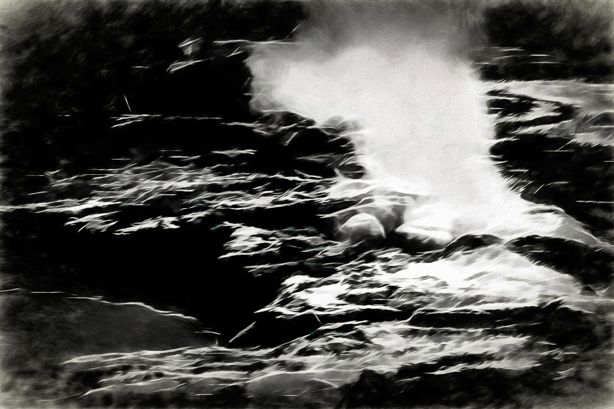
Thank you, Gloria.
This image was cropped, and I took out the top of the steam due to the uninteresting background exposed. I probably misused the word "beauty" as this isn't a beautiful spot. Few visitors clamber up the slope to take images here. Now the park is closed due to flood damage.
"It's not nice to fool with Mother Nature!" |
Jun 15th |
| 96 |
Jun 22 |
Comment |
Hi Bob,
Powerful composition. Magnificent colors, fantastic story telling image. Perfect post processing and amazingly sharp from a boat. Well done, and my favorite so far. |
Jun 14th |
| 96 |
Jun 22 |
Reply |
Thanks for the re-worked image. I like it much better than mine. I did this today, but I'm still mulling it over. I must get better at manipulating the light. This image may be too abstract. |
Jun 9th |
 |
| 96 |
Jun 22 |
Reply |
Thank you, Haru. Definitely needs more work. |
Jun 9th |
| 96 |
Jun 22 |
Reply |
Thanks, Bob
After reviewing the comments, so far, and my own "About..." I decided the beauty and power in Yellowstone can mostly be revealed as abstractions and wildlife. I may still be wrong, but I'm going to go back through each year and see what I can find. Bruce Benson, DD72, grew up near the east side of the NP, and takes beautifully realistic images of nature, especially wildlife. B&W is definite for this image at least and will help. Thanks for the comments. |
Jun 9th |
| 96 |
Jun 22 |
Comment |
Hi Cheryl,
Beautiful colors and a terrific shot. I am so happy you were there at the right time. I like the crop that Haru made, and I think you have the right idea in replacing the sky. My only concern is that I think this is a sunrise as opposed to sunset(?) and maybe your sky would look better flipped. Whether you add more canvas to the sky is a trial you can take on. I used the sky replacement edit in PSCC but selected a blue sky. I then added a new LUT adjustment layer, called Crisp winter look, which I think ties it all together well, and reduced the opacity to 66%.
Quite a beautiful image no matter what. I'd print it big and hang it on a wall. |
Jun 9th |
 |
| 96 |
Jun 22 |
Comment |
Hi Dan,
I like researching your titles. "Dead Cat Bounce" is a market(economy) saying. We all hope it isn't the beginning of a recession, but I think your use of the haystacks as a graph is definitely creative. I assume the center stack is the title spike.
Gorgeous colors, view and processing. Oregon coast has replaced the Palouse as my favorite area.
Great image, cute title. |
Jun 9th |
| 96 |
Jun 22 |
Comment |
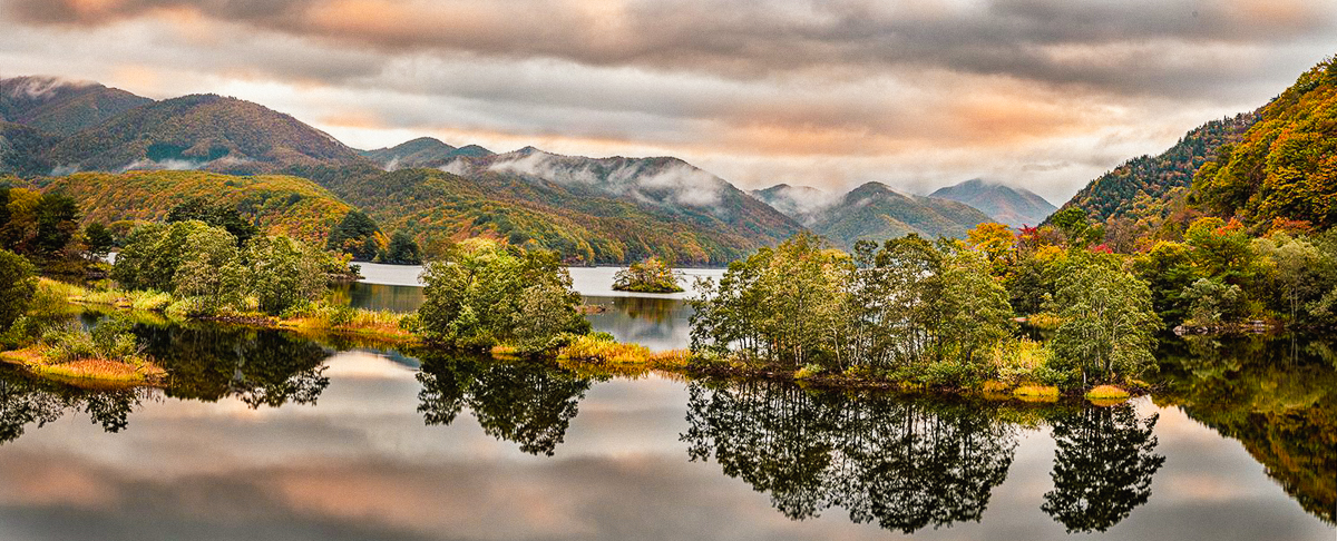
Hi Haru,
I love the Pano, especially that you stitched the images together to create it. There is so much to look at in this image, I am unsure whether "peace of mind" is something I feel. Beauty, wonder and awe of nature are more my feelings.
The sharpness, color (for the most part} and clarity are spot on. I think if you are unsure where to level the image, since the angle is receding POV on the island, I tried using the third tree from the right as a vertical, which only made a slight change. Not critical IMO.
I feel you have achieved a balanced image. The sky is a bit different, but I can't say why. oranges are a little off-putting, without some blue. I might like to see more bright autumn colors, but you get what is there. Some years are better than others.
A really well thought out and presented image. |
Jun 9th |
 |
| 96 |
Jun 22 |
Comment |
Hi Gloria,
I like your composition, and I hear some possible post-processing issues. I've sent an email about that part.
The color and light silhouettes are well done. The bay is a little busy IMO. I would clean up what isn't important to you. An ND filter could get you a longer exposure, smoothing out the water. Gorgeous image.
|
Jun 9th |
 |
5 comments - 7 replies for Group 96
|
11 comments - 10 replies Total
|


