|
| Group |
Round |
C/R |
Comment |
Date |
Image |
| 23 |
May 22 |
Reply |
Thank you, Julia. I also hope you respond to the above BB thread if you wish. http://psadigital.org/group23/bb.php#cmnts
|
May 31st |
| 23 |
May 22 |
Reply |
Thanks, Brian. Rather than pursue a comment than cannot be replied to, I opened a Bulletin Board discussion above, or http://psadigital.org/group23/bb.php
which anyone can read respond to. The thread is the only one so far, so I assume this group does not use it. Thread Title: Button Pushing in 2022. Obviously, I am not a writer, nor a master photographer, but as a self-proclaimed artist, I use all the buttons I have in order to create an image unique to me. |
May 31st |
| 23 |
May 22 |
Reply |
Thank you, Marilyn, I made a duplicate layer Ctrl+J. I used a rather heavy dose of Gaussian Blur, around 80 to get just the colors I wanted, then added a combined layer Shift+Ctrl+Alt+E, which makes a composite layer of all layers below. Then I used the Stylelize_Oil Paint filter without much slider adjustment. The sliders are pretty much self explanatory, Just my workflow though. Here is a youtube filter use guide that is decent. https://www.youtube.com/watch?v=acmUMDjqs00 |
May 24th |
| 23 |
May 22 |
Comment |
When I was in Tasmania and Perth, there were aboriginals playing the digeridoo. It is a very distinct sound and assume that the size of the instrument controls the bass. There was an old movie, called "The Coca-Cola Kid" with Eric Roberts that he went to Australia and a rock band incorporated the instrument. Made for a great sound. One of my favorite movies of all time. https://www.youtube.com/watch?v=OEVhX0EZh9w |
May 22nd |
| 23 |
May 22 |
Reply |
Thanks, Marilyn. I know it's hard to work with only a jpeg, but I really enjoy the depth you've managed in your version. How did you create your image? I'm not sure I am a fan of these analogous colors though. Luckily, colors are easy to change and experiment with. Here is another try using PS blur and oil paint filters. |
May 22nd |
 |
| 23 |
May 22 |
Reply |
Thanks, Brian. I think PJ would be an excellent choice. I am surprised you get time to do any photography at conferences/festivals with your schedule. I appreciate all you do for PSA.
I agree with Adelet that it looks to be a digeridoo. I might burn the instrument to bring out the markings, if that is allowed in PJ. |
May 15th |
| 23 |
May 22 |
Comment |
Hi Adelet,
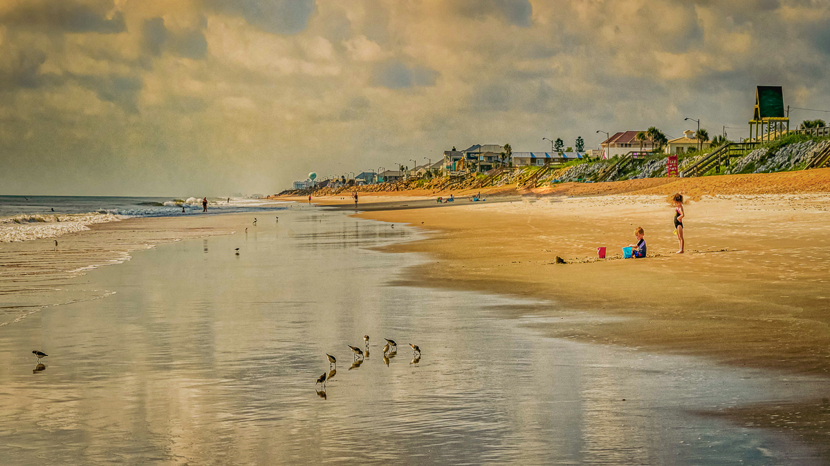
Your image is beautiful, and the pastel colors not only make it timeless, but softens the harsh glow of Florida's sun. My brothers grew up in Merritt Island when my father worked at the cape. I too remember this beach well. You made a nice connection between the top left and lower right with the darker colors. The tower makes a nice diagonal with the birds and children. I selected the girl in PSCC and removed the two sunbathers, isolating the children more. I also removed the bright blue beach umbrellas too, but all is an artistic choice.
LRCC has Vintage style presets, and mostly just change the LUTS. All work well with this gorgeous image. Well done. |
May 12th |
 |
| 23 |
May 22 |
Reply |
Thanks for your edit, Richard. It does add the WOW factor for me. |
May 12th |
| 23 |
May 22 |
Comment |
Hi Julia,
Your image is breathtaking. I love the eye, the tips of the antennae, the sharpness and detail where it counts, and your attention to the background and not overdoing the vignette. It all makes for an outstanding image. |
May 12th |
| 23 |
May 22 |
Comment |
Hi Richard,
I love the conceptual value of your image. The color is beautiful. The vital part of the leaf, and the shadows are in sharp focus. I believe that is also the story. I would crop the right. The story is told without seeing the cause of the shadows and it may even be distracting. It causes a ping-pong effect.
I see the outline of a cardinal in your leaf too.
Excellent work. I did also clean up a couple of yellow spots in the leaf. |
May 12th |
 |
| 23 |
May 22 |
Comment |
Hi Marilyn,
Your image has the WOW factor for me. The story is fantastic, and you captured her (I'll take Adelet's decision of "her") intense look and action. I agree with your crop that the face and hand need no connection since they are connected by her work. Color is beautifully processed, and all is sharp, bringing and keeping us in the image. Beautifully done, and I hope you were able to send her a copy of this outstanding image. |
May 12th |
| 23 |
May 22 |
Comment |
Hi Brian,
I would classify this thumbnail image as a memory, and I was there. Good snapshot by a busy man. |
May 12th |
| 23 |
May 22 |
Reply |
Thank you, Shirley. I'll have to find a wall for abstracts. |
May 8th |
| 23 |
May 22 |
Comment |
Thank you, Richard. |
May 8th |
| 23 |
May 22 |
Comment |
Genuinely nice image, Shirley. I like the greens, and the lighter fern stands out well among the darker leaves. The image is sharp, lighting is diffuse. I took the liberty to remove some of the dead twigs in the upper left. It doesn't have a WOW factor for me, but as an assignment, it is okay. |
May 4th |
 |
8 comments - 7 replies for Group 23
|
| 29 |
May 22 |
Reply |
Those little bitty covid critters have been a pain, too. |
May 12th |
| 29 |
May 22 |
Reply |
They move faster than anyone can. Not just us old folks. |
May 12th |
| 29 |
May 22 |
Reply |
Thank you, Karen. Bears do not like eye contact I am told, having never put it to the test. The only bears I see are at zoos or the Grizzly Bear Discovery Center in West Yellowstone. I still haven't made eye contact to get a shot. Bruce Benson is in my club, and he provides all the bear shots we need. |
May 8th |
| 29 |
May 22 |
Reply |
Thank you, Gunter. Good question/reminder. What I normally do is just scroll through the CURRENT IMAGES http://psadigital.org/groups/images.php
and if I see one that is interesting to me, I click on it, and that takes me to the image, where the comment block is available. I can save it for adding what I comment upon just normally.
Of course, in this case, I was simply curious to see what my old pals, Judy and Karen, were up to. |
May 8th |
| 29 |
May 22 |
Comment |
Hi Judy,
Since DD29 is a general, not an ND group, I'll take the artistic liberty of modifying the image slightly. I like that the bear is sharp, and all color is natural. As Gunter mentioned, faces and eyes are paramount in ND. Great shot.
I looked at images from a camera review, and it doesn't look like bur is a trait, except maybe in the foreground, so it might be a good macro camera.
I straightened the image using the sort of waterline, cleaned up the sticks on the beach, selected the bear, and blurred the background. Finally, I added a radial spot just to highlight the animal more.
So sorry about Bill. |
May 7th |
 |
| 29 |
May 22 |
Comment |
Hi Karen,
Highly creative image. The sharp eye, and the leg leading to that eye are perfect. The diagonal line from the eye to the wing is nicely balanced by the horizontal line of the water. I am glad that you kept the foot shadows too. Superior detail in the body, and while gulls may not be a popular bird, they photograph well, and this shot has WOW appeal. Great image. |
May 7th |
2 comments - 4 replies for Group 29
|
| 33 |
May 22 |
Comment |
Hi, Paul.
Browsing through Current Images, I ran across your outstanding capture of these woods and flowers. I'm not sure what quintessentially English looks like, but I assume it means something to do with Leica's muted palettes. I would suggest a couple of edits could narrow the viewer's eye to the wonderful light and bring out more depth to the view. I tried to keep the colors less vibrant but not enough for your taste (probably.)
In reply to your written text, If I had to give up pristine views like this to allow children access to nature and beauty, I would pick the latter. No painting or photograph hanging on a wall can yet convey the smells and sounds of this scene, and the future of conservation will lie with the children.
Fantastic image, Paul. |
May 24th |
 |
1 comment - 0 replies for Group 33
|
| 34 |
May 22 |
Reply |
Thank you, Jan. |
May 30th |
| 34 |
May 22 |
Reply |
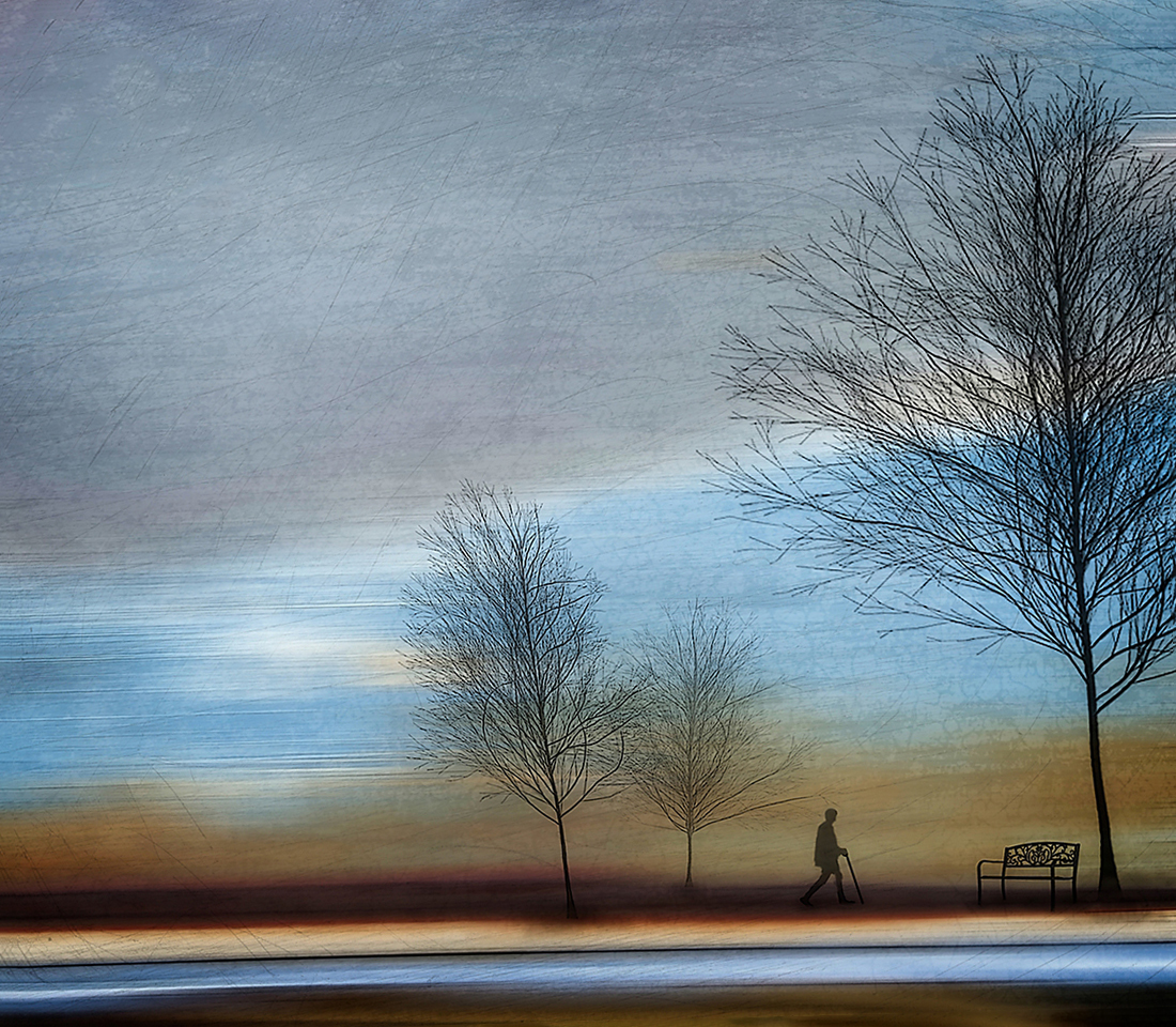
I see Jan. It is your vision that is most important.
If you intend for the viewer to connect the living together, then I might consider having the birds flying towards the man or at least towards the right side of the frame, rather than out of the top of the frame. I failed to make the connection, because IMO the birds were abandoning the scene and taking me out of the frame, if that makes sense.
Your creativity is fabulous in any case. I wish to learn compositing, and your image is an inspiration for me, especially in your storytelling. |
May 27th |
 |
| 34 |
May 22 |
Comment |
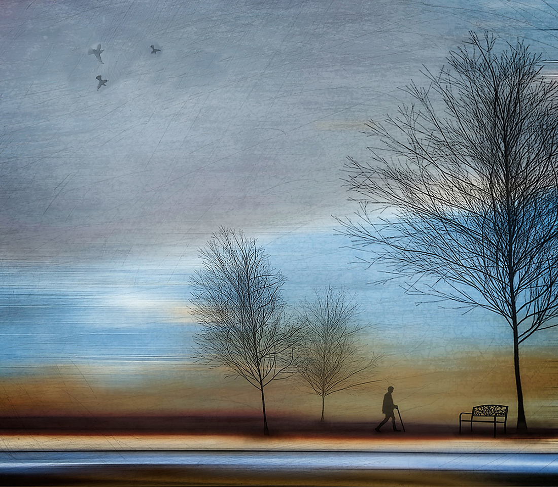
Hi Jan,
I spied this image from "Current Images" and it just spoke to me on many levels. The colors are perfect. The composition lends itself to various interpretations. I see a man walking towards his resting place. He is walking forward into the future, and not looking back at his past. That the trees are in winter, and all are in silhouette except the birds, which bother me.
I suggest they be either darkened to match the other elements. or removed. I prefer the negative space as the birds don't add anything to the story, in my opinion. BTW I also straightened the image slightly on the man and bench which I think are critical to the story. Well done and I think this is a great vision on your part. |
May 24th |
 |
1 comment - 2 replies for Group 34
|
| 74 |
May 22 |
Reply |
Thanks, Dick. Just suggestions. We really liked your projection images. |
May 7th |
| 74 |
May 22 |
Comment |
Hi Dick,
I've always had trouble finding good images in Hawaii. It is all too beautiful to see small. Haru has found two excellent small images. They are like Jim Welninski's B&W's. I like your rendition too. The vines either lead me into or out of the image but are haphazard in where they lead. Maybe either darken the strays, or move them to a better spot via PS. Lot of work, but doable. |
May 6th |
 |
1 comment - 1 reply for Group 74
|
| 96 |
May 22 |
Comment |
Thanks for all your help. I made major crops, didn't get the transform to work. so just cloned above the rock to a smaller top, and I think this is better now. |
May 28th |
 |
| 96 |
May 22 |
Reply |
Thanks Bob,
I might try something similar but might dodge some of the whites to see if I can add some flow to the image. Dorinda always gets good shots here, and I never do either. Maybe next year I'll have resolved the image and will repost it to the group. If I can't I'll wait for another life! |
May 28th |
| 96 |
May 22 |
Reply |
Thanks, Gloria. I agree with the compromises. I must get better with my post processing. It is a never ending learning process. |
May 28th |
| 96 |
May 22 |
Reply |
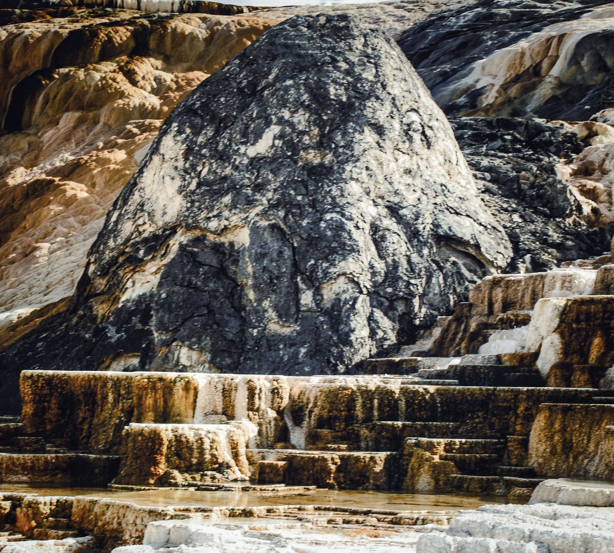
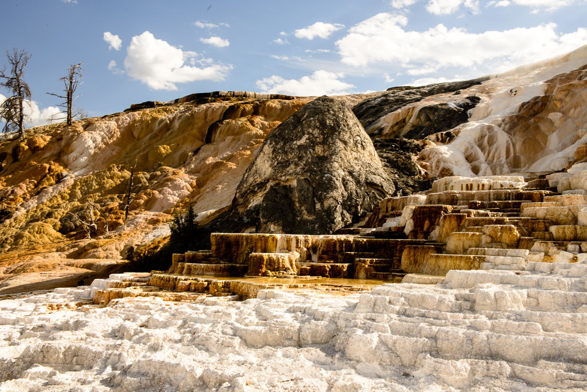
Thanks. That can be done well in PSCC transform. I will need to Clone in the surrounding rocks to make it appear natural. I'll never return here again as my lungs just won't take the altitude. The hot springs are 6,735 feet. |
May 28th |
| 96 |
May 22 |
Reply |
Thank you, Haru. It is somewhat dark, but a good crop. I will look at this as a better reference. |
May 28th |
| 96 |
May 22 |
Reply |
Thanks, Haru. I like that you have included the drawings to highlight you comments. That is an advanced technique. I think I've increased to yellows beyond usefulness. Darker is better, but still not what I saw. I'll include the original in case you have the time to reply again. |
May 28th |
 |
| 96 |
May 22 |
Reply |
It is good to experiment. His head needs to be selected and then either flattened tonally to match the rest of the scene or the selection inverted and vice versa.
Not having been there at the time I don't know if his hair is covering part of the bushes, but to me that appears to be the case. In my opinion it still needs a little work to merge the tones. |
May 18th |
| 96 |
May 22 |
Comment |
Hi Gloria, extremely difficult challenge you have presented to us. His head sticks out like a sore thumb but repositioning his head a little lower might help take his hair from the bushes. He could blend into the sand in B&W. If you have room for a small abstract, I can try one. This was done in LRCC, PSCC, and Topaz. Cropped and processed using a Brilliant on White look at about 40% opacity. Hope it gives you some creative idea. |
May 11th |
 |
| 96 |
May 22 |
Reply |
Hi Haru,
I did not intend my B&W to be an edit, but only for the purpose of highlighting the falls as a king, if you look at just the white. Kind of a gestalt vision. Your B&W shows it even better. |
May 6th |
| 96 |
May 22 |
Comment |
Hi Haru,
We are going to be a little shorthanded in our group this month, so I'll get started right away.
I don't know what I can add to your image. The silky smoothness is not required to be in all fall's shots, in my opinion. The histogram is dark, but no important shadows are lost. I added light but that made the trees and sky draw attention away from the falls. I also changed the hue of the moss but didn't think it made any difference.
You are a master of waterfall imagery, and I know it is hard to change position in a lot of cases, but my suggestion would be move left or right when you can, to eliminate the sky/trees that hinder your processing.
Interestingly, when I made the attached B&W for tonal viewing, the waterfalls looked to me like a European king.
Beautiful image, but I don't think it produces the calming effect you normally provide in your images.
|
May 4th |
 |
3 comments - 7 replies for Group 96
|
16 comments - 21 replies Total
|


