|
| Group |
Round |
C/R |
Comment |
Date |
Image |
| 23 |
Apr 22 |
Reply |
Thanks, Robert, I try. I hope you are enjoying your new group.
|
Apr 28th |
| 23 |
Apr 22 |
Reply |
Good question, Marilyn. If you Google PSCC oil paint tutorials, you can choose from a variety of tutorials to find one you find helpful. I don't know any rules though. Layers are easily moved to the trash can icon, which I use often. Hope this helps. |
Apr 26th |
| 23 |
Apr 22 |
Reply |
Hi Marilyn, (Bob)I didn't use the smudge filter, just oil paint. Richard uses Affinity Photo for editing. |
Apr 25th |
| 23 |
Apr 22 |
Reply |
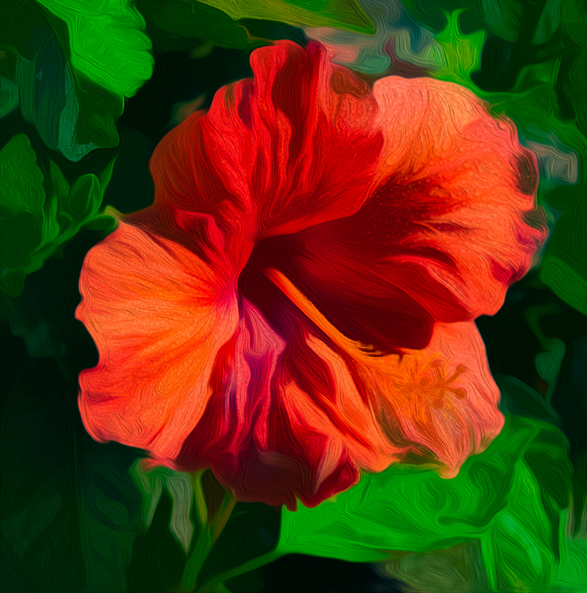
OK. No border is needed as there isn't a conflict with the space given, which happens with blacks. The background needs no border at all, as the texture is light and cheery. How you managed to get light on the petals is amazing to me. |
Apr 19th |
| 23 |
Apr 22 |
Reply |
Thanks, Brian. You are definitely correct in your opinion (How can you not be!) I usually do not submit finished pieces to the study groups, only the ones that I have gotten stuck in processing and need others' opinions. What I need from the group, including you, is what you all think would help.
How and what do you think it needs to stand on its own?
I understand that what you see is not artistically pleasing to you. Is there a processing option that you can share to make it that way to you? Showing the power, I felt by taking this image is what I seek, if that makes sense. |
Apr 19th |
| 23 |
Apr 22 |
Reply |
Hi Stuart. Your global darkening makes the vignette too noticeable, IMHO |
Apr 18th |
| 23 |
Apr 22 |
Comment |
Hi Adelet, wish we had a sunny day here in WA. Hard to shoot in bright sunshine, and other than the eye being a little subdued, you did a fantastic job to capture the speedy bird. It looks like you may have applied a vignette, and if so, I would go back to the raw file and adjust the exposure/curves first to darken it slightly. I sometimes switch to spot metering in full sun. Nicely done image. |
Apr 18th |
| 23 |
Apr 22 |
Comment |
Hi Shirley. I was in Barcelona fifty years ago, but don't really remember their harbor. Sharp image, and with a point and shoot, there probably is no way to blur the background to make the ship stand out, other than try a different vantage point. Good image. |
Apr 18th |
| 23 |
Apr 22 |
Comment |
Hi Julia. Terrific catch of dangerous birds. The position of their eyes is breathtaking. I've never won a first, so I can't help much, as is it needs help! Great composition and camera work. |
Apr 18th |
| 23 |
Apr 22 |
Comment |
Hi Richard. I applaud your willingness to try new techniques to your processing. Flowers and landscapes are favorites for painters in oils. Probably because it gets them out of the studio and aways from the fumes. I am unfamiliar with Affinity photo, so I tried your original in PSCC.
I agree with others that the left needs cropped. The bark didn't fare well in oil and the color just looks muddy to me. The composition may have been improved by placing the camera lower and using the garden as a background.
Anyway, I flipped the flower after cropping and used the oil paint filter in PS. I lost some of the beautiful yellows, but you get the idea (I hope.) Outstanding first try.
|
Apr 18th |
 |
| 23 |
Apr 22 |
Comment |
Hi Marilyn. This is a masterpiece. I always try my hand at all the images, but there wasn't a change or suggestion I could provide. The image is sharp, the background you selected highlights the flowers and adds value for me. The post processing is both subtle and beautiful. This is a fantastic image. |
Apr 18th |
| 23 |
Apr 22 |
Comment |
Hi Brian,
I really like this mouse pose. He/she must be quite precocious. The image is sharp, the color is extraordinary, and the dead leaves don't bother me because they just blend into the fantastic background. Well done image. Just enough color and I would hang it on a wall but my wife doesn't want any mice in the house. |
Apr 18th |
| 23 |
Apr 22 |
Reply |
Thank you, Marilyn. When I decide to try to create an abstract, I try to visualize a meaning for each image beyond the obvious. In this case the power of the overflowing Athabaska falls was my goal, and that is why the wave form worked for me. I am disturbed by the muddiness of some of the browns but haven't found a color change that makes it different. I've tried LUT's and Gradients to no effect. |
Apr 18th |
| 23 |
Apr 22 |
Reply |
Thank you, Brian. It is not a picture. It is an abstract of a photographic image. While I understand Diana may only use her abstract images as backgrounds, that fact alone adds fuel to my desire to use photography as an artistic expression or vision, whatever you want to call it. Some divisions require restrictions on their image processing, but not PID. So for me, there are only questions concerning how to explore my expression using photography as the medium, and software as another tool.
I also understand that abstracts are seldom viewed as purist photography, and do not fare well by judges. So I hang some on the wall and call it good. |
Apr 18th |
| 23 |
Apr 22 |
Reply |
Thank you, Julia. Since chromatic aberration is present in all lenses, when you use the PS filters the CA is more prevalent as lateral and longitudinal lines as well. Sensors are not all that efficient and thus usually the red and green CA. |
Apr 9th |
| 23 |
Apr 22 |
Comment |
Thanks, Richard. Photoshop twist filter was used, and while it may have produced or increased chromatic aberration, it is not reality nor documentation, so I didn't try to remove it. It isn't your monitor, but my brain that is wonky! I just embrace randomness on occasion. |
Apr 7th |
| 23 |
Apr 22 |
Reply |
Thank you, Bev. I have made a comment on your creative work this month. I get much more satisfaction from my study groups than my photo clubs or competitions. Rules are rules, not suggestions during competition. I agree with Brooks Jensen (Lenswork mag) that "Every Picture Is a Compromise." |
Apr 7th |
7 comments - 10 replies for Group 23
|
| 48 |
Apr 22 |
Reply |
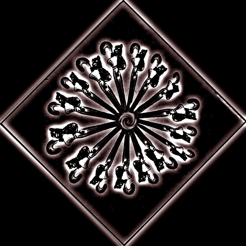
I don't really know how to answer you Bev.
Photoshop CC is the software I use, and it has a filters menu, which contains different filter types and I use them often, probably similar to how you use Topaz. I just made a selection in the center to remove the ink label and swirled it prior to swirling the rest. Part of the issue with the ink bottle was that is wasn't readable. Hope this helps. |
Apr 8th |
| 48 |
Apr 22 |
Comment |
Hi Bev,
I like the concept and composition. Your color, exposure and focus are spot on. Abstracts and vision aren't popular at photo clubs IMHO. Most judges look for technical areas to compare, and ignore the emotional impact, which is harder to explain. We photographic artists should shoot for our own enjoyment and take other opinions for what they are-other opinions.
Here is mine. I think you can take this even further by exploring changes in PS filters. I agree the ink bottle probably helps the story, but not the image. |
Apr 7th |
 |
1 comment - 1 reply for Group 48
|
| 96 |
Apr 22 |
Reply |
Thank you, Stephen. My biggest struggle is seeing smaller, but it was a grand sight, despite all the mosquitoes Jasper offers its visitors. |
Apr 14th |
| 96 |
Apr 22 |
Comment |
Have fun in your new group, Dr Wimbourne |
Apr 13th |
| 96 |
Apr 22 |
Reply |
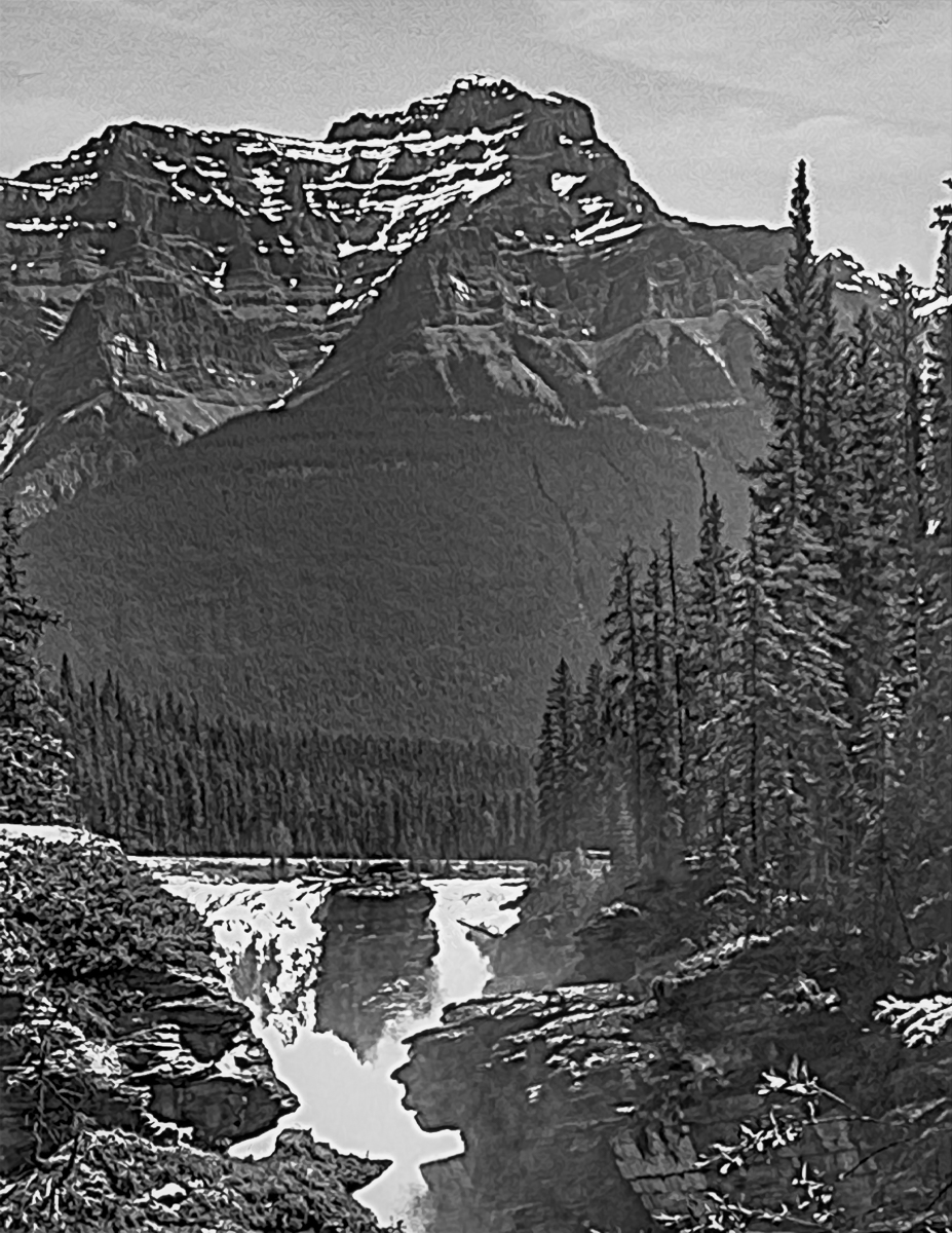
Thank you, Haru.
This will be one of those images that will go on the back burner again, as I need to get away from it to develop a fresh look. My brain is now fried trying to get a proper perspective.
This is an outstanding group for images of water and really being helped on image possibilities. Thank you all. |
Apr 12th |
| 96 |
Apr 22 |
Reply |
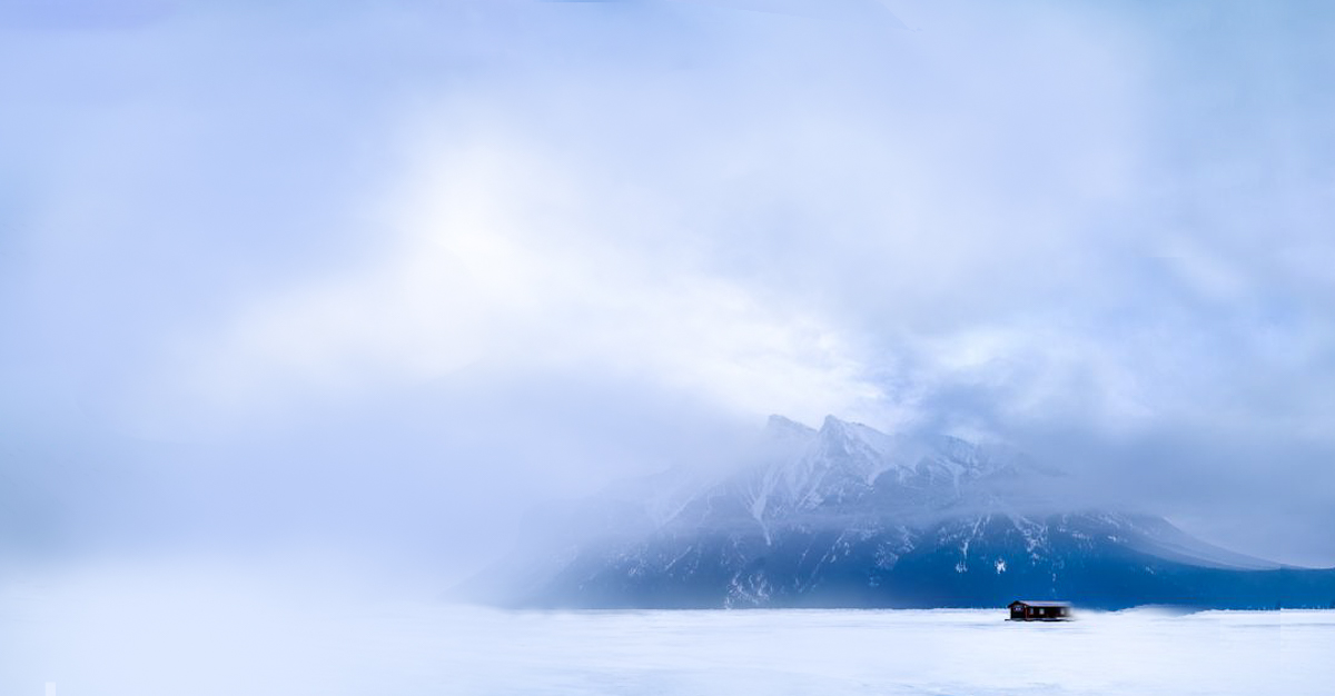
We are probably spending too much time on an average shot, but just to satisfy my curiosity, does this crop of the bottom help, or hurt the image? I also added to the sky by cropping to 8 1/2 x 11. |
Apr 11th |
 |
| 96 |
Apr 22 |
Reply |
Your composition input is valuable and has made me see that I need to crop from the bottom to make the falls a triangle supporting the Mountain as the subject like Robert. All the group's comments will save this image for me. |
Apr 11th |
| 96 |
Apr 22 |
Reply |
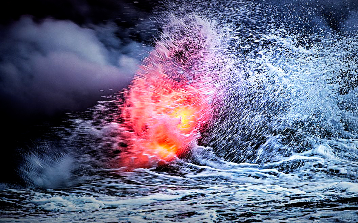
The composited "stuff" adds support to the image for anyone not familiar with lava flowing into the ocean. Subtle and effective.
BTW, I didn't give you more credit than you deserve for getting this image. Burst mode is just a tool. Using it is an artistic decision. Wildlife photogs live by it. |
Apr 11th |
| 96 |
Apr 22 |
Reply |
In response to both you and Haru, I tried to make the waterfalls the subject, with all else being secondary/supporting elements. I hoped that the eye would travel from the mountain down to the falls, but it really may be too soft, either from poor technique on my part or the mist . I'll own the poor technique, which makes this a tough edit, especially in jpeg. I also can't seem to find the right colors in the image and that has also kept me in B&W, High noon in Jaspar. What a dumb time to shoot! I'll hang on to it and maybe swirl it into an abstract. |
Apr 10th |
| 96 |
Apr 22 |
Reply |
Thank you, Haru. My explanation for B&W was weak. I did not mean to try a conversion to B&W, what I meant is that in order to assess image tonality and where the white (lightest) areas are in my image, I make a B&W layer then turn it (the B&W layer) on and off as I adjust my tones for desired effect. I usually want my curve to produce pure or close to pure black and white zones, and if it is all grays then it is too flat. I hope this makes my comment clearer. I attached the tone assessment for Robert's edit. More black, while the white keeps focus on the falls. |
Apr 10th |
 |
| 96 |
Apr 22 |
Reply |
Don't forget Robert, that comment images may be submitted at 1200 px on the long edge too. |
Apr 9th |
| 96 |
Apr 22 |
Reply |
Sorry Robert, Yes I added a duplicate layer (Ctl+J) and changed the blend mode to Linear Light, then I usually change the Fill to around 15-35%, whatever looks right to me. As I've said before Blake Rudis is my PS guru and his courses are really helpful for me. Link to LL:
https://www.youtube.com/watch?v=kqHSjwY9uVQ |
Apr 9th |
| 96 |
Apr 22 |
Comment |
Another glorious image depicting the awesome power in nature. The image does cause conflict when viewing as well it should. Lava flow is not peaceful, but chaotic. Increasing the drama suits my eye quite well. I might (and did) crop the right a little tighter on the spray, centering the molten lava, and changed the blend mode in PS to Linear Light and the fill to 15%, increasing the drama. I use the Linear light mode in PS, which is gaudy until you use Fill rather than opacity as the modifier. It is a powerful mode worth trying.
Your ability to capture these images is fantastic, especially from a small vessel. |
Apr 9th |
 |
| 96 |
Apr 22 |
Comment |
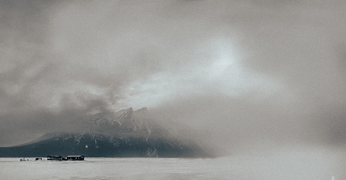
One more addition by subtraction might be removing the outbuildings. Like Robert, I played with your very enticing image. Probably too much. |
Apr 9th |
 |
| 96 |
Apr 22 |
Comment |
Hi Cheryl, I like your vision, but I don't feel enough Isolation. Maybe just living there can give you cabin fever, but there are too many places that are given the viewer to go. The bridge on the left lets me go back in time. The mountains on the right to go forward, all the outbuildings to move about within my domain, and might provide me with (house)transportation.
Blue to me means stability and peace, not isolation. Gray to me is the color of isolation and loneliness. I could always be wrong about that except for my feelings of color, which cannot ever be wrong for me.
I changed this to a gray, removed the left and right, but added negative space to the left and top, cropping the bottom which allowed me to follow a line out of there. Just some of my thoughts on a very creative and well done image.
|
Apr 9th |
 |
| 96 |
Apr 22 |
Reply |
Thanks, Bob. I think I needed to define the two subjects here by making two images. My initial vision was to push the mountain into a third level, but I didn't fade enough. Your version is better. |
Apr 9th |
| 96 |
Apr 22 |
Comment |
Hi Brian, your first two group images are both travel images, and as such, they are appropriate PTD images. This image portrays the heritage site in a way that meets their requirements for entry. Not being a PTD member I cannot verify for sure, but reality is a pre-requisite for competition. Dust spots may be removed.
In PID study groups, we would try to bring something extra to the image to convey a story. In this case, I would try creating a composite, which includes an image of either fire or dramatic sky representing an atomic explosion.
Focus is sharp throughout. More contrast would help.
Your narrative tells the story, but the image lacks emotion, IMHO. |
Apr 9th |
| 96 |
Apr 22 |
Comment |
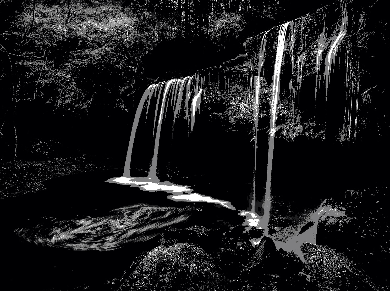
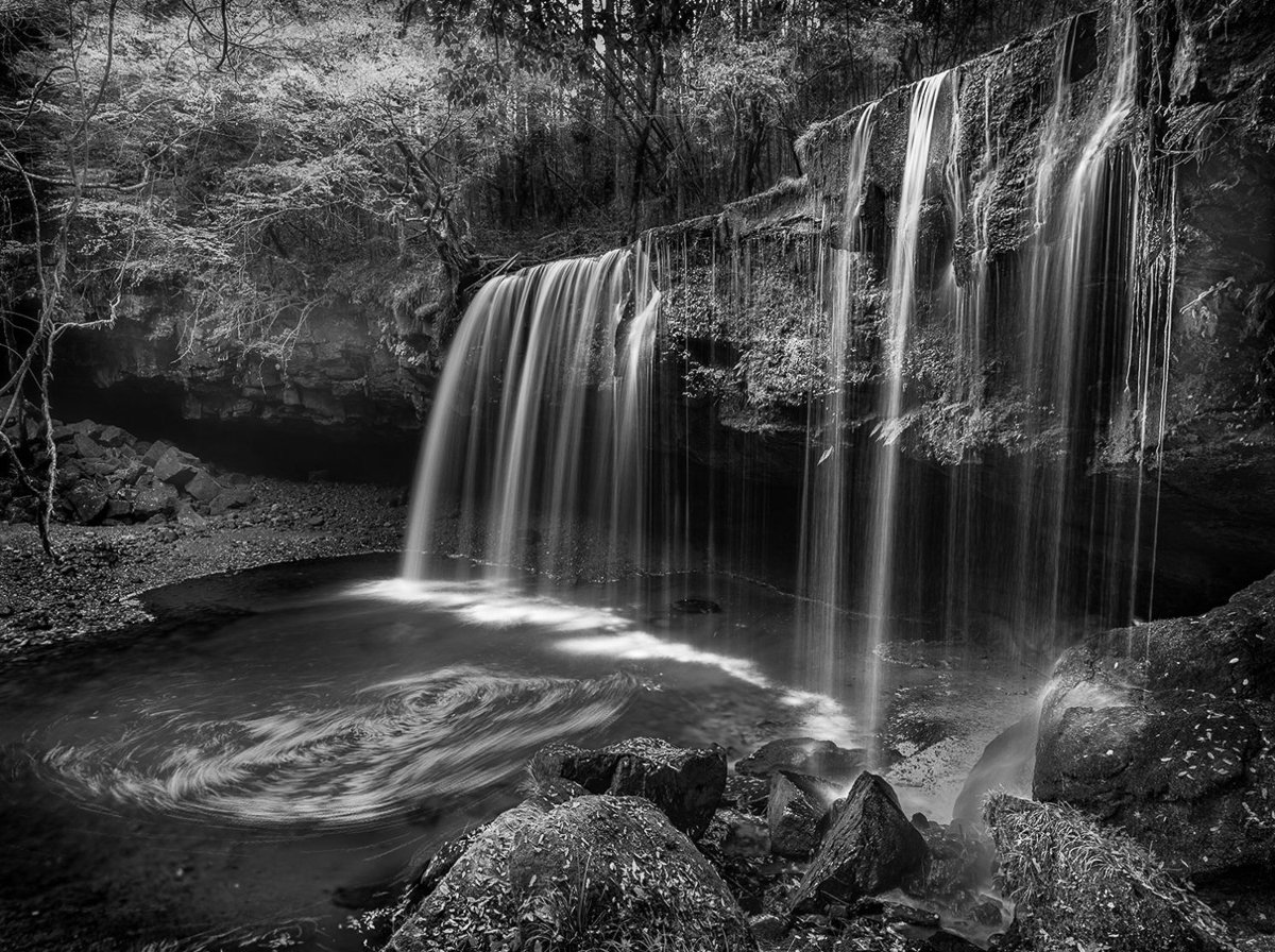
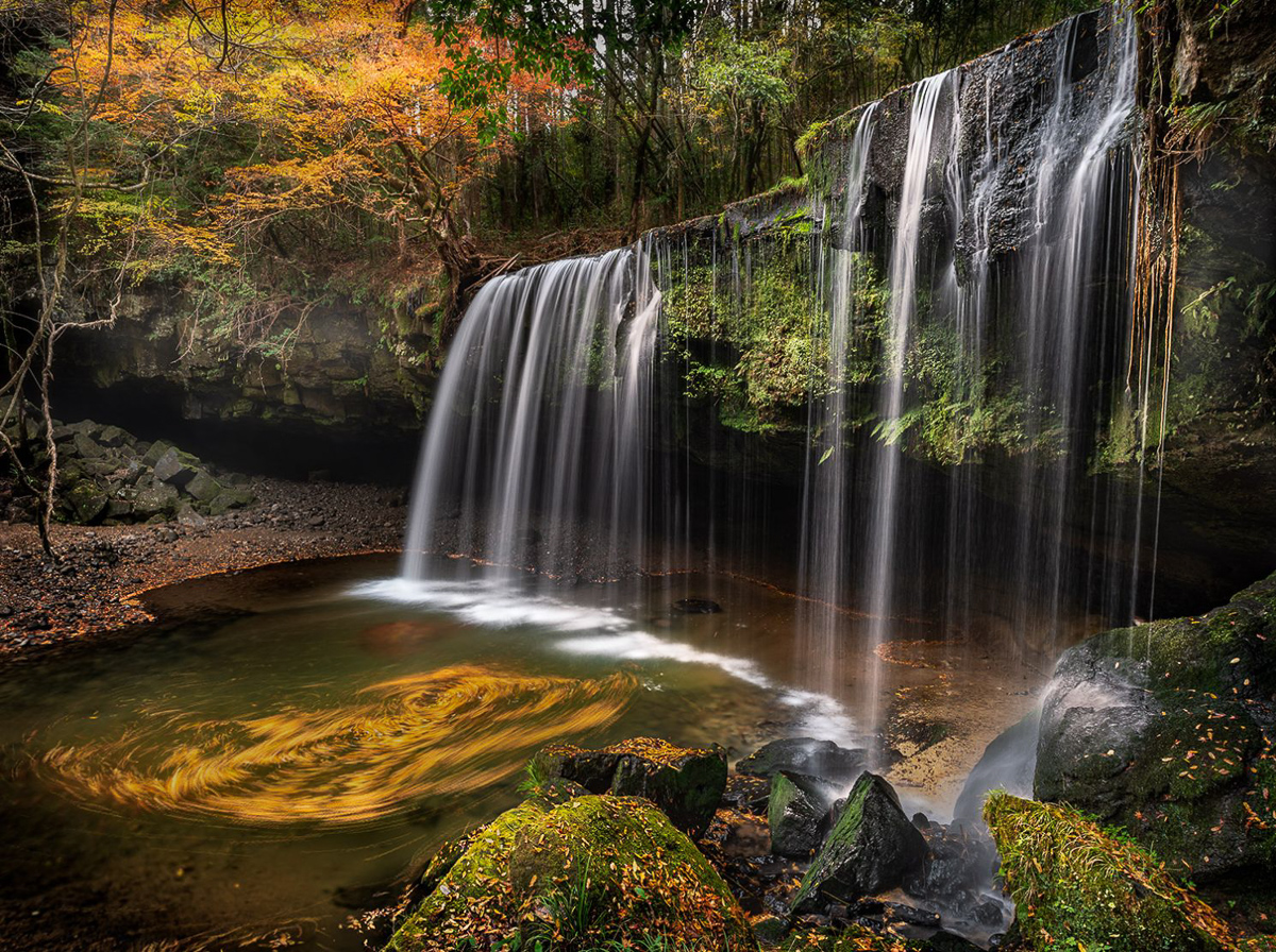
As far as where my eye is being led, I always go through a B&W especially if all is sharp. Our eyes go first to bright and in focus areas. I also use B&W to determine overall tonality, which I think you have pure blacks and whites and levels of gray that add depth to your image. The only areas I see that need looked at closer is a dull area on the upper right side and just left of the falls (rocks). Not sure what it is. If it is mist, then I would probably increase the contrast there. Excellent image and the swirls add impact for me. Makes me wonder what caused it. |
Apr 8th |
 |
| 96 |
Apr 22 |
Comment |
Hi Haru,
I like the swirls. I think the swirls add value because you envisioned them. We must trust our vision. I do think that the swirls need to be muted. I made a lasso selection and tried to make them darker so they didn't compete with the leaves in the trees. |
Apr 8th |
 |
| 96 |
Apr 22 |
Reply |
Thank you, Haru. Your comments are immensely helpful, and I will continue editing this image. Cheryl is correct that I wouldn't have been able to move elsewhere for this shot, except up and down. I should have used the shoreline above the rock for level, rather than the water. That I can fix. More contrast is needed too. I think I can increase depth in the image that way. Thanks for including an image of your thoughts. That is helpful to me.
|
Apr 7th |
| 96 |
Apr 22 |
Comment |
Thank you, Brian. I believe I still need to do more work and appreciate your input. "Every Picture Is a Compromise" according to Brooks Jensen (Lenswork mag) |
Apr 7th |
| 96 |
Apr 22 |
Reply |
Thank you, Cheryl. You are correct that our jpegs are hard to really edit, but security keeps RAW a non-issue on the internet. I wonder if my composition would really be better cropped into two images rather than one. I like the idea of burning some of the mountain. Thanks |
Apr 7th |
8 comments - 12 replies for Group 96
|
16 comments - 23 replies Total
|


