|
| Group |
Round |
C/R |
Comment |
Date |
Image |
| 23 |
Mar 22 |
Reply |
Thank you, Shirley. Wow, I had to look up the meaning of the word. I guess by "garish" you are saying overbright, not lurid. I'll be sure to work on my bad taste.
Is garish a negative word?
Garish comes to English from the Old Norse word gaurr, meaning "rough fellow." It is often used to describe colors, clothing, decorations, and other things that can be elegant and tasteful. Because the word connotes bad taste, however, it is rarely used in a complimentary way. |
Mar 23rd |
| 23 |
Mar 22 |
Reply |
Thanks, Robert. I've since toned it down and added some black to the yellow in selective colors. As you know, I' prefer that my images are about color as the subject. Good to hear from you. |
Mar 21st |
| 23 |
Mar 22 |
Reply |
Thanks, Marilyn. The comments have been helpful. |
Mar 16th |
| 23 |
Mar 22 |
Reply |
Thank you, Brian. I hear everyone and will continue to work on this image. So far, I haven’t found a remedy to fix this. I made need to start over, but my PSD file seems correct until I convert it to jpeg. I’ll try LAB color. |
Mar 16th |
| 23 |
Mar 22 |
Reply |
Thanks, Julia. I did add some canvas in PS. I find checking the content aware box while cropping makes it easiest to add canvas, and especially when you have some room with nothing to create artifacts. I think Nature Division allows canvas changes. |
Mar 10th |
| 23 |
Mar 22 |
Comment |
Hi Shirley,
Nice advertising image. Hope they buy it.
|
Mar 8th |
| 23 |
Mar 22 |
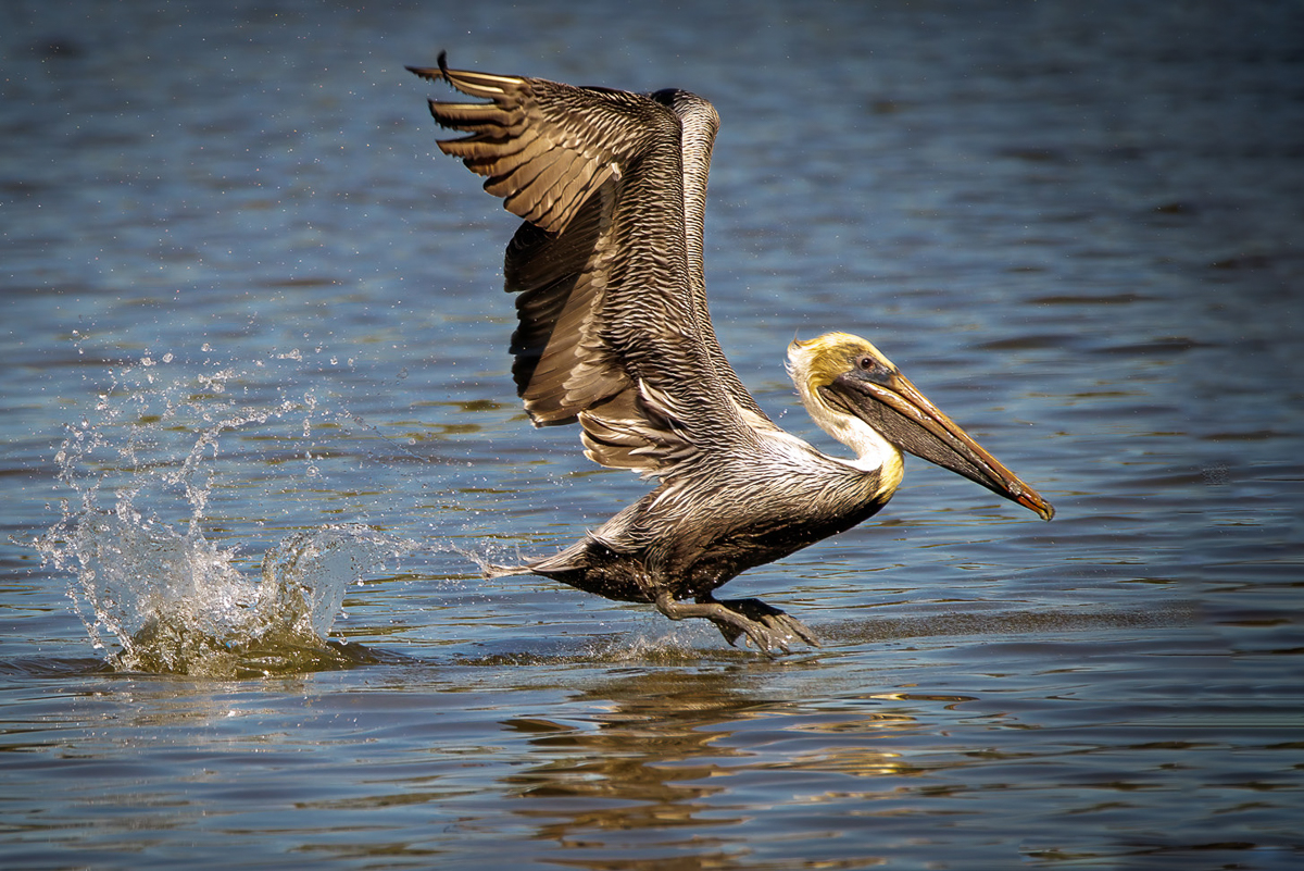
Comment |
Hi Julia,
Very sharp and well-timed shot. Beautiful colors for a pelican, and excellent DOF from your 600 mm lens. I think the pelican needs a little more space to land, and while not a nature photog, I prefer reading images left to right. Either way, a great capture. |
Mar 8th |
 |
| 23 |
Mar 22 |
Reply |
Thank you, Adelet. I get confused between Aspens and Larch, but you are correct. In my opinion, flat means no tonal differences in the image, such as a RAW file prior to processing. As you now know, I don't often see subtle. |
Mar 8th |
| 23 |
Mar 22 |
Reply |
Thank you, Julia. I was not drawn as much to the green, since we have so many fir trees in western WA. I appreciate your input. |
Mar 8th |
| 23 |
Mar 22 |
Reply |
Thank you, Richard, and welcome to the group. I have been heavy handed in my processing for many people. I see more vibrant images in my mind than others. I do take your suggestions into consideration. |
Mar 8th |
| 23 |
Mar 22 |
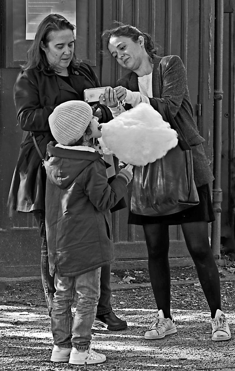
Comment |
Welcome to DD23, Richard. Make sure to send Brian your Bio image. The image is sharp, nice colors and well exposed. You have two issues IMHO with the image. You have four people that are not engaged with each other. Two looking at a phone, one eating spun sugar and one rummaging through her purse. I don't see a story anywhere in the composition unless it is that people don't engage with each other here in Luxembourg Gardens. Your camera work is excellent, and it looks great in B&W too. |
Mar 8th |
 |
| 23 |
Mar 22 |
Comment |
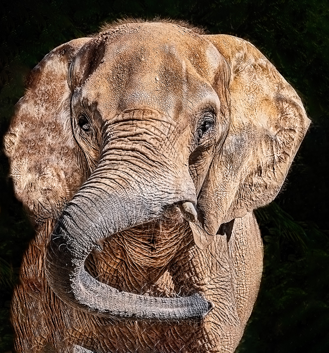
Hi Marilyn,
The image is well exposed, and sharp. Color looks spot on too. The curve of his trunk is appealing and incredibly unique. I can't make out where his mouth might be. I also am experiencing some eeriness with the eyes and texture. The closely cropped composition is not appealing to me.
The background, which I assume is the shaded area you are wondering about, is nicely textured and does not pose an issue for me. If you are talking about the left ear and left body, the texture looks strange to me.
I used a content aware crop to expand the canvas and tried to reshape the left. I can't do much with the texture on a jpeg copy. |
Mar 8th |
 |
| 23 |
Mar 22 |
Comment |
Hi Adelet,
I like the composition, and the exposure looks well done to me. The color is good, and I like the blur and dark areas that draw me into the turtle.
There are a couple of places though that bother me. It appears to me that you had to use some clean-up tools along the left side and there are some signs left of that work. I would redo the area. |
Mar 8th |
| 23 |
Mar 22 |
Comment |
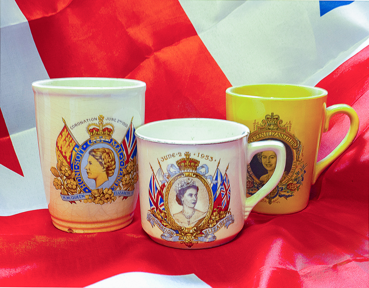
I love your humor. Congrats on your eighty years. Hopefully, the Queen will have more years. I do think that the framing of the Queen's face on the right-hand cup was well done. Even though there is nothing really to use for reference, I felt the image might be unlevel. I tried just using the Auto button in LRCC crop, and it slightly shifted the image. Not knowing the colors of old mugs, it is hard to know, but I also used auto WB just to see what would happen. Not really suggestions, it is just me having a bit of fun. Thanks for all your demanding work in the group and PSA. |
Mar 3rd |
 |
6 comments - 8 replies for Group 23
|
| 26 |
Mar 22 |
Reply |
Must be how they got their name! |
Mar 27th |
| 26 |
Mar 22 |
Comment |
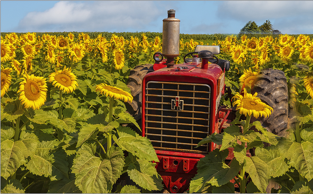
Hi Bob,
I really think you did a great job editing the image. Midwestern dream to ride an IH or JD tractor. Either red or green would have worked, but red is preferable because of all the leaves. I did a quick edit, selecting the left side, copying as a layer, flip horizontal and then masked it in. I used selective color in PSCC to get the colors a little closer to what I remember but messed up the mask by hiding the wheel cover. Terrific image. |
Mar 25th |
 |
1 comment - 1 reply for Group 26
|
| 29 |
Mar 22 |
Reply |
Hmmm, Delaware OH is the home of Ohio Wesleyan, where my dad matriculated. Could I have thought that? Terrific abstract as always. Glad you have your electronics up and running. I like Karen's clover too. Hope you are all doing well. |
Mar 25th |
0 comments - 1 reply for Group 29
|
| 96 |
Mar 22 |
Reply |
Hi Gloria, we all learn from our discussions, and no apology is needed. Thank you for your input. I'm trying to evolve from technology to artistry, but it is extremely difficult for me. I thought I'd have more, not less time after retirement. |
Mar 31st |
| 96 |
Mar 22 |
Comment |
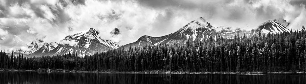
Bob, not Robert. Just my name preference.
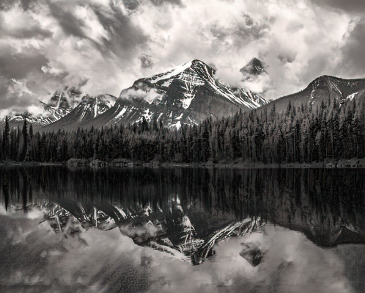
Pano's are great fun to take but harder for me to compose. If you look at the right side, both top and reflection, it is much darker overall and doesn't add to your story. I think it is as flat as it is because with the Pano there is too much in the midtones and blacks. Dodging and burning on the right might increase the depth of that side, giving more balance. My crop makes the main mountain leap out of the frame.
Your choice of course. It always depends for me on the story, emotion or idea that I want the viewer to share. |
Mar 30th |
| 96 |
Mar 22 |
Reply |
Hi Haru,
Robert's images are preferable to my crop, although in my opinion this area is worth more than one image. I agree that the vignette Robert used was heavy handed but does show more possibilities. You display great vision in your images. |
Mar 19th |
| 96 |
Mar 22 |
Comment |
Hi Cheryl,
It is a long month, So I took another look at your edit-2 in your reply to Robert. I know you like these reflected clouds and Panos, but to narrow the viewer's (me at least) focus on the best part of your image, I cropped once again to give you another image possibility. It also keeps the balanced center section and opens the trees a bit.
I used Topaz Chalk Look to open the trees and didn't notice the hatching in the reflection until I posted this, easily removed though..
|
Mar 19th |
 |
| 96 |
Mar 22 |
Reply |
Thank you, Brian. I don't know if nature can be improved, but I am firmly in the camp that believes photography is an art form and not just used for documentation. |
Mar 17th |
| 96 |
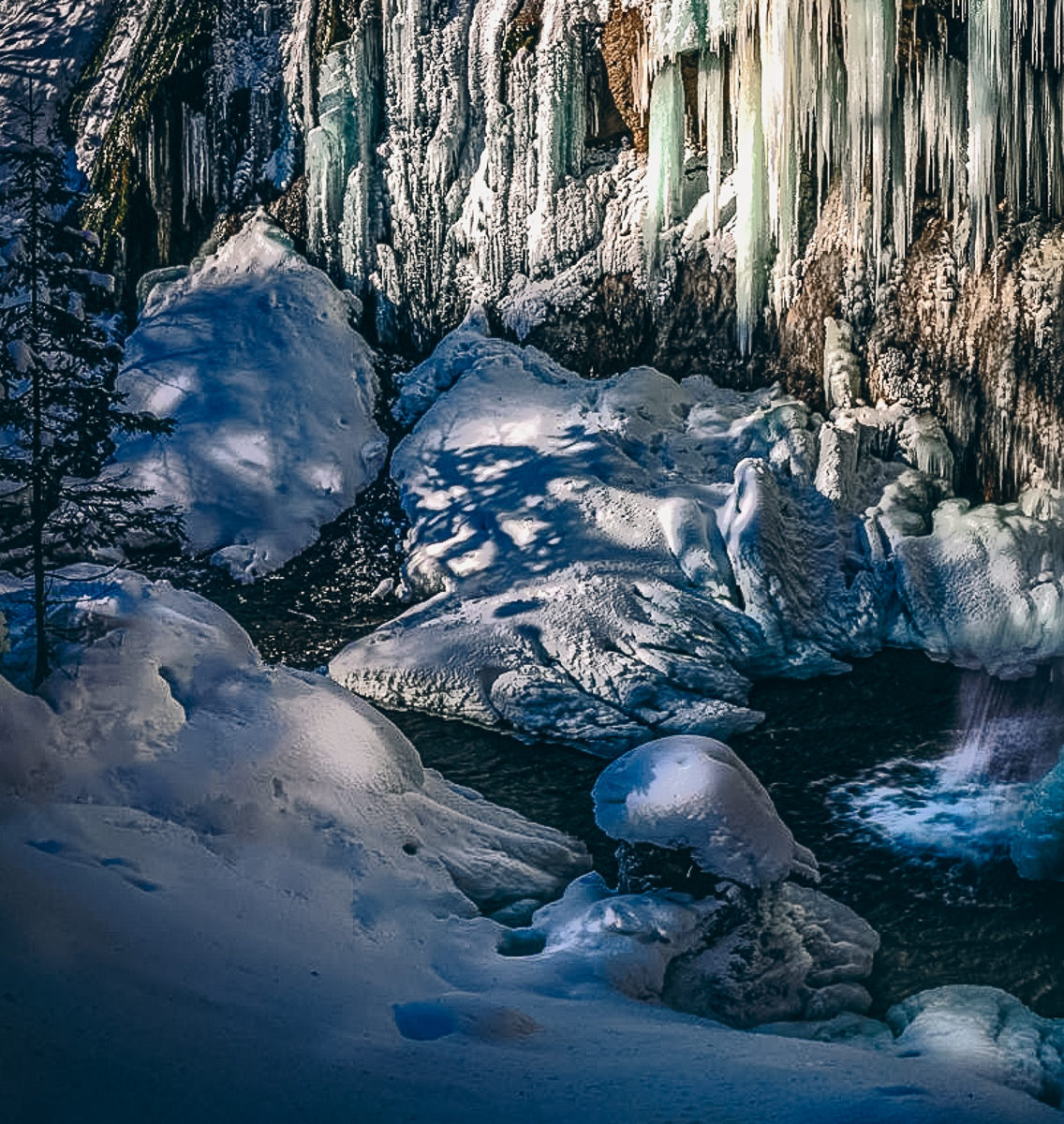
Mar 22 |
Comment |
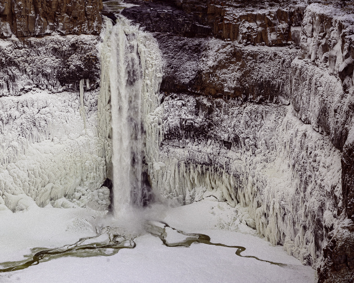
FYI, this was the frozen falls that day before the sun dropped (along with the temperature.) It was really, really cold, and the next day in the Palouse, we went to Steptoe Butte, where the clouds covered most of the butte and the Arctic blast was in full force. |
Mar 13th |
 |
| 96 |
Mar 22 |
Reply |
Thanks, Cheryl,
After all the comments, my version of this area fell flat for everyone else. That is usually the results in my club too. I'll have to learn to dial it back a little. Here is my attempt to absolve the issues you have presented. I appreciate everyone's help. |
Mar 13th |
 |
| 96 |
Mar 22 |
Reply |
Thanks, Bob,
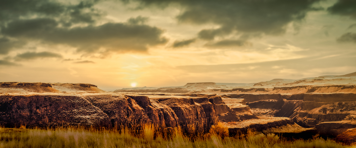
Palouse Falls is at the western end of the Palouse River (167 mi), so it is off the beaten path. Tours to the Palouse are at the Idaho end.
I always apply LUTs at the end of my workflow. I need to create more again. My colors are not meant to be "right," since my brain processes colors the way I see them. Eastern Washington is never desaturated except at noon, IMHO. It is a land of rolling hills, prairie grasses and river basins. I shoot in RAW, so the original is bland.
I used to see more muted before I had my cataracts removed, and now things are bright and colorful with the newer lenses. |
Mar 12th |
| 96 |
Mar 22 |
Reply |
Thanks for the reply, Gloria.
You did draw my eye to the cradle with blur. I didn't find the cradle to be sharp enough. Do you use focus peaking on this camera? It might be valuable to learn, if not.
It sometimes helps to squint at your image, convert to B&W, and to make the image small enough to see its light pattern. The object is to see where the lightest and darkest parts of the image are, and if there is a path for the eye to follow. Our eye is attracted first to the brightest areas/spots and then to the sharpest. In this image there are just too many bright spots that draw my eye away from your subject. The blue in the ship also is a distraction for me, as are the rails.
These are just suggestions for using after your project finishes. I too, always struggle simplifying my images. |
Mar 10th |
| 96 |
Mar 22 |
Comment |
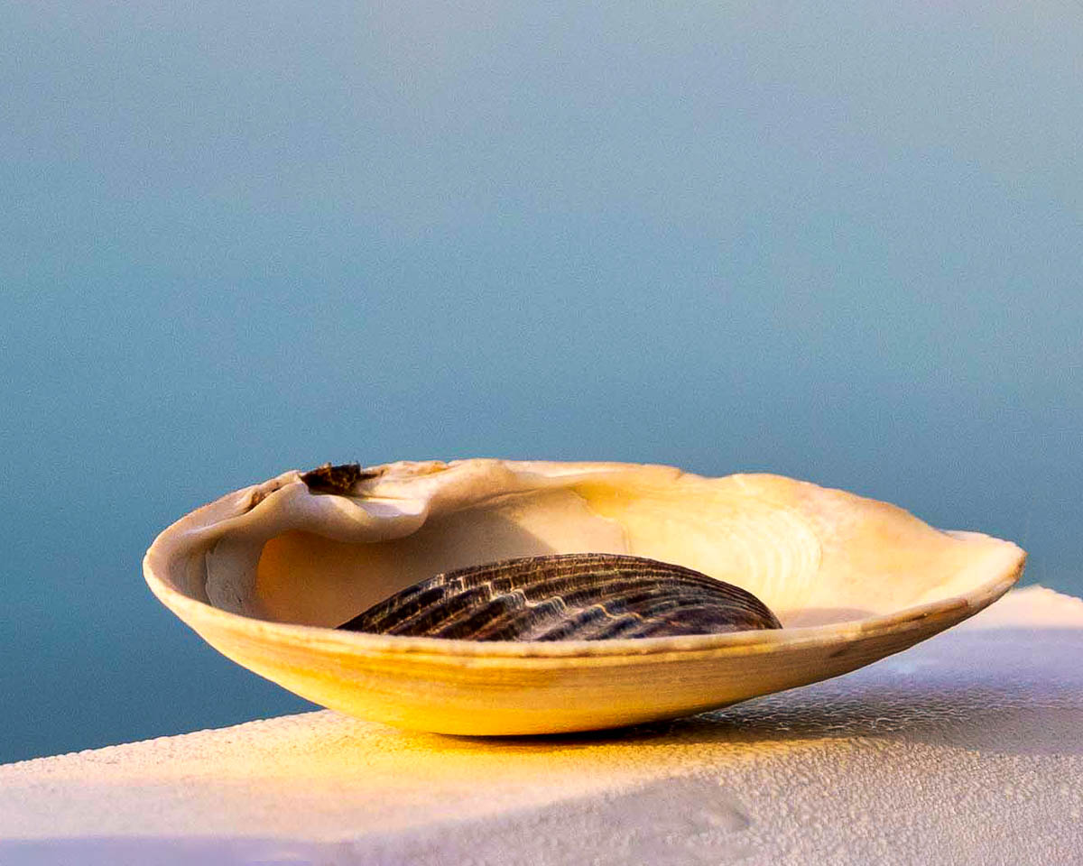
Hi Gloria,
As presented I do not get the same feelings. For me the image is too soft to feel calm, too busy to feel cozy, too cluttered for belonging. I like the colors, but the composition does not tell me your story. Technically the image is too out of focus, but properly exposed.
I took your story, made some edits and hopefully you can see what I think you may have wanted to convey to your viewer. Your story, my vision for it. Probably a recipe for disaster.
I cropped it to where you stated the story (Cradle me) is told. In LR I enhanced it to try to focus it better. I should probably have sharpened it too. I used the healing brush in PS to get rid of part of the right shell left after cropping. I re-cropped in PS using content aware to add extra canvas to the right.
I know you have been very busy, and hope I haven't been too harsh. |
Mar 9th |
 |
| 96 |
Mar 22 |
Comment |
Hi Cheryl,
I agree that the clouds reflections look strange to me. I think it is because some of the reflected clouds block the tree reflections. With the snow reflections also, there is just something different, which you think makes it busy. I do like the triangular shapes of light and dark. and my suggested crop loses that. I don't know how to help, except to say that I also feel something amiss in the reflections.
|
Mar 9th |
 |
| 96 |
Mar 22 |
Comment |
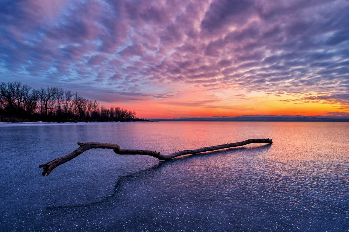
I keep coming back here, and now I see a different image than at first. The branch that is out of the ice, and it's shadow make an animal head I didn't see first time around. I used the brush tool to darken it about 25 per cent and keeping your 4x6 crop I cropped some from the left bank, right side and used content aware to increase the sky. I couldn't tell the white spots in the lake are bubbles, but I also thought the bottom was too much. Your vision though. |
Mar 9th |
 |
| 96 |
Mar 22 |
Comment |
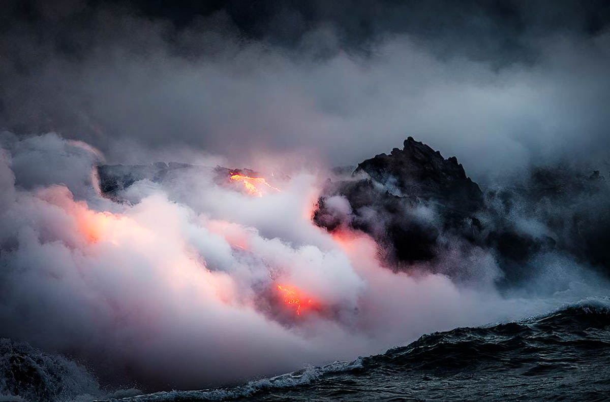
Hi Bob,
I really like this series. Kilauea was flowing the last time we went to the Big Island, but we couldn't get near it. It is a marvelous site watching the lava spew forth. Your colors look realistic to my eyes, but realism is always in the eyes of the beholder. Even though I know your vision included a darker, dramatic look, I think the blackness is too much in this case. I added a little more light and this version is what I saw from much farther away. Hard to believe it has been continuously flowing for 30 years now. |
Mar 9th |
 |
| 96 |
Mar 22 |
Reply |
Thank you, Dan. I do love this shot and have tried it with an entire range of LUT's that change the mood. Blues make me sad, yellows give hope, and greens are soothing to me. This red version is my favorite, but I keep them all in LR.
It is funny to me when most of my images are deemed too intense by most. I print them on an Epson P7000 and use Colorbyte's Image Print Black RIP for all our prints, and process to get prints that match our vision.
That being said, I almost always use DD comments for their valuable assistance in seeing what I missed. I hope when this pandemic opens us back up for travel, that I can re-visit some of my favorite places. |
Mar 9th |
| 96 |
Mar 22 |
Comment |
Welcome, Dr Wimborne,
This is a good travel photo and appears sharp to me. The color is excellent, and as Dan said the image is slightly overexposed. There is also a slight 1-degree port list. I think the sky is also overwhelming.
You'll need to let us know what your goals for your photography are, then we'll be able to help more specifically. Some members want competitive photos, some to hang on a wall, and others just for personal enjoyment.
|
Mar 8th |
 |
| 96 |
Mar 22 |
Comment |
Incredibly challenging image, Haru. I am happy that you present us with the image, but also your list of questions.
1. Cropping solves the challenge of selecting a subject which simplifies things for the viewer.
2. I prefer this direct light, as it makes better use of light and shadow. Not always the case with overhead direct light.
3. For this image, I would start with the blue channel in PS, then adjust from there.
4. Decide what you want to communicate to your viewer the most, then process that image.
Your vision and how it makes you feel is much more important than your camera gear. Keep coming back to what you have taken so far here, then decide what draws you into those images most and then prepare to take those images again next year. |
Mar 8th |
 |
| 96 |
Mar 22 |
Comment |
Hi Dan,
I'm not a fan of Mick Jagger, Marianne Faithful or drug culture at all, so your title and story are lost on me.
That being said, I think the sunset is well done, and the overall blues match the story. The branch seems a little weird to me, and if it is a composite there needs to be more weight at the right end, or something to keep it from falling over.
Hopefully, the lyrics of the song are not prophetic. |
Mar 5th |
| 96 |
Mar 22 |
Reply |
Thank you, Haru. Maybe my red (used to be, anyway) hair causes me to use more saturated reds. The hardest part for me was to tone down the bright yellow grass in the foreground. The bright yellow would not let go of my eye. This version ended up satisfying my vision. By this time, the falls were in deep shadow and produced nothing for me. Thanks again for your excellent comments. |
Mar 3rd |
| 96 |
Mar 22 |
Reply |
No. Visitor safety. The edges of the park have been fenced for a while, and erosion continues to destroy the trails. |
Mar 1st |
| 96 |
Mar 22 |
Reply |
Thanks, Zina. Hope things are going good for you. They have closed a bunch of areas here. |
Mar 1st |
10 comments - 10 replies for Group 96
|
17 comments - 20 replies Total
|


