|
| Group |
Round |
C/R |
Comment |
Date |
Image |
| 23 |
Feb 22 |
Comment |
Hi Brian,
I read elsewhere you don't use or have use for vertical crops. I'll not suggest them in the future for your images. I don't see the garment as a hoodie. The zipper is in the wrong area to me. He just looks like one of the many homeless (and cold) men to me. |
Feb 28th |
| 23 |
Feb 22 |
Reply |
Thank you, Adelet. Extremely helpful comment. |
Feb 28th |
| 23 |
Feb 22 |
Reply |
Still a great capture no matter what colors you chose. |
Feb 21st |
| 23 |
Feb 22 |
Reply |
Thanks, Brian. It looks more like the color I would see in a chimp. Always best to agree with your wife, though. I do see magenta, so another idea could be to use a HSL adjustment and get the colors as Marylin remembers or wants them to be. To me the artist's vision is the important part. |
Feb 21st |
| 23 |
Feb 22 |
Reply |
Thanks, Marilyn. |
Feb 21st |
| 23 |
Feb 22 |
Reply |
Thank you, Brian. |
Feb 19th |
| 23 |
Feb 22 |
Comment |
Here is a little darker version, more in line with the story you are telling.
I use the Gradient Map adjustment in PSCC with the Foreground color black and the background color white for B&W conversions. The gradient map protects the original tones, whereas the gradient adds a color wash disregarding tones. |
Feb 17th |
 |
| 23 |
Feb 22 |
Reply |
I ended up using a gradient map first and using overlay as the blend mode. I adjusted the Blend If to protect the dark trees in the foreground. Still a little too subtle, so I added a white to transparent gradient. Let me know what you think. |
Feb 17th |
 |
| 23 |
Feb 22 |
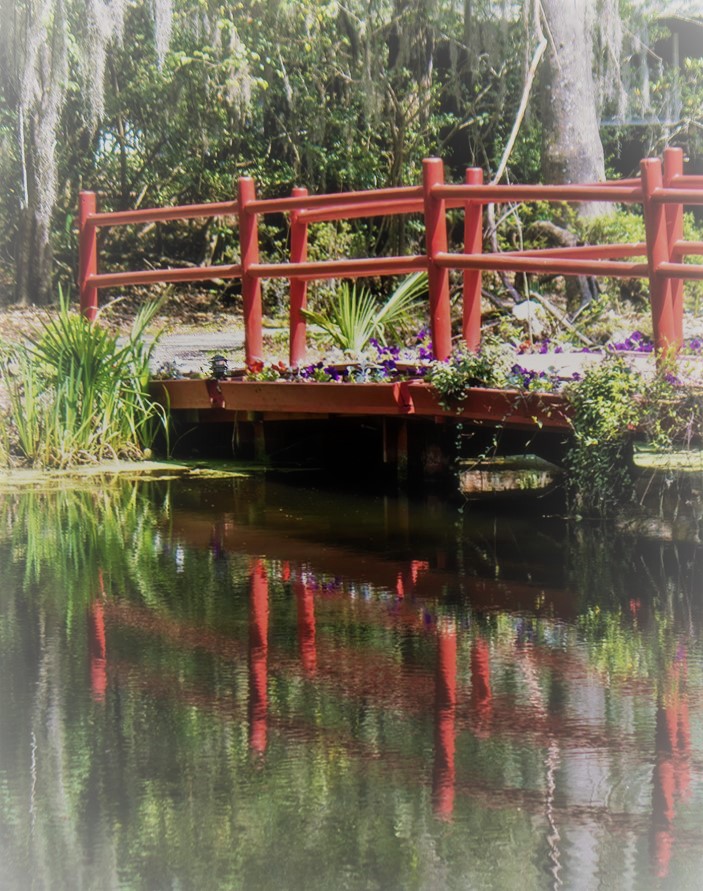
Comment |
Hi Julia,
I like the bridge, and the reflection and the flowers and the moss, and the bushes and the .....
It may be a bit busy for me. I'm not sure other than the red bridge what you want me to look at. I've made a drastic crop, but I want you to decide what the subject is, the lead us to it. I used a white vignette which isn't all that popular, but in some cases works.
For me this kind of scene is the hardest to compose, because when I'm there I take in everything. Nice and sharp. Well exposed, just needs definition.
|
Feb 14th |
 |
| 23 |
Feb 22 |
Comment |
Hi Cynthia,
I think this is a good snapshot and shows how hard it is to get the bison to cooperate into a good image for competition or the living room wall. I like the dust or steam too. Adds a little to the story. I wonder if the bull caught up to the cow. I can't see anything to narrow focus simplify) here. |
Feb 14th |
| 23 |
Feb 22 |
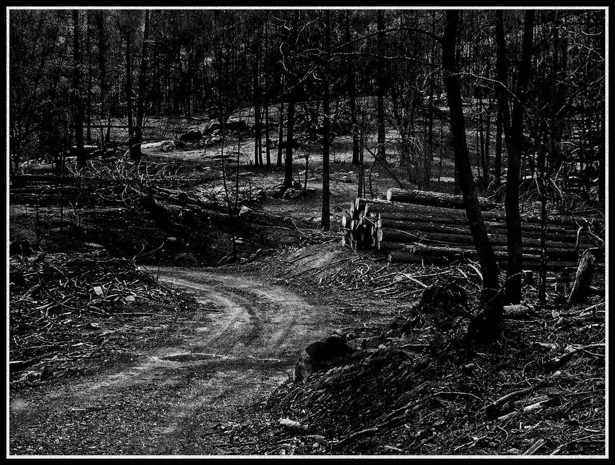
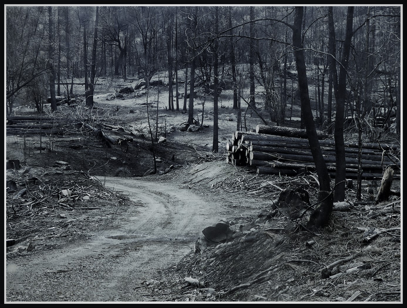
Comment |
Hi Shirley,
This is an excellent PJ image and while it tells a tragic story the pile of trees gives it a hopeful end. It looks good to me in B&W too. |
Feb 14th |
 |
| 23 |
Feb 22 |
Comment |
Hi Marilyn,
I like your story very much. You captured the chimp eating and scratching, which consumes much of their day in captivity. Even though eyes are averted to avoid confrontation, there is a catchlight giving him life. I think there is a blue cast, but I'm not sure of the source and maybe he is bluer than normal. Great image. |
Feb 13th |
| 23 |
Feb 22 |
Comment |
Hi Adelet,
I like your composition. The angle across the frame adds interest. Your lens choice was good in that you have a nice DOF and bokeh. You might want to go back again with a diffuser to remove the harsh light or use a ND/polarizing filter. Red flowers for me are hard because they get blown out so easily. You have done well with your exposure. Genuinely nice image. |
Feb 13th |
| 23 |
Feb 22 |
Reply |
Thank you, Julia. This IS the look I was trying to find. I'll do more research.
Just getting two of my PC's back up has been really time consuming. Both had to have a clean Windows reinstall, and re installing all my programs and settings is a chore. |
Feb 13th |
| 23 |
Feb 22 |
Comment |
Hi Brian,
Excellent choice for black and white. I like the play of light and shadow. His face might be too detailed for my taste. Who'd have thought monks would wear hoodies. I wish that the eyes were open wider, but it looks like someone made him smile a little. That supplies enough emotion for me. I cropped some from the original since I see the face as the subject and his clothes as the a supporting element. I am not a portrait photographer, so my ideas are probably moot. |
Feb 11th |
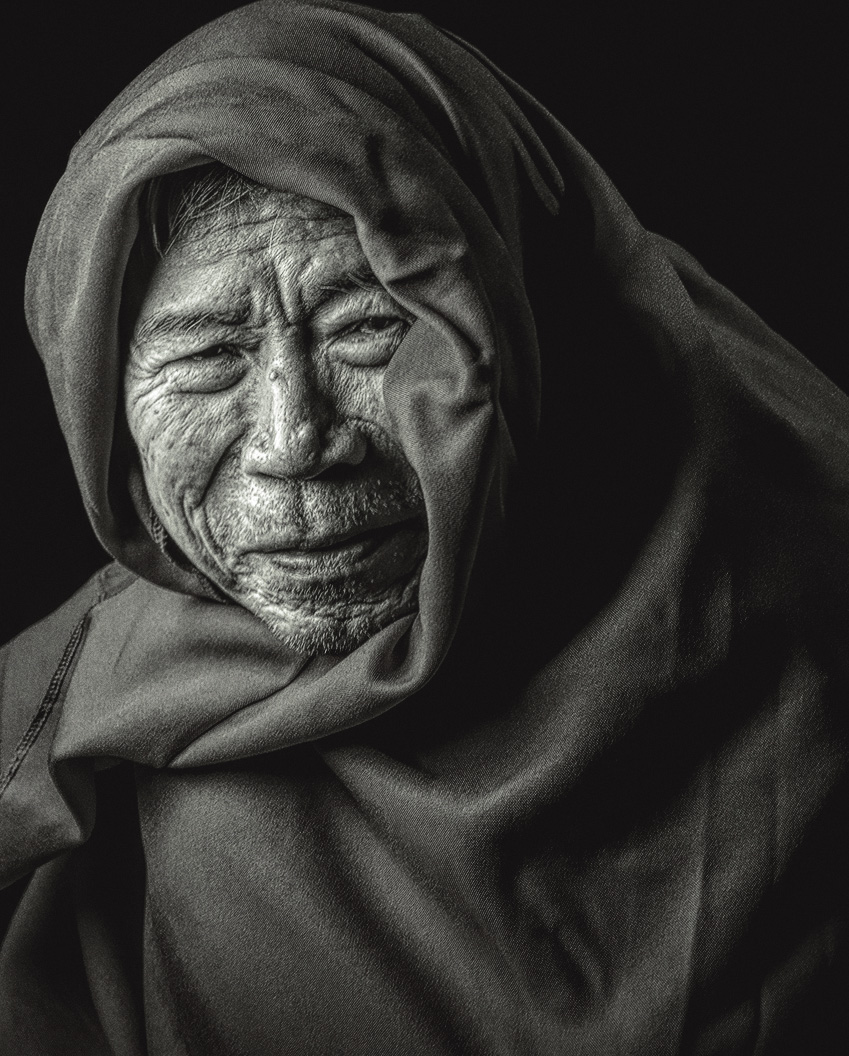 |
| 23 |
Feb 22 |
Reply |
Thanks, Shirley. Any idea on how to do that in PS or some other software. My Fuji didn't capture what I saw.
Or maybe camera settings for next time. |
Feb 11th |
| 23 |
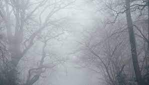
Feb 22 |
Reply |
Thank you, Shirley.
I was unclear about the need for my image.
It was overcast with a light misty/foggy feeling. The bright area you refer to is that mist I'm trying to expand in processing. I want to know how, if known, to increase the fog/mist in the image more like this online image, but not as much. |
Feb 11th |
 |
8 comments - 9 replies for Group 23
|
| 45 |
Feb 22 |
Comment |
Hi Robert,
We have been watching Inspector Morse, Inspector Lewis and Endeavor on Brit Box, and as you know there was some Oxford/Cambridge snobbery on display.
I love this image and must say you did a wonderful job in post. I used the rulers in PSCC to draw a line vertically from the door to the roof, and horizontally across the two ledges in the center and you have it levelled perfectly. That is of course the reason no one minds the convergence since the image is in perfect symmetry. Outstanding job. |
Feb 28th |
1 comment - 0 replies for Group 45
|
| 54 |
Feb 22 |
Reply |
Hi Peggy, outstanding choices and while I couldn't find a true vertical or horizontal to straighten from, this version looks better to me also. Dorinda and I both agreed with Peter that the original composite had a little starboard list. You have created a calm image. If you had the right space, I'd hang it on a wall. |
Feb 28th |
0 comments - 1 reply for Group 54
|
| 96 |
Feb 22 |
Reply |
Thank you, Gloria. Comments are never late and always helpful. I hope some co petitions open this year although I don't enter much. I understand the moving part. We are having our interior painted and it is hectic here too. |
Feb 27th |
| 96 |
Feb 22 |
Reply |
Thanks Dan. Your comments are always helpful. |
Feb 22nd |
| 96 |
Feb 22 |
Reply |
Volcanic ash would be my guess. Mt St Helen's covered parts of Washington, Oregon, Montana, and Wyoming. (I think.) |
Feb 10th |
| 96 |
Feb 22 |
Reply |
Right you are, Haru. I need to work in that area between the tree and moon to define the moon's edge. Thanks for the comment. |
Feb 9th |
| 96 |
Feb 22 |
Comment |
I very much agree with Haru. f18 made the sharp image I am looking at and the fog softens the top half of the image perfectly. Your colors are muted, and I wish Tacoma were this gorgeous. Well done again. |
Feb 9th |
| 96 |
Feb 22 |
Reply |
I do see it. I'll D&B to bring it out more. Thanks, Dori!
|
Feb 8th |
| 96 |
Feb 22 |
Comment |
Hi Gloria,
Such a beautiful image, well worth hanging on a wall. Your vision looks like a painting to me. Well done and I love the color palette. I'm not sure if it would be too obvious if you added a touch more light (dodge) to the left rock at the top to complete the triangle, but that would be my only suggestion to try. The sky and sea are perfect to me and add calmness to your image. Much more focused subject and well worth the effort. |
Feb 8th |
| 96 |
Feb 22 |
Reply |
Robert, I don't think I noticed the first time, but I see in the lava flow several images. A pair of Wellingtons right of center, the head of a gorilla lower left, and a reptilian head just above and left of the boots. You are a Bev Doolittle fan? I'm not sure if I ever help anyone, but I am happy you found the crop helpful. |
Feb 8th |
| 96 |
Feb 22 |
Reply |
Thanks, Robert. I could try Adobe stock. I've never used my free ones, if there are still free images for subscribers. Promising idea, and I'll try it. |
Feb 8th |
| 96 |
Feb 22 |
Reply |
Thank you Dan.
If the mist softened the island then the island probably doesn't have enough data to make USM effective. Maybe a more pronounced glow and lifting the shadows on the island could heighten the mystery, and make sure that the subject is the focus. |
Feb 7th |
| 96 |
Feb 22 |
Comment |
Hi Robert,
I appreciate the layers of emotion. Power in black, tranquility in white, power again in red, gloom in gray. Emotions all over the place which to me creates the turmoil in volcanoes. Very well done. Just the right amount of tension for me.
If you like, I suggest cropping the top and bottom to make the opposing triangles mimic each other more. Not really necessary, but just a thought.
You prove that the eye is more important in photography than gear. |
Feb 7th |
| 96 |
Feb 22 |
Reply |
You are correct, Haru. This is a more dynamic image. In Western cultures, the color white is often associated with weddings, hospitals, and angels and is often used to convey a sense of purity, cleanliness, and peacefulness. In many Eastern cultures, however, white is symbolically linked to death and sadness. That may influence how your viewers feel about your image. I also like that the eye is lead into the center of the image from either side. I am then directed up to the dazzlingly beautiful hills. Well done. |
Feb 7th |
| 96 |
Feb 22 |
Comment |
Hi Dan,
I believe I feel the solitude and peace that you felt taking this image. There is enough dreamy light to add interest and to guide the eye around the image. The sky adds just enough tension to the overall calm.
The lines that lead us to your off-shore haystack are perfect, in my opinion. I wonder why you chose to unsharpen the island and sharpen all the rocks.
It seems to me that the could work in reverse (blurred rocks, sharp island), but probably have to be renamed.
I wonder if you tried to flip the image horizontally. I can't try it now, but I sometimes like the results. Was there a boat or animal that caused the ripples on the right?
Beautiful image, Dan. Just the right light for a thoughtful time. |
Feb 6th |
| 96 |
Feb 22 |
Comment |
Hi Haru,
As with all your images you provide balance, symmetry, and a sense of calm. I don't think your color palette gives me a sense of energy and power though. To me, I still find the muted colors other than the florescent green center to be calming. I usually associate that tone of green with illness and sickness. I think I mentioned that in a previous image.
The B&W feels more powerful to me if that is what your vision wanted for this image. The color image still has a calming (mostly) effect on me.
I believe that symmetrical images are always going to take away energy in art. It is very mathematical and creates harmony, order and aesthetically pleasing results.
I would suggest asymmetry and bold red and blue if you wish energy and power.
This is a beautiful image, which you seem to see at all times in your work.
I am down to borrowing my wife's laptop now as my laptop was being returned from Memphis and delayed because of Midwest storms. My desktop is dying also, so I am unable to provide an image. Technology is only useful when working as designed! |
Feb 6th |
5 comments - 9 replies for Group 96
|
14 comments - 19 replies Total
|


