|
| Group |
Round |
C/R |
Comment |
Date |
Image |
| 23 |
Jan 22 |
Reply |
Thanks, Adelet. |
Jan 30th |
| 23 |
Jan 22 |
Reply |
Thanks for the comments, Bob. It's always a pleasure to hear from you. |
Jan 21st |
| 23 |
Jan 22 |
Reply |
Thank you for your dialogue on Marilyn's image. I learned quite a few things from your bulletin board and posted a reply there. I also am looking deeper into gestalt design to try to improve my images/photography towards fine art. Never to late to learn. Thanks for contributing. |
Jan 20th |
| 23 |
Jan 22 |
Reply |
Thanks, Brian, I probably do overcook my images, even when not trying. |
Jan 19th |
| 23 |
Jan 22 |
Reply |
Thanks, Marilyn. Hope you get to go sometime. |
Jan 19th |
| 23 |
Jan 22 |
Comment |
I'm pretty satisfied now that I have a more balanced image now. |
Jan 15th |
 |
| 23 |
Jan 22 |
Reply |
Thanks for the original, Marilyn. I was able to add a crop increasing the canvas at the left and top. Just for a fresh look, I took it into Topaz from PS and used a high key template, then saved it back into LR where I added a bit of sepia tonality. Just another concept to a wonderful image.
I switched to Windows 11 on my laptop, and it seems to run Adobe better, which allowed me to process your image without a crash. |
Jan 15th |
 |
| 23 |
Jan 22 |
Reply |
Thanks, Julia. So many things to see and do. Rapid City is kind of central to most of the parks and monuments. We also rented a house in Lead. Just have to remember there is a biker rally in Sturgis every year that fills the rentals and campgrounds.
I'll work on my color palette more. Just the first attempt. |
Jan 13th |
| 23 |
Jan 22 |
Reply |
The tree does give an environmental story to the image. I'd keep it. |
Jan 13th |
| 23 |
Jan 22 |
Reply |
I saw the tag and wondered also. If you can remove it without any artifacts (RAW file probably) I would. I was kidding about wanting a copy, just wanted the copyright! I would definitely remove the tag from the portrait image. I love the completed space on your original.
Shirley mentions a competition issue with the tag, but I think the image is very wall-worthy and would take it off. |
Jan 10th |
| 23 |
Jan 22 |
Reply |
Sorry Shirley. Your border adds a Christmas vibe. I am asking you about the "process" of adding borders in case I have an image that would be improved by a border. Do you add canvas for the border, or does it crop the frame?
I ask because the border on this image appears to me to cut through the hanging streetlamps on either side of the image. What software do you use to add your borders? Are they Adobe stock? |
Jan 10th |
| 23 |
Jan 22 |
Reply |
Thanks again, You made me look at whether I need to add blue sky to the edges of the cloud bank to allow the eye to travel around it and stay in the frame. |
Jan 10th |
| 23 |
Jan 22 |
Reply |
Thanks Shirley. If I crop below the moon, I will lose the conversation between the lake (lower left) center mountains and the moon. I will work at removing the halo. Good catch. I hadn't seen that. |
Jan 10th |
| 23 |
Jan 22 |
Comment |
Hi Adelet,
I did a six-month Med tour on the USS Saratoga in Mayport, rented an apartment in Jacksonville for my family, but I never knew Jacksonville had a zoo. This image is beautiful. I love the color palette you used. Sharp, and well exposed, yet a soft and inviting feel to it due to the muted tones. Dorinda loves her Z7 II. Excellent story telling too. I can't think of thing to add. I would call this a perfect image. Can I have it?
|
Jan 9th |
| 23 |
Jan 22 |
Comment |
Hi Shirley,
I had a challenging time finding Christmas spirit again this year.
I love the view you gave us. The lighting is terrific. When you add borders, is it before or after your crop? All the people make the image seem too busy to me, but I know it is typically a people season. I would have liked to see the top of the tower, as I am guessing it is architecturally beautiful. Vienna is the centerpiece of Europe, I think.
I think you could also present a vertical crop to highlight the street. I had to create a roof to the tower. |
Jan 9th |
 |
| 23 |
Jan 22 |
Comment |
Hi Julia,
Eagles are truly magnificent, and your portrait is stunning. The blue-sky background really sets off his lethal yellow parts. He is sharp and well exposed. I like that you blurred the tree limbs. The only idea I could add is that the head could be whiter, so I did that in my edit with white balance, which also increased the blue in the sky., but depending on the time of day, the feathers can take on the light shades. Great work!
My dad worked for Boeing at Cape Canaveral, and we lived on Merritt Island. |
Jan 9th |
 |
| 23 |
Jan 22 |
Reply |
Thank you Adelet. Your suggestions are promising ideas. I have found in my many visits to SD on the way to see my brother and his family in MN, that there are many scenic vistas and parks to visit.
This was taken midday-ish, and there wasn't a lot of contrast in the shot. I played around some to get the moon to show more and decided at that point to go with a duotone image. I will look at yellow, but since the shot above is probably taken during the sunrise or sunset, I would need to be more creative. |
Jan 9th |
| 23 |
Jan 22 |
Comment |
Hi Cynthia, I love Yellowstone and really appreciate how hard it is to get the bison to cooperate and get a good shot. Like trying to get a beagle to stop sniffing the ground. I really think you have captured the feeling of a frigid day in the park. I don't know if you captured the rest of this animal, but I might look to see if you have his tail. I took your image into PS, and cloned out the second animal, and the longer white thing on his shoulder. Really a nice animal image. |
Jan 9th |
 |
| 23 |
Jan 22 |
Reply |
Pretty cool! Our British slang is growing leaps and bounds watching Morse, then Lewis and now Endeavor on Netflix PBS Masterpiece Mystery. The pandemic is making us Oxford and Geordie Brits! Thanks for the image, matey. |
Jan 8th |
| 23 |
Jan 22 |
Comment |
I have judged many images for the clubs and local fairs. and I can vouch for the many different views of the same image by each judge. In my opinion you have a good image. The entire image is sharp, and maybe a more open lens might have added some depth by bringing the driftwood forward. You can use gaussian blur on the background in PS to do close to the same thing.
There are also streaks in the sky that appear to be rain on a sunny day that go away with a blur added. I know that the southern beaches do have a lot of short rainy periods in seemingly clear days.
The only other issue that I see might be that the crop is a little tight and allows the log and a branch to lead one out of the frame sides.
If you added a radial spot to the driftwood, you could try toning that down somewhat.
Just some suggestions that might increase your acceptances in PSA. |
Jan 8th |
 |
| 23 |
Jan 22 |
Comment |
Highly creative, Brian. I don't hate it at all. The colors (Blue, green, yellow, and red) make this very well balanced, and the shapes let my eye wander all around after the initial viewing. It even appears that the red on the left is a top hat sitting upon a monkey's head. Is this a composite of the two images? To me it appears that the original2 provides most if not all of the image.
I took the image into PS, adding some contrast, and adjusted the blacks and whites a little.
I am a sucker for abstracts, and I like this one a lot. Great work. |
Jan 8th |
 |
7 comments - 14 replies for Group 23
|
| 96 |
Jan 22 |
Reply |
I like Dan's work a lot, and I agreed with his assessment to remove more sky. I apologize for my abstract. I'm not sure where my mind was. I cropped more sky and did a curves layer and color balance layer to try to open the darkness of the volcano a bit. Just another possibility for a unique image. Excellent work, Emily.
(The black line was from placing a reflected gradient at 1, so I could place it accurately. Forgot to expand it back.) |
Jan 24th |
 |
| 96 |
Jan 22 |
Reply |
Thanks Emily. I wasn't on a plane, just atop a hill. I used f4.8 to blur the middle and backgrounds on purpose, keep the foreground as sharp as possible, and the lens added the DOF. I couldn't afford a larger aperture lens at the time. |
Jan 23rd |
| 96 |
Jan 22 |
Reply |
Thank you, Bob. As I view your version, it is the scene as I saw it in person. The foreground was startlingly clear and red in the waning light. The park loop is worth a trip in both directions early and late both, as the changing light is spectacular. My twelve mp D90 had a limited DR, but also shows it is the vision, not the gear that counts. I think I was lucky with this image. Thanks for the help. |
Jan 23rd |
| 96 |
Jan 22 |
Reply |
The original is still powerful to me, and I only provided a crop based on the image title. Still proves it is the vision, not the gear..... |
Jan 23rd |
| 96 |
Jan 22 |
Comment |
Hi Robert,
I thought I'd give your image another look and try to answer your questions. I don't think you are missing anything obvious. It remains powerful to me but if this is a rainbow image, I would agree with Cheryl that the left side of the image distracts from the rainbow, both in luminance value and color. The brightest part of the sky draws my eye too much and won't let me explore. There is too much green in the mountain reflection, for my taste. I wanted to add a bit of light to the lower right, but I was unable. It will be up to the artist always to decide if they judge their work too hard. I hope this is more helpful. |
Jan 22nd |
 |
| 96 |
Jan 22 |
Reply |
Thanks, Gloria. I seem to be in a deep funk with this image. I just don't seem to be able to get the colors right. I really love this NP and have marveled at the colors, both at sunrise and sunset, and the colors do get saturated, which Nikon does better with in landscapes than my Fuji, but my processing skills seem inadequate to this task. All the comments are helping. |
Jan 21st |
| 96 |
Jan 22 |
Reply |
I'm over most of my depression now and have the use of my laptop again after installing Win11. I am uploading my feeble attempt to show my thoughts to open up the image, allowing me to navigate this beautiful winter scene. Too many artifacts in processing a jpeg, but you'll get the idea. |
Jan 20th |
 |
| 96 |
Jan 22 |
Reply |
https://youtu.be/iGq9qXhYCBU
This is a link that may give you enough info on your A6000 to set up manual mode with a good explanation of how to change all three exposure values. It seemed clear enough to me to be of value. Hope it is helpful. |
Jan 20th |
| 96 |
Jan 22 |
Reply |
If I were you, I might try to fade her luminance value some before giving up on whether a person could make the image what you envision. She has inherited the bright blue of the waterfall and that makes her stand out too much, almost like she was added in processing. Her color, tone and luminance all match the values in the bluest water stream.
Just a thought I had earlier, then forgot to mention. I am getting older by the day! |
Jan 16th |
| 96 |
Jan 22 |
Reply |
Still too green. How about this, Y'all? |
Jan 13th |
 |
| 96 |
Jan 22 |
Reply |
Thank you, Cheryl. I have a way to go yet. I watched Gavin Hardcastle's latest YouTube video and found out Alberta has a desert area with Hoodoo's, which would make a great trip. He really does an excellent job composing his images and has the British sense of humor that makes it fun to watch.
I got one try not to crash. Let me know. |
Jan 12th |
 |
| 96 |
Jan 22 |
Reply |
Genuinely nice additions, Carolyn. My attempts were in response to Haru's suggestions, but your additional fireworks are spectacular. The most natural looking fireworks I thought I'd achieved; I just faded the colors slightly. They appeared more distant, which also eliminates the need to worry about reflections in my opinion. Maybe Haru can add his thoughts first. Ultimately your choices anyway. The Saskatoon CofC should put a huge print in their office.
I'm going to try Windows 11 for a while to see if it handles my files without crashing. |
Jan 12th |
 |
| 96 |
Jan 22 |
Reply |
Thank you, Gloria, I still have more work to do on it, and hopefully my laptop or desktop PC will not keep crashing on me. Lots of trials and tribulations this month. |
Jan 11th |
| 96 |
Jan 22 |
Reply |
I replaced the sky in Photoshop. I take a lot of sky and texture shots and keep them in their own folders in LR. We can't always depend on nature to provide us with a good sky during a shoot. Keeps people guessing "what in the world is he looking at" when my camera or phone is pointing at the sky or a wall, or just sand.
https://helpx.adobe.com/photoshop/using/replace-sky.html
lots of other YouTube sky replacement videos and software that can be used. Luminar AI does it with ease, but using your own skies are a little trickier. |
Jan 11th |
| 96 |
Jan 22 |
Reply |
I knew this would not appeal to you. More of a Midwest US fall. Your artistic vision is excellent. |
Jan 11th |
| 96 |
Jan 22 |
Reply |
Thanks, Dan. I added a Gaussian blur, but not motion. I wanted the foreground sharper. I'll correct the color cast. I'll crop some of the foreground in my revision. I have another "moonscape" in B&W I used in group 98 without much success. |
Jan 10th |
 |
| 96 |
Jan 22 |
Reply |
Thanks, Haru. I am working on my revision and agree with the comments so far. I had to order another laptop as this one is crashing even though it has 32 GB RAM, and I'm using an external SSD with 100GB cache. Adobe is trying to add AI to PS and LR, and I may have to switch to my desktop for good. |
Jan 10th |
| 96 |
Jan 22 |
Comment |
Hi Gloria, you made me put on my thinking cap with this image and your poem? You've made Guy Tal and Brooks Jensen proud. I'm not going to try to critique the poem. I think Bob A has done a good job of voicing my thoughts on the image itself. I struggle with composition, color, and story most of the time. Hopefully, my crop, and added sky can give you some ideas. |
Jan 10th |
 |
| 96 |
Jan 22 |
Comment |
I've crashed (BSOD's) my laptop four times trying to place a second fireworks over the right side of your city. I was able to lasso just the fireworks, flip them horizontally, and save them on its own layer, then use the move tool to get it to the right. Looked good as I left them a little dimmer as they are supposed to be more distant. As I admired my work, I got the big freeze and then crashed. Over and over. I give up. I'll just say it can be done for balance's sake. I also looked up Saskatoon, because your Pano makes it look a lot larger than I remember. Super job! I am now an officially failed PS creator. It was fun trying to get it all to work though. Thanks for the image.
Anyway, I think you have done marvelous work putting a thoroughly wonderful work together. |
Jan 10th |
| 96 |
Jan 22 |
Comment |
Hi Dan, I'm afraid that I can't see your story. It appears to me to be a tree graveyard, with a cold, soft color palette. My wife loves it, so I know I'm wrong. I'm in a funk, and I shouldn't critique right now, but I'll try.
Nice triangle in the foreground, but the fences lead me out of the image, as do the treetops. Maybe adding canvas will allow the viewer to navigate the entire image, but maybe I just hate this winter. There is a feeling of cold for me though, and desolation. I cannot imagine you having to stay outside in order to shoot this over and over. Kudos for your endurance surfer man.
I am editing my original comments and trying to be more positive. Your image does have an impact on me, just not what you probably wanted. Please don't take this personally. You are an accomplished artist. |
Jan 10th |
| 96 |
Jan 22 |
Comment |
Hi Bob,
Powerful image for me. I am hoping that the story I get from the contrasting darkness and light comes true, and in the not-too-distant future. I am overwhelmed by this imagery. Beautiful work. |
Jan 10th |
| 96 |
Jan 22 |
Comment |
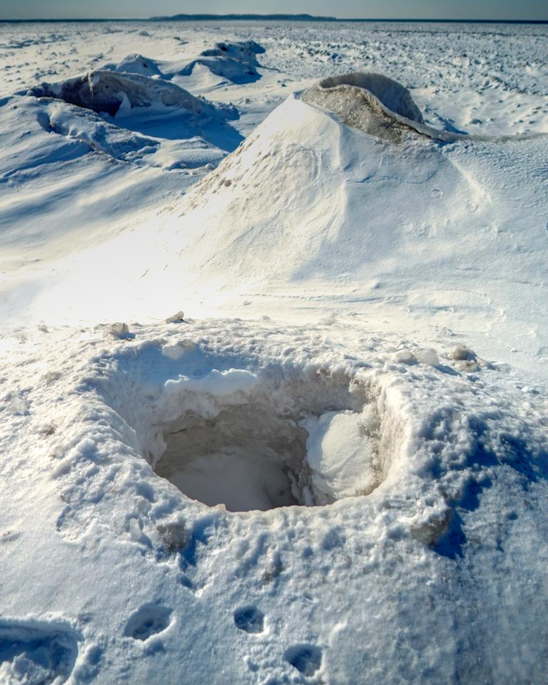
Happy to see all the smog was on the Canadian side! Just kidding. I've never seen an Ice volcano before, but they are pretty cool. The image you have given us does need the tracks in the snow to give a perspective of the volcanoes' size. Well done.
I warped the image in PS just to see what a singular volcano could look like.
|
Jan 10th |
 |
| 96 |
Jan 22 |
Comment |
Hi Haru,
Such a beautiful place to be able to visit. I'm sorry that the area didn't have more rain to keep the water volume up, but we will be happy to send you all the downpours we have received in Washington and California via Hawaii.
1. The lady behind the falls doesn't add to the serenity of the story, in my opinion
2. I'm surprised that your PL filter didn't cut through the mist more. The haze in the middle looks about the same in both images, and to me does pose an issue of mild proportion.
3. The falls seem brighter but have that typical blue cast. I am not a huge fan of blue water since I know it is clear, not blue.
4. I've added a more fallish color gradient to your image, but probably more browns than Japan sees.
I really like your images, just trying different perspectives. |
Jan 10th |
 |
7 comments - 16 replies for Group 96
|
14 comments - 30 replies Total
|


