|
| Group |
Round |
C/R |
Comment |
Date |
Image |
| 20 |
Dec 21 |
Comment |
Nice image composite, Tom. I've yet to start compositing images myself, but I would like to. I like the story you are telling very much. To me it speaks of a bleak pandemic world that we are in but that our children are on the path to a more hopeful world.
That being said, I am confused by the direction of that path. It appears to me that the children are going off track soon. If you could, I think the tracks need to run parallel to the logs in your original image, and then the book centered on that path. Then your grandchildren will find their new and hopeful world. Beautiful imagery.
If you have any recommendation on how I should get started on composites, I would appreciate your reference. |
Dec 27th |
1 comment - 0 replies for Group 20
|
| 23 |
Dec 21 |
Reply |
HaHa! We do now!! |
Dec 28th |
| 23 |
Dec 21 |
Reply |
Looking forward to your solution, Adelet. |
Dec 20th |
| 23 |
Dec 21 |
Reply |
Thanks, Julia for the references. Immensely helpful, and I'm not on Facebook, but Dorinda is. I find it interesting that when I did some research, B&W was not an element of fine art, yet when I look at what are considered to be FA images a preponderance is B&W. The light is well balanced on your egg, and it is well done in my limited experience. I looked at the two fine art group images and didn't see anything that was better than what our group produces. |
Dec 10th |
| 23 |
Dec 21 |
Reply |
I meant more pages/articles. Sorry, my comm skills are lacking as ever. |
Dec 9th |
| 23 |
Dec 21 |
Reply |
I like the balance you have on the orb, and the colors work well. Unfortunately, my OOF area ruins the effect IMHO. Good try, Julia.
|
Dec 9th |
| 23 |
Dec 21 |
Reply |
Julia, I forgot to mention that the light on the rose from the lightpad is wonderful, and the exposure is spot on. Red is so hard to photograph.
Not having taken your course, I wonder what the instructor taught about what constitutes fine art photography, and how to show emotion in a photograph. Who were the artists highlighted and which works? Google doesn't give me a great reference. |
Dec 9th |
| 23 |
Dec 21 |
Reply |
Thanks, Marilyn, and Diana for your replies. I'll adapt my comments to eliminate borders in the groups. Not a problem for me. |
Dec 6th |
| 23 |
Dec 21 |
Reply |
Thanks for commenting this month, Diana.
I am beating a dead horse here (no pun intended), but in order for me to add space on a framed image, I have to first crop the frame out, then add the negative space, and it just adds more processing time to my making comments.
Save the frames/borders for the finished image, says I. This is my final whine on this subject! Cheers |
Dec 5th |
| 23 |
Dec 21 |
Reply |
Thanks, Diana, I'll take a look. The Journal surely was bigger back then. |
Dec 5th |
| 23 |
Dec 21 |
Reply |
https://psa-photo.org/index.php?mypsa-login-psa-journal-online
You have to log in to the PSA website first then all the back issues are there. The link is above in white. |
Dec 5th |
| 23 |
Dec 21 |
Reply |
I think you got some beautiful clouds on this day, especially for Florida. Seems like when I lived there it was either blue skies or rain clouds for an hour then gone. Excellent timing, Adelet. |
Dec 5th |
| 23 |
Dec 21 |
Comment |
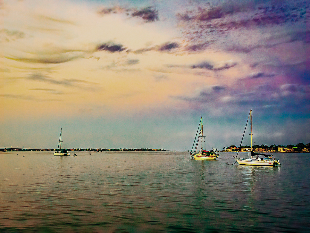
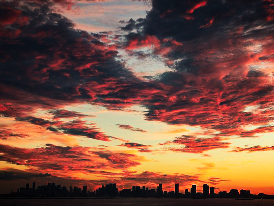
Assuming this is in Florida, is this a sunset or sunrise? Or does it even matter? I agree that the colors are idyllic, and this would make a wonderful watercolor print for a wall. Just to simplify the image, I would suggest removing the anchor buoys and channel marker. I played some with the colors but don't think it is better, simply different. I did crop a tad from the top but left the water since the colors are terrific. Very sharp boats the image is calming to me, Adelet. |
Dec 4th |
 |
| 23 |
Dec 21 |
Comment |
What a wonderful still life, Shirley. Very festive and Christmas-y, and fun I would imagine. The background works for me. Terrific idea and follow through. |
Dec 4th |
| 23 |
Dec 21 |
Comment |
Hi Julia, no doubt about the image conveying love, unless English isn't the viewers primary language. I'm going to go out on a limb here and see if I can create a different image that shows emotion without words. I'll steal Brians idea for a square crop which I think works well. Your image is sharp, the processing is good, exposure/color right on and your story was told. Excellent work. |
Dec 4th |
 |
| 23 |
Dec 21 |
Comment |
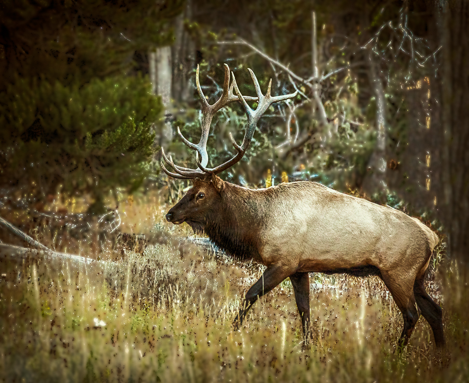
Wow, Cynthia, amazing animal in our favorite NP. I cannot handle the altitude anymore, but I still love it. Vey sharp, and while a little busy in the background it can be blurred in PS or LR with masking or darkened as Brian suggested. The background is why the wildlife photogs buy their 600+ mm lenses. I think there is a blue color cast which is easy to correct in any program or plug-in. You just missed rutting season, or he would have stared you down! Great shot. |
Dec 4th |
 |
| 23 |
Dec 21 |
Comment |
Hi Marilyn,
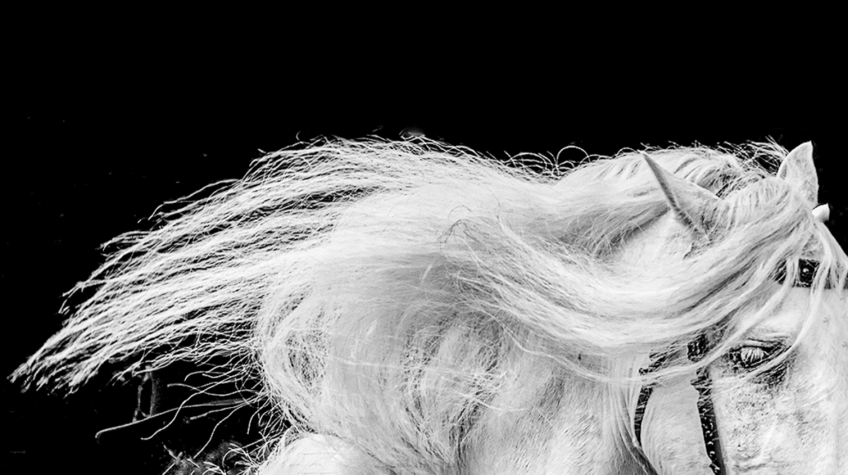
I too, like the sweep of the mane and I think there is a story here. I like the B&W conversion, but I also think the details are too fine. The lower neck area is a little confusing to me, so I almost cropped it off, but decided it was just me. The group seems to like borders, so I won't say any more about them. I extended the canvas 1/2 inch in PSCC to add more space at the top. Great work. |
Dec 4th |
 |
| 23 |
Dec 21 |
Comment |
I like the concentric rings and the color remains strong. I don't think it is horrible and in fact it has possibilities as an abstract. Most of the OOF areas have been eliminated. Kind of a fun exercise when out of doors shooting is gone. Your image is balanced well too. Good work. |
Dec 4th |
6 comments - 11 replies for Group 23
|
| 33 |
Dec 21 |
Comment |
Hi Raymond,
I really enjoyed your image contribution to the Member's Showcase this month. Congrats on your selection.
You have captured a beautiful view of Venice, and the composition is well balanced. As a Fujifilm photographer myself, our landscape images need some help in post to add pop. Fuji is a master at portrait (skin tones) coloring, but not so much with landscape coloring. I would like to see a little more contrast in the sky, and some removal of the poles along the skyline to simplify the view. Fantastic job, Raymond and congrats on your QPSA too. |
Dec 28th |
1 comment - 0 replies for Group 33
|
| 45 |
Dec 21 |
Comment |
Great action shot, Bob. Sharp as always, and well exposed. I like the colorful clothing more than the white uniforms we saw on PBS's Downton Abbey series. Sorry about England's loss to Australia in the ICC World Cup.
Very excellent shot of Remagen in the DD Showcase. http://psadigital.org/
I think the story of the famed Ludendorff bridge will forever remain a mystery.
|
Dec 11th |
1 comment - 0 replies for Group 45
|
| 96 |
Dec 21 |
Reply |
Thanks, Gloria. We are happy that you have joined our study group too and look forward to your contributions.
The latest version of my image lost much of the feeling I had so I don't think it will probably end up as a print. If I ever get back to competition this version may do better though. I never know.
We are getting an arctic blast next week, and I envy your being in Miami. |
Dec 24th |
| 96 |
Dec 21 |
Reply |
Thank you so much Emily. Your detailed and thoughtful response was extremely rewarding to me. I may need to re-evaluate my use of "snapshot" in describing images. You have given me a lot of valuable feedback to ponder. I felt all the same emotions as you when stopping here. I truly am never fishing for compliments from the group.
This is the image I produced based on all the comments. Like Dan and Emily state, we are all constantly evolving our abilities, and even from day to day we may view the same image differently. To my eye I have a more balanced image but have lost warmth and feeling. That being said. I would probably get a better chance of this image being accepted in competition.
Thank you all for being such a wonderful group and for all your thoughtful contributions. I am hoping 2022 can be as productive and that the health of this world will improve.
|
Dec 23rd |
 |
| 96 |
Dec 21 |
Reply |
Thanks for the link Cheryl. |
Dec 15th |
| 96 |
Dec 21 |
Reply |
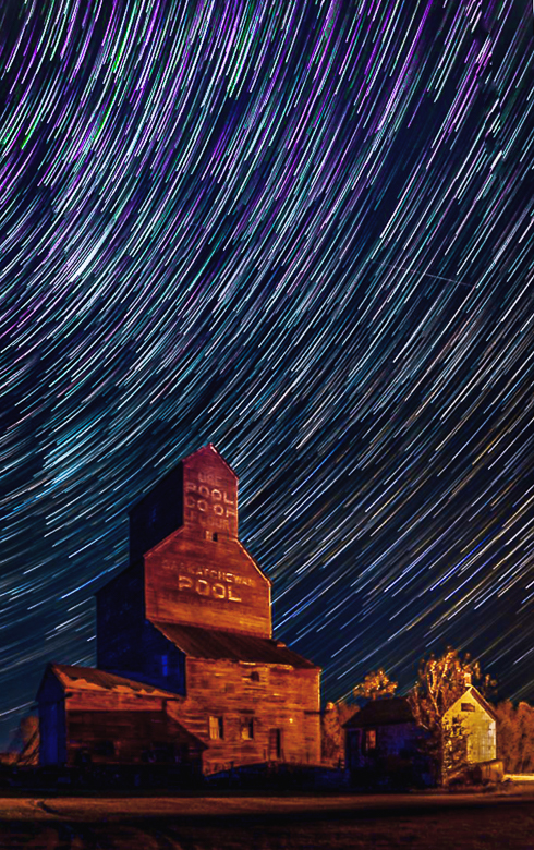
Thanks, Cheryl. I agree that that the colors work well, but that the impact of the trails have been reduced too much. I agree with Haru, that your experimentation is increasing the night photography knowledge of the group. The balance/weight between the sky and foreground seems especially important in night photography to me. Lots of work involved. Keep experimenting and keep us informed along your journey. We'll add skyscapes to our list of scrapes.
http://psadigital.org/group04/image.php?iid=66839 DD4 Gary Butler has a Star Trace image and a hint about settings in his description. |
Dec 13th |
| 96 |
Dec 21 |
Reply |
Thank you, Gloria. If you did shoot RAW then the image, without any processing is the jpeg created by Canon from an algorithm based upon their image files. What kind of editing software are you using, or wanting to learn? |
Dec 10th |
| 96 |
Dec 21 |
Comment |
Welcome, Gloria. I'm glad you have gotten such great sunsets. This is an amazing sky image. Michelangelo's paintings are six centuries' years old, so the colors are probably faded quite a bit from what he saw or imagined.
You don't say what file format you shoot, but if you didn't have to process this, I would guess jpeg, since RAW requires processing. If you want more control of your images, switch to 14-bit RAW.
The colors are subtle as are M's paintings. I think more contrast could work on the colors in your sky. The skyline works for me. I would narrow the image to the city itself and crop the rest on the right. Most of the sky action is also in that area. The top of the dark clouds is less interesting to me. I've probably overdone a lot, but it is possible to take it farther with post. I don't see any technical flaws and using a good tripod in the wind is smart. Excellent image.
|
Dec 9th |
 |
| 96 |
Dec 21 |
Comment |
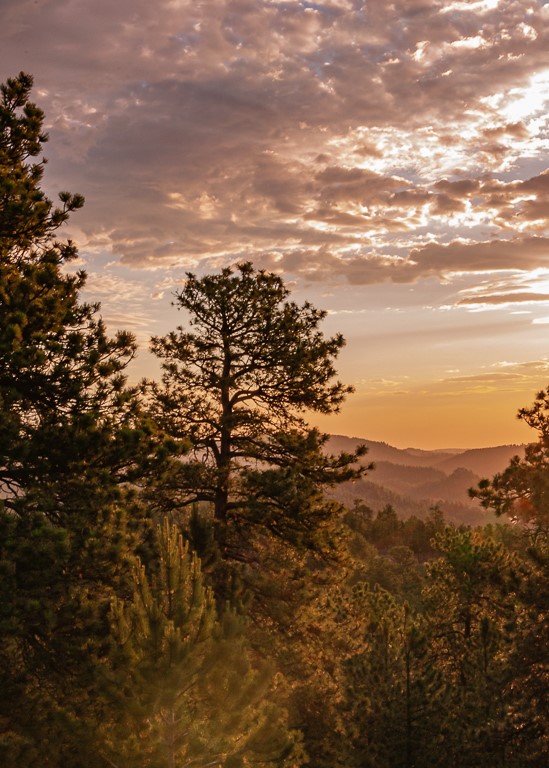
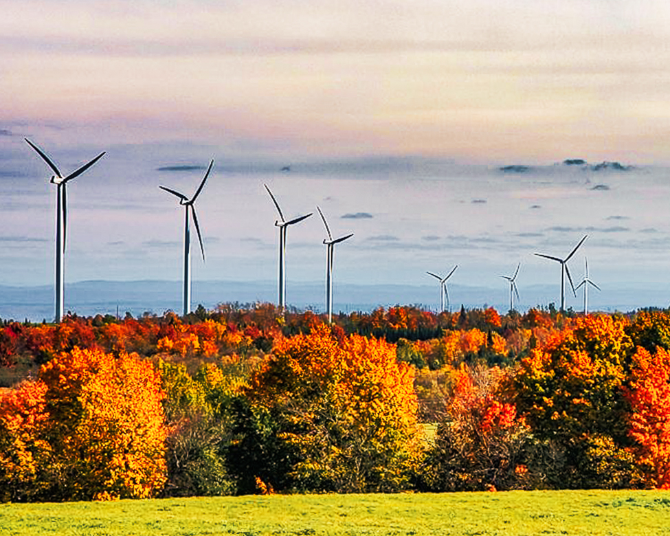
I also love wind farms and have many images taken in eastern WA of the Palouse wind turbines. You did a wonderful job of capturing the scope of the farm, there is great color in the foliage. The image looks a little soft to me, but my old eyes may be losing their ability to focus. You take good notepad images though. Looking at your tones in B&W, three fourths of the image is in the top three zones. IMO you could crop some and still get the story across and provide sufficient DOF. Nice work |
Dec 9th |
 |
| 96 |
Dec 21 |
Reply |
Thank you, Haru. I like the analysis style presentation of your comment. I like your B&W, which I use often for harsh light. I agree that I need to at least soften the color palette. I'll look at some different gradients/LUTS to calm the image. The sun rays were probably lens flares. because I had to remove some sunspots. I also try to create a B&W just to see the lights and shadows that lead the eye through the image. I think I do need more light leading the eye to the mountains, as suggested by Cheryl.
I think I'll use the strengths/weakness comparison in the future for my own editing. Thank you for that idea. |
Dec 8th |
| 96 |
Dec 21 |
Reply |
Thanks, Dan. I should have changed my 24-70 to a 70-200 or 300 mm lens which would have gotten the shot you are describing. Nothing worse than being lazy about a subject, but we were going to lose the light quickly, and still had a way to go to get to Mt Rushmore. Better planning was required! |
Dec 7th |
| 96 |
Dec 21 |
Reply |
I think the debris in the water is even more distracting in the B&W version, Haru. For that reason I like the color image better. |
Dec 7th |
| 96 |
Dec 21 |
Reply |
I guess that I did not state my question very well, so I'll edit it above in case someone else wants to comment. You and Dan have taught me a valuable communications lesson, Cheryl. Thank you both.
What I am really trying to ask is does this image convey an emotion to YOU or is it just a snapshot? What do you think it would need in order to provide an emotional response in my viewers?
So what I think from your comments is that it, like most of my images, needs a defined subject, sky replacement and I sympathize with only a jpeg, but that is beyond my control.
|
Dec 7th |
| 96 |
Dec 21 |
Comment |
I am unable to add Haru's B&W image from DDG74 as an additional image for reasons unknown, so I am adding it here as a comment. You can just click on the thumbnail (as always) to open the full-size image for comparison, or to edit. Sorry for the inconvenience. |
Dec 7th |
 |
| 96 |
Dec 21 |
Reply |
I am a huge fan of Blake Rudis, and he has courses on Blend Modes that make sense. I've learned that the Linear Light blend mode does so much more than any other blend mode, but the trick is to adjust it using the Fill slider, not Opacity. It looks super harsh at first, then starts really making changes from 35%-10% fill. |
Dec 6th |
| 96 |
Dec 21 |
Reply |
Thanks, Dan. I do subscribe to "Lenswork" which is published here in Anacortes by Brooks Jensen and printed in Canada. Guy Tal is a regular contributor to the magazine, but I've never read "Like a Rock." Their articles are definitely heavy reading, but sometimes on point.
I do appreciate your tactful comment and assume this image did not provide you with emotional impact. If you have any suggestions, I would appreciate your input. Suggestions for improvement are what I wish for from study groups and I use to have the same hope from my camera club. |
Dec 6th |
| 96 |
Dec 21 |
Comment |
Quite the sunrise, Dan. The sun is bright enough to make my eyes hurt. Your title leads me to guess that the two figures on the beach at the right are people, not signs. I also wonder if the haze above the trees is fog, sun, smog or smoke from California ablaze. Many stories available in this image. Terrific eye and image.
I don't have any suggestions, just awe at the coast. |
Dec 5th |
| 96 |
Dec 21 |
Comment |
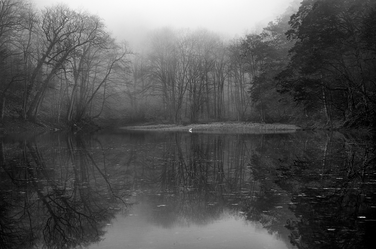
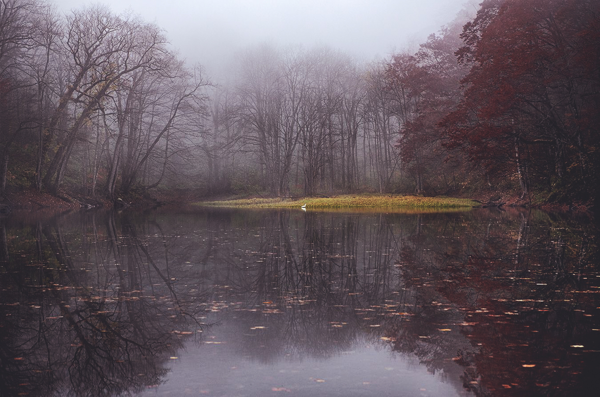
Haru, your image seems symmetrical even if not perfectly, and the somewhat muted colors do add serenity and a sense of peacefulness to the image. The green is a little off-putting to me in that it seems too fluorescent. While the size of the swan/goose(?) is small the white makes it stand out. I would suggest cleaning up some of the brighter flotsam in the water, especially for competition. The reflection is wonderful. Excellent work. |
Dec 5th |
 |
| 96 |
Dec 21 |
Comment |
As I said last month, I'm not a night sky photographer, but when I look at the images online there are a lot of different looks to star trails. If you like what I've done or want some experimenting ideas, I started with a Night Sky profile in LRCC 2020, sharpened and reduced the luminance noise and adjusted the color calibration, and finally added a Tamron profile to the lens correction tab. I wasn't satisfied with your brown/yellow color palette, so I added a reflected gradient in PS to add more of a lavender/blue look. I finally sharpened it somewhat which seemed to get the trails more definition. Not really better, just different. |
Dec 5th |
 |
6 comments - 11 replies for Group 96
|
15 comments - 22 replies Total
|


