|
| Group |
Round |
C/R |
Comment |
Date |
Image |
| 96 |
Oct 21 |
Comment |
Very subtle work of art. Thanks for sharing. |
Oct 30th |
| 96 |
Oct 21 |
Reply |
Thanks, Dan. I have done enough whining on this shot. I hope to do better next month. |
Oct 21st |
| 96 |
Oct 21 |
Reply |
I also updated all my Topaz apps, and they are accessible through PS Filters, so I'll relearn their apps. |
Oct 21st |
| 96 |
Oct 21 |
Reply |
Thank you for the comments, Emily. I do think editing my images provides me some therapy and hopefully my Van Gogh days will end (not THAT way though.) |
Oct 21st |
| 96 |
Oct 21 |
Reply |
I'm going to post a Luminar discussion on the jPeg/Raw question on the bulletin board above. Your image is still a horizontal crop, but I'll produce a vertical for you now. Not sure that the big tree adds to your image but can probably be removed in Luminar. I used the spot healing brush quickly in PS, and those caused artifacts, but with more work it could be done better. |
Oct 20th |
 |
| 96 |
Oct 21 |
Reply |
I wasn't successful. I usually fail with only a jpeg version. This needs a RAW file to work with, and best shot with an exposure bracket, I think. As I look at it again now, possibly a vertical crop around the red light could be done. |
Oct 19th |
| 96 |
Oct 21 |
Reply |
I seldom use thirds anymore, as it has become too obvious, so it was just accidental. I'm just not sophisticated enough to appreciate the little subtleties, I guess. If I ever get past my overcontrasty processing, I can try to look at more fine art photography, which might help me advance. Right now I'm just hoping to shoot again. |
Oct 9th |
| 96 |
Oct 21 |
Reply |
Wow, this is a whole lot better and has Dorinda's seal of approval. I hope I'll feel better too, but it will take some time, I'm afraid. Thanks for the comments. |
Oct 9th |
| 96 |
Oct 21 |
Reply |
Thanks, Bob. It worked very well on this image. Not sure why I picked such an out of focus image in the first place. Must be worse off than I thought. Thanks for the tip! I seldom use topaz anymore, but I should. |
Oct 9th |
| 96 |
Oct 21 |
Comment |
Hi Emily, I grew up with the history of the Erie Canal (and a song) but have never been there. I think Bob A. is correct that there is a story in the silhouetted image that is good.
I may lose your story by opening up the shadows, but I think it matches the title better. You'll be the judge of course. I also worked on the upper sky too, as I think Bob is correct that the blue may be pushed too far. I did my edits in LR but I'm sure the same adjustments are available in Luminar.
Really a nice image that may just need some work to up it a level. |
Oct 9th |
 |
| 96 |
Oct 21 |
Reply |
Thank you, Cheryl. As I said, I'm not particularly good with flowers, but maybe I can call them beescapes to fit in our group. My wife has a lensbaby and has taken wonderful flower images. Focus was off on this. |
Oct 9th |
| 96 |
Oct 21 |
Comment |
Hi Bob, I like your composition and please be careful getting into position. A 12-24 mm lens may have been useful, bur doesn't keep things in perspective. Your image is sharp throughout, color and tone look good to me. The light is still pretty harsh though, so sometimes a look at a B&W will help. A standard lens like the 24-70 keeps everything in proper perspective.
I think the composition needs tightening, as the view to the left adds little. The story between the scout statue and the modern Kansas City is good. The sky doesn't add much either but can be replaced. The bush leads to the scout, and the tree ads a frame. Good travel image possibilities. |
Oct 8th |
 |
| 96 |
Oct 21 |
Comment |
Another possibility, without the birch trees (or whatever they may be.) this is mostly done with the oil painting filter in PS at about 50%. I then used a Color Balance Layer to adjust the midtones, highlights and shadows. |
Oct 8th |
 |
| 96 |
Oct 21 |
Comment |
Hi Cheryl,
I have the same issue, and I think I've seen some YouTube video's that help correct the issues. Nothing is more frustrating.
I really like the compositions, and selection for your image. It does look impressionistic to me. I don't see many dark impressionist images, but there are some.
I think the color, and tones are okay, but if you squint at the image the birch trees compete with the subject tree for my eye.
I think the subject tree should be lightened even more, and I'm just not sure the other trees are needed. I think a square crop, centering the "Hope" can make the image stronger.
I think this is a great beginning for your growth. |
Oct 8th |
 |
| 96 |
Oct 21 |
Comment |
Here is an alternative crop. I may have dodged and burned a little too much. Can't remember and Cheryl is more the expert on that editing. As I look more at my crop the upper sky would need burning to add back the balance. |
Oct 6th |
 |
| 96 |
Oct 21 |
Comment |
Hi Bob. This is so creative (right out of Dune) and really has a wow factor. I wonder how this would print as a 44" or even 64" on acrylic. The color is amazing. The composition is stunning, and I had no idea this NP existed. Technically I have no suggestions. Your color grading is beautiful and very subtle.
I do have a couple of opinions (nitpicks)for your spectacular image. I know you want the moon, but it is so small in comparison, it looks to be a flaw in the sky (to me.) There is also a peak(?) in the upper right that I find distracting. I'm going to add a crop also for consideration. I would cover a whole wall in an office with this image. |
Oct 6th |
 |
| 96 |
Oct 21 |
Comment |
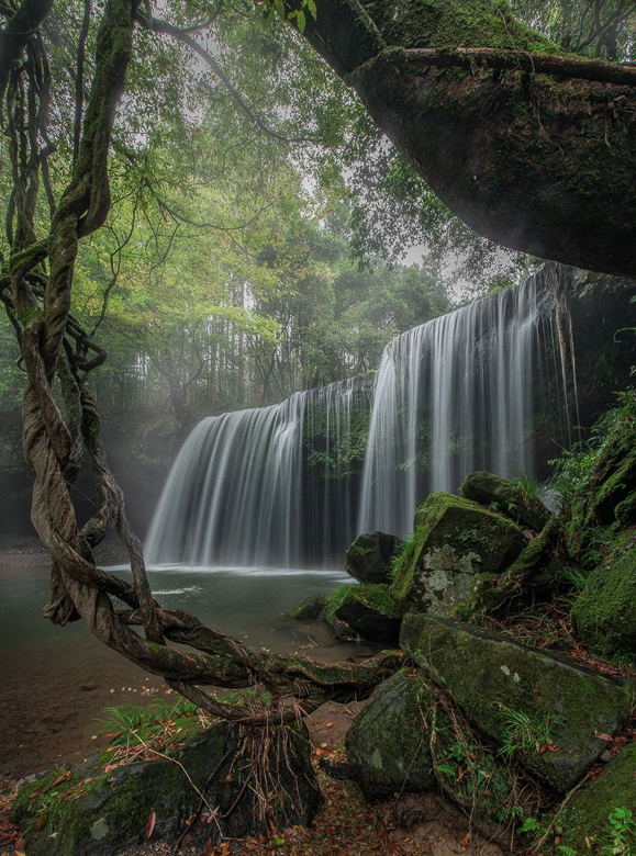
Hi Haru,
Your composition is tight and interesting. In PS there is a sky replacement feature that works quite well and allows you to manipulate it. You can add your own skies, which I like best, but since there isn't much sky in this image any should work for your needs. The mist from the waterfalls or fog that lightens the background could be reduced or increased in my opinion. I'm learning quickly that you are a subtle processer, so I just added a dodge to the base and decreased the haze sliders in LR. |
Oct 5th |
 |
| 96 |
Oct 21 |
Comment |
Thanks, Bob. I've got 300+ images from this shoot, and I may try a few more, mostly with bees that were doing their thing. |
Oct 5th |
| 96 |
Oct 21 |
Comment |
This is with a radial blur, and a radial spot from the foreground.
I forgot to mention that there are great shapes within your frame. |
Oct 5th |
 |
| 96 |
Oct 21 |
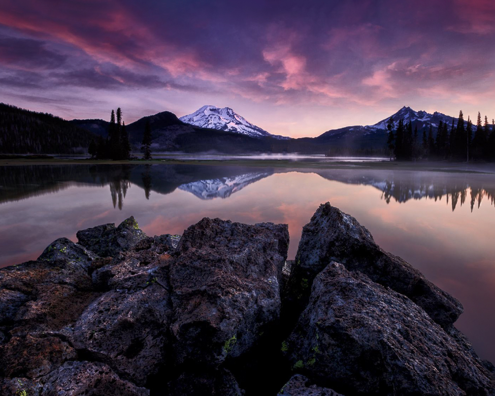
Comment |
I think you've captured the mood of the Cascades quite nicely. The color palette you used especially creates a sense of calm and quiet for me. The entire scene is in sharp focus, the lighting is good and there are nice layers. This should get plenty of acceptances.
While I know many judges harp on sharpness, I think in a 2D medium we must sometimes allow some blur to create depth in our images.
In this image the Three Sisters competes with the foreground rocks in Scott Lake because the detail is all the same to me (I may have the wrong area.) The entry into the image comes from the right and then is stopped after the mountain. There is no path for my eye to get to the foreground, as the end of the lake is so dark. If I come into the image from the rather dark foreground, I still get stuck trying to stay in the frame.
Don't get me wrong as I wish I could make images this good, and I'm just throwing ideas at you. I think I'd remove the two trees in the center also. Excellent work, Dan. |
Oct 5th |
 |
| 96 |
Oct 21 |
Reply |
My wife's saying is that when faced with a bowl of lemons, make a lemon meringue pie (she does a tasty bake!) |
Oct 3rd |
| 96 |
Oct 21 |
Reply |
I forgot to answer your question about what my story and goal was for this image. That is one of my biggest challenges in photography. I am at heart, most passionate about sports and the ocean. I have a tough time seeing the beauty and stories in flowers. In this instance I was the driver for my wife and her friend, so I filled my time with taking images. That is a poor excuse for taking images, but it does allow me to practice, which is what I was really doing.
Processing images is more my passion, as I can try to technologically replace harsh light, refine composition, and create what I missed on location. Hope this answers your questions, but probably isn't a satisfactory reason to work an image. Processing though, does help me see better in the field. |
Oct 3rd |
| 96 |
Oct 21 |
Reply |
Thank you, Haru. I must agree that the resulting image is redder than pink now. It might just reflect my current attitude, as I am in constant pain. Your evaluation is very insightful, and I respect your comments very much. Soft colors with a softer approach look infinitely better. |
Oct 1st |
11 comments - 12 replies for Group 96
|
| 98 |
Oct 21 |
Comment |
Sorry for using the film idea of pushing and pulling colors, which is just an idea to add or subtract a stop of exposure.
The LR tool I use most is the HSL targeting tool. I start with Luminance then change to hue or saturation only as needed. The new color grading too is also a possibility, but I haven't really dived into it yet.
I usually use the Calibration sliders to do the overall ISO, which I think is better than the ISO settings. |
Oct 18th |
| 98 |
Oct 21 |
Comment |
Hi Zina, Sounds like a wonderful trip. Here am I stuck in a chair with an IV for another three weeks (at least!) I envy you.
Excellent job replacing the sky. Lots of light leading us to the mountain. All is sharp and I think you wanted the details sharp, so that works. I find the tones in the mountain, foliage, and stream to be somewhat flat. I'd suggest either to dodge and burn areas to separate them, or you could push and pull just the greens to add depth. Beautifully shot. |
Oct 15th |
 |
| 98 |
Oct 21 |
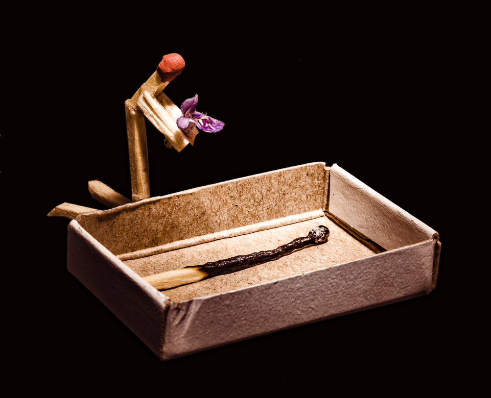
Comment |
I am awestruck by your creativity, Tom. Not only the subject matter is creative, but the light is amazing. Your use of tones and colors takes us where you want us to look, which is the play between the grieving figure and the dead body. The colors of red, lavender, and black further lead the eye and tell the story.
The only suggestion I have is to eliminate the writing in the box as it is a distraction for me.
I used the healing brush and then the clone stamp to restore the proper light in PS. |
Oct 15th |
 |
| 98 |
Oct 21 |
Reply |
Thanks, Zina. You are right of course. The crop changes the story significantly. As Robert stated they may not be the same image, but from the same day. I'm definitely not as sharp as I once was. Thanks for the wellness thought |
Oct 13th |
| 98 |
Oct 21 |
Comment |
Great Shot, Bob. I just saw a similar image in a magazine or online, but it was a goose. Sharp image, lots of detail, and a delightful story with the coot. I at first thought it was another type of animal with two ears. Glad you mentioned it was a coot, which I had to look up. The top birds don't add anything to the story for me. The swan wings and some of the water appears to be overexposed to me, but since Zina stated otherwise, it may just be my eyes. |
Oct 9th |
| 98 |
Oct 21 |
Reply |
Thanks Bob. I am struggling with my health, and it is making me miss things. It doesn't appear to be the same, but sometimes I add more to the canvas and use by using content aware crop which does a decent job usually.
I just don't remember. Maybe you should remove the original.
The series of images from this spot are in order in LR, but sometimes I've accidently deleted images I've renamed for DDG. That may have happened. |
Oct 9th |
| 98 |
Oct 21 |
Reply |
Thanks Bob. You may be correct. The problem I saw with the groups at the gate, is that the gate is blue and modern, not the story I wished to tell. I should take the people out. My family is from Galway and my wife's from Roscommon and they were much greener areas. We were lucky and it stayed fairly warm and dry while there. |
Oct 9th |
4 comments - 3 replies for Group 98
|
15 comments - 15 replies Total
|


