|
| Group |
Round |
C/R |
Comment |
Date |
Image |
| 96 |
Sep 21 |
Reply |
Thanks, Robert.
True that there are multiple options available in PS that work to achieve the same goal, so I think, whatever works for you is best. It is the standard just because you can always find an option to get your image right. Just throwing out questions. |
Sep 24th |
| 96 |
Sep 21 |
Reply |
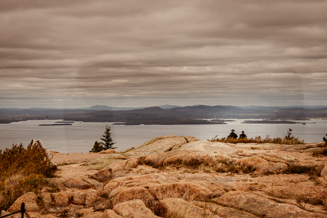
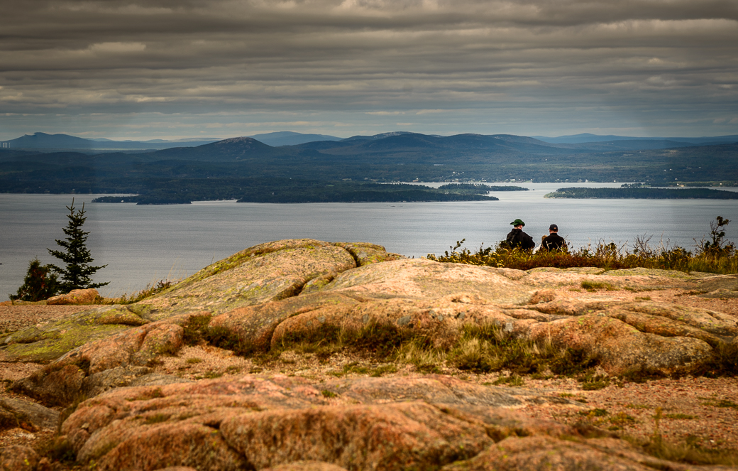
Hi Robert, I've been released from the hospital, and I really appreciate all the work you have put in on your image. While it is a long summation, the depth of the processing becomes clear. (I haven't heard from Barbara on your suggestions, but she is still finishing her move) While I suggested the horizontal crop, your newest version makes the vertical crop more interesting. I had to reduce my zoom to 75% on my laptop in order to see it all.
In my opinion a print is worth doing for many reasons.
I agree that the tree pops out better against the cooler background. The shadows progress from dark to light naturally, so I think that is good. On the horizontal you'd probably have to burn the left more to keep that natural.
I don't know if you use blend-if on your layers, but I find it essential for protecting both ends of the zone. |
Sep 22nd |
| 96 |
Sep 21 |
Reply |
Really nice work Robert. You've gotten rid of a lot of the smears. I may work this some more using all the comments. The subject and story are there, just my camera work was off. I mean my camera work was off, bad, horrible, aaaaggghhh! |
Sep 11th |
| 96 |
Sep 21 |
Reply |
It is a jpeg copy of the NEF (Nikon's RAW format). I did a bad job of wiping the lenses off. It was cold, wet and foggy, and my attitude was not good for this part of the trip. I hate driving 5K miles for crummy weather. |
Sep 11th |
| 96 |
Sep 21 |
Reply |
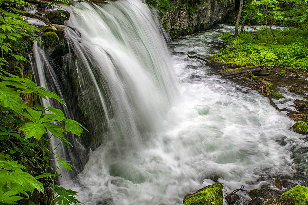
My crop did remove all the mood and mystery that you provided in your version, so my other option would be to try a horizontal flip for western viewers, who would enter left to right, and dodge the lower water runoff as the entry point to either view. The green areas that you dodged to lead into the falls is a subtle, and effective edit. I think your image should do well in competition. |
Sep 11th |
| 96 |
Sep 21 |
Reply |
I agree that Haru has uncluttered the image by his conversion to B&W and by use of dodging and burning. Nice edit, Haru. |
Sep 11th |
| 96 |
Sep 21 |
Comment |
Hi Cheryl,
Wedding photographers use glam shots in the water all the time. That being said, the images are created for the bride, not the landscape. This image could be a landscape instead of portrait by having her looking at the mountain.
You did a fantastic job of compositing all the images. Bravo! |
Sep 10th |
| 96 |
Sep 21 |
Comment |
Bring the image alive???
Hi Dan,
Good sense of humor. I like the shallow depth of field in this case, as I can see his death slowly closing in from tail to head. While blue can mean serenity, it also associated with sadness. My only suggestion would be to change the background color from black (death) to blue (sadness) since the poor bee is so brightly lit. I cropped some to eliminate bright bubbles I felt distracting |
Sep 10th |
 |
| 96 |
Sep 21 |
Comment |
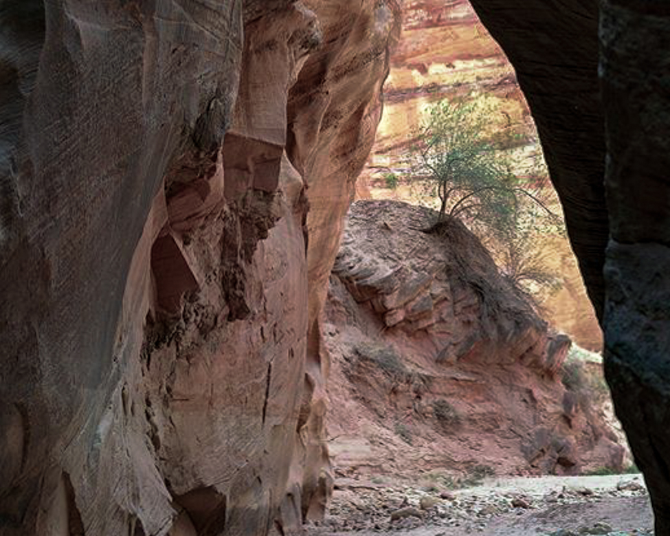
Hi Robert, I truly enjoy your descriptions as they tell me the story, and the how's of why you created your images. I have quit listening to my club's critiques since they aren't relevant to what I want on my walls. They also seem to want to follow rules ad nauseum.
I think your original idea to create a horizontal frame would work for the image. I think you can make the tree larger yet still let the viewer know that the image came from a slot canyon. Your work with your gear is amazing, and never has any flaws I can see. Splendid work, again. |
Sep 10th |
 |
| 96 |
Sep 21 |
Comment |
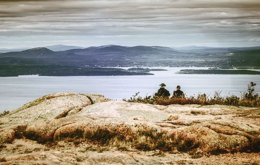
Hi Emily, I think that this is a snapshot of a wonderful place to visit. Once you get there, then the work begins to find small areas of interest to you. One of the hardest things about photography for me is to find a subject within the beauty I see. As Cheryl and Dan point out, no subject is clear to the viewer in this image. At f3.5 there isn't enough depth to really make a crop usable for competition. I suggest returning and when time allows to work the area in depth. It looks to be a beautiful place to get images. I tried a small area off the dock as just an example. Good luck and have fun |
Sep 10th |
 |
| 96 |
Sep 21 |
Comment |
Welcome, Naru. I'm happy you are fully participating this month. Your image has pop with the greens and whites. Your exposure looks great to me. Your focus is sharp, and the composition is good, but to me it seems a little off horizontally. The distortion may be due to the wide-angle lens, but it makes me wonder. It may just be me since no one else has mentioned it. I'll just add my version and see if it helps make sense of my words. I lose some of the greenery in the crop though, which probably also changes the mood.
|
Sep 10th |
 |
| 96 |
Sep 21 |
Reply |
Thank you Haru. I should have asked what they were discussing, but it was probably the horrid weather. |
Sep 10th |
| 96 |
Sep 21 |
Reply |
Don't use NIK since they changed owners. Thanks for the suggestion.
|
Sep 10th |
| 96 |
Sep 21 |
Reply |
Thanks, Cheryl. I do make B&W's of most of my high contrast images, and I had to rule this one as bad, due to what Dan noticed. The lens was wet, and B&W shows that more than color. I am now thinking this was not a good choice for me to present. Garbage in-Garbage out! I'll do better next month, hopefully. |
Sep 10th |
| 96 |
Sep 21 |
Reply |
I don't think I used a filter, but the lens was probably not dry, as there was a mist in the air or rain constantly during the week. We finally gave up after a fog rolled in permanently and left Maine early. |
Sep 10th |
| 96 |
Sep 21 |
Reply |
Here is the entire original (jpeg version) |
Sep 9th |
 |
| 96 |
Sep 21 |
Reply |
Good question, Dan. Yupper, I calibrate my monitors each month. (Spyder 5 Elite) I also pay attention to the histogram and set the highlight and blacks warnings in LRCC and PSCC. I don't always back off from blown highlights however as I really don't like the muddy gray that sometimes result.
Blown highlights just appear as the paper color when printed, so I am careful to select the right paper when I print.
I have found that since I moved to Fuji X cameras, I have better control over exposure than I did with my Nikons. Or maybe it is just a matter of being more careful in setting my exposure.
I'll see if I can provide a better jpeg for this image. I am including the original. |
Sep 9th |
 |
| 96 |
Sep 21 |
Reply |
Thanks, Dan. Please don't take offense, but I wish to use your request as a DDG admin moment.
I do not encourage anyone to share their RAW files. There are many reasons why, and of course, in this case trust isn't an issue, just my preference.
I actually was trying to (not too subtly, evidently) get you to work the jpegs that are available to us all in the group.
I think that including a reworked jpeg, in your comment/reply is a visual aide that helps you make your point. You can click any image in DDG, save it in a folder, then work on it in any program you choose. |
Sep 8th |
| 96 |
Sep 21 |
Reply |
Thanks Dan. Your input is important to me as a critique. I don't really have much success in competition, and maybe your "high contrast style" comment sums up my problem with others. At times I have an image where that works well, but as you have said, not so much with this subject. Would you consider giving me a reworked image to help me see your comment. I'm including what I think is less contrasty, but I may not have a handle on your thoughts. Let me know. |
Sep 7th |
 |
5 comments - 14 replies for Group 96
|
| 98 |
Sep 21 |
Reply |
Thanks, Robert. Good suggestions. |
Sep 9th |
| 98 |
Sep 21 |
Reply |
I believe that there are as many keys to good photography as there are good photographers. I find that if you find a subject that is interesting to you, you will be able to find a way to photograph it in a way that is exciting to you. The more you shoot, the better your skills will become. |
Sep 7th |
| 98 |
Sep 21 |
Reply |
You have a very creative mind, Wendy. I didn't even notice the beaks. Well done. |
Sep 7th |
| 98 |
Sep 21 |
Reply |
Thank you, Tom. I always struggle with finding and using my level source, My tremors get in the way a lot. I was shooting from a stairwell and trying not to fall. Looks better vertically! |
Sep 7th |
| 98 |
Sep 21 |
Reply |
Thanks. I was way off on my guess. |
Sep 7th |
| 98 |
Sep 21 |
Reply |
Thanks, Zina. Talk about a senior moment! I am not sure where the "telephone" came from. All I can think is that maybe my phone rang while sending this to Robert. At least I hope there was some reason and not a brain loss. |
Sep 7th |
| 98 |
Sep 21 |
Comment |
Hi Robert,
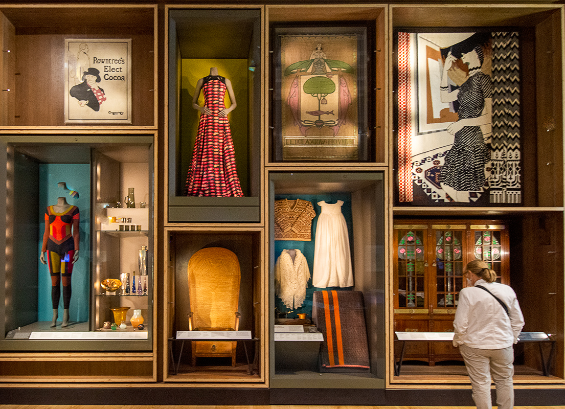
This image is really eye-catching. It has that old time feel. The lady is an added benefit and gives size relationship to the display. Excellent work on the transform, even if her feet are cropped, which can still be fixed with the right image (or stock photo.) I cropped her more! I worked quickly in LRCC to remove the light reflections in the window, which does help as Stuart mentioned. Color, clarity, and tone are all well done. Excellent work, Robert. |
Sep 6th |
 |
| 98 |
Sep 21 |
Comment |
Excellent capture, Wendy. I think you did well showing his wings in motion, and the body still and sharp. Framing the little bird is usually a good technique, but in this case, I think the frame competes with the bird. I assume she became defensive once her food was secured, or she fed a baby. Well done.
Click on the thumbnail to see it full size. |
Sep 6th |
 |
| 98 |
Sep 21 |
Comment |
Hi Zina, Excellent work with your phone. They are handy little creatures. Your composition is great. My son lived across from Mills College, and we made this walk too. I did a little cleanup of the birds in the water and added some canvas to the bottom of the image to eliminate the merger. I also added a glow using PS gaussian blur. You could tighten the crop, a little off the right, and maybe the left until you can recognize the lights a little better, assuming that is why you wanted the shot. |
Sep 6th |
 |
| 98 |
Sep 21 |
Comment |
Hi Tom,
I love the creativity, and I do imagine you had a lot of fun. You didn't include camera info, but I can guess you shot an open lens, as your DOF is small. Sepia seems a desirable choice, but you may wish to draw back the vignette some. In my opinion, the subject is simplified enough without the need for a vignette. Very clever image.
I don't know of a way beyond cropping to reduce the vignette without the original file, so I can't include an image. I tried cropping but was not satisfied with my results. |
Sep 6th |
4 comments - 6 replies for Group 98
|
9 comments - 20 replies Total
|


