|
| Group |
Round |
C/R |
Comment |
Date |
Image |
| 96 |
Jul 21 |
Reply |
Hi Emily,
I was actually just suggesting that a B&W image can quickly ID whether the image has tonal values that lead the eye where the artist wants. However, your processed B&W is very well done, although I would still burn the bright clover in the lower left. Excellent B&W. |
Jul 23rd |
| 96 |
Jul 21 |
Reply |
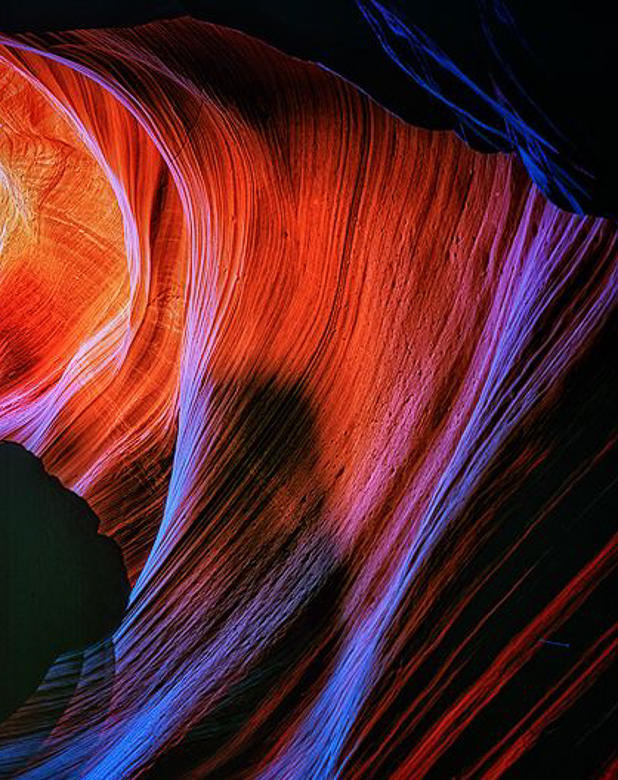
I am going to reply to both posts here. When I look at your last version as a thumbnail, which I use often and squint at it, I believe it provides a more balanced image. I'm glad you posted this for us. Your image provides a lot of artistry training for us. Even though it is an abstract, it is still an identifiable slot canyon image. |
Jul 21st |
| 96 |
Jul 21 |
Reply |
I know that color relationships change when viewed via the zone system. Ansel had Einsteinian insight into photography.
I should have thought to put antsy into quotes! Glad you enjoyed it. Zooming to a thumbnail also helps see where light leads the eye.
|
Jul 19th |
| 96 |
Jul 21 |
Reply |
That I keep coming back to your image speaks volumes to me about how much there is to view. The green flare, for want of a better term, does break up the blackness, but the more I look, the more I realize that the swirling lines all lead me to the darkness then out of the frame. Even my crop doesn't change that aspect. What I may be seeing is that the black rock edge is too sharp and might be better left unsharpened. I also cloned some of the blue in the blackness at the top onto the rock to break up the black. This is such a good image I would suggest you come back to it repeatedly until you have nothing more. Or maybe you are already there. |
Jul 19th |
 |
| 96 |
Jul 21 |
Reply |
The alien idea is funny.
I decided to use light painting on the final image (for now.) The bottom of the moon is barely visible, just left of the top of the bush. I want the dark of the moon to mimic the shape of the right rock formation, so that is why it was placed in that position, and size. I created a high key image and dodged the left formation, so it wasn't a "dark hole." Then I burned the top left peak. Now you know why I don't mind sky replacements. |
Jul 18th |
| 96 |
Jul 21 |
Reply |
When I was evaluating your image, I always start with Auto tone in ACR/LR and the green glob showed up. I assumed it was a lens flare, or aberration, so that's when I started to look for a crop. I wasn't smart enough to go to the Antelope Canyons in my youth, so it is beyong me now.
I never expect any member to think my comments are "better or worse" just my thoughts on YOUR image. |
Jul 18th |
| 96 |
Jul 21 |
Comment |
Hi Cheryl,
Your goal is achieved. This is a "nice" cityscape of Calgary. I like your use of reds and blues. The sky replacement works for me and will become commonplace before long. I have a couple of folders of skies, backgrounds, and textures. Excellent job processing your image and in your composition. |
Jul 18th |
 |
| 96 |
Jul 21 |
Comment |
Hi Dan,
I don't think the ferns are too bright, but since they lead my eye to their center, I am a little disappointed to find a mundane patch of clover. If you look at the image in B&W you can see there is more tonal range in the lower left than in the center where our eyes were drawn. I like your idea of the magenta, but a cluster among the ferns might have more WOW! I don't have any issue with cutting off the ferns, but a lot of club members get antsy. Create for your on pleasure is your idea and a good one. |
Jul 18th |
 |
| 96 |
Jul 21 |
Comment |
Hi Robert,
I am in awe of your images, and this image is no exception, highlighting your technical skills. Tack sharp, excellent processing and color use. I like the saturation of reds and blues. My eye is drawn into the big black hole and suggest looking at a crop to minimize that issue for viewers like me. As always. stellar work. Ultimately, our work is to please our own eye, and you have an excellent eye for beauty. |
Jul 18th |
 |
| 96 |
Jul 21 |
Comment |
Hi Emily,
I think your image is processed beautifully. The sharpness looks perfect to me, the colors are great (making Brooklyn seem more welcoming.) The tonal range and leading lines are all well done, taking us down the tracks. There is a lot of detail in the shadows. While I disagree with Stephen on the color interest, his B&W does show the large tonal range in your image. Excellent work. |
Jul 18th |
| 96 |
Jul 21 |
Reply |
Thanks, Robert. I've hopes this image can be solved. Good suggestions, and I have had lighting issues like this just ignored by viewers, or I might be able to add a light painting effect. |
Jul 11th |
| 96 |
Jul 21 |
Reply |
I only use LR for the data base, profiles, auto tone, and straightening. All else is done in PS and I use either blend-if to protect highlights and shadows, or inverted masks to brush on curves, or both. Levels adj may be needed locally on this image. Thanks for the hint. |
Jul 10th |
| 96 |
Jul 21 |
Reply |
Thanks, Dan. I appreciate your comments, and I am still wondering if there is a directional light issue. I had to bring out the shadow detail in the rocks to keep the image from too large a black area, which may have increased the moon brightness, so I'll continue to work that. |
Jul 9th |
4 comments - 9 replies for Group 96
|
| 98 |
Jul 21 |
Comment |
Hi Tom,
I believe you just found a good reason to carry a small flashlight and a handkerchief (for a diffuser) in your bag. Really great composition, and color. Terrific processing. |
Jul 18th |
| 98 |
Jul 21 |
Comment |
Hi Wendy,
Beautiful colors, and view. I wonder what lens you used as it looks to me like a wide angle, which can cause minor distortion in architecture, which can be fixed when you get further along in your processing. I agree with Zina that the rocks add noting to the skyline. Excellent work. |
Jul 18th |
| 98 |
Jul 21 |
Comment |
Hmmm. Interesting question, Kathy. An option would be to find an oil painting (at a gallery or online) or have an artist paint from your photo. That being said, you did great work on this, have it printed big and hang it on a wall. Call it fine art and dare anyone to say differently.
I might even crop the mountain top snow, which was not captured entirely anyway, and you will still have sufficient environment and add some simplification. The foreground mountains look blotchy to me which sometimes means I over sharpened or pushed the colors too far. Hope you like the print. |
Jul 18th |
| 98 |
Jul 21 |
Comment |
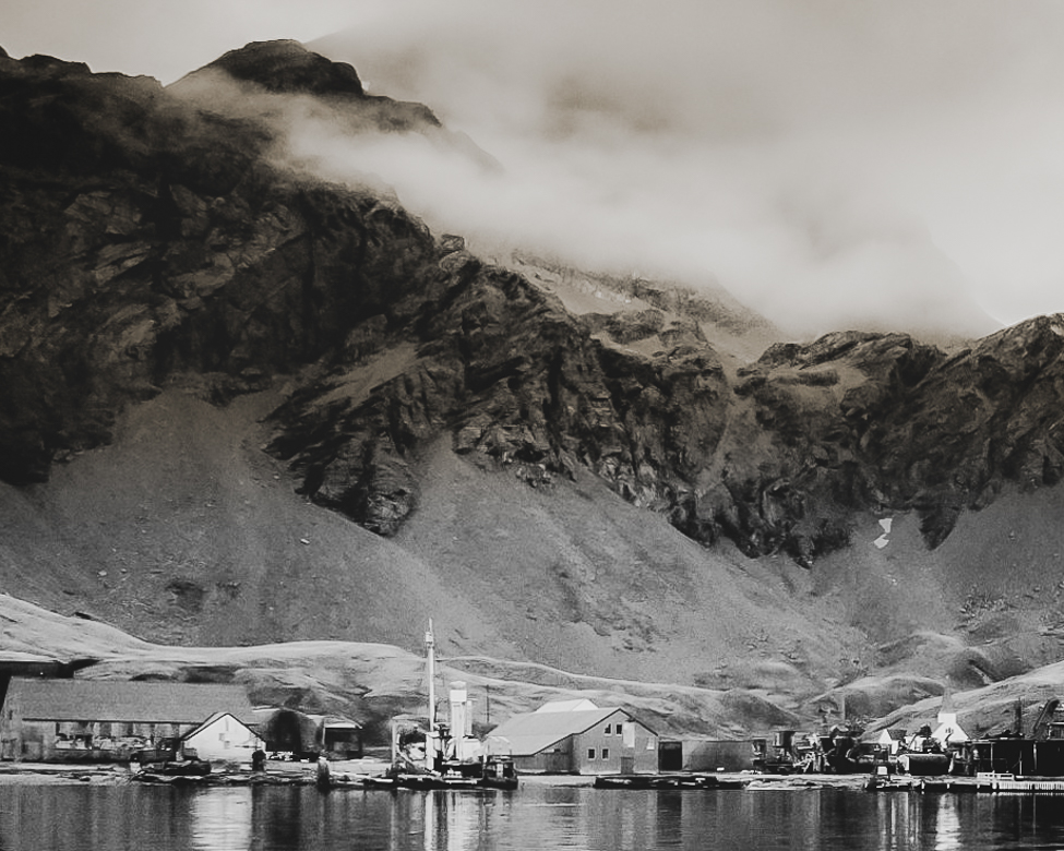
Hi Zina,
I really like the image as a pano. It is crisp and clear. When we travel, we always like to get a full view of the destination, then look for images within. I took the liberty to crop from the windy mountain top down. There are lots of images here and I hope you had fun. Excellent work, |
Jul 18th |
 |
| 98 |
Jul 21 |
Comment |
Hi Robert,
Nothing like gray skies in England and Washington. I like your subject. It looks sharp to me, and your processing helps. I prefer the plane more towards the bottom of the image with more room at the top, as in the original. Color is good, just wish he'd been flying into the light. Where was your position? Excellent work. |
Jul 18th |
 |
| 98 |
Jul 21 |
Reply |
Thanks, Zina, I used a standard 4x5 crop for printing, but I think I used the 1024x780 crop for this posting. I agree I didn't do well on the crop for DD98. |
Jul 10th |
5 comments - 1 reply for Group 98
|
9 comments - 10 replies Total
|


