|
| Group |
Round |
C/R |
Comment |
Date |
Image |
| 29 |
May 21 |
Comment |
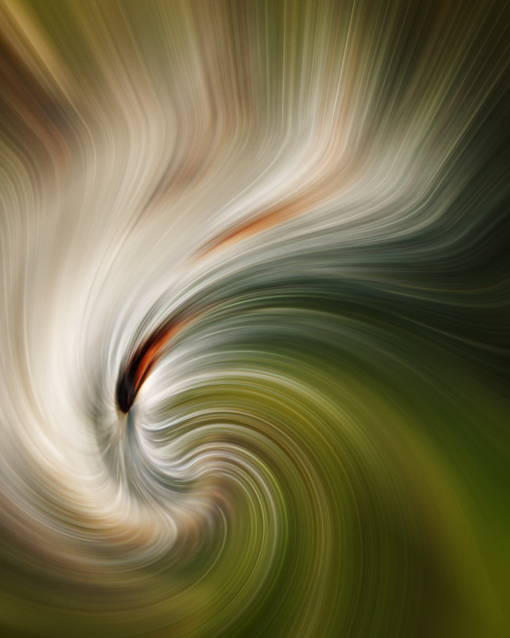
Very creative editing, Bob. You can also do similar things in camera, especially with a zoom lens. I like the soft curves, but IMHO a crop might make the image more powerful. I took this into PS flipped, cropped and added a curves adjustment layer. Just playing with possibilities on a lovely image. Good work |
May 18th |
 |
1 comment - 0 replies for Group 29
|
| 30 |
May 21 |
Comment |
I'd like to see more canvas at the top. I you wish to make any color modifications, PS is best. Let Blake Rudis and Bob be your guide! |
May 7th |
1 comment - 0 replies for Group 30
|
| 96 |
May 21 |
Reply |
Thank you Dan. I will try to keep everyone aware of DDG and PID changes in group studies. |
May 19th |
| 96 |
May 21 |
Comment |
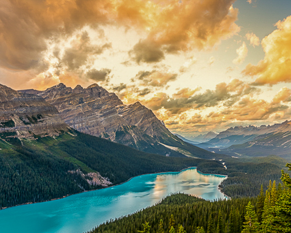
Beautiful area to photograph, and I think you've crafted a lovely image. It looks quite sharp to me and while it might be a little bit overexposed the colors are spectacular. I think the composition could be made stronger by honing in on the reflection in the water. A vertical crop would also remove the bare spot of hill in the foreground. It is always hard to eliminate any beauty from our images, but you may like this too. The left part may be an image unto itself. |
May 17th |
 |
| 96 |
May 21 |
Comment |
Very creative and a great subject. The car is sharp and the colors are really good. It's hard to tell from a junkyard perspective but there seems to be a feeling to me that the car is tilted to the left, but that may be because you were placed slightly right. I levelled the car anyway on my version and lightened the image globally. Excellent work, Dan. |
May 17th |
 |
| 96 |
May 21 |
Comment |
Another good eye in my new group. I am going to struggle to keep up. Your image is very well composed and sharp. The composition makes me envious and the colors are terrific. It is exposed to the left, even though it was dusk, I still like data the shadows. IMO the image could be made stronger with a couple of additions. I cropped it to 4x5 since that is what you usually shoot. Even though there is not a horizon, the two plants in the mid ground seem a tad off to me, even though I cannot say why. I thought I could use three rulers in PS to force an appearance of level, then straighten to those. Also, the sky could be replaced, so I added another sky. Just possible changes you could try if you like.
Congrats on your great image in this month's Member Showcase. If you all are not familiar looking at the monthly PID showcase click on the HOME drop down menu. |
May 17th |
 |
| 96 |
May 21 |
Comment |
I like the colors of your image. It looks very sharp to me and I am amazed that you managed walking, and I assume, hand holding your cell, from Manhattan to Brooklyn. I was on a WW II destroyer in the Brooklyn Navy Yard in the 70's and the breeze along the East River below is usually quite strong except in the summer. I am also of the opinion that the composition can be made stronger with a crop. I struggle with composition myself. I also tried to put more emphasis on the reds and blues too. I'm not sure how Luminar 4 works, but in PhotoShop I sometimes create a B&W layer to check for tonal quality. The image looked a little flat (no real blacks or whites,) which might be why you liked Cheryl's contrast boost. Good eye! |
May 17th |
 |
4 comments - 1 reply for Group 96
|
| 98 |
May 21 |
Reply |
Of course. |
May 28th |
| 98 |
May 21 |
Reply |
Thanks, Bev. I don't know why you would get a sharper image with a zoom lens than a prime, other than Dof, but overall sharpness in a macro, and all photography, is overrated in my opinion. I want the subject sharp because our eye is drawn there first and to brightness. Many judges want all things equally sharp too. Focus stacking can help with the sharpness of your macro lens, if that is an issue. |
May 28th |
| 98 |
May 21 |
Comment |
My wife and I visited Ireland in June 2016 and drove the southern route taking images from Dublin to Galway (my Bodkin ancestral home) and Rosscommon (Dorinda's.) Best trip ever and my knuckles are still white from driving the one lane roads. You've captured the essence of the castle. The color looks good to me, but the white edge is probably over-sharpening. Nice image, Tom. |
May 8th |
 |
| 98 |
May 21 |
Comment |
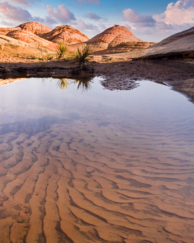
OK Wendy! Thanks for submitting an accidental image. There's nothing more I like than to play with the images in DD. I do not know what Q1 is, but since you mentioned the stones I took that to be your subject. I cropped until I thought I was including essential parts and colors around the stones. I leveled the stones, then added a blur (under filters)in PS to smooth the water as you initially intended. Then I went bonkers and played with the colors and tones and even added more motion blur. FUN is my other name for photography. |
May 8th |
 |
| 98 |
May 21 |
Reply |
I mostly use Gavin Hardcastle's (fototripper) to decide my crops. Simplifies the process and makes sense to me. |
May 8th |
| 98 |
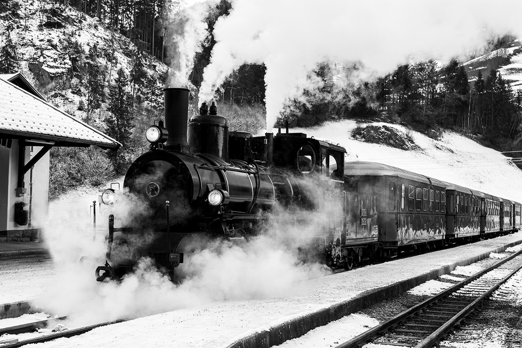
May 21 |
Comment |
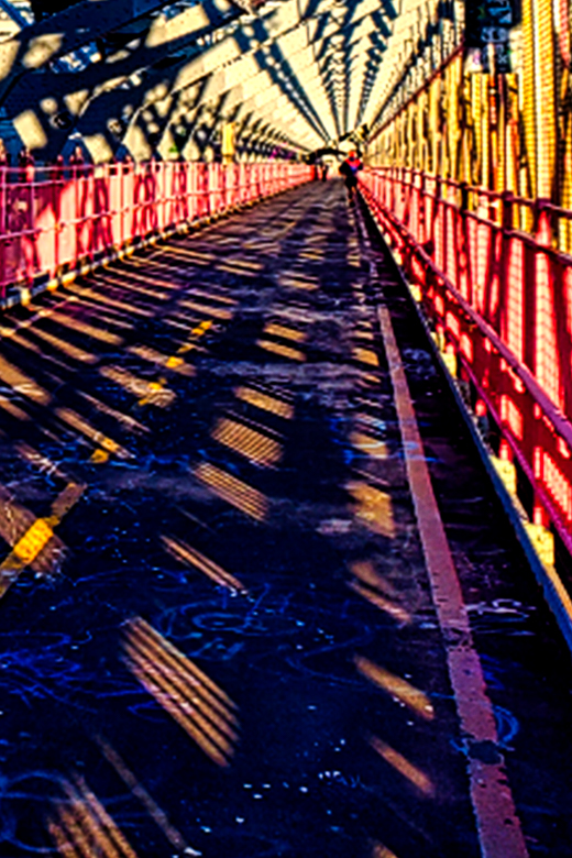
Excellent composition and processing. I didn't notice the wires and glad that Tom mentioned them. I like this in B&W too, but it does cool the headlamps. Were you shooting from another train, or just across the tracks? |
May 8th |
 |
| 98 |
May 21 |
Comment |
I really like your composition, and color. Your crop is good, but I wonder if eliminating some of the right side would add to your tree's impact. I feel some competition between the tree, the mountain rocks and the large sailboat. Tonality is very difficult in a large dynamic range like this. The trunk and water's edge are both in bright light. Dodging and burning help produce a finished look (says the guy who seldom does!) |
May 8th |
 |
| 98 |
May 21 |
Reply |
Thanks, Zina. I appreciate your inputs. I did end up with more of a painterly image than a true macro. The bees don't appreciate invasions of their space, or, at the least, environment loving people assume that a bee (and all of nature) thinks like they do. Anyway I do try to do no harm in order to keep the peace. Please see my reply to Robert below. |
May 8th |
| 98 |
May 21 |
Reply |
Thanks, Robert. When I decide to manipulate an image, rather than just photo-edit, it is always an attempt on my part to create the mood I felt when seeing an image for the first time in LR. I don't always remember what led me to take the shot, but when culling the images, a story about the shot may grow in my little head.
The images that I deem to be editable, or possibly manipulated, I place in a folder for processing later. My photo philosophy is obviously debateable, and has been debated ad nauseum. I learned to look at areas of editing and manipulation from Ansel Adams, a master of tool use, and allow myself the freedom to go where an image leads me, not always with pre-conception.
I hope that answers your question.
In this particular case I went from shooting a Dahlia garden to making a lily pad with a bee. I'm not sure I've ever seen a bee on a lily pad, but I can imagine it, and did so. I could have extracted more detail by using a longer telephoto lens, as I was obviously too far away for a macro shot, but I didn't have another lens with me. |
May 8th |
| 98 |
May 21 |
Reply |
Thank you Tom. No, I think I may have actually picked the wrong original, not noticing the bee's position correctly. I have quite a few images of the little critter while he was flying around. I didn't add any petals, but I probably used content aware to remove leaves. PS does a pretty good job and I try to make things look as real as I can, but not always successfully. I need to move my tripod more often when I shoot. (If you meant this to be a comment, and not a reply, you have the ability to cut and paste it as a comment on the same day.) |
May 7th |
| 98 |
May 21 |
Reply |
There are many photo-editing programs available, and each has their own pluses and minuses, and learning curve. DDG's are a good resource for seeing some of these when you are ready to expand your own editing.
One way to start is to click on the "Current Images" menu above and scroll through the current images from all groups until you see one you like. Click on it and review the artists description.
Comment on the image and ask for a reply to see what tools he/she used.
When you have enough info then, if it is within your budget, start a trial subscription and see if you can learn the program.
Hope that helps. Thanks for the comment, Wendy. |
May 7th |
4 comments - 7 replies for Group 98
|
10 comments - 8 replies Total
|


