|
| Group |
Round |
C/R |
Comment |
Date |
Image |
| 29 |
Mar 20 |
Reply |
I can swap them if you want me to. |
Mar 15th |
| 29 |
Mar 20 |
Reply |
Au contraire, mon ami!
The Tone Curve (simply referred to as "curves" by most photographers) is a very powerful tool that can affect the overall brightness and contrast of an image, and make regional adjustments too. By adjusting the Tone Curve, you can make your images brighter or darker, AND affect the contrast levels, and finally adjust the individual color channels too.
It is my go to tool for tone adjustments. |
Mar 15th |
| 29 |
Mar 20 |
Reply |
I'll have to try it and see. My club bailed from competition this week until at least May. |
Mar 15th |
| 29 |
Mar 20 |
Reply |
My subject was the play between the blue and white. I wanted the structure to be secondary. Don't know if I was successful, but that was my intent. |
Mar 10th |
| 29 |
Mar 20 |
Comment |
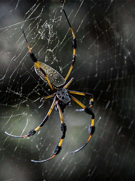
I like the revised image a lot. Do not like spiders at all. They are like pit bull insects. Bite, bite, bite. I used the Heal tool in LR, just slightly larger than the line, and drew it the full length. I also used the Radial filter (the other circle too at the top) and lightened the face and upper body. Then I lowered the highlights and increased dehaze to reduce the background whites to expose more leg. Cropped a little off the left to give him the appearance of more room to move down his web. A really great image, Bill. |
Mar 10th |
 |
| 29 |
Mar 20 |
Comment |
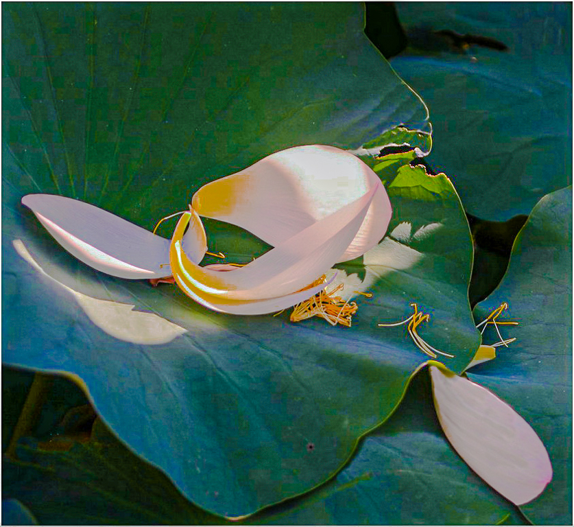
I had a little trouble figuring out the image, but with some curves adjustments, I think it has potential. The whites are somewhat blown out, but a polarizer would help if you go back, just make sure you stand 90 degrees to the sun so the CP filter will work. I agree that some water might add interest. |
Mar 10th |
 |
| 29 |
Mar 20 |
Comment |
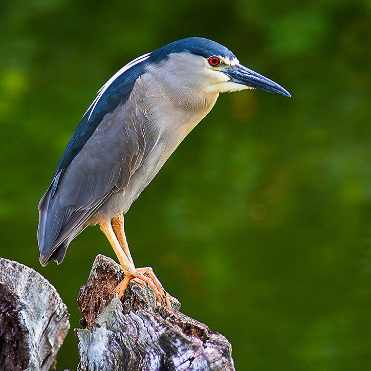
Perfect technically as usual, Karen. Nothing to do really, but a square crop works well here too. |
Mar 10th |
 |
| 29 |
Mar 20 |
Comment |
Love the abstract, colors and design. Popped the colors a little with a curves adjustment. Probably could have just added contrast too, but I like to work with curves mostly. |
Mar 10th |
 |
| 29 |
Mar 20 |
Comment |
Love the image and your angles work well for me. I think the reflection works great, but I find the bubbles somewhat distracting since I wasn't sure what they were, pebbles or bubbles. Left to right leading lines work better for me since that is the direction I read. |
Mar 10th |
| 29 |
Mar 20 |
Reply |
You nailed it Stephan. I don't get many blue skies like this in Western Washington, so the blue was the focus of my image, not the Pavilion, which I wanted to fade in the image. That is also the reason I used a white vignette, to hide that the support is coming out of the corner, and lead into the dark blue. |
Mar 10th |
| 29 |
Mar 20 |
Comment |
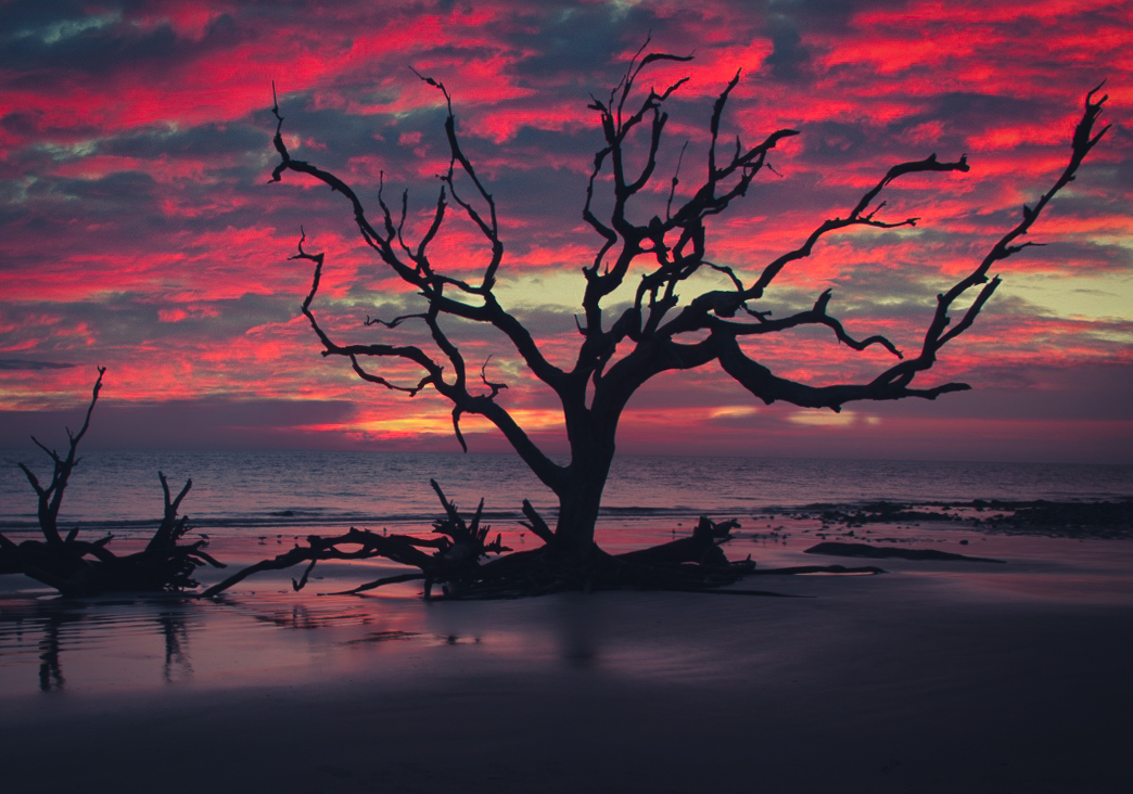
Very nice image Bob L. At the risk of incurring the wrath of the others already commenting, I am going to make a couple of my suggestions anyway. The first is that if I put a ruler across the horizon (i had to increase the magnification to see it) I found it had a slight port list. I also think cropping some from the left and bottom increases the dialogue between the fallen tree and the standing tree. I also increased the overall brightness just a tad. I usually find that sunsets on the ocean are a little more intense. |
Mar 10th |
 |
6 comments - 5 replies for Group 29
|
| 33 |
Mar 20 |
Reply |
Much appreciated(and needed) as do many others now. |
Mar 28th |
| 33 |
Mar 20 |
Reply |
No, I've been postponed until at least May, but I'm thinking much longer. I'm not doing well, it won't get better, only worse, but I am totally supportive of keeping hospitals and medical staff safe, and available for the pandemic. Thank you for your wishes. |
Mar 26th |
| 33 |
Mar 20 |
Reply |
Thank you, Bob, for your suggestion. |
Mar 16th |
| 33 |
Mar 20 |
Reply |
Thanks, Randy. As always, I look forward to your thoughtful critiques each month. I do think all opinions are valid, but I gave up long ago trying to get validation from others opinions. I am always aware the "Moonrise over Hernandez" prints have sold for over a cumulative $25 million, which probably wouldn't place first in my club, and the suggestions would include making it a pano by cropping the top. I do usually try suggestions from my groups to see if they help. Post is more fun for me now than getting my poorly functioning body out to shoot. Larry and Dot Beller are my inspiration to keep trying. Thank goodness for mirrorless technology. |
Mar 16th |
| 33 |
Mar 20 |
Reply |
Thanks, Paul. I like your analysis. Quite thoughtful, in my opinion. |
Mar 16th |
| 33 |
Mar 20 |
Reply |
Thank you Elizabeth. I have reworked the image from the RAW original, based on your suggestions, but I was unable to re-create what I felt made the image worthwhile. Thank you again for all of your encouragement. |
Mar 16th |
| 33 |
Mar 20 |
Reply |
Thank you Raymond. Read my reply to Marilyn at the bottom, as you both saw much the same thing in this image. |
Mar 16th |
| 33 |
Mar 20 |
Reply |
Good question Marilyn. I am a huge fan of Isaac Asimov, as I have read the original three books of the Foundation series five times during my life (and Lord of the Rings too) so that may play into my vision for this image. If I make it through this surgery, I will look at my Picks collection and see if there is a science fiction and fantasy look to my images. Thanks for the observation. |
Mar 16th |
| 33 |
Mar 20 |
Reply |
I remember how cold it gets from riding the USS Enterprise in the Sea of Japan in the 1980's when the water was probably a tad colder than now. It is the wind from the Arctic that chills the bones. |
Mar 16th |
| 33 |
Mar 20 |
Reply |
I forgot I flipped it. |
Mar 14th |
| 33 |
Mar 20 |
Reply |
I am so full of it, sometimes! Good rendition. Looks cold. |
Mar 13th |
| 33 |
Mar 20 |
Reply |
Interesting observation Marilyn.
Whole lifetimes have been devoted to color theory. In my opinion, the tones, hues, saturation and luminance (HSL) values in each of the RGB channels are only important to me if they can help me convey a mood, or emotion I felt at the time. I spend a lot of processing time with different gradient combinations to try to find my vision for a scene. LUTs are also a valuable Photoshop tool for finding emotions.
In product photography, the accuracy of colors is of the most importance to the client.
As the only one of us who was there that day, you also get to choose the colors you feel you want to display. |
Mar 13th |
| 33 |
Mar 20 |
Comment |
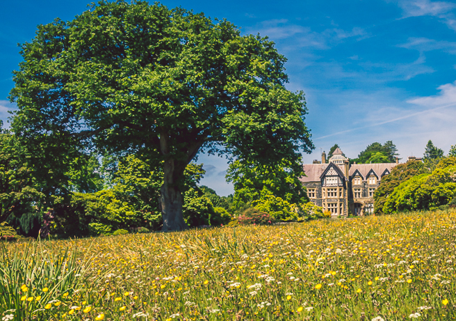
Excellent camera work. Sharp, colorful and well exposed. Here is a crop suggested if you are interested in narrowing the viewers focus. |
Mar 10th |
 |
| 33 |
Mar 20 |
Comment |
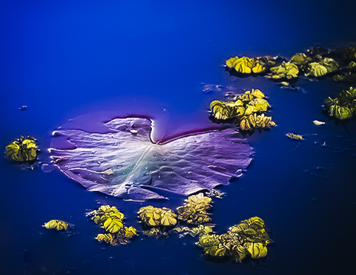
I like the image, but not sure about how two pads would do. I like the left best as there is less clutter under the water. Sharp, well exposed and nice colors. Good work. |
Mar 10th |
 |
| 33 |
Mar 20 |
Comment |
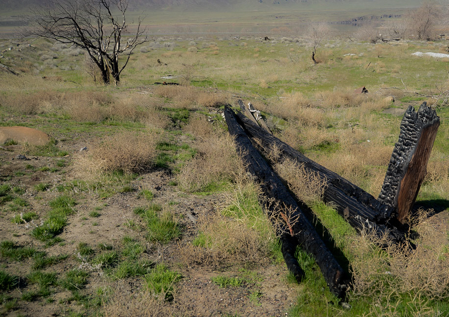
You captured the dreary all right. I wonder what it would have looked like if you had shot low from between the burnt timbers, I made an image that isn't so dreary, but not what you were after. |
Mar 10th |
 |
| 33 |
Mar 20 |
Comment |
Long exposures usually require adjustments until you get what you want. Did you use an ND filter? Really nice colors, and reflections. Good work. |
Mar 10th |
 |
| 33 |
Mar 20 |
Comment |
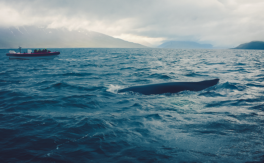
Terrific action/travel image. Not sure what the PSA rules are for processing travel images for competition, but I'll just add some processing in LR. I like that the clouds or fog send me to the whale. |
Mar 10th |
 |
| 33 |
Mar 20 |
Comment |
Excellent image. |
Mar 10th |
6 comments - 12 replies for Group 33
|
12 comments - 17 replies Total
|


