|
| Group |
Round |
C/R |
Comment |
Date |
Image |
| 29 |
Feb 20 |
Reply |
To further enhance your great tips, Stephan, is that LR tools, like PS, offer reduced density sliders that allow you to make more subtle changes by using more of the tools to build up the area you want to fix. Turning on the mask below the image shows where you have added the tool.This is a good image to work on to learn what all the tools and panels do. Rather than just recreating someones work in video, get the hands on training thru experimenting with each area of the panel. Start at the top and work your way down. Hope ell this helps, Bill. |
Feb 22nd |
 |
| 29 |
Feb 20 |
Reply |
Won't the new tracking system give you the data? As you can tell, I know nothing about ROPA. |
Feb 21st |
| 29 |
Feb 20 |
Comment |
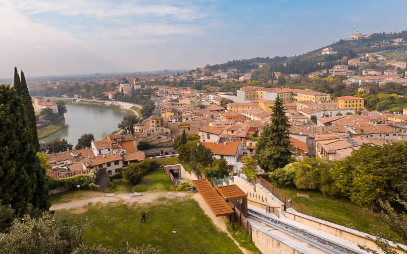
I like it flipped even better, but probably becaus I have never been there. |
Feb 13th |
 |
| 29 |
Feb 20 |
Comment |
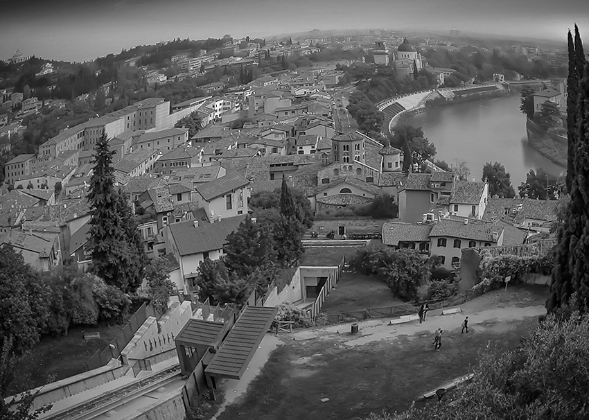
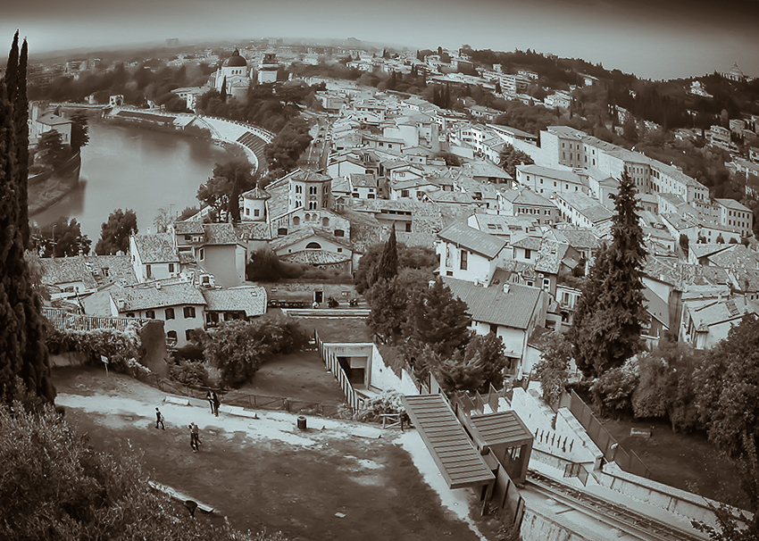
You set yourself quite the challenge with this lens and subject. Even though I find it somewhat busy, if you crop it a little from the left and use the tree as a stopper and as a vertical level, I think it creates a nice flow for my eye. I like it as a B&W better too. See if you can wrap your head around this version. |
Feb 13th |
 |
| 29 |
Feb 20 |
Comment |
Kind of a love/hate effect. If the clutter is a problem maybe B&W will help. Very sharp image. The Europeans are masters of B&W. |
Feb 13th |
 |
| 29 |
Feb 20 |
Comment |
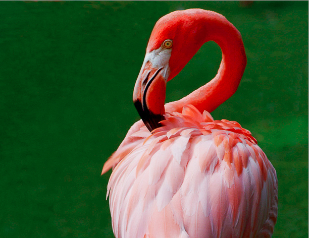
Good focus, color and a wildlife image is hard to get with a relatively short lens,but if you can change your camera to DX format for these shots, you have plenty of pixels. I would add more room at the top as Karen suggested. |
Feb 13th |
 |
| 29 |
Feb 20 |
Comment |
Kind of a scary image to me. Dance teams take a lot of chances. Tell her next time to find Grandma and then make sure she flips facing you. To me motion blur is okay, but her head should be where the focus is. Try pre-focusing on the free throw line. Good grandma! |
Feb 13th |
| 29 |
Feb 20 |
Comment |
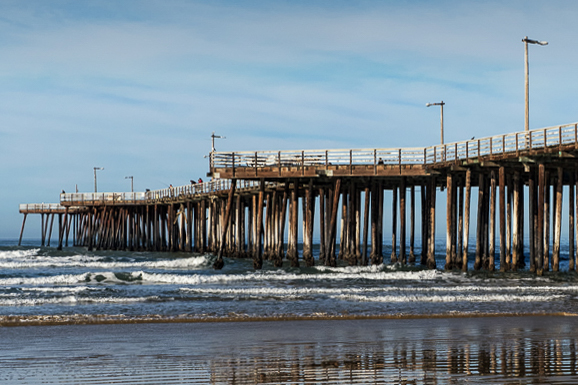
Love those California beaches. Love the colors, focus. and reflections. All I did was crop using the pier light as a stopper and then was able to crop the top and bottom to heighten the importance the waves. I straighten it after the crop. I hope you like! |
Feb 13th |
 |
| 29 |
Feb 20 |
Comment |
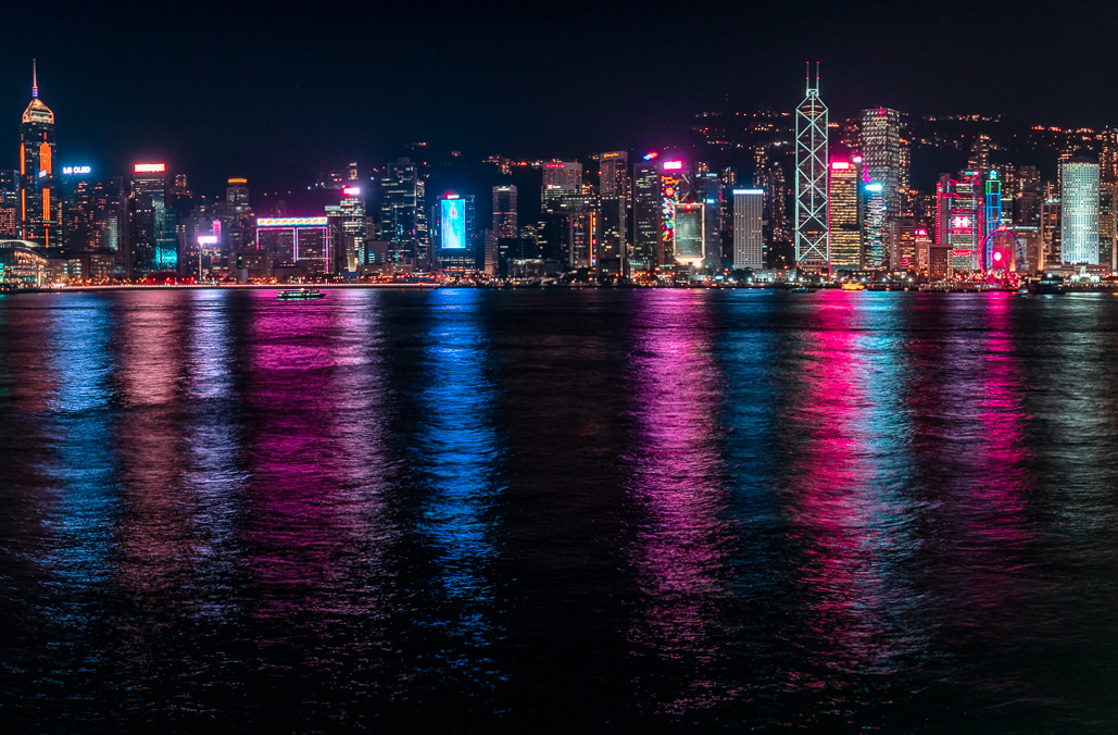
Beautiful image. China's flair for vivid colors and your capture really sparkle. Cropping can eliminate some barrel distortion on the edges, so I tried that and eliminated the leaning buildings. Using the calibration sliders I popped the colors a little more, but nothing is really needed except a ferry! |
Feb 13th |
 |
7 comments - 2 replies for Group 29
|
| 30 |
Feb 20 |
Comment |
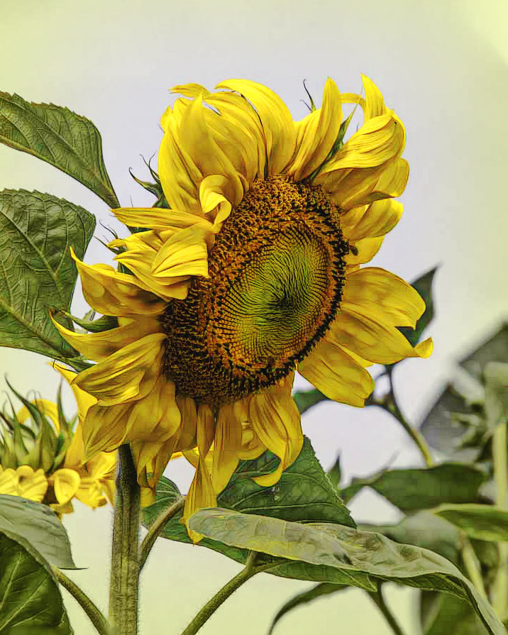
I agree with Robert that it needs simplified. I love the sunflower, but it needed some fill light to make it pop. The ed leaf below the sunflower is somewhat distracting to me, but it would take a lot of work to remove it, I think. I added a yellowish vignette which I don't like now. |
Feb 8th |
 |
1 comment - 0 replies for Group 30
|
| 33 |
Feb 20 |
Reply |
My art (sounds pretentious to me,) probably should be cooked! |
Feb 19th |
| 33 |
Feb 20 |
Reply |
I like that you reduced the contrast in the shadows. That changes the light to softer transitions, appealing to me. |
Feb 19th |
| 33 |
Feb 20 |
Reply |
When I am able go into the field these days I have to take stock of the changes that are caused by massive population growth and technical advancement. I could have easily removed at least the telephone poles. but IMO I think there is a lot of beauty left. and just needs a little more close inspection. Glad we have photography and the abilities to show things both as they are, and as we may wish them to be. Keep up your good work. |
Feb 18th |
| 33 |
Feb 20 |
Reply |
I had not heard of the Briscoe light effect. but it is an interesting technique. I have watched videos from Sean though when looking for a specific fix. Whether post processing is good or not is a subject that generates volumes of discussion. At least we do ours without harmful chemicals. Thanks for the suggestions. |
Feb 18th |
| 33 |
Feb 20 |
Comment |
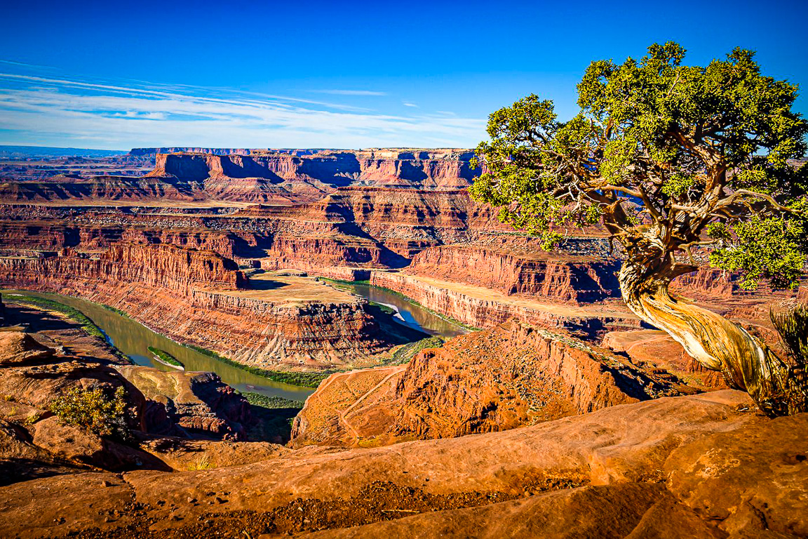
Welcome, Randy. This is a really good composition. Exposure and color is good, and to my eye it looks all in focus. It doesn't need any sharpening. It probably doesn't NEED anything, but as I usually do I experiment with the groups images, one reason for practice, and another to try to give a different perspective.
I love the foreground trunk which leads us right into the gorge, beginning our discovery of all the leading lines and curves. If you have a little more of the left, then the river wouldn't lead my out out of the frame. Excellent image. |
Feb 17th |
 |
| 33 |
Feb 20 |
Reply |
I find that if I zoom out an image like this to postage stamp size, where there is a lot of contrast, it helps me to see what the viewer sees. About 1/3rd light, and 2/3rd dark. The image you presented to Marilyn reverses that and gives you more data to work with. Subtle changes to tone by dodging and burning can lead the viewer through the valley, and add light to areas you find of interest once you have gained our attention. Vignetting is only one tool, and wouldn't necessarily make it stronger. Cropping slightly can help. Hope this helps. By the way, the bird shadow now looks like a small squirrel to me, and is much less distracting. |
Feb 17th |
 |
| 33 |
Feb 20 |
Reply |
I actually like this better Raymond. The shadows in your original do provide a little guide to navigating the image, but I think sometimes stepping away for a while can help understanding what you are showing the viewer, rather than what you saw. Using subtle changes in tone, dodging and burning, and cropping, not just vignetting, create the illusion of depth. |
Feb 17th |
| 33 |
Feb 20 |
Comment |
Your images have made me understand the choice to presenting the Prisoner series in B&W. The vivid colors would have taken out the mystery and Manchurian Candidate effect. Your image is sharp, vivid and well done. Holds up well in B&W too. |
Feb 14th |
 |
| 33 |
Feb 20 |
Reply |
I agree about the storm clouds and only added them back in due to my club evaluation thought the rain was just noise. |
Feb 14th |
| 33 |
Feb 20 |
Comment |
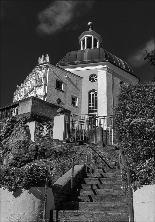
This is my favorite image composition this month. I am glad you stopped. I would suggest to remove the halo around the church, or else exaggerate if you meant it as an artistic effect. There are a slew of online videos on ways to do that. Beautiful image and you have many color palette choices you could use effectively. I just lightened it a tad. |
Feb 13th |
 |
| 33 |
Feb 20 |
Comment |
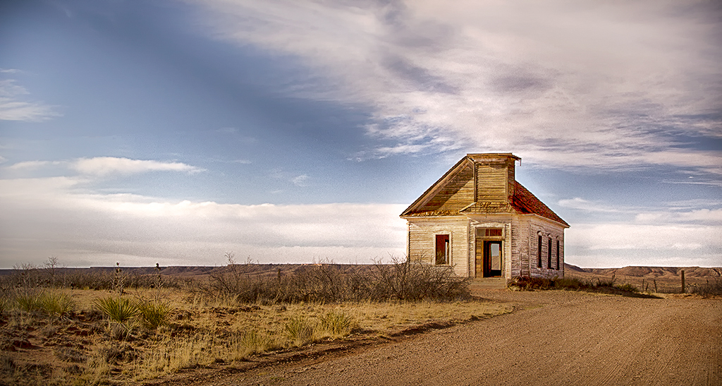
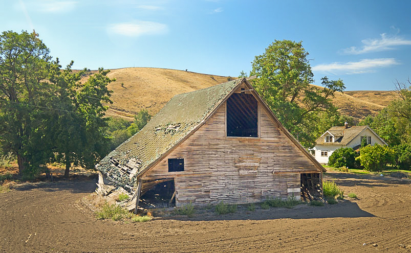
Your exposure and focus are good. Your lens choice makes me doubt your composition though. While the home is brighter it almost the smallest feature and is partially hidden by the barn. So I'll assume the barn should be the focus and bring it into the foreground. I'm including my cropped version, but I also tried a horizontal flip and might even like that better. Try flipping it and see what you think. |
Feb 13th |
 |
| 33 |
Feb 20 |
Comment |
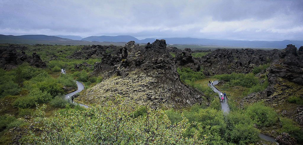
The right pathway. I like the way the way the light foliage curves around in this version. The images could all use some dodging and burning for separation, but because your original contains a lot of good data, focus and color, you have many options.
One hint is to drop the opacity of the brush to 20-30 percent when dodging and burning, and just use the alt key to switch back and forth after choosing one in the drop down menu. |
Feb 13th |
 |
| 33 |
Feb 20 |
Comment |
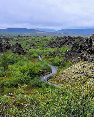
The left path by itself. |
Feb 13th |
 |
| 33 |
Feb 20 |
Comment |
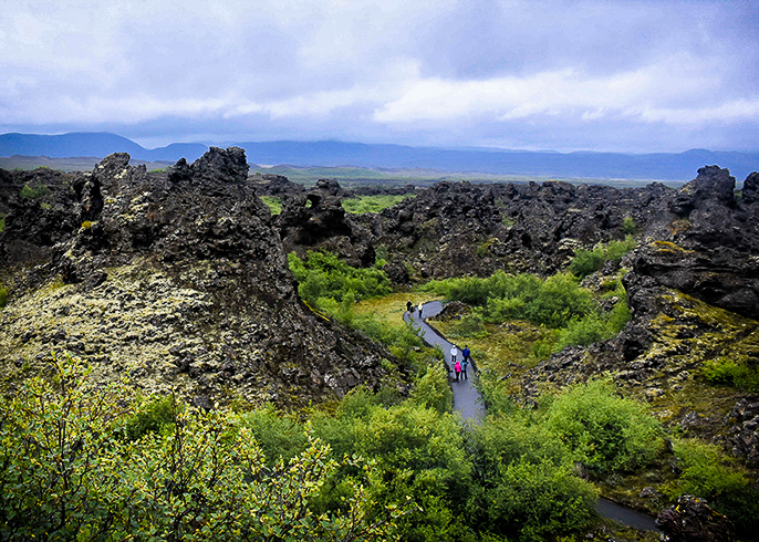
I think you have two possible images here. At first I thought maybe this was a 3-D shot. I am not a big fan of the 16x9 image format, but it does work in some cases. Getting back to your image I think each pathway could became a unique image. One path leads us into the mountains and beautiful sky, Then the other path into an open area and background mountains. As presented, my eye is immediately drawn to the sky and background mountains because they are the lightest part of the image. If you prefer it as is. then I would add a grad filter to the sky and the foreground individually. Then add a radial filter and vignette to direct the viewers to the middle of the paths. |
Feb 13th |
 |
| 33 |
Feb 20 |
Comment |
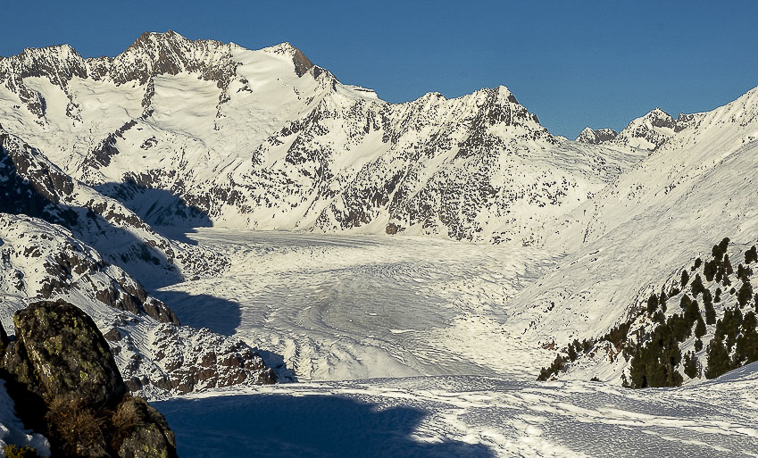
I think you focus is good, exposure is good, but I wonder if the glacier shouldn't be whiter, as it looks kind of gray to me. Nice snapshot. The only interest I see is the upper shadow looks birdlike. In my opinion, if you want to progress you will need to need to add post-processing your images to focus the viewers eye on those areas you want us to visit. |
Feb 13th |
8 comments - 7 replies for Group 33
|
16 comments - 9 replies Total
|


