|
| Group |
Round |
C/R |
Comment |
Date |
Image |
| 29 |
Jan 20 |
Reply |
Year of the dog coming soon.(Dorinda and I both were born in a year of the dog) |
Jan 18th |
| 29 |
Jan 20 |
Reply |
I did miss that part (Taken from the RR)! Never mind. |
Jan 10th |
| 29 |
Jan 20 |
Reply |
Never done well for me. |
Jan 10th |
| 29 |
Jan 20 |
Reply |
Now I see a rabbit, squirrel, and pig! Can anyone else see them? |
Jan 10th |
| 29 |
Jan 20 |
Comment |
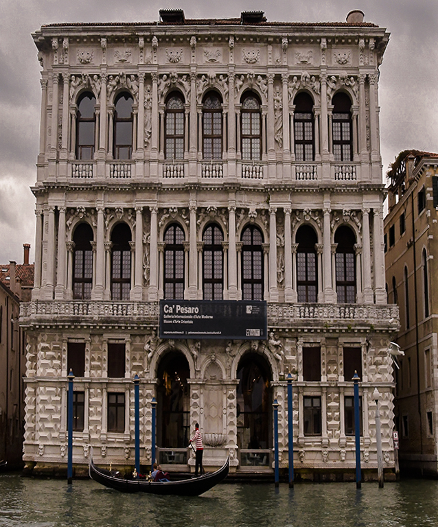
I'm hoping Venice will be saved. It would be a great loss to history. The government has spent a lot to clean up and restore Naples, not to mention placing enough Carabinieri and police to make it safe.
Your image processing is really good. The prospective warp is actually pretty advanced, so kudos to you. It still has a slight right tilt, so I would use one of the balcony railings to make the building look level. IMO I would brighten the image overall, even though the EU is old and dingy, we can choose to see it in a better light if we wish. Art allows us to see as we wish.
I might also burn the sky Good job. LR is a piece of cake compared to PS, but for either, starting with a profile, then adding layers from there will get you where you want. Good work.
|
Jan 8th |
 |
| 29 |
Jan 20 |
Comment |
Looks like a perfect image to me. Sharp, excellent color and clarity, and the composition is good. The only thing I'd consider in the future is using a ND filter to extend the exposure to blur the water, and maybe order a cloud or two from Mother Nature. Judges love smooth, silky water. |
Jan 8th |
| 29 |
Jan 20 |
Comment |
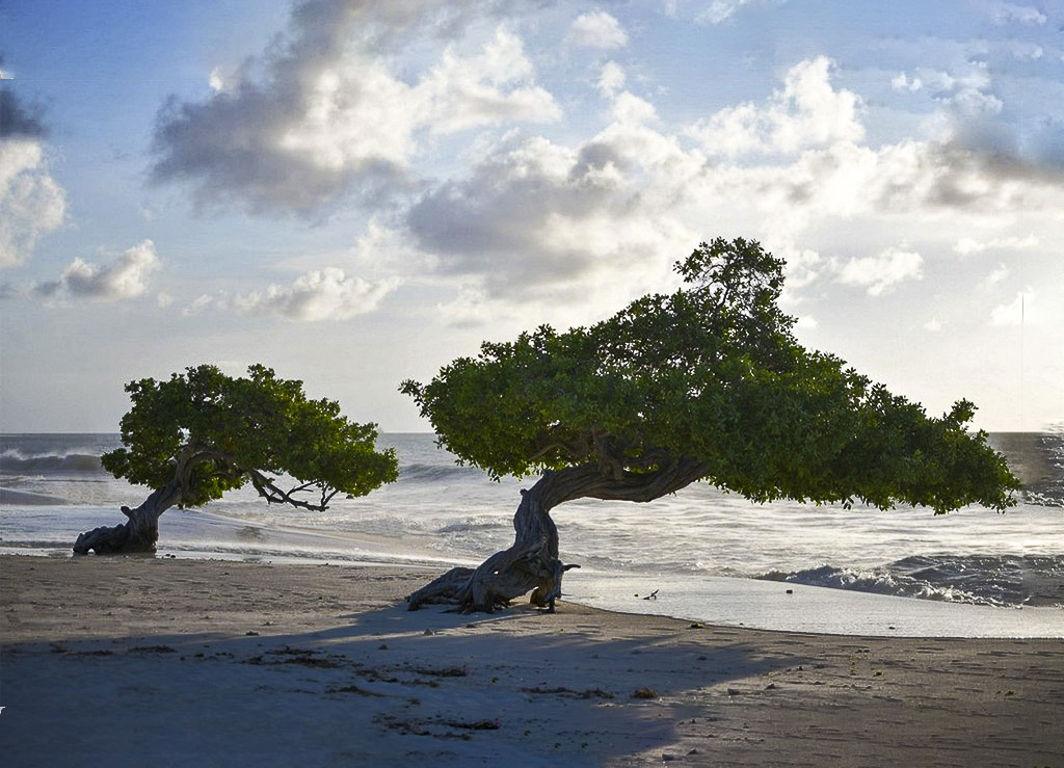
I think you have a good image here, and I know it is very hard to carry a lot of gear aboard ship. I would however take a wide angle lens for a shot like this, as it would give some added depth to your two trees. A polarizer would also help some. The details in the trees are somewhat missing in the harsh light. Like Judy I think the addition of canvas on the right is a good idea. |
Jan 8th |
 |
| 29 |
Jan 20 |
Comment |
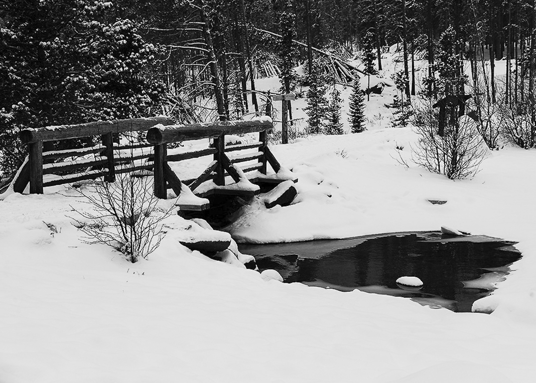
Auto works when you need the shot! Great composition, and it does look cold. Auto also tries to change your exposure point(s) colors to 18% gray. I'd try to whiten it since I assume the sky was gray too. In images where there is no horizon like this, I used a bridge upright as a vertical level. Good work. |
Jan 7th |
 |
| 29 |
Jan 20 |
Comment |
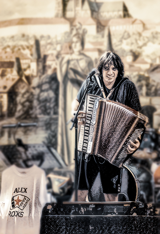
We sold Dorinda's accordion because it got too heavy on her neck and shoulders. I agree it probably isn't sharp enough for competition, and the background looks to me like those hideous (IMO) 1950's instant Polaroid colors. Topaz allowed me to blur the background and tone down the colors. Not sure if anything can fix focus yet in post. |
Jan 7th |
 |
| 29 |
Jan 20 |
Comment |
In my opinion, I think the biggest area of interest is in the upper left. It may not show all you want, but for a smaller sized image I think a crop can help. There is a lot more detail nearer the fireworks, and the color, dramatic in the smoke, and sharpness can be increased. As I mentioned f8 to f11 gives a good depth to fireworks. Really good work, Stephan.
The fireworks from the Seattle Space Needle this New Years was cancelled because of high winds and of course rain! |
Jan 7th |
 |
| 29 |
Jan 20 |
Reply |
I agree with the focus. About 2 seconds at f8 or f11 does more justice to fireworks. |
Jan 7th |
| 29 |
Jan 20 |
Reply |
Thanks. I will try to bring out the animal face I see in the knot. Don't know if that'll make it better, but at least different. |
Jan 6th |
| 29 |
Jan 20 |
Reply |
The bluish color is caused by an optical effect called Rayleigh scattering. Distant mountains can and will take on the blue/purple hue of the sky.
The lighter blue above higher mountains is caused by the colder air at higher altitudes.
While water in small quantities appears colorless, the thicker the water sample, the deeper the blue caused by selective absorption and scattering of white light.
That is the sum of my color theory knowledge. I'm going back to my room now. |
Jan 6th |
| 29 |
Jan 20 |
Reply |
I have added the original. Thanks for submitting it. |
Jan 6th |
6 comments - 8 replies for Group 29
|
| 33 |
Jan 20 |
Reply |
Thank you, Elizabeth. I'll try your suggestions. |
Jan 20th |
| 33 |
Jan 20 |
Reply |
Thanks for your reply, Paul. |
Jan 17th |
| 33 |
Jan 20 |
Reply |
I have an edited image now in which I extended to top by 1/2" and removed the electric extension cords or hoses(don't remember which) in Photoshop. |
Jan 15th |
| 33 |
Jan 20 |
Reply |
Paul, Your comment states "With your camera." Is this tip related only to Nikon? It didn't seem to set the black clipping point for my Fuji images, but did set the white clipping point. Other than possibly setting the clipping points, do you know what this tip affecting?
You can also set the clipping points by holding the shift key, while using the back and white slider to slightly remove any black or white clipping, but I don't know if tone is distributed evenly. The Auto tone button in ACR (PS 2019 or 2020) or Lightroom CC works pretty well now and is a great starting place for tone.
Shows you how much redundancy is built into Adobe. |
Jan 14th |
| 33 |
Jan 20 |
Reply |
Sorry Elizabeth, but we are limited to one image per comment. If you have more than one, you can just write another short comment such as "here is another thought" then attach your other image.
On the monthly image I am limited to posting the original and three additional images.
for all-Please note that each image submitted on a page slows that page from loading, so you may need to be patient. |
Jan 14th |
| 33 |
Jan 20 |
Reply |
Thanks, Marilyn. |
Jan 9th |
| 33 |
Jan 20 |
Reply |
I was unclear. When there is not a trustworthy horizon like the sea, then I try to find something in the middle, like the top of the plateau that will make the image appear to be level when used to straighten the image. After that I try to find something vertical. Interior architecture is especially challenging for me.
In this image the background mountains do not provide a straight horizon. My workflow begins with leveling, as an image not purposefully tilted makes the viewer uncomfortable, and to be truthful all the little levels on cameras and tripods are not all that accurate. Hope that clarifies things.
In my case, it is never an operator error!
I'm really glad you were able to view our galaxy's core. |
Jan 9th |
| 33 |
Jan 20 |
Comment |
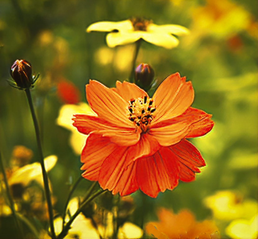
Very sharp and beautiful colors. Sometimes two subjects work, but in this instance I think you have one that pops out at me. Cropping to the left flower would reduce clutter and still give us the color you want. Excellent timing as it is raining monstrously here in the northwest US. |
Jan 8th |
 |
| 33 |
Jan 20 |
Comment |
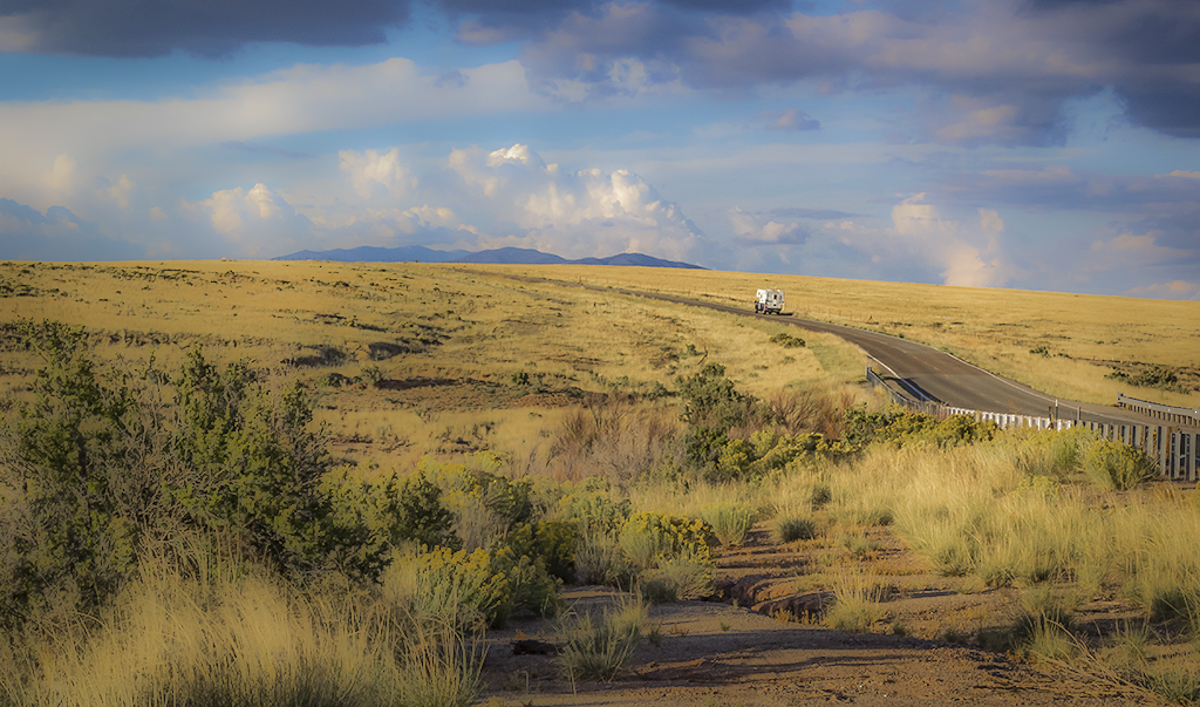
I love the composition, color and story you told. I also enjoy that the that the road leads to the background mountains. You stopped down to make everything tack sharp, which it is. Another option could be to soften the image and make it more ethereal. I did clone out the distant black sign or truck. Beautiful image. |
Jan 8th |
 |
| 33 |
Jan 20 |
Comment |
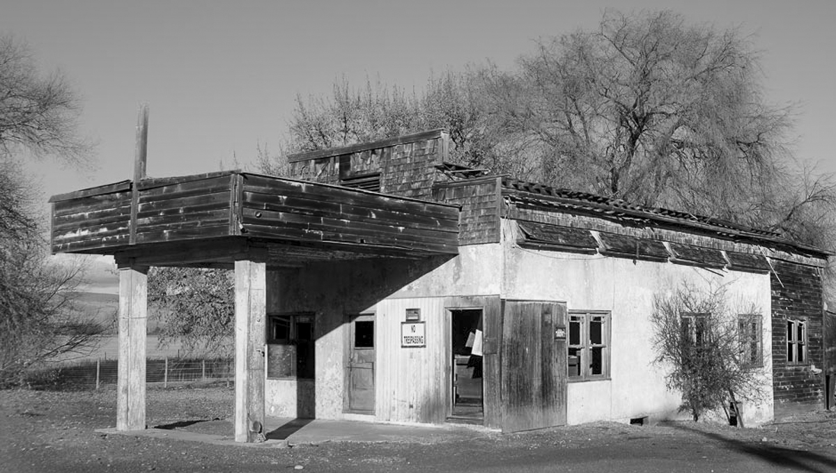
Classic image well composed and sharp. I think I may have included more space on the left, and a tighter crop on the right. Just my opinion. Late midday shots make great B&W subjects too. I might open up to f4-5.6 to blur the background tree, or add contrast to separate the garage some. |
Jan 8th |
 |
| 33 |
Jan 20 |
Comment |
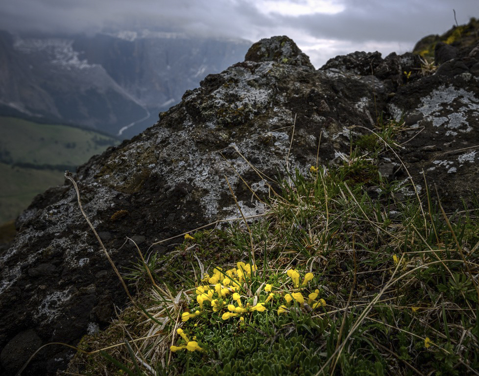
Great eye to capture this image. The color and sharpness are, in my opinion, spot on. I enjoy your composition immensely, and the narrative matches the image. As you have included the bright break in the clouds, I suggest a radial spot leading the eye to the flowers. |
Jan 8th |
 |
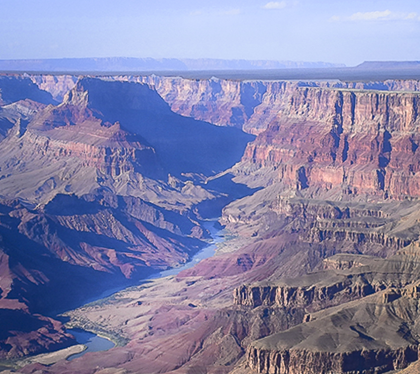
| 33 |
Jan 20 |
Comment |
I'm happy you had such a good day to view our natural wonder, and that the normally blah brown Colorado was blue. I wonder if the canyon was your subject, or the river. I am providing a crop that shows off the Colorado more, in my opinion. I'm assuming this image was taken from the south rim. I used the mid-canyon plateau (or the North rim) for a horizon, as it appears to me, that the image tilts to the right. Good color and sharp. I hope you got to watch the sunrise, but if not, I would go again as it creates a marvelous experience. |
Jan 8th |
 |
| 33 |
Jan 20 |
Comment |
The color palette you used to process your image adds a wow factor for me. The image appears sharp to me also. Your composition is good, but there is a problem for me. All the beautiful leading lines take me to the center distant mountains which for me is a stopper in the image. My eye never is actually drawn to the village. I think there is promise in what you've captured, it just needs some work to get it to where the viewers eye is led to explore around. |
Jan 8th |
6 comments - 7 replies for Group 33
|
12 comments - 15 replies Total
|


