|
| Group |
Round |
C/R |
Comment |
Date |
Image |
| 29 |
Nov 19 |
Reply |
Dorinda thought she needed new glasses, but it turned out she has another cataract. I actually reduce the brightness to 120 cd/m2 for printing. |
Nov 19th |
| 29 |
Nov 19 |
Reply |
We have a tendency to rotate most abstracts 90 degrees at a time just to see, since they're not recognizable anyway. Anxious to see your Chincoteague images. |
Nov 19th |
| 29 |
Nov 19 |
Reply |
How in the world will the elevator bring their produce cart from the basement without the white thing! Just kidding. (I hope that is what it is} |
Nov 18th |
| 29 |
Nov 19 |
Reply |
"I was under the impression that we were not supposed to post our very best images so I have posted a very good image, so we can all learn."
You are most definitely correct Bob. If you highlight and right click the below link you'll find my solution to blue water.
I do like your foreground and top cropped image best, but you are also right that each judge has a particular bias that makes us shake our collective heads. I am enjoying your comments greatly. https://www.shutterbug.com/content/quick-photoshop-tip-here%E2%80%99s-how-cure-waterfall-blues-video |
Nov 17th |
| 29 |
Nov 19 |
Comment |
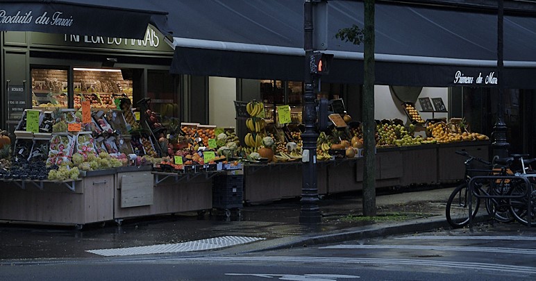
I really think this is a magnificent image as shot. You've captured the mood and tranquility of pre-dawn Paris, but added the bicycle to remind us of the bustling city to come. Sharp as a tack, and wonderful color. As a pano I would say it is perfect. I have to add a crop for competitive entry though, just because! |
Nov 17th |
 |
| 29 |
Nov 19 |
Comment |
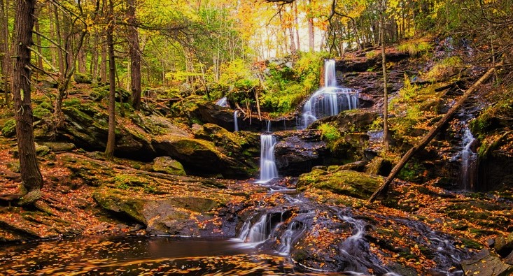
Very sharp throughout. Great color and you have removed most of the blue color cast I see in many waterfall shots. There is quite a bit of difference for me in the two images you've shown. In the original, I struggled with the conflict between the serene forest with waterfalls and the turbulent lake. If this was supposed to show these conflicts I get it, but it makes me uncomfortable. The second image in your reply to Larry comes closer to removing the conflict and adds some good foreground. I might crop even more of the top in that image to concentrate on the leaves in the water. Just something to think about. Welcome to Group 29. |
Nov 17th |
 |
| 29 |
Nov 19 |
Comment |
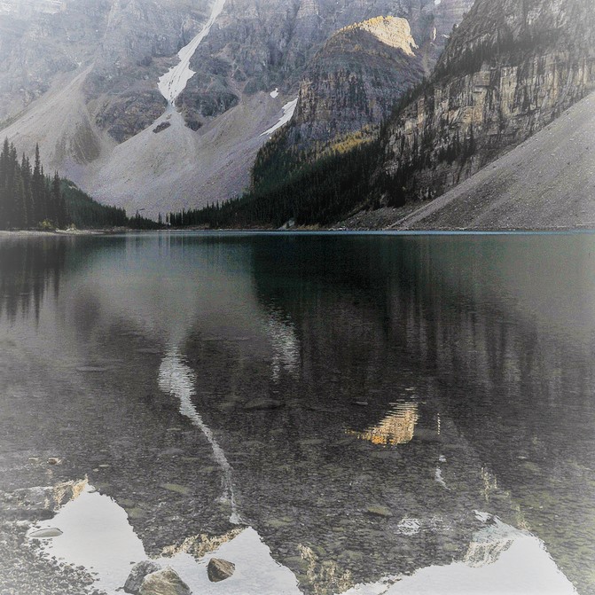
This version emphasized the lake, reflection and foreground. |
Nov 17th |
 |
| 29 |
Nov 19 |
Comment |
I think that your image is clear, sharp but lacks interest for me as presented. I have made several images for you to ponder, but I would suggest that the image need something to direct the viewer to your vision, using light and shadow. This version uses a cool color grade, and a horizontal flip. |
Nov 17th |
 |
| 29 |
Nov 19 |
Comment |
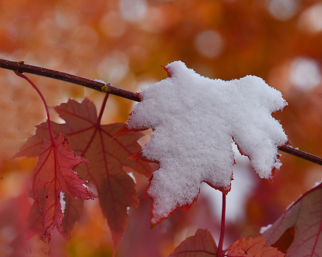
Crisp clean snow with detail, beautiful autumn color, excellent bokeh. I would try it flipped horizontally to see if that makes a difference for you. |
Nov 17th |
 |
| 29 |
Nov 19 |
Comment |
Sharp image, nice color choices of cyan and magenta on the edited version. Not sure about the title "Neon" unless you were going to add a glow or radiance. As always abstracts can be iffy in competition. Did you try it as a vertical, putting the space at the top? |
Nov 17th |
 |
| 29 |
Nov 19 |
Comment |
Beautiful color shot, crisp and clear An overcast day probably doesn't exist on Bora, so shadows will always plague local images. I guess the only suggestion I have would be to select the background if you have PS CC 2020, and add a Gaussian blur to make the subjects stand out more. Nice clouds, and the fronds on the lower right help lead into the blessing, and whatever the fronds are that curve from the Tahua's arm to Ken's head. Have you tried to flip horizontally? |
Nov 17th |
| 29 |
Nov 19 |
Reply |
I took the liberty to edit your comment from "to center of interest" to "no center of interest" which is what I think you were saying. If I am wrong, then use the edit/update boxes to make a correction.
I do agree with you and Bob. |
Nov 12th |
| 29 |
Nov 19 |
Reply |
Your image edit did not load, Stephan. You can use the edit button, and then choose file, then update, to add it to your comment. |
Nov 12th |
7 comments - 6 replies for Group 29
|
| 30 |
Nov 19 |
Comment |
Really love the image. Sharp, unique and interesting. Played around with the dead leaves, but I know you won't like it. Added a gradient too. |
Nov 18th |
 |
1 comment - 0 replies for Group 30
|
| 33 |
Nov 19 |
Reply |
Fixed the reply. Do you guys have an edit button on tour comments? I usually just fix typos when I run across them. |
Nov 21st |
| 33 |
Nov 19 |
Reply |
Thank you Raymond. My wife didn't like my toning down the sunrise. Goes to show why the artist/photographer has to stay true to their own vision,
I do not know what a DNG filter is, but I never have storage problems since my X-T2 has a cropped sensor. |
Nov 21st |
| 33 |
Nov 19 |
Reply |
We do like it. |
Nov 20th |
| 33 |
Nov 19 |
Reply |
Puyallup, WA, between Seattle/Tacoma and Mt Rainier. |
Nov 18th |
| 33 |
Nov 19 |
Comment |
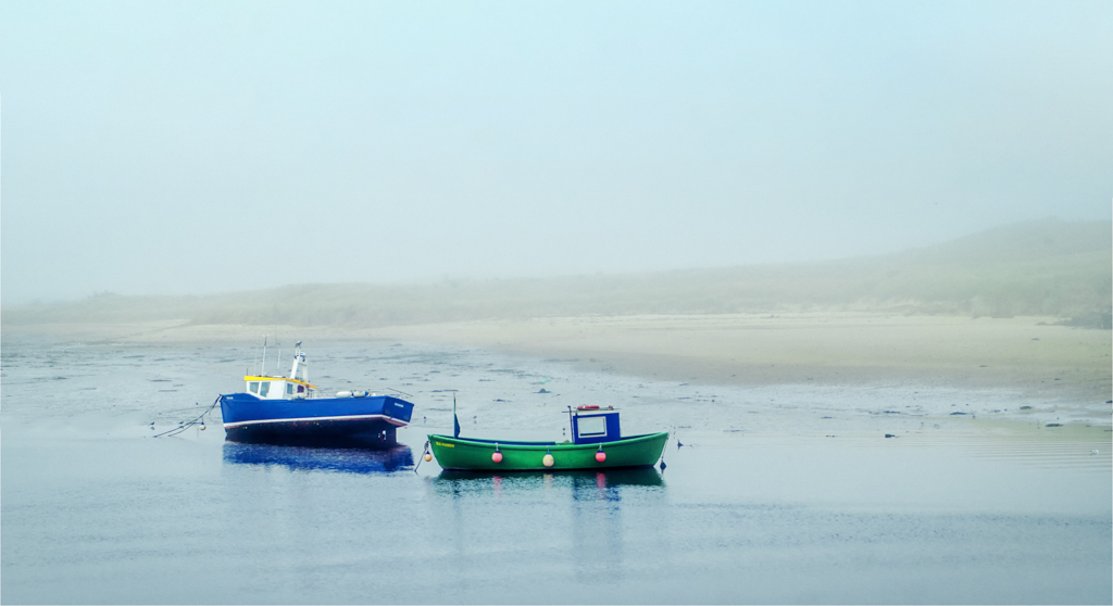
Great color sharpness and composition. Low tide gives a nice tilt to the largest of the boats. The shallows reveal too much beach clutter for me though. I cropped the image using content aware, increasing the canvas size to a more conventional 3x2. I removed some of the rocks but could have done more. I didn't touch the birds though. See if you like the crop. |
Nov 18th |
 |
| 33 |
Nov 19 |
Reply |
I get my desktop back after spending the last month getting an adjustable standing desk and all our portable HD's moved onto a NAS. Now we wont lose any more images due to crashes. That means I can use my 30" monitor for editing instead of my laptop. I will be able to see and correct the flaws. Thanks for your help. |
Nov 18th |
| 33 |
Nov 19 |
Comment |
Very unique shot at the NP. It does look surreal to me in B&W, especially without the Sangre de Cristo mountains in the background. I'd love to visit there someday. My only observation to add, is that there appears to be a water/lens spot blending into the dark clouds in the upper left corner. Nice capture! |
Nov 18th |
| 33 |
Nov 19 |
Comment |
I love this image. Nice soft autumn colors, leading lines, triangles, diagonals, all keep us in the frame. Paul fixed the only issue to my liking, and this can hang in my house anytime. Beautiful capture and post. |
Nov 18th |
| 33 |
Nov 19 |
Comment |
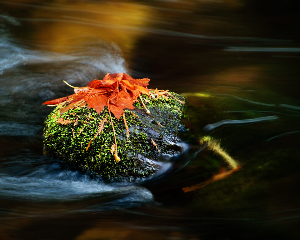
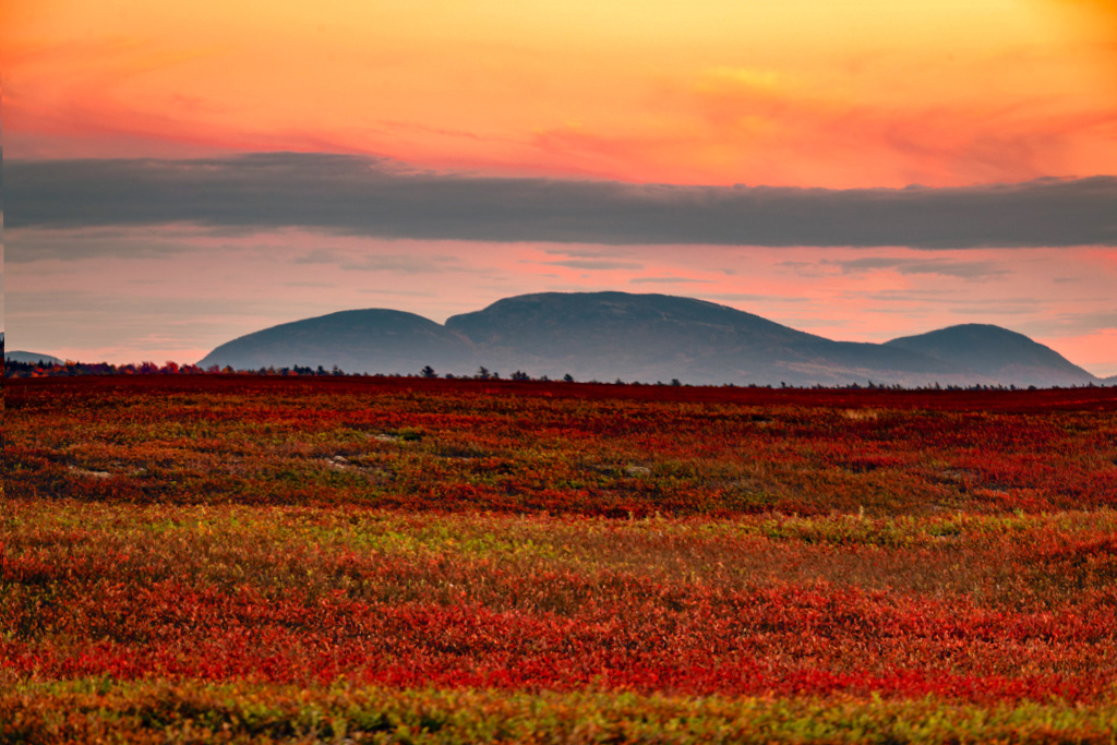
I think the color tells the story, Ken. You've captured really nice layers of color. Like Paul, I had an uncomfortable feeling, and his crop does fix that. If you want to keep the layer, What I think is causing me to feel something like seasickness is that the diagonal lines of the ground are conflicting with the lines in the sky. My attempt was to use a warp edit to resolve the lines to my liking. I also used a color balance adjustment to pop some reds and yellows a little. Our blueberry fields are red also, and full of geese right now. Terrific image. |
Nov 18th |
 |
| 33 |
Nov 19 |
Comment |
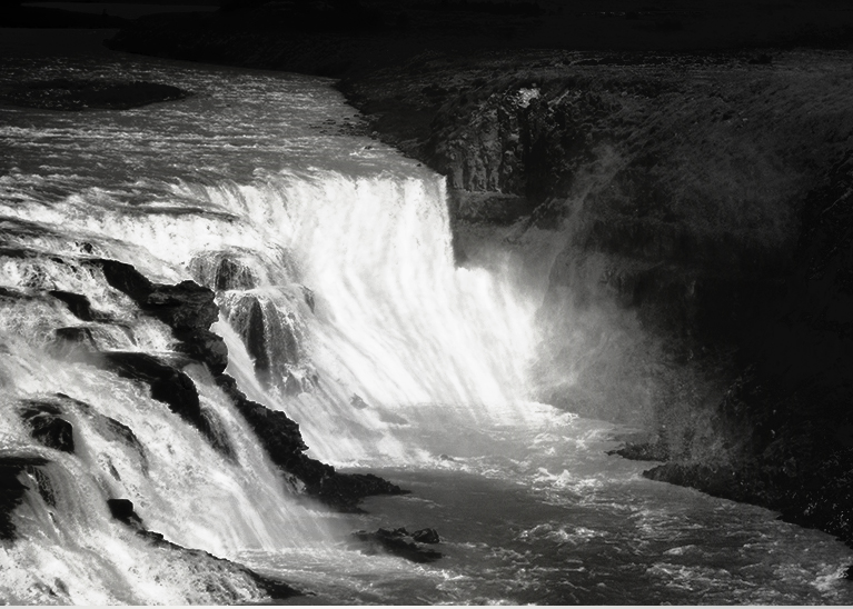
I agree with the group that this is a very difficult image to edit. It will strain even Photoshop to handle the huge dynamic range you have presented us. Waterfalls normally are shot at a lower shutter speed to provide silkiness to the water probably about 1/6th sec, but you also tried capturing a rainbow, all the while handheld! What an ambitious trial.
So the waterfalls look blown out to me. With a jpeg to work with, it is hard to make suggestions, but here is one for really bad lighting. I created a B&W to consider, but of course the rainbow is lost, but in my opinion the waterfall is of greater weight in the image, and the muddy colors are eliminated.
I would also suggest getting a pen tablet to do your dodging and burning in PS. A mouse just doesn't provide the control that a pressure pen does. XP-Pen tablets are reasonably priced and will give you a faster learning curve. |
Nov 18th |
 |
| 33 |
Nov 19 |
Comment |
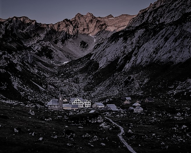
I think your love and passion for travel, especially in the Alps is apparent. This image in my opinion is sharp, and probably strained the dynamic range of your camera. Because of that, I would suggest shooting scenes like this in HDR, allowing you to combine them for the best exposure of the highlighted alps and the shadowy valley. If your intention was to highlight the hotel/inn I would suggest a crop. That being said, I have never done that well with travel images, so my opinion may not be valuable to you. |
Nov 17th |
 |
| 33 |
Nov 19 |
Reply |
Good eye, Ken. I will need to do more work on that area. I struggled cleaning up the tree. Hoping to get PS CC 2020 soon. It has some wonderful masking improvements. |
Nov 10th |
6 comments - 6 replies for Group 33
|
14 comments - 12 replies Total
|


