|
| Group |
Round |
C/R |
Comment |
Date |
Image |
| 5 |
Sep 19 |
Comment |
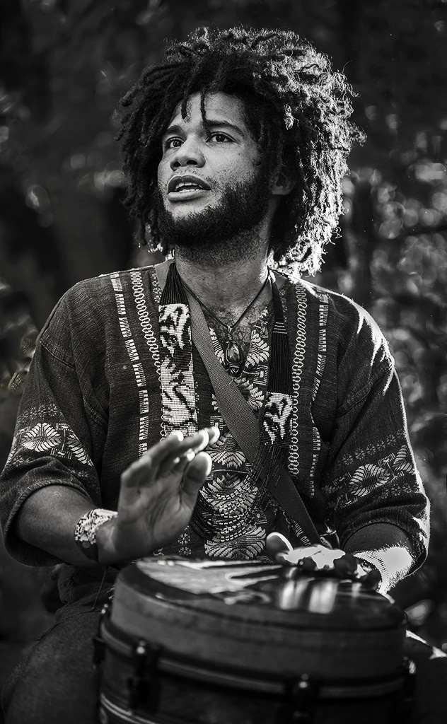
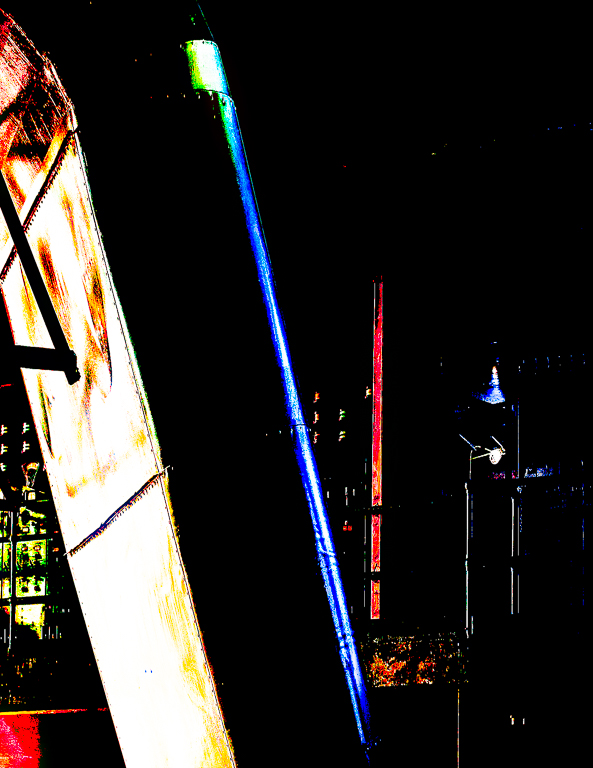
Hi Pete, Just thought I'd throw in on your image. I like the work you have done with this story. I know our judges worry too much about blow outs and sometimes miss the story. I really like his colorful attire, but the image is about his face to me. I used the patch tool to eliminate more background light, converted it to B&W, added a radial spot to him, and a vignette to try to direct the viewer more to the left. Here's to you, buddy!
I didn't know at this time you are also in a B&W group. |
Sep 24th |
 |
1 comment - 0 replies for Group 5
|
| 29 |
Sep 19 |
Reply |
I do not think that a D300 would lack the dynamic range to capture this pretty well. I quickly read Ken Rockwell's review of the D300 and there is a setting called active d-lighting which Nikon claims will expand the DR. I have never shot a D300. A grad ND filter might help, assuming that Tam didn't actually get the exposure she wished. Tam used spot metering and a -3 compensation, but I don't know her spot point. I don't think she would need HDR as I don't think the DR is all that wide, although the waterfalls lacks detail in some areas.
All that is the long answer. The short answer is that in my opinion, this image can be shot well in-camera, with minimal PP. |
Sep 24th |
| 29 |
Sep 19 |
Comment |
Your thank you is on Bill's page. You may want to move it to your page (you can copy and paste.) Then delete your comment on Bill's page or e-mail me and I can do it. No need to apologize. Part of my job is to review the suggestions for the site. |
Sep 20th |
| 29 |
Sep 19 |
Reply |
So I too am experiencing. |
Sep 14th |
| 29 |
Sep 19 |
Comment |
Part of our aging process, I find. |
Sep 14th |
| 29 |
Sep 19 |
Reply |
Maybe a B&W? |
Sep 14th |
 |
| 29 |
Sep 19 |
Comment |
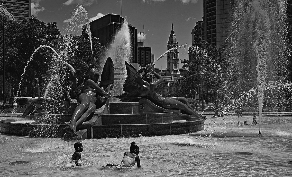
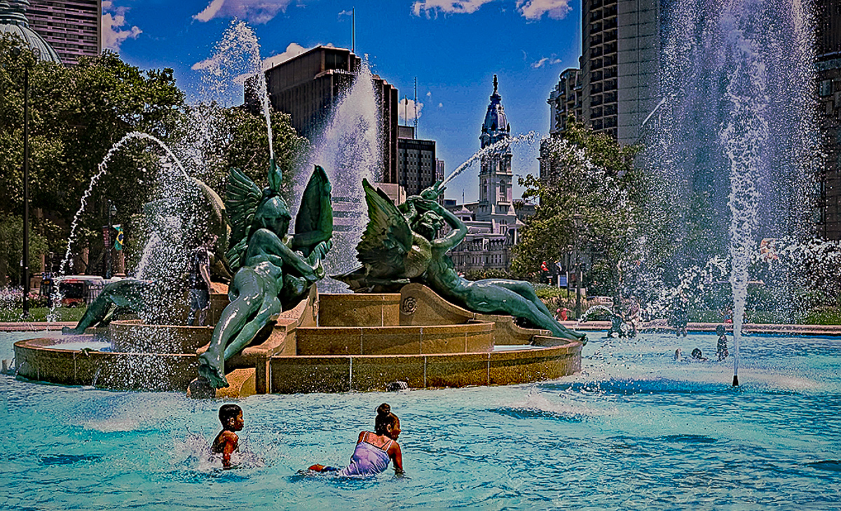
I like the composition and where you stood to make the two kids prominent in the image. Karen's crop is too close at the bottom for my taste, but her straighten was good. I think there is a blue or cyan cast. The light is a little harsh. Very sharp to my old eyes. Good job |
Sep 14th |
 |
| 29 |
Sep 19 |
Comment |
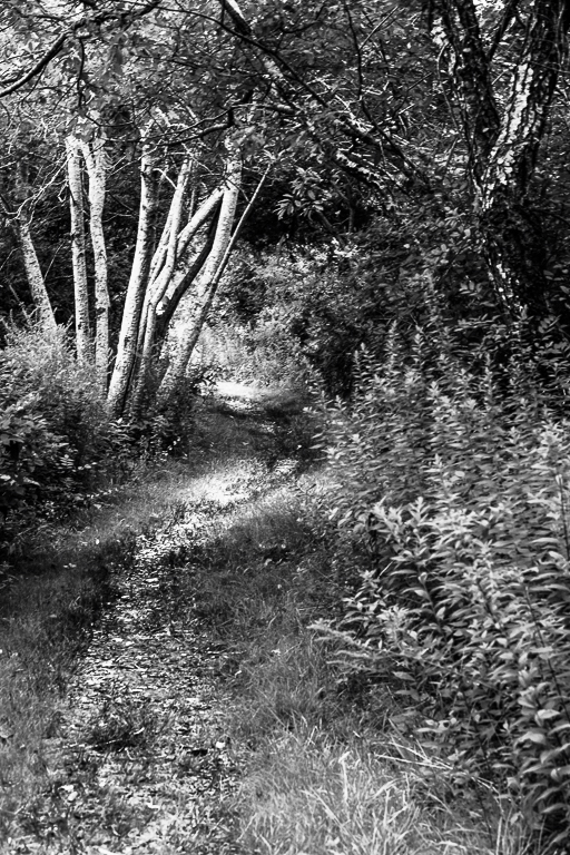
I love your image. It looks sharp and I think it is a great subject for B&W conversion. I don't know id the yellow trail takes it out of a monochrome or not. Good eye and product. |
Sep 14th |
 |
| 29 |
Sep 19 |
Reply |
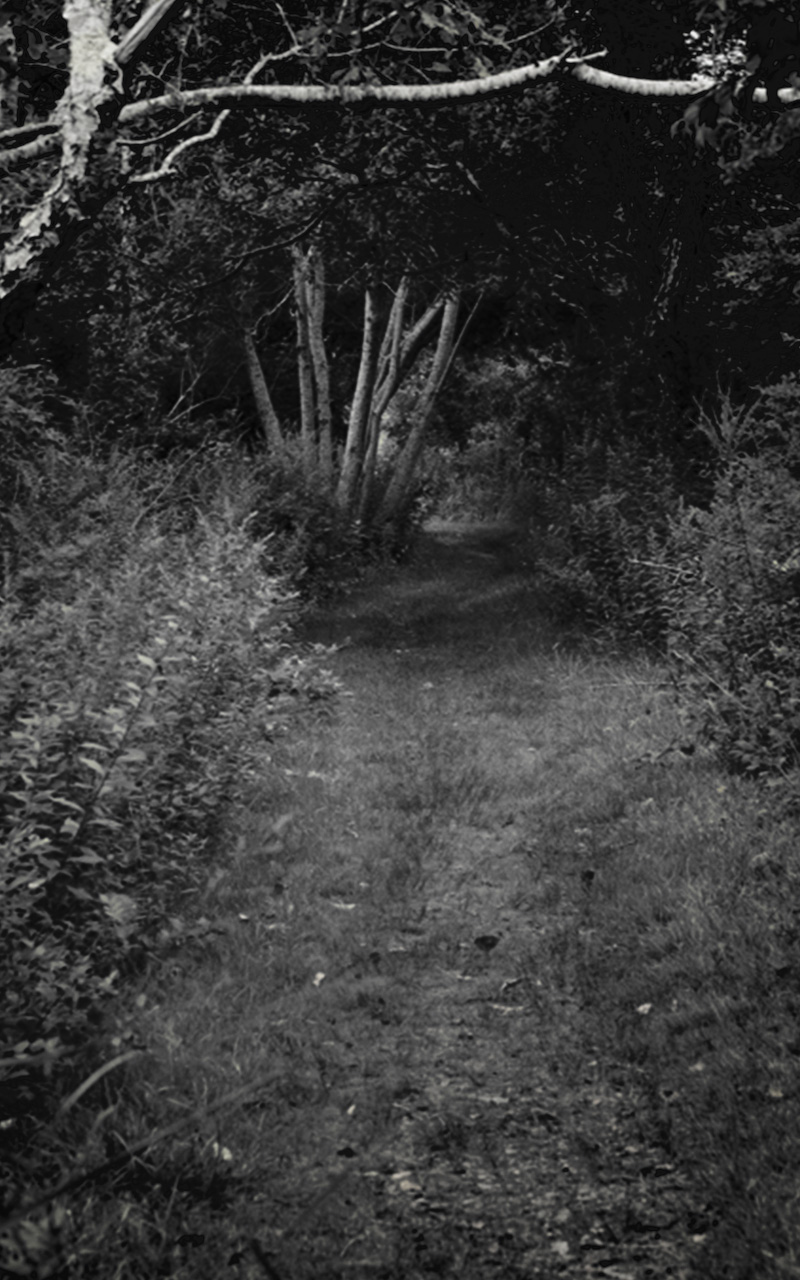
This is a really good capture Jim. Here's a B&W version with an eerier feeling. I actually like the crossing limb left in the image. |
Sep 14th |
 |
| 29 |
Sep 19 |
Comment |
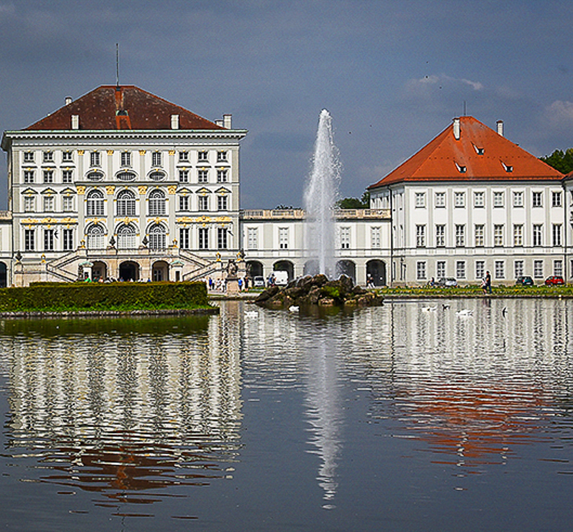
As always your captures are magnificent and technically proficient.. You seldom mention any post processing, nut digital images require at least some. I see a couple of images myself in this palace that you can extract. I'm including one. Glad you had some clouds this day to add interest in the sky. Great job. |
Sep 14th |
 |
| 29 |
Sep 19 |
Comment |
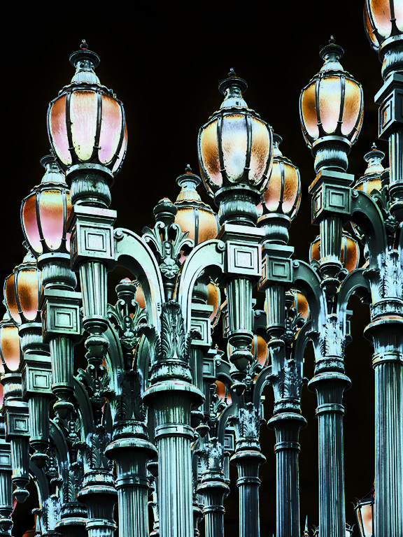
I love the composition, and clarity of the image. I think the black background is okay, but I think I might like a midnight blue better to simulate a night sky. Excellent job as always. I brightened the colors a tad, and tried to highlight the front lamp to add some depth. |
Sep 14th |
 |
| 29 |
Sep 19 |
Comment |
Love the composition, and I have to agree even the rocks are a bit soft, but first shots with new equipment are rarely perfect. The newest AI programs are able to simulate sharpness to some extent, but are not as good as in camera focus. I did some cropping to make the rock more prominent, and added some contrast with a vignette. Some dodging and burning would sculpt the light even more. Excellent effort. |
Sep 14th |
 |
| 29 |
Sep 19 |
Reply |
I agree that it all is a mess, I have tried it as an abstract, but my club really hates abstracts. Maybe I should just put this in a round file. Here was my abstract. |
Sep 14th |
 |
| 29 |
Sep 19 |
Comment |
I like the image as shown for a printing that you wish to display on a wall. As far as it being in a PSA competition, I see several issues. The image is overwhelmed by the frame. My eye is drawn to the border due to it being the brightest area in the image. If you frame or put a border on an image you are basically saying that here is my image, and come in or go out. Placing a watermark also would keep it from competition. I'm probably in admin mode but, I don't think your last two images are meeting the guidelines of DDG.
These groups are for learning. This is not a contest, but rather a sharing of images, techniques, and personal reactions. The intent of our groups is to show the work that we would sincerely like to have an opinion on, such as what looks good and what we could do to improve it.
I might like your image or have suggestions, but it appears as such a finished project, I think there is nothing you want from me for the image. |
Sep 14th |
| 29 |
Sep 19 |
Reply |
I am sorry, Stuart, This is Karen's image, not mine. |
Sep 3rd |
8 comments - 6 replies for Group 29
|
| 33 |
Sep 19 |
Reply |
We are happy that you are able to add your insights to this month's images, and we look forward to your images when your computer gets well. |
Sep 16th |
| 33 |
Sep 19 |
Comment |
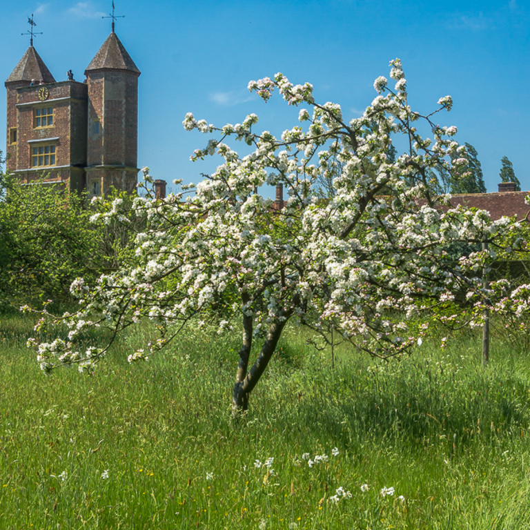
I think your image is colorful, sharp and interesting. Since you probably cannot prune on private or trust lands, I suggest you can crop! The flowering crab has a wonderful shape. |
Sep 14th |
 |
| 33 |
Sep 19 |
Reply |
I agree. It is hanging on a wall. My subject is the layers of color the wind pretty much blew any detail away from the snow and it was extremely crunchy. I took the white to its upper limit to increase the feeling I had of freezing. |
Sep 14th |
| 33 |
Sep 19 |
Reply |
Thanks, Paul. |
Sep 14th |
| 33 |
Sep 19 |
Reply |
This is taken from the first of three levels on Steptoe Butte. There was no chance to go higher as the butte was enveloped in fog. While the bare fields look like an ocean, they are just rolling wheat and canola fields. Much like distant mountains that appear blue, the air was so cold the fields took on that blue. There will be many PSA images from this area during this years conference in nearby Spokane. |
Sep 14th |
| 33 |
Sep 19 |
Comment |
I agree with Paul on this image. It will be interesting to see future images with this technology from you. I like your composition on DDG 85 much better. |
Sep 14th |
| 33 |
Sep 19 |
Comment |
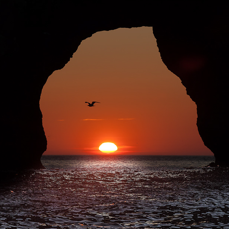
Gorgeous sunset image, nicely framed and exposed. If I were going to propose any changes it would be to make it a square crop and remove the smaller birds. |
Sep 14th |
 |
| 33 |
Sep 19 |
Comment |
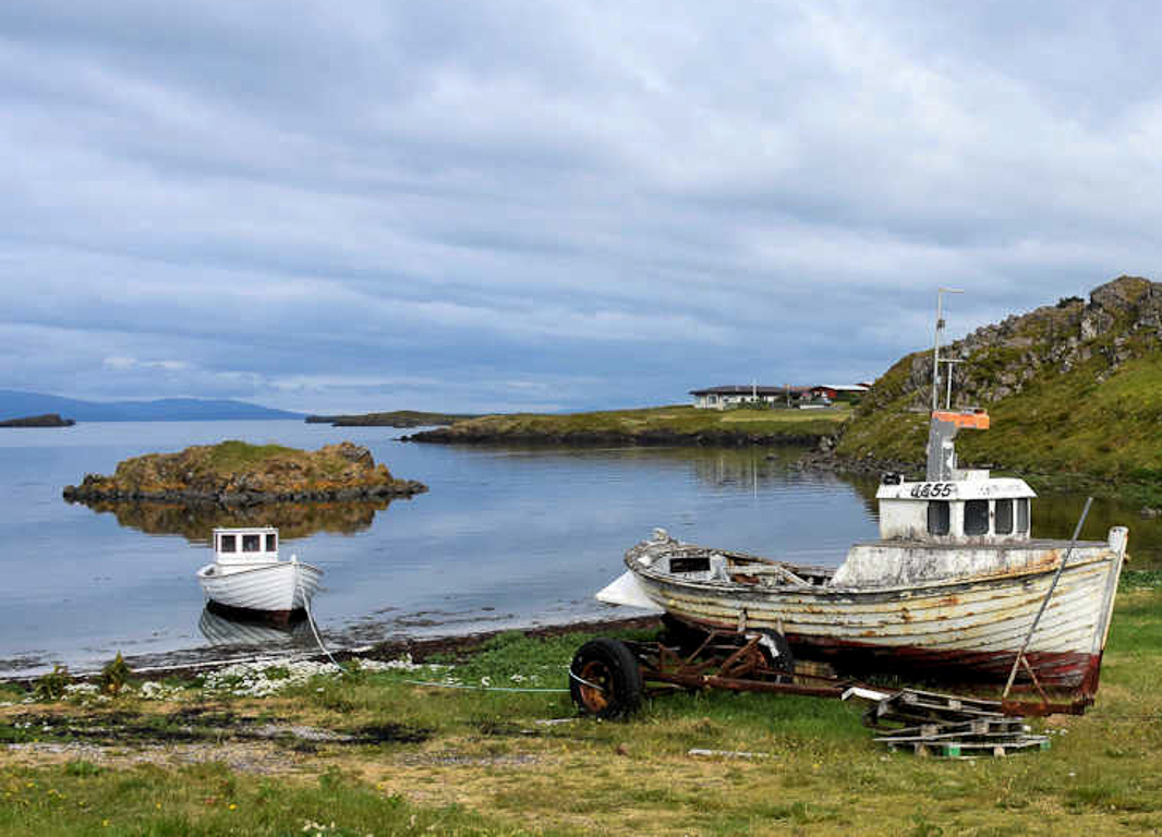
I don't really think I would change anything. Your composition is good, color is good and tone is good. I'll add an image since Ken mentioned some options. If I were going to crop the image I would remove the church and make it a boat image. |
Sep 14th |
 |
| 33 |
Sep 19 |
Comment |
Terrific composition, sharpness and color. The only suggestion I can think of is to crop the top, as there is no interest in that deep blue sky. |
Sep 14th |
5 comments - 4 replies for Group 33
|
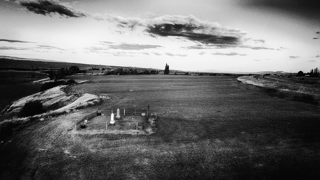
| 85 |
Sep 19 |
Comment |
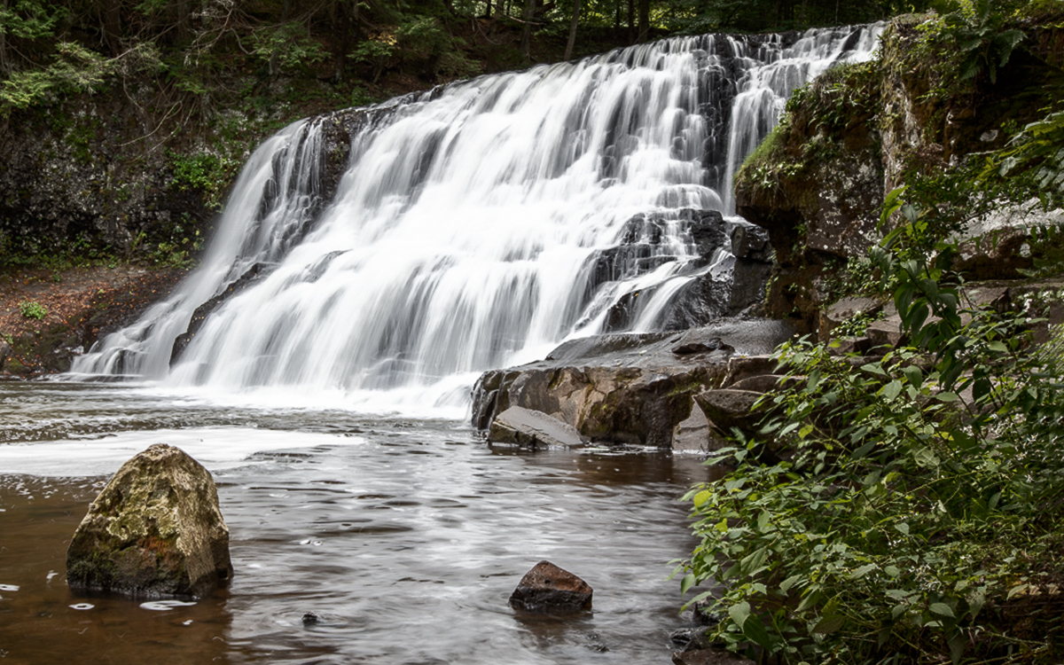
I wonder if a conversion to B&W might tell a different story. I eliminates the roadway in PS CC but didn't work on the heavy vignette, as that would be easier on the original prior to a conversion. I would maybe straighten the image along the edge of the cemetery too. Nice diagonal created from the white marker to the black(now) trees.
I am visiting from groups 29/33. |
Sep 16th |
 |
1 comment - 0 replies for Group 85
|
15 comments - 10 replies Total
|


