|
| Group |
Round |
C/R |
Comment |
Date |
Image |
| 29 |
May 19 |
Reply |
It was a good question. I seldom get the really silky water that judges love so well. Just lazy on my part to leave out the camera info. |
May 27th |
| 29 |
May 19 |
Reply |
Here's a method that might work for you, Bill. I took the image into PS and while the stylus blade is much too thin to really change much, I minimally was able to lighten the area without making it too obvious (in my opinion.)I can't rid the blade of the halo, but maybe someone else has an idea. Using the eyedropper tool, I selected a color from her hand and brushed that over the area. I then lowered the opacity until it blended in nicely. I then used the spot healing brush to lose the tag, and some other areas I thought distracted from the dark background. These changes could better be done on the RAW file, but I thought it helped some.See what you think. |
May 19th |
 |
| 29 |
May 19 |
Reply |
Thanks, Tam. I'm sorry, but I cannot see what you did to the background. Can you tell me what you did? |
May 18th |
| 29 |
May 19 |
Reply |
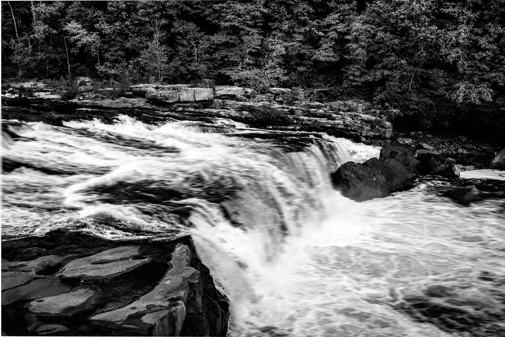
Is this better. I added a motion blur in PS to the water, and masked out the rocks and trees. |
May 17th |
 |
| 29 |
May 19 |
Reply |
You are probably right. I guess the solution would be to see if the artist would move her etching tool into the light, or to wait until it gets in the light, neither of which I ever have the gumption or patience to do. |
May 17th |
| 29 |
May 19 |
Reply |
Sorry Stephan for not including camera info. I had a limited use of my arm in Pittsburgh, so I only took my Fuji X100F with a 23mm lens. It does have a built in ND filter, but not sure it was all that effective. 1/200th sec @ f11, ISO 2500. I couldn't carry a tripod, so I was restricted to hand holding. The conference produced a ton of not so sharp images for me. It was fun though. |
May 16th |
| 29 |
May 19 |
Reply |
Excellent capture. The poor guy probably still felt the heat on his paw. |
May 11th |
| 29 |
May 19 |
Comment |
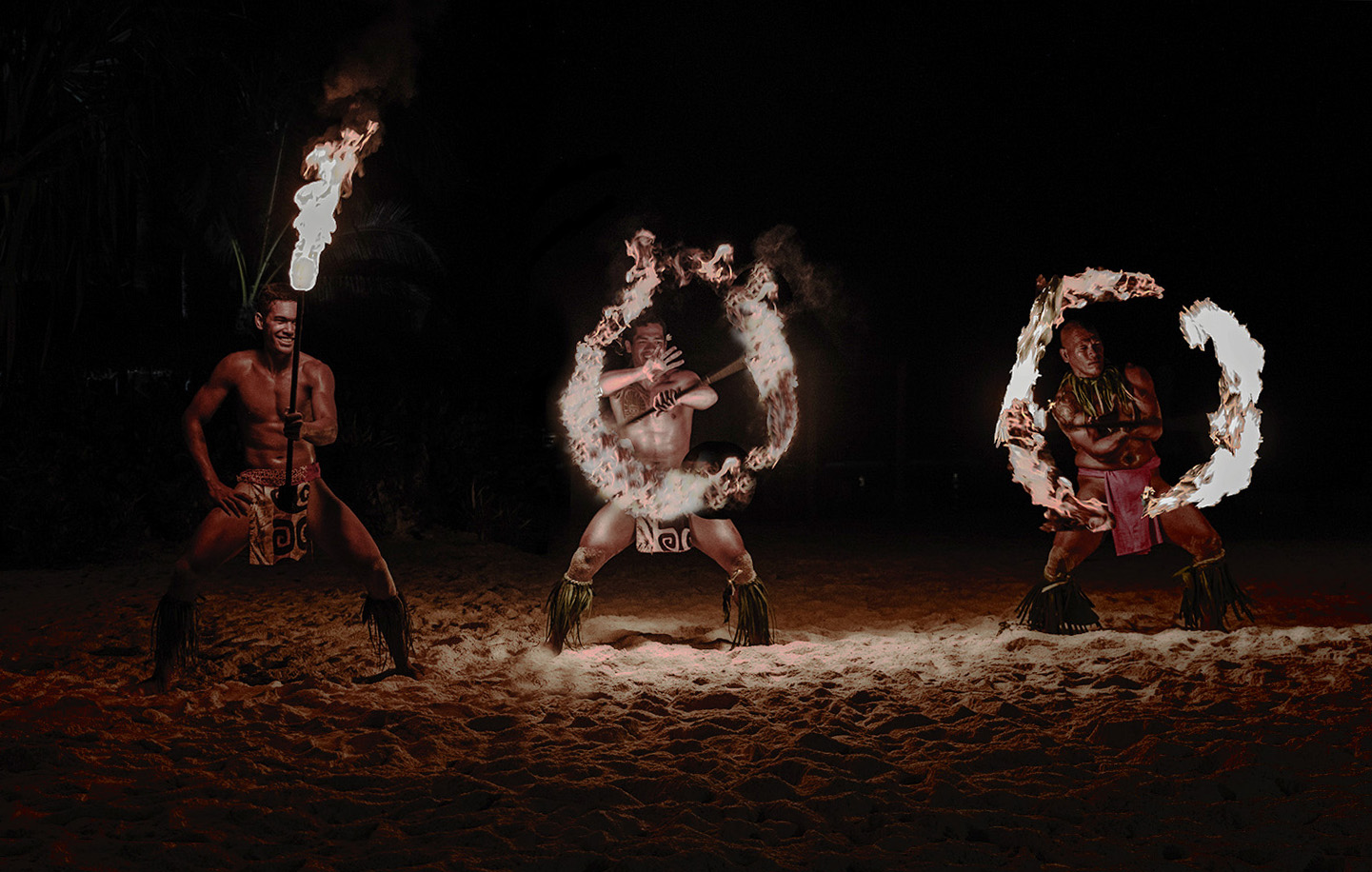
The male dancer evidently is on the lamb, or is letting his diva own the spotlight. You do these quite well, and I enjoy them all. |
May 11th |
| 29 |
May 19 |
Comment |
Excellent sports image. Sharp eyes, but a sense of motion (blur), and great color. Perfect crop for my taste. |
May 11th |
| 29 |
May 19 |
Comment |
I can't say I like the original, but I love the mood you have wrought from the image. I think the blues and yellows work. I love the composition, but wish the right hand cloud was higher, just so it doesn't appear like a halo. I did a minor perspective shift forward in PS. It helped me, if not the image. Terrific Post processing. |
May 11th |
 |
| 29 |
May 19 |
Comment |
I think this is a really well done image. The 100 stands out, and is blown out a little, but I think the strength of the image is in how well exposed the dancers are. All I might do is level on the beach light. |
May 11th |
 |
| 29 |
May 19 |
Comment |
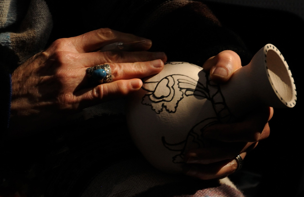
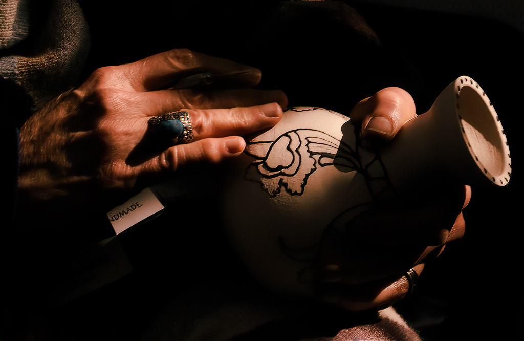
I love the shot, love the composition, love the lighting. The only thing that I find a little distracting is in the shadows there are some vague parts that I would eliminate. I also thought that the spectral highlights could be removed.but not positive about that. The ring gave me an idea to warm it into a native american skin color. Gorgeous image. |
May 11th |
 |
5 comments - 7 replies for Group 29
|
| 33 |
May 19 |
Reply |
Just to expand a little to what Larry stated, those in the west read from left to right, and usually look at images from the same direction. In the east, reading is from right to left, and so if you enter an international competition, you may wish to look at flipping horizontally and see if it might look better in the judges perspective. If the image contains words, flipping won't work. I think Larry's crop works better because the bright clouds at the top no longer draw the eye away, and the lower clouds lead us into the homes. I like the triangles. All that being said, a good image it is, in either horizontal position. |
May 28th |
| 33 |
May 19 |
Comment |
Thank you, Larry. I sometimes (almost always) struggle with grand vistas. I am attracted to it all, and fail to see the trees for the forest. Probably why I never do anything with my images other than print and frame. DSG has helped me some to crop better, but not enough. |
May 25th |
| 33 |
May 19 |
Reply |
I took a look at groups 35, and 66, as they are IR groups. Gave me some small insight into the medium possibilities and if you wish join a group, you could ask Barbara to be placed on a waiting list. |
May 22nd |
| 33 |
May 19 |
Comment |
I like the tones in your B&W, and the balance you have in the bright areas in the top right and lower left. I might even crop some of the top to make it even more of a pano, and limit the black space. Just my preference on a wonderful image. |
May 21st |
| 33 |
May 19 |
Reply |
Thank you Elizabeth. |
May 21st |
| 33 |
May 19 |
Reply |
Thank you Paul. The Mad Max series was really good, even if Mel is wackadoodle. |
May 20th |
| 33 |
May 19 |
Comment |
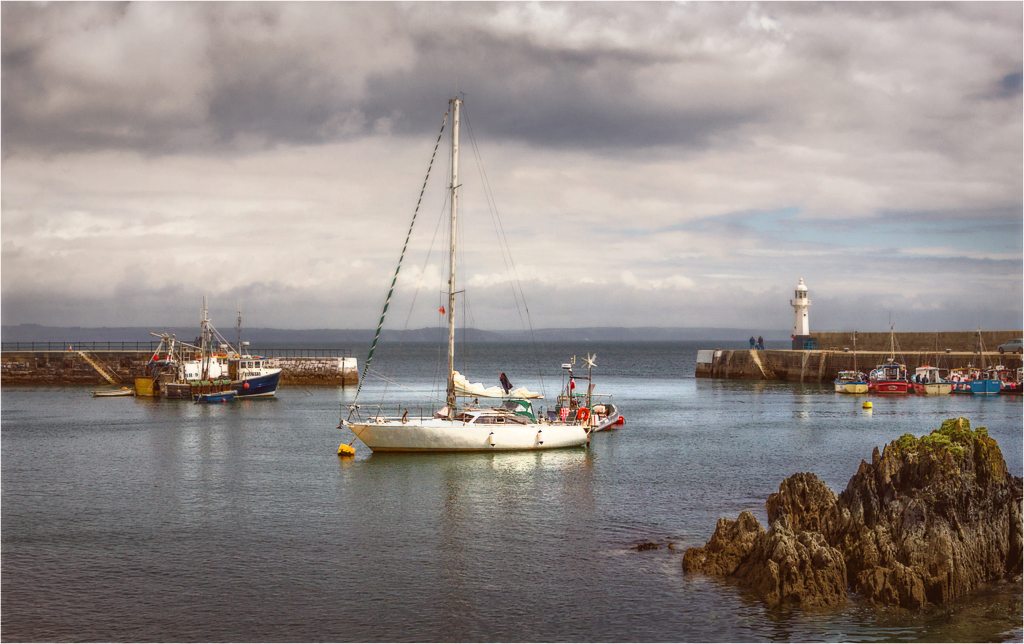
Really nice composition, Paul. Color and focus are spot on in my opinion. I like Ken's idea of centering the boat between the breakwaters. It is a little busy for competitions, and I'd like a little more contrast, but that is just my opinion. I think a subtle vignette might help, too. |
May 19th |
 |
| 33 |
May 19 |
Comment |
There is gorgeous light on the scene, but for my taste the image lacks depth (flat.) It was somewhat hard to work on because of the small size, but I hope I can show you what I think might take a wonderful image to the next level. I masked the image by using tonal curves in PS. |
May 19th |
 |
| 33 |
May 19 |
Comment |
I agree with Ken's wish list. Some of the clouds appear blown out to me, which may be the cause of the somewhat light blue sky. You'll need to clean up the dust spots for competition, and maybe use some dodging on the homes and rocks and burning on the cliffs and grass to direct the viewers eye where you wish it. Dingle is a wonder. |
May 19th |
| 33 |
May 19 |
Comment |
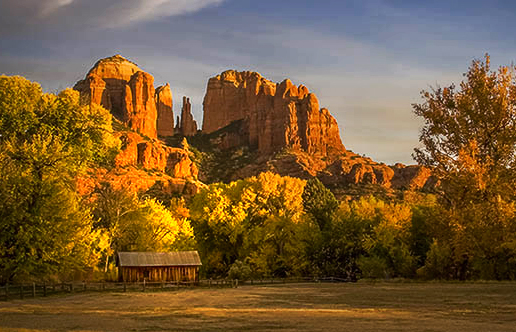
You give us leading lines that actually lead somewhere interesting, perfect exposure and focus, and an image with depth. Great image and processing. If you wish to take it to another level. maybe more dodging and burning on the rocks and island could prove helpful. Maine is gorgeous (except in the winter!) Love the image. |
May 19th |
| 33 |
May 19 |
Comment |
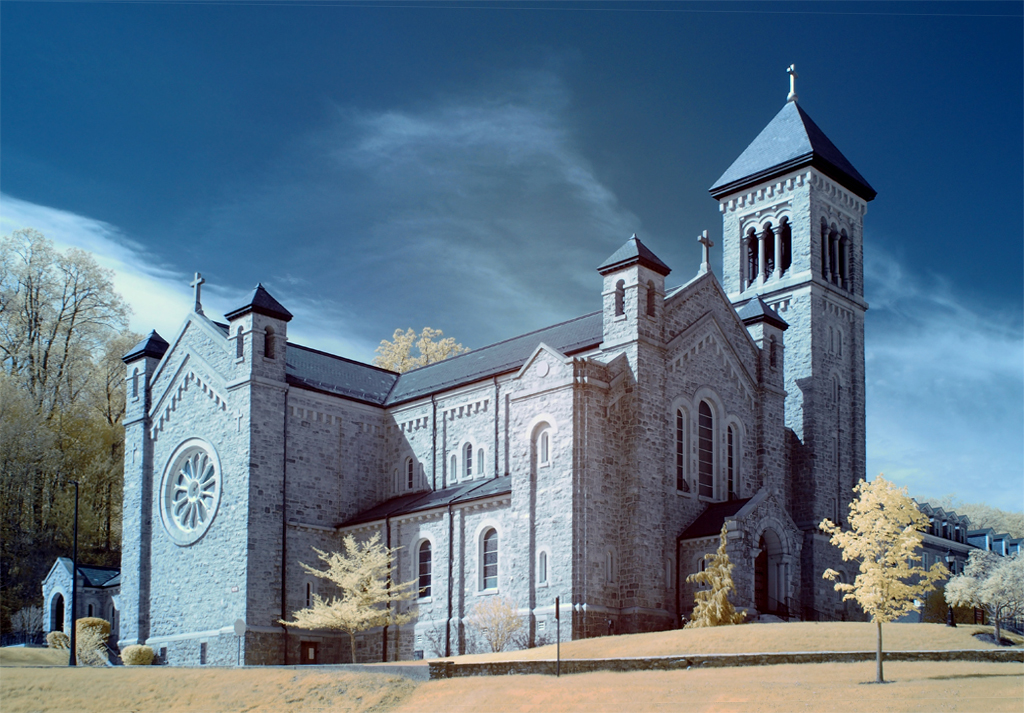
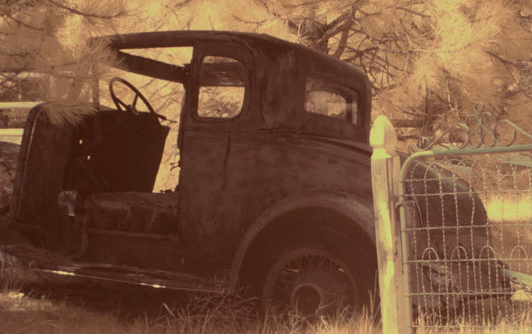
I don't know anything about IR except that is is a filter. Do you have a converted camera or an lens IR Filter. What is the effect that you hoped for. I agree with Ken, that the gate detracts from the car, which though the image is untitled, I think is the subject. My eye goes straight to the bright gate. I might have moved left until the gate goes away. Good experiment though. |
May 17th |
 |
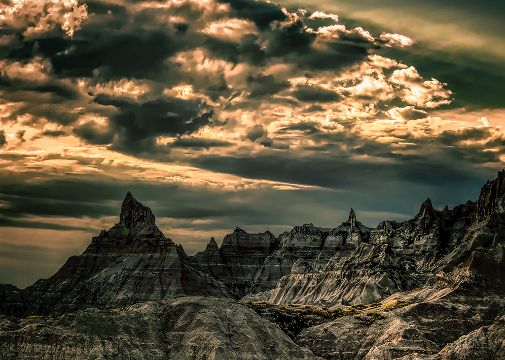
| 33 |
May 19 |
Reply |
I didn't see that , but I can make it more blue. The Badlands are red-striped, so I added a gradient to neutralize that aspect, to create a "new" Badlands. |
May 17th |
 |
7 comments - 5 replies for Group 33
|
12 comments - 12 replies Total
|


