|
| Group |
Round |
C/R |
Comment |
Date |
Image |
| 29 |
Apr 19 |
Comment |
I missed commenting on your image. Sorry.
Color is great. Background is beautiful and perfectly out of focus. I think Judy's crop is effective, since I think the OOF flower is a little distracting. The top is purely subjective IMO. As you have stated before, judging is a matter of opinion. |
Apr 25th |
| 29 |
Apr 19 |
Reply |
The only issue I can see with your crop is that it throws the right line of windows out of vertical alignment. |
Apr 25th |
| 29 |
Apr 19 |
Reply |
Thanks Jim. I always worry about having to shoot midday, but I think architectural images may do better in the harsher light. |
Apr 18th |
| 29 |
Apr 19 |
Reply |
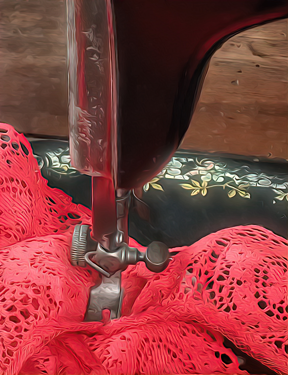
Topaz adjustment that intensifies lighting in images to change atmosphere, or create that perfect dreamy, sun kissed look. I used it to make the sewing surface artwork a little brighter and softer to match the fabric. |
Apr 17th |
| 29 |
Apr 19 |
Reply |
Normal 1.5X Fuji crop factor for APS-C sensors. |
Apr 17th |
| 29 |
Apr 19 |
Reply |
Thanks, Karen. The older I get the dumber I am! |
Apr 11th |
| 29 |
Apr 19 |
Comment |
The eyes have it! Very sharp using a 2x converter. Tripod? If not excellent job at just 1/640th sec. I never could get a sharp image with the 2x on the 70-200 2.8. Colors are nice and the catch light is perfect. |
Apr 10th |
| 29 |
Apr 19 |
Comment |
Even though I am not sure this is a sunset, I love the colors. The clouds lead me into the boats, and the wave helps define and add balance. I might remove some of the smaller boats and buoys just to see if it simplifies the image. Good subject for a pano. |
Apr 10th |
| 29 |
Apr 19 |
Comment |
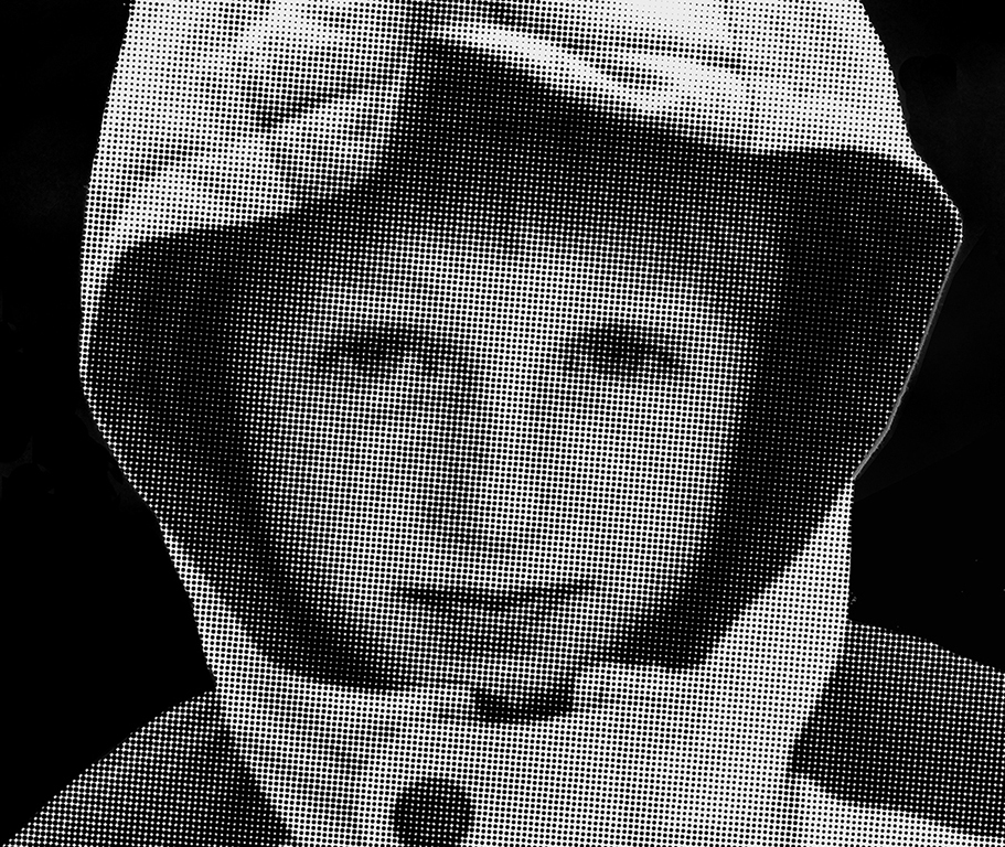
Thanks for showing us some creative work. IMHO the eyes make or break the shot, and I'm getting dizzy trying to see the eyes. It would be nice to see the original. I burned the eyes a little and some of the parka. |
Apr 10th |
 |
| 29 |
Apr 19 |
Comment |
I like the creativity you bring to the group. The sewing machine is a little too scratched or maybe in motion which keeps me from settling on what I think is your subject (the work.) It is a little soft compared to your normal work.I made some minor changes to the focus, removed the label?, and softened the table and added a bloom to the artwork. The colors are great. |
Apr 10th |
 |
| 29 |
Apr 19 |
Reply |
Thank you Mark. We hope you are coming out to Spokane. |
Apr 10th |
| 29 |
Apr 19 |
Reply |
Thank you Dave |
Apr 10th |
5 comments - 7 replies for Group 29
|
| 33 |
Apr 19 |
Comment |
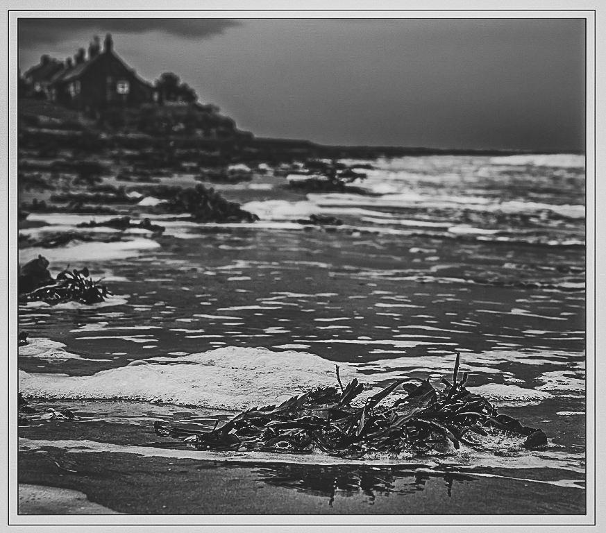
Definitely a lot more out of focus than in focus. I think it works here because it was a "dark and stormy...." Lots of lines and shapes are in this image and I think it all works together for me. Competition judges might say there is no interesting subject, but I think they'd be wrong. B&W is perfect for your story. |
Apr 24th |
 |
| 33 |
Apr 19 |
Comment |
I like the subject of this image. I am sorry that the air quality was so bad there, which is what I think the sky looks like. We get air inversion layers here and the sky looks just like yours. Keeps the smog trapped. Luckily it rains here and clears it again. I leveled the horizon and pretty much left everything else alone. Good capture, and I love the triangles. I always wanted to play golf at Hilton Head. |
Apr 24th |
 |
| 33 |
Apr 19 |
Comment |
At least we have a governor who is willing to spend millions on Orcas. The composition is really good, and I'm sure you wished you had a longer lens, but cropping can save the day. I also leveled the image, which immediately caught my eye. I added a little more processing to your image, but it is a little soft, as it is hand held on a very high end camera. |
Apr 24th |
 |
| 33 |
Apr 19 |
Comment |
I would love to go back again, and your pastoral scene is great. The composition, color and clarity are all top notch. Couldn't help myself from simplifying the scene and adding a little drama to the sky. |
Apr 24th |
 |
| 33 |
Apr 19 |
Comment |
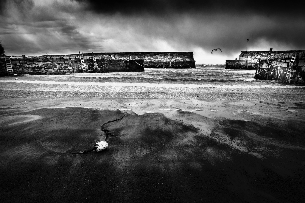
I don't know your skill level with PS, but it has some tools that make it worthwhile. I did remove some spots and took it beyond a matte effect just to see if it made any difference for you. Since the gull is the wow factor, I made him a little bigger and more centered in the breakwater, using the content aware move tool. I didn't mess with the buoys, but they are pretty prominent. Your composition is wonderful. |
Apr 24th |
 |
| 33 |
Apr 19 |
Comment |
I'm not a big fan of gray snow, although growing up in Ohio we had lots of yellow and black grungy snow! The composition is pretty nice with the meandering water. I have had luck with "Sunny" f13 as a starting point for really bright scenes. I always shoot them in Raw so WB isn't an issue. |
Apr 24th |
| 33 |
Apr 19 |
Comment |
I'm glad that you chose the image you did for the showcase. It really shows off your talents, which is the main purpose of the showcase. I love the image. Congratulations on being selected, and for participating. |
Apr 18th |
| 33 |
Apr 19 |
Reply |
Thank you Marilyn. |
Apr 10th |
| 33 |
Apr 19 |
Reply |
Thank you. Mark. My little brain just converts images into what I want to see. I'll leave the tonally correct images to Dorinda. Just creative differences. Glad you liked it. Hope to see you in September. |
Apr 10th |
| 33 |
Apr 19 |
Reply |
I looked up the eastern (Maine) cedars and they are as you have depicted the colors. We have red in ours on the west coast, which looks to me to be the main difference I see. We also are in a temperate rain forest, so our greens may be a little different also. I like your version too. My wife fell in love with Maine at the Portland Conference, until I reminded her of your winters. Good job, also. |
Apr 4th |
7 comments - 3 replies for Group 33
|
12 comments - 10 replies Total
|


