|
| Group |
Round |
C/R |
Comment |
Date |
Image |
| 29 |
Feb 18 |
Reply |
Thank you, Tam. I think if I do use this image at the club, I'll use the the breakwater as a level. I didn't have a horizon, but it may look better with the portion of the breakwater looking level. If you look at the top image you'll see that I did level the ball-head for the shot. I also need the person in the water to show how nuts Oregonians are! It was really cold. |
Feb 22nd |
| 29 |
Feb 18 |
Reply |
I'll give it a shot and see what you think then. Thanks Ellen. |
Feb 16th |
| 29 |
Feb 18 |
Reply |
When it becomes art and not photojournalism. |
Feb 13th |
| 29 |
Feb 18 |
Reply |
Thanks, Bill. Actually I was just too tired to carry and use my ND filters. Getting older isn't all that much fun for me. |
Feb 12th |
| 29 |
Feb 18 |
Reply |
Photoshop Elements 11(at least) allows masking. See this link for information. https://helpx.adobe.com/photoshop-elements/using/layer-masks.html. |
Feb 12th |
| 29 |
Feb 18 |
Reply |
I'm sorry Bill. My long time off for health reasons, has made me more of a post processor than photographer. I hope that will make my images better in the long run. I don't know what program you use to process your images, but I posted a link to "radial spot" tool in Adobe Camera Raw and Lightroom on our links page. No matter what you use, Radial gradients can direct the viewers eye where you want it.
The short answer is yes, I added brightness to the car. It helps to add depth and highlight the subject. If you click on Judy's and my thumbnails, you will hopefully notice that the image has added depth. With more careful application of the radial, it can add a lot of depth to our images. I am really learning a lot from watching f64 critiques. Applying the knowledge still takes much practice. |
Feb 12th |
| 29 |
Feb 18 |
Reply |
Just a reminder, but your suggested images can be sized at 1080 x 768 so they are bigger when we click them. |
Feb 12th |
| 29 |
Feb 18 |
Comment |
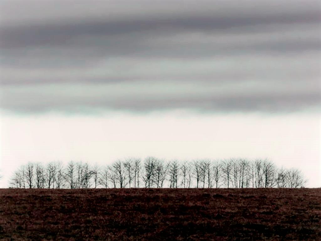
I believe that you have captured the simplicity that you wanted. The trees are sharp enough for me, and the overall tone seems to be cold bleak winter. For me,I think I'd like a crop as there is more interest in the sky, than the ground. I also removed the evergreen bush that was left after the crop. The 4 or so evergreens look like porta-potties from a distance, which distract my eye. We don't have so many areas that are mostly hardwood trees like this. Mostly the Evergreen State. I get cold just looking! I also added an orange gradient to warm it a little. Hoping you feel better soon. |
Feb 12th |
 |
| 29 |
Feb 18 |
Reply |
I never really paid attention to the waves before, but it does appear that the breakwater causes the waves to divert to the beach on either side. Or the breakwater was built at this point because the currents split there. Image one shows that it could be either explanation, Thanks for your comments. |
Feb 12th |
| 29 |
Feb 18 |
Reply |
Thanks, Karen. I like your crop, but the saturation boost added way too much "sparkle" to the image, especially the rocks, for my taste. It doesn't show up in your thumbnail until I click on it and make it full size. It also blows out the lady in the water, but maybe she should be blown out of the water! |
Feb 11th |
| 29 |
Feb 18 |
Comment |
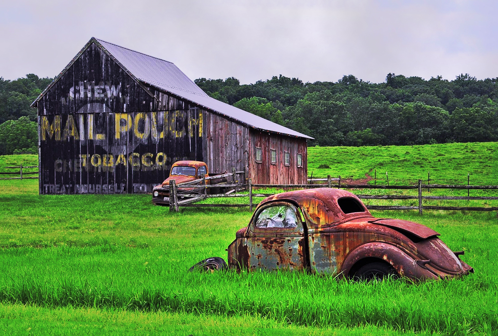
I really like your composition, Bill. The diagonal crated by the cars and barn is outstanding. The colors are very good to my eye, our greens pop in the NW. Not as much yellow in our grass. I've been to Charleston, but don't really remember the greens. Since the car is the main player to my eye, I added a radial spot to bring it out more. See what you think. I'm trying to be subtle as I know you don't really like computer time. Excellent detail throughout. |
Feb 10th |
 |
| 29 |
Feb 18 |
Comment |
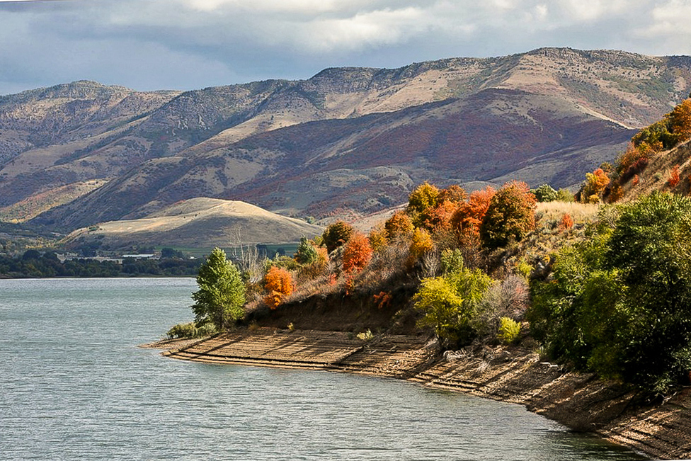
The depth you have is great. The foreground triangle of trees and bushes pops with color and sharpness. The muted hills in the background add tremendous depth to your image. The dramatic sky completes your compelling landscape. Great light and shadow highlight. My only suggestion would be to straighten the image using the far bank. |
Feb 10th |
 |
| 29 |
Feb 18 |
Comment |
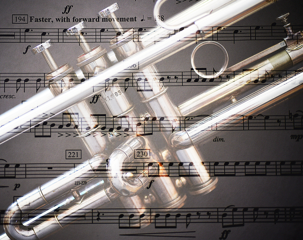
Excellent work in camera for your project, Karen. The text is sharp even for my bad eyes! I like the color combinations, detail and the exposure is terrific. Like Judy, I might like the music as a background to the trumpet better. Your title leads me to believe that you wanted the music to take priority. Did you try it both ways? I used a radial spot to try to replicate what I thought that would look like. Beautifully composed and cropped too. Strong diagonal as Judy mentioned. I'd put this on a wall. |
Feb 10th |
 |
| 29 |
Feb 18 |
Comment |
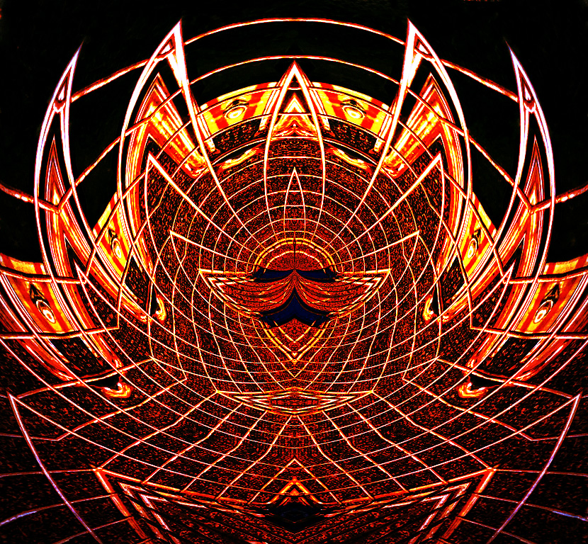
I do not know how to answer the question about abstracts as competitive. I think they are riskier, but I like this one. It is sharp and the symmetric shape is appealing to me. I do not have a clue what the cart may have looked like, so abstact it is for sure. If it were mine, I think I might go for the gusto, and add a gradient map to pop the colors a little. |
Feb 10th |
 |
| 29 |
Feb 18 |
Comment |
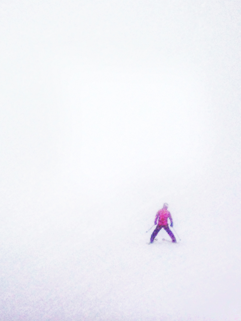
I like the image as is, but in my opinion, it could be made better by a little more and less post processing. I am assuming that the fog is why the skier is soft and the color is muted. That is good. The snow is a little too blue for my taste, with splotches of magenta. I agree with Judy, that you can make the subject larger with a crop, yet still let the viewer imagine the large slope. I think a vignette helps, but I'm not sure I think this is particularly a "slight" vignette. If you consider lowering the opacity and increasing the feathering of your vignette, I think you might be happier. I don't know what editing options there are in your phone, so I'm using Adobe terminology. |
Feb 10th |
 |
| 29 |
Feb 18 |
Reply |
I'm not sure yet that Adobe has the correct lens adjustments, but they have to live with what Fuji gives them. The first image was daylight white balance, while the other two were changed to cloudy white balance, which adds more warmth. I remember the beach as more like the blue cast, but I wanted the warmer feeling. It was really cold and windy. Not sure what those folks were thinking! Dorinda and I thought we packed too light for the mid fifty's we actually got at the beach. |
Feb 10th |
6 comments - 10 replies for Group 29
|
| 30 |
Feb 18 |
Comment |
I really think this has a lot of potential in competition. I'd suggest some modification to the upper left corner, and a gradient to unify the colors. I'm not sure about the green on the leaves. I might clone them out. This is really sharp, colorful and creative. Excellent work. |
Feb 12th |
 |
1 comment - 0 replies for Group 30
|
7 comments - 10 replies Total
|


