|
| Group |
Round |
C/R |
Comment |
Date |
Image |
| 29 |
Jan 18 |
Reply |
It should do well. Good luck. |
Jan 17th |
| 29 |
Jan 18 |
Reply |
You are definitely a Sears battery! |
Jan 16th |
| 29 |
Jan 18 |
Reply |
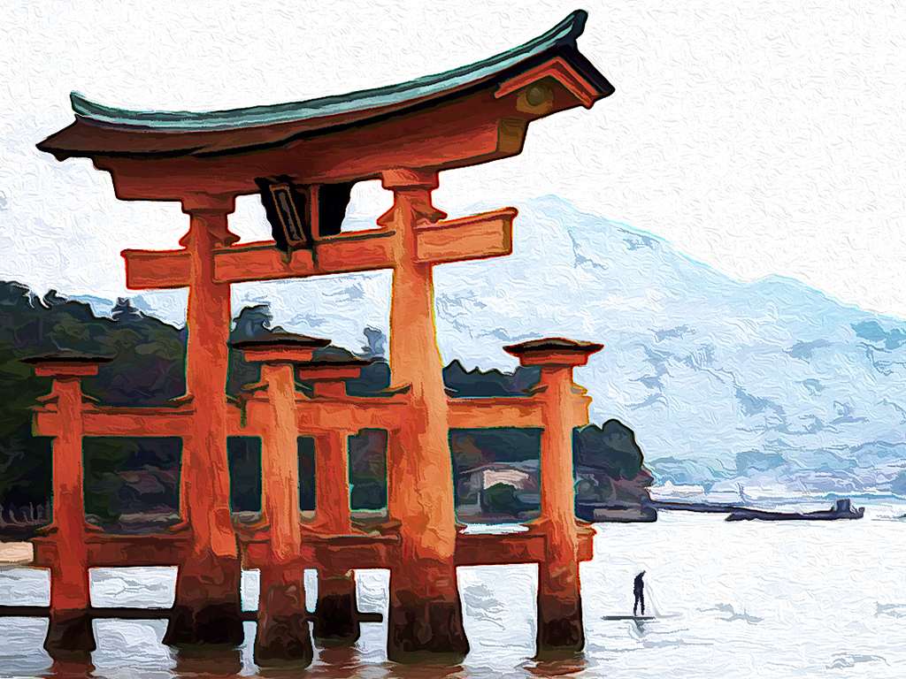
Are you speaking about "similar image" as it pertains to gaining acceptances? It looks like the catch all for the reality based divisions is "All allowed adjustments must appear natural."
The only allowable adjustments are removal of dust or digital noise, restoration of the appearance of the original scene, and complete conversion to greyscale monochrome. Other derivations, including infrared, are not permitted. All allowed adjustments must appear natural.
If this doesn't include dodging and burning, they should state that. Ansel Adams made D&B the standard in B&W that we all try to live up to. Color adjustments need to be made, in my opinion, to make an image appear as it did when shooting. The human eye has a DR of about 20 stops. DSLR's get 9-14 and are more limited by camera electronics than sensors. Hasselblad only gets 13.55 at $40,000. |
Jan 16th |
| 29 |
Jan 18 |
Reply |
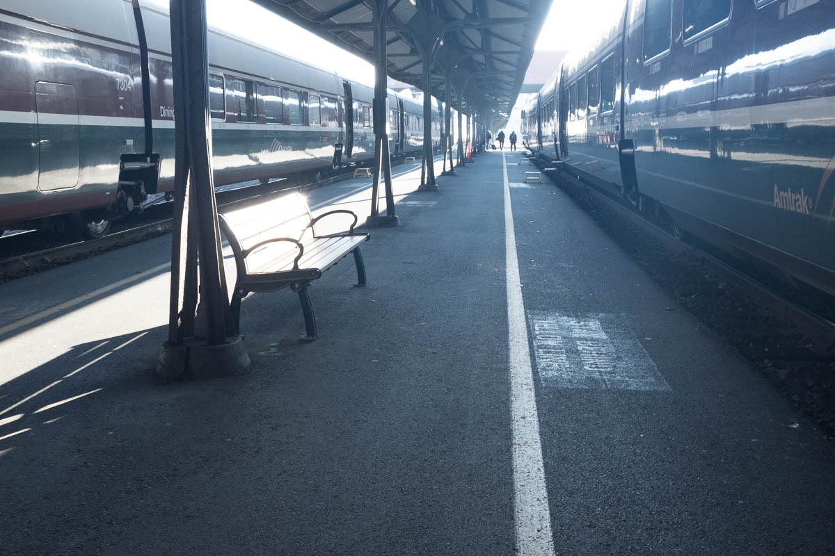
Your image actually repeats one of my layers in Photoshop, leaving no definition between the sky and the top of the left hand cars. That made me add a gradient layer of blue/yellow to warm it up some to contrast to the sky. That is where I'll probably lower the opacity some. Thanks, Tam. |
Jan 16th |
| 29 |
Jan 18 |
Reply |
Thanks, Bill. I might tone it down somewhat. Even in B&W like Judy's. with a crop, the lines and reflections hold up. |
Jan 16th |
| 29 |
Jan 18 |
Reply |
My LR/PS CC workflow involves just three stages-Tone-Color-Effects.I cropped it first in LR (Adobe Lightroom), and then used the new Auto tone button in LR CC (V4 new 2018 updated process to LR and ACR-Adobe Camera Raw), which I can now recommend as a good starting point. Then I took it into PS CC for tone mapping (making sure the tones go from close to pure white and pure black by using curves, and the same with color. This is a good website for comparing PS Elements and what upgrades might help. I;m not sure if you have a good working computer yet- http://www.adobe.com/products/photoshop-elements/buying-guide.html. For workflow I love Blake Rudis. If you sign up for e-mails, he sends a free weekly processing video. https://f64academy.com/
|
Jan 14th |
| 29 |
Jan 18 |
Reply |
I cropped it first in LR, and then used the new Auto tone in LRCC (V4), which I can now recommend as a good starting point. Then I took it into PS CC for tone mapping and color curves. |
Jan 13th |
| 29 |
Jan 18 |
Comment |
Excellent composition, Bill. The snow is properly white, good job with a high DR image. Even a single image taken into HDR software may bring out more cabin and snow detail, if you wish. Good job in camera, but as we all know, even film required post processing to get all we could from an image. Thanks for sharing. |
Jan 12th |
| 29 |
Jan 18 |
Comment |
Wow, I'm thrilled to view this image. Great focus, color, depth and detail. Your radial filter lighting is perfect. Great composition, Jim, and it would be a winner in my opinion. I might try to angle it a little on the diagonal, but that is really a minor change and may not help. Beautiful image! |
Jan 12th |
| 29 |
Jan 18 |
Comment |
I'm envious of your travels. Judy can probably comment better on whether this can be made into a PT competitive image. It is could be a good wall image, but there are some issues with your composition, in my opinion. The gate has the color, size and clarity for a good subject. Tere is a partial sea wall that makes a great diagonal, but leads to a building that has no outstanding features. Jim already commented on the horizon. In my opinion some cropping would help, and content aware canvas can add to the top and save the top of the gate when straightened. Yhr gate and man are the important features for me. |
Jan 12th |
 |
| 29 |
Jan 18 |
Comment |
Red, white and blue always has great impact for me. Focus is perfect (says the man with blurry vision) I agree with Jim that the telephone pole adds nothing to your image. If you crop the left you would eliminate that and the white thing below it on the wall. I'd probably crop that part of the wall too, halfway through the large bush. One or two more steps to the left and you would have a full window on the right. Just wishing I were young and limber again. Well done travel shot. |
Jan 12th |
 |
| 29 |
Jan 18 |
Comment |
You've captured a once in a lifetime moment with your phone camera. Definitely one that may have many meanings for the viewer. Your title is also provocative. The light unfortunately also reflects in the eye, giving a dead animal life, which in my opinion is not particularly good in this instance. One for the scrapbook. |
Jan 12th |
| 29 |
Jan 18 |
Comment |
I am really impressed with your explanation of how you did this. It is extremely well written, and I applaud you. The image itself is really well done technically- Sharp focus on the subject, soft background with detail. Beautifully exposed and framed. The splashes provide a nice diagonal, and this work keeps you out of the cold. If you plan to show this competitively, I would consider removing some of the spectral highlights from the individual drops. You didn't mention your light source, but it seems smallish to me. You and Jim have inspired me to do some macro since I can no longer negotiate long walks. Well done on all fronts. |
Jan 12th |
| 29 |
Jan 18 |
Reply |
Thanks, Jim. There was just too much dynamic range for my little Fuji, and I really wanted to bring out the reflections on the train. The sky was a last minute addition, just to separate the train from the sky. I'm sure all the comments will give me something to work on. I'm not sure if it's competitive though. |
Jan 12th |
| 29 |
Jan 18 |
Reply |
Thanks for the request. I am including the original. I would prefer comments on the submitted photo. What do you not like. Anything you do like? |
Jan 9th |
 |
6 comments - 9 replies for Group 29
|
| 30 |
Jan 18 |
Reply |
https://f64elite.com/course/ps-foundations-gradients/
The above is a great course on using gradients and gradient mapping, which preserves the tonal quality in PS. Don't forget to add either Links or a bulletin board for your group. |
Jan 28th |
| 30 |
Jan 18 |
Comment |
Just thought I'd try a copy too. I love the story. I didn't like the shadow or wet spot on the bricks. I also removed a little more of the second bench, and added a gradient map in PS CC to pop the colors a little. Let me know what you think. |
Jan 27th |
 |
1 comment - 1 reply for Group 30
|
7 comments - 10 replies Total
|


