|
| Group |
Round |
C/R |
Comment |
Date |
Image |
| 13 |
Jul 21 |
Reply |
Wendy
I bought his course on Game of Tones which was discounted last week. It is well worth buying it. It totally changed how I looked at editing an image. |
Jul 19th |
| 13 |
Jul 21 |
Comment |
|
Jul 18th |
| 13 |
Jul 21 |
Comment |
Wendy
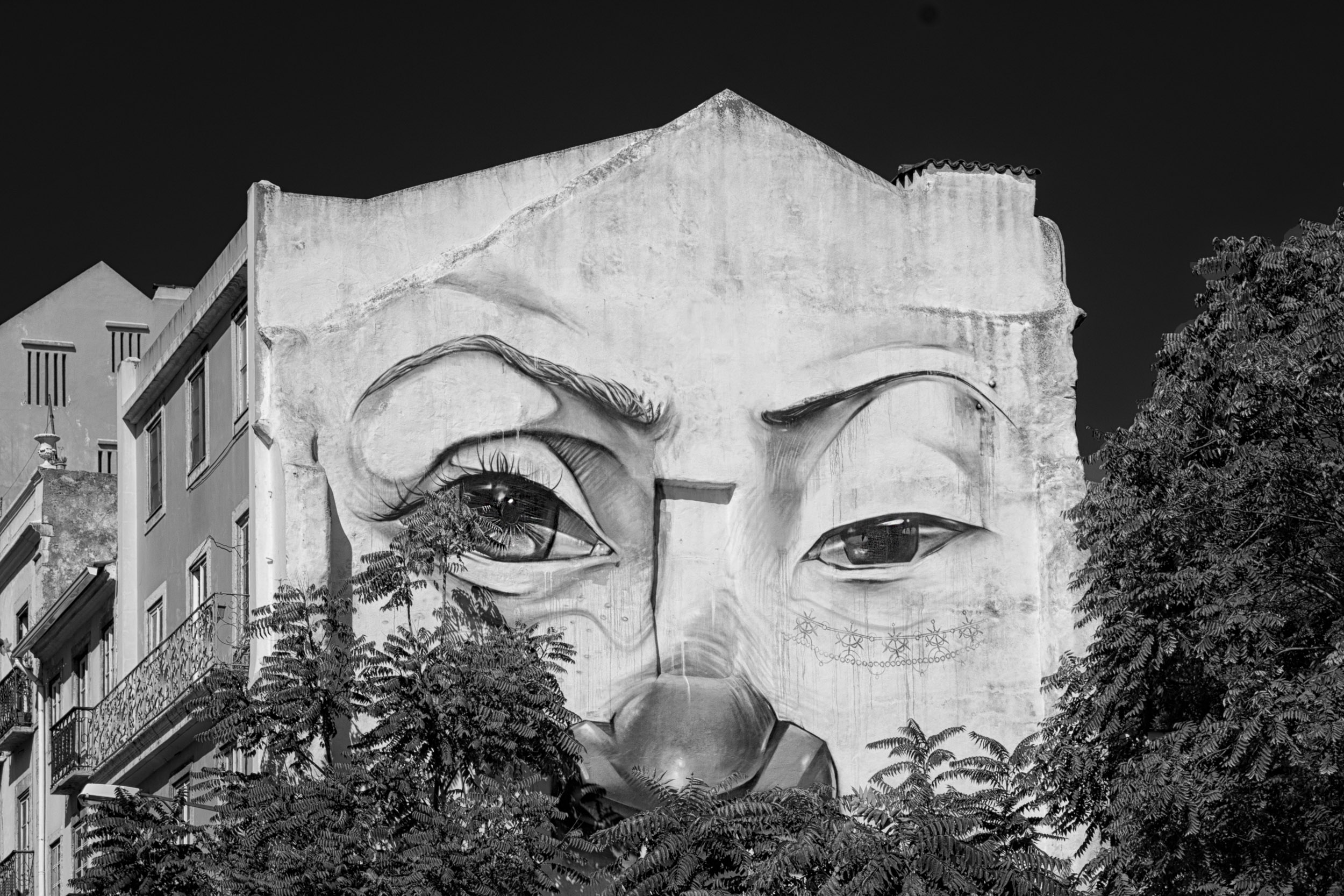
Good for you for spotting the bubble. You are not picky. I am taking the PSA competitive images course and left in three bubbles on the image I sent to my instructor. That image also had a fish and my intent was to capture the symbiotic relationship of nature as the pond with its roots was a hiding place for the fish and the fish appeared in the right place. He told me to remove the bubble.
I was in DDG 83 monochrome for two years and last month did the lesson on monochrome for the PSA course. Therefore, I have had to learn some advanced techniques of selections and compare two or three different ways of creating a monochrome conversion i.e. Silver Effex, the PS BW adjustment layer, calculations, gradient map, the HSL adjustmet layer. That was the reason for my comments on your image and the other members image. Your image had good composition and I made suggestions, even if extreme, to refine it.
Monochrome minimalism was such a good topic to work with this month. |
Jul 18th |
| 13 |
Jul 21 |
Comment |
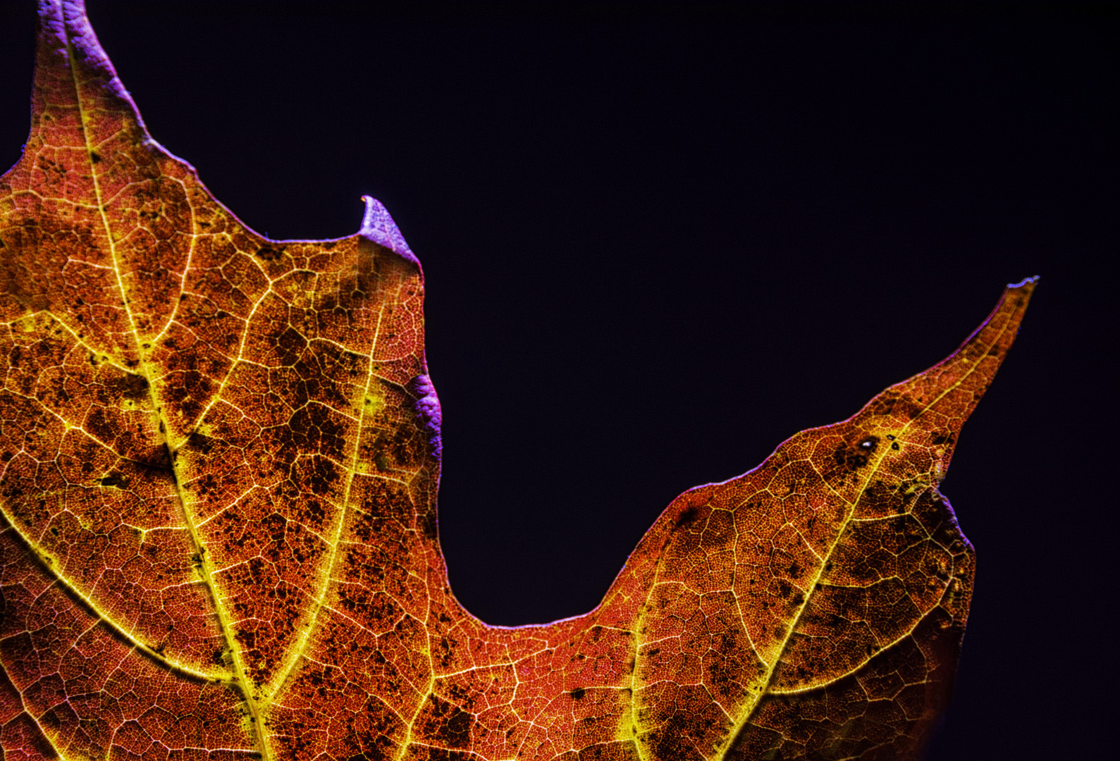
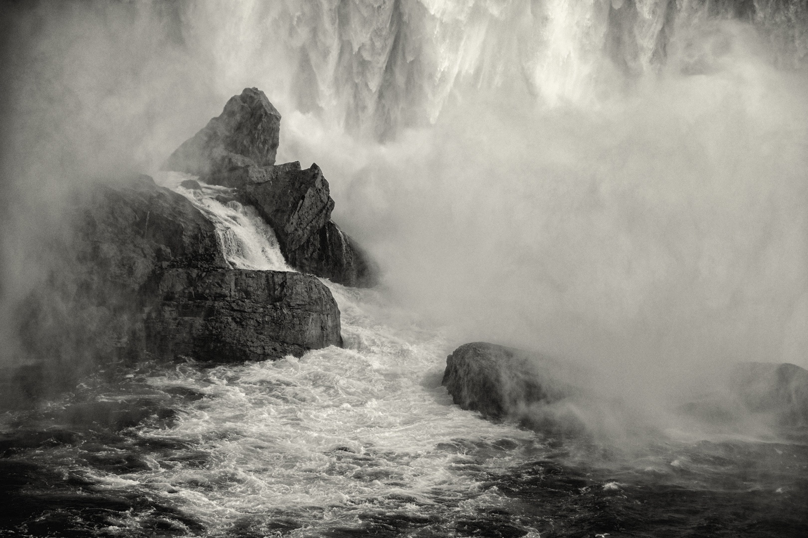
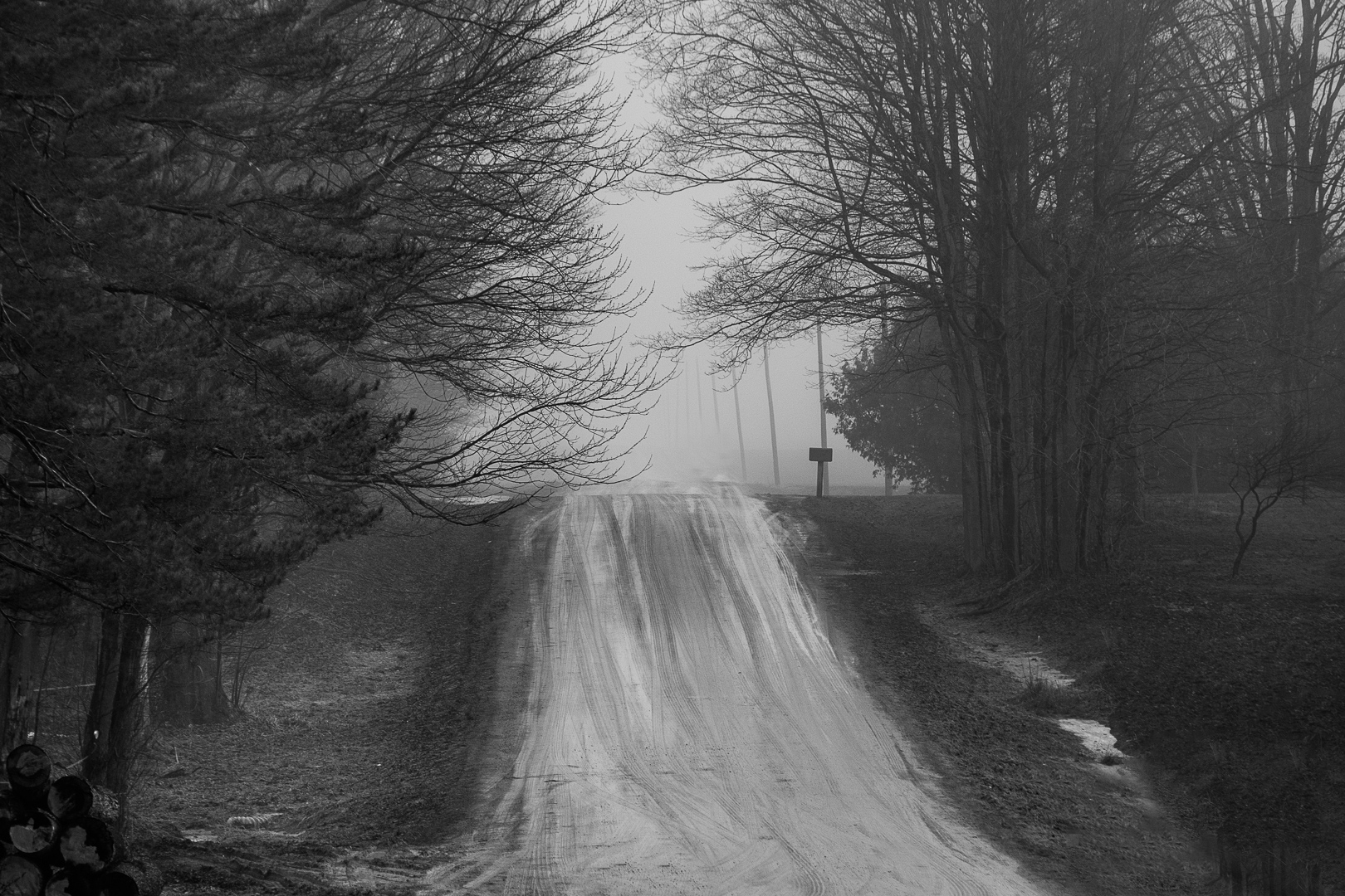
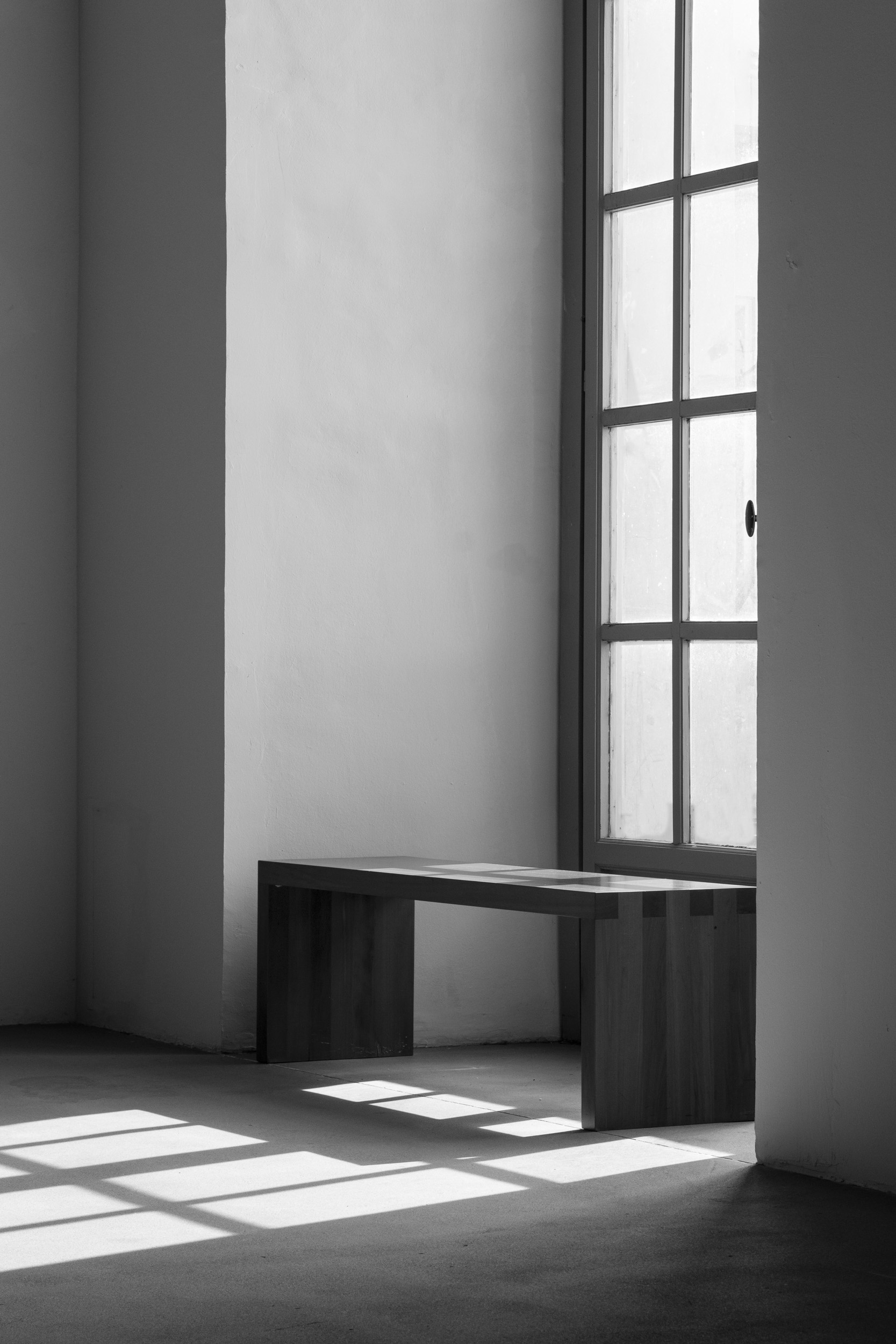
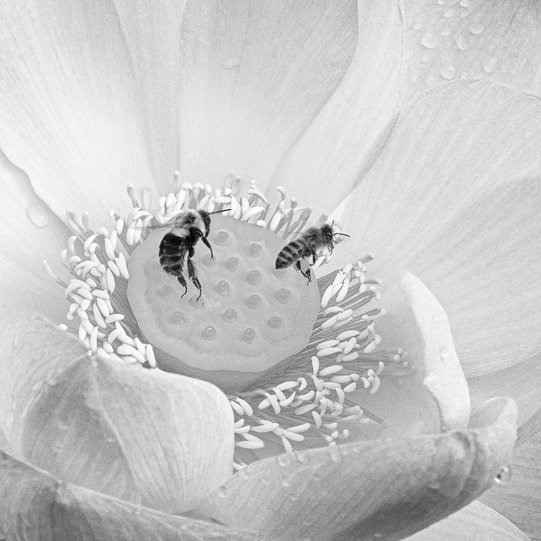
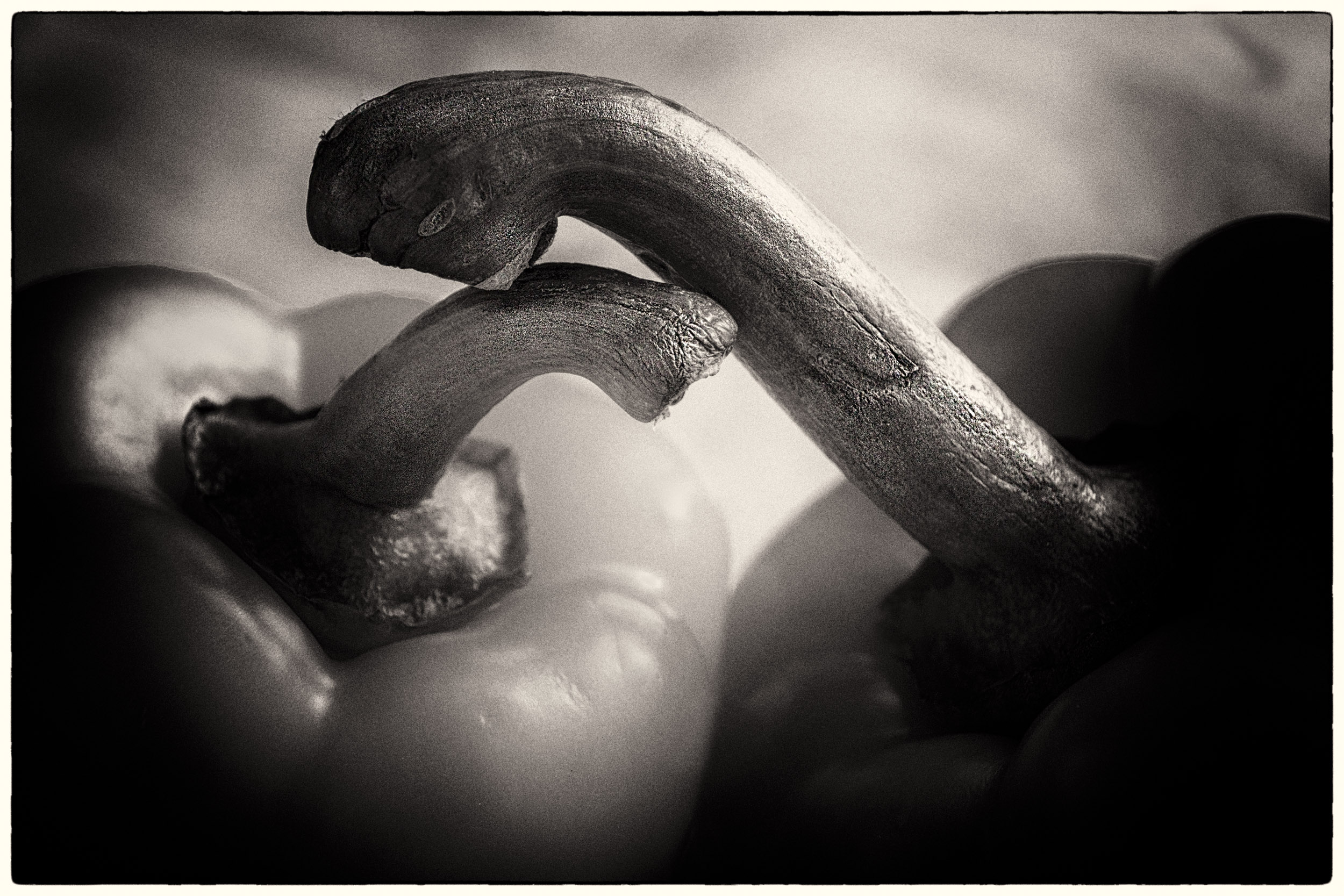
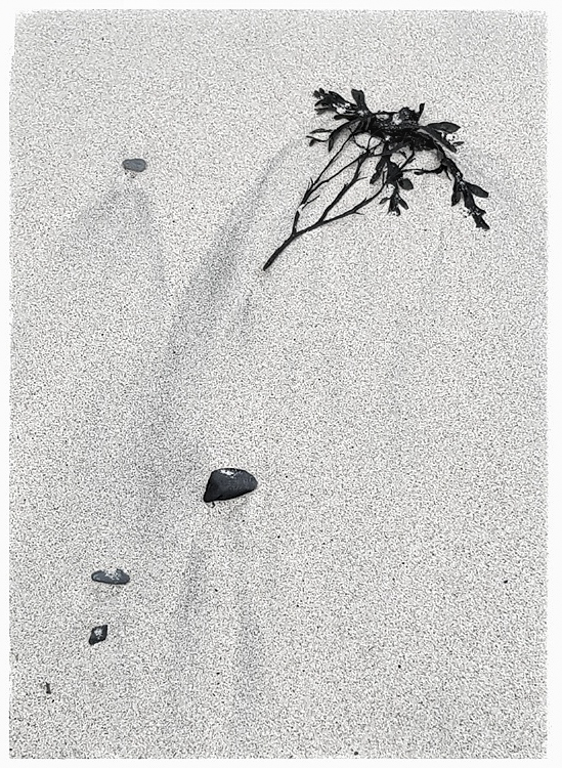
I think this is a good example of minimalism with a strong composition, textures, lines and shapes.
I note on my computer the clipping warnings on for highlights and blacks. You might consider reducing the highlights and brushing the top of the black weed to reduce the black. The image might have stronger visual impact by flipping it horizonally.
The eye is attracted to white and drawn to the edges of the image. You could consider a darker toned border for this image. |
Jul 14th |
 |
| 13 |
Jul 21 |
Comment |
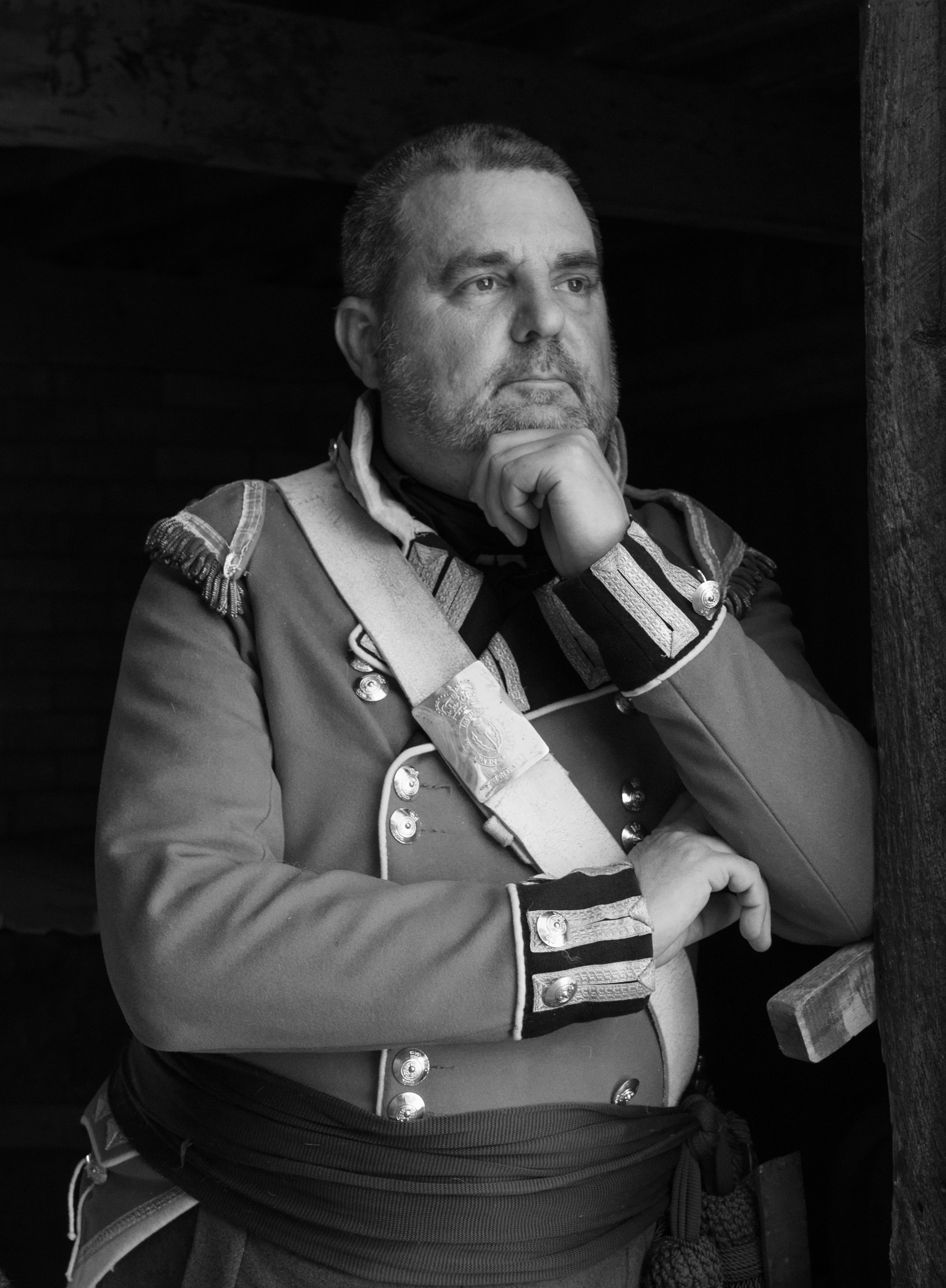
Paul
I think you have chosen a good subject.
I feel the solarization removes details from this image and perhaps is not the most appropriate because my eye is drawn to a massive blank of blank of black which dominates the image.
With structures, it is important to check the vertical and horizontal alignment. I noted they were off. |
Jul 14th |
 |
| 13 |
Jul 21 |
Comment |
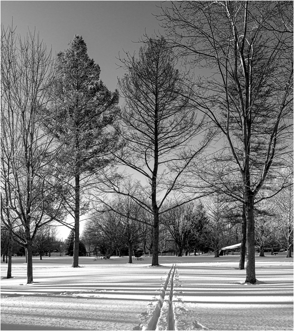
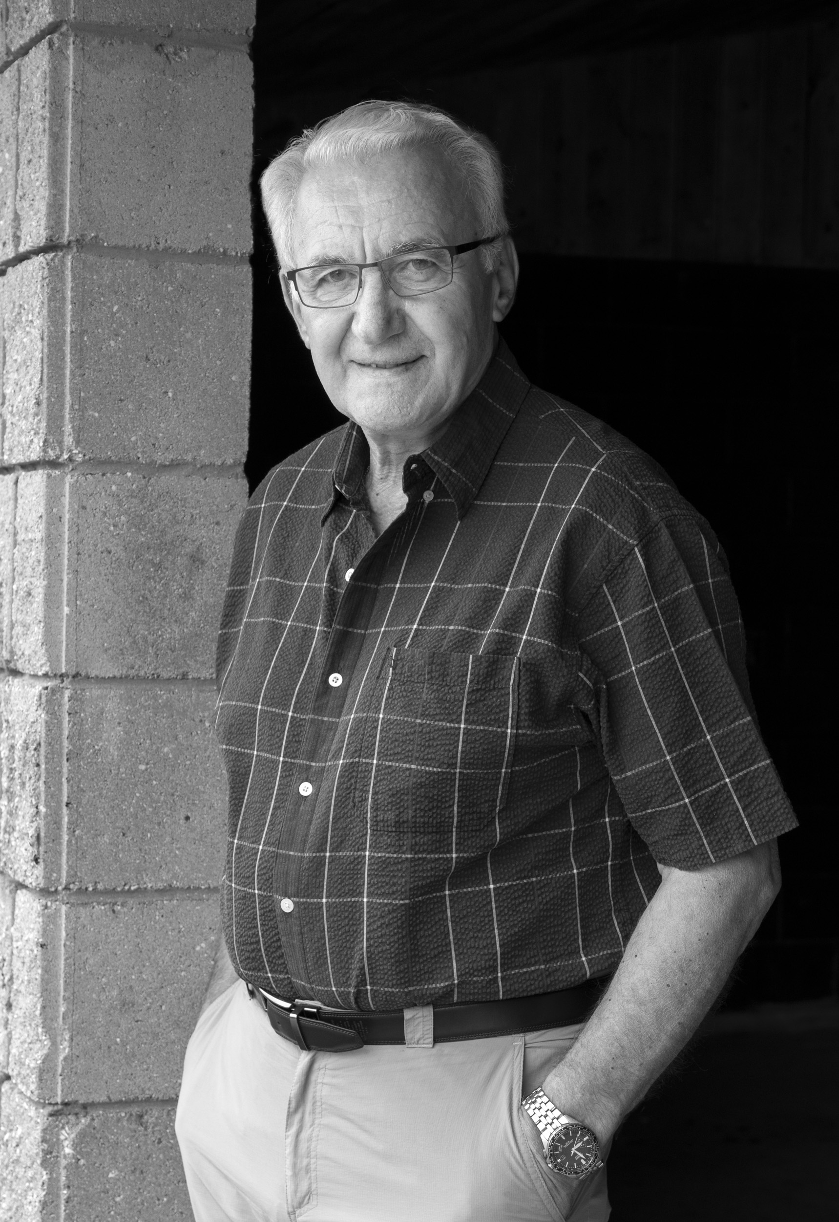
Barbara
I see you have used a variety of techniques to reduce the noise and to bring out the dynamic range in the image. The image has strong shapes and a good range of tonal contrast. With the low light, I can see detaill in the clouds and water and the rock/island appears as a silhouette.
My eye is attracted to the lighter areas of the image and immedidately goes to the plain grey sky that dominates the image.
You could consider selecting the sky, applying the selection to a level adjustment layer, and reducing the brightness of the sky. The eye then goes to the white cloud area and the island/shape.
You could also experiment with some of the tone options in SEP. |
Jul 14th |
 |
| 13 |
Jul 21 |
Comment |
Barbara
I see you have used a variety of techniques to reduce the noise and to bring out the dynamic range in the image. The image has strong shapes and a good range of tonal contrast. With the low light, I can see detaill in the clouds and water and the rock/island appears as a silhouette.
My eye is attracted to the lighter areas of the image and immedidately goes to the plain grey sky that dominates the image.
You could consider selecting the sky, applying the selection to a level adjustment layer, and reducing the brightness of the sky. The eye then goes to the white cloud area and the island/shape.
You could also experiment with some of the tone options in SEP. |
Jul 14th |
 |
| 13 |
Jul 21 |
Reply |
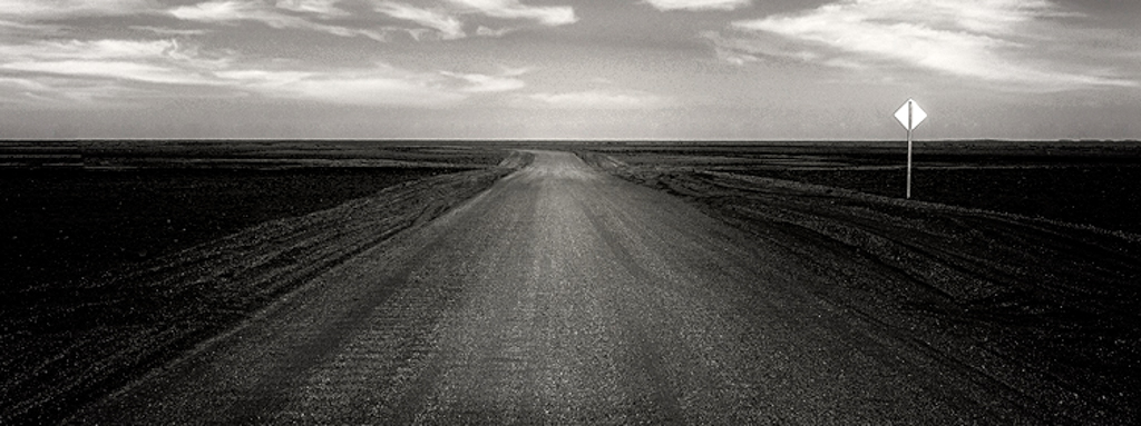
Wendy
I think you have presented a good example of a minimalist image and monochrome simplifes the image revealing textures, leading lines of road, shapes (puffy clouds) and good triangles.
I noted you put the traffic signal on a rule of thirds intersection. In my VH attached I have provided an alternate crop with the road symmetrical and the sign to the left. The sign is so powerful that the eye is immediately drawn to it. Therefore, you might consider putting it off to the side just as a driver would see it and keep the focus going symmetrical down the road.
I think you could expand the tonal range in this image. To do so, I used a curve and moved the white point in. Also, you could dodge the clouds.
I also feel you could strengthen how the viewer looks through the image by dodging the road and moving the eye to the horizon, providing a spotlight where the road meeds the horizon (radial circle), and a vignette to hold the eye in the image.
See VH attached fo your consideration. |
Jul 14th |
 |
6 comments - 2 replies for Group 13
|
6 comments - 2 replies Total
|