|
| Group |
Round |
C/R |
Comment |
Date |
Image |
| 13 |
Jun 21 |
Reply |
Paul
You certainly have stimulated wonderful conversation with your image and are helping us grow. This is the true spirit of the DSG. |
Jun 20th |
| 13 |
Jun 21 |
Reply |
Wendy
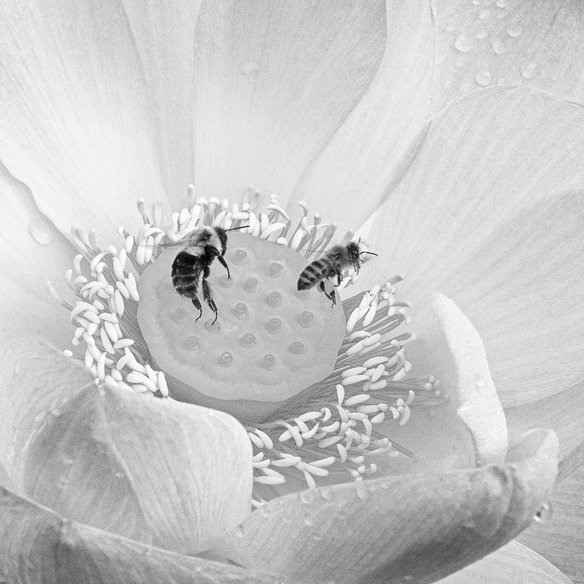
This is the interesting part of crops. I read a comment that the crop is one of the most powerful elements we have to change how an image looks. This kangaroo is so cute and I wanted to have a closer look at him/her. You are fortunate to have such an interesting animal to photograph. |
Jun 20th |
| 13 |
Jun 21 |
Reply |
Wendy
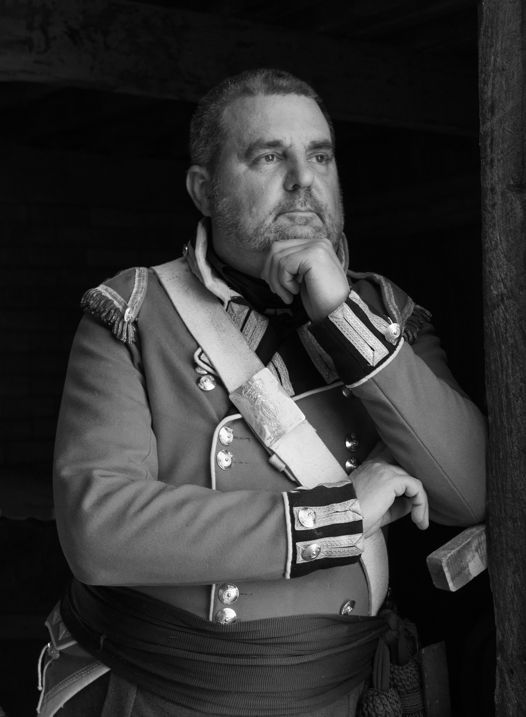
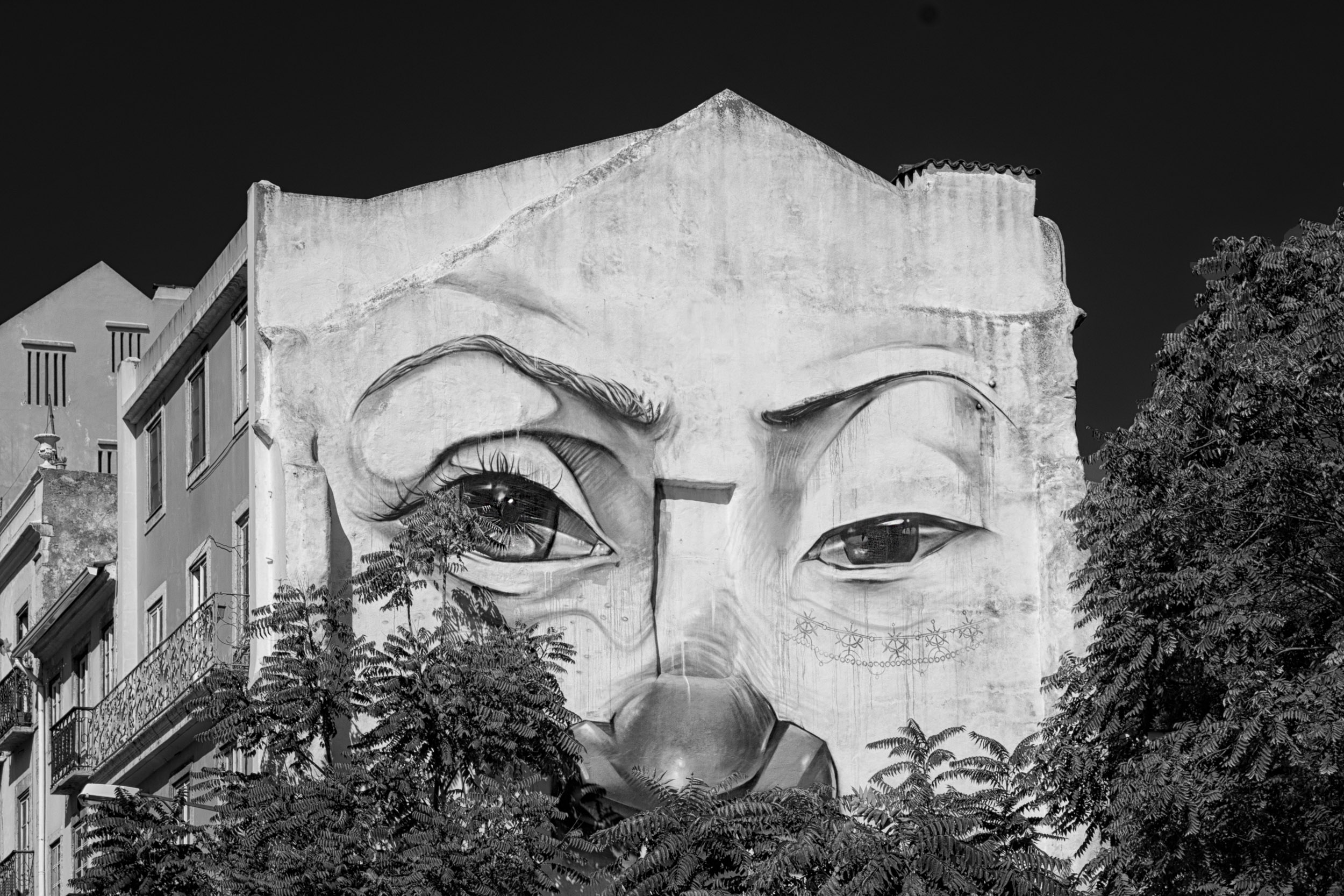
Your comment is interesting. I am doing a lesson on monochrome so turned everyone's image into monochrome to see how it looks. Color brings an added dimension to images because color has symbolic meaning and can draw and attract the eye.
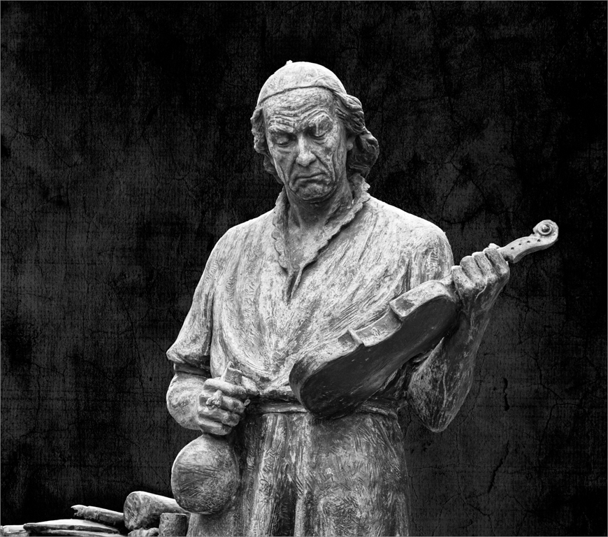
That is what fascinates me about Fat's image. It stands so wonderfully with its shapes and lines and the eye immediately goes to the dark area, his head and jacket and I ask where is this man gazing and what does he think. I do not need the catchlights in the man's eye to tell me where to look. The three white lines in the structure point to the man. Then the turn of the man's head points me to the right but not out of the image because I am held in by the black point, his head.
|
Jun 20th |
| 13 |
Jun 21 |
Reply |
Timothy
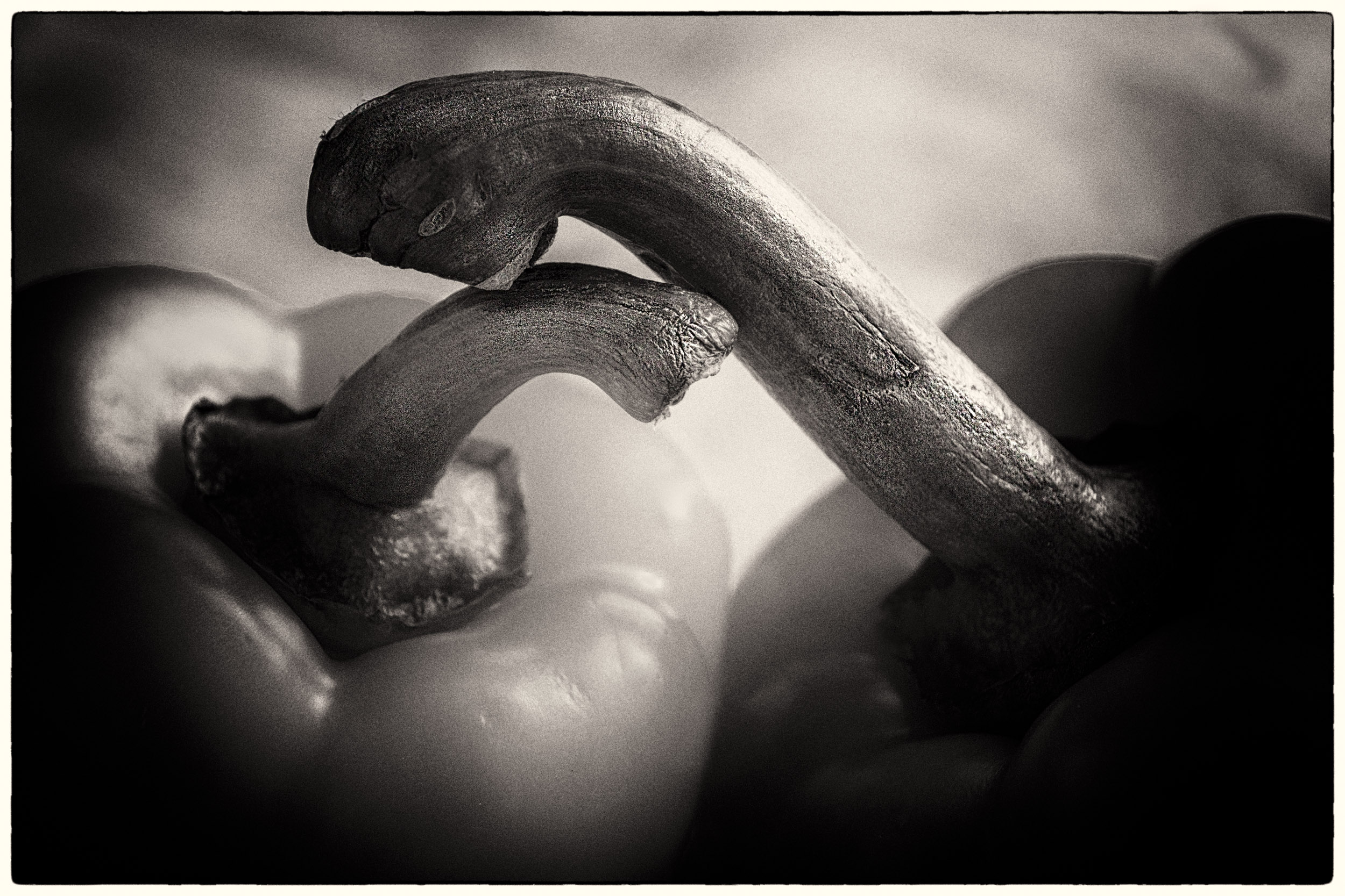
I completely understand the challenge of photograhing with covid restrictions. I am doing a course right now and resorting to creating an image with peppers and a colored toy. I read about Weston's famous pepper 30 image which was a six hour exposure. I figured my 30 secs with light painting was an improvement.
|
Jun 15th |
| 13 |
Jun 21 |
Reply |
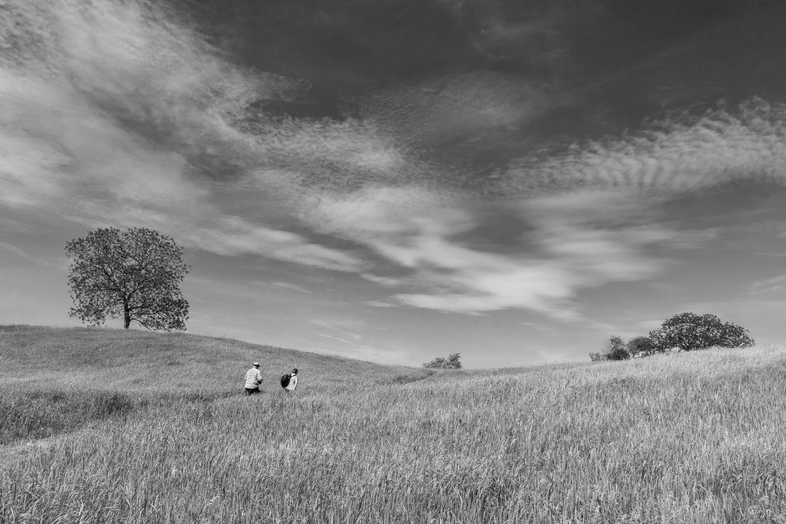
Steve
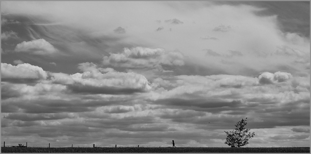
You have used various concepts from past rounds: minimalism, clouds and now two ones. Those clouds are eyegrappers but the two dark shapes of the boy and the tree grab my attention.
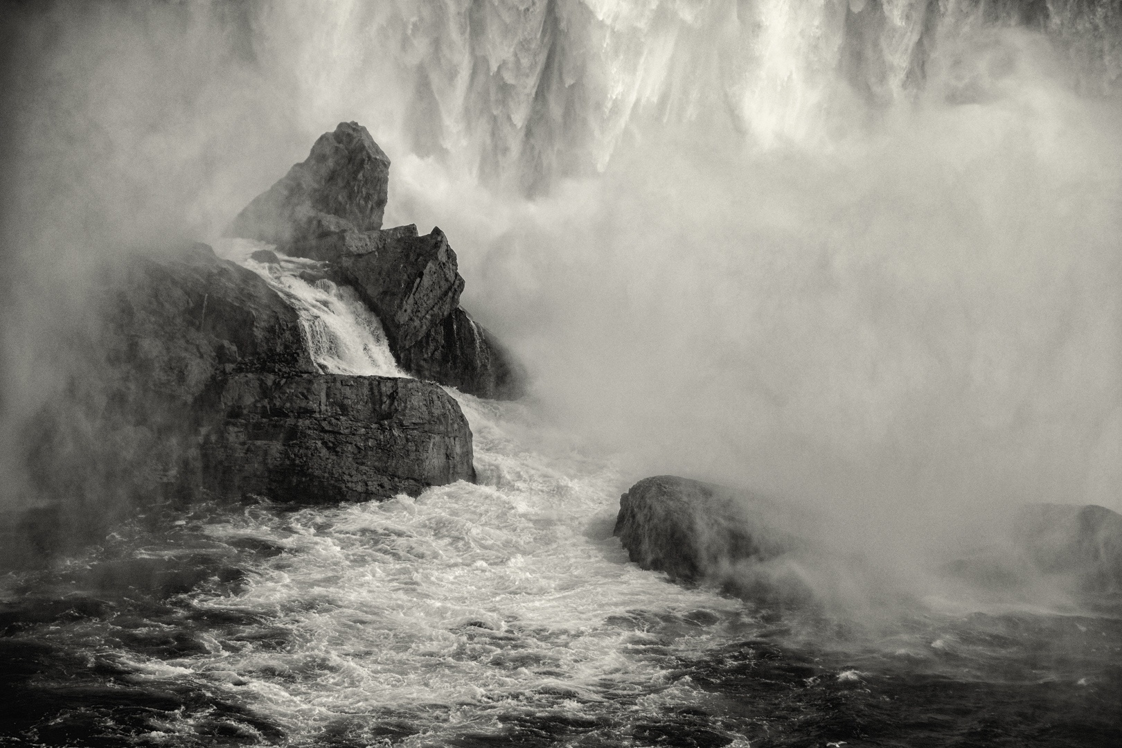
This month, I have been searching for landscape images to photograph and experiment with monochrome on so tried monochrome on your image. For the monochrome version, I increased the contrast using a gradient map PS adjustment layer and the PS BW adjustment area. I find the monochrome increases the feeling of isolation. From you image, I have a better understanding of what type of landscape images work better in monochrome.
Both color and monochrome versions work well. |
Jun 15th |
 |
| 13 |
Jun 21 |
Reply |
Paul
This is a powerful image with the rain pouring down.
For me, the main parts of the image are the turbulent sky and downpour. I think you could increase the visual impact but reducing the amount of water in the foreground, increasing the contrast, and burning some areas. In my VF attached, I cropped, burned the water, applied a luminosity mask to target dark areas in the sky and burn them, an to burn the orange area. The rain fall really popped.
I am studying monochrome this month and therefore converted your image to monochrome using the PS BW adjustment layer. This image also does well in monochrome and the downpour really stands out.
|
Jun 15th |
 |
| 13 |
Jun 21 |
Reply |
Barbara
I like the simplicity in the image, the placement of the bird and having him turned toward camera left. He is well set off against the plain background. Also I find good details in the shadow areas.
|
Jun 15th |
| 13 |
Jun 21 |
Comment |
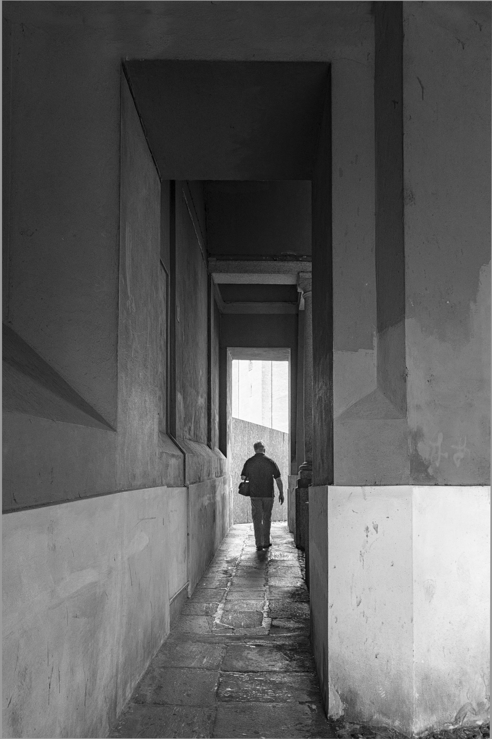
Fat
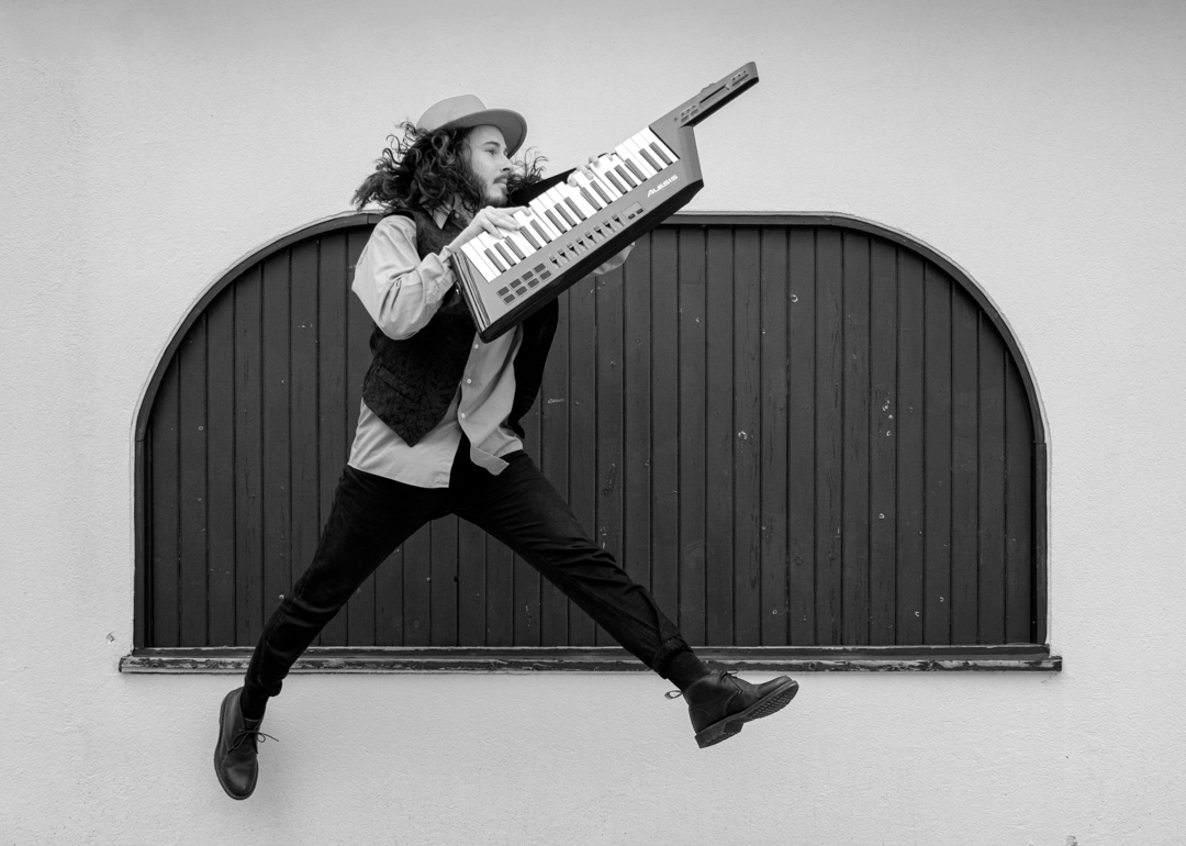
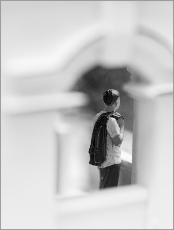
Well done. This is an interesting composition with the soft framing around the subject and my eye is immediately drawn to the area of dark contrast.
I noticed the bandage on the man's elbow which you might try removing. I do not think you need as large a frame and you might consider cropping tighter. Also, this image would do well in monochrome as another option. |
Jun 15th |
 |
| 13 |
Jun 21 |
Comment |
Timothy
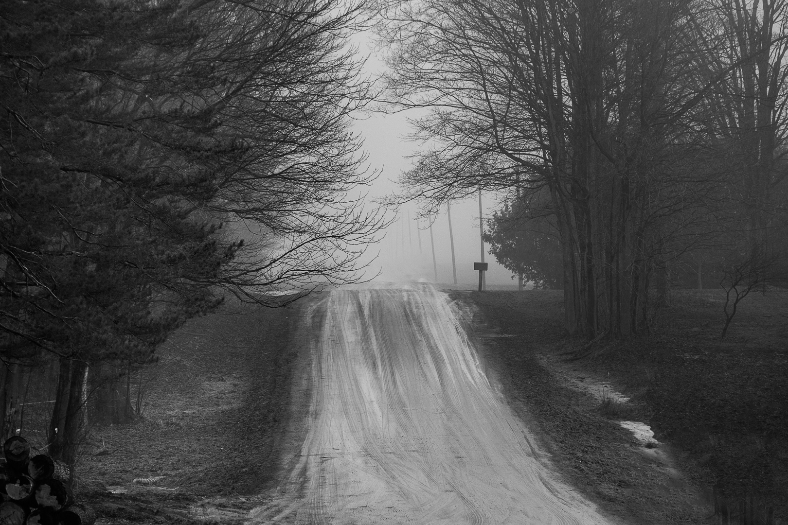
You have captured the desolation of early spring. The warm light brings hope.
I like the textures, shapes, and raking light and think that this image would also do well in monochrome. See VF attached. I used the PS BW adjustment layer, and also bumped up contrast with the gradient filter to illustrate monochrome. |
Jun 15th |
 |
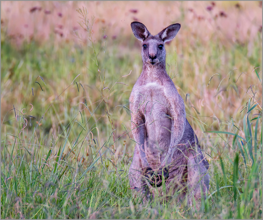
| 13 |
Jun 21 |
Reply |
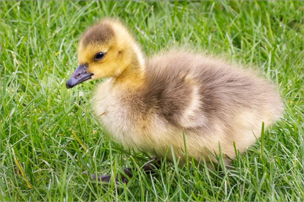
Wendy
She has posed beautifully for you and her eyes have good catclights. I like the soft pastel color palette and your composition and see the kangaroo blends in with the background.
To increase the visual impact, you might consider cropping tighter and burning the background. |
Jun 15th |
 |
2 comments - 8 replies for Group 13
|
2 comments - 8 replies Total
|