|
| Group |
Round |
C/R |
Comment |
Date |
Image |
| 13 |
Dec 20 |
Comment |
Paul
I am in two other groups: DDG monochrome and DSG competitive images. Check out our DDG 83 monochrome bulletin board where there is a discussion on vignetting.
Last month, I read the rules for nature competitive images where it said one should not use a vignette on a nature image. I hestitated to comment about the vignette because perhaps your intention was not a competitive image or fine art image. Thus, when I looked at your image, I thought about the use of vignettes.
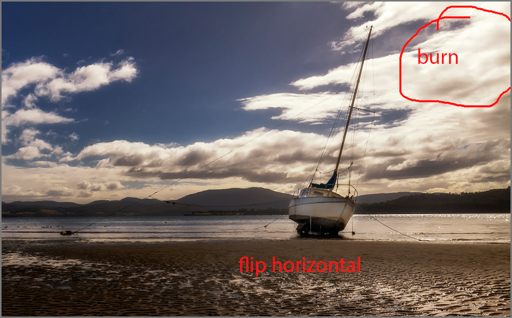
Having sailed for 30 years, the last 11 years off Vancouver Island, I understand your comments about unstable boats. With a sailboat, add the heeling. Perhaps that is why I never pursued photography as a hobby. One needs two hands to sail a boat... even if one hand is used to say cheers. |
Dec 13th |
| 13 |
Dec 20 |
Reply |
Steven
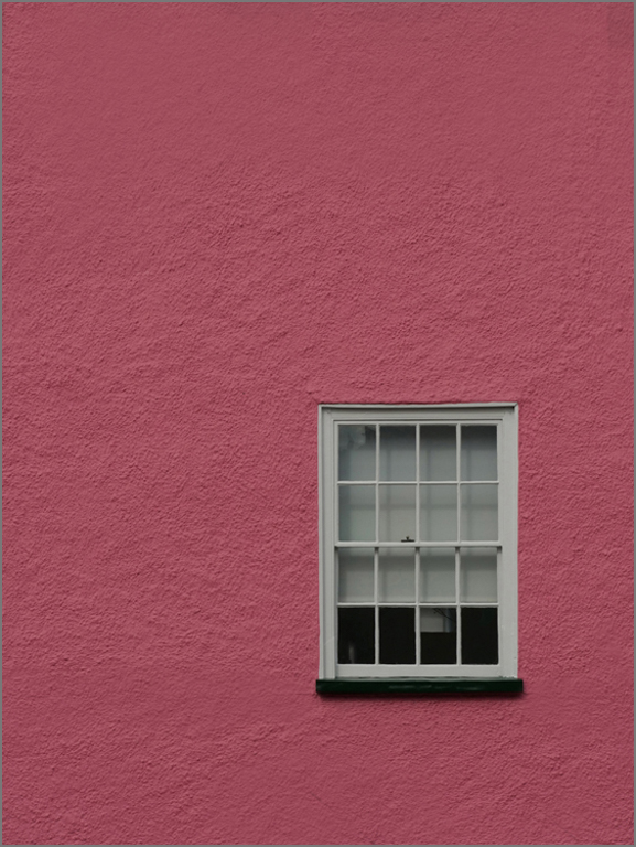
Thanks for letting me know what software you use. I use PS and am learning the power of the curve. It is perhaps a little bit more advanced technique. Your image was such a wonderful example to use this editing technique. The reason I had noted it was that someone had made this comment on an image I had done in my competitive images course. Therefore, my eye went to the lampshade.The interesting part about the image is that even though pink is a strong emotional color, the eye is attracted by the whiter/brighter greyish color, then the dark. |
Dec 12th |
| 13 |
Dec 20 |
Comment |
Fat
Your title is well chosen and the color, and lighting enhance the image.
This is a good example of minimalism. For me, there is too much empty space at the top and perhaps a horizontal crop may have worked better.
In a couple of areas, I noticed dust spots Also, in some areas the shadows go to complete black lacking any detail.
You can adjust your black point to bring back more detail or dodge.
|
Dec 8th |
| 13 |
Dec 20 |
Comment |
Wendy
For me, this is not a good example of a negative image. The background and foreground has too much detail and should be simple.
Some other general comments on this image. The boat and mast leaning starboard directs the eye to camera left out of the image while the light on the beach and the line to the mooring buoy from the mast to the buoy on port leads the eye outward to camera right. Try flipping the image horizontally.
Also, the highlights in the clouds camera right compete for attention and overwhelm the boat. Dodging the boat would defeat the intent of the low light image. I have circled where the highlights are blown out. I tested this with the eye dropper tool and would suggest burning the clouds in this area.
If I were critiquing this as a sailor, I would be asking who on earth would attach a line from the mast to the mooring bouy and ask why. I certainly would not want to be hoisted up the mast if the sea was rough to take down this line. Then, I would be making all sorts of different suggestions on how to safely moor. However, that is a separate discussion for a different venue. |
Dec 7th |
 |
| 13 |
Dec 20 |
Reply |
Steven
This is a good example of negative space, good composition, lighting, and simplicty which gives visual impact.
With the lighting, texture, shapes, and graphic design, this image would convert well into monochrome.
A suggestion for improvement, is to do a selection of the windows, apply a curve, and then bring up the black point slightly from 0 to about 5. Then the lampshade in the window shows more.
I understand you do not like detailed editing and this is such a marginal improvement to a strong image.
|
Dec 7th |
 |
| 13 |
Dec 20 |
Comment |
Paul
This is certainly a challenging image to photograph and a good example of negative space. The composition is well done.
However, the image is soft. Perhaps increasing your shutter speed might have helped.
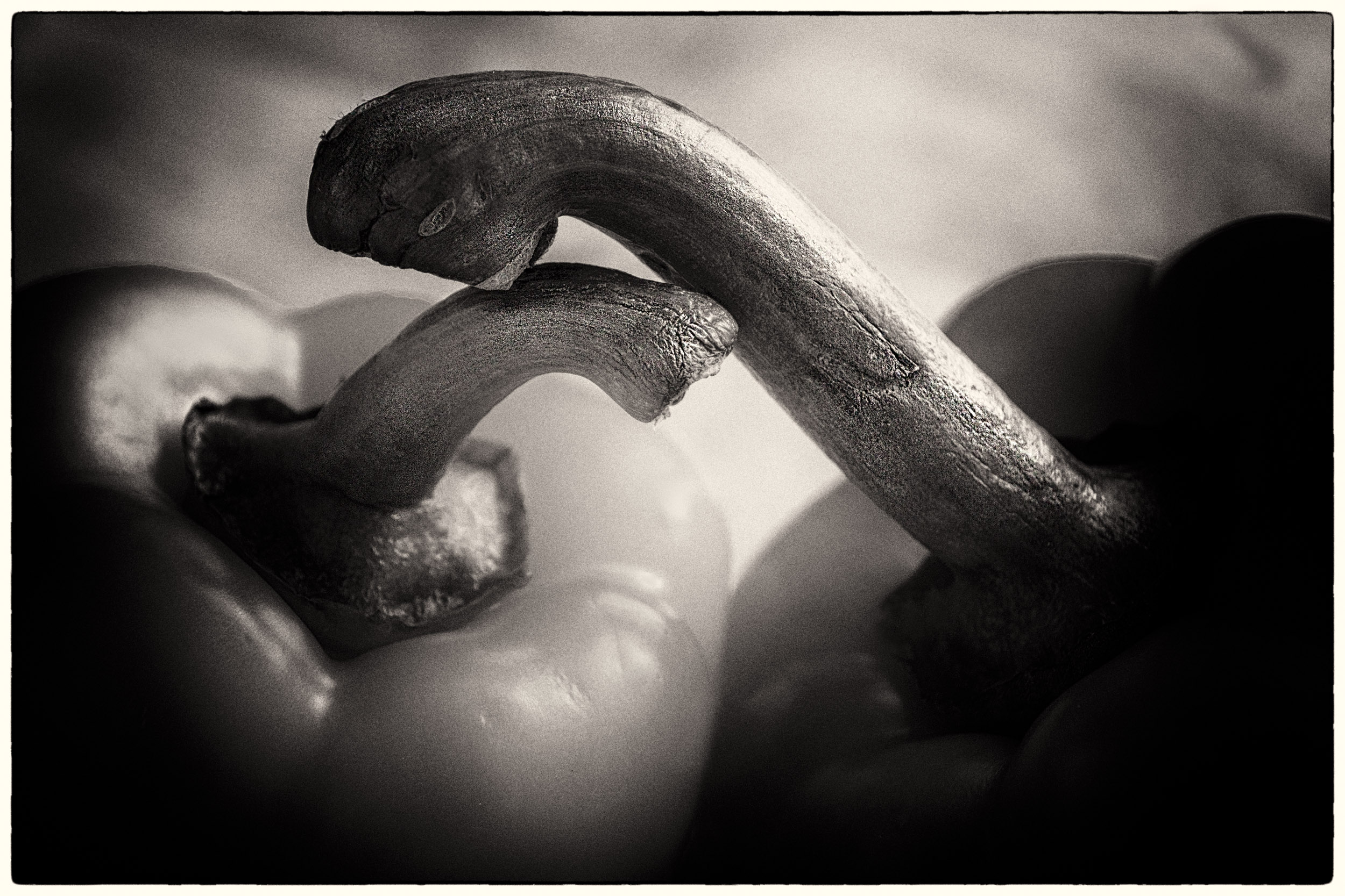
In this case, the vignetting is a distraction. When I put the image on my screen, because of the solid blue background, I can see the halo of circle lines from the vignette.
I have had this same problem recently creating selections and then putting the subject on a plain background. Thus I specifically checked for it in this image to see if it occured. |
Dec 7th |
| 13 |
Dec 20 |
Comment |
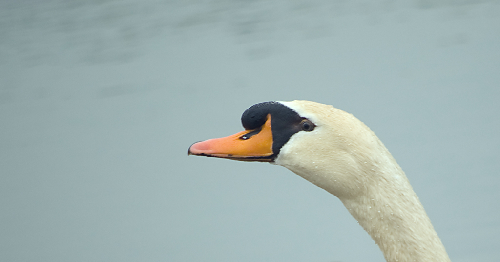
Barbara
This is a good example of negative space, composition, perspective, color, lighting,which gives the image visual impact. The ripples in the water and reflection add drama.
The reflection in the image add an additional element to this composition and story and make it more than a bird in the water image.
With your lighting, you were able to create a catchlight in the eye and the lighting helped create the texture in the feathers. The image is well exposed and you did a good job of exposing/editing to not blow out highlights in the white.
I have no suggestions for improvment. Well done. |
Dec 7th |
| 13 |
Dec 20 |
Comment |
Timothy
This is a good example of minimalism.
For me, the light on the bird is flat. Thus it was difficult to get good texture detail in the feathers or a catchlight in the eye.
To tease more texture out of the file, in PS, I applied a curve level and raised the midpoint contrast. Also, I raised the black point to moving the point from 0 to 5 to see if I could get more detail in the black. Then, I adjusted the blue curve, moving the slider to the level.
I also suggest a tweaking of your crop to bring the eye more to the crash point.
See what you think. |
Dec 7th |
 |
6 comments - 2 replies for Group 13
|
| 83 |
Dec 20 |
Reply |
Lance
Thank you for responding and clarifying that blown out highlights are unacceptable.
As written on our bulletin board, I am now totally confused what I am to be commenting on in a monochrome image. There are items which deal with aesthetics and others which deal with technical criteria.
Two months back, that was a comment posted in response to a critique I gave on an image. The person commenting instructs in LR and PS. Consequently, if I had not been exposed to other viewpoints, I would have accepted this answer. My dilemna was do I respond back to an authority suggesting how to fix it, or do I let it pass.
However, given my modus operandi, I researched it, commented back, stated under Dianne's image that this was one of my review criteria, posted the comment on our bulletin board, and now under Dianne's image, and you have kindly clarified the matter.
It has taken all this effort on my part, to have one simple technical item clarified.
|
Dec 29th |
| 83 |
Dec 20 |
Reply |
Lance
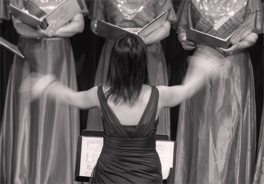
I used the word journalistic in the sense of telling a story, not in the sense of photojournalism. I connected the hand movement with the score sheet. |
Dec 28th |
| 83 |
Dec 20 |
Reply |
Jose
This is an interesting image to explore. My first reaction was to crop it and put the attention on the subject. Looking at it a couple of weeks later, I realize the background helps tell the story of the street.
Street photography is a unique genre that challenges us to go beyond the conventional rules. |
Dec 24th |
| 83 |
Dec 20 |
Reply |
Debashish
In my writeup, the first sentence, I stated that my intention was to demonstrate motion. I did the image for the PSA basic course, which asked for an image to demonstrate motion. Nowhere in my text have I mentioned that I was capturing a journalistic image or editing to meet photojournalism requirements.
Also, I state that I used the HDR filter in SEP to enhance motion. For a photojournalism image, one is not allowed to use vignettes, clone, spot remove, or enhance the image.
I set my camera on manual, f 7.1 because this is close to the sweet spot, 1/10 sec. because I wanted to create a blurred effect, and auto ISO because I wanted to be able to change the shutter speed not knowing which speed would work best to capture blurred hand movement but clear detail on the conductor.
Your suggestion of a higher ISO is valid if I wanted to stop the hand motion. In fact, I did try higher shutter speeds up to 1/60 sec to see the comparison and the ISO increased.
In the future, I shall try to be more specific about why I chose certain camera settings and the type of image I am submitting.
I thought of clarifying that this was not a photojournalism image when Dianne mentioned it but hesitated. Given, your comment, I shall set the record straight. |
Dec 22nd |
| 83 |
Dec 20 |
Comment |
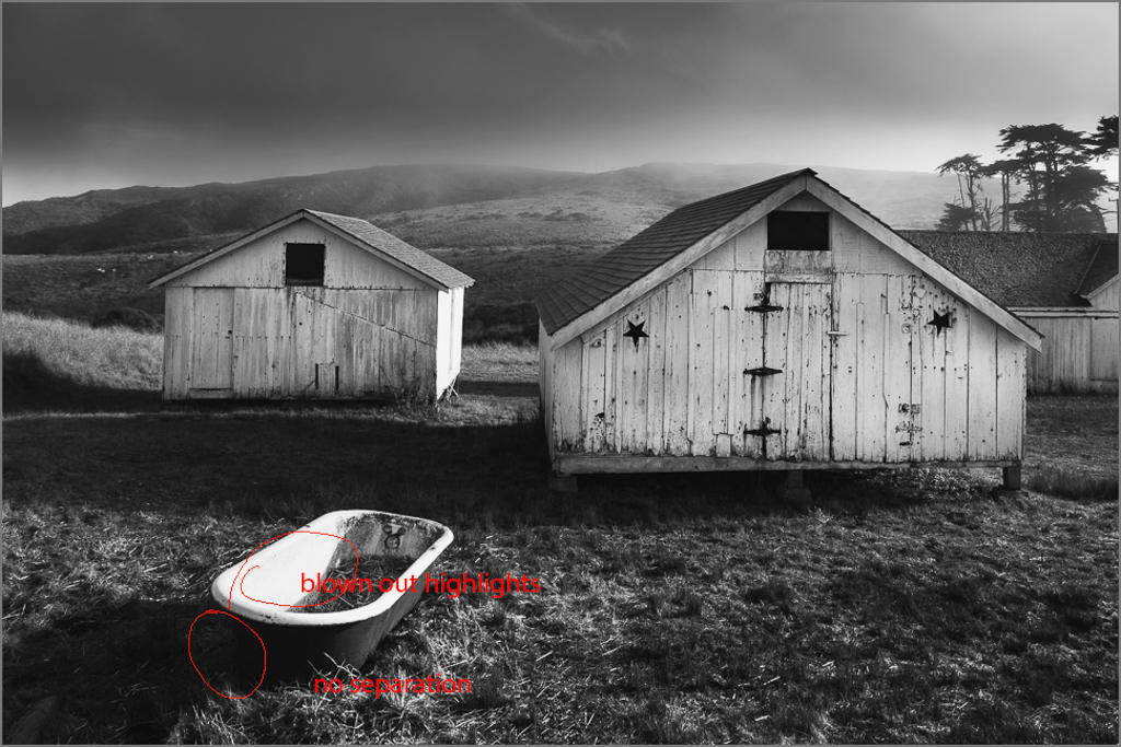
Dianne
It is interesting to see the progression in your images as you explore the same location with new insite.
People differ in their opinion concerning how to deal with black, white and shadow in monochrome. One school says, a good monochrome image should cover the complete tonal range from black to white. A second school is there can be complete black but there should be detail in the white with no blown out highlights. A third says, there can be complete black but if two black objects are adjacent there should be tonal or structural separation between the objects so that they do not merge. A fourth school says, if it appears natural, then do not worry about blown out highlights. A fifth school states, an image needs to reflect an aesthetic which may not espouse the complete range of black or white but tones in between.
I approached your image to 1) remove blown out highlights: 2) create separation in key darks; and 3) look at composition.
Please see my visual feedback attached. In PS, I applied a curve, raised the black point, then adjusted the curve to maintain the contrast. Also, I lowered the white point to bring back detail into the bathtub and it softens the glare.
For me, the tub is an anchor point for this image, thus this extra editing was warranted.
Also, I provided an alternative crop which makes the tub more predominant and the tub acts like a leading line with its diagonal. Because the barn camera right is natural larger, the eye moves in a triangle from the tub, to the barn camera right to the small barn and then back.
Also, this crop, reduces the drawing power of the sky on camera left.
See what you think. Please let me know if you find the visual feedback image useful in terms of editing. The adjustments are marginal. It takes time to do and if it is not considered helpful, I shall eliminate this step in my next round of critiquing images.
|
Dec 13th |
 |
| 83 |
Dec 20 |
Reply |
Joe
Perhaps you misunderstood. I was complimenting you on being able to see the leading lines of both the roller coaster and the sidewalk - one curved and one straight. The image is so well seen. |
Dec 13th |
| 83 |
Dec 20 |
Reply |
Lance
Monochrome is complex both creating and commenting on an image.
The images this month have taught me the importance of understanding the artists' intent and how he/she renders it in monochrome. It has also taught me that no one editing method fits all.
There is such a range of possibilities from high key, low key, complete detail in the highlights and shadows, to a full range of black and white to create maximum visual impact.
|
Dec 8th |
| 83 |
Dec 20 |
Reply |
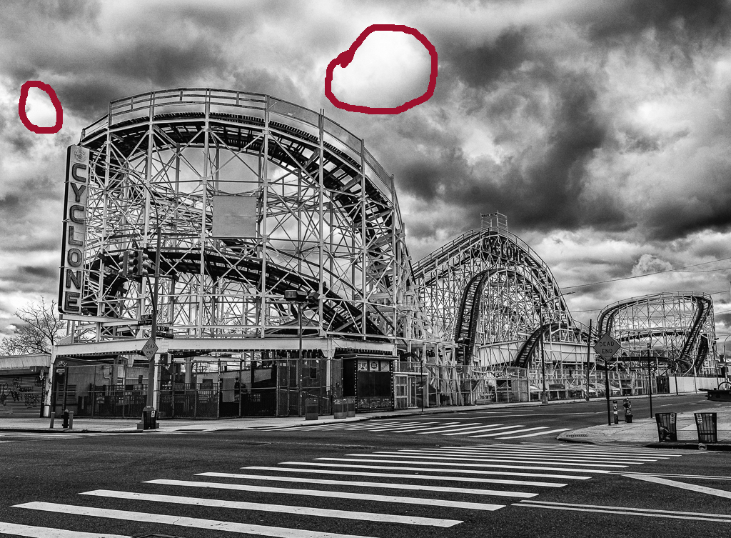
Joe
You may have misunderstood my point about the cross walk. I like very much how the lines in the cross walk also move my eye out of the image, and you have done a wonderful job tying together the movement of the lines in the walk with the overall direction of the lines in the roller coaster. Also the pattern of light and shadow in the clouds also moves the eye from camera left to camera right.
I have had to ponder what is acceptable or not acceptable editing with nature and fine art monochrome images. Just because the highlights are blown out in an image and naturally there, does not mean one cannot tone the highlights down by burning slightly.
In a 10 sec glance at the image, most people would not even notice this and wonder what I am commenting about. Perhaps, I have been picky because I have had to prepare images for my DSG 52 competitive images group and carefully looking at the white and black points, and check with the eyedropper tool for blown out highlights or lack of detail in shadows. This is a time consuming excercise to check this on our groups images. However, I find it worth it, to educate me on the fine points of monochrome editing.
How we edit, setting the black and white point determines the output of the image. In PS, I applied a curve to your image, raised the black point from input 250 to output 250, and lowered the white point from 255 to 250, it dealt with the blownout highlights. Therefore, without dodging one can deal with the blownout highlights. The image still retains the contrast. If you find you wish more, you can still manipulate the curve.
|
Dec 7th |
| 83 |
Dec 20 |
Comment |
Lance
I like the balance in the composition of your selected image compared to the original 1 and 2.
In your selected image, you have captured light, and texture quite well However, I do not feel that there is a strong play of shadow probably because of the direction of the sun shining from camera left to camera right.
If this image is digital, is it possible to create a little more tonal separation between the tree leaves and the background. The leaves seem to melt into the wall.
|
Dec 6th |
| 83 |
Dec 20 |
Comment |
Jose
You explained why the man is wearing sun glasses.
For me, the strength of this image is the man's face so beautifully lit and the puff of smoke. Your timing was excellent.
Did you consider a tighter crop that would bring more attention to the man? (See attached).
A second suggestion retaining your oiriginal crop is to burn the highlighted areas on the cars so the highlights attract less visual attention. |
Dec 6th |
 |
| 83 |
Dec 20 |
Reply |
Joe
This location makes a wonderful study for a portfolio with a variety of shapes, angles, and lines and possibilities for both distant and closeup images.
The heavy clouds and sky add additional drama. Did you use the new PS sky replacement feature.
The leading lines on the road way, and the directional lines of the curves in the roller coast both move my eye from left to right out of the image.
On the visual feedback attached, I have circled to areas which go almost to complete white and would suggest burning slightly. I used the curve eye dropper tool to identify these areas after noting them visually. |
Dec 6th |
 |
| 83 |
Dec 20 |
Comment |
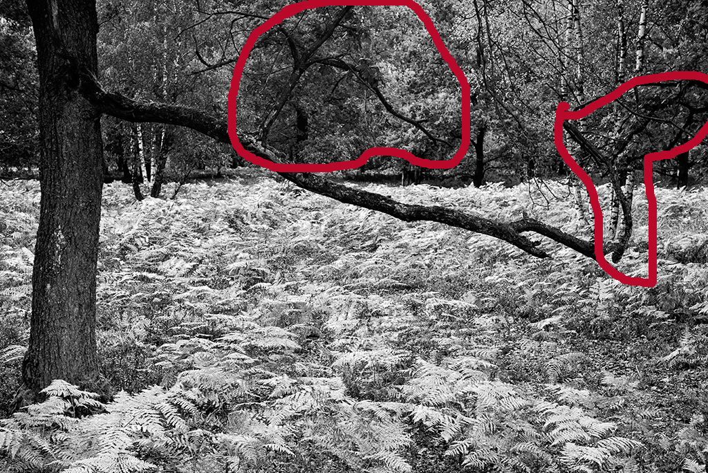
Dirk
This image for me is slighly surrealistic. I cannot tell if the areas circled are branches of the tree on the left or are separate trees.
I like the light airy feeling of the foreground, and you have captured the variety of textures in the landscape.
My eye goes the horizontal tree branch which becomes the subject rather than the entire scene. Perhaps another angle might have worked better. |
Dec 6th |
 |
| 83 |
Dec 20 |
Reply |
Debasish
This image makes me miss my sailing days and looking at the pattern of the waves as they roll into shore.
The image has a beautiful curving line that leads the eye to the left outside the image while the repetition of lines moves the eye from left to right and has an interesting pattern.
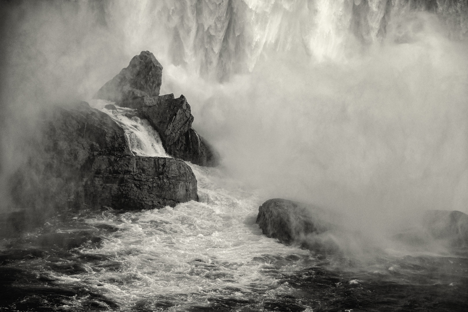
You might consider dodging very slightly the midtone area in upper right corner which competes slightly for attention with the curve of the top of the waves. |
Dec 6th |
| 83 |
Dec 20 |
Comment |
Unfortunately, there is not much more on the left side of this image.
I took the image from quite a distance at the top of the balconey and extended my lens to the maximum i.e.300 mm or 450 mm if it were a full frame.
JPS |
Dec 6th |
5 comments - 9 replies for Group 83
|
11 comments - 11 replies Total
|