|
| Group |
Round |
C/R |
Comment |
Date |
Image |
| 13 |
Oct 20 |
Comment |
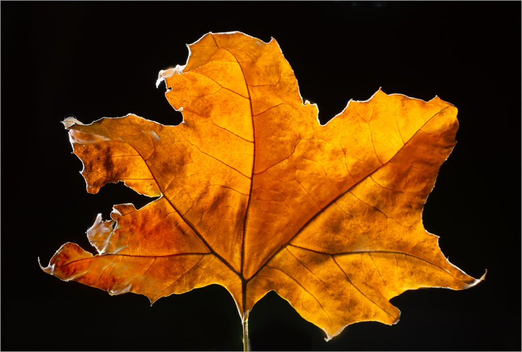
Thank you for the various suggestions.
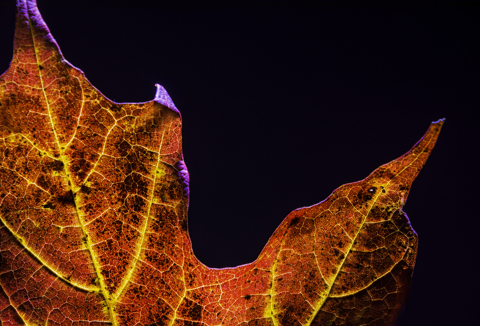
Backlighting a fallen leaf is such a challenge. I pulled the table away from the wall so that the back wall was 8 ft away. This solved some problems. |
Oct 21st |
 |
| 13 |
Oct 20 |
Comment |
Ste
I was thinking about the old union jack. I realized my mistake yesterday and wondered who would catch it. Well done. See attached. |
Oct 15th |
 |
| 13 |
Oct 20 |
Comment |
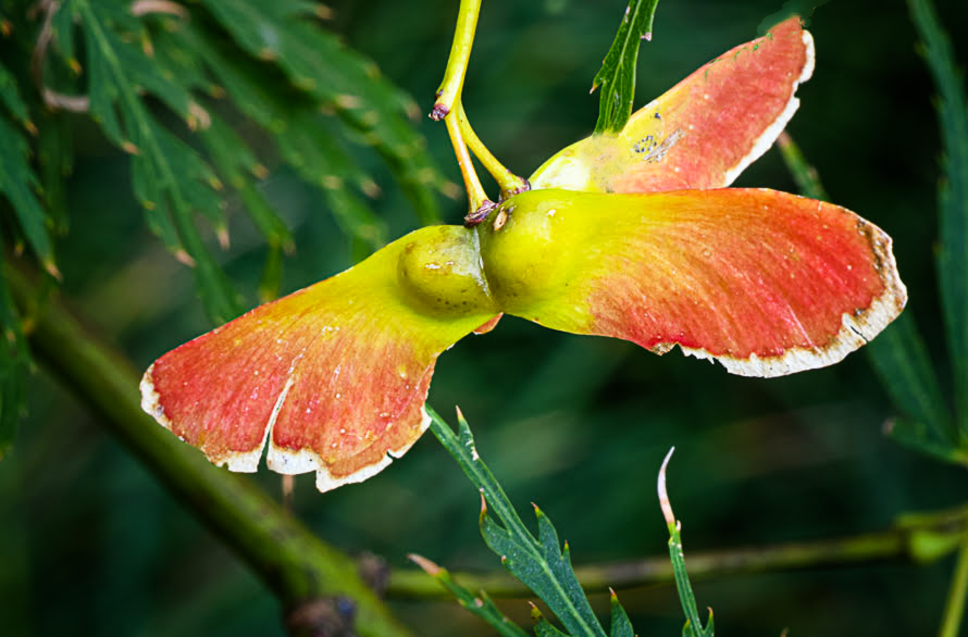
Steve
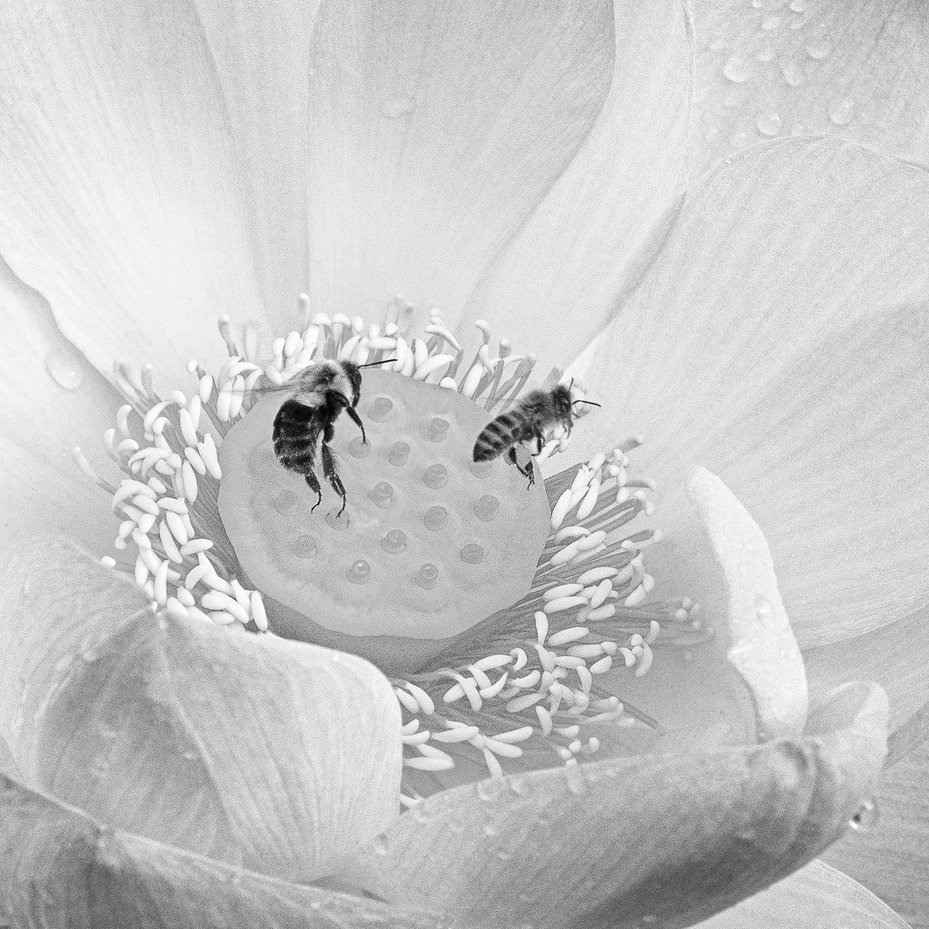
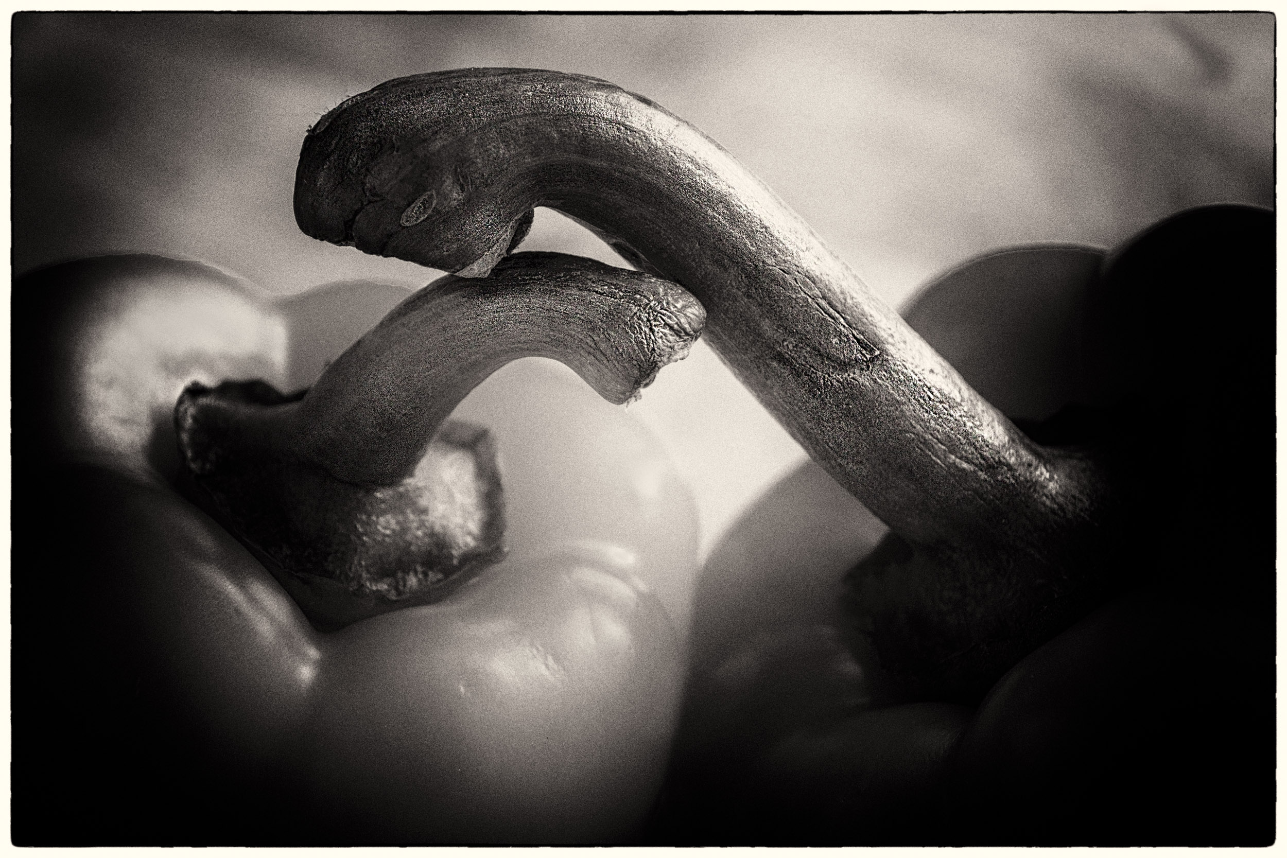
You raised two good points. To light paint, I use an LED flashlight that has a blue color tone. The black foam core, when light painted turns a blue color. I can adjust the tint on the temperature slider (LR) to create a black background. However, I wanted to use analogous colors in this image i.e. red and purple. Also, since it was a maple leaf, I was thinking of the colors in the Canadian flag: red, white and blue so I kept the background in a blue/purple tone. Purple is a royal color, red is dominant. Yellow and red are analogous. Using yellow, it is best not to have it to dominant. The yellow color attracts the eye helping to draw it in two directions. This is reinforced by the direction of the two leafs at an angle. One line of yellow stops in the composition while the other moves the eye out of the composition hinting that there is something more out there.
This image is entirely backlit. Thus the purple tone on the leaf, comes from the flashlight and the background, bouncing color onto the leaf. Because the leaf is ed toward the camera, it is very difficult to light paint it from the back and not get a dark blob. With dark pixels, there is little information, thus one can not dodge. I would have to clone out the blue fringe or paint this area with a brush, picking up a red tone from the leaf. For me, I liked the blue tinge because it shows backlighting so kept it that way. Also, I was trying to produce an image which required minimal editing other than moving global sliders.
Re, the leaf at the top being cut off, I would have liked more space at the top but my comment above explains why I retained this crop.
I do not have a macro lens. Therefore, I used my 18-300 mm full out which on a crop sensor is 450 mm. I had to think through the distance of my camera to the subject, given 450 mm, and chose to cut off the top slightly to balance the image. Thus two sides of the iamge are cropped, left and top,and I am still able to work with the yellow lines in the image. It is alright not to have the whole leaf in the image. One has to think through the balance of the composition and intent.
Subsequent to posting this image, I watched the PSA webinar on macro photography by Dan Needles. Wonderful. Also, I watched the Jackie Krammer video on floral photography and attended our camera club zoom meeting on floral photography. So many of my misunderstandings about macro have been cleared up about lens choice, techniques etc. I will redo this image, using a shorter focal length to put the whole leaf in the image.
I hope the above addresses your points. Raising them, you made me further look at this image and verbalize my artistic choices. |
Oct 13th |
| 13 |
Oct 20 |
Comment |
Steve
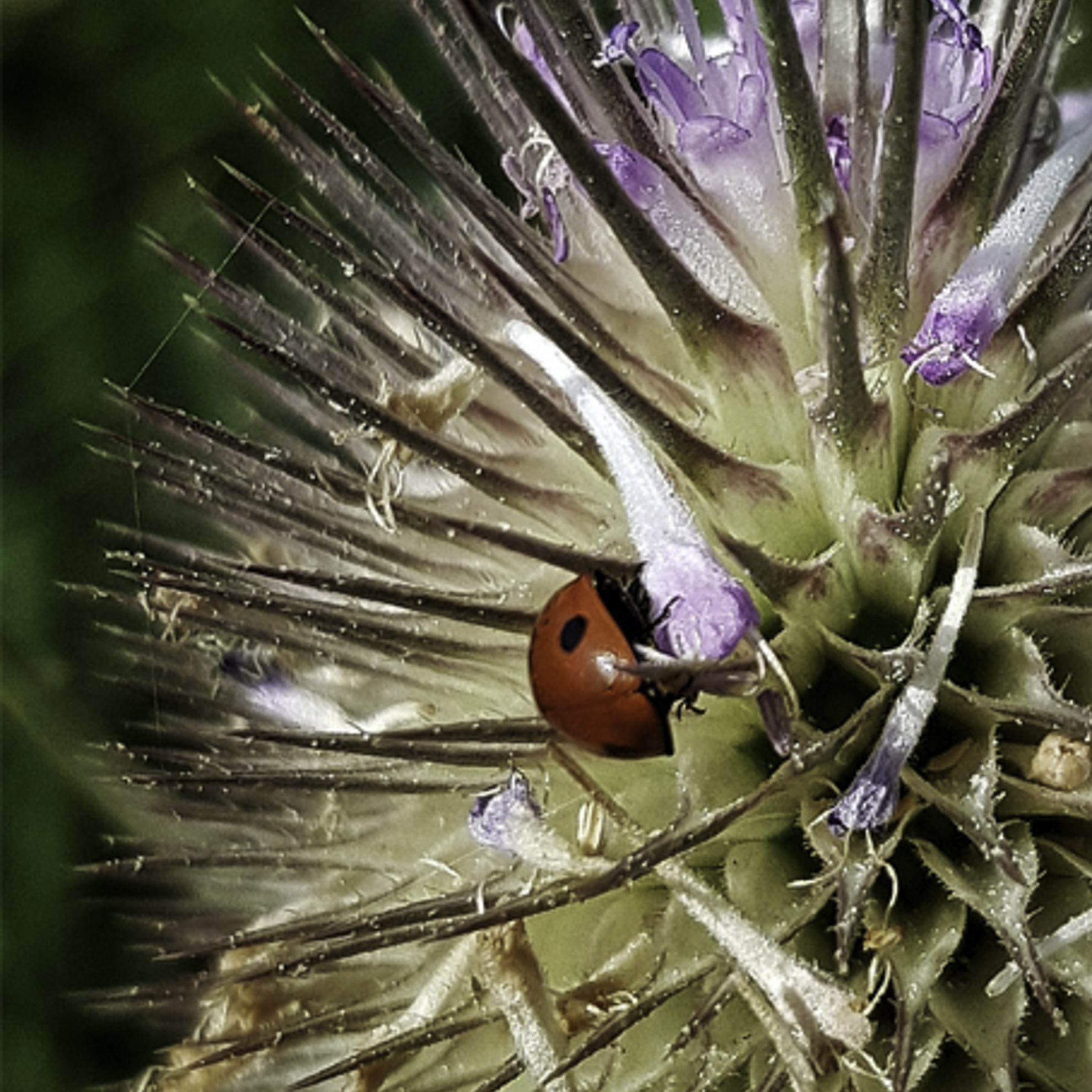
I am glad you commented back. This month, for my new DSG, I wrote an intent statement to help me focus on what it was that I trying to capture in my image.
Given your intent, my crop missed the mark since I focused on the ladybug. I thought your intent was photographing the bug. This image also taught me that I have to look up terms when I do not understand them (i.e. teasel). |
Oct 13th |
| 13 |
Oct 20 |
Comment |
Till
This is an interesting subject to photograph. You have used color (orange and green complementary) and lighting well.
If you wished this to be a portrait of the seed, you might consider:
1. tighter crop and moving the sleed slightly to camera right (less centred).
2. removing leafs on the seed which are distracting
3. increasing the brightness on the seed pod, and darkening the background to make the pod stand out more
If you wished to have minimum editing, next time, you could eliminate distractions on your subject by changing your position, or tying back the overlapping leaf.
It depends on your intent: environmental vs portrait image.
I have attached a suggestion for another crop, and removed a leaf covering the pod for you to consider. However, I still kept the framing around the pod. |
Oct 9th |
 |
| 13 |
Oct 20 |
Comment |
Wendy
This image has good visual impact, composition, leading lines to move one's eye through the image, and an attractive use of complementary colors. The side lighting helps create dimension in the ?????.
You might wish to consider flipping the image horizontally which changes the the movement of leading lines of the leave from left to right. I understand that this would change light direction. |
Oct 6th |
| 13 |
Oct 20 |
Comment |
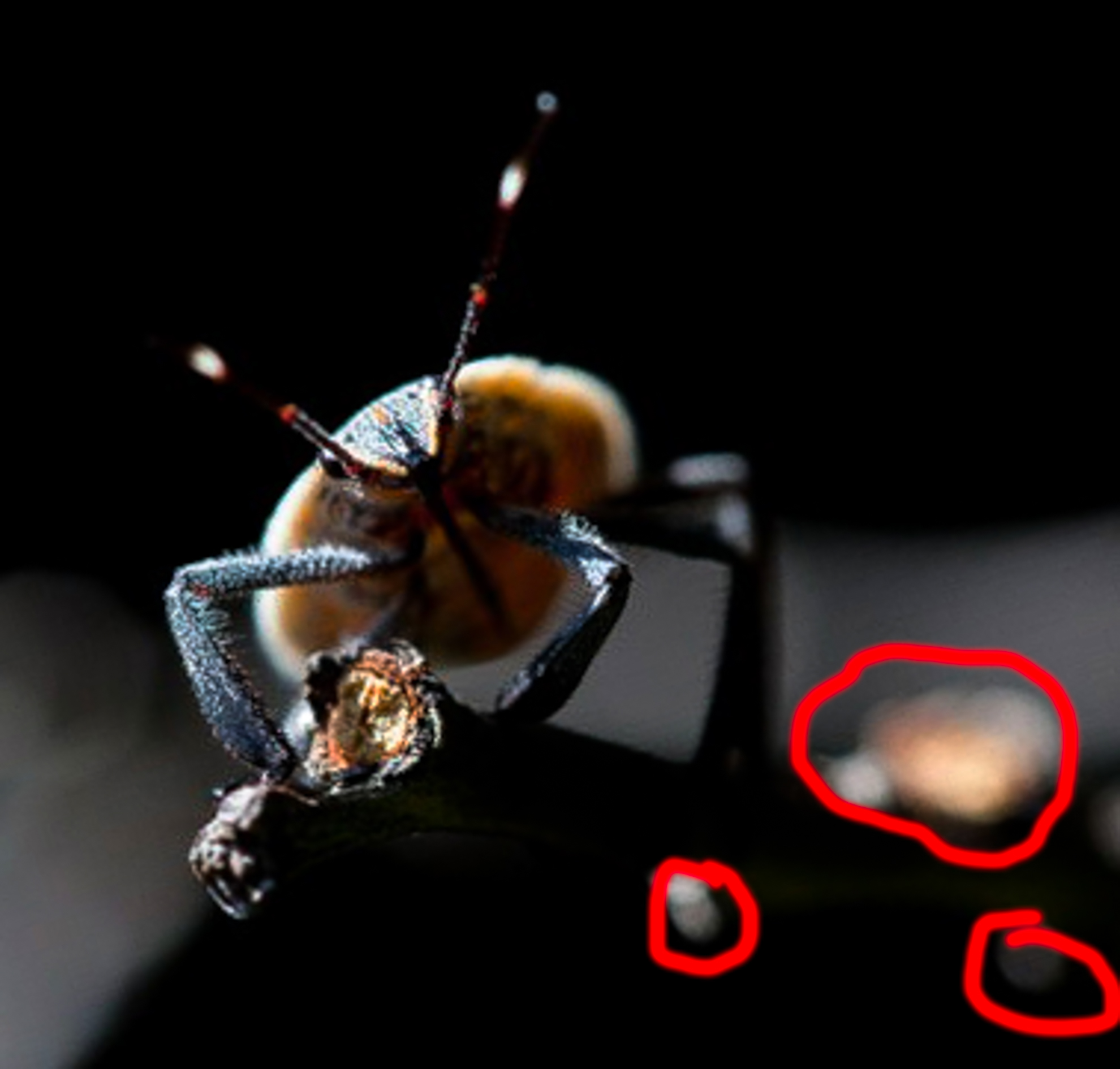
Chen
You found an interesting subject and are fortunate to have a macro lens to use.
Some things you might want to consider.
. if your subject is the insect crop tighter to draw attention to the insect.
. check your background. The branches in the background are so bright that one looks at the background rather than the insect. Move your position.
. there is interesting side lighting on camera left that helps show detaail. However, on camera right the bug is dark with no detail. Even when I tried to dodge this areas (i.e. paint with a white paint brush) the area is completely dark and no detail could be recovered.
I have attached a feedback image, where I cropped tighter, and dodged to brighten up detail. |
Oct 6th |
 |
| 13 |
Oct 20 |
Reply |
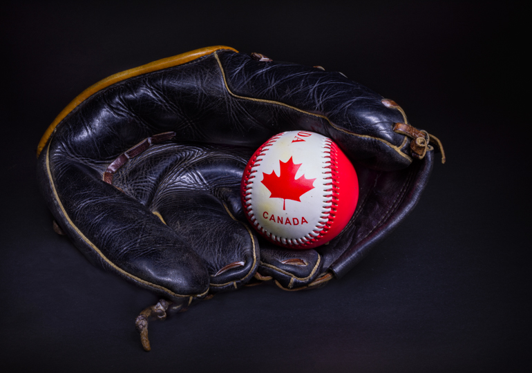
Tim
Thanks for sending me the coins. I used it to create this image. |
Oct 5th |
 |
| 13 |
Oct 20 |
Comment |
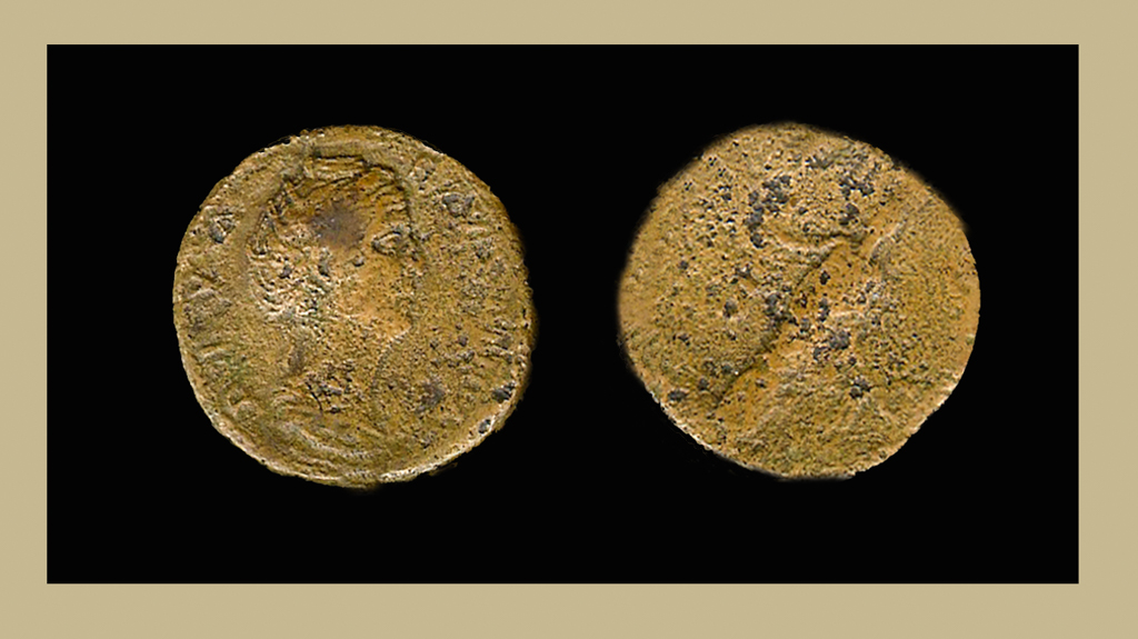
Timothy
It is such a beautiful coin. It would be interesting to show us how it looked set against a lovely rich background i.e. black. I admired your ingenuity and it is important to experiment. |
Oct 4th |
| 13 |
Oct 20 |
Comment |
Stephen
You photographed an interesting subject whose bright red stands out against a busy background.
For me the yellow and green stem at the top of the iamge is distracting. Keeping with your philosohy of minimal editing would you consider a tighter crop at the top to remove the stem. This would bring more attention to the bug making him the main subject.
|
Oct 3rd |
 |
| 13 |
Oct 20 |
Comment |
Barbara
You handled the challenge of photographing on a white background well to create an even white. Also, you created a good abstract with a strong leading line.
I see that some areas, under the wing lack detail, and perhaps, you could brush on reduced exposure in that area.
Did you consider doing a selection of the wing, creating a solid fill background, and choosing a color which complemented the wing. I tried three versions picking out a green, a grey, and a black and felt that it made the image more dramatic.
It is a matter of taste and your intent - an abstract or duplicating the original image.
|
Oct 3rd |
| 13 |
Oct 20 |
Comment |
Timothy
What an interesting story about the coins. You certainly challenged yourself thinking of a different way two show two sides of the same coin.
Since you had photographed both sides of the coins separately, would it have been simpler to create a canvas, and copy the two images on to the same canvas. You still could have crated the border to frame the coins.
With your technique, I see dust spots on the white, blown out highlights in the top corners (drag your temperature slider on the corners), and a distracting shadow at the top of both coins. Also, there is a difference in the lighting pattern. For me, this distracts from the beauty of the coins.
|
Oct 3rd |
12 comments - 1 reply for Group 13
|
| 32 |
Oct 20 |
Comment |
https://www.tandfonline.com/
I cannot explain the bowditch device. I wondered if it referred to a survey technique.
|
Oct 13th |
| 32 |
Oct 20 |
Comment |
Stephen
Google it. |
Oct 13th |
| 32 |
Oct 20 |
Comment |
Stephen
You have inspired me to take the big box of ropes and boat jewelry from our sailboat and photograph it. I wanted to create themes of what was important to me related to sailing. I did an image that just had too many things and I realize that if I combined a couple of the items with a rope, it might make an interesting composition i.e. Bowditch, nautical compass, antique binoculars, captain's hat, hand held radio. I also enjoyed looking at Asbjorn's image. |
Oct 13th |
3 comments - 0 replies for Group 32
|
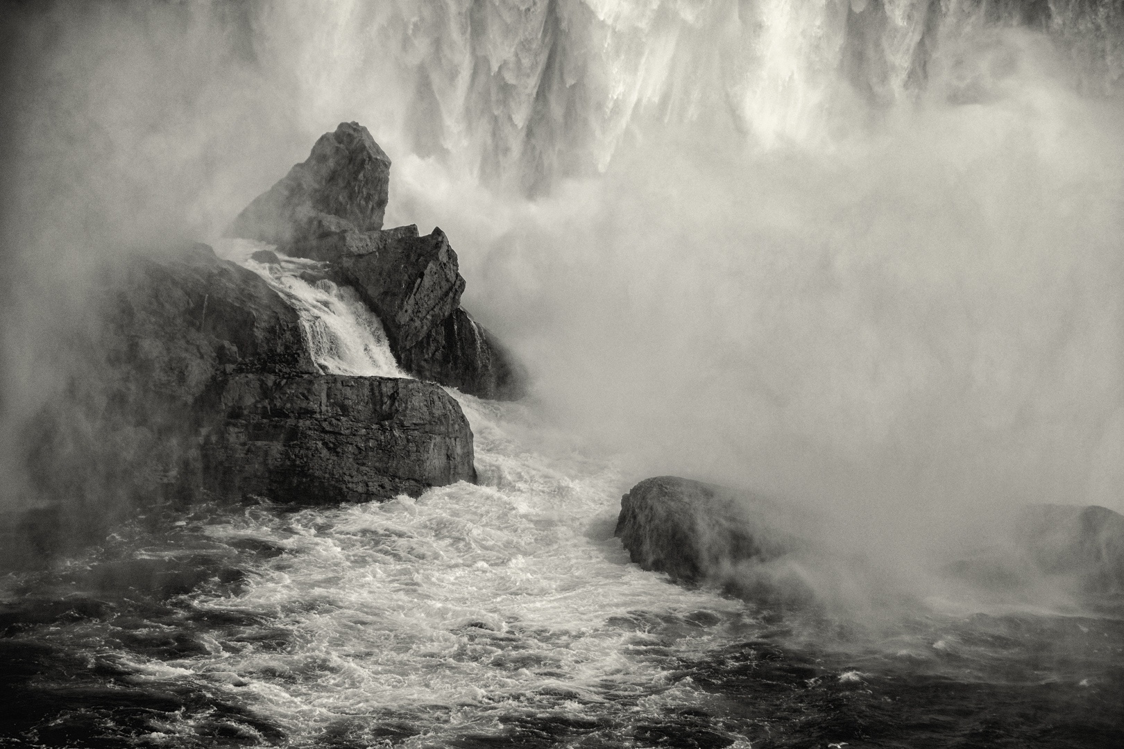
| 83 |
Oct 20 |
Reply |
Joe
I noted that I missed your PSA webinar. This prompted me to look at your bio and I clicked to follow the various links.
Given your background with teaching and writing, you must have wondered, who is this lady tellling your you have mergers.
I very much liked reading about Sunday dinner and who sat around the table. I understan the spirited debates of an Italian household. Sometimes one has to call time out or act as referee. I shall enjoy the lively debate on our site.
Given your background, it will be good to read your comments on the individual members images. We learn from one another. |
Oct 29th |
| 83 |
Oct 20 |
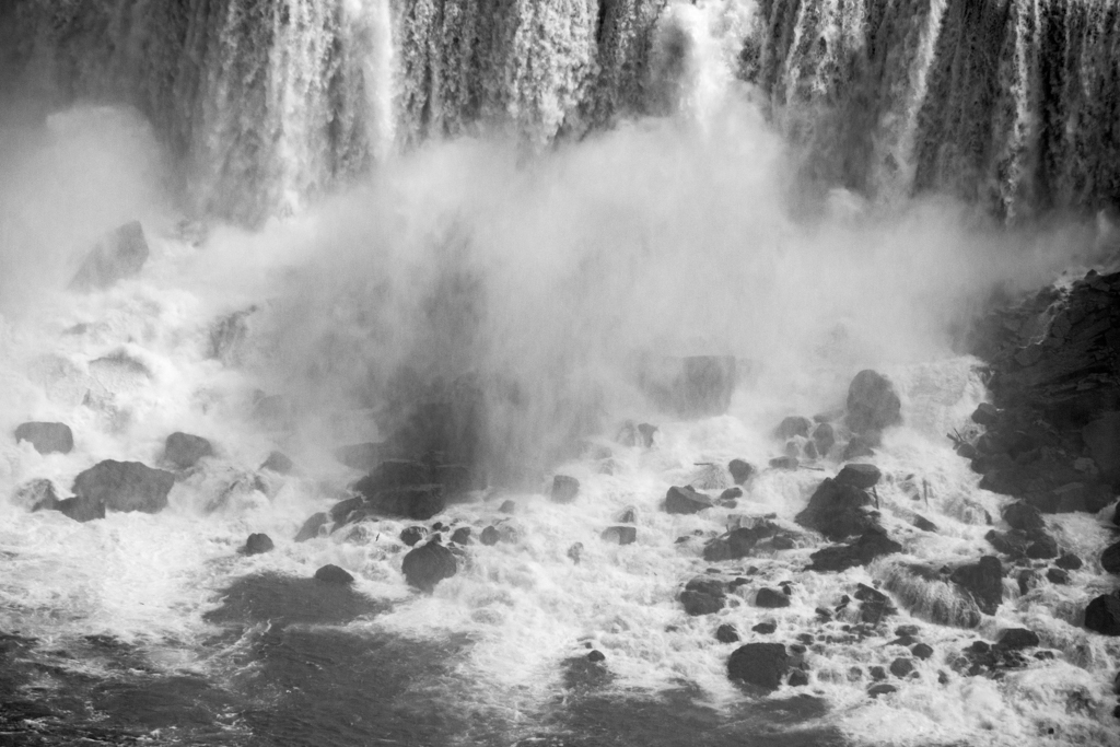
Comment |
Jose
I learned how to use the Nik CEP procontrast filter with control pointsplaced where I want the contrast. It is a much better technique than applying the filter globally for the waterfall. |
Oct 27th |
| 83 |
Oct 20 |
Reply |
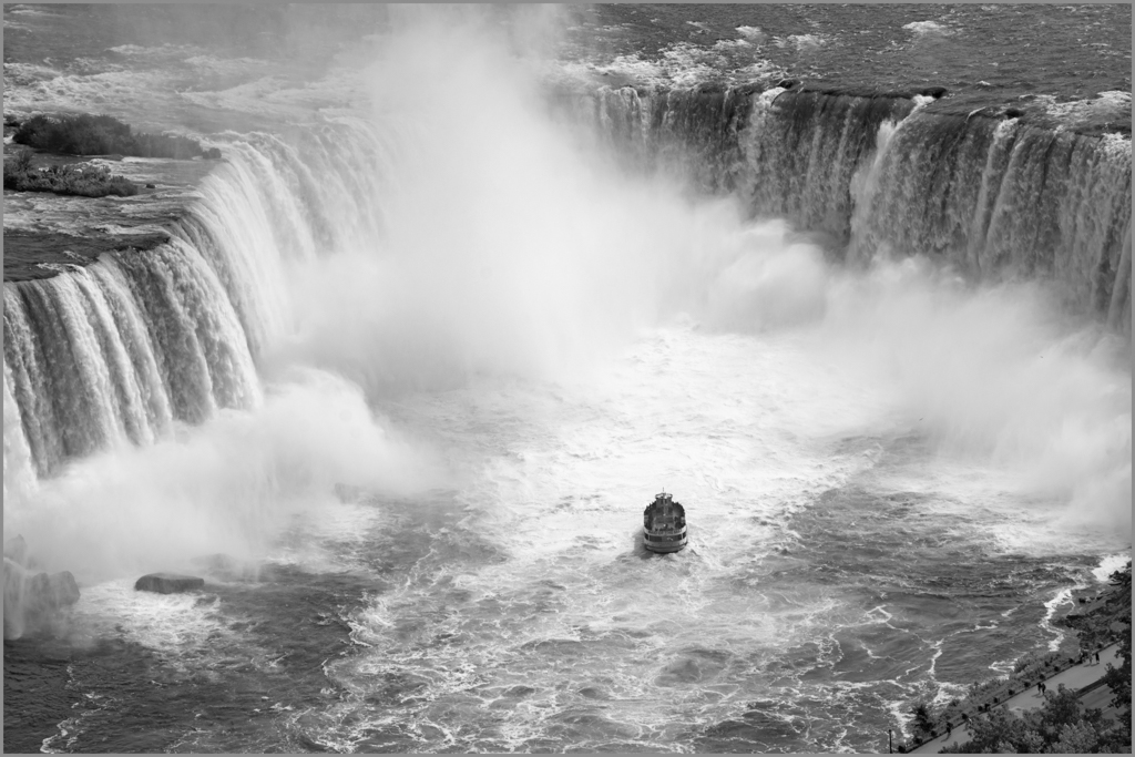
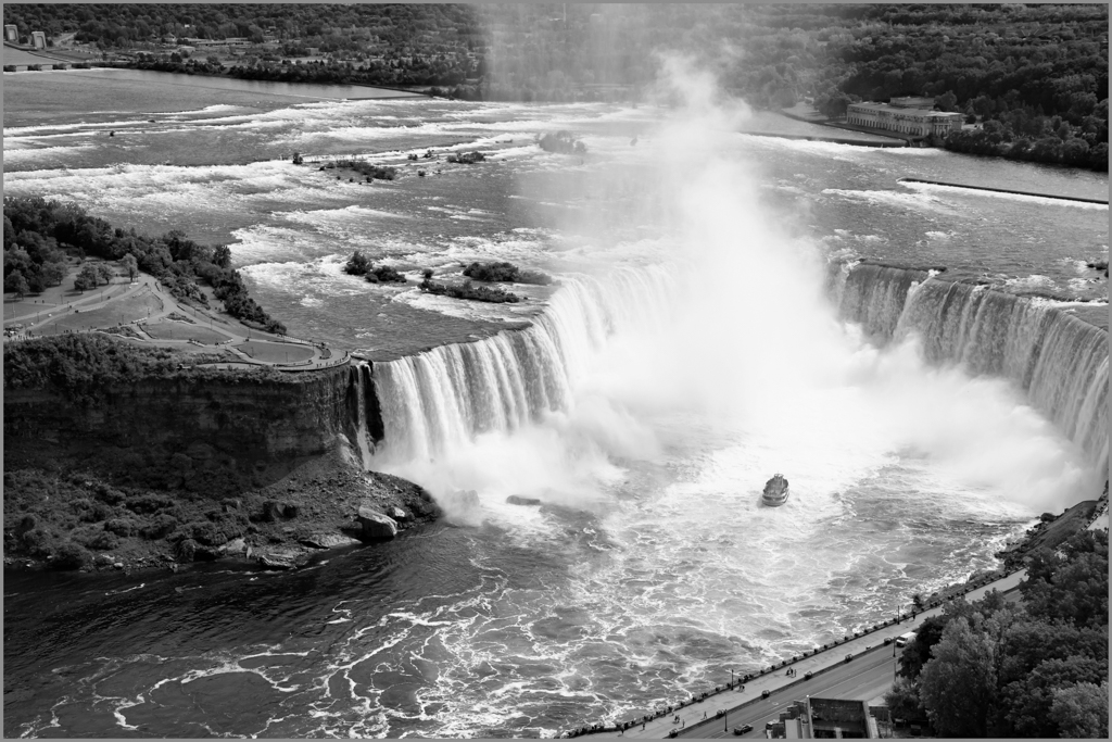
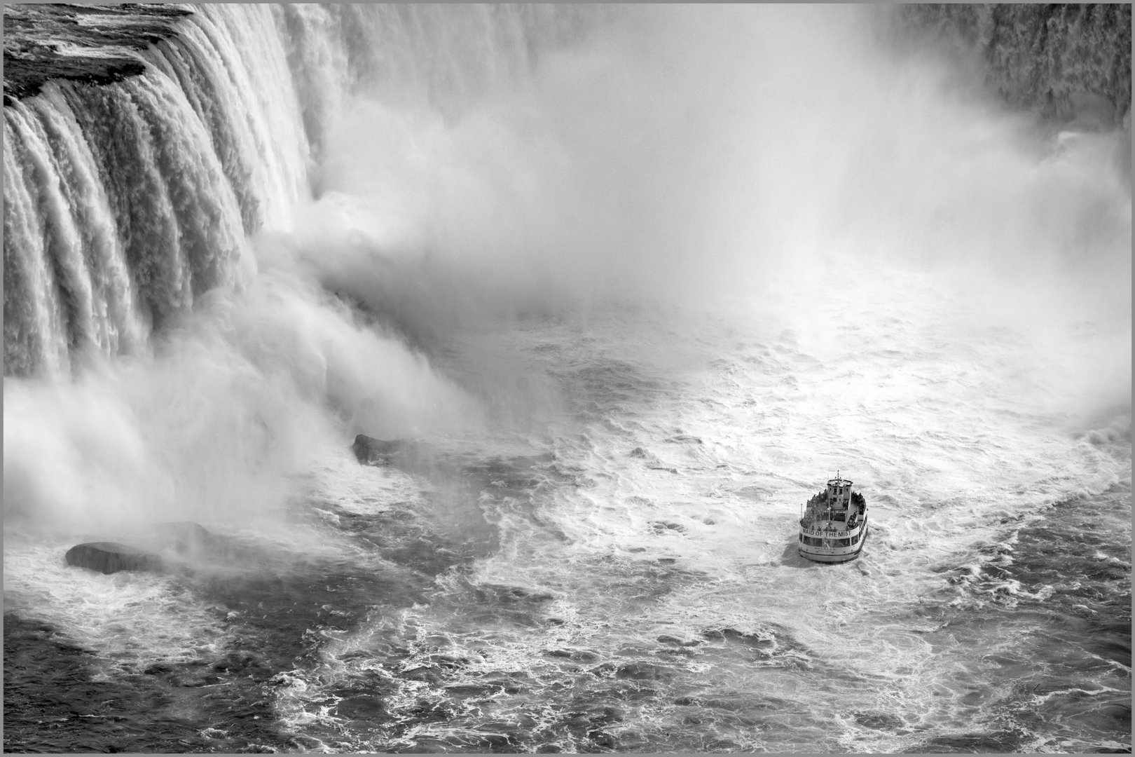
Dianne
A bigger picture view of the falls.
|
Oct 24th |
 |
| 83 |
Oct 20 |
Reply |
Debasiah
The attached gives the scope of the Canadian side of the falls. |
Oct 24th |
 |
| 83 |
Oct 20 |
Reply |
Debasish and Dianne
Take your pick - detail, or the big picture.
|
Oct 24th |
 |
| 83 |
Oct 20 |
Reply |
Dianne
I am learning how to use the PS curve and threshold layer to set the black and white points on an image to avoid blown out highlights and to color correct. Also, I have learned how to use the CEP pro contrast filter with control points.
Therefore, I selected an image with the full falls, Canadian side.
|
Oct 24th |
 |
| 83 |
Oct 20 |
Reply |
Lance
Congratulations on being appointed the PSA black and white mentor. |
Oct 24th |
| 83 |
Oct 20 |
Reply |
Joe
I am now learning how to use the threshold and curves layer to set the black and white points in my images and to identify which areas are black and thus have no detail.
That is why I immediately, noted the spots in your image where the black in the building merges into the sky. I took your image into PS, and applied a curves layer but immediately saw the diffiulty of separating out some of the small dark window areas from the other areas.
For this edit, to create the separation, I would use luminosity masking. However, I am not sure if you know how to use it.
I downloaded Photopills on my desk top but have not tried to learn how to use it. The Ephemeris gave me the simple information I needed.
|
Oct 21st |
| 83 |
Oct 20 |
Comment |
Joe
Welcome to the group.
Which app did you prefer. I have used the Ephemeris but not Photopills.
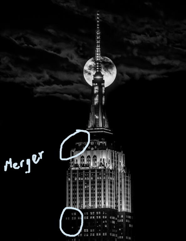
This is a very striking image with the moon so perfectly postioned and the clouds adding drama. I have circled two areas where the dark sky merges with the building. You may wish to check the edges to dodge these areas to create the separation. |
Oct 21st |
 |
| 83 |
Oct 20 |
Comment |
Dianne
I resized per Lance's instructions.
Lance
Thank you for going into the discussion about how black is too black. I had to rethink through my comments on Jose's image about black. We are here to learn from one another. |
Oct 14th |
 |
| 83 |
Oct 20 |
Reply |
Jose
I have looked at this image again and it speaks to me.
Could you explain your reason for using so much shadow. I am trying to better understand the concept of light and shadow and how shadow creates drama. |
Oct 13th |
| 83 |
Oct 20 |
Comment |
Lance
I very much enjoyed seeing this image of Pete, his thoughtful gaze at the water with the birds flying overhead.
Your use of negative space, accentuates man and nature and sends the message that we are small and insignificant in comparison to the power of the water.
A couple of suggestions for your consideration:
1. There are some highlights clipped per my LR highlight clipping warning, and I scrolled the temperature slider over them. The area is above 98. See circles.
2. If you were not concerned about using a standard crop, you might consider cropping slightly down from the top to create a more panoramic feeling. This brings more attention to Steve because of less canvas, and for me reinforces stretching out the water in front of him. At the same time you would still retain the lighthouse and circling birds, an integral part of a seascape image. For me, it still retains the concept of negative space. |
Oct 13th |
 |
| 83 |
Oct 20 |
Reply |
Steve
Your comment is very interesting and reminds me that we see through the filter of our experiences. I have gazed on water for over 30 years with sailing and looked at the curve of a wave, its speed and height to determine how to cut through or ride the wave, and predict wind speed, weather etc. I have watched sea bottoms for potential problems with fouling, scraping the bottom etc. I have looked at shores, to determine what footwear to wear. However, I have never looked at the very tiny reflections to photograph. |
Oct 13th |
| 83 |
Oct 20 |
Comment |
Debashih
This image challenges me because I am not experienced in commenting on abstract images and thus did some research on them.
In this image, you have stripped everything to the bare essentials without providing something for my eye to rest or ponder on i.e. strong line or shape, object, light or shadow. The image does not hold my attention.
For me, it might make a good texture.
One suggestion, since it is water, is to add a small twig, seaweed, or pebble to break up the pattern and have some place for the eye to land. Even it is part of a larger image, i.e. water flowing on a beach you might want to combine a segment of the beach in the corner of the image.
My suggestion I realize may go against your intent of showing water reflections.
|
Oct 10th |
| 83 |
Oct 20 |
Comment |
Dianne
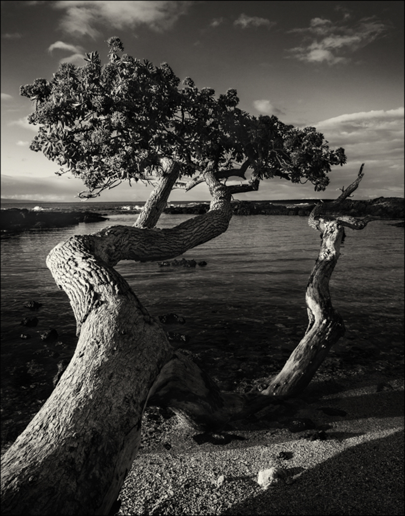
This image has a good strong leading line that moves my eye through the image from camera right bottom to camera left. The light amplifies the textures.
Looking at the clipping warning for blacks, I noted so many areas where the blacks totally lacked any detail and the tree trunk on camera left blends into the distant hills with some areas having little separation.
This image forced me to think through is complete black acceptable and what is the light direction in a dawn image.
You might want to consider:
1. Removing some of the black clippings by using the LR brush moving the blackk to the right.
2. I rotated the image horizontally to see how the lines worked. The problem with this suggestion is that, if people know the location, and given the title, one would expect the sun to rise form the east as in your image.
3. Applying a light centre dark vignette with the centre point on the leaves of the big tree to draw more attention to this area and lead the eye along the trunk.
4. Dodging some areas selectiveley. i.e. I dodged some areas of the hills and small island to bring out detail and suggest they are far away.
5. Dodging the front part of the rocks in the water consistent with the direction of the sun.
Perhaps Lance could address the concept of how dark is too dark in a monochrome image. He did start the discussion on our bulletin board. Your and Jose's image this month are good examples fof how to edit bright light.
|
Oct 9th |
 |
| 83 |
Oct 20 |
Comment |
Jose
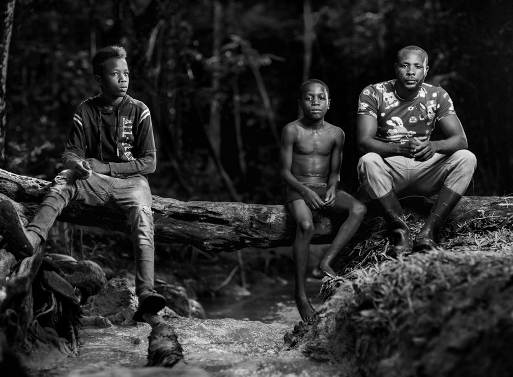
I like the mood of this image, the variety of facial expressions and intensity in this image.
When I look at this image, I feel there are two images. My eyes are drawn to the dark almost black in the middle area first rather than the people. Also, I found that this image had too much contrast, and that there were areas where bodies merged into the tree stump.
I made a few suggested changes:
1. identified the bright highlights in the background and burned them to minimize distraction.
2. Doddge the areas where thebodies seemed to merge into the tree.
3. Dodged the left side of the face of the boy on camera left just to lighten slightly but still show light direction from camera left. Burned the white area on his pant left.
4. Cropped tighter on the right side to see if by enlarging the people it would tighten the composition.
5. Burned the frothy water of the stream on the bottom edge to reduce attention to it, but to still retain the sense that it was a waterfall.
6. Burned the young boys knees.
For me, it was unfortunate that the light was so strong on the left side of the man's face creating such a sharp triangular highlight. I was not certain if this was a very high contrast look you were going after or it was simply the time of day.
These are just some suggestions for considertion.
|
Oct 8th |
 |
7 comments - 9 replies for Group 83
|
22 comments - 10 replies Total
|