|
| Group |
Round |
C/R |
Comment |
Date |
Image |
| 13 |
Sep 20 |
Reply |
Barbara
If you have time,could you google Greg Benz deconvolution sharpening and tell me what you think. I do not have Topaz so am unable to compare it. |
Sep 27th |
| 13 |
Sep 20 |
Reply |
Tim
When I red Stieglist's theory of equivalents, it fascinated me. Taking the concept one step further, we may not feel what the photographer feels when he/she took their image. We interpret the image through our own inner experience.
|
Sep 27th |
| 13 |
Sep 20 |
Comment |
Wendy
As others have said, this is a beautifull image, well composed, good detail in the plane, shadow and clouds, and good lighting. |
Sep 27th |
| 13 |
Sep 20 |
Comment |
Steve
I find it interesting to read people's approach to photography and red with interest your bio and approach.
Kudos to you for setting a goal for an image a day.
There is such a difference of approaches to photography from extreme photo manipulation to minimilasm, and from phone photography to using DSLRs and from snapshots to works of artistic merit.
For me, this image embraces the theme of lines. It tells us to look up, see a subject in a different way, and capture a unique moment.
I understand your viewpoint of minimal editing and cropping. The red sign post with the dominant color attracted my attention against the blue background and the white line through the sign post is the dominant line.
For me, the image would be stronger if the top 1/3 were cropped and the exposure on the red sign was increased/brightened. Had you considered this crop? |
Sep 27th |
| 13 |
Sep 20 |
Reply |
Paul
We share some similarities. I realized when I saw my husband in the emergency room, in Nov. 2016, I did not have any images to remember him. Therefore, I decided to face my fear of the digital world, pick up a camera and ipad and learn how to use one.
That one goal, the desire to remember and capture what is meaningful keeps me motivated. Other people may be better, but as several have told me "practice, practice and practice". Photograph what you love and photograph from the heart.
Your image reminds me of the eagle nest I watched when living on Vancouver Island. You showed your passion by jumping in a boat to capture the image. As a sailor off Vancouver Island, I appreciate your choppy water and how difficult it was to capture the image. I like the story of the two birds, sentinels standing guard watching for predators. You have good detail on the pine needles, but the white on the eagle head camera left is slightly blown out. Is there some way you could bring back the detail through burning?
What time did you take the image. I was trying to figure that out from looking at how the light fell on the trees and other eagle? |
Sep 27th |
| 13 |
Sep 20 |
Reply |
Barbara
Well done and cropped. The lead bird sets the story of the leader with his wings raised and the rest following in a curved formation creating a pleasing composition. I like the soft colors and how the blue and pink tones complement each other. It is a challenge to get the details and light and shadow in the wings.
Could you tell me why you use Topaz DeNoise for sharpening and how much you cropped the image?
I did the Greg Benz luminosity masking course and he recommended using "convolution sharpening" as the first step in LR. That means, set detail to 100, amount to 45, radius to 0.5 and masking to 0. I use to use PS, filter, other, high pass, to sharpen but then just switched to convultion sharpening. If I felt an image required more detail, I went into Nik Color Effex Pro and invoked the detail filter and applied only about 2 for sharpening.
I apologize if this question is too technical. However, with your bird image, I assume that you have had to work through the challenge of the best way to bring out detail and would appreciate your experience. |
Sep 27th |
| 13 |
Sep 20 |
Reply |
Tim
Either you approach things literally or you have looked at the work of Stieglist and his cloud series. I copied the google reference.
Stieglitz photographed clouds from 1922 into the thirties. A symbolist aesthetic underlies these images, which became increasingly abstract equivalents of his own experiences, thoughts, and emotions. The theory of equivalence had been the subject of much discussion at Gallery 291 during the teens, and it was infused by Kandinsky's ideas, especially the belief that colors, shapes, and lines reflect the inner, often emotive "vibrations of the soul." In his cloud photographs, which he termed Equivalents, Stieglitz emphasized pure abstraction, adhering to the modern ideas of equivalence, holding that abstract forms, lines, and colors could represent corresponding inner states, emotions and ideas.
Could you en"light"en me? With my kite image, I made the kite not the sky the main subject.
|
Sep 27th |
| 13 |
Sep 20 |
Reply |
Tim
Please see my comments to Steven. |
Sep 27th |
| 13 |
Sep 20 |
Comment |
Steven
When I did my portfolio, I thought about our little London 380,000 people vs your big London. London ON has so many similar street names, a Covent Garden etc. that when googling streets, I make sure to put London On.
I shall update my bio. Since then I have taken several other PSA courses: History of Photography, Image Analysis, Still life and just did the Still Life Light Painting Course. I am also in DDG 83 monochrome. During the summer I focused on learning light and how to use a polarizing filter and then a flashlight for image.
I have switched from being a sailor, to photographing the Thames River, and then to photographing the pond in my backyard. Covid certainly influenced subject matter. However, the theme was constant water.
As a sailor, the approach is to learn how to sail a small boat (dinghy), then move to a keel boat. We were warned about footitis. That means learn how to handle the 27 ft boat until you buy your dream ocean boat. That is my approach to photography. So I am still photographing with my Nikon d7200, a 50 mm lens and 18-300 mm lens. I have moved from one speedlite, and a continuous lite and now moved to a $20 flashlight as my main light tool.
I remember the comment Jon Fishback asked in lesson 16 of my History of Photography Course, what can photographers today do that photograhers of old could not do. Perhaps the answer is adjustment layers. This prompted me to turn my attention to luminosity masking and buy a wacom tablet.
I apologize for the ramble. However, I thought this background might be useful.
I am interested in the mental challenge of doing monthly images on different topics and look forward to participation in this group. |
Sep 27th |
3 comments - 6 replies for Group 13
|
| 83 |
Sep 20 |
Comment |
Debasish
This is the challenge of light painting. To reduce a heavy shadow under the tools, I light paint under them. The result is sometimes heavier shadow in the corners and I have to remember this to light this area more.
With card stock, using a light clone to reduce shadows can create a messy effect. |
Sep 20th |
| 83 |
Sep 20 |
Reply |
Jose
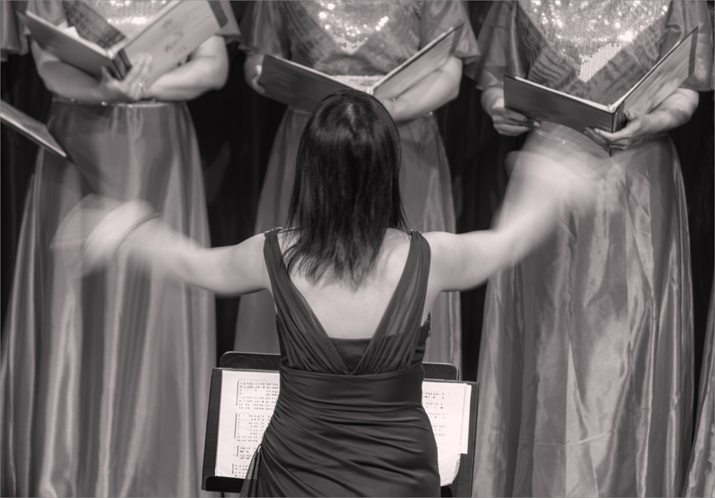
Your showcase image. Your lighting is superb and the title is so well chosen. You have really captured her spirit.
JPS |
Sep 17th |
| 83 |
Sep 20 |
Comment |
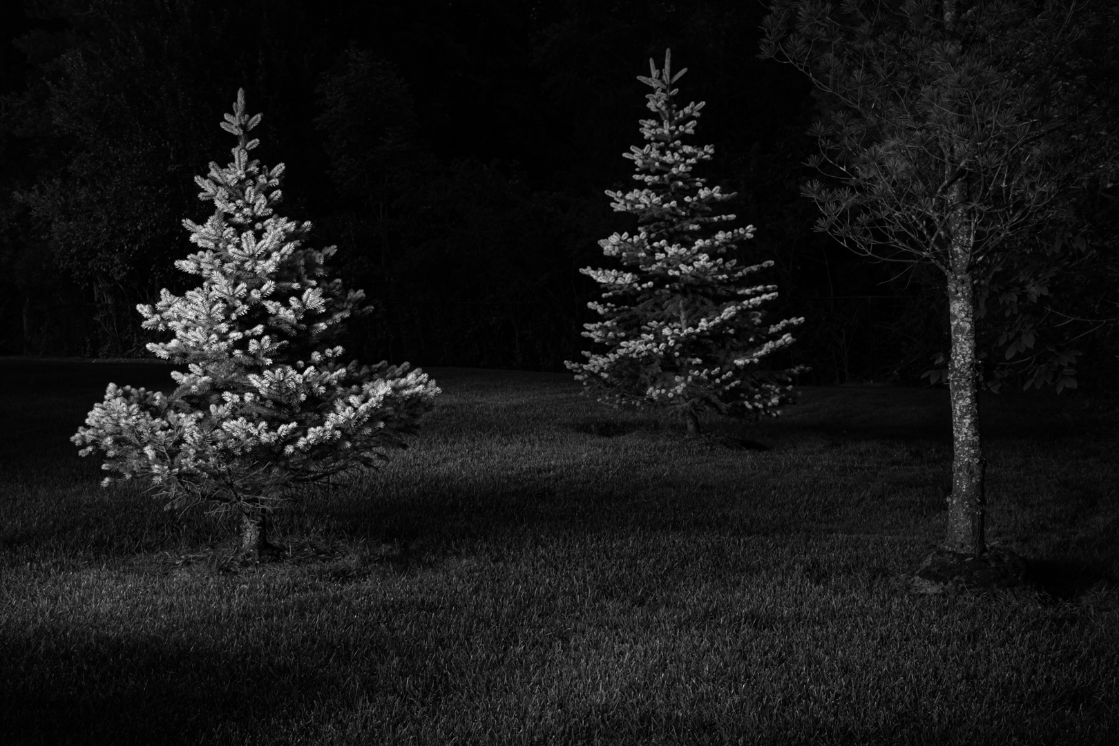
Lance
Is it your perspective, use of light and shadow, the tree or all three, that give the appearance of a giant tree? The bright white immediately draws my attention to the top of the tree. |
Sep 13th |
| 83 |
Sep 20 |
Reply |
It is not a boat anchor. We use to have a plough anchor on our boat. |
Sep 13th |
| 83 |
Sep 20 |
Reply |
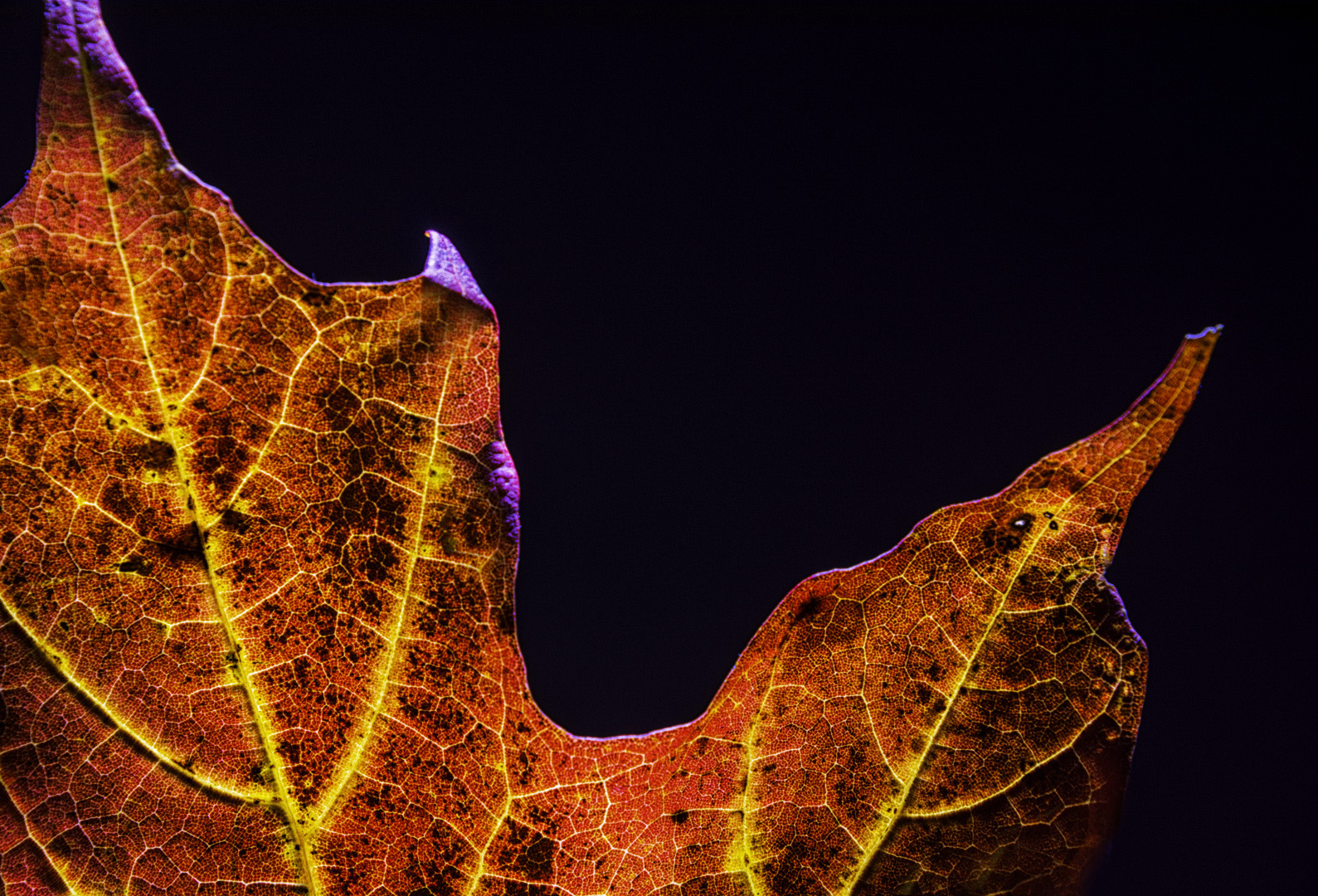
Dianne
On our DDG bulletin board, in the section under light and shadow, I posted more light painted images: yoga tune up ball, corn, flower backlit, and a thistle. You may be interested in comparing your leaf image backlit with what I did with a flashlight in a dark room.
JPS |
Sep 13th |
| 83 |
Sep 20 |
Reply |
Lance
I use the red filter quite often. However, I red for people that the green filter is a good choice so I switch back and forth to see which one I prefer. Because the leaves in Dianne's image were green, I tried both red and green but found the green maintained the higher degree of translucency.
Perhaps Jose can tell us which filter he uses for his portraits. |
Sep 10th |
| 83 |
Sep 20 |
Comment |
Dirk
Your composition is well seen and conceived and there is a beautiful play of light, shadow and texture. It is striking with its simplicity.
Did you try other crops? If so, did you feel it changed the balance of the image?
|
Sep 9th |
| 83 |
Sep 20 |
Comment |
Dianne
You have selected an interesting section of the leaves to highlight.
To create the dark background, you could apply a green filter in PS and then move the blue slider to the left. I find the green filter, maintains the translucent backlighting of your color image.
|
Sep 9th |
 |
| 83 |
Sep 20 |
Reply |
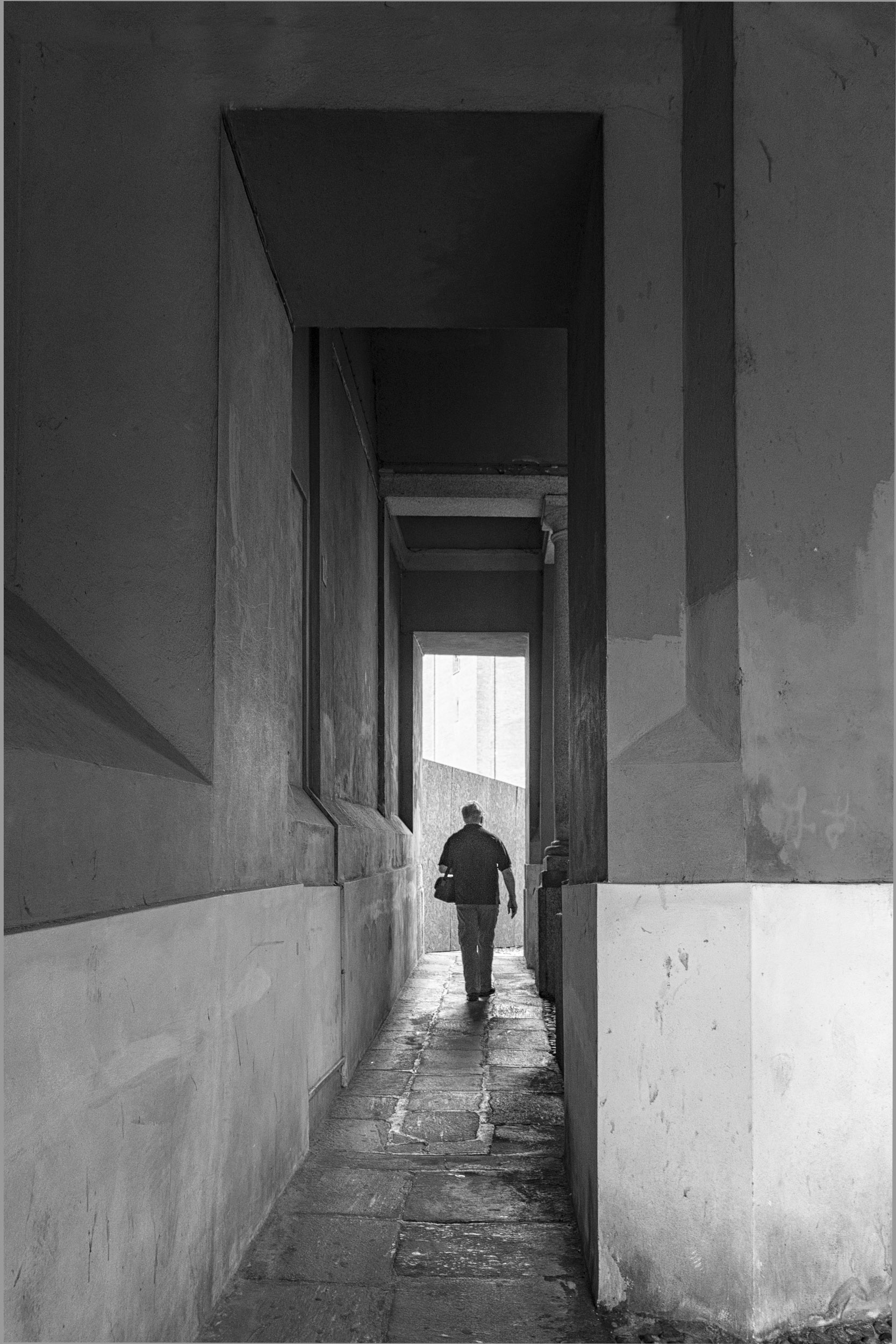
Jose
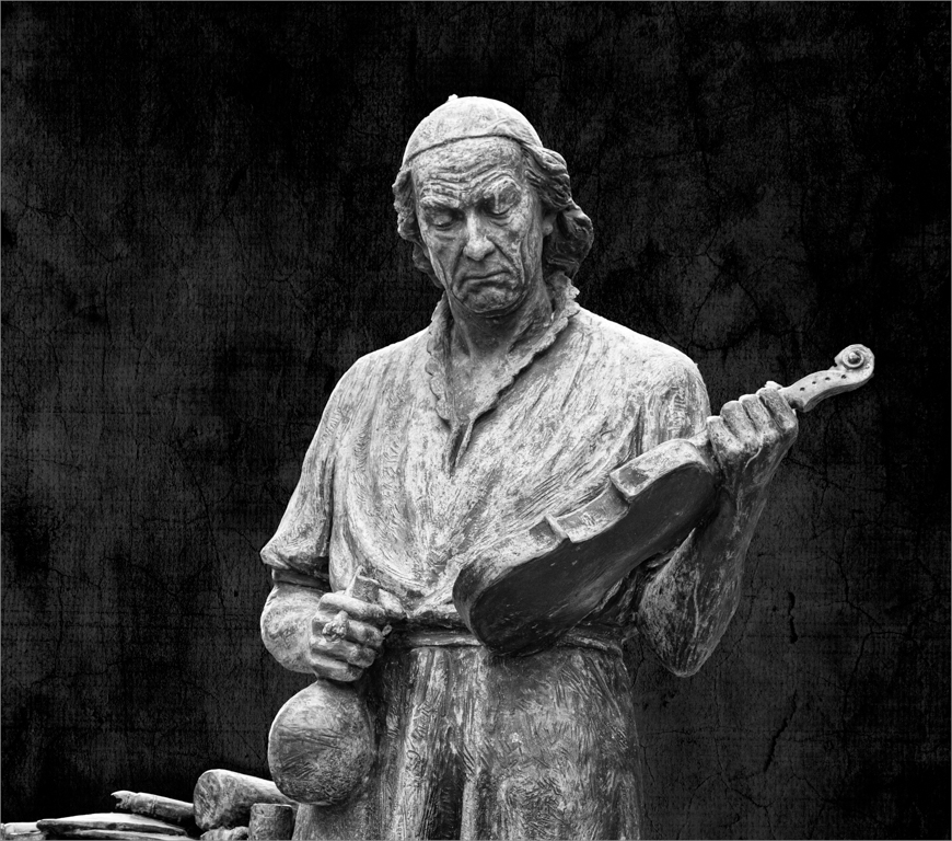
I like the framing of this image.
It is fascinating the different sets of eyes looking at the man being painted: you with your camera, the artist, and the poster of Christ. Each sees something different and is immortalizing the scene.
What a fascinating capture. |
Sep 9th |
| 83 |
Sep 20 |
Reply |
Debasish
This is a beautifully observed and framed image. What body of water is it?
|
Sep 9th |
| 83 |
Sep 20 |
Reply |
Stephen
Also look at the effect of controlling the angle of light. I took this image close to the bridgeway over my backyard pond. I was only able to light the image from a straight on position and did not angle/rake the light to create dimensionality or the beauty of light and shadow. The image is boring lacking the beauty of light and shadow.
The attached image converts poorly to monochrome and looks better in color because red and green are complementary colors.
In planning for a monochrome still life light painted image, intent and visualization are key. One has to think about composition, background, lighting, and then paint to achieve the result. |
Sep 3rd |
 |
| 83 |
Sep 20 |
Reply |
Stephen
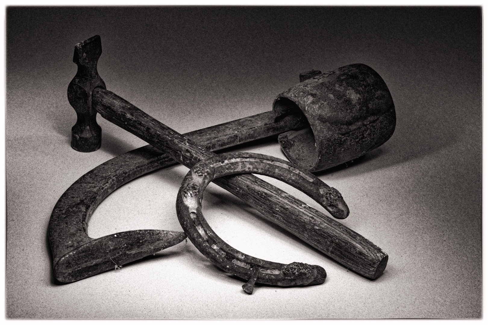
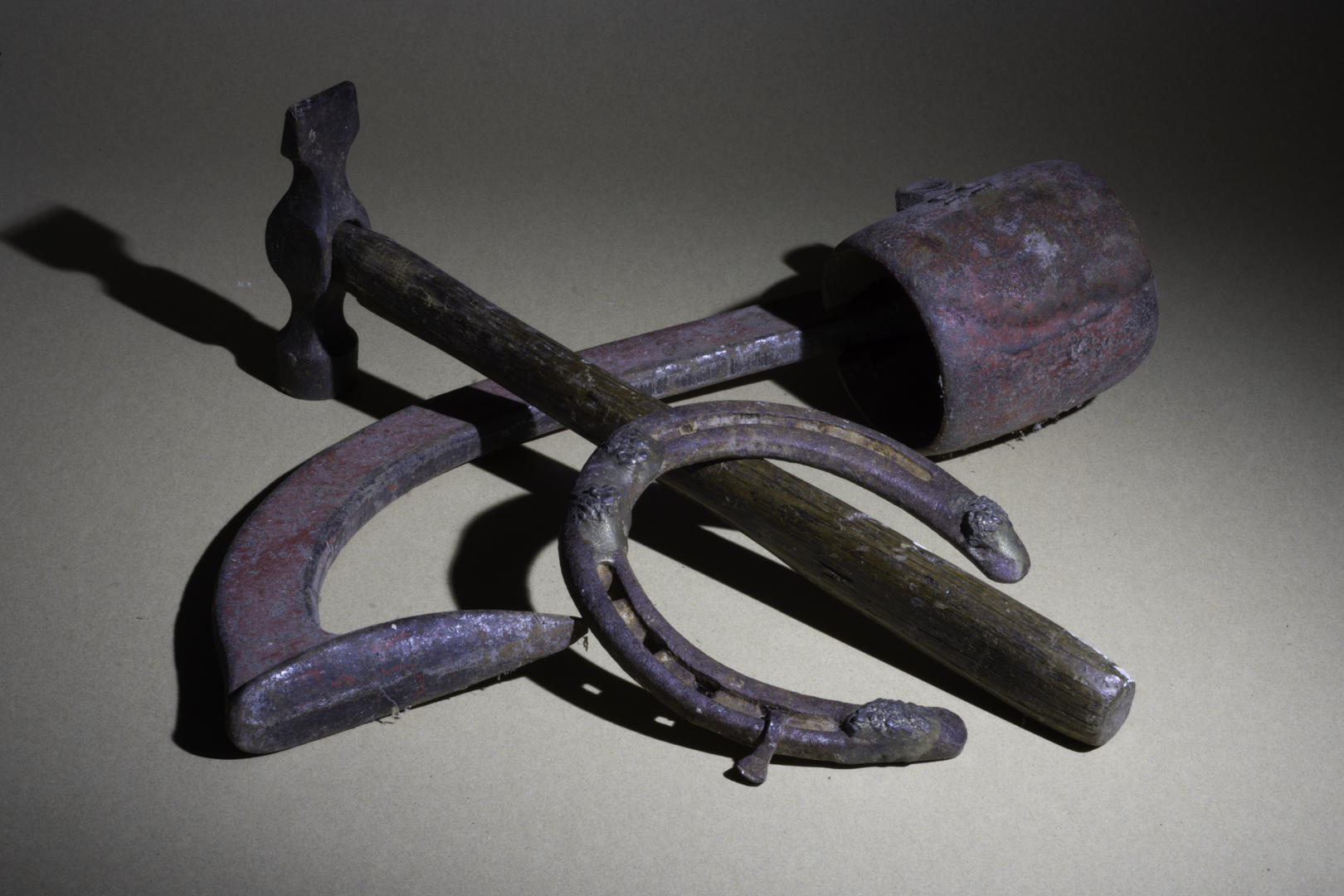
Attached is an image which I did not select because the shadow around the handle of the curved object camera right. This area lacked detail and thus merged into the surface. However, I did like the slight shadow cast from the horseshoe and under the hammer and the area within the horse shoe was not blown out and the natural vignetting. Note the different feel to this image. I could try dodging that shadow area but was trying for a 100 % correct image where I only used light room global edits and took the image into PS for dust spot removal. |
Sep 3rd |
 |
| 83 |
Sep 20 |
Comment |
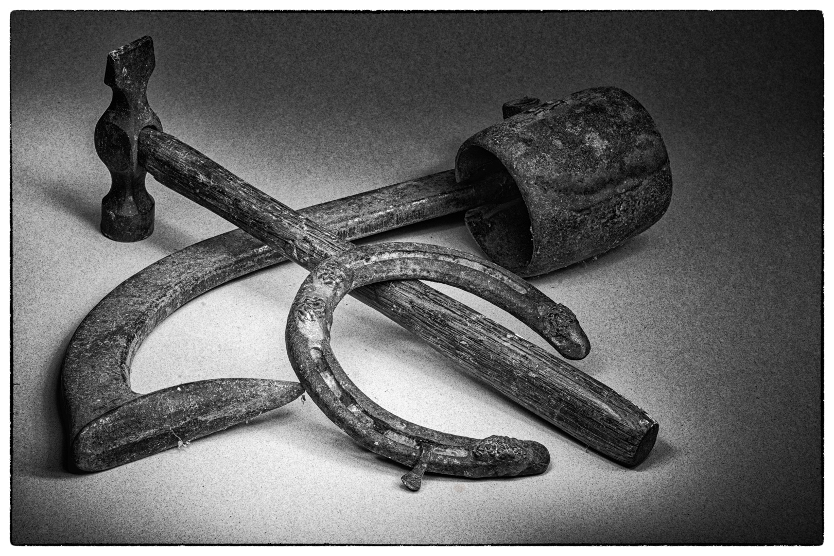
Stephen
Here is the planning shot. I held my flashlight still for 25 secs and achieved this result, unedited. Therefore, 25 sec. is about the right time.
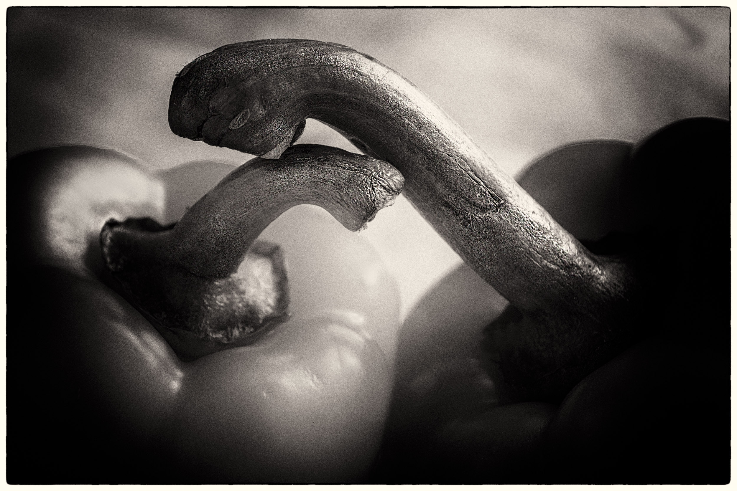
Note the harsh shadows under the hammer, projecting from the hammer head, by the horseshoe and around the bottom of the handle of the red object. Note, there is no detail inside the head of the red object or in the handle on camera left. For the latter there is no separation between the handle and the paper. Note also, the nice natural vignetting in the top right hand corner. Note the focal point is where the three objects meet and the horseshoe is sharp.
I painted inside the red object to create detail, over the top of the hammer to eliminate shadow, along the edge of the handle to eliminate the harsh shadow and create separation, and under the handle. This meant changing the angle of the flash light especially going under the handle of the hammer. Going under the handle, also meant I was perhaps overpainting on some parts of the paper.
One image I eliminated because I felt the shadow along the handle was too strong. In another, the shadow under the hammer seemed too sharp.
This is where I would like to have a discussion of the aesthetic of light and shadow. The PSA light painting course did not deal with this subject.
Do you know what that curved object is. The head is hinged and could be bent in such a beautiful curve as if it were supporting the horseshoe.
|
Sep 2nd |
 |
| 83 |
Sep 20 |
Comment |
Stephen
My images are still life light painting. To paint, I use a LED flashlight powered by three triple A rechargeable duracell batteries. After each light painting session, I recharge the batteries.
To diffuse the light, I put waxpaper on the flashlight head. Then I insert it into a empty roll of toilet paper so that the roll extends about two inches from the top of the flash light. I cover the roll of toilet paper with electrical tape so that there is no leakage at all through the cardboard roll. Harold Ross sells a much more expensive flash and attachments but my home made solution works.
This one flashlight replaces what would require multiple light sources to illuminate.
I set my focus point and make sure the 2 sec delay for my remote is on. Then I turn off the light so that I paint with the flash light in a completely dark room.
Normally I paint from the camera right side because I am right handed.
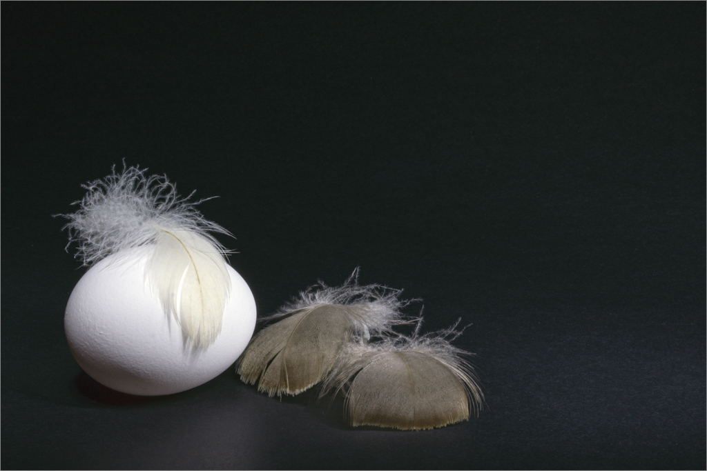
First, I determine the direction of the main light, by holding the flashlight in my hand and directing it at the still life composition. Based on the setup and materials used, I estimate a an exposure time. For example,for the egg image, I set my time to 30 sec. Because I wanted a high key image (overexposure), I determined I needed a longer exposure time and set my time to bulb. I used my remote to both open and close the shutter.
I used f16 because this was a small enough aperture to give me sufficient time to paint. For my outdoor image last month, because the scene was large (three trees), I opened up my aperture to f8.
I set the speed to allow myself sufficient time to paint without feeling rushed.
To determine how far away to hold the flashlight from the object, a rule of thumb is to set the distance almost equal to the size of the object i.e. for an egg hold the flashlight an egg distance away (Harold Ross's rule).
It is important to maintain this sense of the direction of the main light throughout the object not to confuse the viewer. When I am painting under or behind objects to fill in shadow areas or create definition, I need to be mindful of the direction of the main light.
When light painting, one needs to continually move the flashlight not to create hot spots or overblown highlights.
The closer the light is to the object, the softer and more diffuse the light.
The camera records the light reflected back from the surface of the object. Light colors take less time to paint than dark colors.
The fascinating part of light painting, is you choose where you want to direct the light. Lingering just one second longer at a spot can create a different result from image to image.
Also, one has to understand shapes of objects and textures. If you reply back, I can show you an example with multiple objects and my thought process. |
Sep 1st |
6 comments - 8 replies for Group 83
|
9 comments - 14 replies Total
|