|
| Group |
Round |
C/R |
Comment |
Date |
Image |
| 83 |
Aug 20 |
Comment |
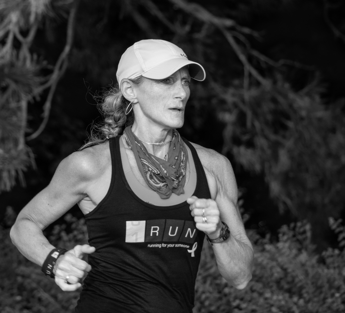
Debasish
I red your CV after you commented on my image of Therese at One Run and realized why you made the comment about other runners. You to must fine when you are running that you enter a point where body and mind unite. |
Aug 15th |
| 83 |
Aug 20 |
Reply |
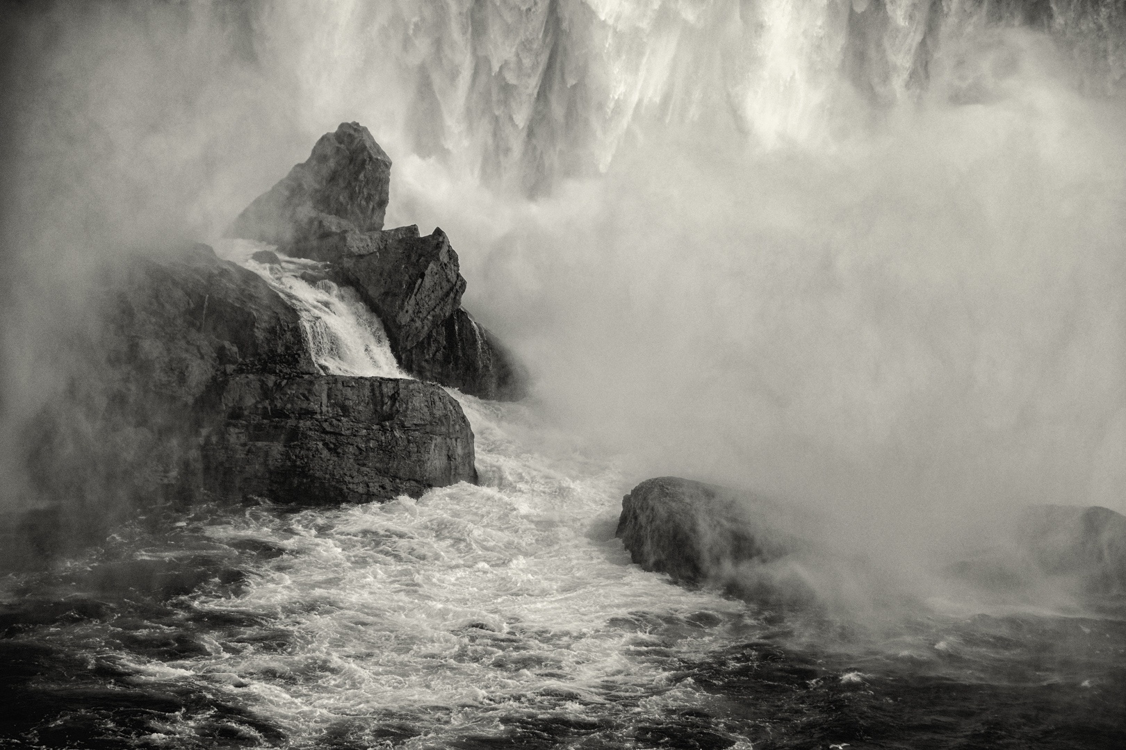
Georgianne
I noted that Lance and I approached your image with the same concept. We both wanted to create more depth, dimension, separation and detail. Lance did it through PS an SEP where I used luminosity masking.
Lance's edit, gives sense to the direction of light. In my interpretation, I darkened parts of the left bottom corner of the image and the left cliff shifting the direction of light.
Certainly, this image has helped me work through looking at what is the direction of light. |
Aug 14th |
| 83 |
Aug 20 |
Reply |
Georgianne
I noted that Lance and I approached your image with the same concept. We both wanted to create more depth, dimension, separation and detail. Lance did it through PS an SEP where I used luminosity masking.
Lance's edit, gives sense to the direction of light. In my interpretation, I darkened parts of the left bottom corner of the image and the left cliff shifting the direction of light.
Certainly, this image has helped me work through looking at what is the direction of light. |
Aug 14th |
| 83 |
Aug 20 |
Comment |
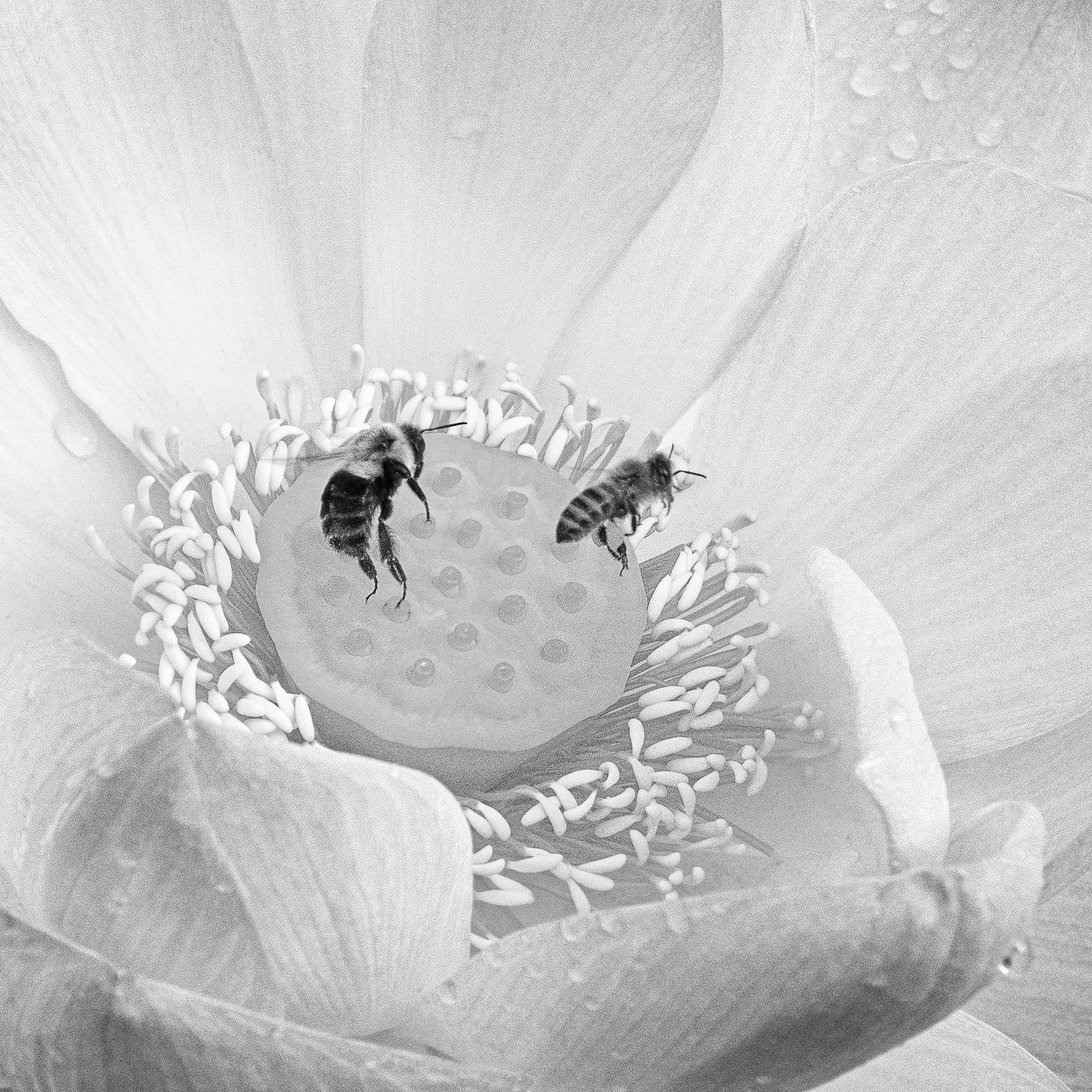
Georgianne
For me D's image, evoked memories of my three caminos in Spain, experience as a volunteer at the hostel for pilgrims in Salamanca, and separate visits to historical sites in Spain.
When I looked at D's picture, I felt that sense of time and place and the spiritual journey of the camino. There is darkness inside and one walks the path to seek enlightenment. We (my husband and I) would start walking early in the morning in darkness and experience the sunrise.
Whether using a spiritual or time of day analogy, my interpretation of D's image was I was moving from the dark to the light.
Perhaps this image is moving us toward Stieglist's concept of equivalents. Perhaps Lance, who is far more eloquent than me, can comment on this. |
Aug 14th |
| 83 |
Aug 20 |
Reply |
Jose
Thanks for explaining what Dirk did.
|
Aug 6th |
| 83 |
Aug 20 |
Comment |
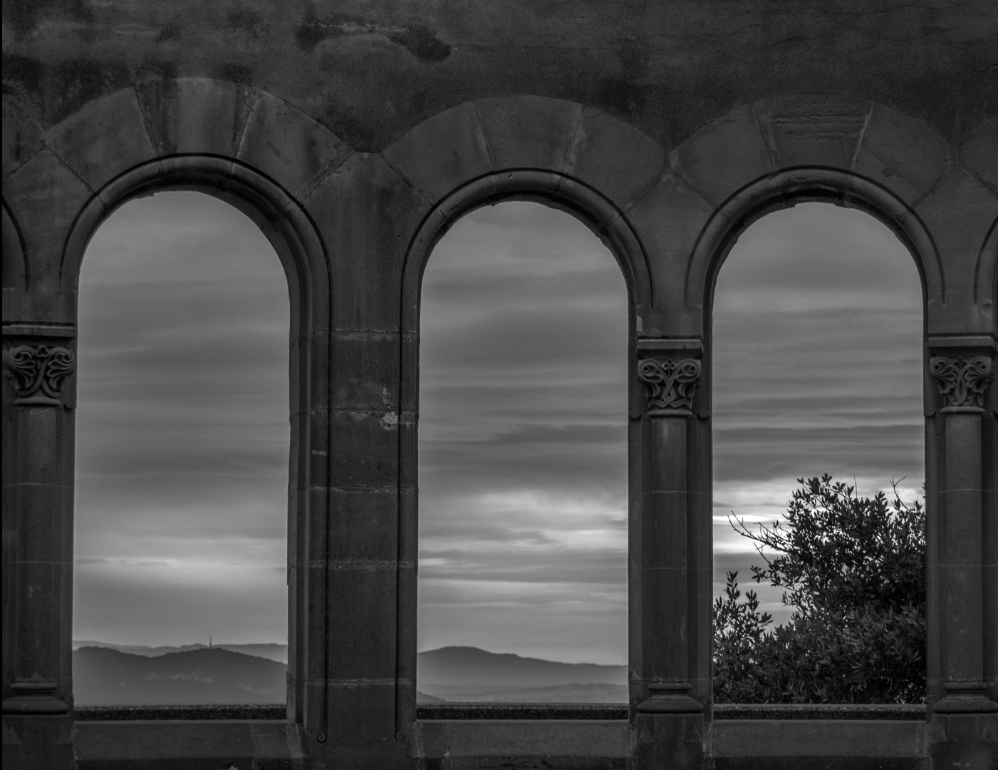
Debasish
I experimented with lightening the sky to draw the viewers eye outward but did not touch the exposure of the arches. I just used a luminosity mask to brighten the outside sky. The mask left the trees and mountains dark as in your original image.
|
Aug 6th |
| 83 |
Aug 20 |
Comment |
Jose
I loved this image, the space around her, the moody sky, and the reflections of the bride and sky in the water. For me, the negative space suggests the bride is alone and feels isolated pondering her future as she transitions into married life.
You handled the back lighting well. I did try to apply a luminosity mask to burn the brighter highlight on the bride's dress around the back waist area to bring out more detail but was not successful. |
Aug 3rd |
| 83 |
Aug 20 |
Comment |
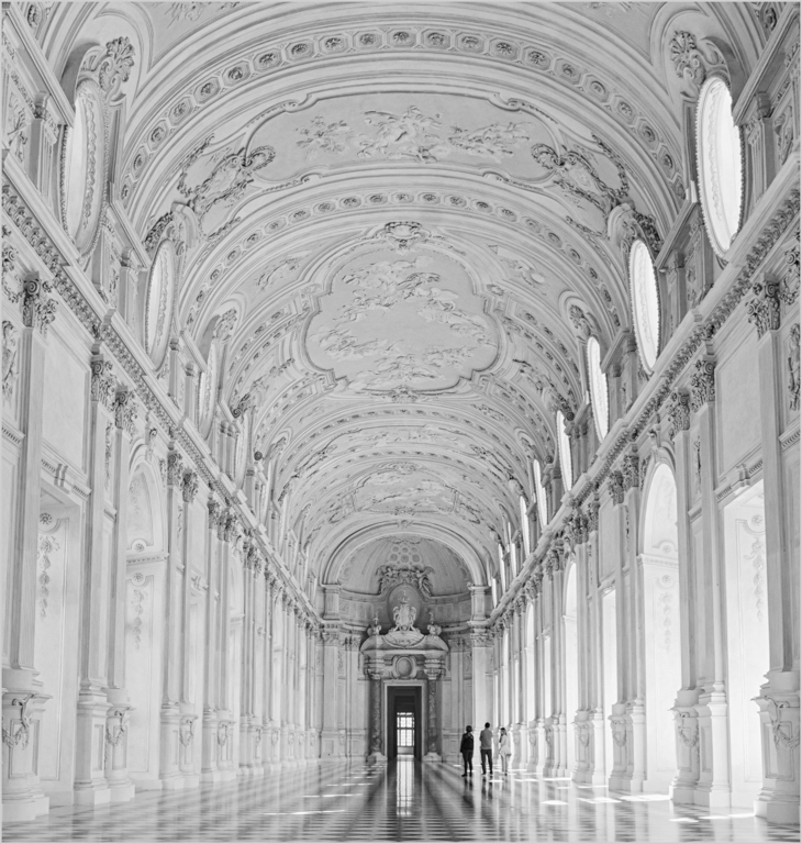
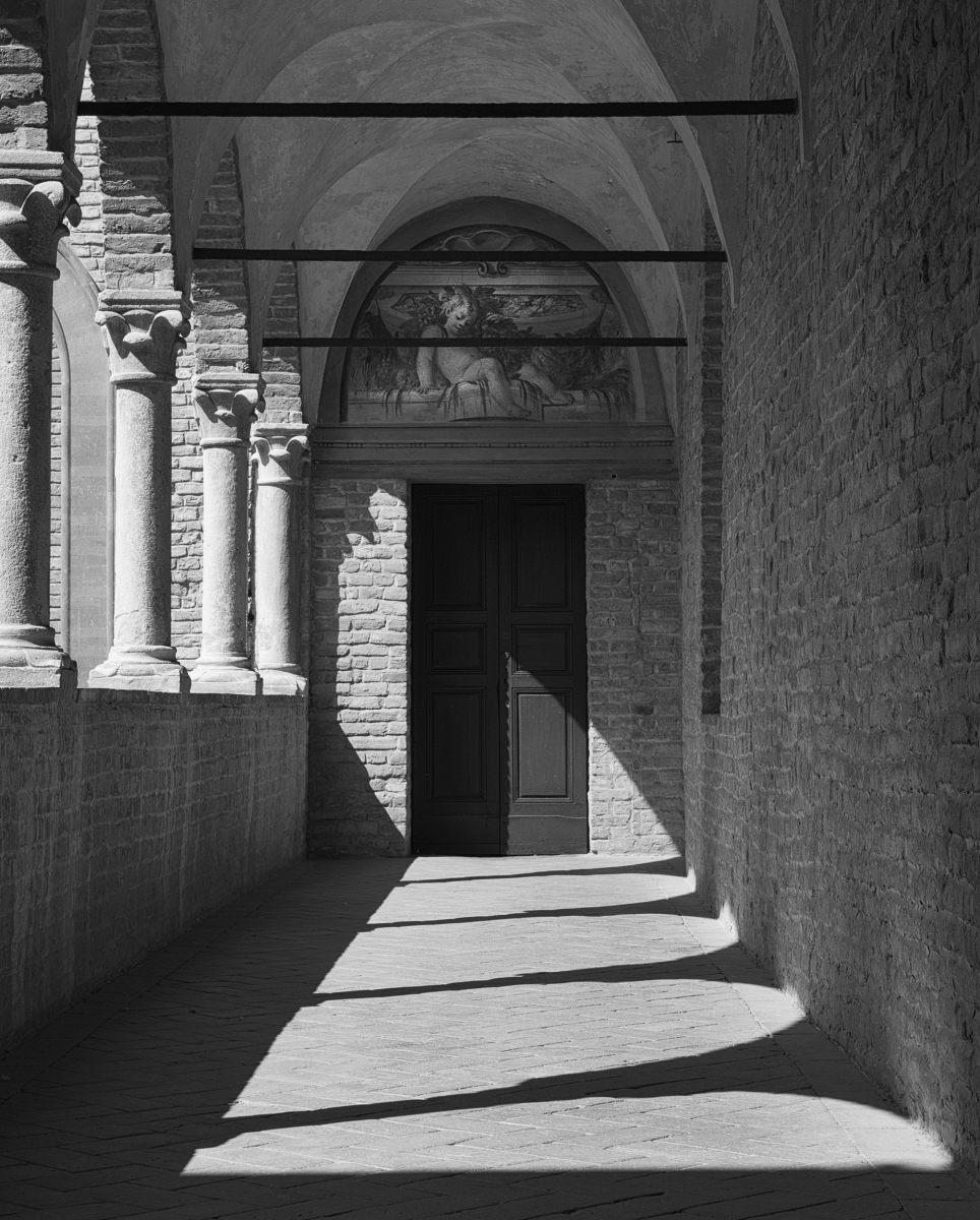
Debasiah
This is a beautiful composition with the tree in the corner. It is tricky to create symmetry because the arches are not equally spaced. This is the beauty of imperfection and reflects the technology of the time.
For me, the image is dark and reminds me more of evening because I do not know the direction of the sun relative to the building. Therefore, I experimented with lighting it, by increasing the exposure 1 EV in LR, taking it into PS and applying a levels adjustment. On the levels adjustment, I moved the white point to 233 then applied a luminosity mask that targeted the brighter parts of the image i.e. sky. This creates more tonal contrast. Also, I tweaked your crop on camera right by toggling on the arrow key at the bottom of the keyboard to shift the crop inward. I finally learned this trick to move just a few pixels at a time.
This image was a good one for me to try this technique on. |
Aug 3rd |
 |
| 83 |
Aug 20 |
Comment |
Jose
I agree with you in the image above, the light on the tree camera left is too strong. That is why I chose the original one.
The point I was trying to make is one really has to previsualize where and how long to put the light to create an effect. LP is so different. It is not a matter of bracketing exposures.
I shall look up your reference because I need to better understand the concept of light and shadow. I enrolled in PSAs light painting course, quite new and am doing lesson 2. There is such a wonderful explanation of the concept of main light, previsualization, and then light painting thinking about the main light.
|
Aug 3rd |
| 83 |
Aug 20 |
Reply |
Here is another image taken 2 minutes later with the same length exposure 63 vs 65 sec, all else constant. You can see a slightly different light pattern. In this image, the tree on camera light was not lit sufficiently so I used a rectangular gradient starting at camera to increase exposure and selectively targeted the areas with slight underexposure with a luminosity mask and painted with a white brush at about 4% opacity. The shadow pattern is different.
|
Aug 3rd |
 |
| 83 |
Aug 20 |
Comment |
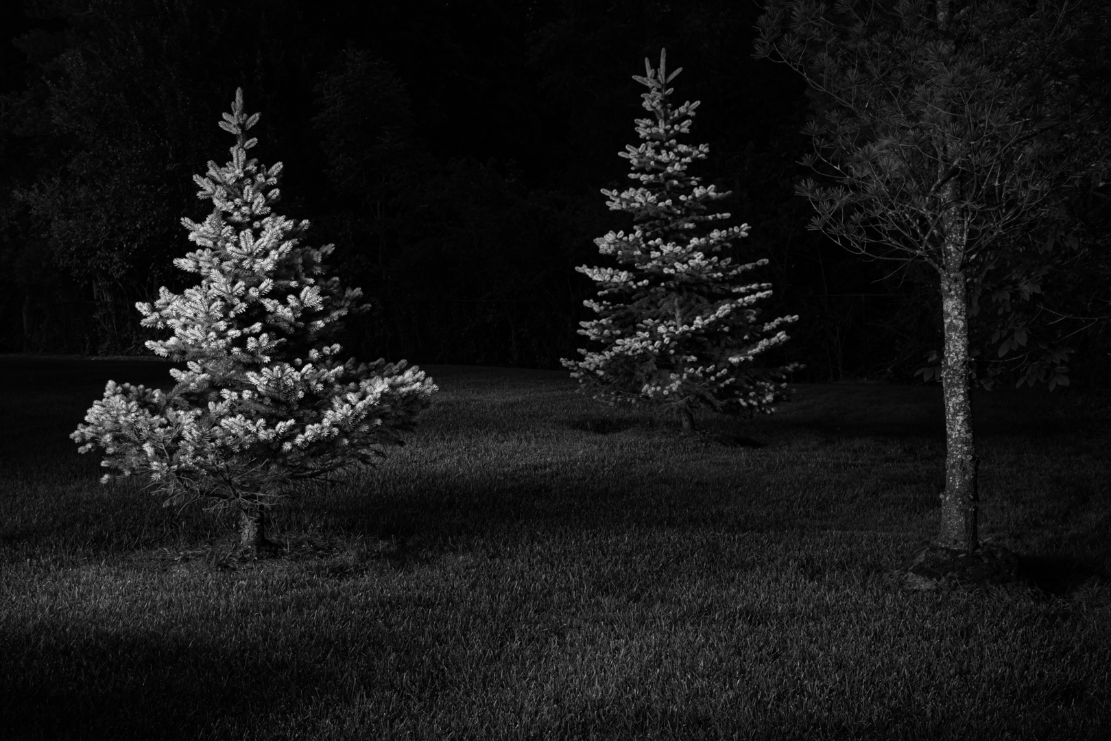
Lance
Good question. I had three light sources: civil twilight, a LED flashlight, and dim light coming from the neighbor's house two doors door.
1. The flashlight has a blue color tone, is zoomable and has ? lumens.
2. The GPS-coordinates of London Ontario are: 42� 59' 5.723" N 81� 14' 42.997".
Civil Twilight ended 21:19 hrs. Civil twilight is the time between 0 - 6 degrees when the sun passes from the horizon to below the horizon
Nautical Twilight is the time between -6 and -12 degrees. It started at 21.19 hrs and ended 21.59 hrs.
Source: the Photographer's Ephemeris.
3. I thought the yellow light coming from the neighbor's window would ruin the image. However, editing a day two image, I found that in monochrome this light illuminated some of the background to create separation, provided color and thus tonal range.
I set up my tripod about 21:12 hrs, auto focused on the tree on camera left, locked down my exposure by moving the lock down switch, and proceeded to take images. I used an electronic remote, set up a 2 sec delay, and turned off vibration reduction on my 18-300 mm lens. If not switched off, the result is camera shake and an out of focus image.
In manual, I set the exposure to bulb to have complete control over timing and also to reduce possibilities of slightly moving the camera. The previous nights I had tried a couple of different apertures.
I chose ISO 100 to minimize noise.
I photographed at nautical twilight between 21:16 hrs to 21:41 hrs. My exposure times varied between 53 to 63 secs.
During the 25 minutes shooting, I took about 16 exposures, not moving my tripod. This exposure is at 21:34. Exposures prior to this time, because of the amount of natural light did not have the same drama. In the couple of subsequent exposures, I did not paint the upper branches of the tree on the left sufficiently.
The first night I tried this scene, the composition was the same as this month's image. The second night, my composition was just the two trees. July 31, I went back to the three tree composition.
Technique for light painting. I studied a couple of surrealistic night light painting images to see how light fell and the use of light and shadow. Based on the light pattern in these images, it seemed that there were two people assisting, one to trip the shutter, another person in the background toward the top of the image. The light pattern did not look natural. I had to do this image alone.
Considerations were:
1. create a light pattern to act as a leading line, with the leading line being a diagonal.
2. use light and shadow to create drama.
3. do not paint straight down the middle of the image nor hold the light to close to the ground because it creates burned highlights and focuses the eye too much.
4. do not create blown out highlights in the foreground left side tree
5. create a focal point. If setting focus on the left tree, should I have both trees in sharp focus.
6. work from one side, otherwise it will look as if the leaves are shifting/blurring.
I did not know whether I should or should not paint the background trees. On the day one trial, I did not light them much and the result was purple banding? noise? Perhaps someone could explain this to me. On this image, I did light the background trees to create separation.
With still life light painting, I found that photo editing, targeting dark pixels with a luminosity mask, can only do so much. If light is not there, the result is purple.
I wanted to get as much right in camera as possible and create sharp detail through light. In editing day 1 and 2 images, I learned that if I apply a Nik Color Effex detail extraction filter (even at a low amount), it does create increased detail. However, it also evens out the light effect therefore, destroying the drama of the light painting.
This image is WIP (work in progress). I have more questions than answers.
Certainly, night life painting is so different from still life light painting where one controls all the variables.
I apologize for my long winded explanation that is boring for people who understand night light painting.
To this image, I am bringing my knowledge of still life light painting and celestial navigation.
I still have to work through toning monochrome images with the Infinte Color Panel. Pratik did develop a monochrome panel. However my goal is to understand how adjustment layers within the panel work.
|
Aug 2nd |
| 83 |
Aug 20 |
Comment |
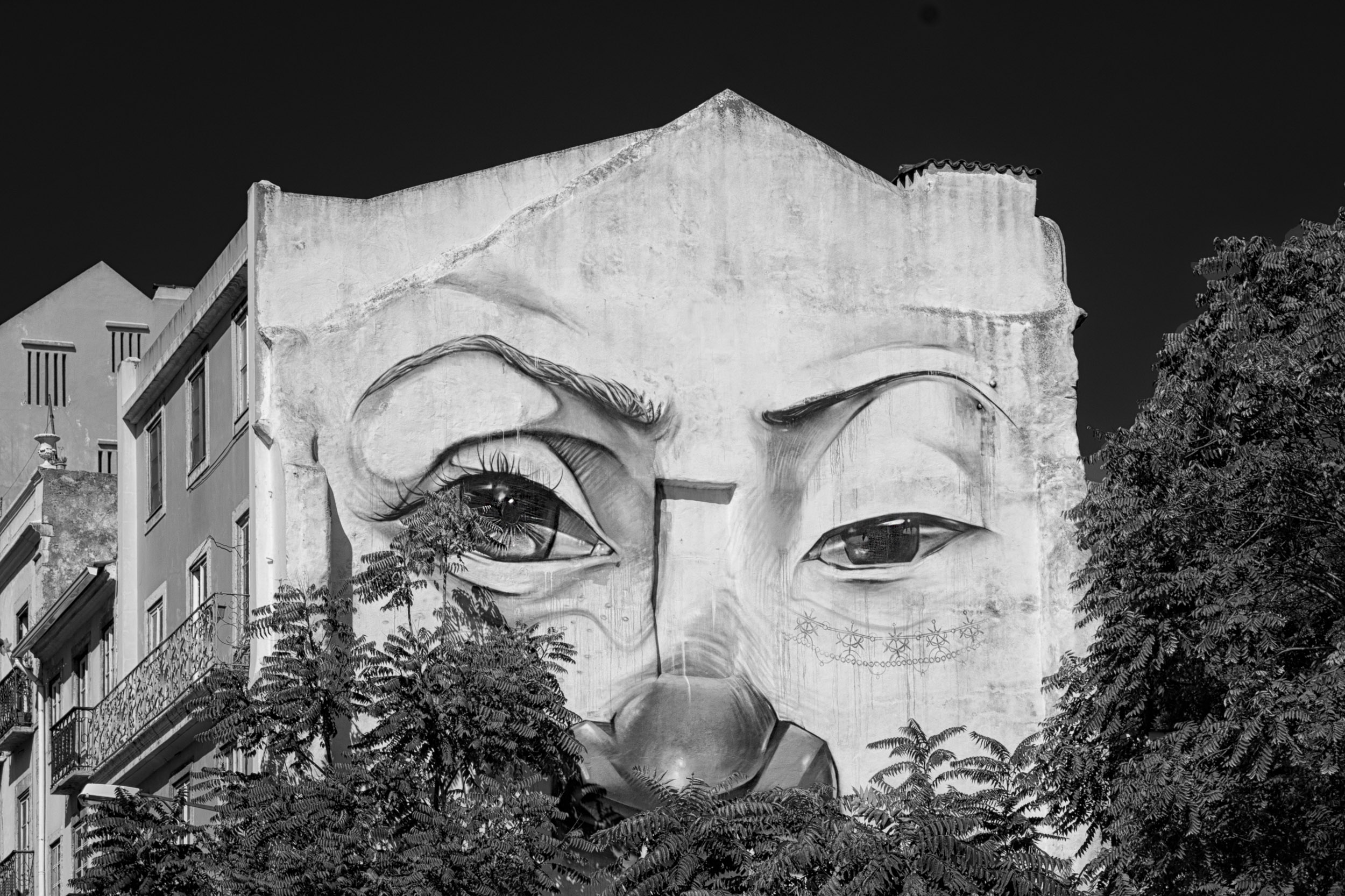
Dirk
This image is a beautiful play of lines, shape, texture, light and shadow. I like the two bicycles that add interest points as well as the reflections captured in the windows.
My suggestion is to look closer at where the sky and building meet camera left. I find the greyish areas distracting. Is this what is termed banding or is this caused by blending/merging two images and your blending technique.
I can see where the door bottom of camera left is the same as the door on camera right second level and that the two bicycles are the same. Thus it appears you blended the images. You may consider making this less obvious by changing the the position/sizing/orientation of one of the bicycles.
Can you describe your technique for creating this image? |
Aug 1st |
| 83 |
Aug 20 |
Comment |
Lance
What an interesting approach. It stimulates the imagination and is doable with our covid environment. I love the concept, we must reach in, not stop, and fathom the bottom(less)......
We were both in the trees yesterday. We both accepted what was. However you created story and mood through a tryptych where I chose the play of light, shadow and darkness to tell the story.
The crop in the three images is different. I wondered how this would look if you sized the left and right images with the same dimension. Also both the left and right images point the same direction with one being magnified in post slightly larger. I wondered how the image would look if you flipped the right image horizontally so it points into the middle.
Am I just trying to create perfection out of imperfection and not accepting what is imperfect?
JPS
|
Aug 1st |
| 83 |
Aug 20 |
Comment |
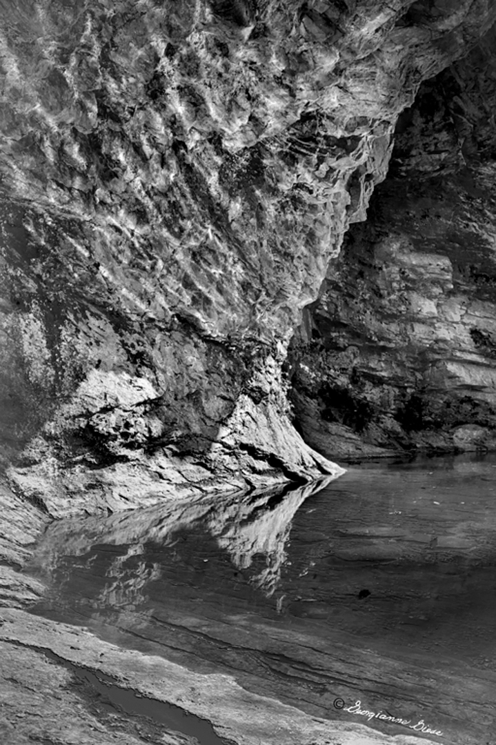
Georgianne
It is refreshing to see a different approach to water images. The water is so clear and see through in your original image. Recently I have been photographing the pond in my backyard with a little water fall and frogs on lily pads and had to work through how to darken the water, create clear see through water and dimension in rocks. Thus I appreciate you achieved both: reflection and clarity in the water in your image.
One suggestion is to create more dimension in the image and separation between the background and foreground rock. In PS, I applied a darks 5 luminosity mask and painted black at a 5% flow rate on the the back rock where it meets the foreground rock. Then I looked for areas in the foreground where I could target shadow and paint black with 5% opacity to increase dimension. The last step was to apply a curves layer, move the black slider to the right to create a steeper contrast curve, create a mask, and then mask out the areas which I thought should remain brighter.
To me, creating the steeper contrast line/curve, makes the clear water pop more. However, I may have created too dark water.
It was interesting for me, to test out this workflow on your image.
|
Aug 1st |
 |
10 comments - 5 replies for Group 83
|
10 comments - 5 replies Total
|