|
| Group |
Round |
C/R |
Comment |
Date |
Image |
| 83 |
May 20 |
Comment |
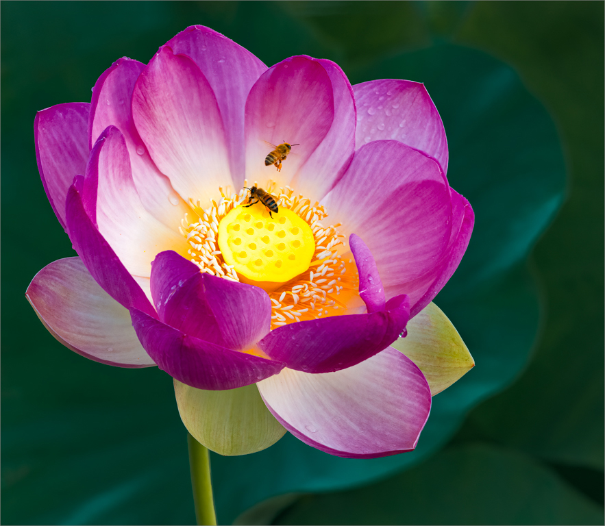
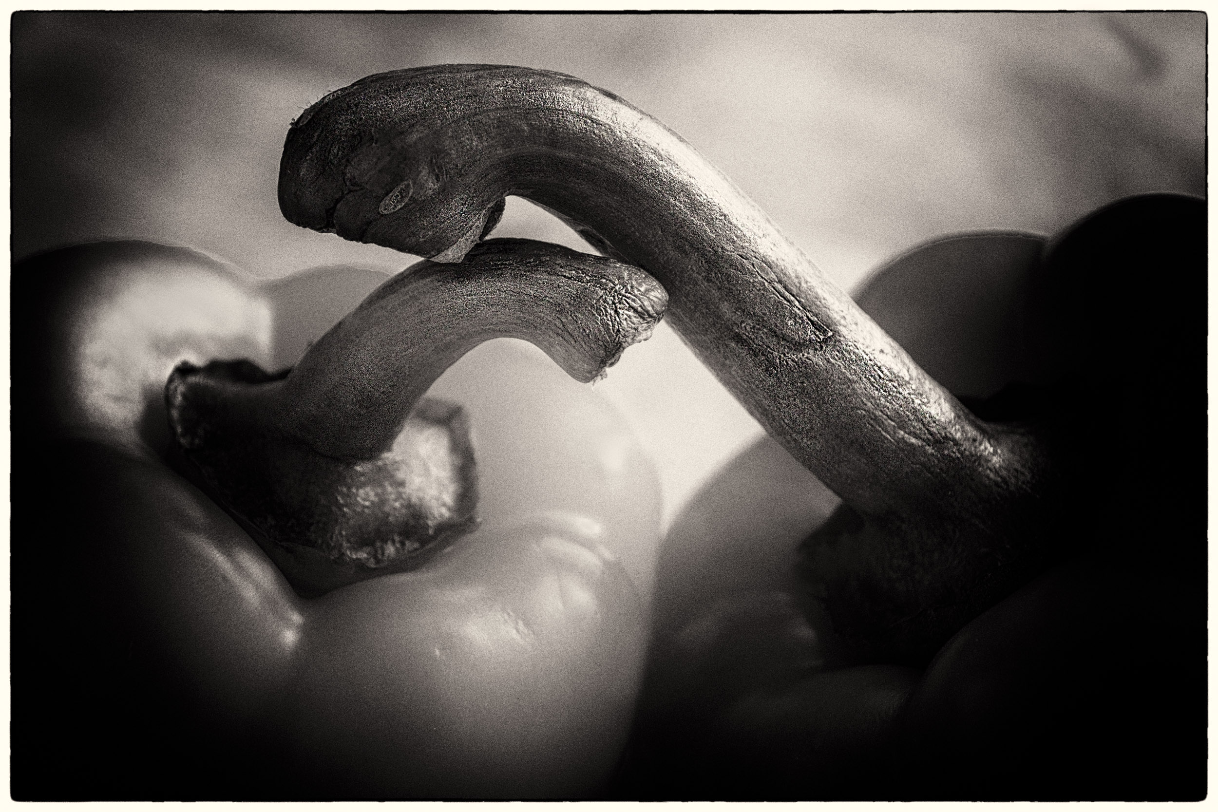
Georgianne
I wondered if when you were editing D's image, you tried just a curve and using a screen blend mode at about 50%.
I like the way you have brought out the tree trunk and branches. |
May 8th |
| 83 |
May 20 |
Comment |
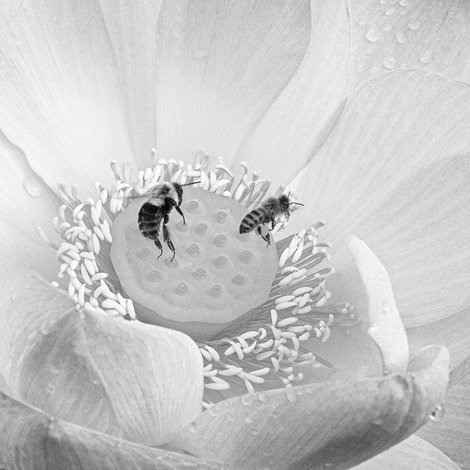
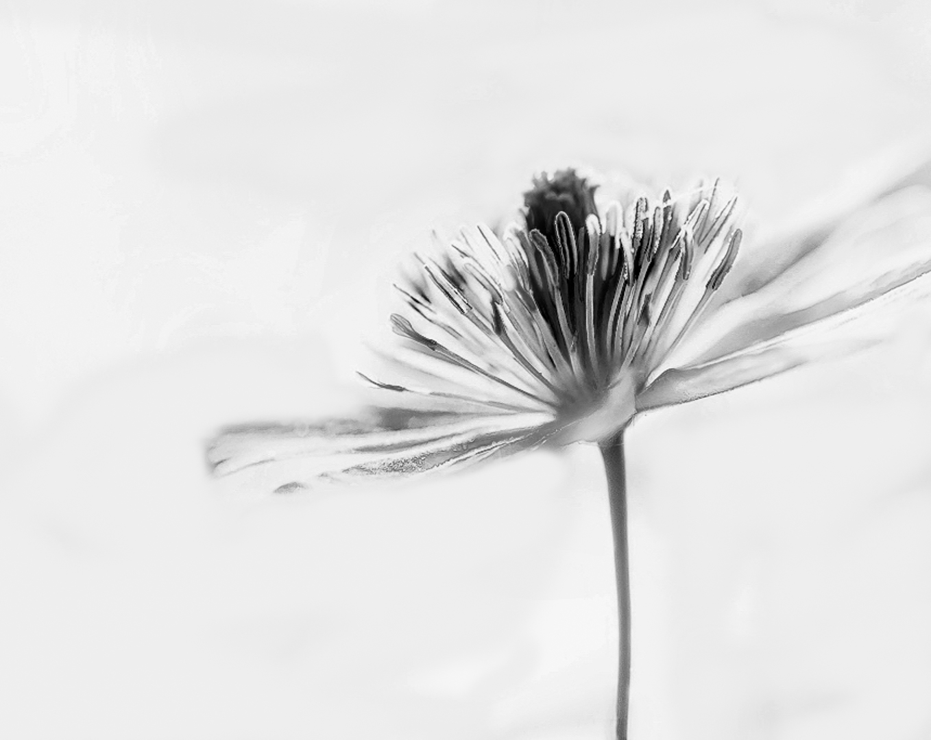
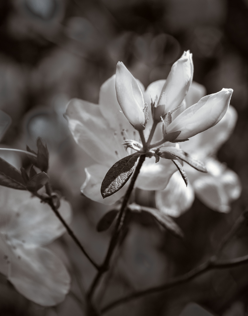
Georgianne
For me it was interesting to experiment with your image to try out the Infinite Color Panel to see how color toning and using more separation creates a different look to the image.
My edited version loses the soft dreaminess of your version. If you wanted more separation of the buds, perhaps you could use your posted version, dodge the buds slightly and paint a little bit of brightness on them. It depends on your vision for the image.
Editing your image was a useful experience for me, because I do not take many flower images nor understand the aesthetics of selecting them for further editing. I had the same difficulty when I looked at Lance's flower image three months ago. |
May 6th |
| 83 |
May 20 |
Reply |
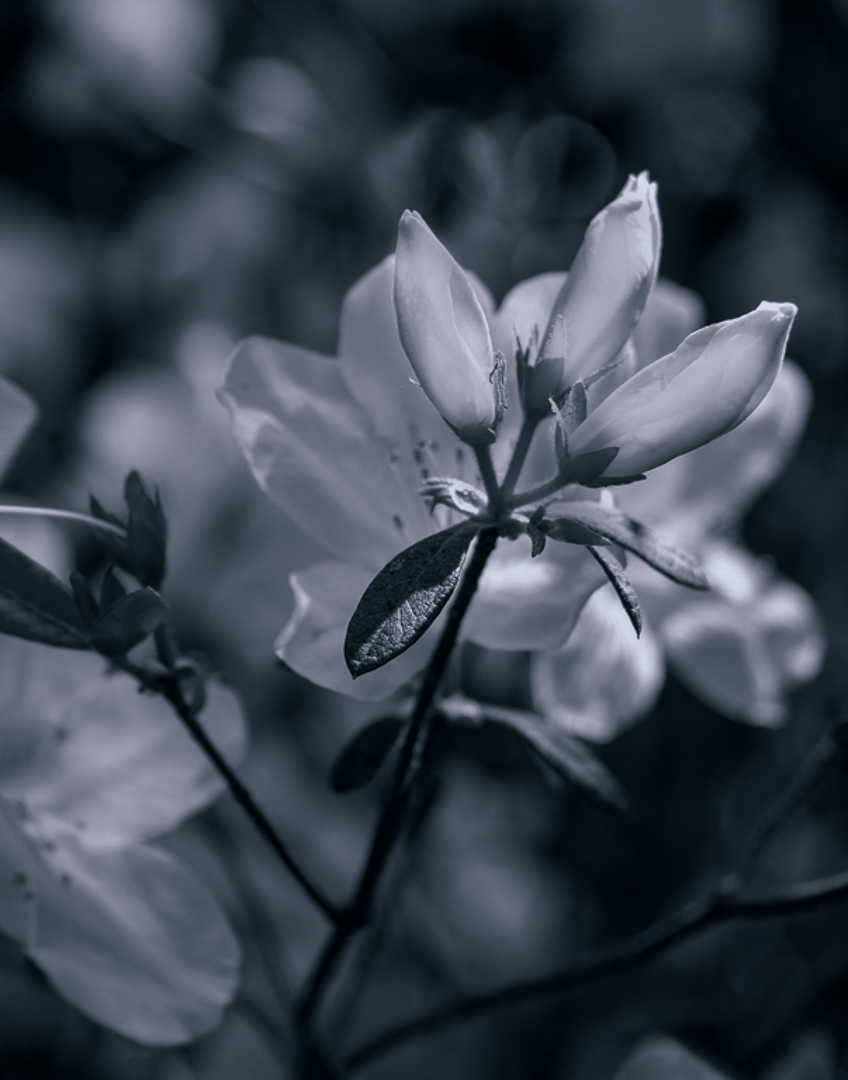
Dirk
I tried to bring out the flower more by applying a curve to increase the contrast, using a luminosity mask and burning the flower, then painting out the background. Then I applied in PS a BW adjustment layer blue filter and moved the sliders to create tonal contrast. I liked your crop but tried another one to see the effect.
JPS |
May 5th |
 |
| 83 |
May 20 |
Reply |
Georgianne
My first version where I did not burn the background. Also, I used a different tone. I keep clicking the Infinite Color Panel and it produces a different tone. |
May 5th |
 |
| 83 |
May 20 |
Reply |
Georgianne
I tried dodging the buds to brighten them, applying a brightness contrast layer to the buds and increasing the brightness and contrast, then applying a reverse mask to decrease the brightness on the overall image. Then I used a luminosity mask to burn out some of the brighter white areas in the background.
I applied the Infinite Color Panel to tone the image because I do not have your platinum filter I prefer your softer toning. You might not like the more burned out background in my attached image but I wanted to see if it was possible to get more separation. |
May 5th |
 |
| 83 |
May 20 |
Reply |
Lance
I took the image I edited yesterday, created a smart object, then in Nik Color Efex added two filters: detail extraction,and darken lighten centre.
Georgianne's flower made me think of using detail extraction. |
May 5th |
 |
| 83 |
May 20 |
Reply |
Georgianne
I admire all the steps you took to bring this image to life and interpret it to your vision. The platinum color gives a warm old time feel to this image.
For me, more separation between the buds and background would have brought more focus to the buds as shown in the color version.
|
May 5th |
| 83 |
May 20 |
Reply |
Lance
My reedit. |
May 5th |
 |
| 83 |
May 20 |
Comment |
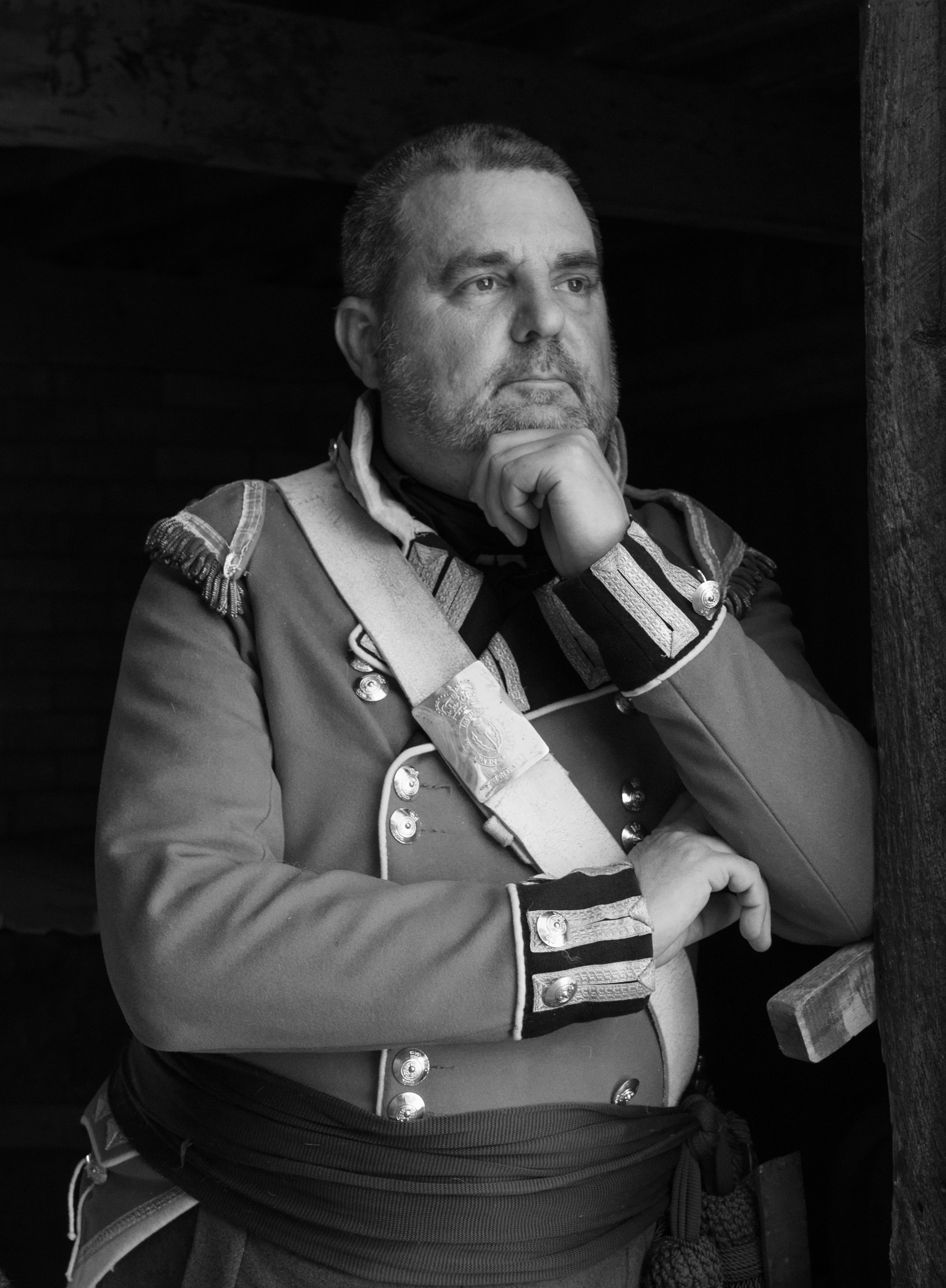
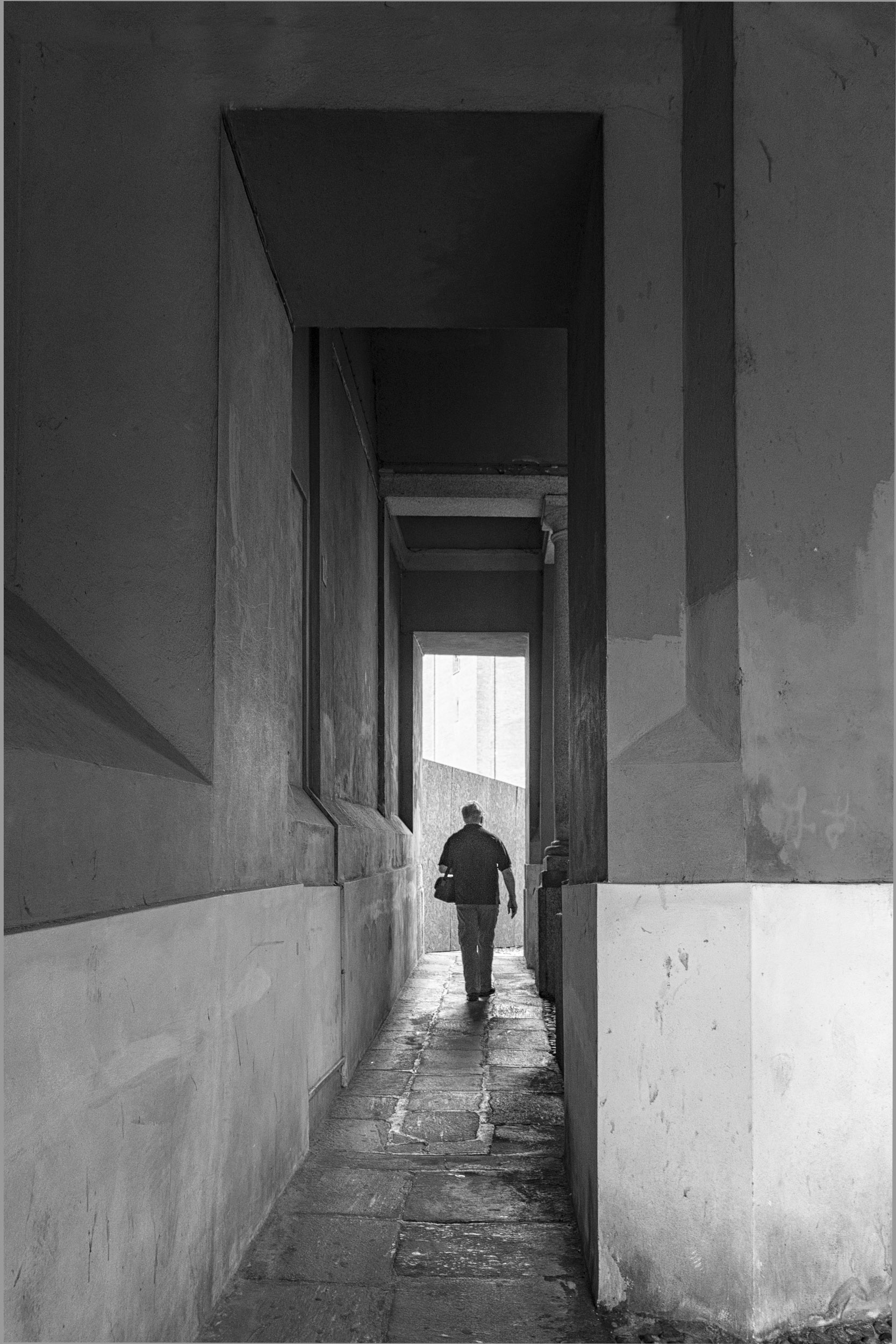
Jose
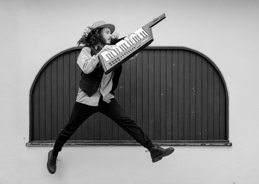
I liked the sky tone you used. I wondered if a simpler approach to draw more attention to the man was to put a light vignette around him.
JPS |
May 4th |
| 83 |
May 20 |
Comment |
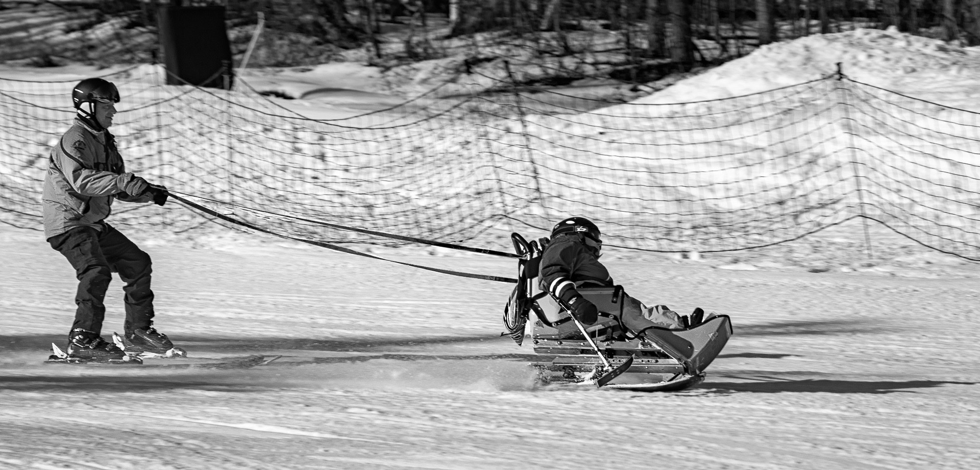
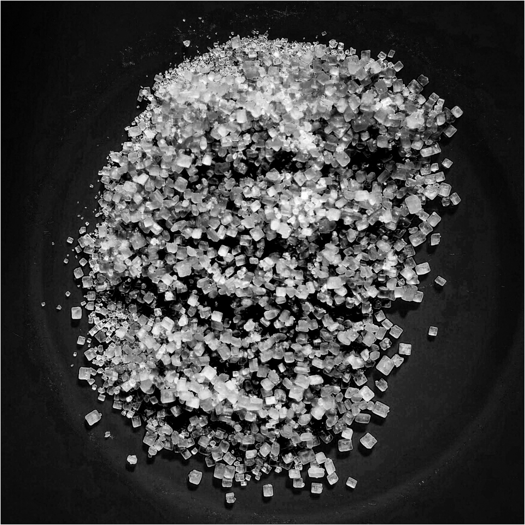
Lance
See attached.
In PS, I applied a luminosity dodge burn layer, and burned the highlights. Then I used a yellow PS BW adjustment layer and moved the sliders to create a variation in the color of the sugar crystals. Adding a white border gave a complete range of tone from black to grey to white.
JPS
|
May 4th |
| 83 |
May 20 |
Comment |
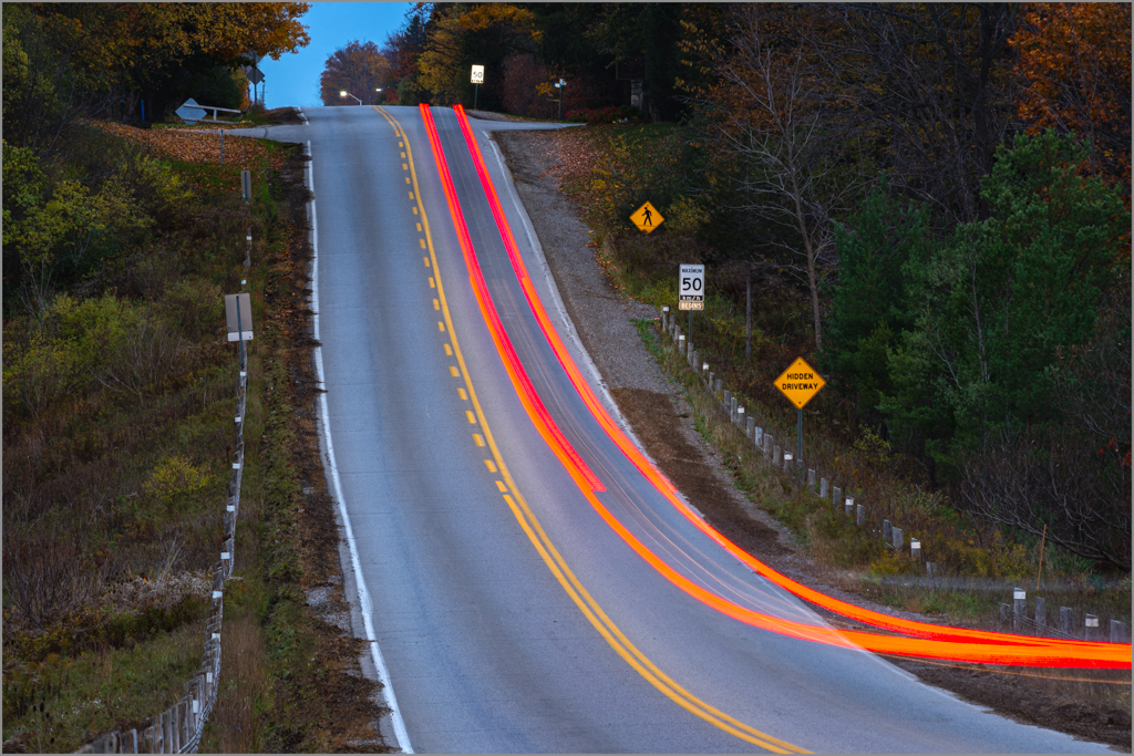
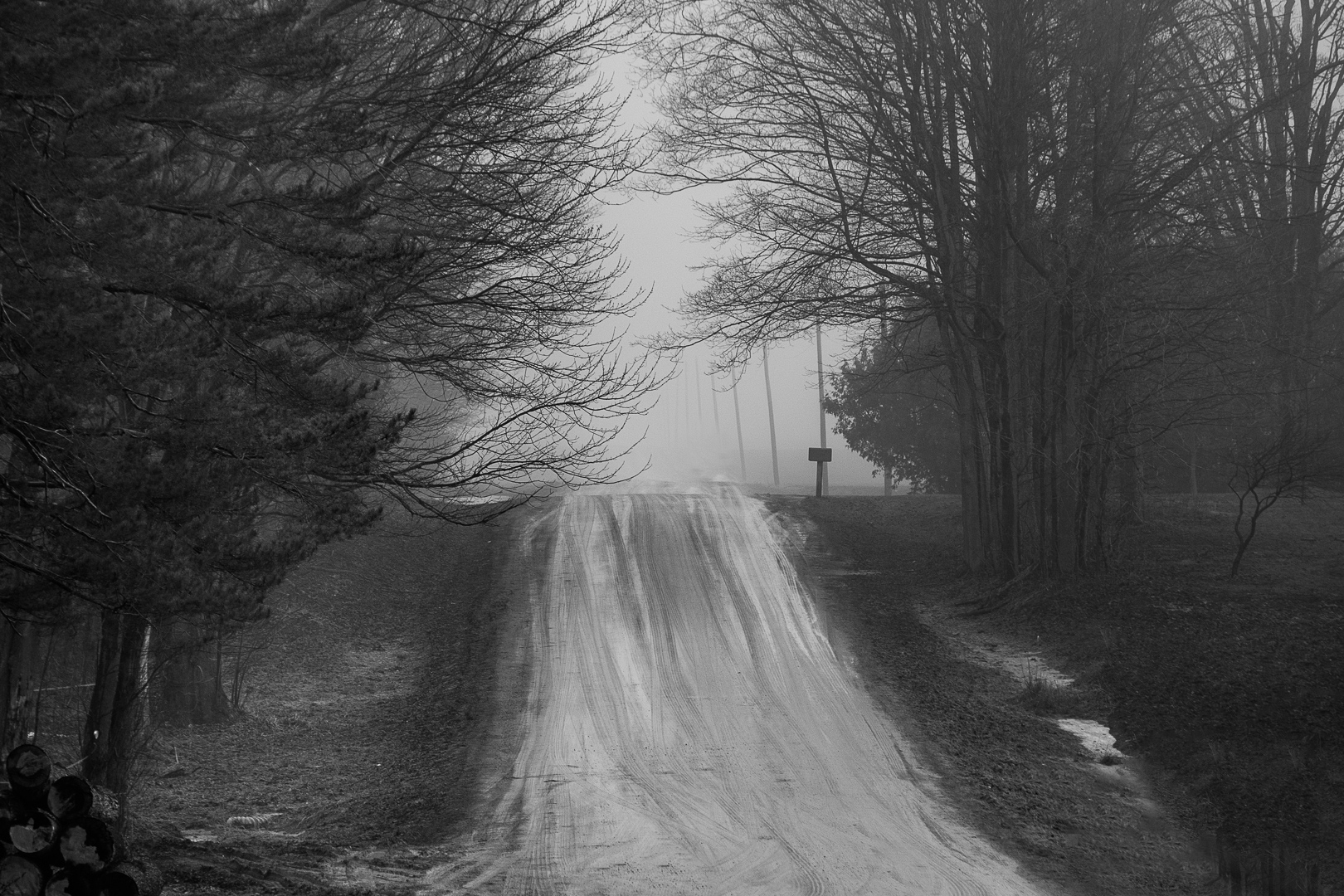
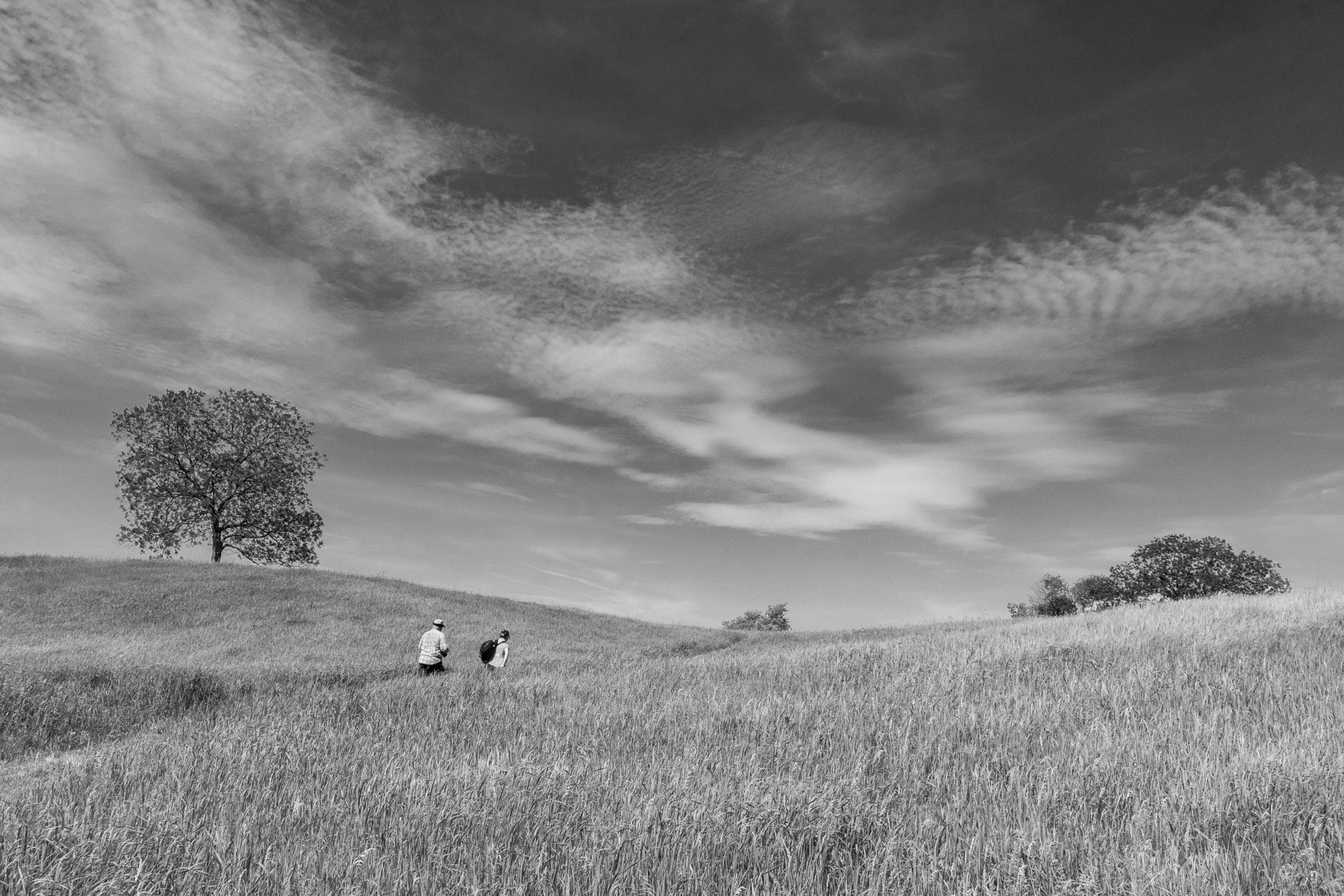
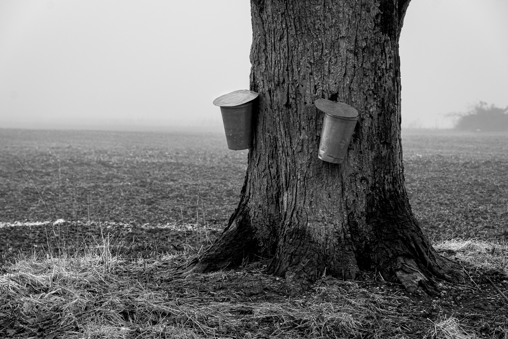
Georgianne
This is a country road so it does not get a lot of use. What you see is melting water on the road because the warmer land is heating the cooler denser moist air rolling in creating radiation fog (my nautical explanation). Also,the humid index is high.
I used Greg Benz's lumenzia panel (luminosity masking) in the version that is posted as the original, not the bigger image posted. In the bigger image, I used two curves layers to heighten the contrast between the white and the dark.
I have just completed the Greg Benz luminosity dodge burn course that I highly recommend members of our group consider. The course really made me think through what is my artistic vision for an image, and then how do I use editing to bring out this vision. In the lighter version (original), my concept was to show the dense fog by making things closer i.e. the trees more visible to the naked eye and the background almost white. In the image I edited last year, my approach was to lift the fog.
For a good explanation of luminosity, you could go to Greg Benz site on luminosity masking. Luminosity masking is a step beyond straight masking because one uses the luminence value of pixels to create masks. Rather than creating the masks myself which is cumberome, (there are videos showing one how), I chose to use the lumenzia panel which creates the masks. I can also customize the masks and then doge burn based on these masks. I can use the luminosity masks with dodge burn layers or with curves.
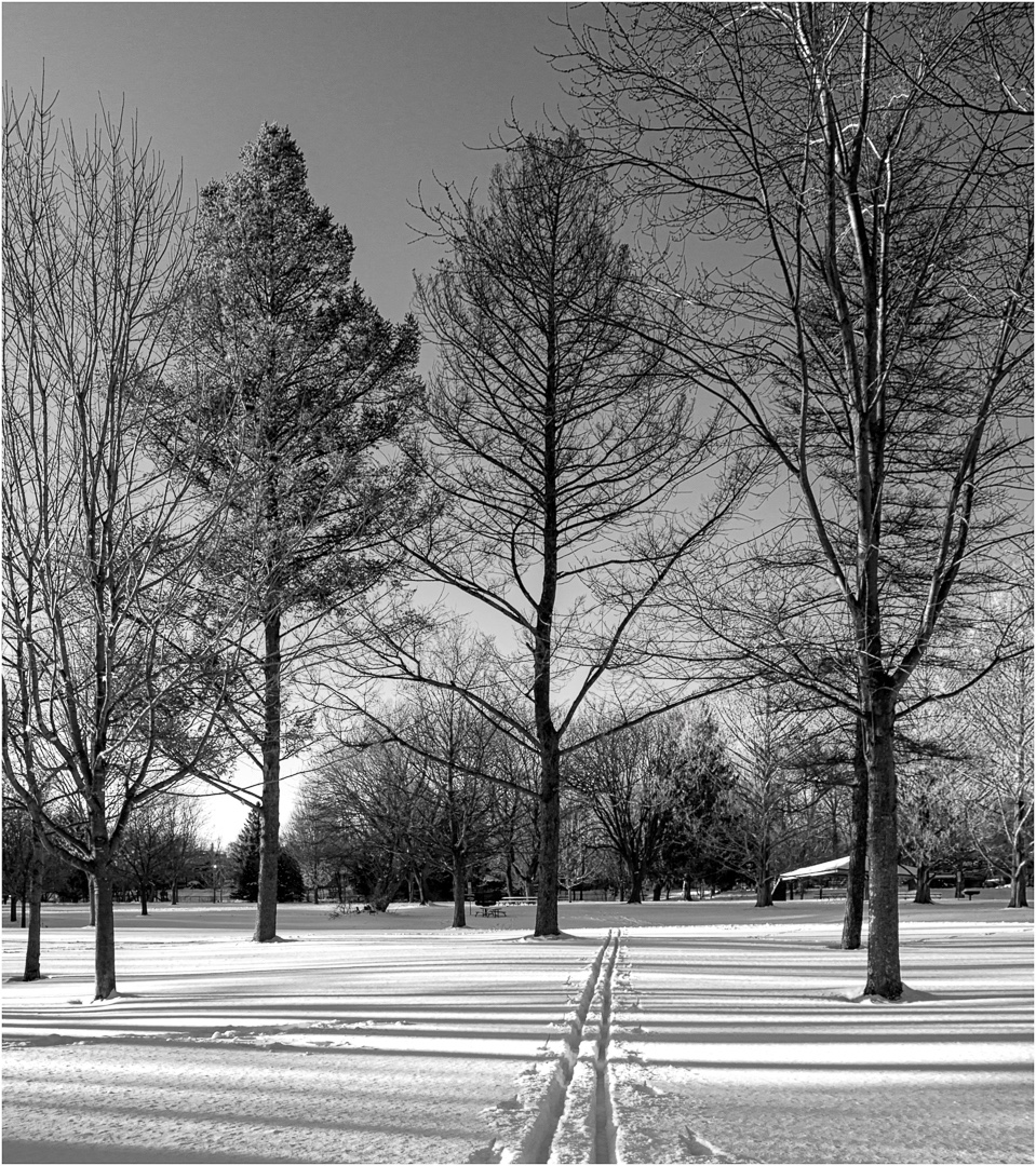
I have attached the image that I considered for this month. Look carefully at the tree trunk. I targeted the darkest pixels with a darks mask to bring out contrast and dimension. You can see how this brings out depth to the tree trunk and the tree stands out more clearly against the background. Also I targeted with a lights mask, the maple syrup pails to bring out the highlights in the pails and create more brightness and draw the eye. Then I applied an inverted vignette curve layer to draw attention to the pail.
Essentially what I am doing is creating more tonal contrast by going back to the simple principles of dodge burning.
I apologize for adding another image but I want you to see the benefit of editing with luminosity masking. I used a curve and luminosity mask last month on Debasiah's image to improve it. I also used luminosity masking on my January snow image to deal with a problematic issue of highlights blown out from the sun and a tree that merged with the background as well as to deepen shadows in the snow to create contrast, depth, and dimension.
|
May 1st |
 |
5 comments - 6 replies for Group 83
|
5 comments - 6 replies Total
|