|
| Group |
Round |
C/R |
Comment |
Date |
Image |
| 83 |
Feb 20 |
Reply |
Georgianne
I like your sense of humour.
JPS |
Feb 24th |
| 83 |
Feb 20 |
Comment |
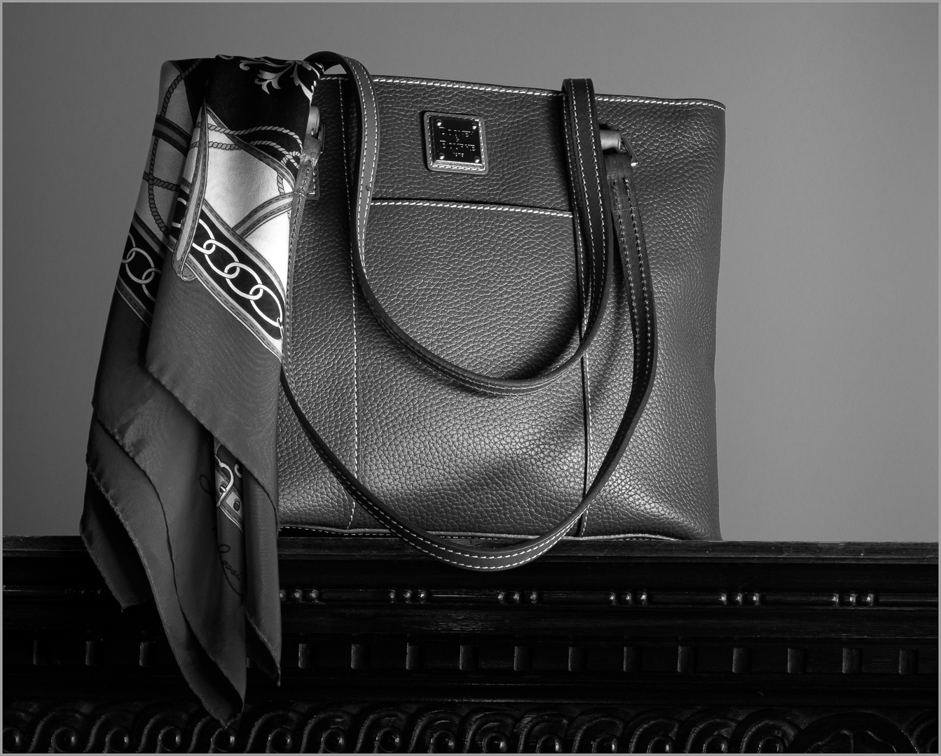
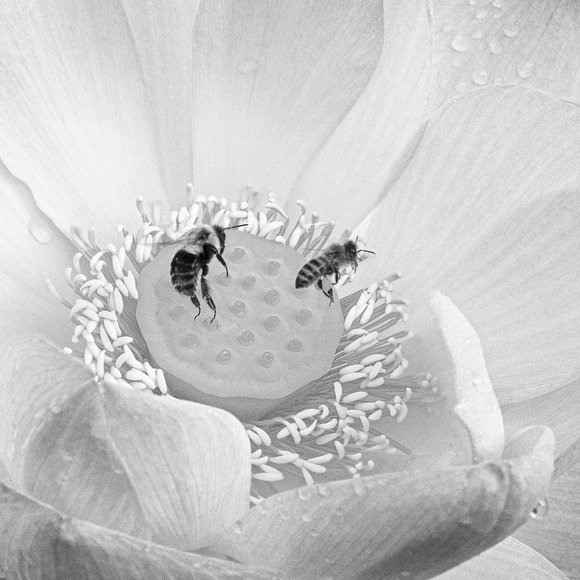
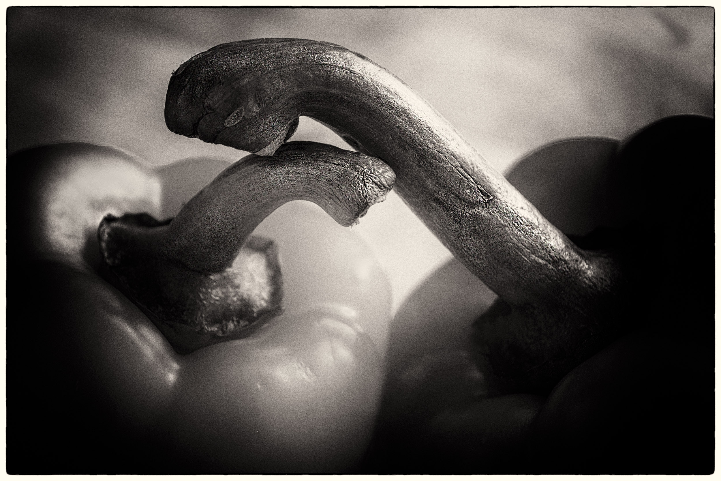
Here is the image where the light falls more on the label. However, there is not the same sense of dimension as in the image I used for this month. Also, the folded scarf adds more style. |
Feb 24th |
 |
| 83 |
Feb 20 |
Comment |
Georgianne
I revised the image adding a brightness/contrast adjustment layer selecting just the label, lassoed around the label and applied a slight vignette/curve, then grouped my two monochrome PS adjustment layer and did a selection of the scarf red border. That is an interesting suggestion.
I also looked to see if I had light painted an image which highlighted the label. I will attach that separately so you can see the effect with using light painting to draw attention. Unfortunately, I did not have an image that both included the scarf and highlighted the lable. |
Feb 24th |
 |
| 83 |
Feb 20 |
Comment |
Dirk
This is an interesting design and use of soft focus and repetition to create depth.
Did you consider adding light to the fork tines to draw more attention to this area?
|
Feb 11th |
| 83 |
Feb 20 |
Reply |
Lance
I find as our group is evolving, we are commenting less on the aspects of monochrome conversion and more on the aesthetic of monochrome, fine art, and visualization.
|
Feb 5th |
| 83 |
Feb 20 |
Reply |
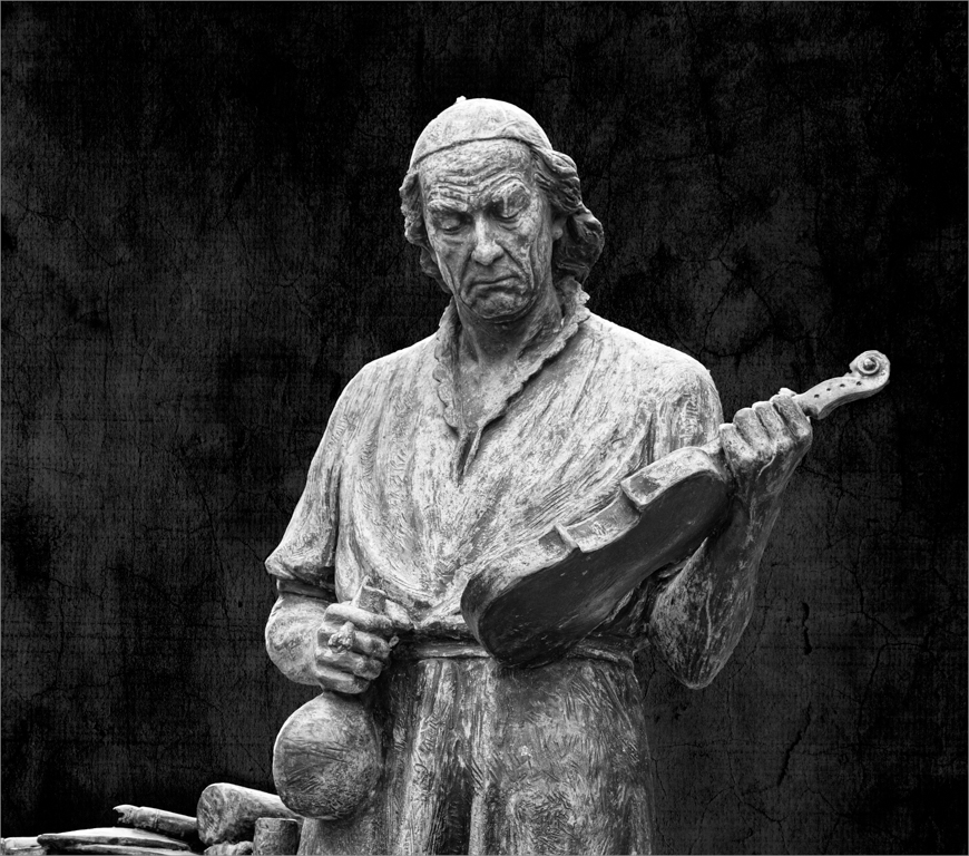
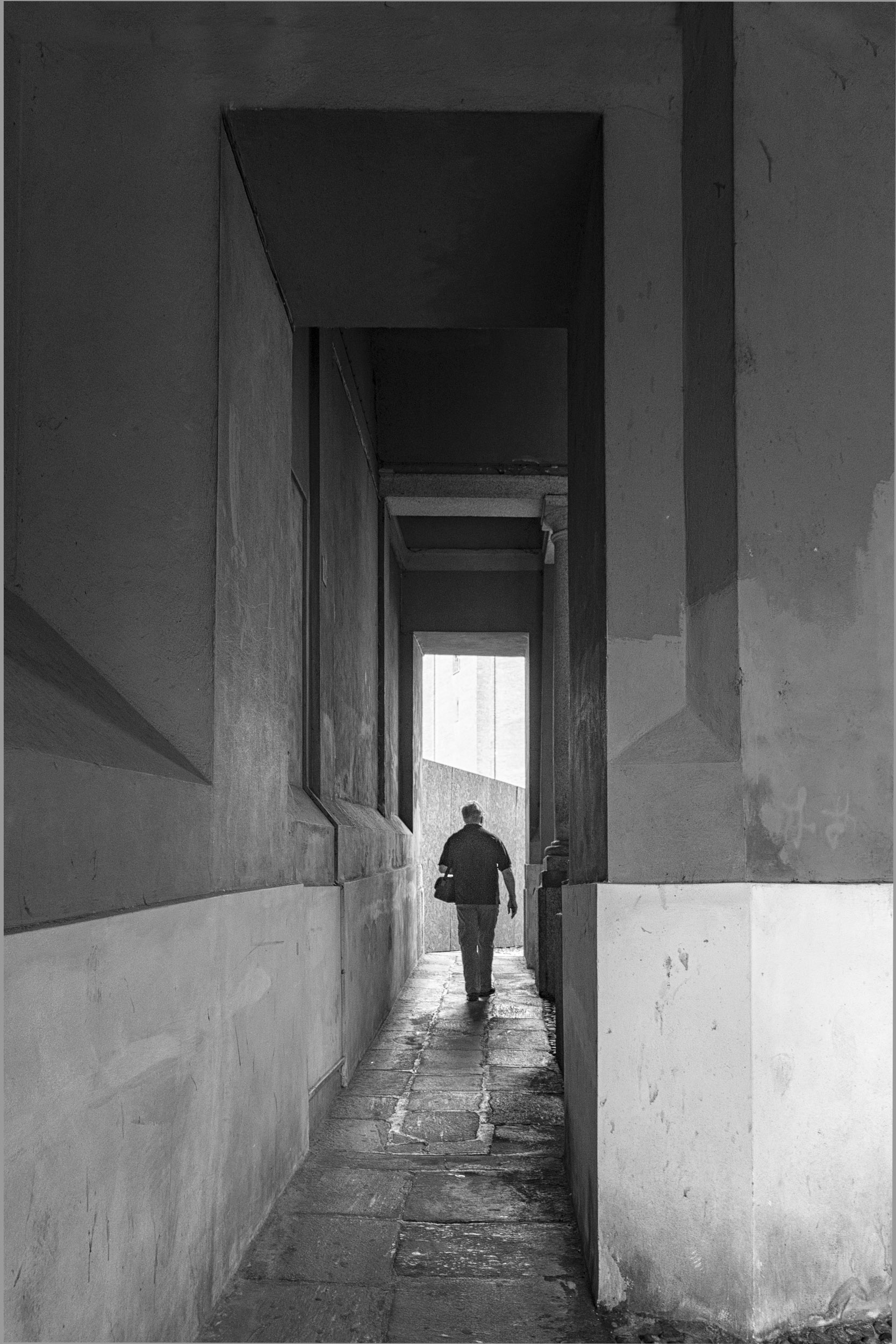
Jose
The bright sky did not bother me.
What I liked about this image was the juxtaposition of the rushing man and his violin case with the stationary mannequin on the left and the slower moving people in the background. Your image brought home a deeper meaning to me that we often rush through life forgetting to listen to the music.
|
Feb 5th |
| 83 |
Feb 20 |
Comment |
Georgianne
When I wrote the sky in your original version is not realistic, I meant the monochrome version.
I have not used textures and cannot comment on that aspect of your image.
When I sailed lake Ontario for 20 years, we read the clouds and water to tell us when to head to harbor. I do like your brooding sky in the colored image because it tells me rain is imminent. Taking an image of the whole tug anchored in harbor to showcase it and choosing the best perspective is such a challenge.
I am curious how the image would look with no texture overlay in the sky.
Your tug image has really brought home to me, how we filter pictures through our experience and the challenges of dealing with the limitations of the camera and editing software to create our memories and vision.
|
Feb 5th |
| 83 |
Feb 20 |
Comment |
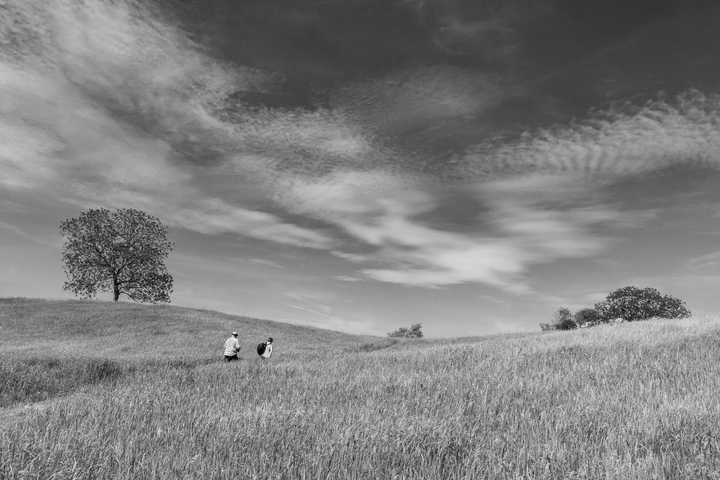
Lance
I much prefer the original image you submitted. In the second, I find the fence and walkway visual blocks but not in the first. The walkway in the first image is a dramatic element leading me into the composition.
For me, your color toning adds interest while the sun flare provides a time reference: about 11:00 a.m. or 1:00 p.m. I like how you handled the lighting of the sun flare and the image has a light feeling.
Your images of trees and this image are taken looking up. Is this your preferred perspective for images?
|
Feb 3rd |
| 83 |
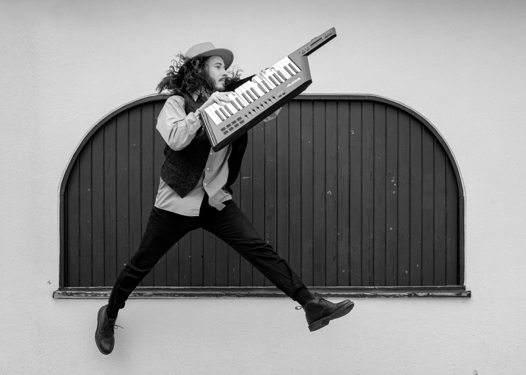
Feb 20 |
Comment |
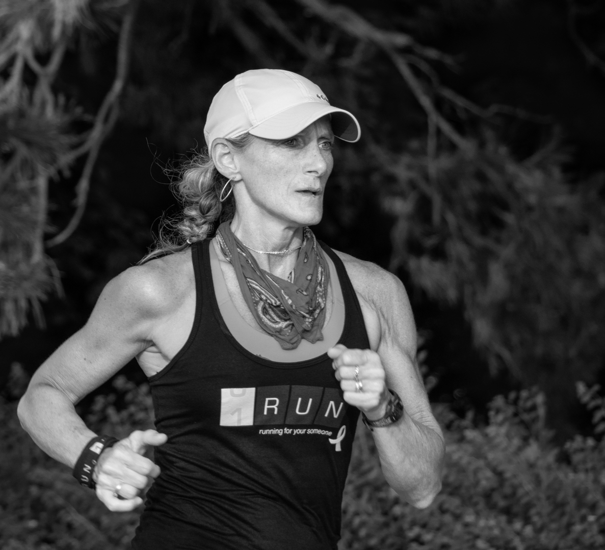
Jose
I like the perspective, use of shutter speed, and placement of the man in the frame. They convey a sense of energy, speed and purpose. The wide focal length gives context. You have nicely separated the man from his background.
I wondered if dodging the top of the building right behind the lamp post, central top part of your image would create more separation with the sky. However, the downside might be that the lamppost might disappear. |
Feb 3rd |
| 83 |
Feb 20 |
Comment |
Georgianne
I agree with Lance's comment about the sky.
I lived on Vancouver Island or 12 years and sailed the Straits of Georgia. We would sail across to Vancouver or down to Seattle and encountered many tugs and have looked at many skies. For me, the sky in your colored version is not realistic. Tugs get weather beaten. That is part of their beauty. |
Feb 3rd |
| 83 |
Feb 20 |
Reply |
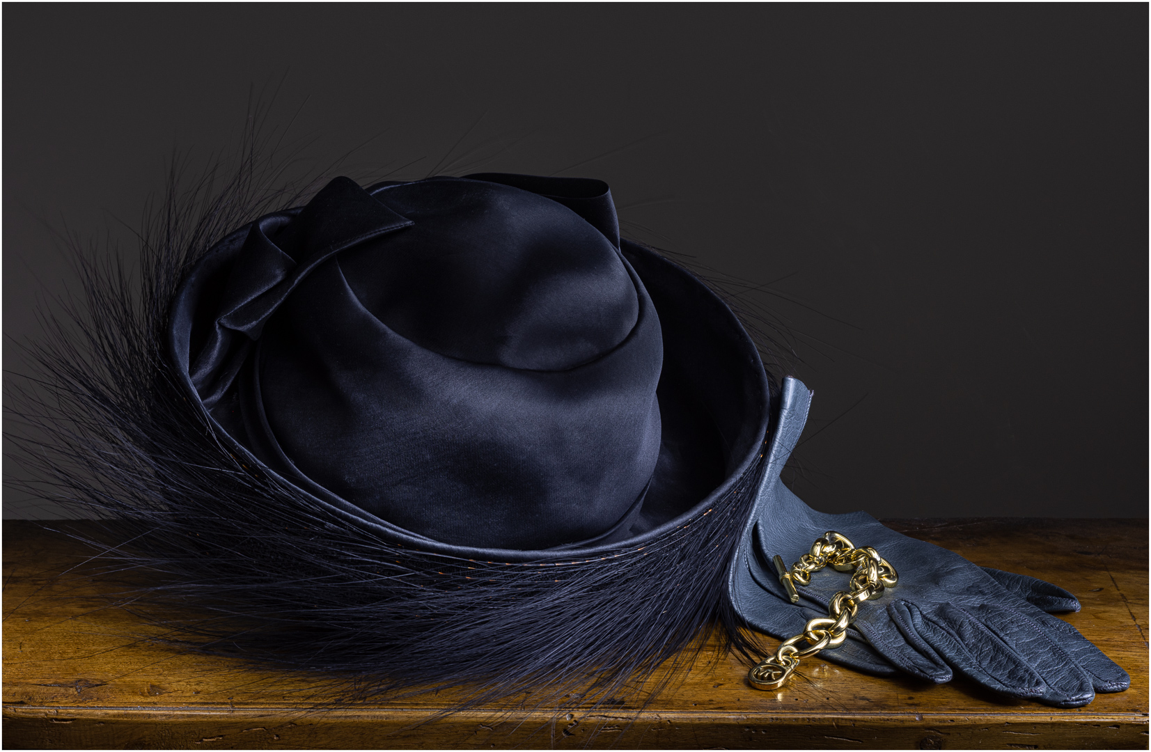
Lance
I found that when using a glass, it should be filled to avoid problems with highlights on the glass. Because I put the purse on the top of the armoire, for this setup a wine glass does not work.
I have attached the image that I made for the DDG showcase for this month. You are right on: hat, gloves, and bracelet. I converted the image to BW but attach the color.
|
Feb 3rd |
 |
| 83 |
Feb 20 |
Reply |
Lance
Here is the alternate image. |
Feb 2nd |
 |
| 83 |
Feb 20 |
Comment |
Lance
I revised the crop. Also, I masked the wall to create 2 BW layers, one to for the wall, the other for the purse and armoire so I could treat the blue slider differently on each mask.
I am also attaching another setup with the scarf beside the purse to balance the composition.
Amazing how neatly folding and placing a scarf creates an image of elegance while scrunching it creates a realistic image and the balance and crop change.
Now tell me which you like. |
Feb 2nd |
 |
8 comments - 5 replies for Group 83
|
8 comments - 5 replies Total
|