|
| Group |
Round |
C/R |
Comment |
Date |
Image |
| 83 |
Jan 20 |
Comment |
Jane
Thanks for the suggestions. I copied your image from dropbox and will use it and the other suggestions as a guide for my reedit. |
Jan 23rd |
| 83 |
Jan 20 |
Comment |
Georgianne
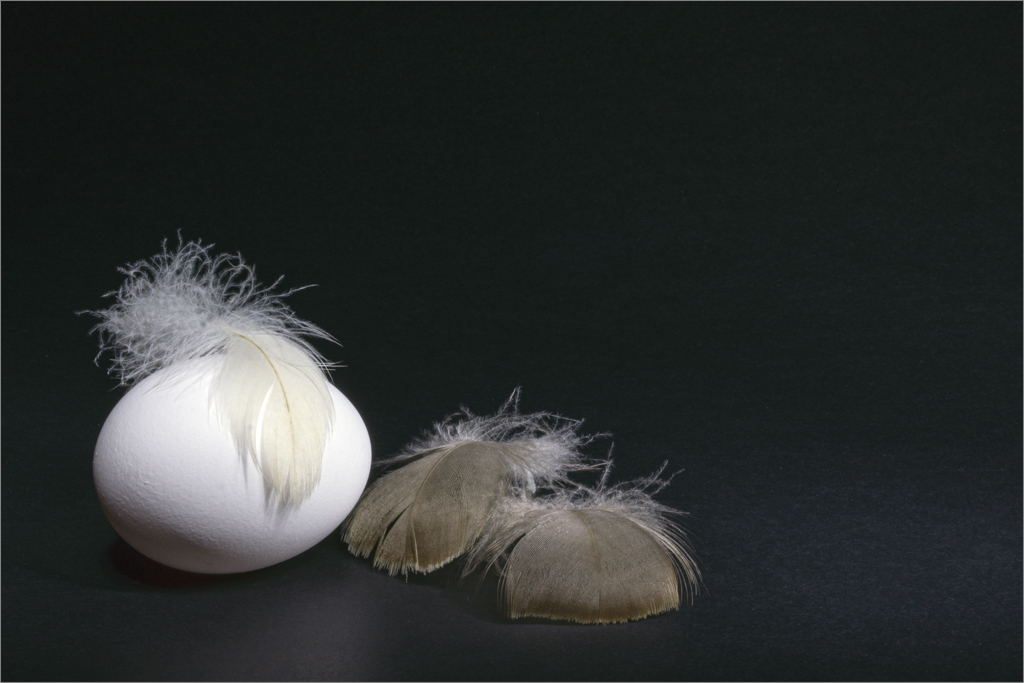
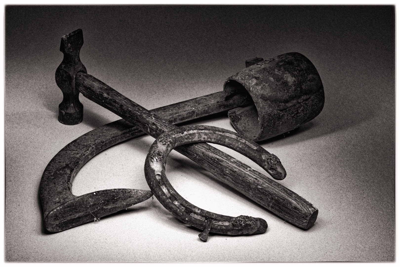
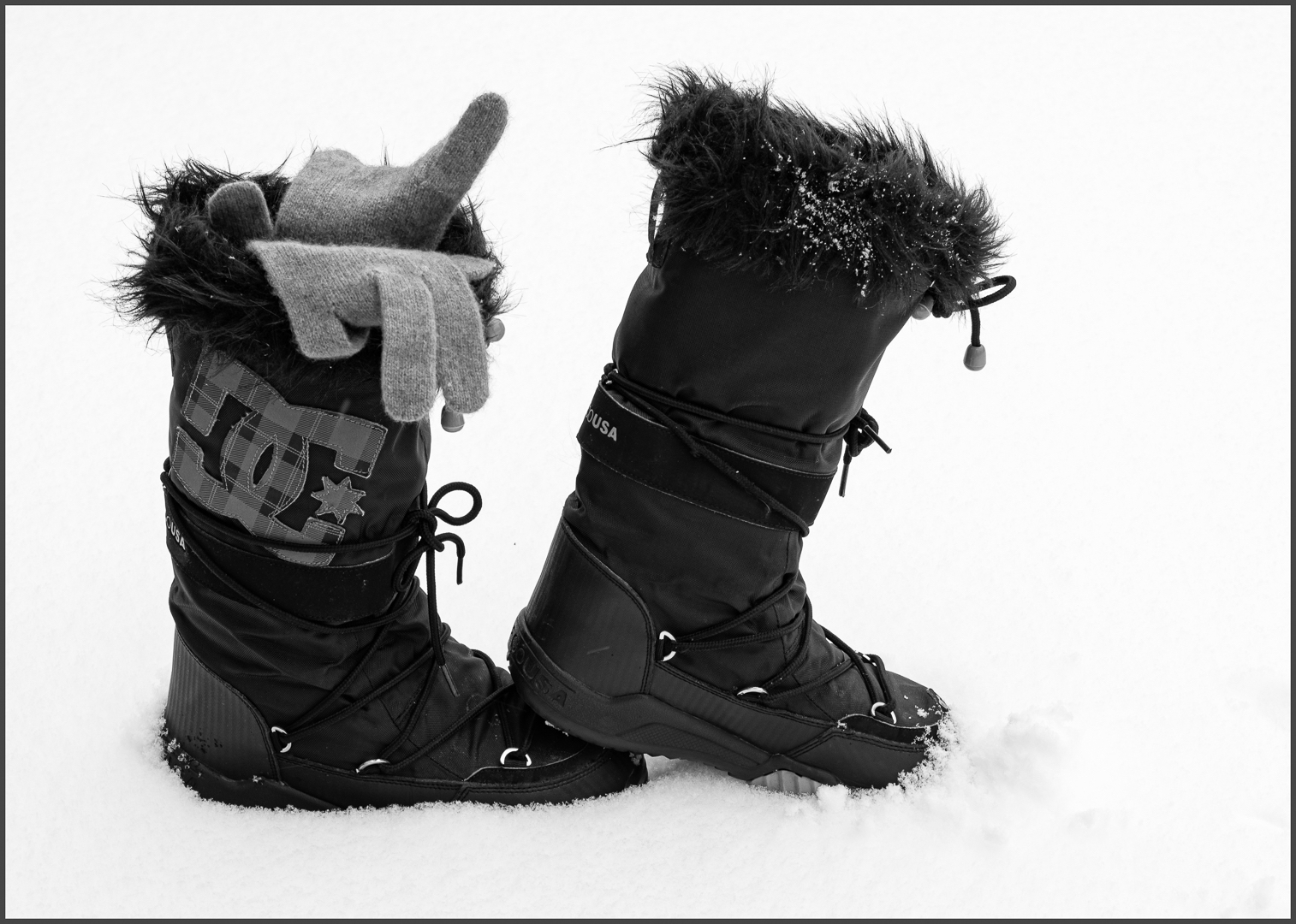
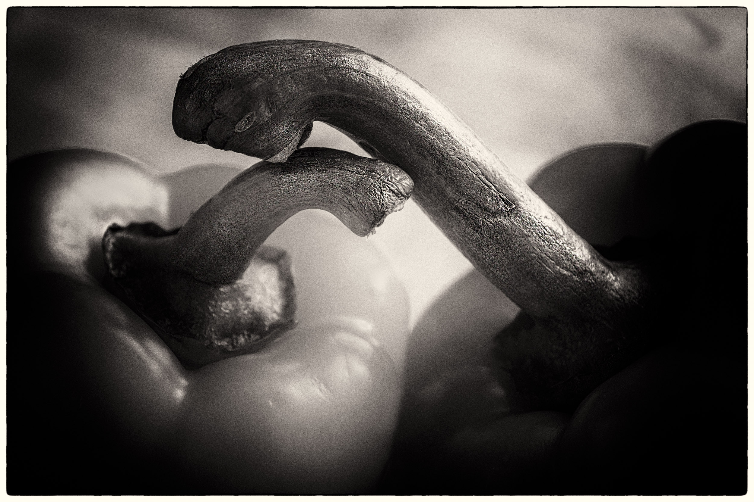
I took this image because I was doing the PSA still life course and wanted to try a still life. Also, on Dec. 31, it finally snowed. London Ontario is in the snow belt but this winter we have had warmer temperatures than usual and rain.
I am not experienced with the Selective Color Adjustment layer and will watch some videos on how to use it.
In my work flow, after global adjustments, I check whether to apply a levels adjustment, and secondly a contrast adjustment layer and which tool (contrast in CR or an adjustment layer). For this image, I was cautious because of the extreme color contrast difference between the white snow in the background and the black boots.
I put the new Greg Benz dodge and burn course on the back burner until I finished the Still Life course. With your and Lance's suggestions, I will now turn my attention to this area to learn how to improve my editing.
JPS |
Jan 17th |
| 83 |
Jan 20 |
Comment |
Lance
Thanks for the suggestions. I will try them.
JPS |
Jan 12th |
| 83 |
Jan 20 |
Reply |
Lance and Georgianne
Thanks for your responses.
Georgianne, to clarify a point. I am not teaching but took the PSA History of Photography course Feb - May 2019. Picking up a digital camera in Jan. 2017, I have been on a steep learning curve and taken all but one PSA on-line course. I just finished the Still Life Course. That is the reason for my Still Life images in Dec. and Jan.
My background is in research, analysis, evaluation and review, so I tend to bring that same approach with me to photography. I enjoy seeing the different images our group produces and the receptivity to exploring and learning from each other. |
Jan 12th |
| 83 |
Jan 20 |
Reply |
Lance
Yesterday, as I photographed a hat and pair of gloves using different lighting scenarios(natural, CFL, mixed) and backgrounds (wood, white foam core, and black foam core) and observed the different outcomes, your tree images came to mind. I realized how even with nature, you can go back to the same subject matter, simplify, and explore it with different lighting - the sun peaking through the fog. Thanks for giving me this in site. |
Jan 12th |
| 83 |
Jan 20 |
Reply |
Georgianne and Lance
It is interesting with your and Jane's images this month, that both are experimenting with toning.
When I replicated ambrotype images for my History of Photography course, I used the CEP ambro type toning. Have you experimented with the SEP toning or do you prefer the PS photo filter or is it "it depends"?
JPS
|
Jan 12th |
| 83 |
Jan 20 |
Comment |
Jane
I like the changes. Greg Benz had mentioned in one of his videos that he often used the blue cast if it fit the landscape scene. That is where my suggestion. He used the PS photo filter. He also mentioned in his new dodge and burn course about things in the distance being more hazy.
JPS
|
Jan 12th |
| 83 |
Jan 20 |
Comment |
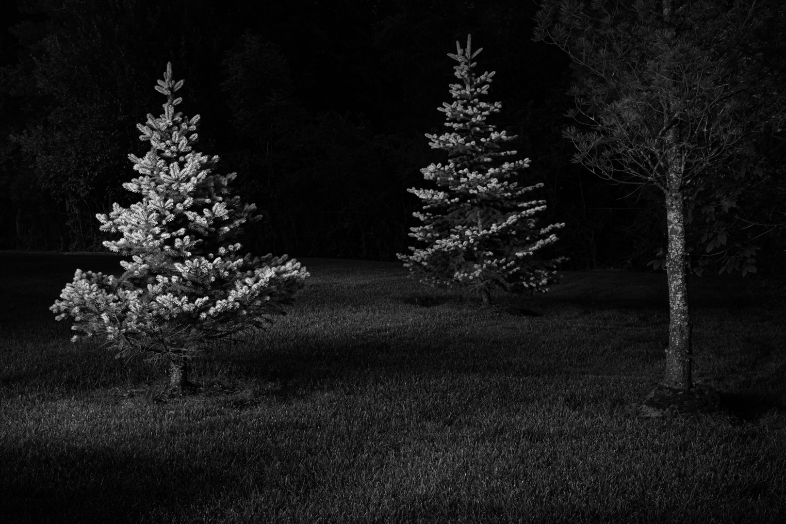
Georgianne
I like your use of the yellowish tint to give an aged look to this image.
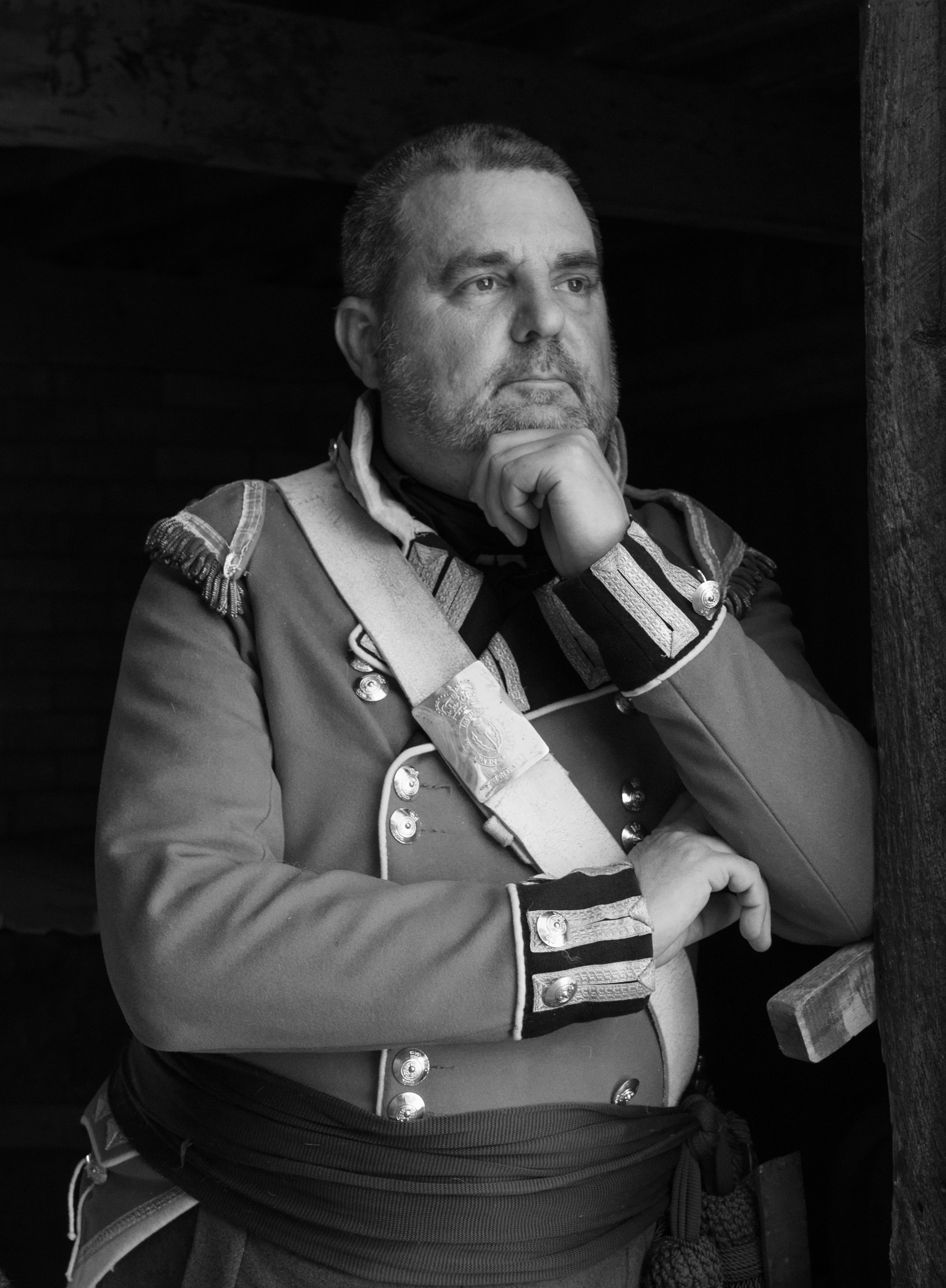
I have a couple of suggestions for your consideration. The grass on camera left close to the bottom as well as the highlights on the tree trunk for me seem too bright. Reducing the overall exposure slightly, 0.2 EV, in LR still retained the bright sunny look and increased the contrast in the image. However, the light area of the tree trunk was still for me distracting and could be toned down.
Using tree branches on camera left and right creates dimension and depth in the image. However, I found the blur on the edges distracting. I had to ask why the blur and then noticed it was because you used a blur vignette.
My comments are slightly biased since I have been focusing on still life for the past two months, looking at backgrounds, lighting, simplicity, DoF, sharpness etc where the photographer has complete control.
It was interesting to look at the exact opposite scenario your image presents and to see how you handled a complex scene with difficult lighting to create a monochrome image. |
Jan 10th |
| 83 |
Jan 20 |
Comment |
Jane
For me, this image conveys the cold bleakness and solitary nature of winter.
I wondered if you dodge more the central rock, it might disappear more into the water.
I noted how you had dodged the foreground trees in the upper 1/3 of the image and burned the taller trees behind them. To create more a sense of depth, you may wish to reverse this, dodging those in the foreground and burning those in the background to create a greater sense of depth as visually in general things in the distance appear more hazy compared to those in the foreground. When I looked at your original image, it seemed all these trees were dark and you purposely chose how you would dodge and burn but I am not certain.
I liked the cold blue tonality of the original image. Would you consider toning your image with a blue cast? |
Jan 10th |
| 83 |
Jan 20 |
Comment |
Dirk
I find this high key image pleasant. The light grey tonality and haze of the trees in the distance create the sense of distance. It is amazing that you captured those birds in such tight formation and that they are placed in just the right spot to balance the composition.
I was puzzled by the reflections of the main tree and fence posts. I like how the main tree is reflected into ice? However, given that the land is flat, I wondered why the tree was in water to up to mid tree trunk height and the pattern of some of the other reflections. Is this image a composite?
One suggesting is to crop slightly tighter at the top of the image if you wished to bring more attention to the tree on camera left. Keeping the fence post in on camera right gives the sense that the scene keeps moving on. |
Jan 10th |
| 83 |
Jan 20 |
Comment |
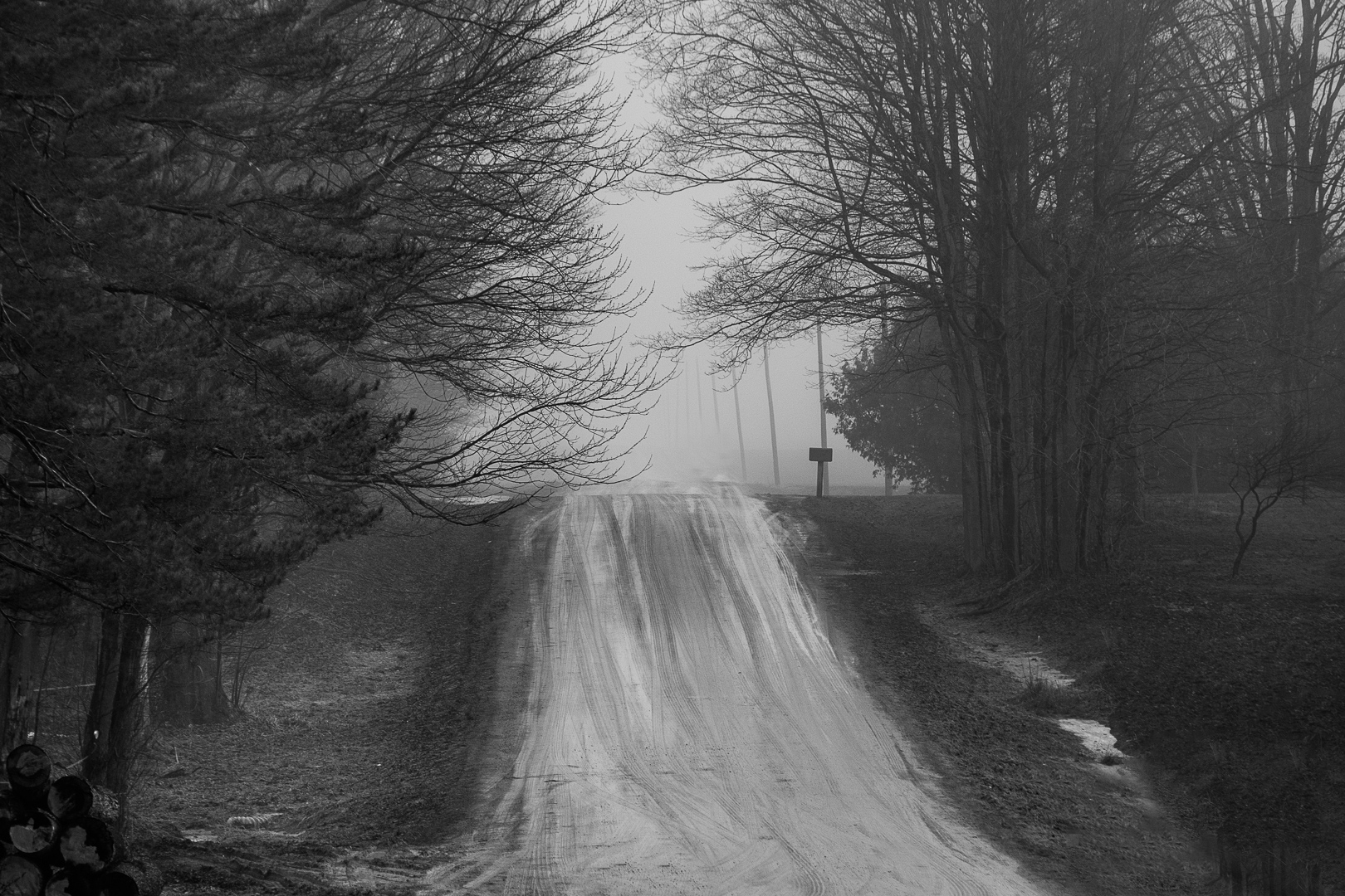
Lance
You are motivating me to try more landscape images with trees. Both last month's image and this, have similar viewpoints and subject matter, and create an ethereal feeling.
I like how you have handled the sun and its position in the composition to draw the eye into the middle of the image. The branches of the tree on the left crossing horizontal add interest and depth to the vertical composition. The blue/grey toning to me, conveys the feeling of winter.
My suggestion for improvement, given the position and direction of the sun, might be be to dodge a little more the right side of the two larger tree trunks on camera left to create a little more sense of depth. However, I am not sure if given the opaque sky this would be realistic. I was surprised when I photographed alpacas when snowing with opaque skies, that there was still back lighting because of the direction of the sun behind them. Therefore, I do not know if this would be realistic in your image.
I wish the dark tree trunk in the upper left corner were not there. However, it shows how skillfully you were able to define the boundaries of the image, where I might have seen confusion. |
Jan 10th |
8 comments - 3 replies for Group 83
|
8 comments - 3 replies Total
|