|
| Group |
Round |
C/R |
Comment |
Date |
Image |
| 83 |
Dec 19 |
Reply |
Lance
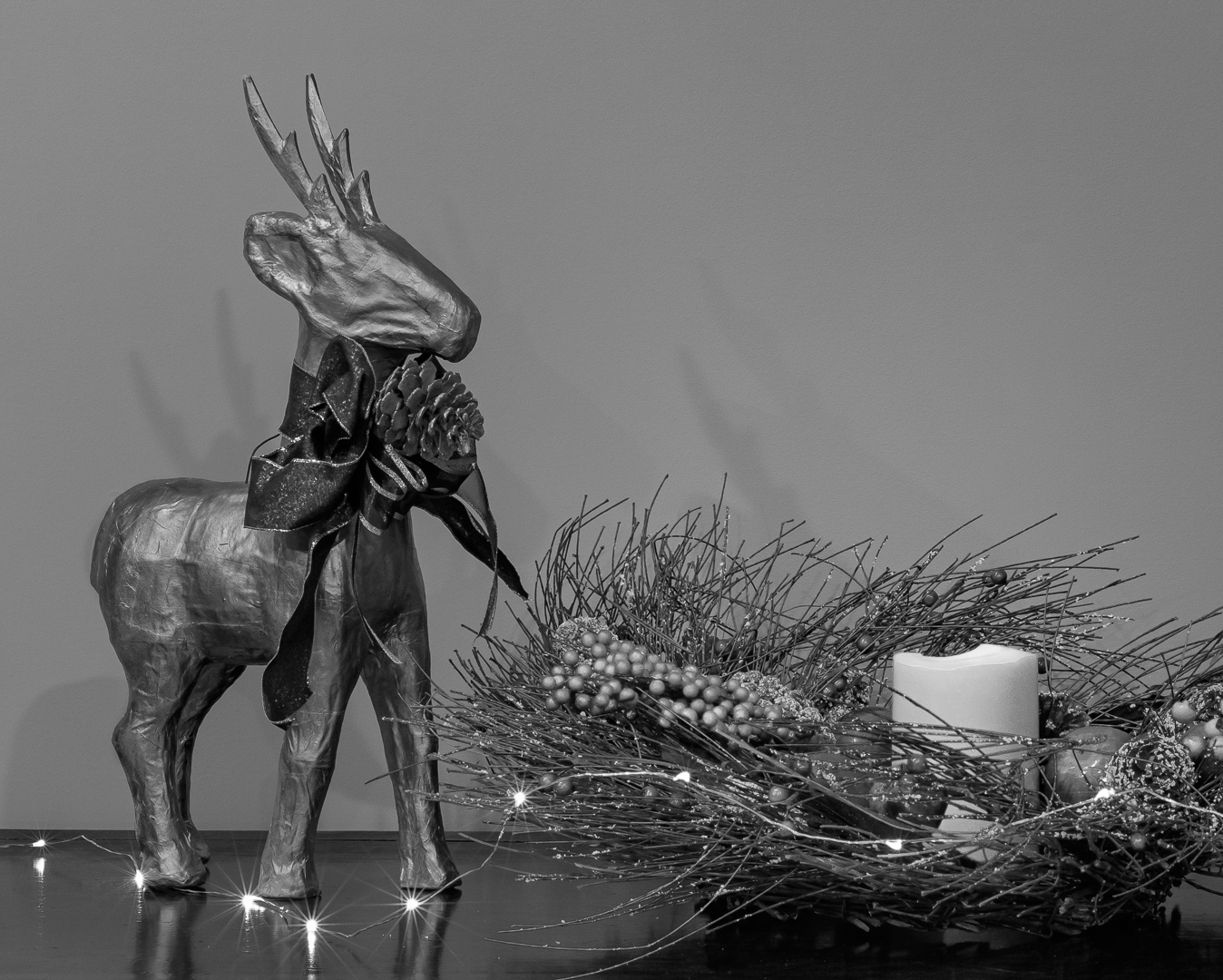
I did a slight reedit to create tonal contrast with the wall image. However, it still did not work as well as black. |
Dec 20th |
 |
| 83 |
Dec 19 |
Comment |
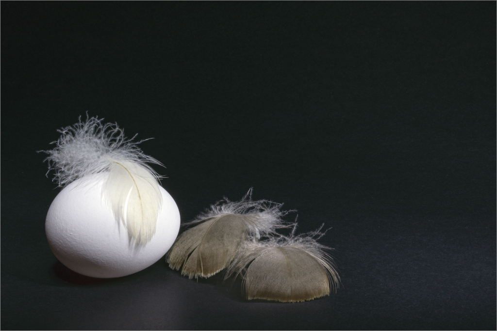
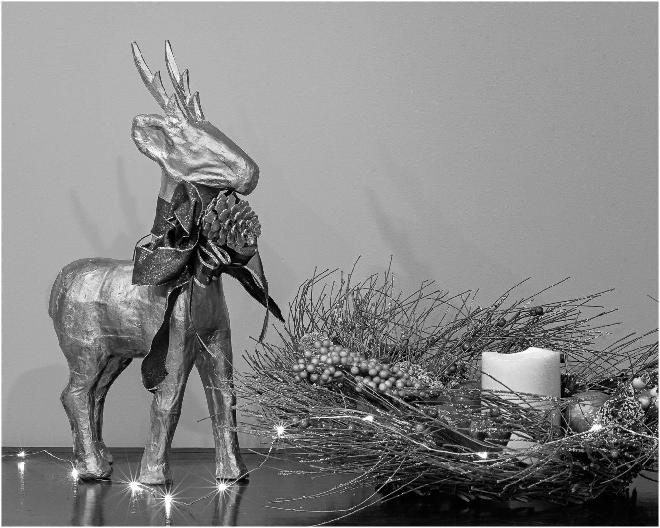
Jane
Those are two good suggestions and I will try it out. I think I would put the pine cone in front of the deer's foot but would have to experiment with the positioning.
|
Dec 20th |
| 83 |
Dec 19 |
Reply |
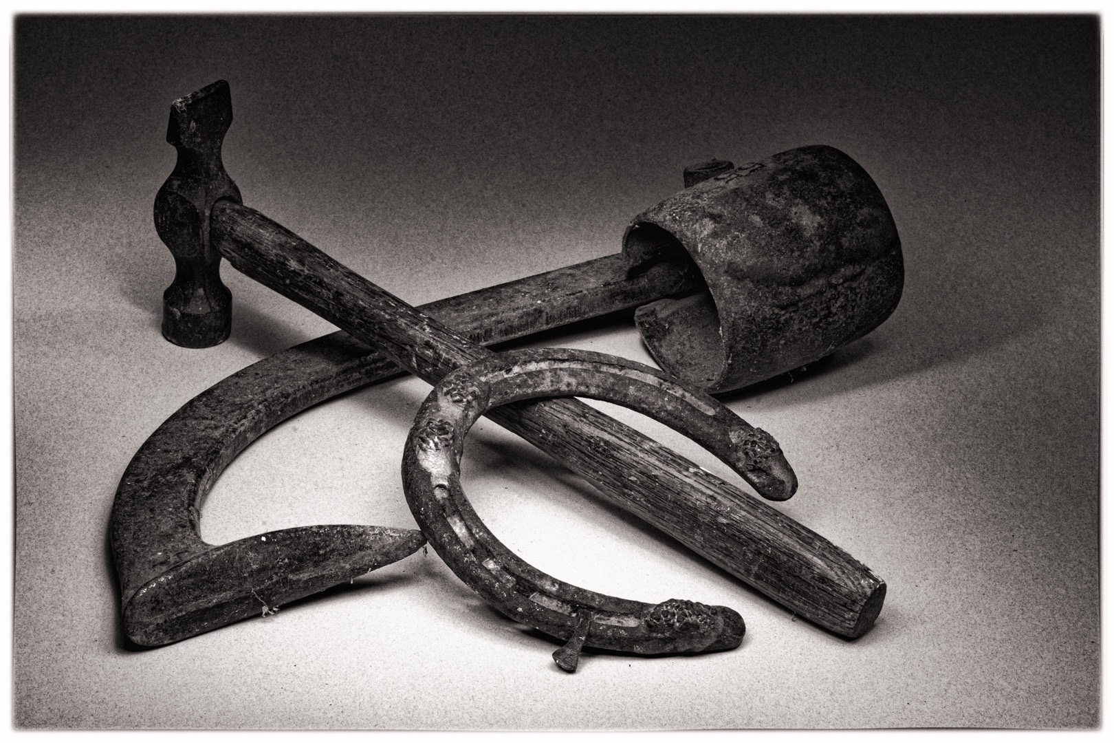
Jane
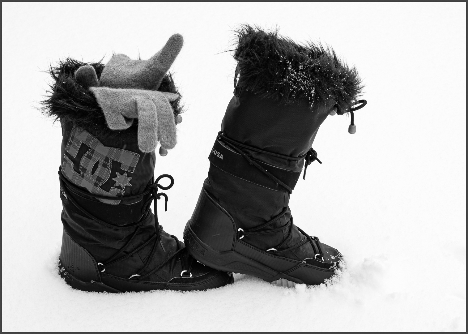
1. This is a single image with no focus stacking.
2. The black velvet is what makes the lights stand out. Also I could pin the light strand to the velvet. Black foam core would cause a weird light pattern.
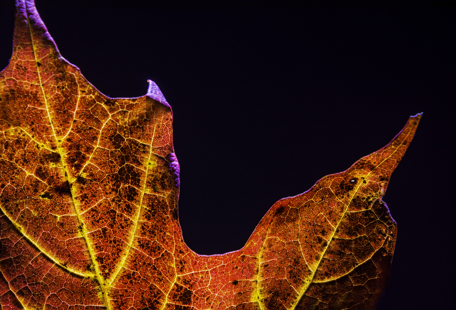
See image attached of the deer against a tan wall. The lights against wood do not stand out as much. There is not much contrast between the deer (gold) and the wall (tan). I could put the deer against a dark blue wall to get the tonal contrast. Pushing the blue slider to the left would darken the wall. For this image, a selection on the deer and pushing the yellow slider to the left to create more contrast did not solve the problem.
The shadows on the wall help create depth. |
Dec 19th |
 |
| 83 |
Dec 19 |
Reply |
Lance
I understand your viewpoint about presets being "visual trickery". However, they can provide a useful learning tool. For me, as I did the History of Photography Course, it was interesting to work through the Nik presets starting from the pinhole, to antique plate, to film noir, etc as the time period I was studying changed. As I progressed to the 1920's, I then moved to using the PS BW adjustment layer, masked selections and curves. Now I am moving in even a more simple direction, luminosity masks and dodging and burning.
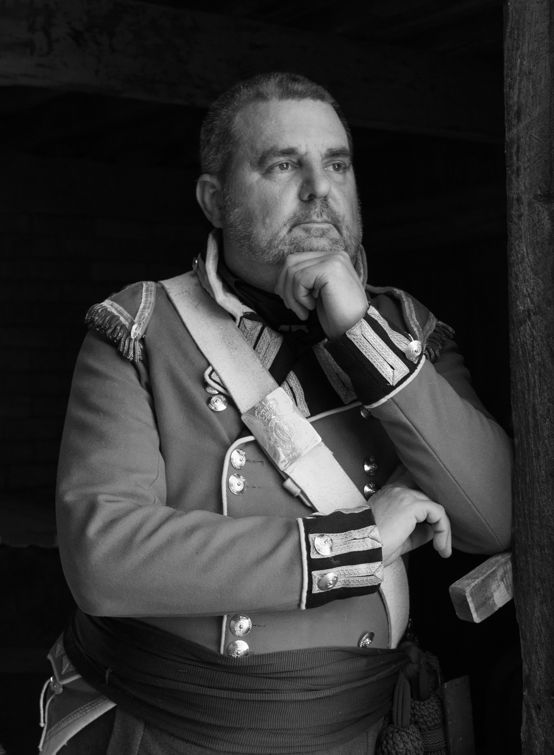
To me, presets have to be used judiciously with the composition fitting the preset. One assignment was to take a 30 sec. exposure of a person to demonstrate the difficulty of doing portraits in the 1830 -50's. I photographed an old man (my husband) sitting on a leather and wood Italian rennaissance chair, with a a mushroom toned painted wall background and applied analog efex pro preset. I learned that all elements must tie together.
His clothing was inconsistent with the time period and visually to me the image failed..
I found it interesting to look at the soft focus and high contrast in works of Cameron, Nadar, and Daguerre to see how far technology has progressed. |
Dec 18th |
| 83 |
Dec 19 |
Comment |
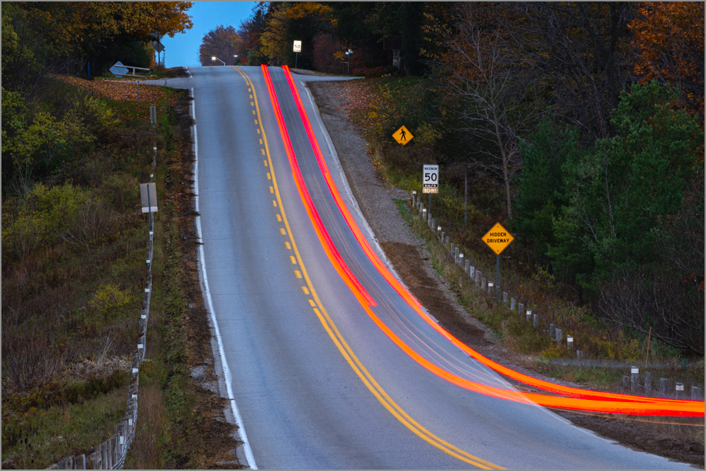
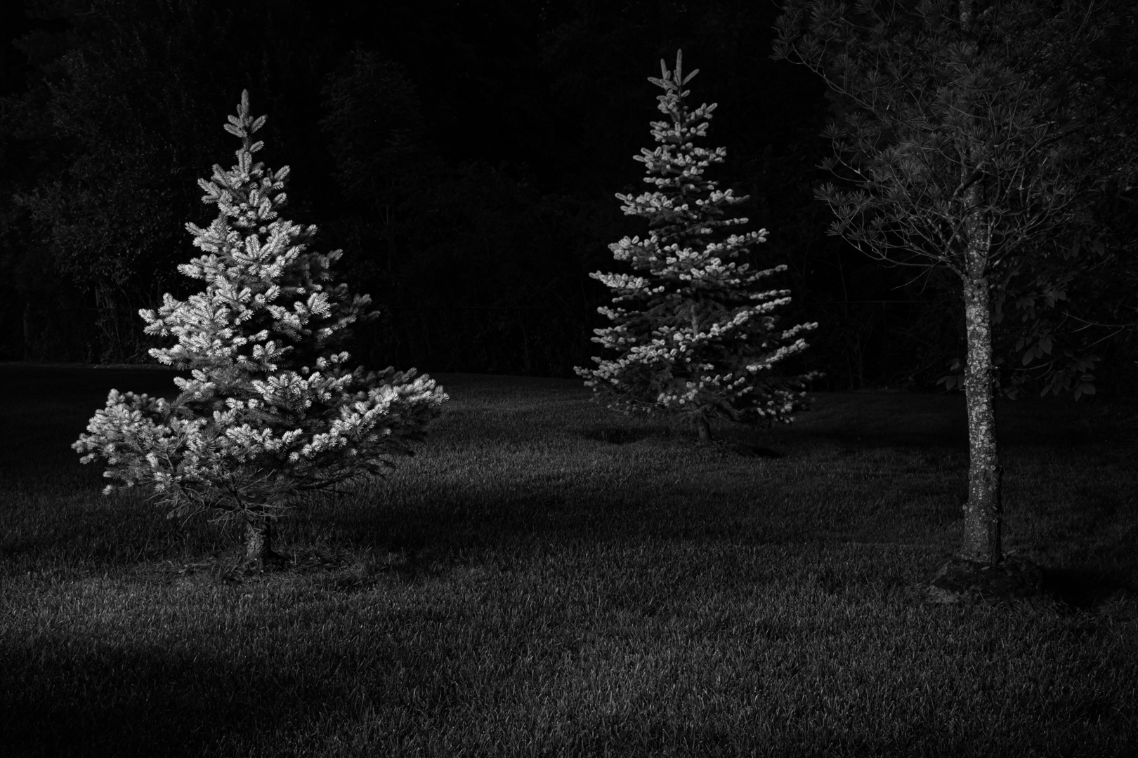
I am now confused about what we are looking at in the sky. When I read Lance's comment (first one), it mentioned snow and the this month's theme was the holiday/Xmas season so naturally I thought it was snow. Then I looked on the ground and tried to figure out why the snow was falling heavily but there was minimal snow on the ground. Then with night/low light I assumed a long timed exposure and would have expected that if indeed it was snow, there would be streaking in the snow. Furthermore, those white "blobs", have neither a streaking pattern that I would expect with snow nor any type of starburst pattern.
Bottom line: what am I looking at? How do are past memories influence how we visual see things? What is the story we are trying to convey?
My knowledge of stars is limited to taking a Canadian Power and Sail Squadron celestial navigation course when I lived in Nanaimo Vancouver Island where I would have to look at weather patterns to see if there would be cloud cover. I needed a clear sky to take sextant readings. If it were raining, there would be cloud cover and no stars. Ergo, if it were snowing, there would be cloud cover and no/minimal clouds. So again, it leads me to conclude this is a merged image and those white circles are neither stars or snow.
Dirk, would you provide us with the colored image. Amazing how color gives us information and visual clues. I cannot figure out from the monochrome what the landscape is - sand or grass. Perhaps this is a composite of more than one image.
JPS
JPS
|
Dec 18th |
| 83 |
Dec 19 |
Comment |
Lance
I enjoyed the challenge of using a theme and our members images on the theme. Could we try this concept again for next month?
JPS |
Dec 14th |
| 83 |
Dec 19 |
Comment |
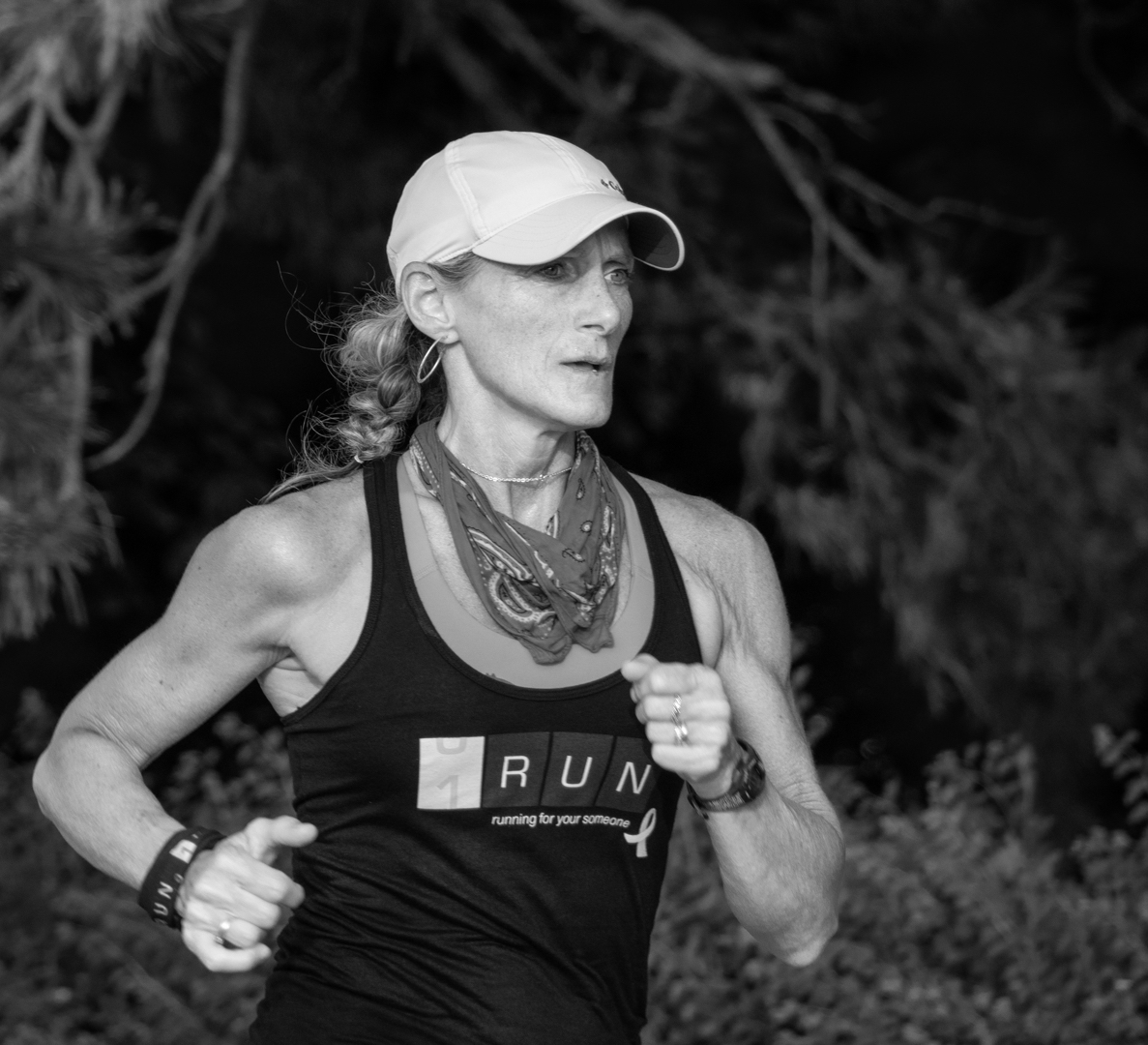
Jose
Best wishes for the New Year.
Where do you find all these beautiful women?
I agree with Lance's comment, the step could be cloned out and the crop just above the knee.
The camera left hand, left part of the hand, is that her thumb or snow she is holding? Would you consider burning this part slightly so the skin tones are more similar to the rest of the fingers.
JPS |
Dec 14th |
| 83 |
Dec 19 |
Comment |
Lance
The tree has an anthropomorphic feeling as if it were raising its hands (branches) heavenward - a beautiful composition and perspective.
Your dodging and burning reveals the light direction and creates depth.
Is it possible to dodge the branch camera left, lower one third from the bottom so it is not as noticeable? I was not sure if it belonged to this or another tree. |
Dec 14th |
| 83 |
Dec 19 |
Comment |
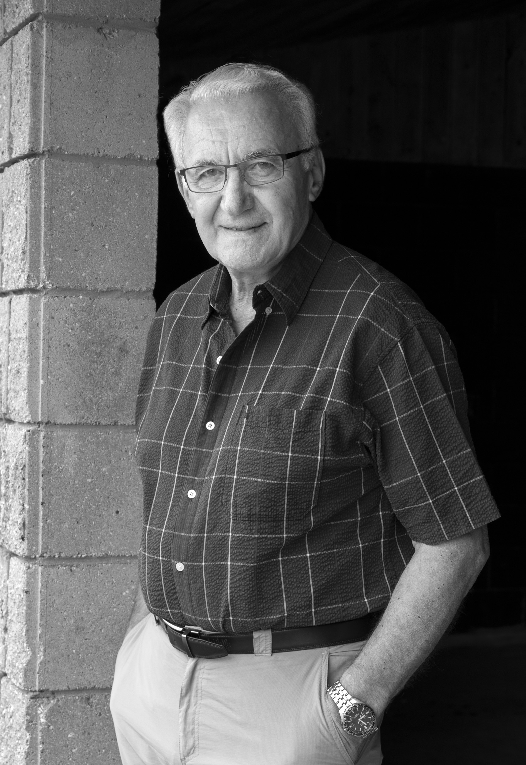
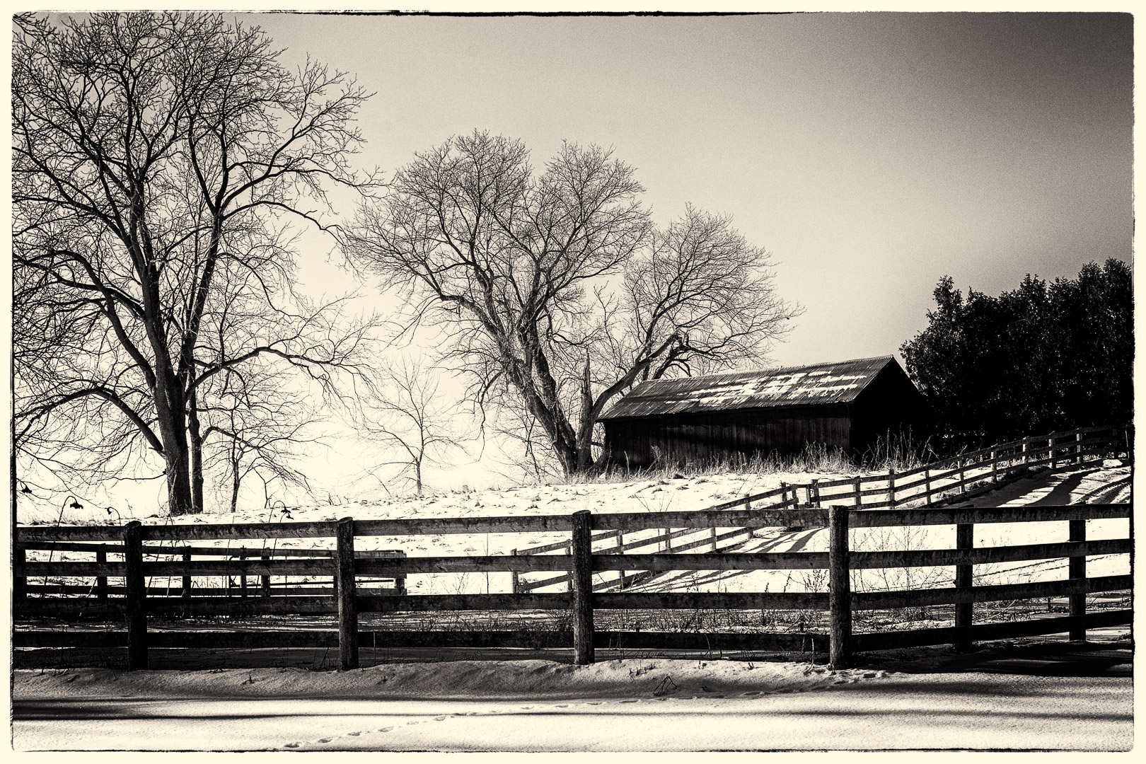
Georgianne
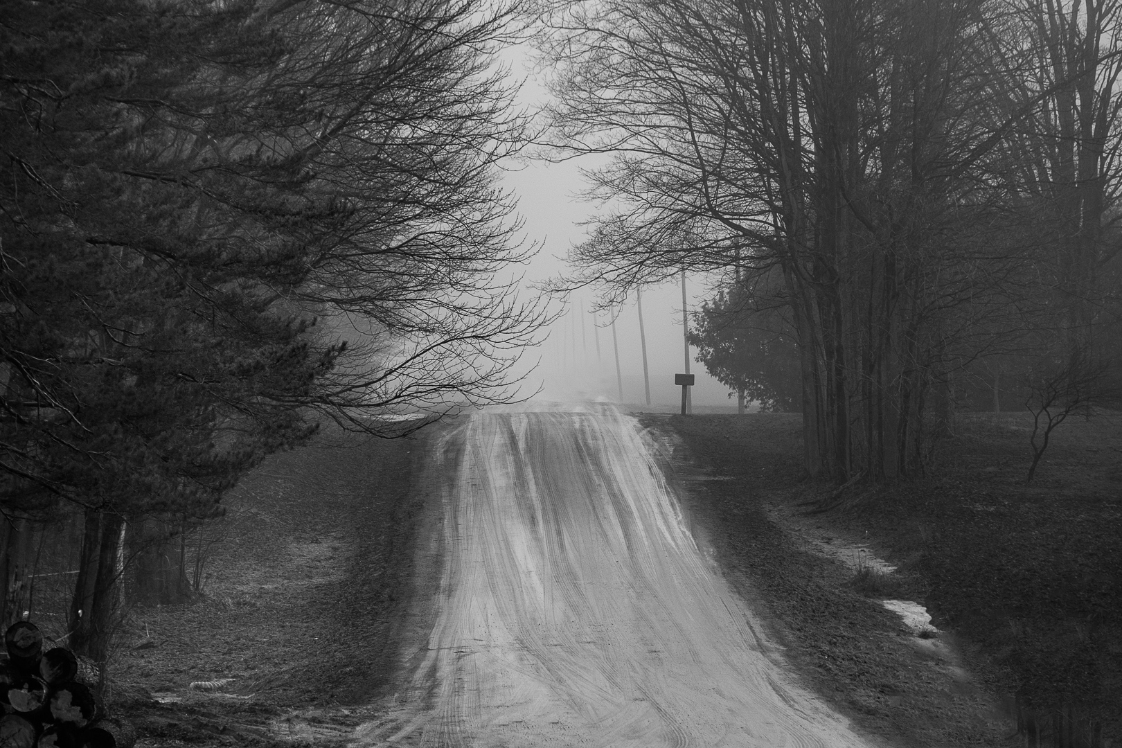
Are you familiar with some of the presets in Silver Effex Pro, part of the Nik software package. When doing my History of Photography course and trying to introduce grain etc., I used one of these presets as a starting point and found them particularly good for creating old world looks. See attached taken of a farm. |
Dec 14th |
 |
| 83 |
Dec 19 |
Comment |
Dirk
You have us all asking about how you created this image. I like the lighting on the lighthouse, However, somehow it does not fit in with the snow. With falling snow, I would assume an overcast sky therefore, no or minimal light. If it is evening, and there is light coming from the top of the lighthouse, I would expect the light would have some type of starburst pattern (i.e. like my deer). Consequently, with Lance and Steve's points, I assume that this is a blended image.
Interesting image.
JPS |
Dec 14th |
| 83 |
Dec 19 |
Comment |
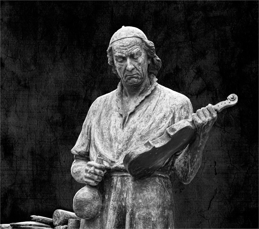
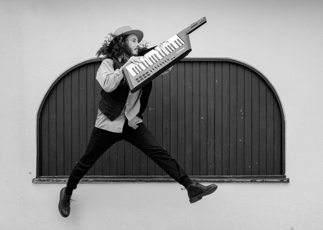
Jane
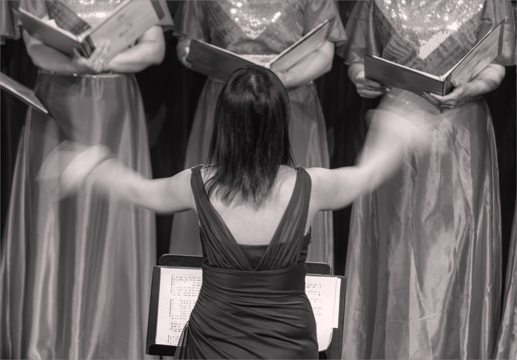
Seasons greetings. This is a strong visual image with hearts dancing to the music.
I like how you focused the light on the instrument to bring out the carving and toned down the lighting in the dancing hearts. I find there are a couple of hot spots on camera right on the table and toning them down might draw less attention. I also wondered how the image would look if the two hearts 1/3 from camera right were removed. |
Dec 14th |
| 83 |
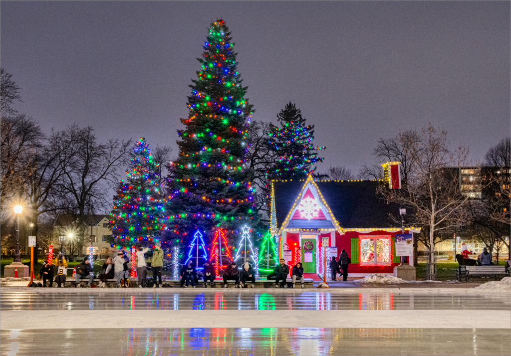
Dec 19 |
Comment |
Lance and Jose
I was surprised and delighted when I saw the lights and will try some more setups.
JPS |
Dec 6th |
9 comments - 3 replies for Group 83
|
9 comments - 3 replies Total
|