|
| Group |
Round |
C/R |
Comment |
Date |
Image |
| 83 |
Oct 19 |
Comment |
Jose
Your advice is good. When I submitted this to my camera club competition last week, I took off the door handle. It is a definite distraction.
JPS |
Oct 24th |
| 83 |
Oct 19 |
Reply |
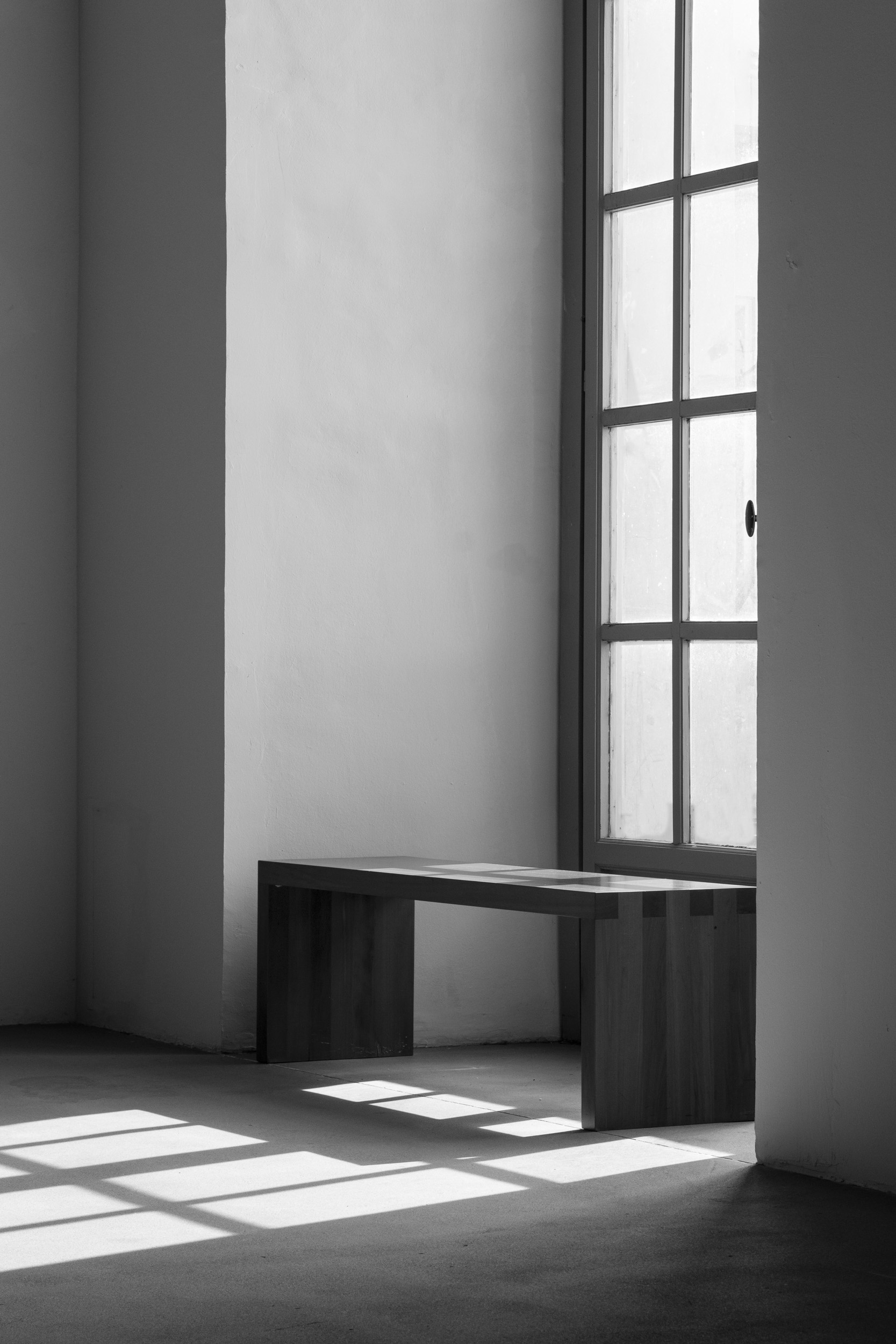
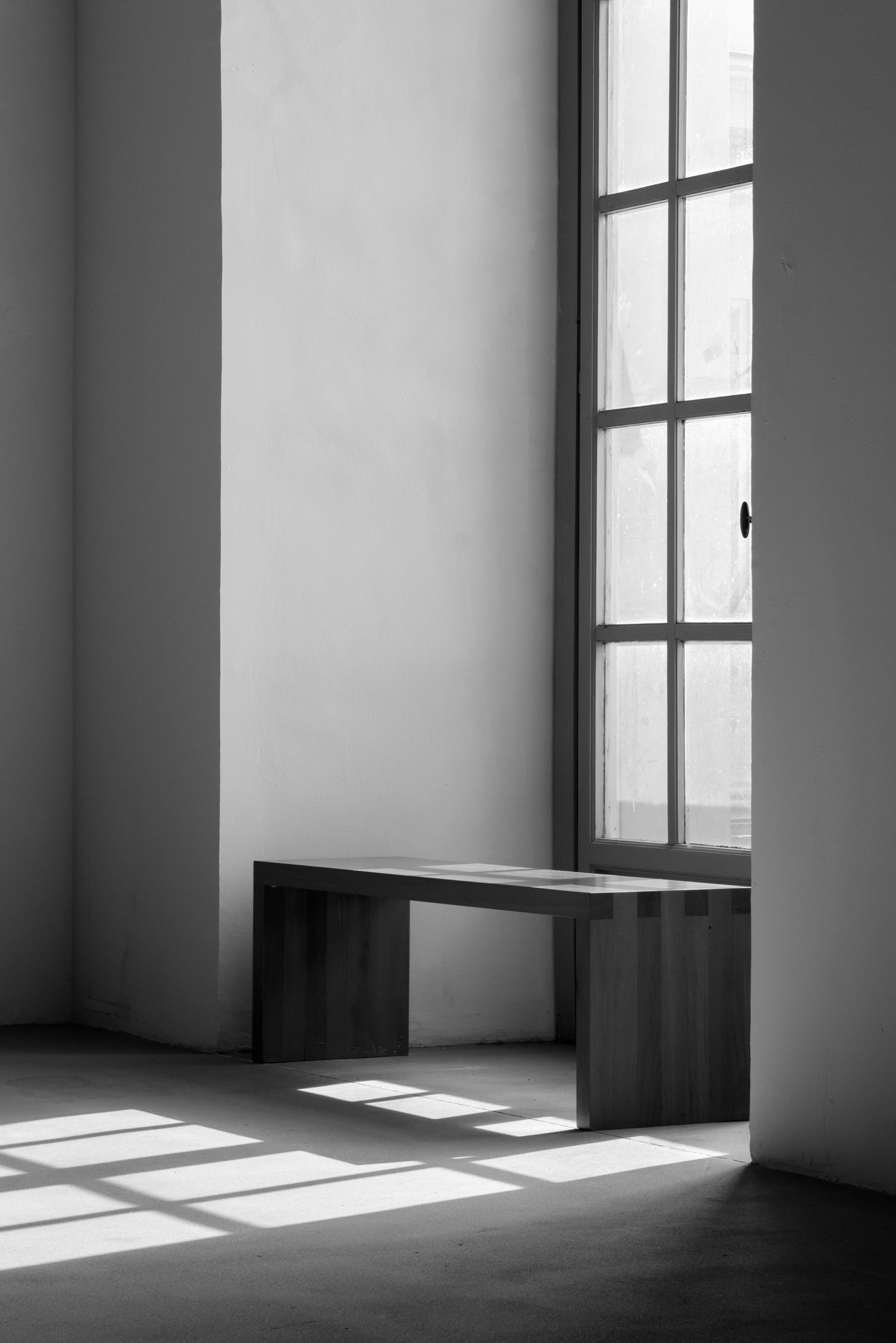
Jane
I like the crop. For me, it brings focus to the bench.
How did you do the light beams? |
Oct 23rd |
| 83 |
Oct 19 |
Reply |
Jane
I think we both made the same tweeks. For contrast, I used the curve (called contrast in Lumenzia). I left the white in the reflection and bottom of the window just a little lighter than on your version to draw attention to this area.
JPS |
Oct 23rd |
| 83 |
Oct 19 |
Reply |
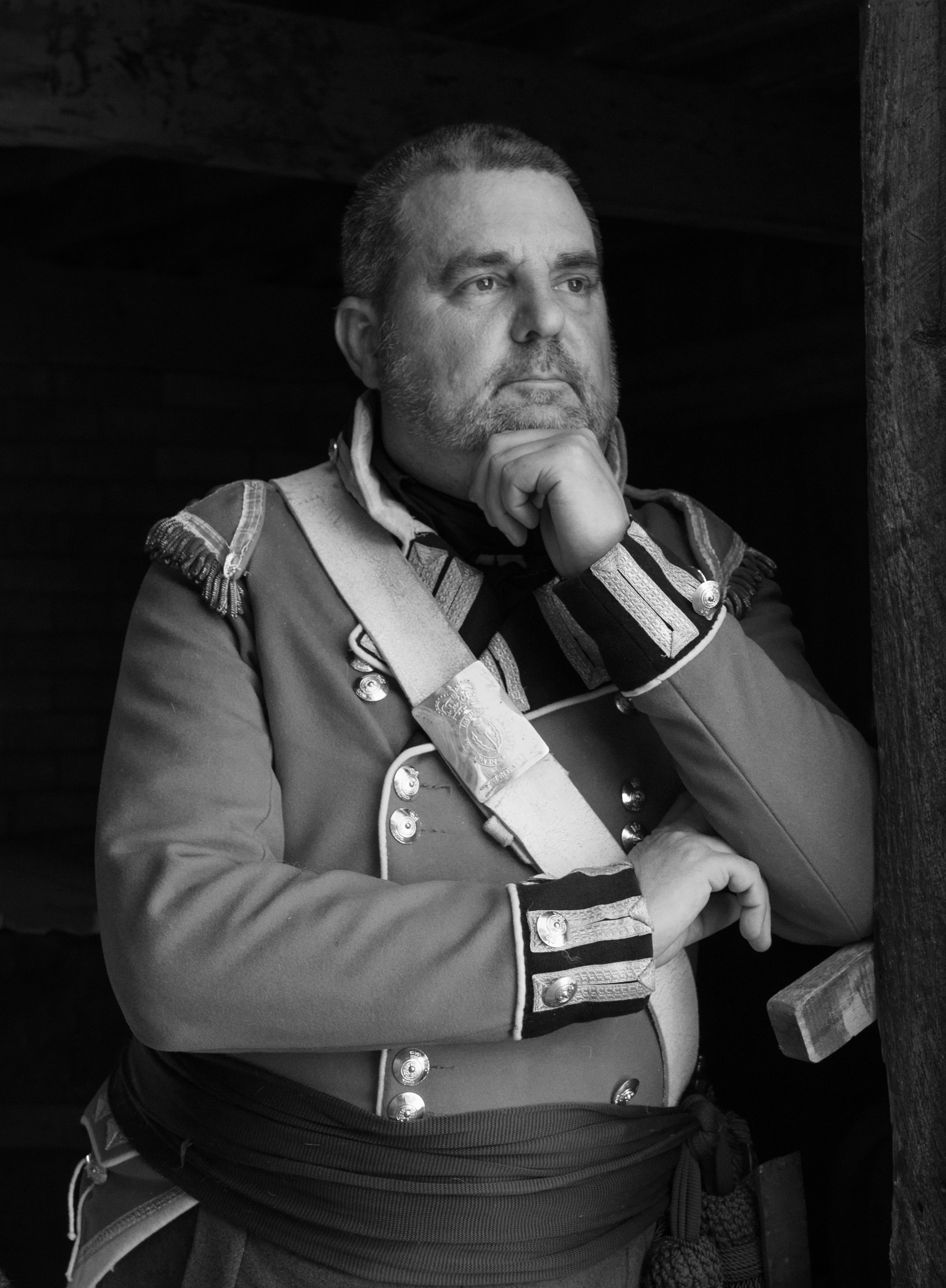
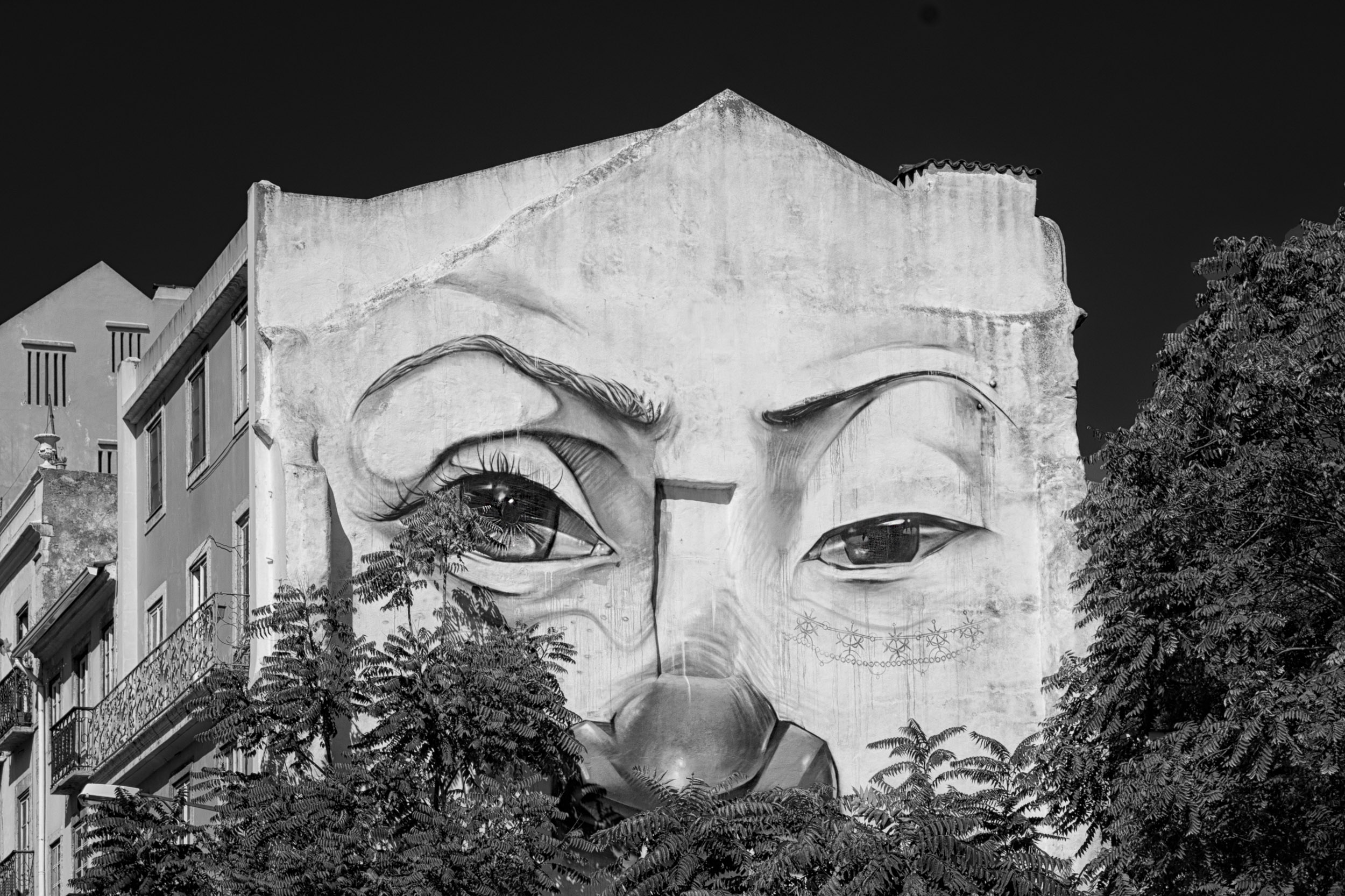
Georgianne
I looked at your suggested changes again after watching a video by Sean Tucker, a portrait photographer, on how to edit dramatic portraits in photoshop. It was interesting to see how he took a portrait from simple to dramatic by applying several curve layers. His end result was a look similar to Jose's original image.
Jose
Did you create the thoughtful look by your lighting, editing or both?
JPS |
Oct 22nd |
| 83 |
Oct 19 |
Reply |
Emma
Here are some edits you might want to consider - cropping in tighter, adding more contrast, and transforming the skew.
The tighter crop might move away from your intention but to me, it draws more attention to the reflection.
JPS |
Oct 22nd |
 |
| 83 |
Oct 19 |
Comment |
Emmy
Welcome!
You have taken this image using an interesting angle and perspective and I find myself pulled into the image to make out details of the reflected landscape.
I find the top slightly heavy and wonder if cropping slightly down from the top would lighten the image.
JPS
|
Oct 21st |
| 83 |
Oct 19 |
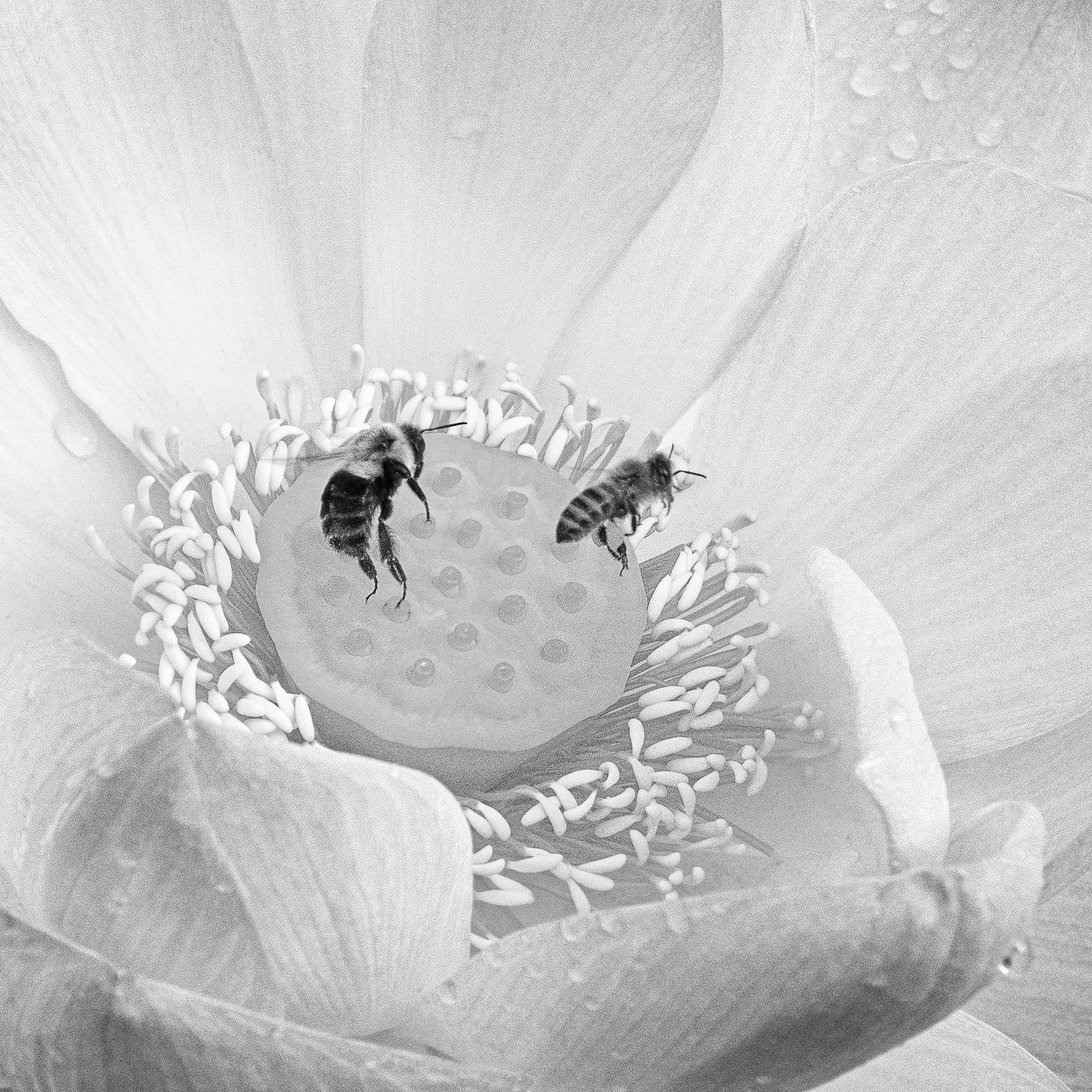
Comment |
Jane
I am not sure what TK is but I really like using the Lumenzia luminosity masking since it can target by different levels of luminosity whether light or dark. Adjusting the luminosity in the bright parts of the sky without effecting the trees was fast and easy. |
Oct 11th |
| 83 |
Oct 19 |
Comment |
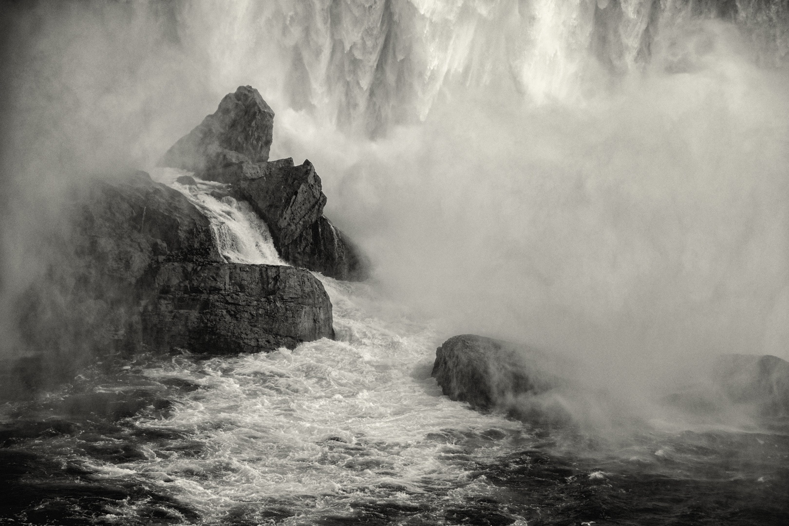
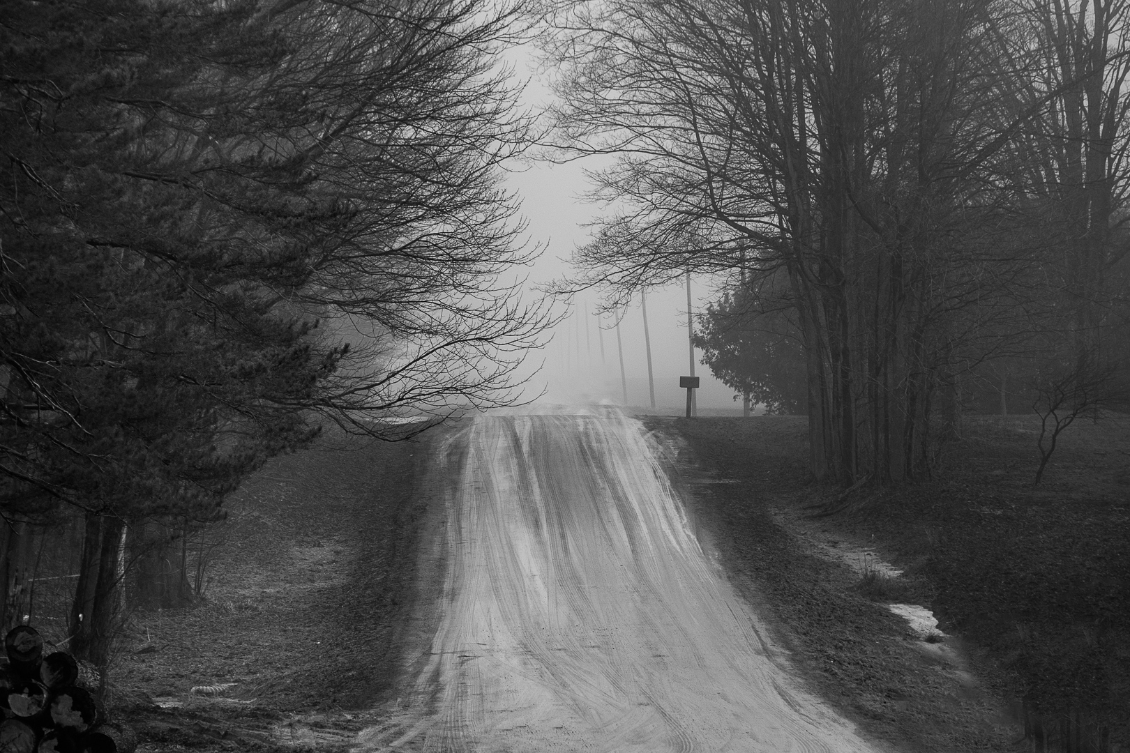
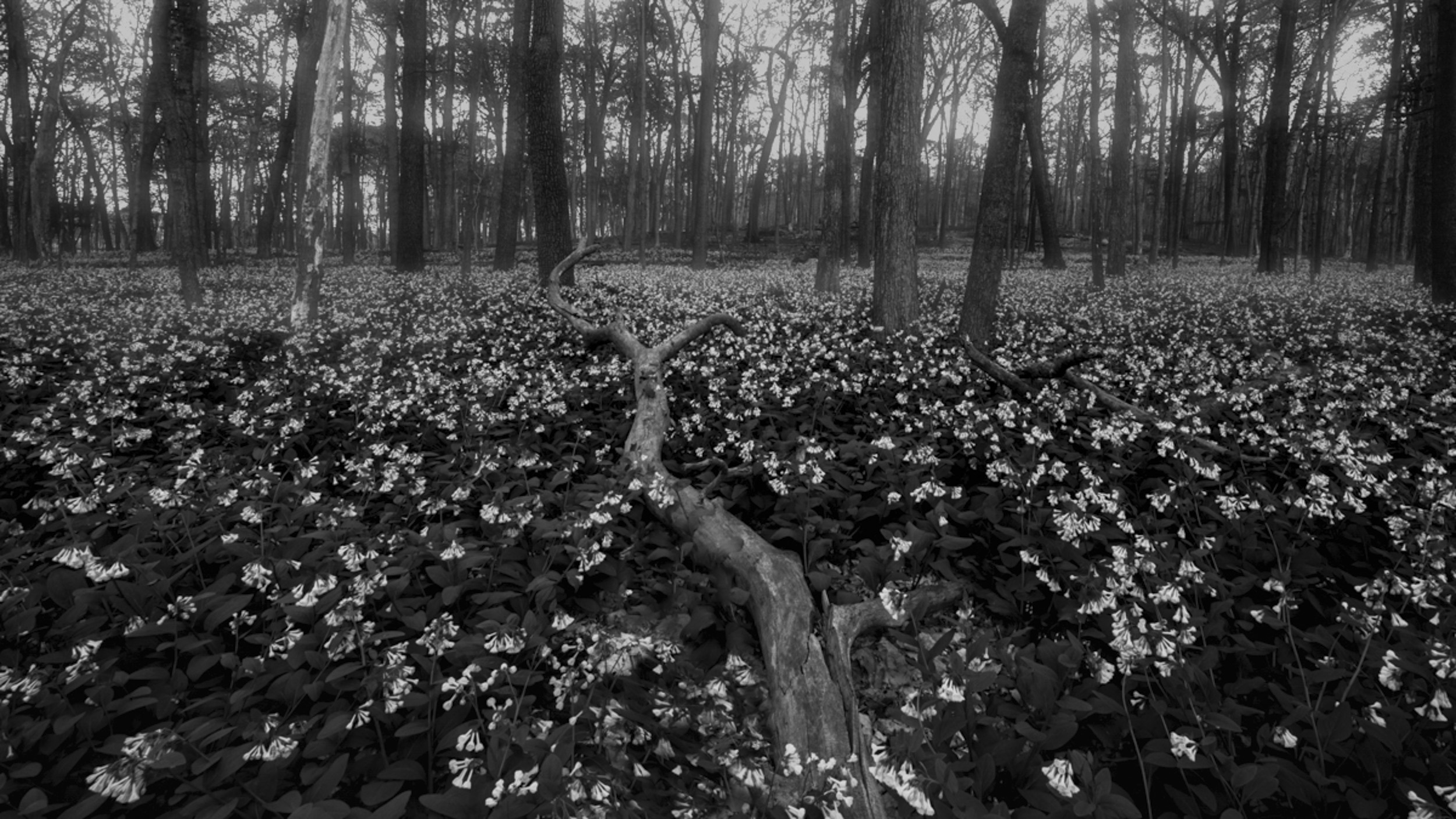
Lance
This is such a beautiful image.
You have captured the movement of the fog with the contrast of the obscure detail on the left and sharp detail on the right.
Did you dodge the left side of the image to create more of the feel of movement and light?
It is interesting to see how the fog acts as a diffuser spreading light and obscuring detail.
Were you on a boat to take the image?
|
Oct 9th |
| 83 |
Oct 19 |
Comment |
Jane
Lovely image.
Since you were concerned about the distraction in the sky (brightness), I applied a luminosity mask to take down the brightness in the sky only. Then to draw attention to the foreground, in CR, I applied a gradient to the leaf part of the image and opened up the shadows and moved the dark slider to the middle to provide more detail in the leaves.
Then I dodged along the tree lightening it to further bring the eye to the lower part of the image while using the line of the tree to move the eye upward.
Is this what you had in mind?
JPS |
Oct 9th |
 |
| 83 |
Oct 19 |
Reply |
Jose and Lance
After commenting on symbols, I realized that your use of lighting emphasized the symbol of thoughtful - moving from shadow to light. The pose is so appropriate, the lighted arm supporting the arm in shadow. |
Oct 9th |
| 83 |
Oct 19 |
Comment |
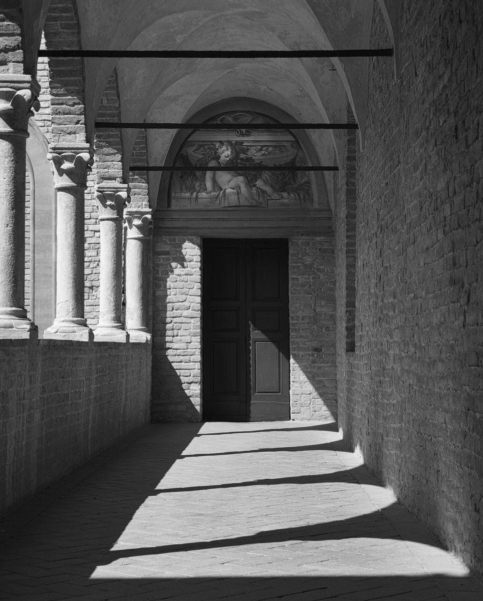
Dirk
Your composition and choice of depth of field creates a strong image.
For me, the bright white light in the upper third competes for attention and the line on the right of the image carries moves my attention out of the image.
I burned the bright light, did some other burning, and cropped the image slightly on the right and top. For me, these tweaks, linked the front and rear light (a major and minor interest point), and gave depth to the image.
|
Oct 9th |
 |
| 83 |
Oct 19 |
Comment |
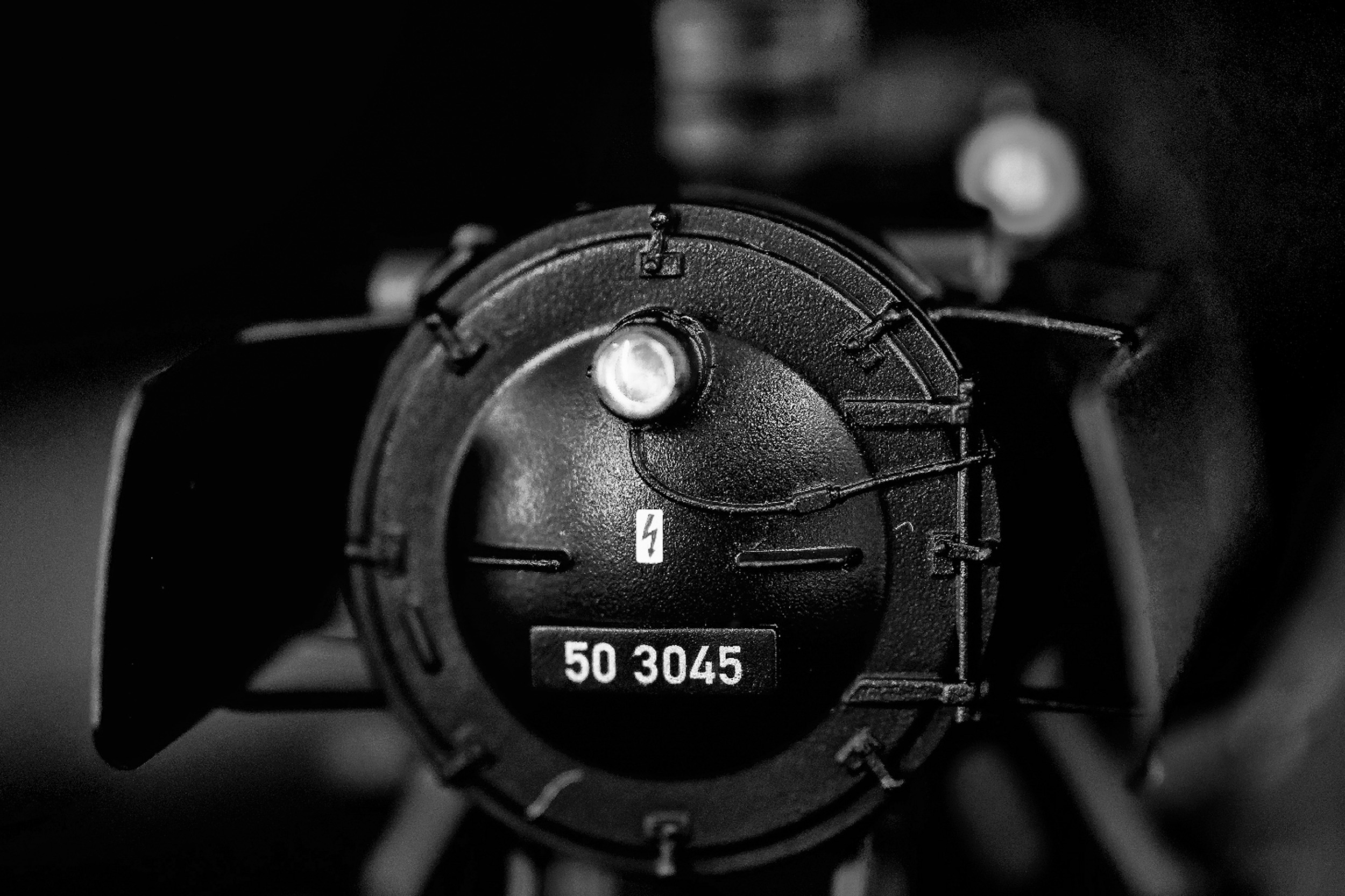
Georgianne
This is certainly a challenging image to photograph in the junkyard setting and you have conveyed the old world feeling of the engine.
For me, the image is quite busy, and I prefer the color version that helps outline the objects.
I also found that the vertical lines (wall etc), crooked causing further visual confusion. |
Oct 9th |
| 83 |
Oct 19 |
Reply |
Lance
I am reading Freeman Patterson and Andre Gallant Photography for the Joy of It. One concept that resonated with me was that the photographer was the discussion of symbols. "How a person says something is just as important as what he says". First he must ask what his subject matter (content is likely to suggest) to others. Second he must ask wahat his treatment of that subject matter (style) is likely to convery. Third he must ask if his content and style are harmonious.
When I reedited the image last night, I thought about this concept. In Turino this September, after spending five days, visiting the Egyptian museum with all its death symbols, castles that displayed wealth with all the gold, paintings, tapestry etc., and the museum of cinematography, going to the museum of modern art represented light and new life. |
Oct 9th |
| 83 |
Oct 19 |
Reply |
Jose
I love this image and am suggesting a couple of tweaks.
In Georgianne's revised crop, I like that she has moved the model from centre to the viewer right to create more room as the head tilts to the viewer's left.
On my suggested crop, I left more on the bottom for the black to ground the image but removed the stool which stood out.
I like how the shadow on the model's face (camera left) provides dimension. Therefore, on the version attached, I increased the overall exposure about 0.12 to brighten the image overall and the face rather than opening up the shadow.
I also tidied up the hair on the camera left side. Young ladies seem to love flat irons and smooth hair.
I edited on your resized image. |
Oct 9th |
 |
| 83 |
Oct 19 |
Comment |
Georgianne
Thanks for reminding me of the BW adjustment layer option.
JPS |
Oct 9th |
| 83 |
Oct 19 |
Reply |
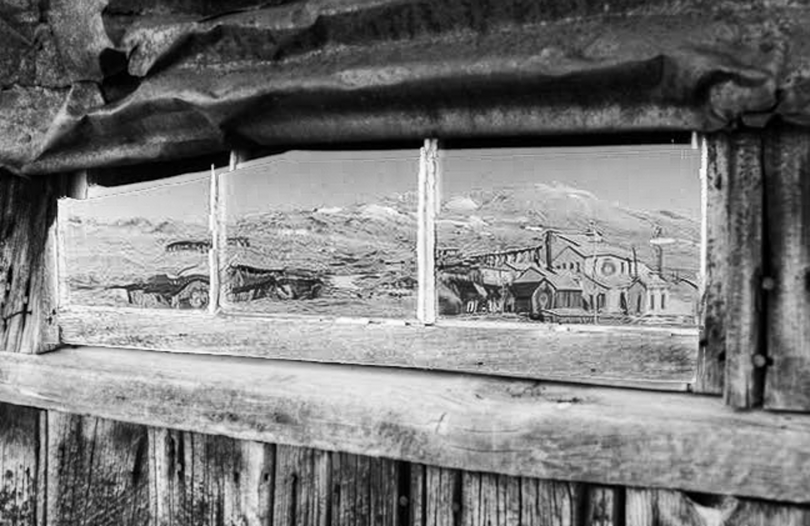
Georgianne
What attracted me so much to the window was the brightness and I wanted a high key effect. Instead, I ended up with a somber low contrast image.
I tried your suggestion of moving the yellow slider to create a difference between the outdoor and indoor light. The result was dark unattractive splotches on the interior wall. Then I tried Nik starting with presets as a base and adjusting sliders to suit. No version came close to my experience.
Finally, I tried luminosity masking to brighten the window. I left the irregular splotches on the window in this version.
The brighter image is much closer to what I wished to convey.
|
Oct 8th |
 |
8 comments - 8 replies for Group 83
|
8 comments - 8 replies Total
|