|
| Group |
Round |
C/R |
Comment |
Date |
Image |
| 83 |
Sep 19 |
Comment |
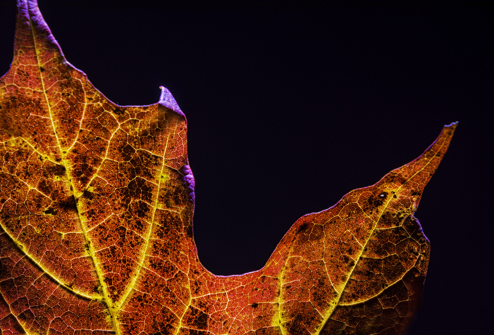
Jane
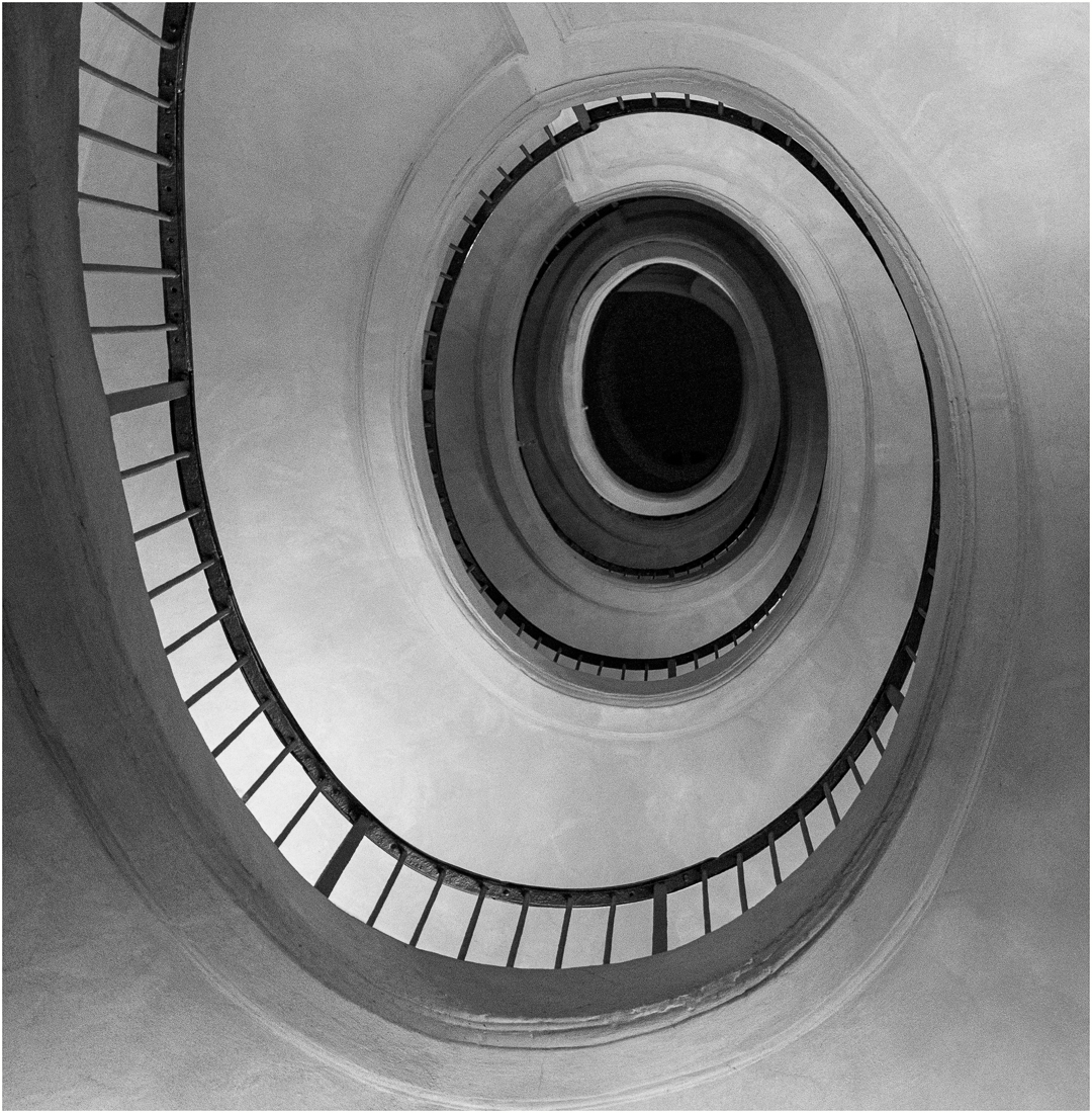
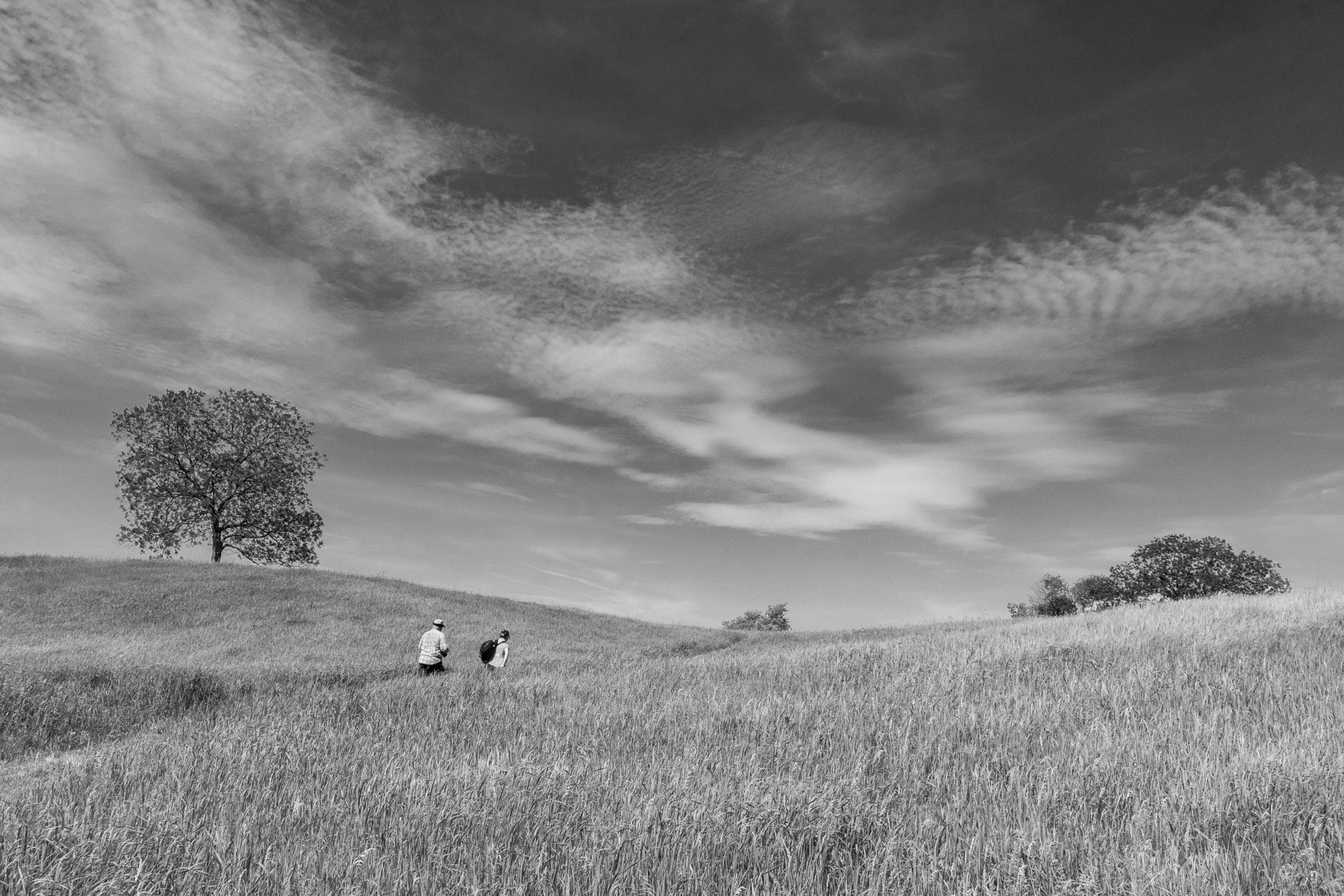
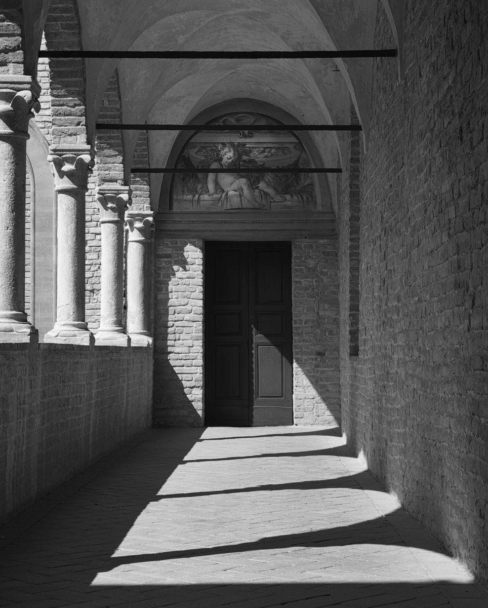
I like the use of negative space in this image. However, I found that my attention was held by the bright spots in the middle and I wanted more detail in the shadows.
I increased the exposure to obtain more detail, reversed the image, burned some areas for your consideration.
JPS
|
Sep 21st |
 |
| 83 |
Sep 19 |
Comment |
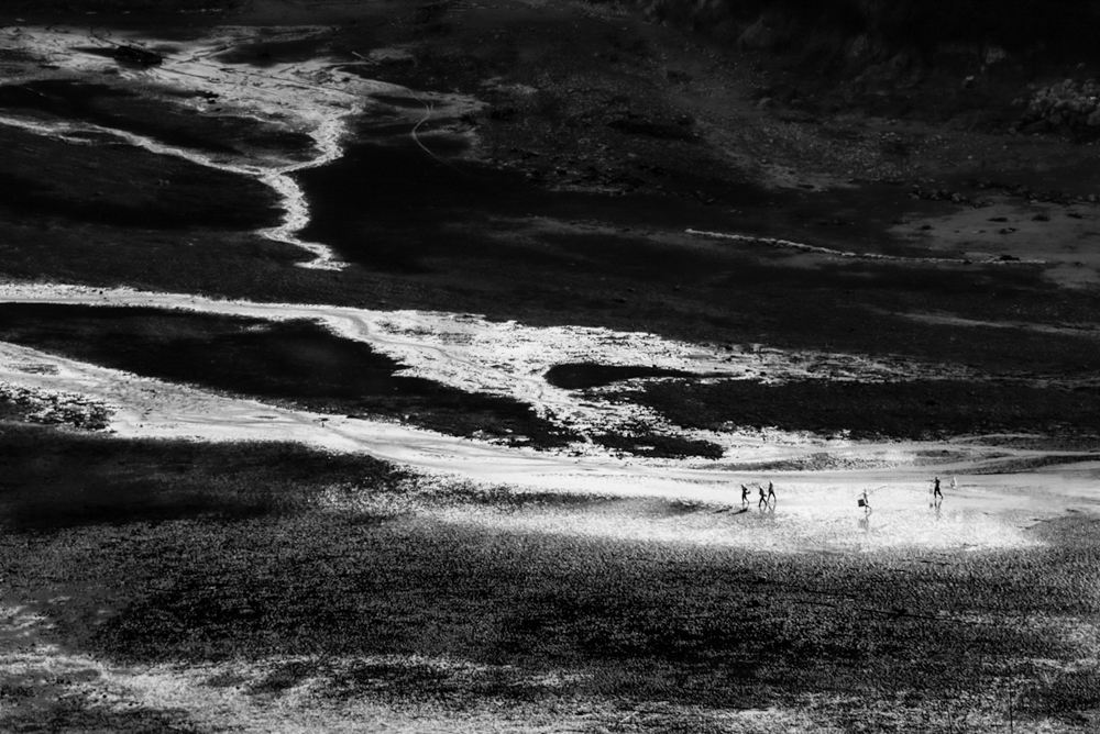
Georgianne
It is amazing how the different editing approaches (version 1 and 2) create such different moods.
I noticed halo effects around the tree tops and hills. This could be because of the aligning during the HDR or poor blending. I am still at the learning stage with exposure blending so can identify the problem but not provide you with an expert solution. Maybe others can.
|
Sep 21st |
| 83 |
Sep 19 |
Comment |
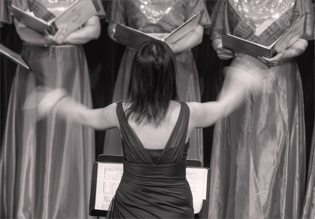
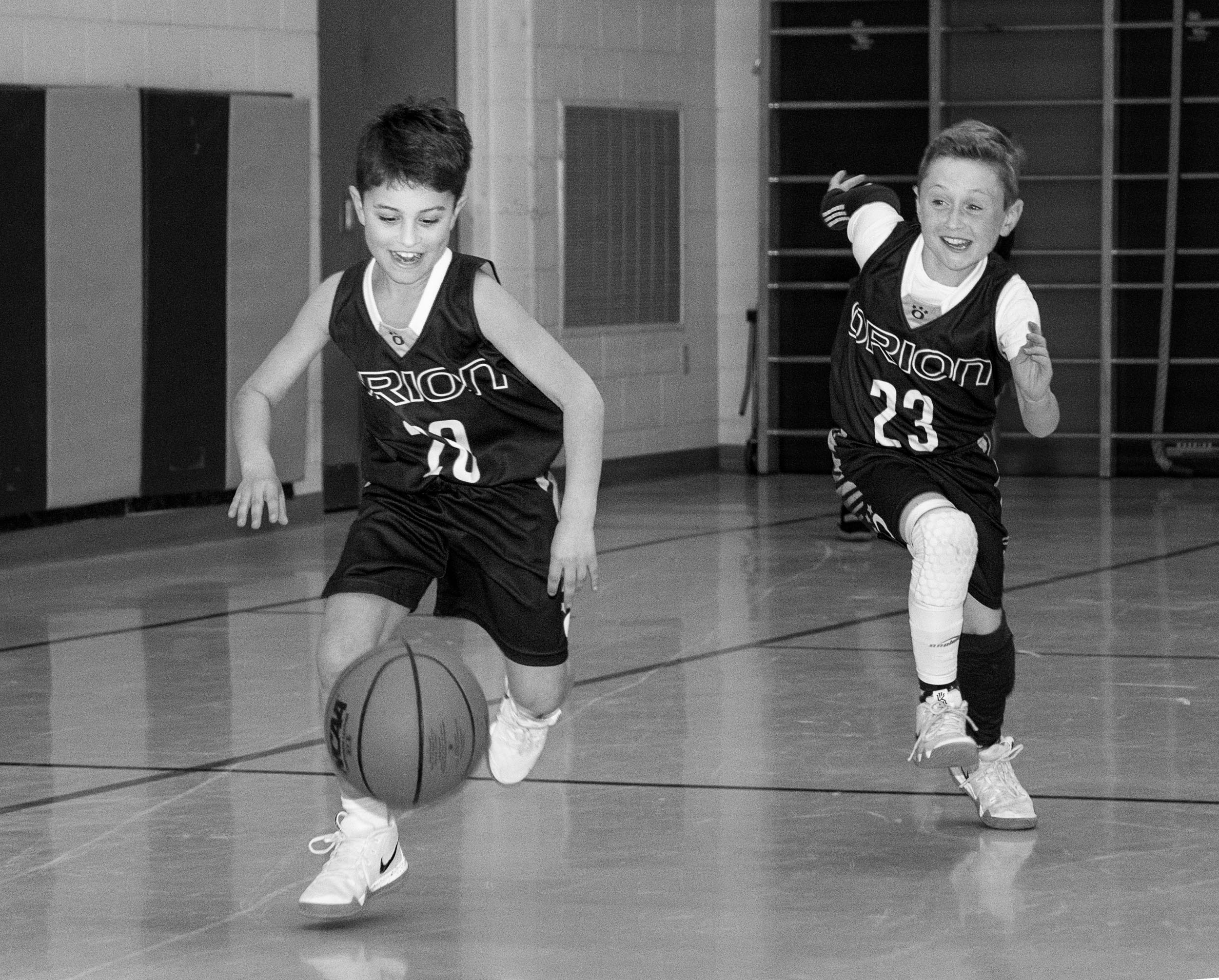
Jose
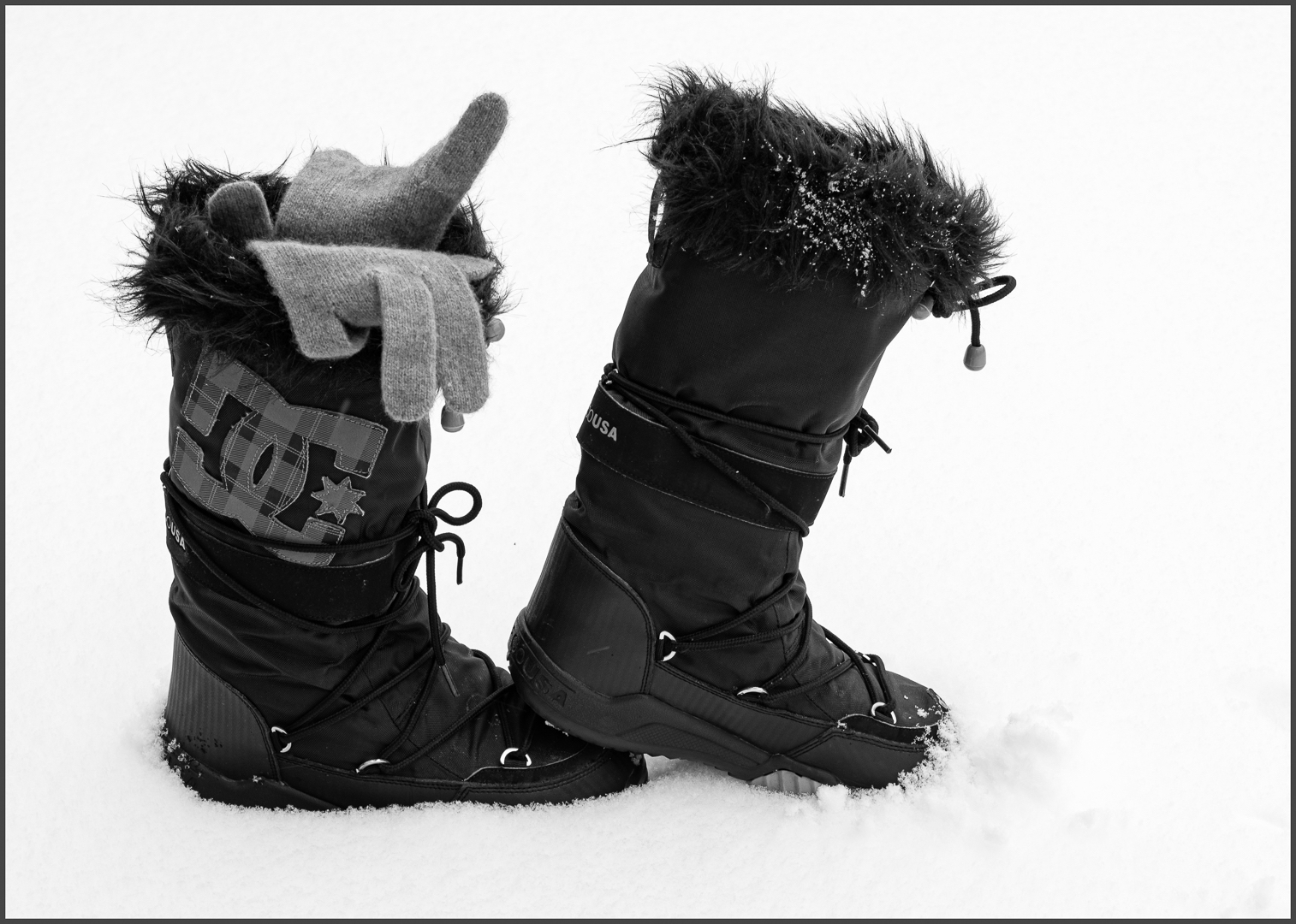
I find just looking at the left side of this image intriguing. There is such contrast between the woman on the left looking frontal and the other women, as well as the dress and shoes. |
Sep 11th |
| 83 |
Sep 19 |
Comment |
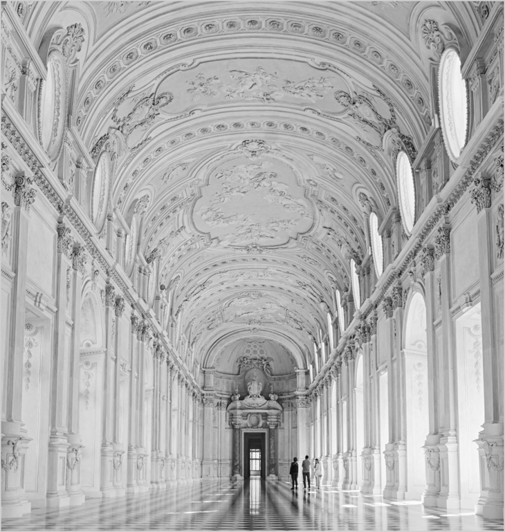
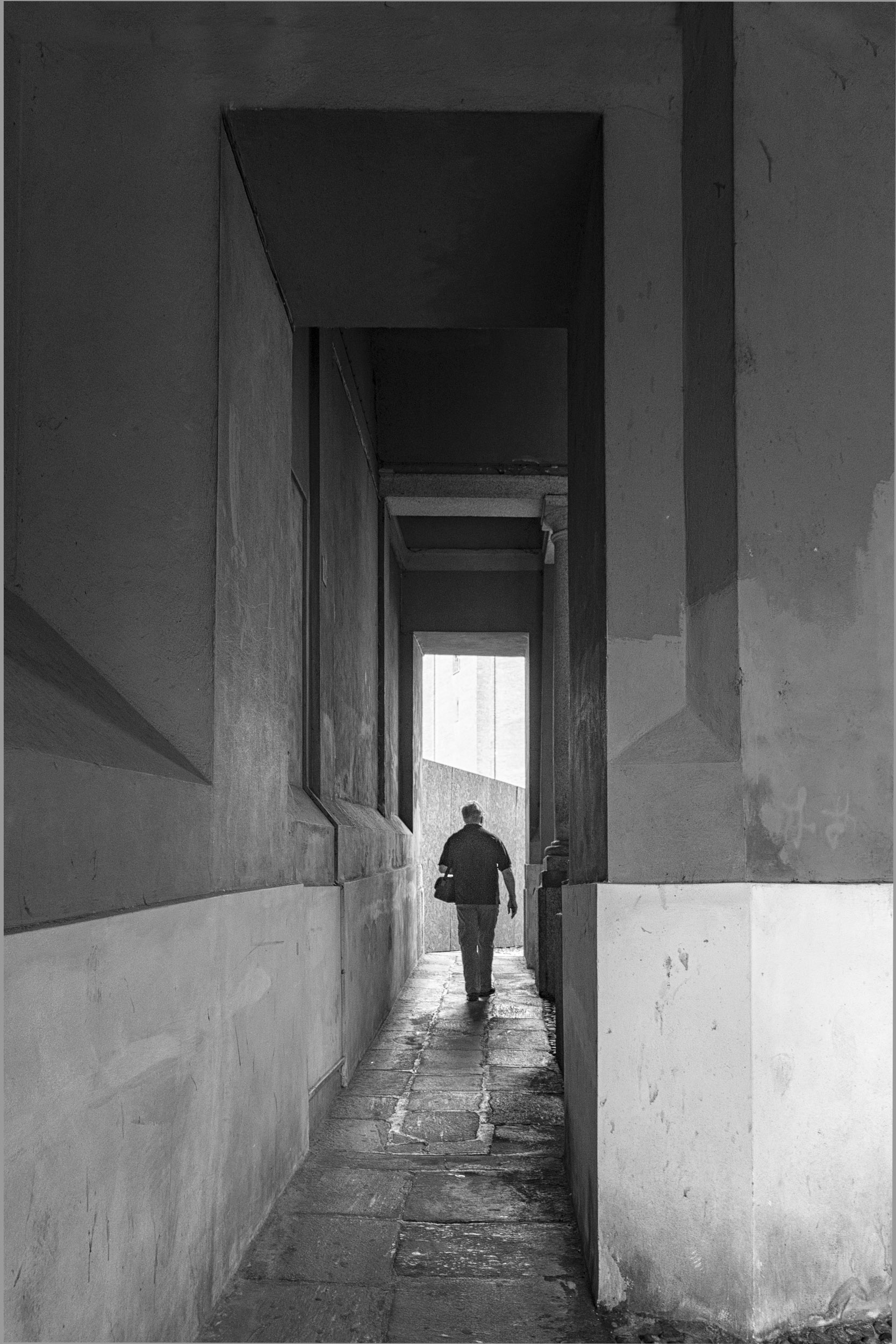
Dirk
What a beautiful image and interpretation.
Did you use a preset? |
Sep 11th |
| 83 |
Sep 19 |
Comment |
Lance
Thanks for the comment. My first mentor taught me to create sharp focus front and back, to focus stack front, middle and back, and then blend images and to use f 16 at a minimum.
Your image was an eye opener. I have a 1.8 50 mm and will experiment.
JPS |
Sep 11th |
| 83 |
Sep 19 |
Comment |
Lance
I found this image both ethereal and abstract. Did you choose blue for the blue hour?
I like how you have edited the sky. Given, the clouds are moving, did you consider creating two exposures from the same raw file and blending them to bring out more detail in the mountain area or do you think that this would alter your vision of the scene.
This scene reminds me of a scenario in my luminosity blending master course. Could you put the raw file in our drop box account so that I could experiment with it.
N |
Sep 11th |
| 83 |
Sep 19 |
Reply |
Lance
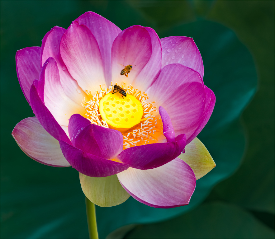
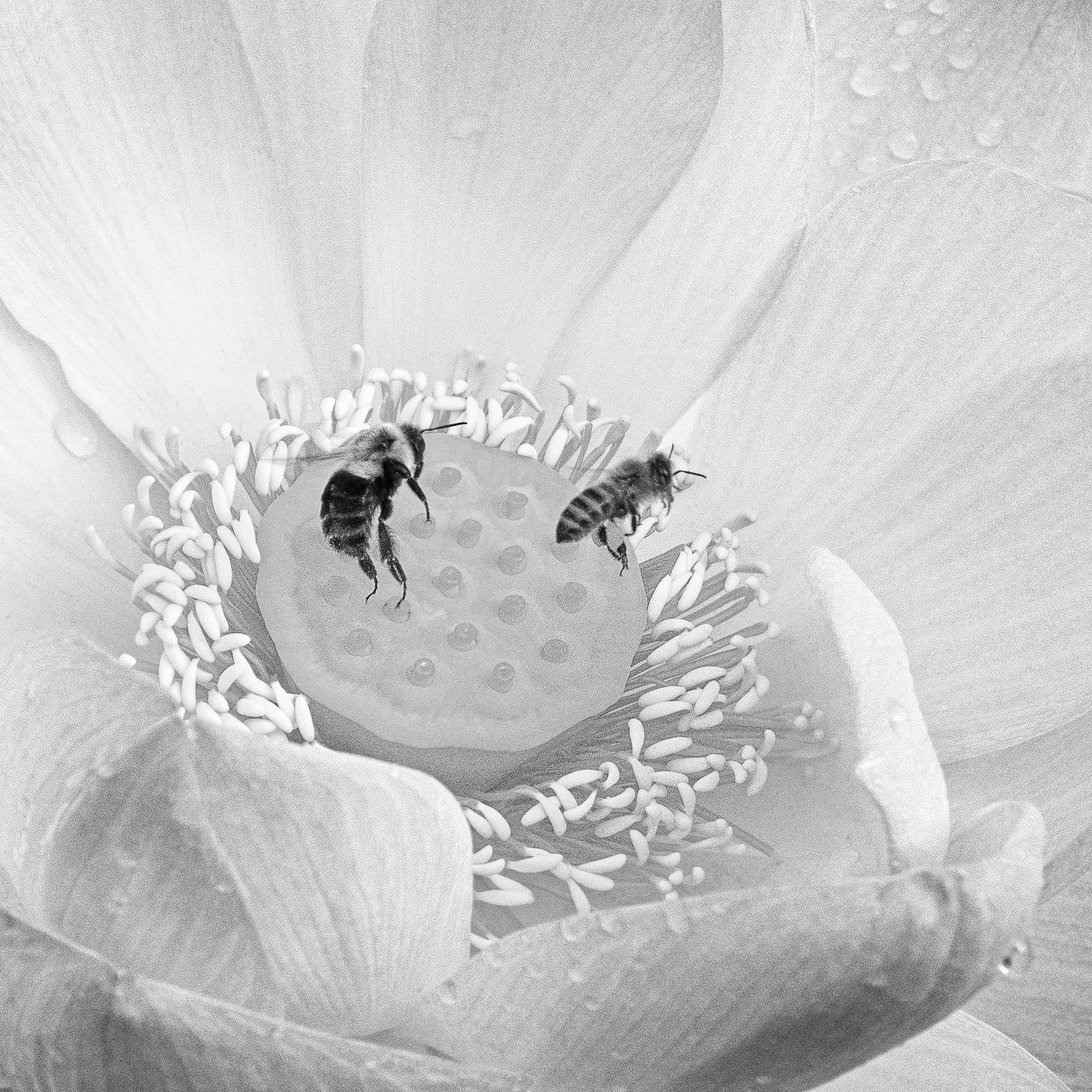
The background is the green leaves.
I found using the red PS filter worked the best to create tonal contrast between the pink petals and green leaves. Also moving the green slider to the left helped accentuate the highlights on the leaf rim.
I selected this image because of your comment last month on using a tripod. Because I used a tripod, I could carefully compose the image of the flower and stamen. The story of the bees depended on chance and timing.
When you commented on your flower image last month as being a portrait, it made me think differently about flowers and I edited this image considering it to be a flower with a simple soft focused background. |
Sep 11th |
| 83 |
Sep 19 |
Reply |
Georgianne
I took several images that morning. The story is so different depending on where the bee is and the orientation of the flower.
I chose this image because of where the bees legs landed and the story was clear. |
Sep 11th |
| 83 |
Sep 19 |
Comment |
Lance
My description sounds complex. My goal was to reduce global edits and use targeted edits.
I also prefer the uncropped version.
|
Sep 11th |
| 83 |
Sep 19 |
Comment |
Jose
I also prefer the whole flower. The cropped version is not balanced and the image is degraded.
|
Sep 11th |
8 comments - 2 replies for Group 83
|
8 comments - 2 replies Total
|